


Intelligent Assistant
Chat with our virtual assistant to get answers promptly.
App Multiplier is a system-level compatibility solution that implements the split-view display for wide-screen and large-screen devices based on the standard configuration when apps are not adapted to the split-view layout. When App Multiplier is enabled and the split-view display is used, two pages are displayed in one window at the same time. By default, each page occupies half of the window, as shown in the following figure. The home page is displayed on the left, and the page routing and redirection occur only on the right. The details page after redirection is displayed on the right. Starting from API version 23, developers can configure this feature.
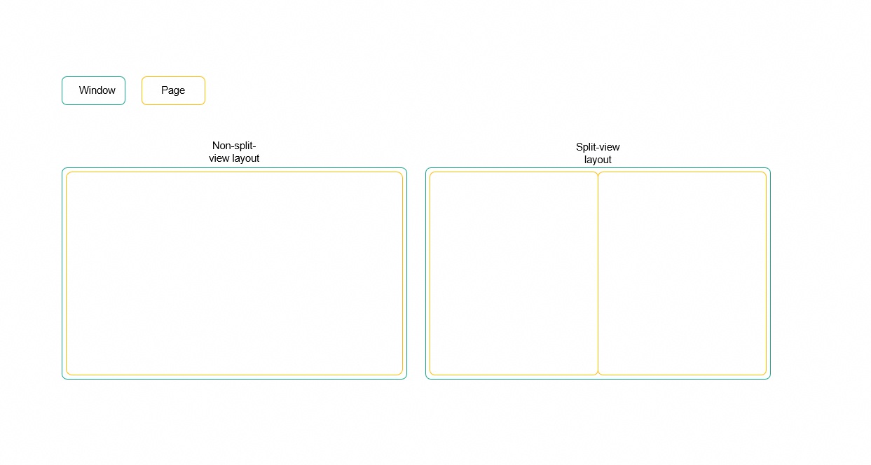
App Multiplier is applicable to apps that require frequent page switching, such as office, email, IM, and e-commerce apps. Currently, App Multiplier supports two routing modes: navigation mode and shopping mode. The following uses a shopping app running on a dual-fold phone as an example:
Route Mode | Navigation Mode | Shopping Mode |
|---|---|---|
Effect |
|
|
This topic is intended for intermediate and senior developers. Before learning this topic, complete the following preparations:
This topic covers the following content:
Create the configuration file easy_go.json of the compatibility solution in the profile directory. The file name is an example and can be customized. Add the easyGo field to the module.json5 configuration file. This field points to the easy_go.json configuration file to be referenced. Currently, this configuration can be performed only in the entry module. After the configuration, it takes effect at the app level.
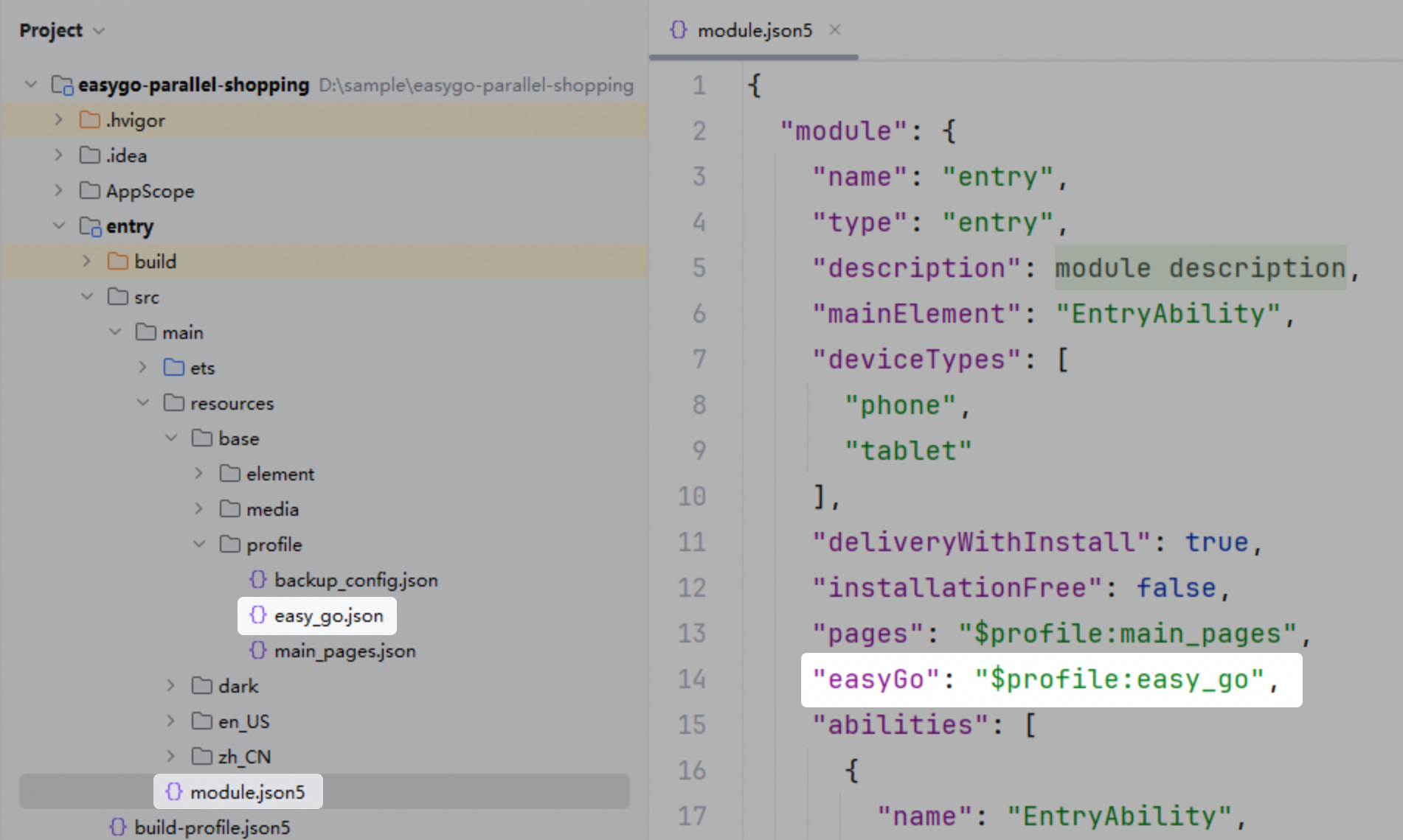
easy_go.json is a standard object file in JSON format. It consists of two layers. The first layer configures the device type, and the second layer configures the display mode for the corresponding device type.
{
  "common": {},
  "phone": {},
  "tablet": {}
} Enumerated Value | Description | Optional |
|---|---|---|
common | General device configuration, which is the basic default configuration provided for all device types. | No |
phone | Configuration that takes effect on phones. After this configuration is set, the common configuration does not take effect on phones. | Yes |
tablet | Configuration that takes effect on tablets. After this configuration is performed, the common configuration does not take effect on tablets. Note: App Multiplier is not supported in free-from multi-window mode. | Yes |
The second layer configures the displayModeOptions field, which indicates the display mode of App Multiplier. The internal fields are as follows:
Field | Description | Optional |
|---|---|---|
wideWindowMode | Display mode of the app in a rectangular window (width >= 600 vp, width/height > 1.2) that is wider than a bar-type phone. | No |
squareWindowMode | Display mode of the app in a square window (width >= 600 vp, height/width <= 1.2, width/height <= 1.2) that is wider than a bar-type phone. | Yes |
routerSplitOptions | Configuration when the Router component is used to implement split-view display of App Multiplier. | Yes |
navigationSplitOptions | Configuration when the Navigation component is used to implement split-view display of App Multiplier. | Yes |
Internal fields of wideWindowMode and squareWindowMode:
Enumerated Value | Description |
|---|---|
navigationSplit | The app routing is implemented by the Navigation component. This field must be used together with the navigationSplitOptions field. |
routerSplit | The app routing is implemented by the Router component. This field must be used together with the routerSplitOptions field. |
original | Disable all compatible running of the window display mode. |
The following table describes the fields that can be contained in routerSplitOptions and navigationSplitOptions.
Field | Description | Data Type | Optional |
|---|---|---|---|
homePage | Name of the home page. If this parameter is not set, the system uses the default policy to identify the home page. Note: For Navigation, if NavDestination is used as the home page, set this parameter to the name of NavDestination. If the Navigation home page is used as the home page, set this parameter to navBar. You are advised to set homePage to the actual home page of Navigation. For Router, set this parameter to the absolute path of the page, which is provided by the pages list in the configuration file, for example, pages/index. | string | Yes |
relatedPage | Name of the related page. If this parameter is not set, the page association capability is unavailable. Note:
| string | Yes |
enableReducedContainerSize | Whether to enable the virtual container capability. The default value is false. - false: The logical pixel unit, horizontal breakpoints on the page, window width, and screen width are calculated based on the original size. - true: The logical pixel unit, horizontal breakpoints on the page, window width, and screen width are calculated based on the reduced ratio of the original size on the right of the page. Note:
| boolean | Yes |
fullScreenPages | Array of pages that support full-screen display. When a page in the array is redirected to, the split-view display mode is exited. Note: Each item in the array must have the same format as that of homePage, but their content cannot be the same as that of homePage or relatedPage. | string[] | Yes |
supportLandscapeFullScreen | Whether to display the app in full screen when the app requests landscape mode. The default value is true. - true: When the app requests the landscape mode, the app exists split-view display and enters full-screen display. - false: When the app requests landscape mode, the App Multiplier effect is retained. | boolean | Yes |
wideSplit | Configuration parameter for a rectangular window wider than a bar phone (width >= 600 vp, width/height > 1.2), including the ratio field. This tag is supported since API version 26. | Object | Yes |
squareSplit | Configuration parameter for a square window (width >= 600 vp, height/width <= 1.2, width/height <= 1.2) wider than a bar phone, including the ratio field. This tag is supported since API version 26. | Object | Yes |
mode | Routing mode. The value is an integer. The default value is 1. - 0: shopping mode - 1: navigation mode This tag is supported since API version 26. | number | Yes |
transPages | Transition pages. This parameter takes effect in shopping mode. The page configured with this tag is always displayed on the right and cannot be pushed from the right to the left. Note: NavDestinationMode is the NavDestination page of the dialog type, which is a transition page by default. Each item in the array must have the same format as that of homePage, but their content cannot be the same as that of homePage, relatedPage, or fullScreenPages. This tag is supported since API version 26. | string[] | Yes |
splitDividerColor | Color of the divider line. The light and dark modes are supported. This tag is supported since API version 26. | Object | Yes |
drawableRectHook | Whether to enable the page-level container capability for the WindowProperties.drawableRect. The default value is false. - false: Window.drawableRect will be calculated using the original dimensions. - true: Window.drawableRect will be calculated based on the reduced ratio of the original dimensions on the right page. This tag is supported since API version 26. | boolean | Yes |
enableInSplitScreen | Whether to support App Multiplier in split-view mode. The default value is false. - false: App Multiplier is not supported in split-view mode. - true: If the window width and height meet the requirements in split-screen view, the App Multiplier is supported. This tag is supported since API version 26. | boolean | Yes |
navigationSplitOptions can contain the following additional fields:
Field | Description | Data Type | Optional |
|---|---|---|---|
homeNavigationId | ID of the Navigation component (common component attribute) used to implement split-view display. If this attribute is not set, the outermost Navigation component is used to implement split-view display. You are advised to set this parameter to the ID of the Navigation component for global routing. If this parameter is set to another value, the layout may be abnormal. | string | Yes |
disablePlaceholder | Whether to disable the placeholder page. The default value is false. | boolean | Yes |
disableDivider | Whether to diable the divider. The default value is false. | boolean | Yes |
Internal fields of wideSplit and squareSplit:
Field | Description | Data Type |
|---|---|---|
ratio | Ratio of the left page to the right page. The value is in the format of "positive integer | positive integer". The value ranges from 1:2 to 2:1. If this parameter is not set, the default value 1:1 is used. If the value is out of the range, the boundary value is used by default. This tag is supported since API version 26. | string |
Internal fields of splitDividerColor:
Field | Description | Data Type | Optional |
|---|---|---|---|
light | Color in light mode. The value is a hexadecimal string in the format of #AARRGGBB. This tag is supported since API version 26. | string | Yes |
dark | Color in dark mode. The value is a hexadecimal string in the format of #AARRGGBB. This tag is supported since API version 26. | string | Yes |
{
  "common": {
    "displayModeOptions": {
      "wideWindowMode": "routerSplit",
      "squareWindowMode": "routerSplit",
      "routerSplitOptions": {
        "homePage": "pages/Index",
        "relatedPage": "pages/CategoryPage",
        "fullScreenPages": [
          "pages/FullScreenImagePage",
        ],
        "supportLandscapeFullscreen": true,
        "enableReducedContainerSize": true
      }
    }
  }
} {
"common": {
"displayModeOptions": {
"wideWindowMode": "navigationSplit",
"squareWindowMode": "navigationSplit",
"navigationSplitOptions": {
"homePage": "navBar",
"relatedPage": "CategoryPage",
"fullScreenPages": [
"FullScreenImagePage"
],
"supportLandscapeFullscreen": true,
"enableReducedContainerSize": true,
"wideSplit": {
"ratio": "1 | 2"
},
"squareSplit": {
"ratio": "1 | 1"
},
"mode": 0,
"splitDividerColor": {
"light": "#33FFFFFF",
"dark": "#33000000"
},
"drawableRectHook": true,
"enableInSplitScreen": true
}
}
}
} {
"common": {
"displayModeOptions": {
"wideWindowMode": "navigationSplit",
"squareWindowMode": "navigationSplit",
"navigationSplitOptions": {
"homePage": "CategoryPage",
"fullScreenPages": [
"FullScreenImagePage"
],
"supportLandscapeFullscreen": true,
"enableReducedContainerSize": false
}
}
},
"tablet": {
"displayModeOptions": {
"wideWindowMode": "original",
"squareWindowMode": "original"
}
}
} With a shopping app implemented using the Navigation component as an example, this topic describes four typical scenarios in App Multiplier adaptation development and how to perform configuration through the easy_go.json file.
Scenario
By default, the system identifies a page of the app as the home page. However, the home page may fail to be accurately identified with this mechanism in some scenarios. You are advised to configure the home page. If necessary, you can also configure the related page.
For example, in a shopping app, you can set the home page as the main page and the first product category page as the related page.
Scenario | Configuring Home Page and Related Page | Configuring Only the Home Page |
|---|---|---|
Effect |
|
|
How to Implement
App Multiplier provides the capability of configuring the home page and related page. Set the home page using homePage and the related page using relatedPage.
How to Develop
{
  "common": {
    "displayModeOptions": {
      "wideWindowMode": "navigationSplit",
      "squareWindowMode": "navigationSplit",
      "navigationSplitOptions": {
        "homePage": "navBar",
        "relatedPage": "CategoryPage"
      }
    }
  }
} Scenario
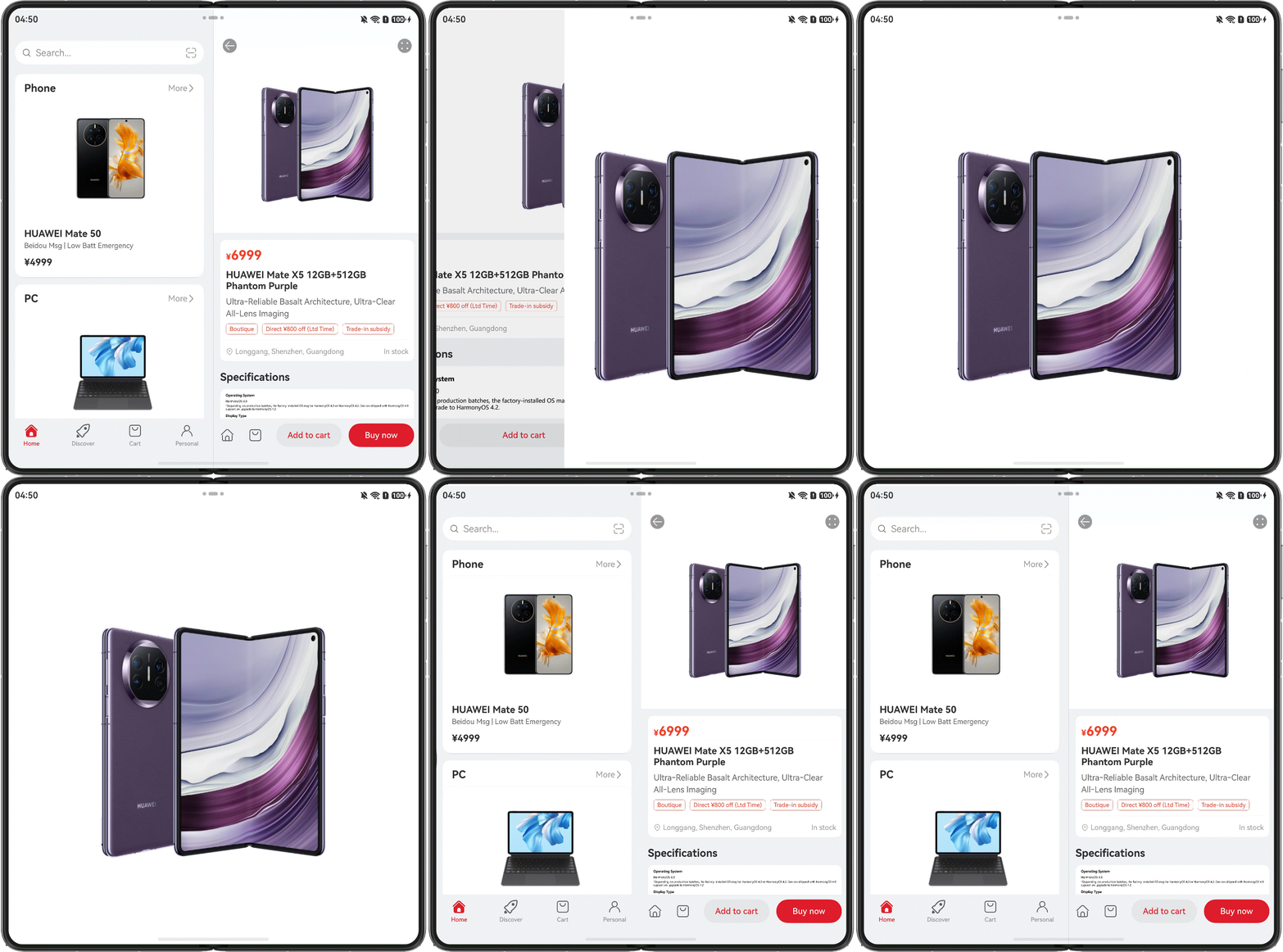
On the product details page, to clearly display product details, the product image needs to be displayed in full screen after a user taps the image.
How to Implement
App Multiplier provides the full-screen page capability, which allows you to specify a full-screen page using the fullScreenPages field. After the configuration, the corresponding page will temporarily exit the split-view mode and switch to the full-screen view. When the page is hidden, the split-view mode is restored.
How to Develop
{
  "common": {
    "displayModeOptions": {
      ...
      "fullScreenPages": [
         "FullScreenImagePage"
      ],
    }
  }
} Scenario
How to Implement
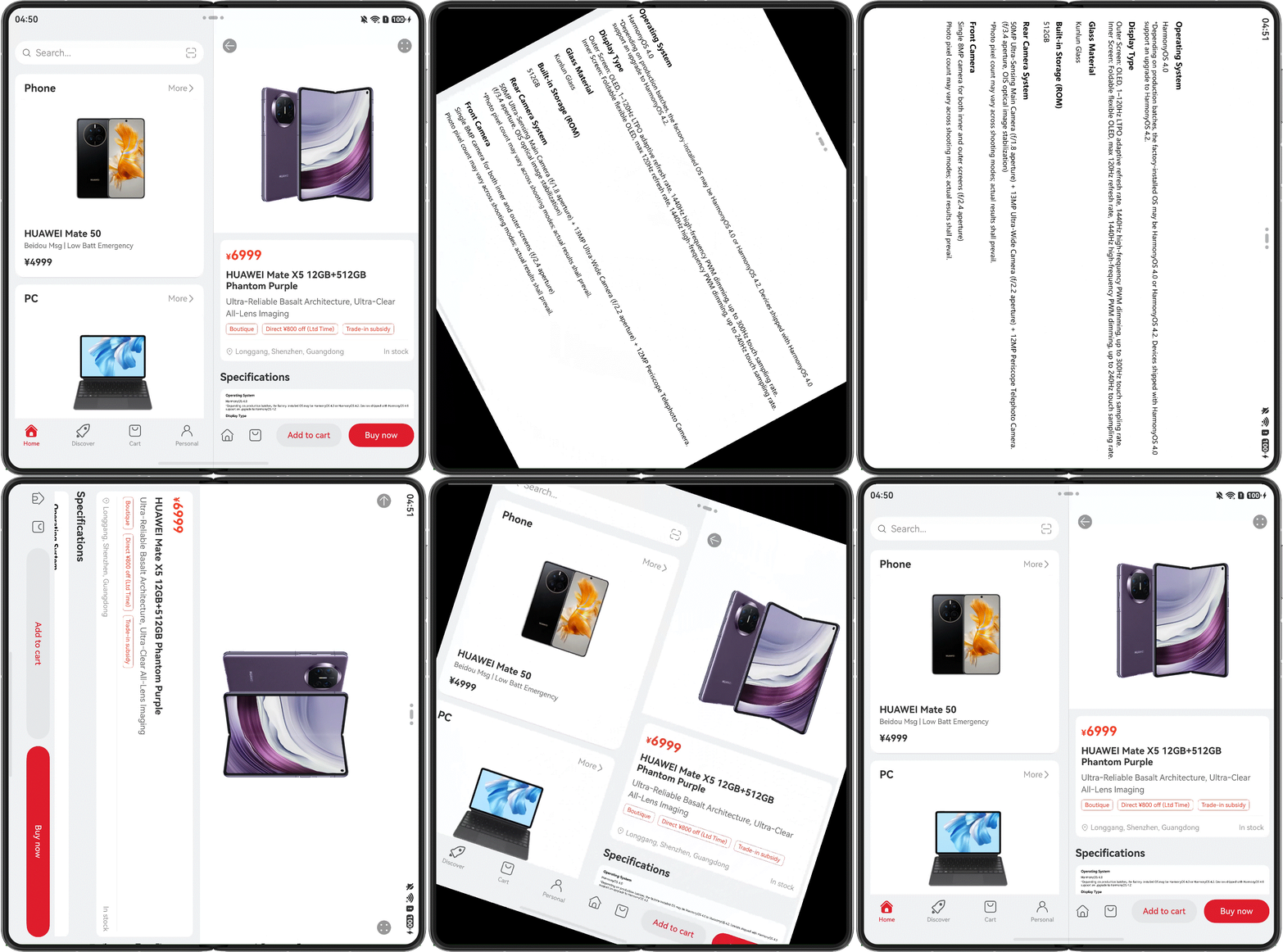
App Multiplier supports full-screen display of pages in landscape mode by configuring the supportLandscapeFullScreen field. After this parameter is set to true in the easy_go.json file, when the app requests landscape mode, the split-view mode exits and the page is displayed in full screen.
How to Develop
{
  "common": {
    "displayModeOptions": {
      ...
      "supportLandscapeFullScreen": true
    }
  }
} Scenario
When App Multiplier is enabled and the split-view display is used, two pages are displayed in one window at the same time. By default, each page occupies half of the window. If the window width is used for the element layout on the page, the UI elements may exceed the page scope and get truncated. In this case, you can enable the virtual container capability. When this capability is enabled, the logical pixel unit, horizontal breakpoints on the page, and window width are calculated based on half of the original size.
How to Develop
{
  "common": {
    "displayModeOptions": {
      ...
      "enableReducedContainerSize": true
    }
  }
} Symptom
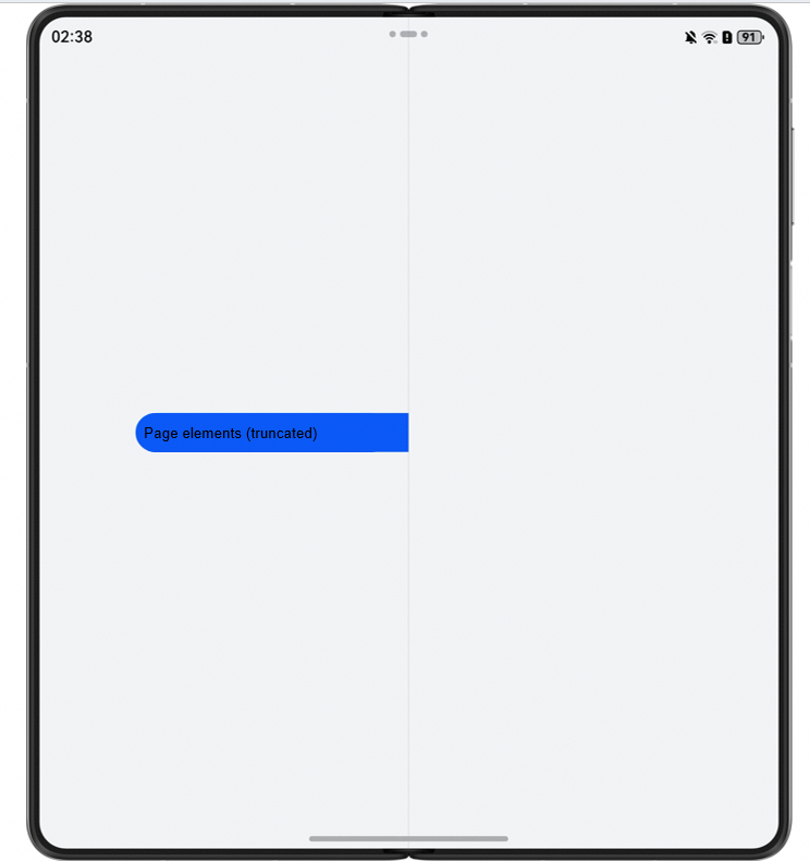
When App Multiplier is enabled and the split-view display is used, UI elements on the page exceed the page scope and get truncated, as shown in the following figure.
Possible Causes
When App Multiplier is enabled and the split-view display is used, two pages are displayed in one window at the same time. By default, each page occupies half of the window. If the window width is used for the element layout on the page, the UI elements may exceed the page scope and get truncated.
Solution
You are advised to take the following measures:
on('navDestinationUpdate'): listens for status changes of the NavDestination component. In API version 23 and later, the returned status of the NavDestination component includes its size.
on('routerPageUpdate'): listens for status changes of routerPage. In API version 23 and later, the returned information of routerPage includes its size.
onRouterPageSizeChange: This callback function is triggered when the size of the visible router page changes.
onNavDestinationSizeChange: This callback function is triggered when the size of the visible NavDestination changes.
Symptom
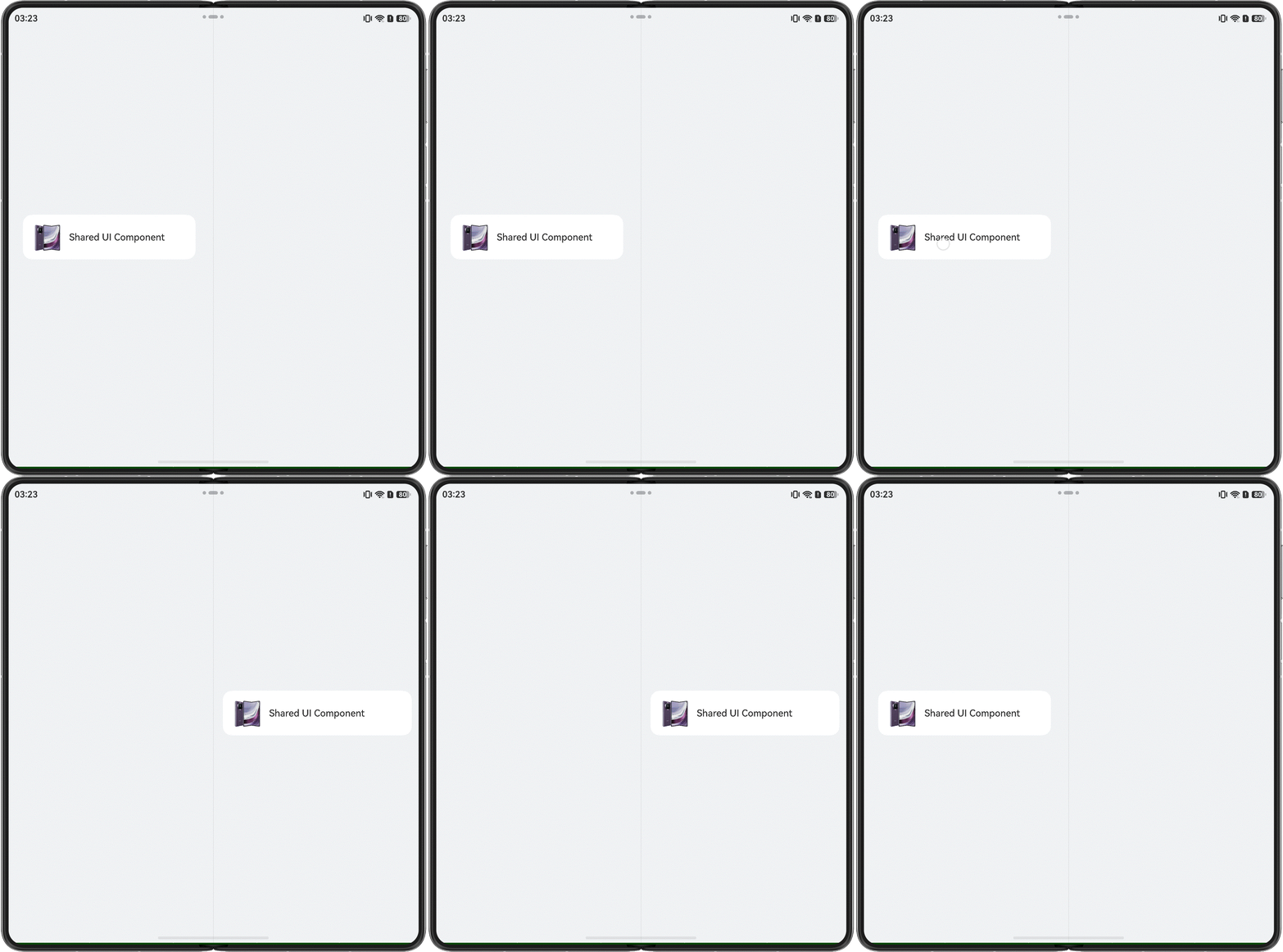
On the left and right pages, the same resource is displayed only on one page, as shown in the following figure.
Possible Causes
If the left and right pages share the same UI resource using the component reuse mechanism (for example, NodeContainer) of ArkUI, the corresponding resource can be displayed on only one page at a time.
Solution
It is recommended that the pages on both sides use independent UI resources that do not affect each other.
Symptom
In the App Multiplier scenario, when the preferredOrientation attribute provided by the NavDestination component is used to set the page orientation, the setting does not take effect.
Possible Causes
In the App Multiplier scenario, the left and right pages are displayed at the same time, and the orientations of the two pages must be the same.
Solution
You are advised to use the window-level solution and set the window policy through the setPreferredOrientation API provided by the Window component.