This topic describes the optimization of component nesting in detail from three perspectives: technical overview, optimization scenarios, and practice data comparison. It focuses on the optimization scenarios and policies of component nesting for you from the perspective of optimization scenarios.
Technical Overview
This section analyzes the impact of excessive component nesting on performance based on the execution process of the ArkUI framework and the lifecycle of custom components.
[h2]Execution Process of the ArkUI Framework
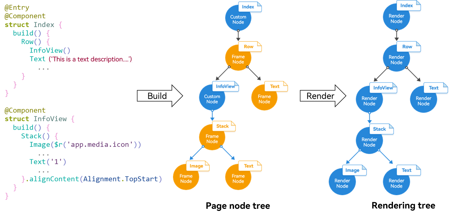
As shown in the preceding figure, the execution sequence of the ArkUI framework is as follows:
- The framework executes the UI description in ArkTS and creates a backend page node tree through the UI description API. The node tree contains service logic such as updating UI component properties, calculating the layout, and handling events.
- The FrameNode tree is used to generate the current UI description data structure, that is, RenderTree which describes the layout information of specific elements on the screen, including the size, position, and other properties.
- The render thread performs drawing work based on the information in the RenderTree tree.
[h2]Lifecycle of Custom Components
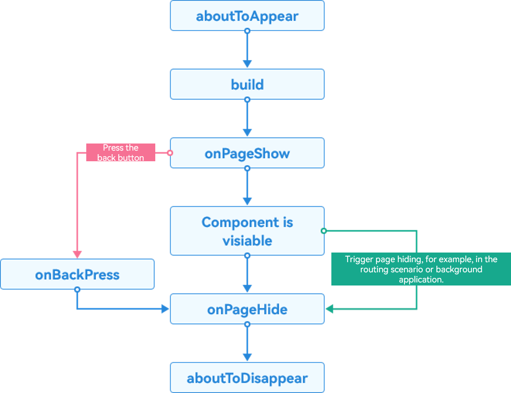
As shown in the preceding figure, execute the lifecycle callback function aboutToAppear() after the custom component is created and before executing the build function. After the build function is executed, there are some event listening functions. For example, you can use the onPageShow function to listen for page display events and the onPageHide function to listen for page hiding events. Ultimately, the aboutToDisappear function is executed before the custom component is destructed.
For details about the lifecycle of pages and custom components, see Custom Component Lifecycle.
[h2]Impact of Excessive Nested Components on Performance
Component nesting refers to the practice of placing one or more components inside another to form a component tree structure. From the perspective of the outermost component type, components can be classified into custom components and native components.
According to the execution process of the ArkUI framework, all nodes are traversed recursively to calculate the component location and size during layout. If the nesting level is deep, more intermediate nodes are generated. In the layout calculation phase, extra nodes cause more calculation processes, resulting in performance deterioration.
From the perspective of the lifecycle of a custom component, if the custom component is overly nested, a large number of lifecycle functions need to be executed, which deteriorates performance.
For details about the performance analysis of nested components, see Reducing Nodes.
[h2]Preferentially Using the @Builder Method Instead of Custom Components
The concepts of custom components and custom build functions are defined as follows:
Custom components: refer to the struct structure modified by @Component. In a custom component, you can define items such as functions or variables, build() methods, and component lifecycle callback. Custom components are composable and reusable, featuring data-driven UI updates.
Custom build functions: refer to the functions decorated by @Builder, which are classified into intra-component custom build functions and global custom build functions. The functions decorated by @Builder comply with the syntax rules of the build() function. You can abstract UI elements that are repeatedly used as a method and call the method in the build method.
The differences between custom components and custom build functions (@Builder) are as follows:
- Custom build functions (@Builder) are more lightweight. As a method for abstracting UI elements, custom build functions can be simply implemented and invoked in comparison with custom components.
- In a custom component, you can define member functions, variables, and component lifecycles. Custom build functions (@Builder) do not support the definition of state variables and custom lifecycles.
- In a custom component, the UI can be refreshed by changing state variables. However, the default parameter transfer mode of the custom build function (@Builder) does not support dynamic component change. When the transferred parameter is a state variable, the change of the state variable does not cause UI refresh in the @Builder method. To dynamically refresh the UI, you need to transfer parameters by reference.
- To implement the slot function in a custom component, you need to use @Builder and @BuilderParams. For details about the implementation, see @BuilderParam Decorator: @Builder Function Reference.
- If a custom component is used in the custom build function (@Builder), it is re-created each time when the function is called.
In general, custom components are more universal and flexible in actual application development. The custom build function (@Builder) does not support variable definition and lifecycle. Consequently, it is not flexible in application scenarios. It is usually used in scenarios where the property transfer type is Builder in slots or components/methods provided by the system.
According to the differences between custom components and custom build functions, and because @Builder does not involve the lifecycle, the lightweight @Builder boasts better performance in scenarios where a large number of custom components are nested.
Therefore, if a custom component does not involve state variables or custom lifecycles, you can preferentially use @Builder to replace the custom component to improve performance.
Optimization Policies
Sample code for custom components:
@Component
export struct example {
  build() {
    Column(){
      Text('Custom Component Sample Code')
      // ...
    }
  }
}
Sample code for custom build functions:
@Builder
export function example1(){
  Column(){
    Text('Sample code for customizing the constructor')
    // ...
  }
}
For details, see Preferentially Using the @Builder Method Instead of Custom Components.
[h2]Reducing Redundant Nodes Generated by Customized Components.
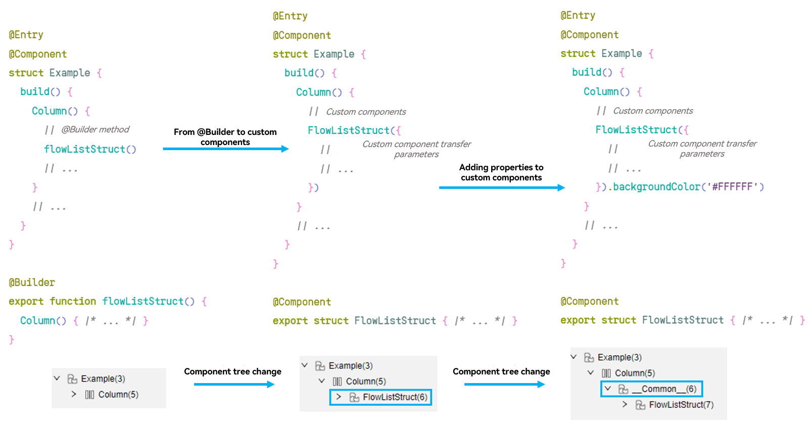
A custom component is a non-rendering node, which is only a combination of the component tree and state data. Generally, no redundant node is generated when a custom component is used. However, after properties are added to a custom component, the custom component is processed as a whole node. Operations on the internal component tree, such as background color drawing and rounded corner drawing, are performed on this node.
You can use the built-in ArkUI Inspector tool of DevEco Studio to view the component tree structure. Compared with the @Builder method, the ArkUI Inspector method has one more custom component node in the component tree. Therefore, you can preferentially use the @Builder method instead of custom components to reduce the number of custom component nodes. When you add properties to a custom component, a node of the __Common__ type is created outside the custom component, as shown in the following figure. To avoid the creation of such __Common__ nodes, you can move the properties of the custom component to the internal or dynamically set the properties of the custom component. Reducing the number of redundant nodes generated by custom components can reduce the total number of nodes, which improves the performance.
Moving the Properties of a Custom Component to the Custom Component
When you need to add properties to a custom component, you can move these properties to the custom component if there are a small number of properties. The following is an optimization example:
Negative example:
@Component
export struct Example {
  build() {
    Column() {
      // Custom Components
      FlowListStruct(
        // Custom Component Passing Parameters
        // ...
      ).backgroundColor('#FFFFFF')
    }
    .width('100%')
    .height('100%')
  }
}
Positive example:
@Component
export struct FlowListStruct2 {
  build() {
    Column() {
      // ...
    }
    .backgroundColor('#FFFFFF')
  }
}
Dynamically Setting Properties of a Custom Component
ArkUI provides APIs for dynamic property setting. You can use custom AttributeModifier to build components and set properties. When a large number of properties need to be set for a custom component, excessive parameters will be transferred if all property settings are moved inwards. In addition, more state variables will be created, which increases the parameter transfer time. Although the number of nodes is reduced, the performance is not effectively improved. Therefore, you are advised to use the custom AttributeModifier to dynamically set the properties of a custom component. This reduces the number of nodes and avoids time consumption caused by excessive parameters. The following is an optimization example:
@Entry
@Component
struct CustomComponentModifier {
  modifier: ColumnModifier = new ColumnModifier();

  aboutToAppear(): void {
    this.modifier.width = 100;
    this.modifier.height = 100;
    this.modifier.backgroundColor = Color.Red;
  }

  build() {
    Column() {
      ModifierCustom({ modifier: this.modifier })
    }
  }
}


@Component
struct ModifierCustom {
  @Require @Prop modifier: AttributeModifier<ColumnAttribute>;

  build() {
    Column() {
      Text('Hello World')
    }.attributeModifier(this.modifier)
  }
}

// When using dynamic attribute setting, you need to inherit AttributeModifier, implement a Modifier by yourself, and then set it to the required component.
class ColumnModifier implements AttributeModifier<ColumnAttribute> {
  width: number = 0;
  height: number = 0;
  backgroundColor: ResourceColor | undefined = undefined;

  applyNormalAttribute(instance: ColumnAttribute): void {
    instance.width(this.width);
    instance.height(this.height);
    instance.backgroundColor(this.backgroundColor);
  }
}
[h2]Selecting Proper Layout Components
The complex layout provides the scenario-based capability to fulfill one or more layout scenarios. However, in some scenarios, improper use of these advanced components may more seriously deteriorate the performance.
Optimization policies:
- In the case of the same nesting level, preferentially select the layout which takes a short time if multiple layout modes can achieve the same effect. For example, use Column and Row instead of Flex to implement the same single-row layout.
- If the number of nodes can be greatly optimized through other layouts, advanced components can be used. For example, RelativeContainer can be used to replace Row and Column to flatten the layout. In this case, the benefit is greater than the performance gap of the layout component.
- Use time-consuming layout components only in special scenarios, for example, using Flex for the folding layout and using Grid for the two-dimensional grid layout.
For details, see Using Layout Components Properly.
[h2]Deleting Unnecessary Stack, Column, and Row Nesting Items, and Removing Redundant Nodes
In the case of component nesting items, some useless container components can be found. During component nesting optimization, you can delete unnecessary container components and remove redundant nodes to avoid performance deterioration caused by redundant nodes.
Optimization method:
Negative example:
@Component
export struct example {
  build() {
    Column() {
      Row() {
        // Custom Components
        FlowListStruct(
          // Custom Component Passing Parameters
          // ...
        )
      }
      .width('100%')
    }
    .width('100%')
    .height('100%')
  }
}
Positive example:
@Component
export struct example2 {
  build() {
    Column() {
      // Custom Components
      FlowListStruct(
        // Custom Component Passing Parameters
        // ...
      )
    }
    .width('100%')
    .height('100%')
  }
}
[h2]Preferentially Using Component Properties Instead of Nested Components.
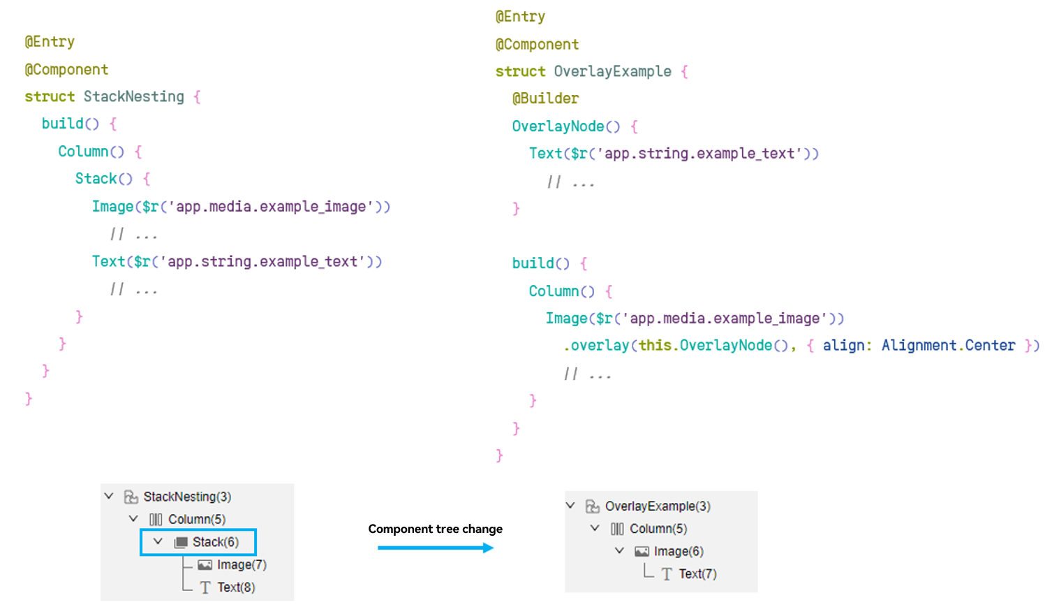
Stack layout nested components are usually used in scenarios such as text floating layer, mask pressing, or color overlay. In some implementation scenarios, component properties or system-level APIs can be used to implement the effects. For example, the overlay property can be used to implement floating layer, and the ColorMetrics property can be used to implement color overlay. Directly using component properties can reduce the number of nested components in the stack layout, which reduces the number of nodes caused by nested components. Take the text floating layer scenario as an example. As shown in the following figure, the text floating layer implemented by using the overlay property has one less stack node than the stack component nesting mode. In this scenario, you are advised to use component properties instead of nested components.
Using the overlay Property to Implement a Floating Layer
The overlay property can be used to directly add a floating layer to a component to implement the stacking effect. Common scenarios include text floating layer and mask pressing. Compared with the nested components in the stack layout, the overlay property reduces the number of stack component nodes to be created. The following is an example of adding a text floating layer. For more examples of using the overlay property to implement the floating layer, see Example.
Negative example:
@Entry
@Component
struct StackNesting {
  build() {
    Column() {
      Stack() {
        Image($r('app.media.startIcon'))
          .objectFit(ImageFit.Contain)
        Text('fragmentary text')
          .fontSize(20)
          .fontColor(Color.Black)
      }
    }
  }
}
Positive example:
@Entry
@Component
struct OverlayExample {
  @Builder
  OverlayNode() {
    Text('fragmentary text')
      .fontSize(20)
      .fontColor(Color.Black)
  }

  build() {
    Column() {
      Image($r('app.media.startIcon'))
        .overlay(this.OverlayNode(), { align: Alignment.Center })
        .objectFit(ImageFit.Contain)
    }
  }
}
Using ColorMetrics for Color Overlay
The system provides the color calculation capability through the ColorMetrics API, which can be used in the color overlay display scenario. Similarly, the ColorMetrics capability can reduce the number of layout nodes at the stack layer, compared with the nested components in the stack layout. The following figure shows an optimization example.
Negative example:
@Component
struct ColorNormal {
  @Prop isSelected: boolean = false;

  build() {
    Stack() {
      Column()
        .width('100%')
        .height(100)
        .backgroundColor(this.isSelected ? Color.Blue : Color.Grey)
        .borderRadius(12)
        .alignItems(HorizontalAlign.Center)
        .justifyContent(FlexAlign.Center)
      Column()
        .width('100%')
        .height(100)
        .backgroundColor(this.isSelected ? "#99000000" : Color.Grey)
        .borderRadius(12)
        .alignItems(HorizontalAlign.Center)
        .justifyContent(FlexAlign.Center)
    }
  }
}

@Entry
@Component
struct ColorOverlayStackExample {
  @State isSelected: boolean = false;

  build() {
    Scroll() {
      Column() {
        ColorNormal({ isSelected: this.isSelected })
          .onClick(() => {
            this.isSelected = !this.isSelected;
          })
      }
    }
  }
}
Positive example:
import { ColorMetrics } from '@kit.ArkUI';
import { BusinessError } from '@kit.BasicServicesKit';
import { hilog } from '@kit.PerformanceAnalysisKit';

@Component
struct ColorMeasure {
  @Prop isSelected: boolean = false;

  build() {
    Column()
      .width('100%')
      .height(100)
      .backgroundColor(this.isSelected ? this.getBlendColor(Color.Blue, "#99000000").color : Color.Grey)
      .borderRadius(12)
      .alignItems(HorizontalAlign.Center)
      .justifyContent(FlexAlign.Center)
  }

  getBlendColor(baseColor: ResourceColor, addColor: ResourceColor): ColorMetrics {
    if (!baseColor || !addColor) {
      try {
        return ColorMetrics.resourceColor(Color.Black);
      } catch (error) {
        let err = error as BusinessError;
        hilog.warn(0x000, 'testTag', `showToast failed, code=${err.code}, message=${err.message}`);
      }
    }
    let sourceColor: ColorMetrics;
    try {
      sourceColor = ColorMetrics.resourceColor(baseColor).blendColor(ColorMetrics.resourceColor(addColor));
    } catch (err) {
      let error = err as BusinessError;
      console.error(`Failed to blend color, code = ${error.code}, message =${error.message}`);
      sourceColor = ColorMetrics.resourceColor(addColor);
    }
    return sourceColor;
  }
}

@Entry
@Component
struct ColorMetricsExample {
  @State isSelected: boolean = false;

  build() {
    Scroll() {
      Column() {
        ColorMeasure({ isSelected: this.isSelected })
          .onClick(() => {
            this.isSelected = !this.isSelected;
          })
      }
    }
  }
}
Practice Data Comparison
For details about the practice data comparison, see data comparison in Layout Optimization and Optimizing Performance of UI Components.