


Intelligent Assistant
Chat with our virtual assistant to get answers promptly.
Functions as a subelement and displays a specific item in a list. The width of list-item is equal to or larger than that of list.
Item | Description |
|---|---|
Applicable devices | Mobile phones, tablets, Vision products, and telematics devices |
Applicable regions | Global |
Supported
In addition to general attributes, the attribute listed in the following table is supported.
Attribute | Type | Default Value | Mandatory | Description |
|---|---|---|---|---|
type | string | - | Yes | Type of a list-item subelement. A list supports multiple types of list items. The list-item subelements of the same type shall have the same view layout after being rendered. When the type is fixed, use the show attribute to override the if attribute to ensure that the view layout remains unchanged. NOTICE Use if and for properly in list-item. They may cause inconsistent DOM structures in list-item subelements of the same type, causing rendering errors. |
This element supports the div style but does not support the position style. In addition to common styles, the style listed in the following table is supported.
Style | Type | Default Value | Mandatory | Description |
|---|---|---|---|---|
column-span | number | 1 | No | Number of columns used by a list-item element in a list. This parameter is used when a list contains multiple columns. |
The width and height of list-item and its subelements cannot be set to a percentage, for example, 30%. A correct example of width is 300 px.
In normal cases, the value of column-span in list-item must be less than or equal to the value of columns in the parent element list.
In 1070 and later versions, the list element supports the layout-type style. The options are stagger and grid (default).
Common events are supported.
<list  class="stagger"style="layout-type: stagger" >
        <list-item type="listItem" class="item item-color">
          <text onclick="textClick" class="txt">{{$item}}--{{$idx}}</text>
        </list-item>
        <!--Set column-span to 1.-->
        <list-item style="column-span:1" type="loadMore" class="load-more" if="{{loadMore}}">
          <progress type="circular"></progress>
          <text>{{messageloadMore}}</text>
        </list-item>
    </list>
    <list class="stagger" style="layout-type: stagger" >
        <list-item type="listItem" class="item item-color" >
          <text onclick="textClick" class="txt">{{$item}}--{{$idx}}</text>
        </list-item>
        <!--Set column-span to 4.-->
        <list-item style="column-span:4" type="loadMore" class="load-more" if="{{loadMore}}">
          <progress type="circular"></progress>
          <text>{{messageloadMore}}</text>
        </list-item>
    </list>
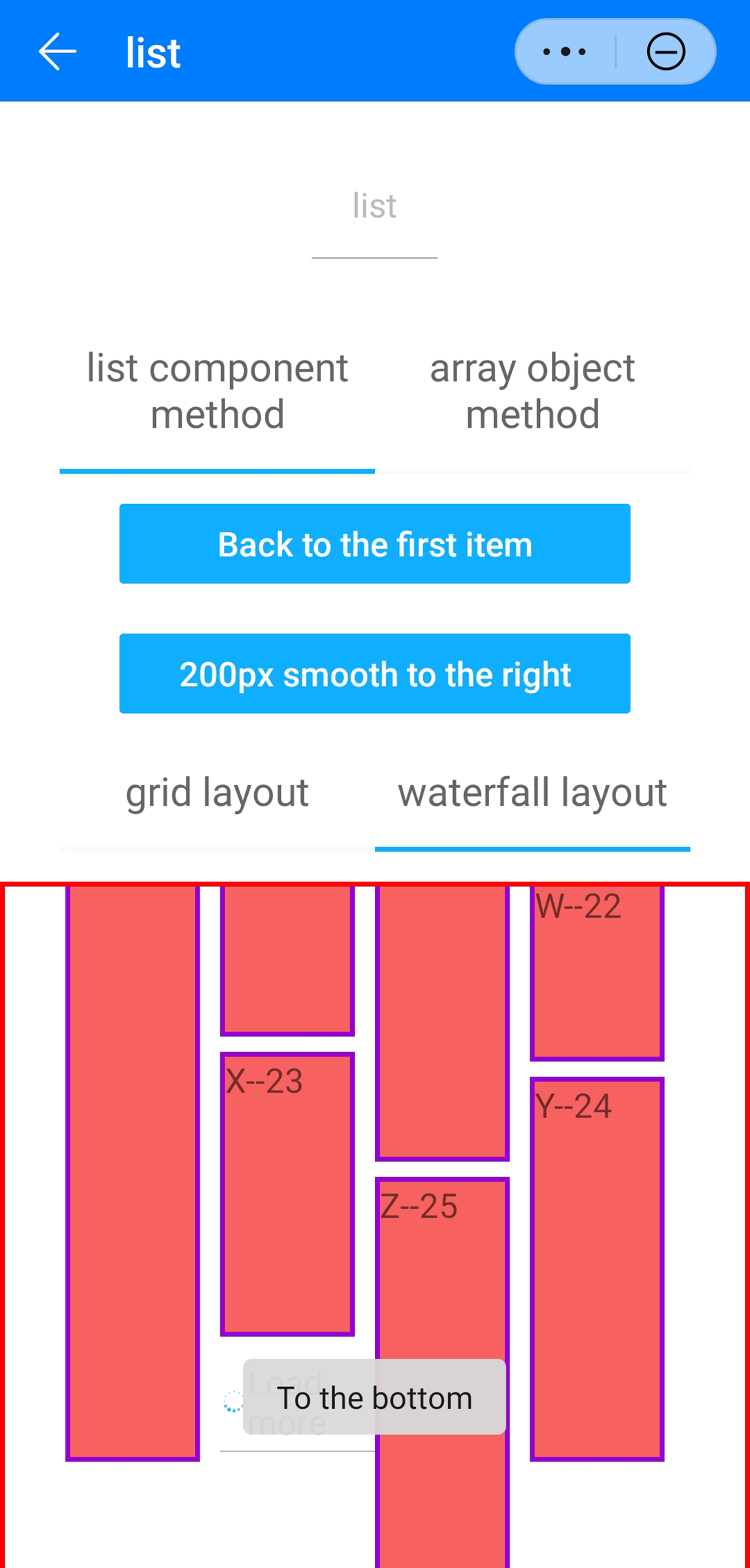
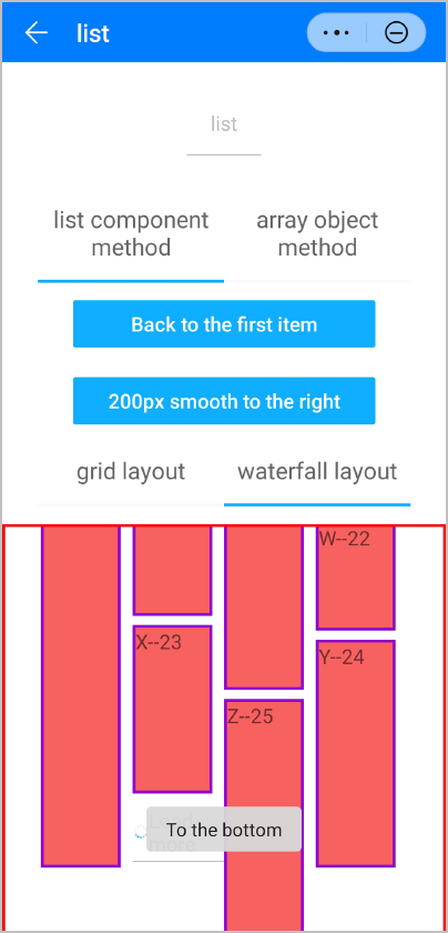
The following figures show the final effect.
Version | Date | Description |
|---|---|---|
1070 | 2020-05-19 | Supported the column-span style, which adapts to different layout-type settings of the list element, to control the number of columns occupied by the list-item subelement in the list element. |