


Intelligent Assistant
Chat with our virtual assistant to get answers promptly.
Shows a star rating to the user.
Item | Description |
|---|---|
Applicable devices | Mobile phones, tablets, Vision products, and telematics devices |
Applicable regions | Global |
None
In addition to general attributes, the attributes listed in the following table are supported.
Attribute | Type | Default Value | Mandatory | Description |
|---|---|---|---|---|
numstars | number | 5 | No | Number of stars to be displayed on a rating bar. |
rating | number | 0 | No | Number of selected stars. |
stepsize | number | 0.5 | No | Step size of the rating. |
indicator | boolean | false | No | Indicates whether to make a rating icon as only an indicator (not-editable by the user). |
The active pseudo-class is supported. In addition to common styles, the styles listed in the following table are supported.
Style | Type | Default Value | Mandatory | Description |
|---|---|---|---|---|
star-background | uri | - | No | Only images specified by a local path or Base64-encoded image are supported. It is an exclusive extension for quick apps to be used on Huawei phones, and is not a part of the quick app specifications formulated by the vendor alliance. |
star-foreground | uri | - | No | Only images specified by a local path or Base64-encoded image are supported. It is an exclusive extension for quick apps to be used on Huawei phones, and is not a part of the quick app specifications formulated by the vendor alliance. |
star-secondary | uri | - | No | Only images specified by a local path or Base64-encoded image are supported. It is an exclusive extension for quick apps to be used on Huawei phones, and is not a part of the quick app specifications formulated by the vendor alliance. |
width | length|percentage | Value of numstars x Width of a star | No | The default value is the value of numstars multiplied by the width of a star. |
height | length|percentage | Height of a star. | No | Its default value is the height of a star. |
The click, longpress, and swipe events are not supported. In addition to common events, the event listed in the following table is supported.
Event | Parameter | Triggering Condition |
|---|---|---|
change | {rating:currentRating, isFromUser:isFromUserValue 1080+} | The rating value changes. isFromUser: indicates whether the event is triggered by a user's dragging. |
- <template>
- <div class="container">
- <div class="page-title-wrap">
- <text class="page-title">{{componentName}}</text>
- </div>
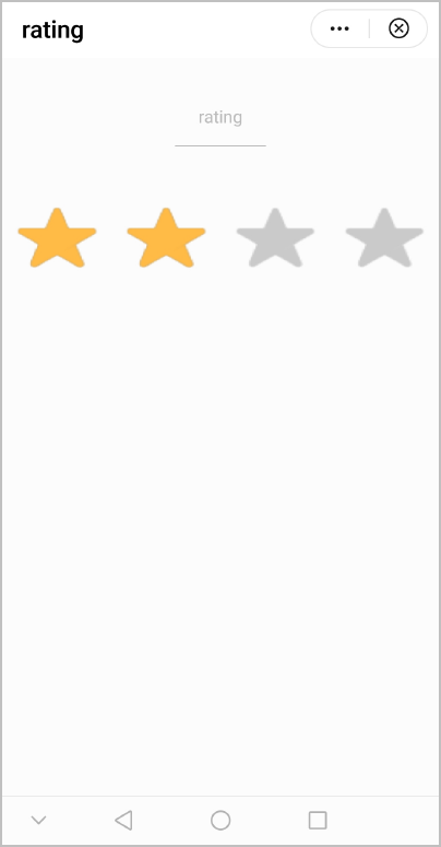
- <rating class="ratingStyle" numstars="4" rating="2" @change="showChangePrompt"></rating>
- </div>
- </template>
- <style>
- .container {
- flex: 1;
- flex-direction: column;
- }
- .page-title-wrap {
- padding-top: 50px;
- padding-bottom: 80px;
- justify-content: center;
- }
- .page-title {
- padding-top: 30px;
- padding-bottom: 30px;
- padding-left: 40px;
- padding-right: 40px;
- border-color: #bbbbbb;
- color: #bbbbbb;
- border-bottom-width: 2px;
- }
- .ratingStyle {
- star-background: url(/Common/img/ic_stars_gray_mid.png);
- star-foreground: url(/Common/img/ic_stars_blue_mid.png);
- star-secondary: url(/Common/img/ic_stars_blue_half_mid.png);
- height: 150px;
- }
- </style>
- <script>
- import prompt from '@system.prompt'
- export default {
- data: {
- componentName: 'rating'
- },
- onInit() {
- this.$page.setTitleBar({ text: 'rating' })
- },
- showChangePrompt(ret) {
- prompt.showToast({
- message: JSON.stringify(ret.rating)
- })
- }
- }
- </script>
The following figure shows the final effect.
Version | Date | Description |
|---|---|---|
1080 | 2021-12-28 | Added the isFromUser parameter, which indicates whether the current event is triggered by a user's dragging. |
1010 | 2018-04-20 | Added the support for the active pseudo-class. |