


Intelligent Assistant
Chat with our virtual assistant to get answers promptly.
Shows the progress.
Item | Description |
|---|---|
Applicable devices | Mobile phones, tablets, Vision products, and telematics devices |
Applicable regions | Global |
None
In addition to general attributes, the attributes listed in the following table are supported.
Attribute | Type | Default Value | Mandatory | Description |
|---|---|---|---|---|
percent | number | 0 | No | Percentage value of the progress. This attribute is invalid when type is circular. If this attribute is set to a decimal, the value is rounded off to an integer. |
type | horizontal | circular | horizontal | No | Type of the progress bar. Its value cannot be modified dynamically.
|
The active pseudo-class is supported.
In addition to common styles, the styles listed in the following table are supported.
Style | Type | Default Value | Mandatory | Description |
|---|---|---|---|---|
color | color | #33b4ff or rgb(51, 180, 255) | No | Color of a progress bar. |
stroke-width | length | 32px | No | Width of a progress bar. This style is invalid when type is circular. |
layer-color (1070+) | color | #f0f0f0 | No | Background color of a progress bar. |
To set the width of a progress bar, you are advised to place the progress element into a div element and set the width of div. If you directly set the width for the progress bar, the setting will not take effect.
Common events (excluding swipe) are supported.
- <template>
- <div class="container">
- <div class="page-title-wrap">
- <text class="page-title">{{componentName}}</text>
- </div>
- <div class="item-container">
- <div class="item-content">
- <text class="item-title">10% (Default: color #33b4ff, height32px)</text>
- <progress class="progress" percent="10" style="layer-color:#09ba07;"></progress>
- </div>
- <div class="item-content">
- <text class="item-title">20%</text>
- <progress class="progress" style="color:#09ba07;stroke-width:10px;" percent="20"></progress>
- </div>
- <div class="item-content">
- <text class="item-title">40%</text>
- <progress class="progress" style="color:#0faeff;stroke-width:10px;" percent="40"></progress>
- </div>
- <div class="item-content">
- <text class="item-title">60%</text>
- <progress class="progress" style="color:#A020F0;stroke-width:10px;" percent="60"></progress>
- </div>
- <div class="item-content">
- <text class="item-title">80%</text>
- <progress class="progress" style="color:#f76160;stroke-width:10px;" percent="80"></progress>
- </div>
- <div class="item-content-circular">
- <text class="item-title">Default: width height 32px</text>
- <progress class="circular circular_0" style="color:#09ba07" type="circular"></progress>
- </div>
- <div class="item-content-circular">
- <text class="item-title">height 40px</text>
- <progress class="circular circular-1" style="color:#09ba07" type="circular"></progress>
- </div>
- <div class="item-content-circular">
- <text class="item-title">height 60px</text>
- <progress class="circular circular-2" style="color:#0faeff" type="circular"></progress>
- </div>
- <div class="item-content-circular">
- <text class="item-title">height 80px</text>
- <progress class="circular circular-3" style="color:#A020F0" type="circular"></progress>
- </div>
- <div class="item-content-circular">
- <text class="item-title">height 100px</text>
- <progress class="circular circular-4" style="color:#f76160" type="circular"></progress>
- </div>
- </div>
- </div>
- </template>
- <style>
- @import '../../../Common/css/common.css';
- .item-container {
- margin-bottom: 50px;
- margin-right: 60px;
- margin-left: 60px;
- flex-direction: column;
- }
- .item-content {
- margin-bottom: 60px;
- flex-direction: column;
- }
- .item-content-circular {
- margin-bottom: 60px;
- flex-direction: column;
- align-items: center;
- }
- .progress {
- flex: 1;
- padding-left: 20px;
- padding-right: 20px;
- padding-top: 20px;
- padding-bottom: 20px;
- }
- .item-title {
- text-align: center;
- }
- .circular-1 {
- width: 40px;
- height: 40px;
- }
- .circular-2 {
- width: 60px;
- height: 60px;
- }
- .circular-3 {
- width: 80px;
- height: 80px;
- }
- .circular-4 {
- width: 100px;
- height: 100px;
- }
- </style>
- <script>
- export default {
- data: {
- componentName: 'progress'
- },
- onInit() {
- this.$page.setTitleBar({text: 'progress'})
- }
- }
- </script>
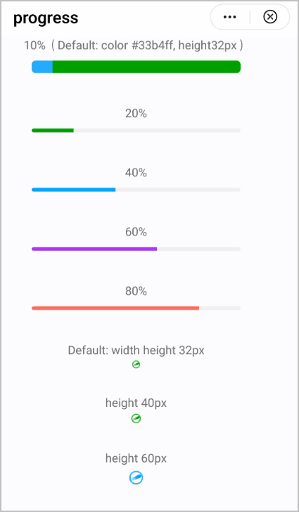
The following figure shows the final effect.
Version | Date | Description |
|---|---|---|
1070 | 2019-05-19 | Added the layer-color style to set the background color of a progress bar. |
1010 | 2018-06-20 | Added the support for the active pseudo-class. |