


Intelligent Assistant
Chat with our virtual assistant to get answers promptly.
Displays the items in the drop-down list box. The option element is subordinate to the select element.
Item | Description |
|---|---|
Applicable devices | Mobile phones, tablets, and telematics devices |
Applicable regions | Global |
None
In addition to general attributes, the attributes listed in the following table are supported.
Attribute | Type | Default Value | Mandatory | Description |
|---|---|---|---|---|
selected | boolean | - | No | Indicates whether the selected item is the default item in the drop-down list box. |
value | string | - | Yes | Options in the drop-down list box. Put them between the tags, for example, <option value="volvo">Volvo XC90</option>. |
In addition to common styles, the styles listed in the following table are supported.
The width and height styles cannot be customized for options. That is, their settings are invalid. The option subelement has the same width as the select element and has a fixed height.
Style | Type | Default Value | Mandatory | Description |
|---|---|---|---|---|
color | color | 0x8a000000 | No | Font color. |
font-size | number | 30px | No | Font size. |
font-weight | lighter | 100 | 200 | 300 | 400 | 500 | 600 | 700 | 800 | 900 | normal | bold | bolder | normal | No | Font weight. The default value is normal. |
text-decoration | underline | line-through | none | none | No | Decorations added to text. |
font-family (1030+) | string | - | No | Font of strings in the element. Android's default fonts normal, sans-serif, serif, and monospace are supported (only for English strings). To customize fonts, please refer to font-face Style. |
None
- <template>
- <div class="container container1">
- <div class="page-title-wrap">
- <text class="page-title">{{componentName}}</text>
- </div>
- <div class="item-container">
- <text style="margin-bottom: 50px">Nanjing Attractions</text>
- <select class="select" onchange="changeValue">
- <option class="option" value="item1">Confucius Temple</option>
- <option class="optionrgb" value="item2" selected="true">presidential palace</option>
- <option class="optionrgba" value="item3">Old door east</option>
- <option class="optionhsl" value="item4">Da Bao En Temple</option>
- <option class="optionhsla" value="item5">Zhonghuamen</option>
- </select>
- </div>
- <div class="item-container">
- <text style="margin-bottom: 50px">font-family</text>
- <select class="select font-family2" onchange="changeValue">
- <option class="option font-family1" value="item1">font-family is sans-serif</option>
- <option class="option font-family2" value="item2" selected="true">font-family is serif</option>
- <option class="option font-family3" value="item3">font-family is monospace</option>
- </select>
- </div>
- </div>
- </template>
- <style>
- .container {
- flex: 1;
- flex-direction: column;
- }
- .page-title-wrap {
- padding-top: 50px;
- padding-bottom: 80px;
- justify-content: center;
- }
- .page-title {
- padding-top: 30px;
- padding-bottom: 30px;
- padding-left: 40px;
- padding-right: 40px;
- border-color: #bbbbbb;
- color: #bbbbbb;
- border-bottom-width: 2px;
- }
- .item-container {
- margin-bottom: 50px;
- margin-right: 60px;
- margin-left: 60px;
- flex-direction: column;
- }
- .select {
- margin-left: 30px;
- margin-right: 30px;
- align-items: flex-start;
- border-color: #007DFF;
- border-width: 1px;
- }
- .container1 {
- align-items: center;
- }
- .option {
- color: #007DFF;
- font-size: 30px;
- font-weight: bold;
- text-decoration: line-through;
- }
- .optionrgb {
- color: rgb(207, 18, 49);
- font-size: 30px;
- font-weight: bold;
- text-decoration: line-through;
- }
- .optionrgba {
- color: rgba(86, 206, 38, 0.452);
- font-size: 30px;
- font-weight: bold;
- text-decoration: line-through;
- }
- .optionhsl {
- color: hsl(180, 100%, 80%);
- font-size: 30px;
- font-weight: bold;
- text-decoration: line-through;
- }
- .optionhsla {
- color: hsla(10, 90%, 60%, 0.9);
- font-size: 30px;
- font-weight: bold;
- text-decoration: line-through;
- }
- .font-family1 {
- font-family: sans-serif;
- }
- .font-family2 {
- font-family: serif;
- }
- .font-family3 {
- font-family: monospace;
- }
- </style>
- <script>
- import prompt from '@system.prompt'
- export default {
- data: {
- componentName: 'select'
- },
- onInit() {
- this.$page.setTitleBar({ text: 'option' })
- },
- changeValue(e) {
- prompt.showToast({
- message: `[${e.newValue}] selected`,
- duration: 2000,
- gravity: 'center'
- })
- }
- }
- </script>
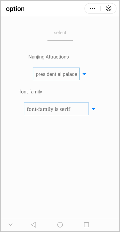
The following figure shows the final effect.
Version | Date | Description |
|---|---|---|
1030 | 2018-10-31 |
|