Intelligent Assistant
Chat with our virtual assistant to get answers promptly.
During app operations, it is necessary to monitor changes in core indicators and the overall operations status on a daily basis. If an anomaly in the data is discovered, operators must analyze the indicators to handle the issue in a timely manner.
Project overview displays the core indicators of the current project, such as the number of new users and user activity, providing a quick overview of how users are using your app.
Here you can view the numbers of new, active, and total users, day 1 retention rate of new users, and average usage duration. The  icon in the upper right corner of a card indicates that the filter and time settings do not take effect for the card.

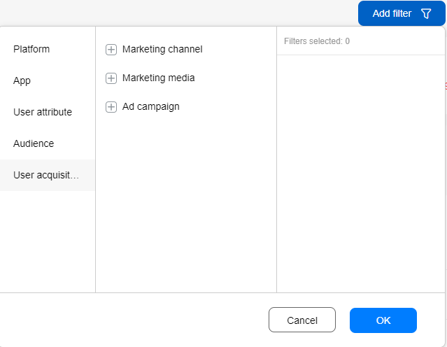
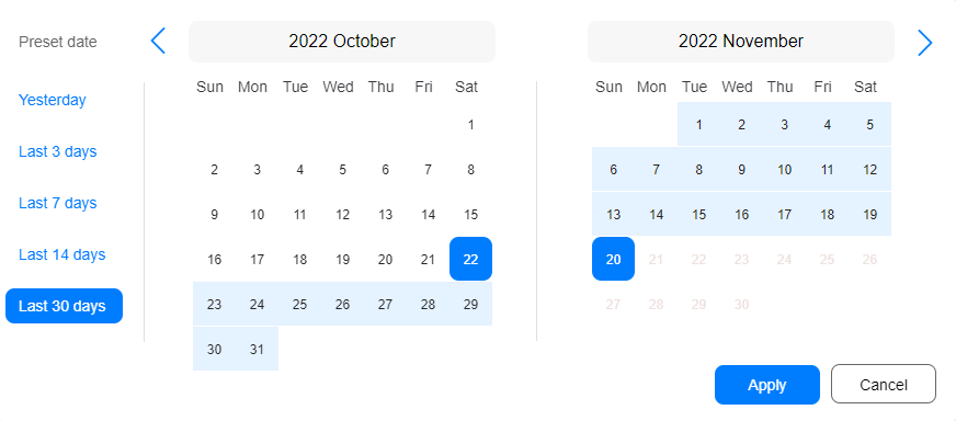
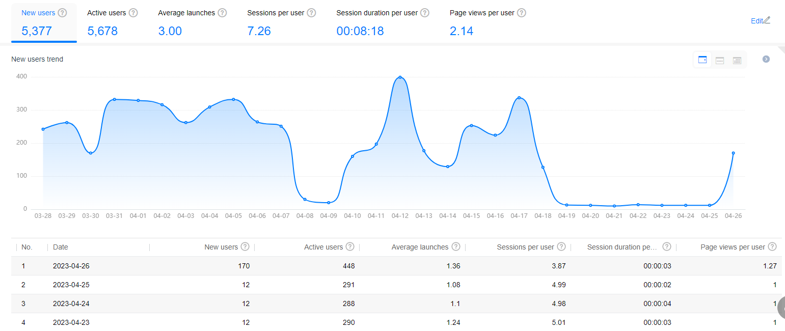
Information displayed includes trends in the numbers of new users, active users, average launches, average sessions, average page views, launches, and paying users, as well as the average access duration and payment amount. Filtering by audience does not take effect for the numbers of new users and active users.
Currently, Page views per user is available only to invited partners. You can apply for the page analysis function by submitting a ticket online. For details about the request template, click here. We will reply to you in 1 to 2 working days.
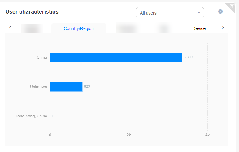
This card shows the top 10 countries/regions of users, as well as device distribution, allowing you to track which locations your app is most popular in and on which devices. The time settings do not take effect for this card.
You can select All users, New users in last 30 days, or Active users in last 30 days from the drop-down list box in the upper right corner of this card.
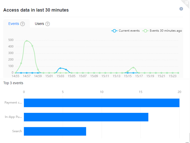
This card displays the numbers of events and users, as well as details of the top 3 events of your app in the last 30 minutes, helping you track the latest status of your app in real time. The filter and time settings do not take effect for this card. You can click the  icon in the upper right corner of the card to go to the real-time overview page and view more analysis details.
Currently, the Access data in last 30 minutes is available only to invited partners.
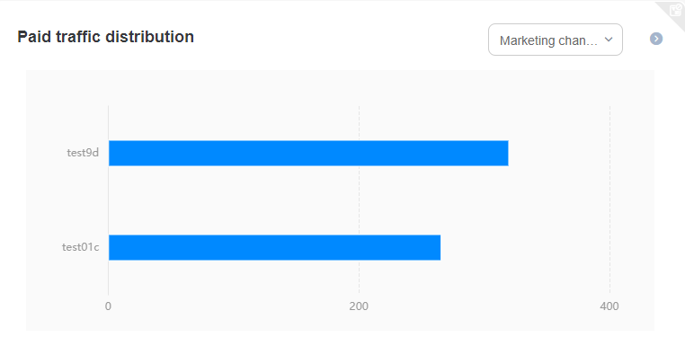
By default, this card displays the distribution of paid traffic acquired from each marketing channel. You can also select Marketing media or Marketing task from the drop-down list box on the right of the card to view the paid traffic distribution. Filtering by audience does not take effect for this card.
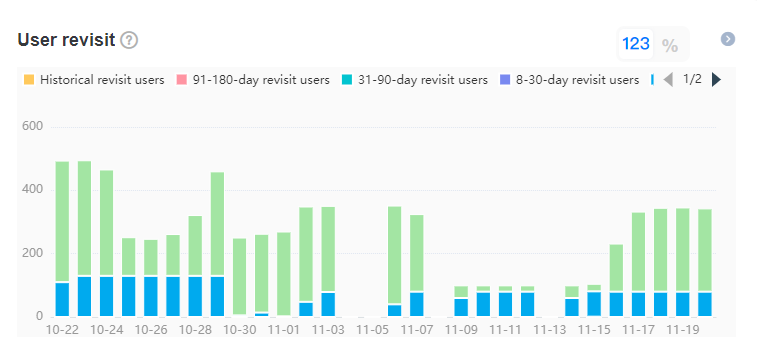
This card displays daily distribution of users who revisit your app, helping you evaluate how attractive your app is to users and the effect of efforts to win back churned users. You can click the  icon in the upper right corner of the card to go to the revisit user page and view more analysis details.
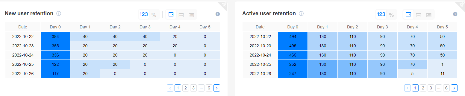
The retention cards display basic information about new or active user retention, helping paint a picture of how attractive your app is to users over time. You can view the information by day, week, or month. Filtering by audience does not take effect for the New user retention and Active user retention cards. You can click the  icon in the upper right corner of the cards to view the retention analysis details.
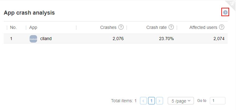
With the Crash SDK integrated, you can view the numbers of crashes and affected users of different apps in your project on the app crash analysis card. You can click the  icon in the upper right corner of the card to go to the crash analysis details page.
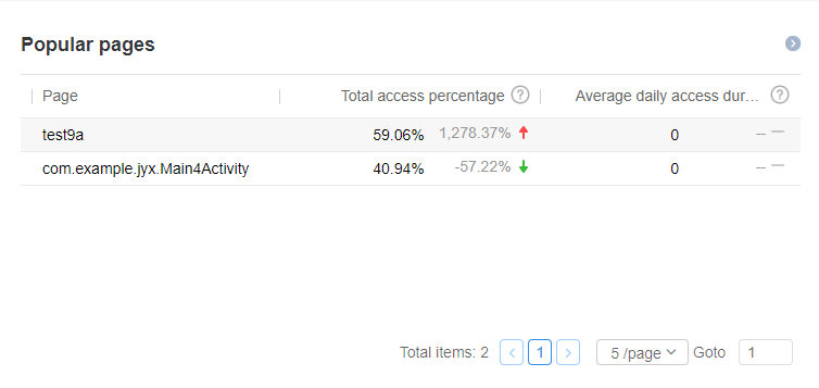
Currently, this card is available only to invited partners. You can apply for the page analysis function by submitting a ticket online. For details about the request template, click here. We will reply to you in 1 to 2 working days.
This card displays the total access percentage and average daily access duration of each page. It tells you which app pages are of most interest to users, and how attractive your app or operations strategy is to users. For app pages with poor performance, you can consider changing or optimizing the design of the page. You can click the  icon in the upper right corner of the card to view page event analysis.
This card clearly shows the channels through which users download your app, or in other words, user sources. When running an activity to attract new users, you can use this card to view sources of new users to identify the effectiveness of different user acquisition channels, and find out how well your app is able to attract new users.
 icon next to Download channel to access the channel analysis page and view details.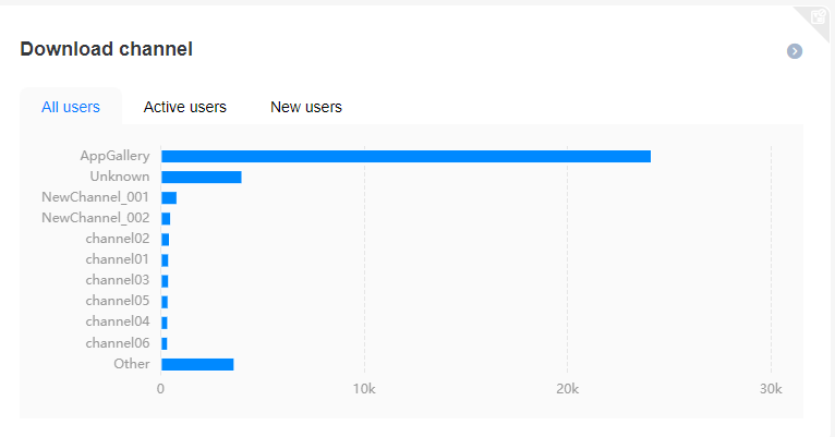
This card uses a pie chart to display the app version adoption rate on different platforms. The filter and time settings do not take effect for this card.
 icon in the upper right of the card to go to the version distribution page and view details.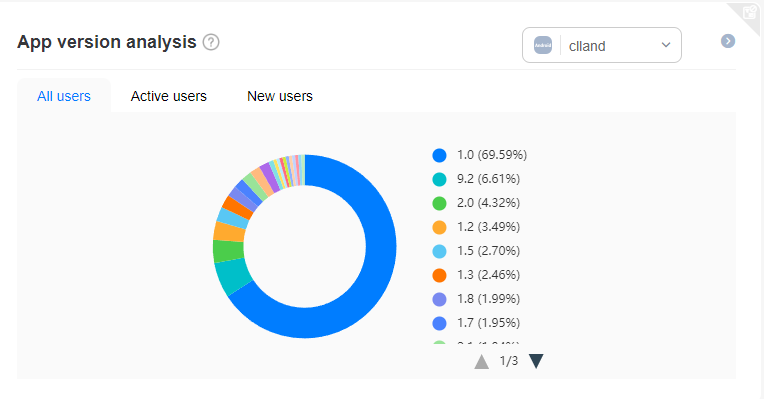
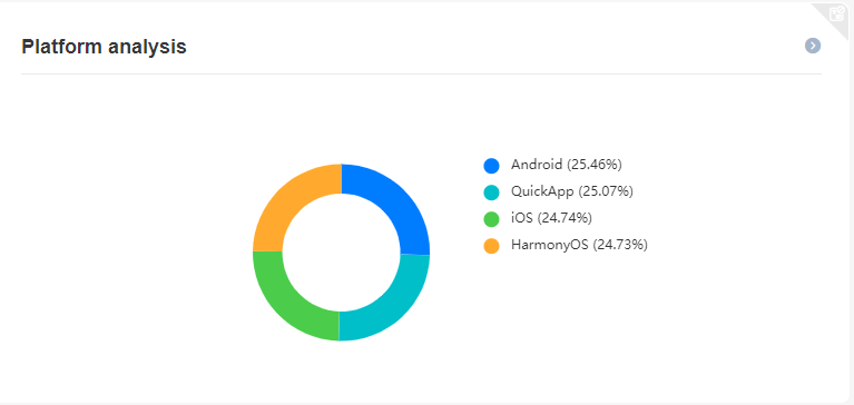
This card displays user distribution by platform, such as Android, iOS, web, and quick app. You can click  in the upper right corner of the card to view all user details. The time settings do not take effect for this card.
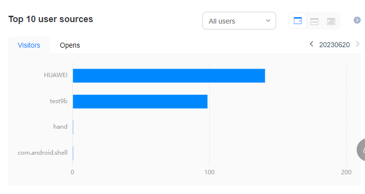
This card displays the top 10 user sources of your app, including the number of visitors from each source and the number of times that your app is opened by users from each source. You can switch among three dimensions: All users, New users, and Active users. You can click  in the upper right corner of the card to view user details. The data can be displayed by day, week, or month.