API Declaration
Before calling this API, add the animation method for elements in the JavaScript code.
var animation = this.$element('xxx').animate(keyframes, options); Application Scope
Item | Description |
|---|---|
Applicable devices | Mobile phones, tablets, Vision products, and telematics devices |
Applicable regions | Global |
Parameters in keyframes
Parameter | Type | Description |
|---|---|---|
frame | array<style> | Multiple groups of animation style objects. |
style parameters
Parameter | Type | Default Value | Description |
|---|---|---|---|
width | number | - | Width value applied to the element after the animation is played. |
height | number | - | Height value applied to the element after the animation is played. |
backgroundColor | color | none | Background color applied to the element after the animation is played. |
opacity | number | 1 | Opacity value applied to the element after the animation is played. The value ranges from 0 to 1. The default value is 1. |
transformOrigin | string | 'center center' | Origin position of the transformed element.
|
transform | object | - | Transformation type applied to an element. For details, please refer to transform parameters. |
backgroundPosition (1090+) | string | '0px 0px' | Position of the background image in the container. A maximum of four parameters are supported. For details, please refer to background-position. |
transform parameters
Parameter | Type | Description |
|---|---|---|
translate/translateX/translateY | length | Location to which the specified element is moved. NOTE: Each parameter can be set in keyframes for no more than twice. |
scale/scaleX/scaleY | number | Target size of an element to scale to at the specific ratio. NOTE: Each parameter can be set in keyframes for no more than twice. |
rotate/rotateX/rotateY | deg | Rotation angle of an element. NOTE: Each parameter can be set in keyframes for no more than twice. |
options parameters
Parameter | Type | Default Value | Description |
|---|---|---|---|
duration | number | 0 | Duration of the animation, in milliseconds. The default value is 0, indicating that there is no animation effect. |
easing | string | linear | Speed curve of an animation, which makes the animation more fluent. For values of easing, please refer to Values of easing. |
delay | number | 0 | Interval (in milliseconds) between the time when an animation is requested and the animation start time. The default value is 0, indicating no delay. |
iterations | number | 1 | Number of animation running times. The value can be Infinity. |
fill | none | forwards | none | Indicates whether to restore to the initial state after the animation is executed. The default value is none, indicating restoring to the initial state. |
Values of easing
Value | Description |
|---|---|
linear | The animation speed keeps unchanged. |
ease-in | The animation starts at a lower speed. |
ease-out | The animation ends at a lower speed. |
ease-in-out | The animation starts and ends at a lower speed, but moves quickly in the middle. |
cubic-bezier(x1, y1, x2, y2) (1080+) | You can customize an animation speed curve in the cubic-bezier() function. The x and y values of each input parameter must range from 0 to 1. |
steps(number-of-steps, step direction) (1090+) | Number of steps of the animation process and the stop time of each step is the same.
|
step-start (1090+) | Equivalent to steps(1, jump-start). |
step-end (1090+) | Equivalent to steps(1, jump-end). |
animation attributes
Attribute | Type | Description |
|---|---|---|
finished | boolean | Indicates whether the animation playback is complete. The attribute is read-only. |
pending | boolean | Indicates whether the animation is waiting for the completion of other asynchronous operations (for example, starting an animation with a delay). The attribute is read-only. |
playState | string | Animation running state.
|
startTime | number | Animation start time. This attribute is similar to that of delay in the options parameters. |
animation methods
Method | Parameter | Description |
|---|---|---|
play | - | Starts an animation. |
finish | - | Ends an animation. |
pause | - | Pauses an animation. |
cancel | - | Cancels an animation. |
reverse | - | Plays the animation in reverse direction. |
animation events
Event | Description |
|---|---|
cancel | The animation is canceled. |
finish | The animation is complete. |
Sample code
var options = {
    duration: 15000,
    easing: 'linear',
    delay: 0,
    fill: 'forwards',
    iterations: 1
}
var frames = [
    {transform: {
        scaleX: "0.1",
        scaleY: "0.1",
    }},
    {transform: {
        scaleX: "1",
        scaleY: "1",
    }}];
var animation = this.$element('xxx').animate(frames, options);
animation.play();
animation.finish();
animation.pause();
animation.cancel();
animation.reverse();
animation.onfinish = function() {
    console.log("animation  onfinish");
}
animation.oncancel = function() {
    console.log("animation  oncancel");
}
Demo
<template>
  <div class="doc-page">
    <div class="page-title-wrap">
      <text class="page-title">{{componentName}}</text>
    </div>

    <div class="item-container">
      <div class="group">
        <text class="header">animation-name</text>
        <div class="item {{color}}">
          <text class="txt">color</text>
        </div>
        <div class="item {{opacity}}">
          <text class="txt">opacity</text>
        </div>
        <div class="item {{height}}">
          <text class="txt">height</text>
        </div>
        <div class="item {{width}}">
          <text class="txt">width</text>
        </div>
        <div class="{{backPosition}}" style="background-image: url(../../Common/logo.png);">
          <text class="txt">background-position</text>
        </div>
        <input class="button" type="button"  value="show" onclick="show01" />
      </div>

      <div class="group">
        <text class="header">animation-delay</text>
        <div class="item {{delay}}">
          <text class="txt">3s</text>
        </div>
        <input class="button" type="button"  value="show" onclick="show02" />
      </div>

      <div class="group">
        <text class="header">animation-duration</text>
        <div class="item {{oneSec}}">
          <text class="txt">1s</text>
        </div>
        <div class="item {{fiveSec}}">
          <text class="txt">5s</text>
        </div>
        <div class="item {{tenSec}}">
          <text class="txt">10s</text>
        </div>
        <input class="button" type="button"  value="show" onclick="show03" />
      </div>

      <div class="group">
        <text class="header">animation-iteration-count</text>
        <div class="item {{oneCount}}">
          <text class="txt">1</text>
        </div>
        <div class="item {{twoCount}}">
          <text class="txt">2</text>
        </div>
        <div class="item {{threeCount}}">
          <text class="txt">3</text>
        </div>
        <input class="button" type="button"  value="show" onclick="show04" />
      </div>

      <div class="group">
        <text class="header">animation-timing-function</text>
        <div class="item {{linear}}">
          <text class="txt">linear</text>
        </div>
        <div class="item {{ease}}">
          <text class="txt">ease</text>
        </div>
        <div class="item {{easeIn}}">
          <text class="txt">ease-in</text>
        </div>
        <div class="item {{easeOut}}">
          <text class="txt">ease-out</text>
        </div>
        <div class="item {{easeInOut}}">
          <text class="txt">ease-in-out</text>
        </div>
        <div class="item {{steps}}">
          <text class="txt">steps</text>
        </div>
        <div class="item {{cubicBezier}}">
          <text class="txt">cubic-bezier</text>
        </div>
        <input class="button" type="button"  value="show" onclick="show05" />
      </div>

      <div class="group">
        <text class="header">animation-fill-mode</text>
        <div class="item {{forwards}}">
          <text class="txt">forwards</text>
        </div>
        <div class="item {{none}}">
          <text class="txt">none</text>
        </div>
        <input class="button" type="button"  value="show" onclick="show06" />
      </div>

      <div class="group">
        <text class="header">transform in animation</text>
        <div class="item {{translateX}}">
          <text class="txt">translateX</text>
        </div>
        <div class="item {{translateY}}">
          <text class="txt">translateY</text>
        </div>
        <div class="item {{scaleX}}">
          <text class="txt">scaleX</text>
        </div>
        <div class="item {{scaleY}}">
          <text class="txt">scaleY</text>
        </div>
        <div class="item {{rotate}}">
          <text class="txt">rotate</text>
        </div>
        <div class="item {{rotateX}}">
          <text class="txt">rotateX</text>
        </div>
        <div class="item {{rotateY}}">
          <text class="txt">rotateY</text>
        </div>
        <input class="button" type="button"  value="show" onclick="show07" />
      </div>

      <div class="group">
        <text class="header">Play multiple animations at the same time.</text>
        <div class="item {{multiple}}">
          <text class="txt">Play multiple animations at the same time.</text>
        </div>
        <input class="button" type="button"  value="show" onclick="show08" />
      </div>

      <div class="group">
        <text class="header">Listen on animation events.</text>
        <div id="animation" class="item {{animateEvent}}">
          <text class="txt">Listen on animation events.</text>
        </div>
        <input class="button" type="button"  value="show" onclick="show09" />
      </div>
    </div>
  </div>
</template>

<script>
  import prompt from '@system.prompt'
  export default {
    private: {
      componentName: 'animation',
      color: '',
      opacity: '',
      height: '',
      width: '',
      delay: '',
      oneSec: '',
      fiveSec: '',
      tenSec: '',
      oneCount: '',
      twoCount: '',
      threeCount: '',
      linear: '',
      ease: '',
      easeIn: '',
      easeOut: '',
      easeInOut: '',
      forwards: '',
      none: '',
      translateX: '',
      translateY: '',
      scaleX: '',
      scaleY: '',
      rotate: '',
      rotateX: '',
      rotateY: '',
      multiple: '',
      animateEvent: '',
      backPosition: '',
      steps: '',
      cubicBezier: ''
    },
    onInit() {
      this.$page.setTitleBar({ text: 'Animation' })
    },
    show01() {
      this.color = ''
      this.opacity = ''
      this.height = ''
      this.width = ''
      this.backPosition = ''
      this.color = 'color'
      this.opacity = 'opacity'
      this.height = 'height'
      this.width = 'width'
      this.backPosition = 'backPosition'
    },
    show02() {
      this.delay = ''
      this.delay = 'delay'
    },
    show03() {
      this.oneSec = ''
      this.fiveSec = ''
      this.tenSec = ''
      this.oneSec = 'oneSec'
      this.fiveSec = 'fiveSec'
      this.tenSec = 'tenSec'
    },
    show04() {
      this.oneCount = ''
      this.twoCount = ''
      this.threeCount = ''
      this.oneCount = 'oneCount'
      this.twoCount = 'twoCount'
      this.threeCount = 'threeCount'
    },
    show05() {
      this.linear = ''
      this.ease = ''
      this.easeIn = ''
      this.easeOut = ''
      this.easeInOut = ''
      this.steps = ''
      this.cubicBezier = ''
      this.linear = 'linear'
      this.ease = 'ease'
      this.easeIn = 'easeIn'
      this.easeOut = 'easeOut'
      this.easeInOut = 'easeInOut'
      this.steps = 'steps'
      this.cubicBezier = 'cubic-bezier'
    },
    show06() {
      this.forwards = ''
      this.none = ''
      this.forwards = 'forwards'
      this.none = 'none'
    },
    show07() {
      this.translateX = ''
      this.translateY = ''
      this.scaleX = ''
      this.scaleY = ''
      this.rotate = ''
      this.rotateX = ''
      this.rotateY = ''
      this.translateX = 'translateX'
      this.translateY = 'translateY'
      this.scaleX = 'scaleX'
      this.scaleY = 'scaleY'
      this.rotate = 'rotate'
      this.rotateX = 'rotateX'
      this.rotateY = 'rotateY'
    },
    show08() {
      this.multiple = ''
      this.multiple = 'multiple'
    },
    show09() {
      this.animateEvent = ''
      this.animateEvent = 'animateEvent'
      this.animationEvent()
    },
    animationEvent() {
      const element = this.$element('animation')
      element.addEventListener("animationstart", (event) => {
        prompt.showToast({
          message: 'type: ' + event.type + ', animationName: ' + event.animationName + ', elapsedTime: ' + event.elapsedTime
        })
      })
      element.addEventListener("animationend", (event) => {
        prompt.showToast({
          message: 'type: ' + event.type + ', animationName: ' + event.animationName + ', elapsedTime: ' + event.elapsedTime
        })
      })
      element.addEventListener("animationiteration", (event) => {
        prompt.showToast({
          message: 'type: ' + event.type + ', animationName: ' + event.animationName + ', elapsedTime: ' + event.elapsedTime
        })
      })
    }
  }
</script>

<style>
  .doc-page {
    flex: 1;
    flex-direction: column;
  }

  .page-title-wrap {
    padding-top: 50px;
    padding-bottom: 80px;
    justify-content: center;
  }
  .page-title {
    padding-top: 30px;
    padding-bottom: 30px;
    padding-left: 40px;
    padding-right: 40px;
    border-color: #bbbbbb;
    color: #bbbbbb;
    border-bottom-width: 2px;
  }

  .item-container {
    margin-bottom: 50px;
    margin-right: 60px;
    margin-left: 60px;
    flex-direction: column;
    align-items: flex-start;
  }
  .group {
    margin-bottom: 150px;
    flex-direction: column;
    align-items: flex-start;
  }
  .header {
    margin-bottom: 20px;
  }
  .item {
    background-color: #f76160;
  }
  .txt {
    text-align: center;
    width: 200px;
    height: 100px;
  }
  .button {
    width: 200px;
    font-size: 30px;
    color: #ffffff;
    background-color: #09ba07;
  }
  .color {
    animation-name: Color;
    animation-duration: 8000ms;
  }
  .opacity {
    animation-name: Opacity;
    animation-duration: 8000ms;
  }
  .height {
    animation-name: Height;
    animation-duration: 8000ms;
  }
  .width {
    animation-name: Width;
    animation-duration: 1000ms;
  }
  .backPosition {
    animation-name: BackPosition;
    animation-duration: 1000ms;
  }
  .delay {
    animation-name: Go;
    animation-duration: 5000ms;
    animation-delay: 3000ms;
  }
  .oneSec {
    animation-name: Go;
    animation-duration: 1000ms;
  }
  .fiveSec {
    animation-name: Go;
    animation-duration: 5000ms;
  }
  .tenSec {
    animation-name: Go;
    animation-duration: 10000ms;
  }
  .oneCount {
    animation-name: Go;
    animation-duration: 3000ms;
    animation-iteration-count: 1;
  }
  .twoCount {
    animation-name: Go;
    animation-duration: 3000ms;
    animation-iteration-count: 2;
  }
  .threeCount {
    animation-name: Go;
    animation-duration: 3000ms;
    animation-iteration-count: 3;
  }
  .linear {
    animation-name: Go;
    animation-duration: 3000ms;
    animation-timing-function: linear;
  }
  .ease {
    animation-name: Go;
    animation-duration: 3000ms;
    animation-timing-function: ease;
  }
  .easeIn {
    animation-name: Go;
    animation-duration: 3000ms;
    animation-timing-function: ease-in;
  }
  .easeOut {
    animation-name: Go;
    animation-duration: 3000ms;
    animation-timing-function: ease-out;
  }
  .easeInOut {
    animation-name: Go;
    animation-duration: 3000ms;
    animation-timing-function: ease-in-out;
  }
  .steps {
    animation-name: Go;
    animation-duration: 3000ms;
    animation-timing-function: steps(3, end);
  }
  .cubic-bezier {
    animation-name: Go;
    animation-duration: 3000ms;
    animation-timing-function: cubic-bezier(0, 0.3, 0.7, 1);
  }
  .forwards {
    animation-name: Go;
    animation-duration: 3000ms;
    animation-fill-mode: forwards;
  }
  .none {
    animation-name: Go;
    animation-duration: 3000ms;
    animation-fill-mode: none;
  }
  .translateX {
    animation-name: translateX;
    animation-duration: 8000ms;
  }
  .translateY {
    animation-name: translateY;
    animation-duration: 8000ms;
  }
  .scaleX {
    animation-name: scaleX;
    animation-duration: 8000ms;
  }
  .scaleY {
    animation-name: scaleY;
    animation-duration: 8000ms;
  }
  .rotate {
    transform-origin: 0px 100px;
    animation-name: rotate;
    animation-duration: 8000ms;
  }
  .rotateX {
    animation-name: rotateX;
    animation-duration: 8000ms;
  }
  .rotateY {
    animation-name: rotateY;
    animation-duration: 8000ms;
  }
  .multiple {
    animation-name: GO, Color, scaleX;
    animation-duration: 3000ms;
  }
  .animateEvent {
    animation-name: Opacity;
    animation-duration: 5000ms;
    animation-iteration-count: infinite;
  }
  @keyframes Go {
    from {
      background-color: #f76160;
    }
    to {
      background-color: #09ba07;
    }
  }

  @keyframes Color {
    from {
      background-color: #f76160;
    }
    to {
      background-color: #09ba07;
    }
  }

  @keyframes Opacity {
    from {
      opacity: 0.9;
    }
    to {
      opacity: 0.1;
    }
  }

  @keyframes Width {
    from {
      width: 100px;
    }
    to {
      width: 300px;
    }
  }

  @keyframes Height {
    from {
      height: 100px;
    }
    to {
      height: 220px;
    }
  }

  @keyframes BackPosition {
    from {
      background-position: left 0 top 0;
    }
    to {
      background-position: left 100% top 100%;
    }
  }

  @keyframes translateX {
    from {
      transform: translateX(20px);
    }
    to {
      transform: translateX(50px);
    }
  }

  @keyframes translateY {
    from {
      transform: translateY(20px);
    }
    to {
      transform: translateY(50px);
    }
  }

  @keyframes scaleX {
    from {
      transform: scaleX(0.5);
    }
    to {
      transform: scaleX(2);
    }
  }

  @keyframes scaleY {
    from {
      transform: scaleY(0.5);
    }
    to {
      transform: scaleY(2);
    }
  }

  @keyframes rotate {
    from {
      transform: rotate(10deg);
    }
    to {
      transform: rotate(360deg);
    }
  }

  @keyframes rotateX {
    from {
      transform: rotateX(10deg);
    }
    to {
      transform: rotateX(360deg);
    }
  }

  @keyframes rotateY {
    from {
      transform: rotateY(10deg);
    }
    to {
      transform: rotateY(360deg);
    }
  }
</style>
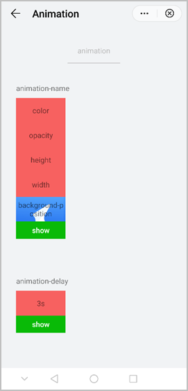
The following figure shows the final effect.