Application Scope
Item | Description |
|---|---|
Applicable devices | Mobile phones, tablets, Vision products, and telematics devices |
Applicable regions | Global |
Attributes
In addition to general attributes, the attributes listed in the following table are supported.
Attribute | Type | Default Value | Mandatory/Optional | Description |
|---|---|---|---|---|
type | button | checkbox | radio | text | email | date | time | number | password | text | Optional | Type, which can be modified dynamically. |
checked | boolean | false | Optional | Indicates whether an element is selected. The setting can trigger the checked pseudo-class. This attribute takes effect when type is set to checkbox. |
name | string | - | Optional | Name of the input element. |
value | string | - | Optional | Value of the input element. |
placeholder | string | - | Optional | Text content, which takes effect when type is set to button, checkbox, radio, text, email, date, time, or number. |
maxlength | number | - | Optional | Maximum number of characters that can be entered in an input box. The empty value indicates no limit. |
enterkeytype | default | next | go | done | send | search | default | Optional | Dynamic modification is not supported. Display text of the Enter button on the soft keyboard. The options are as follows:
NOTE: If the same value is used for different input methods, the display text may be different. |
Styles
The input element supports the active pseudo-class. In addition to common styles, the styles listed in the following table are supported.
Style | Type | Default Value | Mandatory/Optional | Description |
|---|---|---|---|---|
color | color | rgba(0,0,0,0.87) | Optional | Font color. |
font-size | number | 37.5px | Optional | Font size. |
placeholder-color | color | rgba(0,0,0,0.38) | Optional | Text color, which takes effect when type is set to button, checkbox, radio, text, email, date, time, number, or password. |
font-weight (1030+) | lighter | 100 | 200 | 300 | 400 | 500 | 600 | 700 | 800 | 900 | normal | bold | bolder | normal | Optional | Font weight. The default value is normal. |
width | length | percentage | - | Optional | The default value is 128px when type is set to button. |
height | length | percentage | - | Optional | The default value is 70px when type is set to button. |
font-family (1030+) | string | - | Optional | Font of strings in the element. Default fonts normal, sans-serif, serif, and monospace are supported. These four fonts are valid only for English. To customize fonts, please refer to font-face Style. |
caret-color (1060+) | color | transparent | auto | auto | Optional | Cursor color. |
Events
The input element supports the change event, which will be triggered when the status of checked changes. In addition to common events, the events listed in the following table are supported.
Parameter | text | email | date | time | number | password | checkbox | radio | Remarks |
|---|---|---|---|---|
name | - | √ | √ | - |
value | √ | √ | √ | The current value of the input element is obtained from e.value in the change event when type is set to checkbox, radio, text, email, date, time, number, or password. The value cannot be obtained through this.$element('xx').value. For details, please refer to Solution to Failure to Obtain an Input Value. |
checked | - | √ | - | - |
enterkeyclick | {value:valuestring} | - | - | This event is triggered when the Enter key on the soft keyboard is tapped. |
selectionchange (1030+) | √ | - | - | This event is triggered when the select() or setSelectionRange() method is called in the input element to change the selected string. CAUTION: This event applies only to the scenario where the input element type is text, email, date, time, or number. |
Methods
Method | Parameter | Description |
|---|---|---|
focus | {focus:true|false}: If the focus parameter is not passed, the default value true is used. | Makes the element gain or lose the focus. The focus pseudo-class can be triggered. When type is set to text, email, date, time, number, or password, the input method can be displayed or hidden. |
select | - | Selects all texts in a text box. |
setSelectionRange | {start: number, end : number} | Sets the area selected in a text box. |
getSelectionRange | {callback : function(start : number, end : number)} | Obtains the area selected in a text box. |
Sample Code
<template>
    <div class="container">
        <!-- Various types of input examples -->
        <div class="input-item">
            <text class="input-hint">input type="text"</text>
            <input class="input-text" id="selectionInput" placeholder="please enter text" maxlength="100" style="placeholder-color:#FF0000;caret-color:#7b68ee;"
                value="{{inputValue}}" onchange="updateValue" onselectionchange="selectionchange"></input>
            <div class="input-item1">
                <input class="input-button color-3" type="button"  value="set focus true"
                    onclick="truefocus">
               </input>
                <input class="input-button color-3" type="button"  value="set focus false"
                    onclick="falsefocus">
               </input>
                <input class="input-button color-3" type="button" value="Set the value" onclick="setValue">
               </input>
                <input class="input-button color-3" type="button" value="clear the value" onclick="resetValue">
               </input>
                <input class="input-button color-3" type="button" value="select all" onclick="selectAll">
               </input>
                <input class="input-button color-3" type="button" value="select [0-2]" onclick="setSelectionRange">
               </input>
                <input class="input-button color-3" type="button" value="get select []" onclick="getSelectionRange">
               </input>
            </div>
        </div>
        <div class="input-item">
            <text class="input-hint">input type="password"</text>
            <input class="input-text" type="password" placeholder="please enter password" onchange="showChangePrompt"></input>
        </div>
        <!-- radio -->
        <div class="input-item">
            <text class="input-hint">input type="radio":</text>
            <div class="doc-row">
                <label target="radio1">label1:</label>
                <input id="radio1" class="flex-grow" type="radio" name="radio" value="radio1" onchange="showChangePrompt">
               </input>
                <label target="radio2">label2:</label>
                <input id="radio2" class="flex-grow" type="radio" name="radio" value="radio2" checked="true" onchange="showChangePrompt">
               </input>
                <label target="radio3">label3:</label>
                <input id="radio3" class="flex-grow" type="radio" name="radio" value="radio3" onchange="showChangePrompt">
               </input>
            </div>
        </div>
        <!-- checkbox -->
        <div class="input-item">
            <text class="input-hint">input type="checkbox":</text>
            <div class="doc-row">
                <label target="checkbox1">label1:</label>
                <input id="checkbox1" class="flex-grow" type="checkbox" name="checkbox" value="checkbox1" onchange="showChangePrompt">
               </input>
                <label target="checkbox2">label2:</label>
                <input id="checkbox2" class="flex-grow" type="checkbox" name="checkbox" value="checkbox2" checked="true"
                    onchange="showChangePrompt">
               </input>
                <label target="checkbox3">label3:</label>
                <input id="checkbox3" class="flex-grow" type="checkbox" name="checkbox" value="checkbox3" onchange="showChangePrompt">
               </input>
            </div>
        </div>
        <!-- Set the enterkeytype and enterkeyclick examples -->
        <div class="input-item">
            <text class="input-hint">enterkeytype = next search [go] done send default</text>
            <input class="input-text" enterkeytype="go" onenterkeyclick="enterkeyclicked" placeholder="enterkeytype = go"
                onchange="showChangePrompt" style="background-color:#fafafa;">
            </input>
        </div>
        <div class="input-item">
            <text class="input-hint">enterkeytype = next search go [done] send default</text>
            <input class="input-text" enterkeytype="done" onenterkeyclick="enterkeyclicked" placeholder="enterkeytype = done"
                onchange="showChangePrompt" style="background-color:#fafafa;">
            </input>
        </div>
        <div class="input-item">
            <text class="input-hint">enterkeytype = next search go done [send] default</text>
            <input class="input-text" enterkeytype="send" onenterkeyclick="enterkeyclicked" placeholder="enterkeytype = send"
                onchange="showChangePrompt" style="background-color:#fafafa;">
            </input>
        </div>
        <div class="input-item">
            <text class="input-hint">enterkeytype = next search go done send [default]</text>
            <input class="input-text" onenterkeyclick="enterkeyclicked" placeholder="enterkeytype = default" onchange="showChangePrompt"
                style="background-color:#fafafa;">
            </input>
        </div>
        <!-- font-family -->
        <div class="input-item">
            <input class="input-text input-fontfamily" value="this input font-family is serif" style="background-color:#fafafa;margin-bottom:30px;"></input>
        </div>
    </div>
</template>
<style>
    .container {
        flex: 1;
        flex-direction: column;
    }
    .input-item {
        margin-bottom: 80px;
        margin-top: 10px;
        flex-direction: column;
    }
    .input-item1 {
        margin: 20px;
        flex-direction: row;
        justify-content:space-between;
        align-items: center;
        flex-wrap: wrap;
    }
    .input-hint {
        margin-left: 30px;
        margin-bottom: 30px;
        margin-right: 30px;
    }
    .doc-row {
        justify-content: center;
        margin-left: 30px;
        margin-right: 30px;
    }
    .flex-grow {
        flex-grow: 1;
    }
    .input-text {
        height: 80px;
        line-height: 80px;
        padding-left: 30px;
        padding-right: 30px;
        margin-left: 30px;
        margin-right: 30px;
        border-top-width: 1px;
        border-bottom-width: 1px;
        border-color: #999999;
        font-size: 30px;
        background-color: #ffffff;
    }
    .input-text:focus {
        border-color: #f76160;
    }
    .input-button {
        font-size: 30px;
         margin-top: 10px;
        border-radius: 5px;
        color: #ffffff;
         background-color: #00bfff;
    }
    .input-fontfamily {
        font-family: serif;
    }
</style>
<script>
    import prompt from '@system.prompt'
    export default {
        data: {
            inputValue: ''
        },
        onInit() {
            this.$page.setTitleBar({ text: 'input1' });
        },
        updateValue(e) {
            this.inputValue = e.value;
        },
        setValue() {
            this.inputValue = "hello world";
        },
        resetValue() {
            this.inputValue = ''
        },
        showChangePrompt(e) {
            prompt.showToast({
                message: (e.name === undefined ? '' : '---name: ' + e.name)
                    + (e.value === undefined ? '' : '---value: ' + e.value)
                    + (e.checked === undefined ? '' : '---checked: ' + e.checked)
                    + (e.text === undefined ? '' : '---text: ' + e.text)
            })
        },
        enterkeyclicked(e) {
            let msg = "enterkeyclicked-->" + "value:" + e.value;
            console.log(msg);
            prompt.showToast({ message: msg });
        },
        truefocus(e) {
            this.$element('selectionInput').focus({ focus: true })
            prompt.showToast({
                message: "get focus"
            })
        },
        falsefocus(e) {
            this.$element('selectionInput').focus({ focus: false })
            prompt.showToast({
                message: "lose focus"
            })
        },
        showClickPrompt(msg) {
            prompt.showToast({
                message: msg
            })
        },
        selectAll() {
            this.$element('selectionInput').select();
        },
        setSelectionRange() {
            this.$element('selectionInput').setSelectionRange({ start: 0, end: 3 });
            //start=3 end=3 Can move the cursor to index=3
            //this.$element('selectionInput').setSelectionRange({start : 3, end : 3});
        },
        getSelectionRange() {
            this.$element('selectionInput').getSelectionRange({
                callback: function (start, end) {
                    let msg = "getSelectionRange start:" + start + " end:" + end;
                    prompt.showToast({
                        message: msg
                    })
                }
            })
        },
        selectionchange() {
            console.log("selectionchange");
        }
    }
</script>
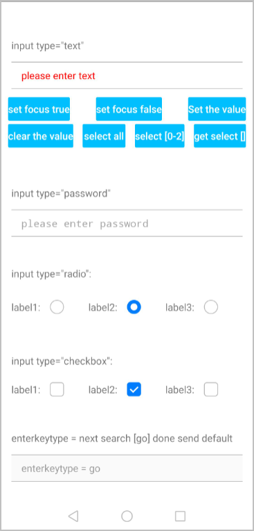
The following figure shows the final effect.
Version Change History
Version | Date | Description |
|---|---|---|
1060 | 2019-12-10 | Added the caret-color style to customize the cursor color. |
1030 | 2018-10-31 |
|
1010 | 2018-04-20 |
|
[h2]FAQs
- What should I do if I want to display a pop-up indicating that the number of input characters exceeds the specified value?
- After the text box of the input element is displayed, how do I implement the following effect: click other places to lose the focus and collapse the keyboard?
- Can I set the display position of the cursor in the input element?