Application Scope
Item | Description |
|---|---|
Applicable devices | Mobile phones, tablets, and telematics devices |
Applicable regions | Global |
Attributes
In addition to general attributes, the attributes listed in the following table are supported.
Attribute | Type | Default Value | Mandatory | Description |
|---|---|---|---|---|
min | number | 0 | No | Minimum value that can be selected on a slider. If this attribute is set to a decimal, the value is rounded off to an integer. |
max | number | 100 | No | Maximum value that can be selected on a slider. If this attribute is set to a decimal, the value is rounded off to an integer. |
step | number | 1 | No | Step to be increased or decreased each time a slider is dragged. If this attribute is set to a decimal, the value is rounded off to an integer. |
value | number | 0 | No | Value currently selected on a slider. If this attribute is set to a decimal, the value is rounded off to an integer. |
Styles
The active pseudo-class is supported. All the common styles except max-width and max-height are supported. The styles listed in the following table are also supported.
Style | Type | Default Value | Mandatory | Description |
|---|---|---|---|---|
color | color | rgba(240,240,240,1.0) | No | Background color. |
selected-color | color | rgba(51,180,255,1.0) | No | Color of the selected item. |
padding-[left|right] | length | 32px | No | Right or left margin. |
block-color (1050+) | color | - | No | Slider color. |
Events
The swipe event is not supported. In addition, versions earlier than 1040 do not support the click event. In addition to common events, the event listed in the following table is supported.
Event | Parameter | Triggering Condition |
|---|---|---|
change | {progress:progressValue, isFromUser:isFromUserValue 1080+} | A drag operation is completed. isFromUser: indicates whether the event is triggered by user's dragging. |
Sample Code
<template>
    <div class="container">
        <div class="page-title-wrap">
            <text class="page-title">{{componentName}}</text>
        </div>
        <div class="item-container">
            <text class="item-title">Display the current value.</text>
            <div class="item-content">
                <slider class="slider" style="color:#FFB6C1" value=50 onchange="getValue('currentValue1')"></slider>
                <text class="label">{{currentValue1}}</text>
            </div>
        </div>
        <div class="item-container">
            <text class="item-title">set step: {{step}}</text>
            <div class="item-content">
                <slider class="slider" value=50 step="{{step}}" onchange="getValue('currentValue2')"></slider>
                <text class="label">{{currentValue2}}</text>
            </div>
        </div>
        <div class="item-container">
            <text class="item-title">Set minimum: 50; Maximum: 200</text>
            <div class="item-content">
                <slider class="slider" min="50" max="200" value=50 onchange="getValue('currentValue3')"></slider>
                <text class="label">{{currentValue3}}</text>
            </div>
        </div>
    </div>
</template>
<script>
    export default {
        data: {
            componentName: 'slider',
            step: 10,
            currentValue1: 50,
            currentValue2: 50,
            currentValue3: 50,
        },
        getValue: function (name, e) {
            this[name] = e.progress
        }
    }
</script>
<style>
    .container {
        flex: 1;
        flex-direction: column;
    }
    .page-title-wrap {
        padding-top: 50px;
        padding-bottom: 80px;
        justify-content: center;
    }
    .page-title {
        padding-top: 30px;
        padding-bottom: 30px;
        padding-left: 40px;
        padding-right: 40px;
        border-color: #bbbbbb;
        color: #bbbbbb;
        border-bottom-width: 2px;
    }
    .item-container {
        margin-top: 20px;
        margin-bottom: 30px;
        flex-direction: column;
    }
    .item-title {
        padding-left: 30px;
        padding-bottom: 30px;
        padding-top: 30px;
        border-bottom-width: 1px;
        border-color: #bbbbbb;
        color: #aaaaaa;
    }
    .item-content {
        background-color: #ffffff;
        border-bottom-width: 1px;
        border-color: #bbbbbb;
        padding-left: 30px;
        padding-right: 30px;
    }
    .slider {
        flex: 1;
        padding-left: 50px;
        padding-right: 200px;
        selected-color: #FF0000;
        block-color: #FFFF00;
    }
    .label {
        padding-left: 30px;
        padding-right: 30px;
    }
</style>
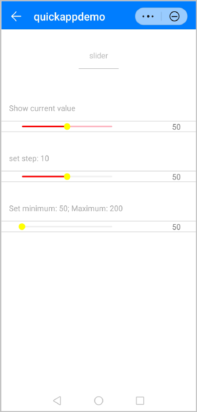
The following figure shows the final effect.
Version Change History
Version | Date | Description |
|---|---|---|
1080 | 2021-12-28 | Added the isFromUser parameter, which indicates whether the current event is triggered by users' dragging. |
1050 | 2019-09-20 | Added the block-color style to set the color of the slider. |
1010 | 2018-04-20 | Added the support for the active pseudo-class. |