API Declaration
Add the following configuration to the features attribute in the manifest.json file:
{"name": "system.contact"} Module Import
Add the following configuration to the script element on the page where the API will be called:
import contact from '@system.contact'
Or
var contact = require("@system.contact") Application Scope
Item | Description |
|---|---|
Applicable devices | Mobile phones and tablets |
Applicable regions | Global |
[h2]contact.pick(OBJECT)
Description
Selects a contact.
OBJECT parameters
Parameter | Type | Mandatory | Description |
|---|---|---|---|
success | function | No | Callback upon success. |
fail | function | No | Callback upon failure. |
complete | function | No | Callback upon completion. |
Parameters returned by success
Parameter | Type | Description |
|---|---|---|
displayName | string | Contact name. |
number | string | Phone number. |
Sample code
contact.pick({
    success: function(data) {
        console.log('data : '+data.displayName+', number = '+data.number);
    },
    fail: function(errmsg, errcode) {
        console.log('pick failed ' + errmsg+' errcode = '+errcode);
    }
})
Demo
<template>
  <!-- Only one root node is allowed in template. -->
  <div class="container">
    <div class="info-container mt-item">
      <div class="info-item border-bottom-1">
        <text class="title">contact name:</text>
        <text class="result">{{namePicked ? name : 'please select name'}}</text>
      </div>
      <div class="info-item">
        <text class="title">contact phone:</text>
        <text class="result">{{namePicked ? phone : 'please select phone'}}</text>
      </div>
    </div>
    <div class="mlr-container row-center mt-item">
      <input onclick="pickName" type="button" class="btn-blue" value="Select a Contact"/>
    </div>
  </div>
</template>

<style lang="sass">
 .container {
  flex-direction: column;
  padding-bottom: 50px;
}
.mt-item {
  margin-top: 40px;
}
.case-title .title {
  color: rgba(0, 0, 0, 0.6);
  font-size: 28px;
  font-weight: 500;
}
.mlr-container {
  margin-right: 32px;
  margin-left: 32px;
}
.row-center {
  justify-content: center;
}
.column-center {
  align-items: center;
}
.border-bottom-1{
  border-bottom-width: 1px;
}
.info-container {
  margin-left: 32px;
  margin-right: 32px;
  margin-top: 40px;
  padding-right: 20px;
  padding-left: 20px;
  background-color: #fff;
  border-radius: 32px;

  flex-direction: column;
}
.info-container .info-item {
  height: 120px;
  border-bottom-color: rgba(0, 0, 0, 0.05);;
}
.info-container .info-item .title {
  flex-shrink: 0;
  font-size: 32px;
  color: rgba(0, 0, 0, 0.9);
}
.info-container .info-item .result {
  width: 100%;
  justify-content: flex-end;
  text-align: right;
  color: #999;
}
  .btn-blue {
     background-color: #0faeff;
    width: 100%;
    height: 80px;
    border-radius: 40px;
    color: #fff;
    font-size: 32px;
    font-weight: 500;
  }
</style>

<script>
  import contact from '@system.contact';
  module.exports = {
    public: {
        name:"",
        phone:"",
        namePicked:false,
    },
    onInit: function () {
      this.$page.setTitleBar({ text: 'contact' });
    },
    pickName(){
      let that = this;
      contact.pick({
        success: function (data) {
          that.namePicked = true;
          that.name = data.displayName;
          that.phone = data.number;
        }
      })
    }
  }
</script>
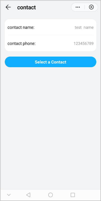
The following figure shows the final effect.