Overview
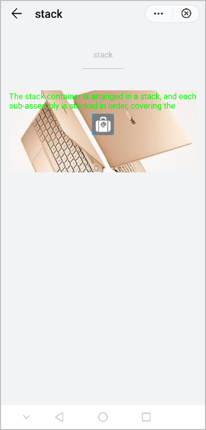
Functions as the basic container. Subelements are successively stacked, and a subelement is overridden by the subsequent.
Application Scope
Item | Description |
|---|---|
Applicable devices | Mobile phones, tablets, Vision products, and telematics devices |
Applicable regions | Global |
Events
In addition to common events (excluding swipe), the event listed in the following table is supported.
Event | Parameter | Triggering Condition |
|---|---|---|
fullscreenchange (1050+) | {fullscreen: fullscreenValue} | A user enters or exits the full-screen mode. |
Methods
Method | Parameter | Description |
|---|---|---|
requestFullscreen (1050+) | { screenOrientation : "portrait" | "landscape" } | Requests to enter the full-screen mode. |
Sample Code
<template>
  <div class="container">
    <div class="page-title-wrap">
      <text class="page-title">{{componentName}}</text>
    </div>

    <stack class="stack">
      <image class="image" src="/Common/xmad.jpg"></image>
      <text class="title">The stack container is arranged in a stack, and each sub-assembly is stacked in order, covering the previous components.</text>
      <div class="wrap">
        <image class="btn" src="/Common/home.png"></image>
      </div>
    </stack>
  </div>
</template>

<style>
    .container {
      flex: 1;
      flex-direction: column;
    }
    .page-title-wrap {
      padding-top: 50px;
      padding-bottom: 80px;
      justify-content: center;
    }
    .page-title {
      padding-top: 30px;
      padding-bottom: 30px;
      padding-left: 40px;
      padding-right: 40px;
      border-color: #bbbbbb;
      color: #bbbbbb;
      border-bottom-width: 2px;
    }
    .stack {
      height: 300px;
      margin-left: 30px;
      margin-right: 30px;
      align-items: flex-start;
    }

    .image {
      width: 100%;
      height: 100%;
    }

    .title {
      color: #00ff00;
      lines: 2;
    }

    .wrap {
      width: 100%;
      height: 100%;
      justify-content: center;
      align-items: center;
    }
    .btn {
      height: 80px;
      text-align: center;
      border-radius: 5px;
      margin-right: 60px;
      margin-left: 60px;
      margin-bottom: 50px;
      color: #ffffff;
      font-size: 30px;
      background-color: #0faeff;
    }
</style>

<script>
    export default {
        data: {
            componentName: 'stack'
        },
        onInit() {
            this.$page.setTitleBar({ text: 'stack' })
        }
    }
</script>
The following figure shows the final effect.