Overview
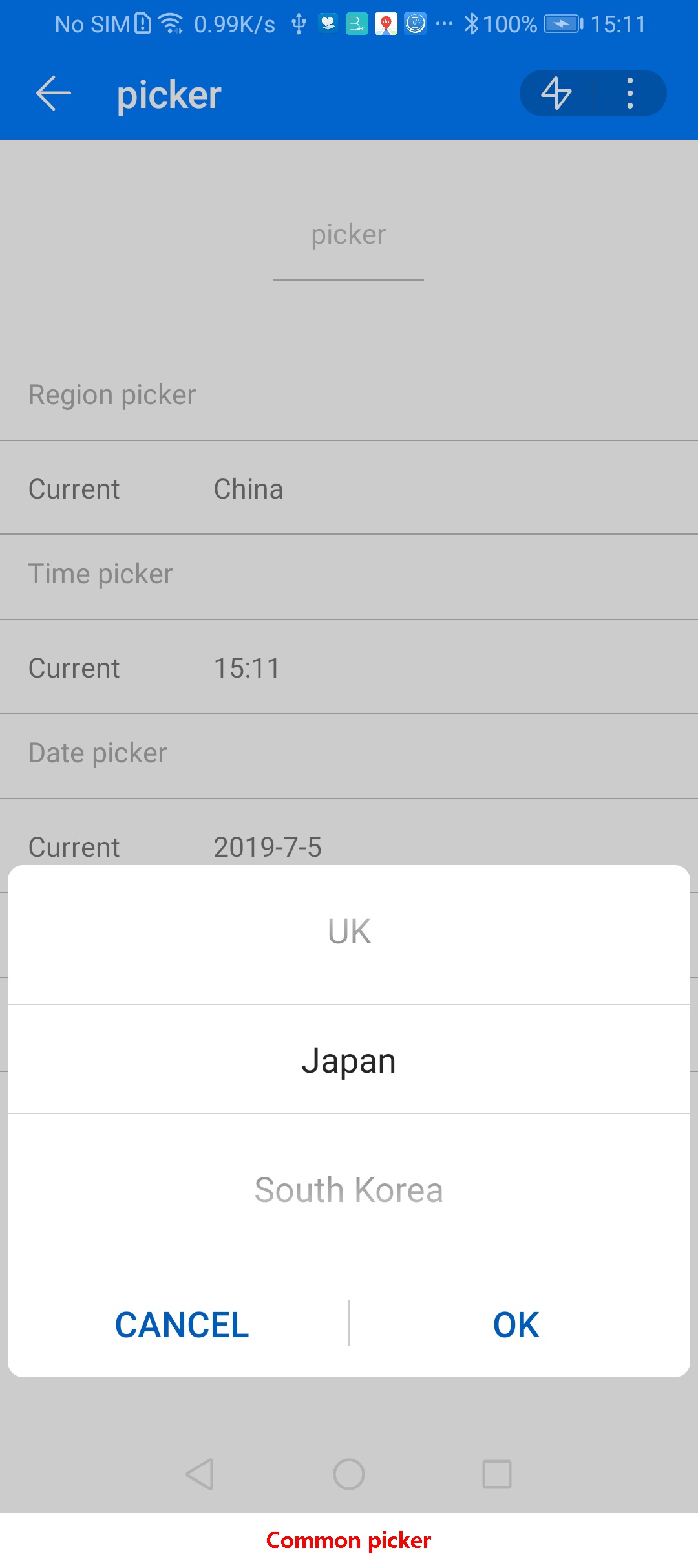
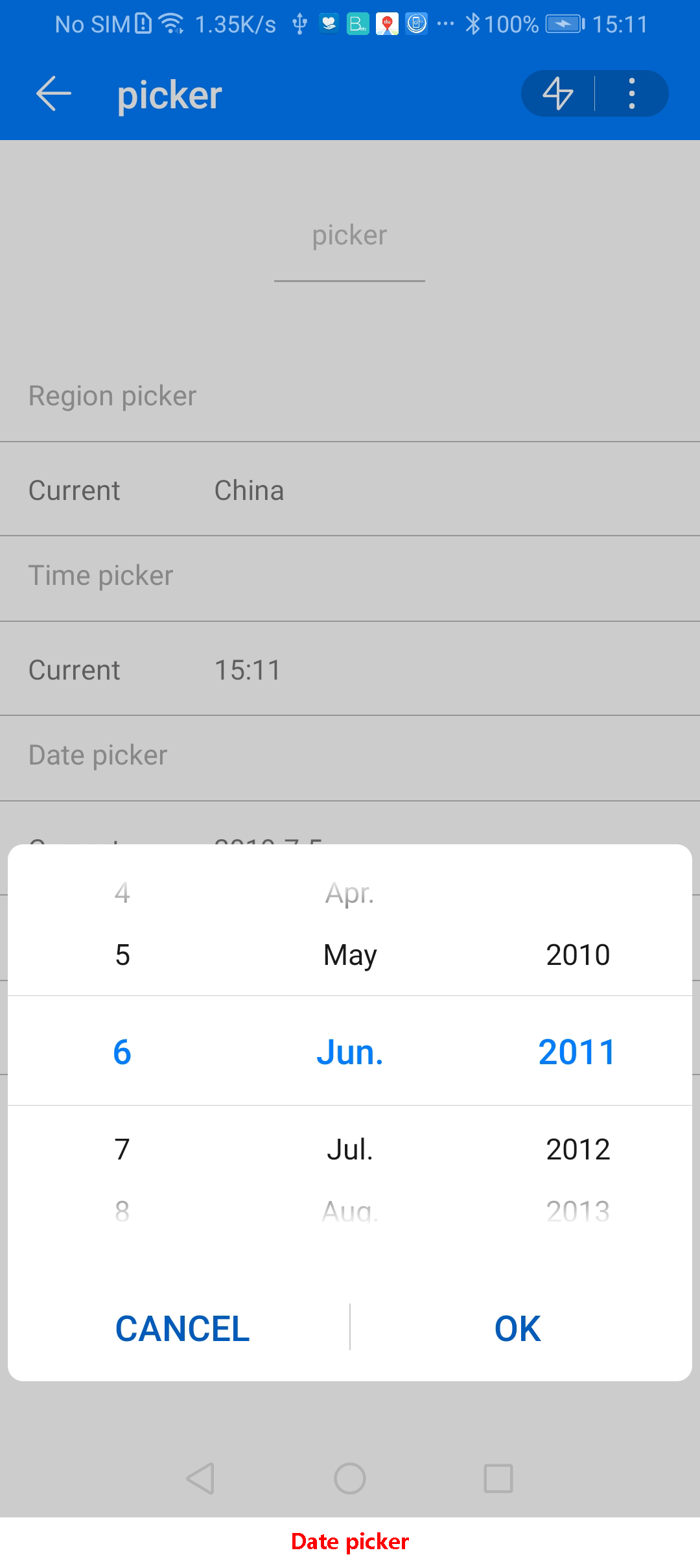
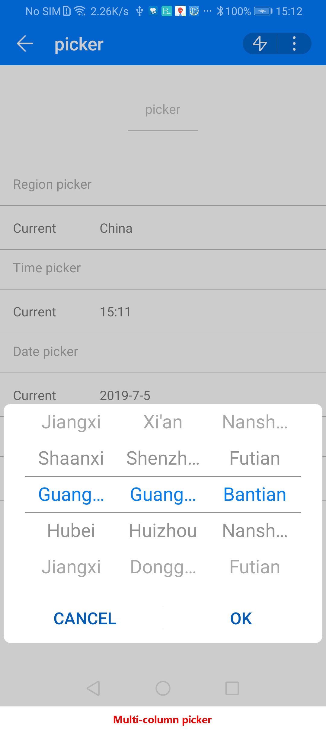
Supports four kinds of pickers, which are categorized by type (the type cannot be modified dynamically) as follows: common picker, date picker, time picker, and multi-column picker. The default type is common picker.
Application Scope
Item | Description |
|---|---|
Applicable devices | Mobile phones, tablets, Vision products, and telematics devices |
Applicable regions | Global |
Attributes
In addition to general attributes, the attributes listed in the following table are supported.
Common picker: type="text"
Attribute | Type | Default Value | Mandatory/Optional | Description |
|---|---|---|---|---|
range | array | - | Optional | Value range of a picker. |
selected | string | 0 | Optional | Default value of a picker. The value is the index of range. |
value | string | - | Optional | Value of a picker. |
Date picker: type="date"
Attribute | Type | Default Value | Mandatory/Optional | Description |
|---|---|---|---|---|
start | time | 1970-1-1 | Optional | Start date, in the format yyyy-(M)M-dd. |
end | time | 2100-12-31 | Optional | End date, in the format yyyy-(M)M-dd. |
selected | string | Current date. | Optional | Default value of a picker, in the format yyyy-(M)M-(d)d. |
value | string | - | Optional | Value of a picker. |
Time picker: type="time"
Attribute | Type | Default Value | Mandatory/Optional | Description |
|---|---|---|---|---|
selected | string | Current time. | Optional | Default value of a picker, in the format (h)h:(m)m. |
value | string | - | Optional | Value of a picker. |
Multi-column picker: type="multi-text" (unavailable to Vision products)
Attribute | Type | Default Value | Mandatory/Optional | Description |
|---|---|---|---|---|
range | array | - | Mandatory | Value range of a picker, which is a two-dimension array. |
selected | array | [0,0,0,0] | Optional | Array that consists of the indexes of the selected items in each column. An example is [0,1,2,1]. |
value | array | - | Optional | Array that consists of the values of the selected items in each column. |
Events
In addition to common events (excluding click and swipe), the following events are supported.
Event | Parameter | Triggering Condition |
|---|---|---|
change |
| A new value is selected by a picker. The newSelected parameter indicates an index). When type is set to date, the return value of month is the current month minus one month. |
columnchange | {column:0, newValue: "value1",newSelected: 2} | This event is used when the type parameter is set to multi-text.
|
cancel | - | This event is used when the type parameter is set to multi-text. This event is triggered when a user taps Cancel on a selection page. |
Sample Code
<template>
    <div class="container">
        <div class="page-title-wrap">
            <text class="page-title">{{componentName}}</text>
        </div>
        <div class="item-container">
            <text class="item-title">Area picker</text>
            <div class="item-content">
                <text class="label">Current choice</text>
                <picker class="picker" type="text" range="{{list}}" value="{{country}}"
                        onchange="getCountry" id="picker" selected="2"></picker>
            </div>
        </div>
        <div class="item-container">
            <text class="item-title">Time picker</text>
            <div class="item-content">
                <text class="label">Current choice</text>
                <picker class="picker" type="time" value="{{time}}" selected="05:20" onchange="getTime"></picker>
            </div>
        </div>
        <div class="item-container">
            <text class="item-title">Date picker</text>
            <div class="item-content">
                <text class="label">Current choice</text>
                <picker class="picker" type="date" start=2010-01-02 end=2020-12-31 value="{{date}}" selected="2011-6-6"
                        onchange="getDate"></picker>
            </div>
        </div>
<div class="item-container">
            <text class="item-title">Multi-column picker</text>
            <div class="item-content">
                <text class="label">Current choice</text>
                <picker class="picker" type="multi-text" range ="{{address}}" value="{{ addvalue }}" selected="{{addselected}}" onchange=" getAddress" oncolumnchange="getColumdata" oncancel="cancelselect"></picker>
            </div>
        </div>
        <input type="button" class="btn" style="margin-top: 50px;" value="Call the region picker through code." onclick="show"/>
    </div>
</template>
<style>
    .item-container {
        margin-top: 20px;
        flex-direction: column;
    }
    .item-title {
        padding-left: 30px;
        padding-bottom: 30px;
        padding-top: 30px;
        border-bottom-width: 1px;
        border-color: #bbbbbb;
        color: #aaaaaa;
    }
    .item-content {
        background-color: #ffffff;
        border-bottom-width: 1px;
        border-color: #bbbbbb;
        padding-left: 30px;
        padding-right: 30px;
    }
    .picker {
        flex: 1;
    }
    .label {
        padding-bottom: 30px;
        padding-top: 30px;
        padding-right: 100px;
    }
    .input-text {
        height: 80px;
        line-height: 80px;
        padding-left: 30px;
        padding-right: 30px;
        margin-left: 30px;
        margin-right: 30px;
        border-top-width: 1px;
        border-bottom-width: 1px;
        border-color: #999999;
        font-size: 30px;
        background-color: #ffffff;
    }
</style>
<script>
    export default {
        data: {
            componentName: 'picker',
            list: ['China', 'UK', 'Japan', 'ROK'],
            country: 'China',
            address:[['Guangdong','Hubei','Jiangxi','Shaanxi'],['Shenzhen','Guangzhou','Huizhou','Dongguan','Xianyang'],['Nanshan','Futian','Bantian']],
            addselected:[0,1,2],
            addvalue:['Guangdong','Guangzhou','Bantian'],
            time: '',
            date: ''
        },
        onInit: function () {
            var date = new Date();
            var Y = date.getFullYear();
            var M = date.getMonth() + 1;
            var D = date.getDate();
            var H = date.getHours();
            var m = date.getMinutes();
            this.date = Y + '-' + M + '-' + D;
            this.time = H + ':' + m;
            this.$page.setTitleBar({text: 'picker'})
        },
        getCountry: function (e) {
            this.country = e.newValue;
        },
        getTime: function (e) {
            this.time = e.hour + ':' + e.minute;
        },
        getDate: function (e) {
            this.date = e.year + '-' + (e.month + 1) + '-' + e.day;
        },
        getAddress: function (e) {
           this.addvalue=e.newValue;
        },
        getColumdata: function (e) {
           var colum=e.column;
           var newValue=e.newValue;
           var newSelected=e.newSelected;
           console.log("getColumdata colum="+  colum);
           console.log("getColumdata newSelected="+  newSelected);
           console.log("getColumdata newValue="+  newValue);
           if(colum==1 && newValue=='Shenzhen'){
              this.address=[['Guangdong','Hubei','Jiangxi','Shaanxi'],['Baoji','Weinan','Hancheng','Xianyang'],['Shenzhen1','Shenzhen2','Shenzhen3','Shenzhen4']];
           }
        },
        cancelselect: function (e) {
          console.log("cancelselect");
        },
        show: function () {
            this.$element('picker').show();
        }
    }
</script>
The following figures show the final effect.
Version Change History
Version | Date | Description |
|---|---|---|
1010 | 2018-04-20 |
|