Overview
Functions as a subelement of tabs. It provides the area for displaying the tab content at the same height as the tabs element excluding the title, and its subelements are arranged horizontally in the area.
Application Scope
Item | Description |
|---|---|
Applicable devices | Mobile phones, tablets, and telematics devices |
Applicable regions | Global |
Attributes
In addition to general attributes, the attribute listed in the following table is supported.
Attribute | Type | Default Value | Mandatory | Description |
|---|---|---|---|---|
scrollable (1040+) | boolean | true | No | Indicates whether a user can swipe the page to switch among tab pages. If this attribute is set to false, the tab-bar element is also required to implement switches among tab pages. |
Sample Code
<template>
  <div class="container">
    <div class="page-title-wrap">
      <text class="page-title">{{componentName}}</text>
    </div>
    <input type="button" value="Switch tab-content's scrollable value" onclick="changeTabcontentScrollable" />

    <!--tab component-->
    <tabs class="tabs" onchange="changeTabactive" index="2">
      <tab-bar class="tab-bar">
        <text class="tab-text">basic</text>
        <text class="tab-text">form</text>
        <text class="tab-text">list</text>
      </tab-bar>

      <tab-content class="tab-content" scrollable="{{scrollable}}">
        <!--basic component-->
        <div class="item-container">
          <div class="item-content">
            <text class="item-title">a</text>
            <a style="color: #09ba07;" href="https://www.huawei.com/">Huawei official website</a>
          </div>

          <div class="item-content">
            <text class="item-title">image</text>
            <image src="/Common/img/xmad.jpg" class="image"></image>
          </div>

          <div class="item-content">
            <text class="item-title">progress type="horizontal"</text>
            <progress percent="20" style="margin-top: 20px;color:#0faeff;stroke-width:10px"></progress>
          </div>

          <div class="item-content">
            <text class="item-title">progress type="circular"</text>
            <progress class="circular" type="circular" style="margin-top: 20px;color:#A020F0;"></progress>
          </div>

          <div class="item-content">
            <text class="item-title">text</text>
            <text style="color: #f76160">I am text</text>
          </div>

          <div class="item-content">
            <text class="item-title">span</text>
            <text>
              <span style="color: #09ba07">I am span</span>
            </text>
          </div>
        </div>

        <!--form component-->
        <div class="item-container">
          <div class="item-content">
            <text class="item-title">input</text>
            <input class="item-input" placeholder="I am input" />
          </div>

          <div class="item-content">
            <text class="item-title">picker</text>
            <picker class="item-picker" type="time" value="{{time}}" onchange="setTime"></picker>
          </div>

          <div class="item-content">
            <text class="item-title">slider</text>
            <slider class="item-slider" style="selected-color:#0faeff" min="50" max="200" value="100" />
          </div>
        </div>

        <!--list component-->
        <div class="item-container">
          <input type="button" class="btn" value="back to the first item" onclick="goIndex" />
          <list class="list" onscrollbottom="scrollbottom" id="list" scrollpage="{{scrollPage}}">
            <list-item type="listItem" class="item item_color" for="{{list_data}}">
              <text class="txt">{{$item.name}}--{{$idx}}</text>
            </list-item>
            <list-item type="loadMore" class="load-more" if="{{loadMore}}">
              <progress type="circular"></progress>
              <text>load more</text>
            </list-item>
          </list>
        </div>
      </tab-content>
    </tabs>
  </div>
</template>

<style>
    .container {
      flex: 1;
      flex-direction: column;
    }
    .page-title-wrap {
      padding-top: 50px;
      padding-bottom: 80px;
      justify-content: center;
    }
    .page-title {
      padding-top: 30px;
      padding-bottom: 30px;
      padding-left: 40px;
      padding-right: 40px;
      border-color: #bbbbbb;
      color: #bbbbbb;
      border-bottom-width: 2px;
    }
    .tabs {
      flex: 1;
      margin-top: 20px;
      margin-right: 30px;
      margin-left: 30px;
      background-color: #ffffff;
    }

    .tab-content {
      flex: 1;
    }

    .tab-bar {
      height: 100px;
      border-color: #bbbbbb;
      color: #bbbbbb;
      border-bottom-width: 1px;
    }

    .tab-text {
      width: 300px;
      text-align: center;
    }

    .tab-text:active {
      color: #f76160;
    }

    .item-container {
      padding-top: 30px;
      padding-left: 30px;
      padding-right: 30px;
      flex-direction: column;
    }

    .item-content {
      flex-direction: column;
      padding-bottom: 30px;
    }

    .item-title {
      padding-top: 50px;
      padding-bottom: 20px;
      color: #aaaaaa;
    }

    .item-input {
      height: 80px;
      margin-right: 60px;
      margin-left: 60px;
      padding: 20px;
      border-width: 1px;
      border-color: #bbbbbb;
      border-radius: 5px;
      font-size: 30px;
    }

    .item-picker {
      margin-right: 60px;
      margin-left: 60px;
      padding: 20px;
      border-width: 1px;
      border-color: #bbbbbb;
      border-radius: 5px;
      flex: 1;
    }

    .item-slider {
      padding: 20px;
    }

    .circular {
      width: 40px;
      height: 40px;
    }

    .list {
      flex: 1;
    }

    .load-more {
      justify-content: center;
      align-items: center;
      height: 100px;
    }

    .item {
      height: 150px;
      align-items: center;
      justify-content: center;
      margin-bottom: 15px;
    }

    .item_color {
      background-color: #f76160;
    }

    btn:disabled {
      background-color: #008000;
    }
</style>

<script>
    import prompt from '@system.prompt'

    export default {
        data: {
            scrollable: true,
            componentName: 'tabs',
            time: '',
            loadMore: true,
            scrollPage: false,
            btndisabled: false,
            list_data: [{ name: 'A' }, { name: 'B' }, { name: 'C' }, { name: 'D' }, { name: 'E' }, { name: 'F' }]
        },
        onInit: function () {
            this.$page.setTitleBar({ text: 'tab-content' })
            // initial time
            this.time = new Date().getHours() + ':' + new Date().getMinutes()
        },
        changeTabcontentScrollable: function () {
            this.scrollable = !this.scrollable
        },
        changeTabactive: function (e) {
            prompt.showToast({
                message: "the playing page number is " + e.index + "  "
            })
            // switch tab
            console.log('----------switch tab: ' + e.index)
        },
        setTime: function (e) {
            // After select time picker,set time
            this.time = e.hour + ':' + e.minute
        },
        scrollbottom: function () {
            var that = this
            // list scroll to bottom
            setTimeout(function () {
                that.list_data = that.list_data.concat([{ name: 'A' }, { name: 'B' }, { name: 'C' }, { name: 'D' }, { name: 'E' }, { name: 'F' }])
            }, 1000)
        },
        goIndex: function () {
            // List scrolls to the specified index position
            this.$element('list').scrollTo({ index: 0, smooth: true })
        }
    }
</script>
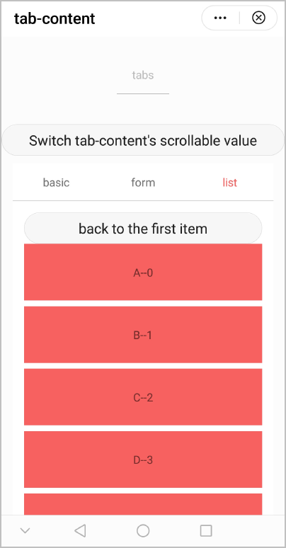
The following figure shows the final effect.