Application Scope
Item | Description |
|---|---|
Applicable devices | Mobile phones, tablets, Vision products, and telematics devices |
Applicable regions | Global |
Attributes
In addition to general attributes, the attribute listed in the following table is supported.
Attribute | Type | Default Value | Mandatory/Optional | Description |
|---|---|---|---|---|
checked | boolean | false | Optional | The checked pseudo-class can be triggered when the value is true. |
Styles
The active pseudo-class is supported. In addition to common styles, the styles listed in the following table are supported.
Style | Type | Default Value | Mandatory/Optional | Description |
|---|---|---|---|---|
thumb-color (1070+) | color | - | Optional | Slider color. |
track-color (1070+) | color | - | Optional | Guide rail color. |
Events
In addition to common events, the event listed in the following table is supported.
Event | Parameter | Triggering Condition |
|---|---|---|
change | {checked:checkedValue} | The toggle state changes between checked and unchecked. |
Sample Code
<template>
    <div class="container">
        <div class="page-title-wrap">
            <text class="page-title">{{componentName}}</text>
        </div>
        <div class="item-container">
            <text class="item-title">default style</text>
            <div class="item-content">
                <switch checked="true" class="switch"></switch>
                <switch checked="false" class="switch"></switch>
            </div>
        </div>
        <div class="item-container">
            <text class="item-title">recommended display style</text>
            <div class="switch-wrap">
                <div class="switch-content border-bottom">
                    <text class="label">on</text>
                    <switch checked="true" class="switch"></switch>
                </div>
                <div class="switch-content">
                    <text class="label">off</text>
                    <switch checked="false" class="switch"></switch>
                </div>
            </div>
        </div>
        <div class="item-container">
             <text class="item-title">Switch slide and slide ball customization</text>
            <div class="switch-wrap">
                <div class="switch-content border-bottom">
                    <text class="label">modify thumb-color</text>
                    <switch checked="true" style="thumb-color:#ff0000" class="switch"></switch>
                </div>
                <div class="switch-content">
                    <text class="label">modify rack-color</text>
                    <switch class="switch" style="track-color:#00FF00"></switch>
                </div>
                <div class="switch-content">
                    <text class="label">Modify slide and ball color at the same time</text>
                    <switch class="switch" style="thumb-color:#13ca22;track-color:#ff00ff"></switch>
                </div>
            </div>
        </div>
    </div>
</template>
<script>
    export default {
        private: {
            componentName: 'switch'
        }
    }
</script>
<style>
    .container {
        flex: 1;
        flex-direction: column;
    }
    .page-title-wrap {
        padding-top: 50px;
        padding-bottom: 80px;
        justify-content: center;
    }
    .page-title {
        padding-top: 30px;
        padding-bottom: 30px;
        padding-left: 40px;
        padding-right: 40px;
        border-color: #bbbbbb;
        color: #bbbbbb;
        border-bottom-width: 2px;
    }
    .item-container {
        margin-top: 20px;
        margin-bottom: 30px;
        flex-direction: column;
    }
    .item-title {
        padding-left: 30px;
        padding-bottom: 30px;
        padding-top: 30px;
        border-bottom-width: 1px;
        border-color: #bbbbbb;
        color: #aaaaaa;
    }
    .item-content {
        background-color: #ffffff;
        border-bottom-width: 1px;
        border-color: #bbbbbb;
        padding-left: 30px;
        padding-right: 30px;
    }
    .switch-wrap {
        border-color: #bbbbbb;
        padding-left: 40px;
        border-bottom-width: 1px;
        border-top-width: 1px;
        background-color: #ffffff;
        flex-direction: column;
    }
    .switch {
        margin-right: 30px;
    }
    .switch-content {
        padding-right: 50px;
    }
    .label {
        flex: 1;
        height: 100px;
    }
    .border-bottom {
        border-color: #bbbbbb;
        border-bottom-width: 1px;
    }
</style>
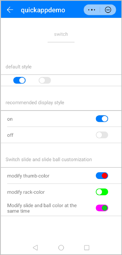
The following figure shows the final effect.