API Declaration
Add the following configuration to the features attribute in the manifest.json file:
{"name": "system.prompt"} Module Import
Add the following configuration to the script element on the page where the API will be called:
import prompt from '@system.prompt'
Or
var prompt = require("@system.prompt") Application Scope
Item | Description |
|---|---|
Applicable devices | Mobile phones, tablets, Vision products, and telematics devices |
Applicable regions | Global |
Definition
API | Description |
|---|---|
Displays a toast. | |
Displays a pop-up. | |
Displays the context menu. | |
Displays a loading pop-up. | |
Closes a loading pop-up. |
[h2]prompt.showToast(OBJECT)
Description
Displays a toast.
OBJECT
Parameter | Type | Mandatory | Description |
|---|---|---|---|
message | string | Yes | Text to be displayed. |
duration | number | No | Toast display duration. The value 0 indicates a short period, and the value 1 indicates a long period. The default value is 0. A short period and a long period last approximately 2000 milliseconds and 3500 milliseconds, respectively. A value greater than 1 indicates the custom toast display duration. The unit is millisecond. If the configured duration exceeds 10,000 milliseconds, the value will revert to 10,000 milliseconds. |
image (1020+) | uri | No | To-be-displayed local image path in this app. |
gravity (1020+) | string | No | The value can be bottom, right, left, center, or top. By default, the system setting is used. This parameter is not supported in HarmonyOS 2.0, Android Q, or their later versions. |
Sample code
prompt.showToast({
    message:'message',
    duration:"100000",
    image:"/Common/logo.png",
    gravity: 'center'
})
[h2]prompt.showDialog(OBJECT)
Description
Displays a pop-up.
OBJECT
Parameter | Type | Mandatory | Description |
|---|---|---|---|
title | string | No | Title. |
message | string | No | Content. |
buttons | array | No | Button array. The button structure is as follows: {text:'text',color:'#333333'}. Colors are optional. The first item of buttons is a positive button; the second item (if any) is a negative button; and the third item (if any) is a neutral button. Up to three buttons can be configured. |
success | function | No | Callback upon success. |
cancel | function | No | Callback upon cancellation. |
complete | function | No | Callback upon completion. |
Parameters returned by success
Parameter | Type | Description |
|---|---|---|
index | number | Sequence number of the selected button in the buttons array. |
Sample code
prompt.showDialog({
    title: 'title',
    message: 'message',
    buttons: [
    {
        text: 'OK',
        color: '#33dd44'
    },
    {
        text: 'Cancel',
        color: '#33dd44'
    }
    ],
    success: function (data) {
        console.log("handling callback",data);
    },
    cancel: function(){
        console.log("cancel");
    }
})
[h2]prompt.showContextMenu(OBJECT)
Description
Displays the context menu.
OBJECT
Parameter | Type | Mandatory | Description |
|---|---|---|---|
itemList | array | Yes | Text array of a menu item. |
itemColor | hexcolor | No | Color of a menu item. |
success | function | No | Callback upon success. |
cancel | function | No | Callback upon cancellation. |
complete | function | No | Callback upon completion. |
Parameters returned by success
Parameter | Type | Description |
|---|---|---|
index | number | Sequence number of the selected button in the itemList array. |
Sample code
prompt.showContextMenu({
  itemList: ['item1', 'item2'],
  itemColor: '#ff33ff',
  success: function(data) {
    console.log("handling callback");
  },
   cancel: function() {
    console.log("user cancel=");
  }
})
[h2]prompt.showLoading(OBJECT) (1075+)
Description
Displays a loading pop-up.

OBJECT
Parameter | Type | Default Value | Mandatory | Description |
|---|---|---|---|---|
message | string | Loading... | No | Message displayed in a loading pop-up. |
loadingColor | string | #CACACA | No | Color of the loading animation. |
mask | boolean | true | No | Indicates whether to use a mask to prevent a touch event from passing through the pop-up. |
Sample code
prompt.showLoading({
    message: 'message'
    loadingColor: 'blue',
    mask: false
})
[h2]prompt.hideLoading() (1075+)
Description
Closes a loading pop-up.
Sample code
prompt.hideLoading()
Demo
<template>
  <div class="container">
    <div class="item-container">
      <input type="button" class="btn" onclick="showToast" value="Show a toast" />
      <input type="button" class="btn" onclick="showDialog" value="Show a dialog" />
      <input type="button" class="btn" onclick="showContextMenu" value="Show the context menu" />
      <input type="button" class="btn" onclick="showLoading" value="Show a loading " />
      <input type="button" class="btn" onclick="hideLoading" value="Close a loading " />
    </div>
  </div>
</template>

<style>
    .container {
    flex-direction: column;
    justify-content: center;
    align-items: center;
  }
  .item-container {
    margin-bottom: 50px;
    margin-right: 60px;
    margin-left: 60px;
    flex-direction: column;
  }
   .btn {
    height: 80px;
    width: 400px;
    text-align: center;
    border-radius: 5px;
    margin-right: 60px;
    margin-left: 60px;
    margin-bottom: 50px;
    color: #ffffff;
    font-size: 30px;
    background-color: #0faeff;
  }
</style>

<script>
  import prompt from '@system.prompt'
  export default {
    data: {
      componentName: 'Pop-up',
      componentData: {},
    },
    onInit: function () {
      this.$page.setTitleBar({ text: 'Pop-up' })
      this.componentData = this.$t('message.interface.interaction.prompt')
    },
    showToast: function () {
      prompt.showToast({
        message: 'logo',
        duration:"100000",
        image:"/Common/logo.png",
        gravity: 'center'
      })
    },
    showDialog: function () {
      let that = this
      prompt.showDialog({
        title: 'Pop-up Title',
        message: 'Description such as pop-up content, current status, information, and solutions should be controlled in three lines.',
        buttons:  [
          {
            text: 'OK',
            color: '#0faeff'
          },{
            text: 'Cancel',
          },{
            text: 'Ignore'
          }
        ],
        success: function (ret) {
          prompt.showToast({
            message: 'Success callback: selected button serial number---' + ret.index
          })
        },
        cancel: function () {
          prompt.showToast({
            message: 'Cancel callback'
          })
        },
        complete: function () {
         prompt.showToast({
           message: 'Execution completed',
           duration: 2000,
           gravity: 'center'
         })
        }
      })
    },
    showContextMenu: function () {
      let that = this
      prompt.showContextMenu({
        itemList: ['item0', 'item1', 'item2', 'item3', 'item4', 'item5'],
        itemColor: '#ff33ff',
        success: function (ret) {
          prompt.showToast({
            message: 'Success callback: selected button serial number---' + ret.index
          })
        },
        cancel: function (ret) {
          prompt.showToast({
            message: 'Cancel callback'
          })
        },
        complete: function () {
            console.log("Callback after the execution completed");
        }
      })
    },
    showLoading: function () {
      prompt.showLoading({
          message: 'loading',
          loadingColor: 'blue',
          mask: false
      })
    },
    hideLoading: function () {
      prompt.hideLoading();
      console.log("Loading pop-up is closed");
    }
  }
</script>
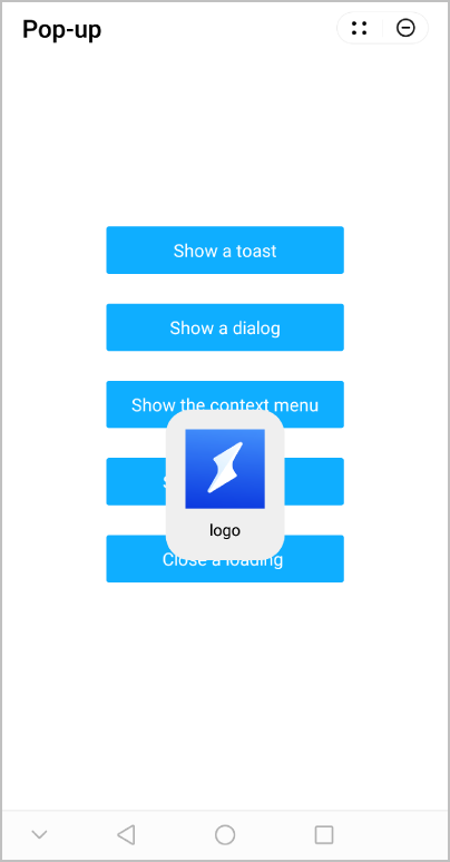
The following figure shows the final effect.