Overview
Grids are widely adopted in app development. They form an orderly and neat grid layout through intersecting horizontal and vertical lines. Grids are suitable for displaying various types of data such as images, media files, and shopping items. During grid scrolling, the child components incur performance costs in measurement and rendering.
Performance optimization is crucial in high-frequency grid scenarios, focusing on accelerating rendering speed, improving scrolling frame rates, and reducing memory usage, all of which significantly enhance app smoothness and user experience. You can use the ScrollComponents library to create smooth scrolling grids. The library provides optimization capabilities such as component reuse, lazy loading, and reuse pool sharing, and supports pre-creation and preloading, greatly reducing the performance optimization cost. For details about the implementation and best practices, see Implementing the Grid Layout Based on ScrollComponents.
When implementing the scrollable layout shown in the following figure, you may use columnStart/columnEnd to set the number of rows and columns occupied by the child components to implement irregular layout.

The use of columnStart or columnEnd may cause performance problems in the following scenarios:
- Deleting or dragging a GridItem to change its position.
- Using scrollToIndex to scroll to the specified GridItem.
If there are multiple grid items in a Grid and columnStart/columnEnd or rowStart/rowEnd is used to set the GridItem size, performance problems may occur. In this case, you are advised to use GridLayoutOptions to improve performance. In the case of columnStart/columnEnd or rowStart/rowEnd layouts, when scrollToIndex is used to swipe to specify an index, Grid traverses grid items to locate the position. By contrast, the GridLayoutOptions layout proves to be more efficient because the position is located through calculation. In this case, you can use the GridLayoutOptions layout together with rowsTemplate or columnsTemplate to replace columnStart/columnEnd to control the situation where GridItem occupies multiple columns.
The following describes the scenario where scrollToIndex is used to swipe to a specified position in Grid. In this case, the negative example where columnStart/columnEnd is used to set an irregular grid layout and the positive example where GridLayoutOption is used are compared. The sample code is as follows:
Negative example: Use columnStart/columnEnd to set the GridItem size.
// Import performance dot modules
import { hiTraceMeter } from '@kit.PerformanceAnalysisKit';

@Component
struct TextItem {
  @State item: string = '';

  build() {
    Text(this.item)
      .fontSize(16)
      .backgroundColor(0xF9CF93)
      .width('100%')
      .height(80)
      .textAlign(TextAlign.Center)
  }

  aboutToAppear() {
    // Finish the task
    hiTraceMeter.finishTrace('useColumnStartColumnEnd', 1);
  }
}

class MyDataSource implements IDataSource {
  private dataArray: string[] = [];

  public pushData(data: string): void {
    this.dataArray.push(data);
  }

  public totalCount(): number {
    return this.dataArray.length;
  }

  public getData(index: number): string {
    return this.dataArray[index];
  }

  registerDataChangeListener(listener: DataChangeListener): void {
  }

  unregisterDataChangeListener(listener: DataChangeListener): void {
  }
}

@Entry
@Component
struct GridExample {
  private datasource: MyDataSource = new MyDataSource();
  scroller: Scroller = new Scroller();

  aboutToAppear() {
    for (let i = 1; i <= 2000; i++) {
      this.datasource.pushData(i + '');
    }
  }

  build() {
    Column({ space: 5 }) {
      Text('Use columnStart and columnEnd to set the size of a GridItem').fontColor(0xCCCCCC).fontSize(9).width('90%')
      Grid(this.scroller) {
        LazyForEach(this.datasource, (item: string, index: number) => {
          if ((index % 4) === 0) {
            GridItem() {
              TextItem({ item: item })
            }
            .columnStart(0).columnEnd(2)
          } else {
            GridItem() {
              TextItem({ item: item })
            }
          }
        }, (item: string) => item)
      }
      .columnsTemplate('1fr 1fr 1fr')
      .columnsGap(10)
      .rowsGap(10)
      .width('90%')
      .height('40%')

      Button('scrollToIndex:1900').onClick(() => {
        // Start some tasks.
        hiTraceMeter.startTrace('useColumnStartColumnEnd', 1);
        this.scroller.scrollToIndex(1900);
      })
    }.width('100%')
    .margin({ top: 5 })
  }
}
Positive example: Use GridLayoutOptions to set the GridItem size. The layout effect is the same as that in the negative example.
// Import performance dot modules
import { hiTraceMeter } from '@kit.PerformanceAnalysisKit';

@Component
struct TextItem {
  @State item: string = '';

  build() {
    Text(this.item)
      .fontSize(16)
      .backgroundColor(0xF9CF93)
      .width('100%')
      .height(80)
      .textAlign(TextAlign.Center)
  }

  aboutToAppear() {
    // Finish the task
    hiTraceMeter.finishTrace('useGridLayoutOptions', 1);
  }
}

class MyDataSource implements IDataSource {
  private dataArray: string[] = [];

  public pushData(data: string): void {
    this.dataArray.push(data);
  }

  public totalCount(): number {
    return this.dataArray.length;
  }

  public getData(index: number): string {
    return this.dataArray[index];
  }

  registerDataChangeListener(listener: DataChangeListener): void {
  }

  unregisterDataChangeListener(listener: DataChangeListener): void {
  }
}

@Entry
@Component
struct GridExample2 {
  private datasource: MyDataSource = new MyDataSource();
  scroller: Scroller = new Scroller();
  private irregularData: number[] = [];
  layoutOptions: GridLayoutOptions = {
    regularSize: [1, 1],
    irregularIndexes: this.irregularData,
  };

  aboutToAppear() {
    for (let i = 1; i <= 2000; i++) {
      this.datasource.pushData(i + '');
      if ((i - 1) % 4 === 0) {
        this.irregularData.push(i - 1);
      }
    }
  }

  build() {
    Column({ space: 5 }) {
      Text('Use GridLayoutOptions to set the size of a GridItem')
        .fontColor(0xCCCCCC)
        .fontSize(9)
        .width('90%')
      Grid(this.scroller, this.layoutOptions) {
        LazyForEach(this.datasource, (item: string, index: number) => {
          GridItem() {
            TextItem({ item: item })
          }
        }, (item: string) => item)
      }
      .columnsTemplate('1fr 1fr 1fr')
      .columnsGap(10)
      .rowsGap(10)
      .width('90%')
      .height('40%')

      Button('scrollToIndex:1900').onClick(() => {
        // Start some tasks.
        hiTraceMeter.startTrace('useGridLayoutOptions', 1);
        this.scroller.scrollToIndex(1900);
      })
    }.width('100%')
    .margin({ top: 5 })
  }
} The positive and negative examples use the same procedure to collect and compare the performance parameters during the redirection.
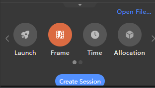
- Open the Profiler tool, connect to the device, and select the target app process.

- Select Frame and tap Create Session to start data collection.
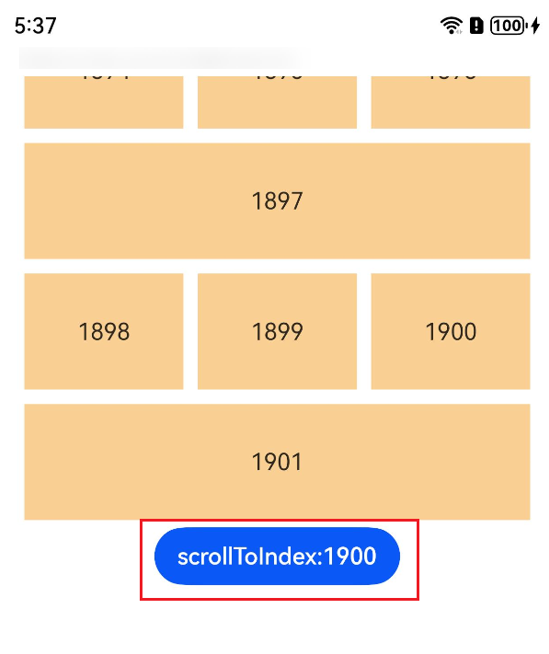
- Use startTrace to start performance tracing by tapping the button before calling scrollToIndex.
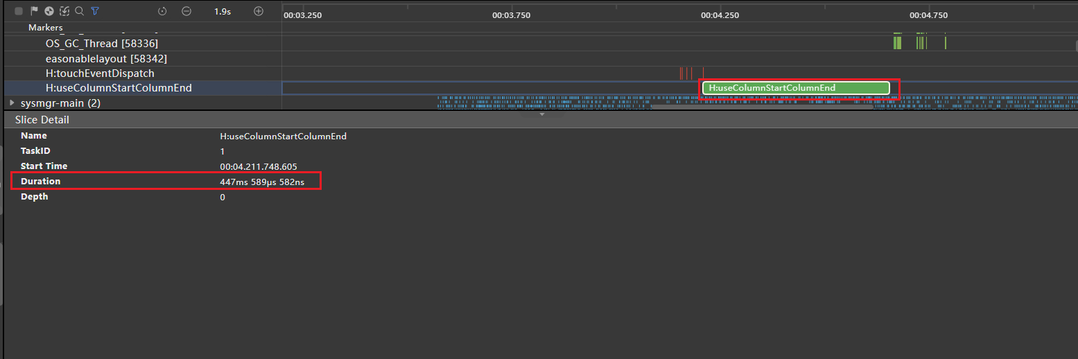
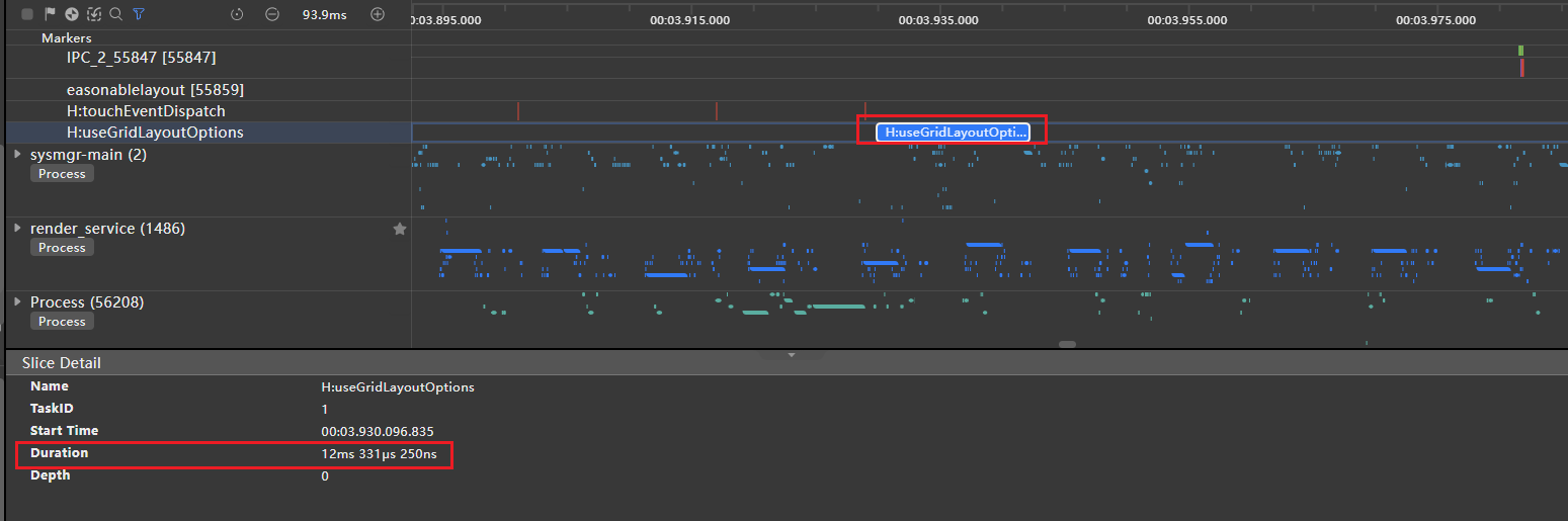
- View the custom tracing event of the target app process, including useColumnStartColumnEnd defined in the negative example code and the trace diagram under useGridLayoutOptions in the positive example code.

Tracing event description: When Grid finds the specified GridItem position and prepares to render the GridItem node, it enters the lifecycle callback aboutToAppear of the component GridItem and finishTrace is used to stop performance tracing. Use the startTrace tag to call scrollToIndex, and use the finishTrace tag to render the first GridItem node to compare the time consumption in the positive and negative examples. For details about performance tracing, see @ohos.hiTraceMeter (Performance Tracing).
[h2]Result Comparison
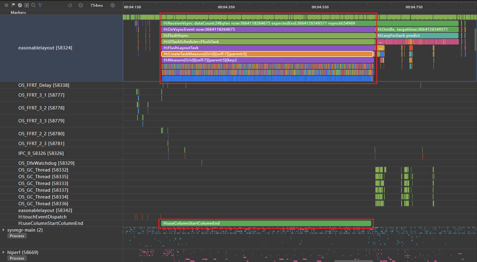
As shown in the following figure, columnStart and columnEnd are used to set the GridItem size. According to the custom tracing tag H:useColumnStartColumnEndGrid, it takes 447 ms to call scrollToIndex, find the specified index, and prepare for building the GridItem node.
As shown in Figure 3, GridLayoutOptions is used to set the GridItem size. The custom trace tag H:useGridLayoutOptions shows that the process from calling scrollToIndex to locating the specified index and preparing to build the GridItem node takes 12 ms.
According to the detailed trace analysis, a large number of H:Builder:BuildLazyItem tags exist in the H:useColumnStartColumnEndGrid trace tag period. This indicates that Grid traverses all indexes in sequence to find out the 1900th index.
In the example of using GridLayoutOptions, only one H:Builder:BuildLazyItem tag is recorded within the time period marked by the H:useGridLayoutOptions trace tag. This indicates that Grid finds the 1900th index at a time.

In the same layout, if columnStart and columnEnd are used to set the GridItem size, Grid traverses GridItem nodes in sequence when scrollToIndex is used to search for a specified index. Therefore, the search process takes a rather long time. However, if GridLayoutOptions is used to set the GridItem size, the specified index is found at a time, which is certainly more time-efficient. Therefore, using GridLayoutOptions to set the GridItem size can effectively shorten the loading time and improve app performance.