Overview
In terms of basic functions, different tab navigation modes have different UI styles based on different product forms. This section introduces the implementation of multiple navigation styles.
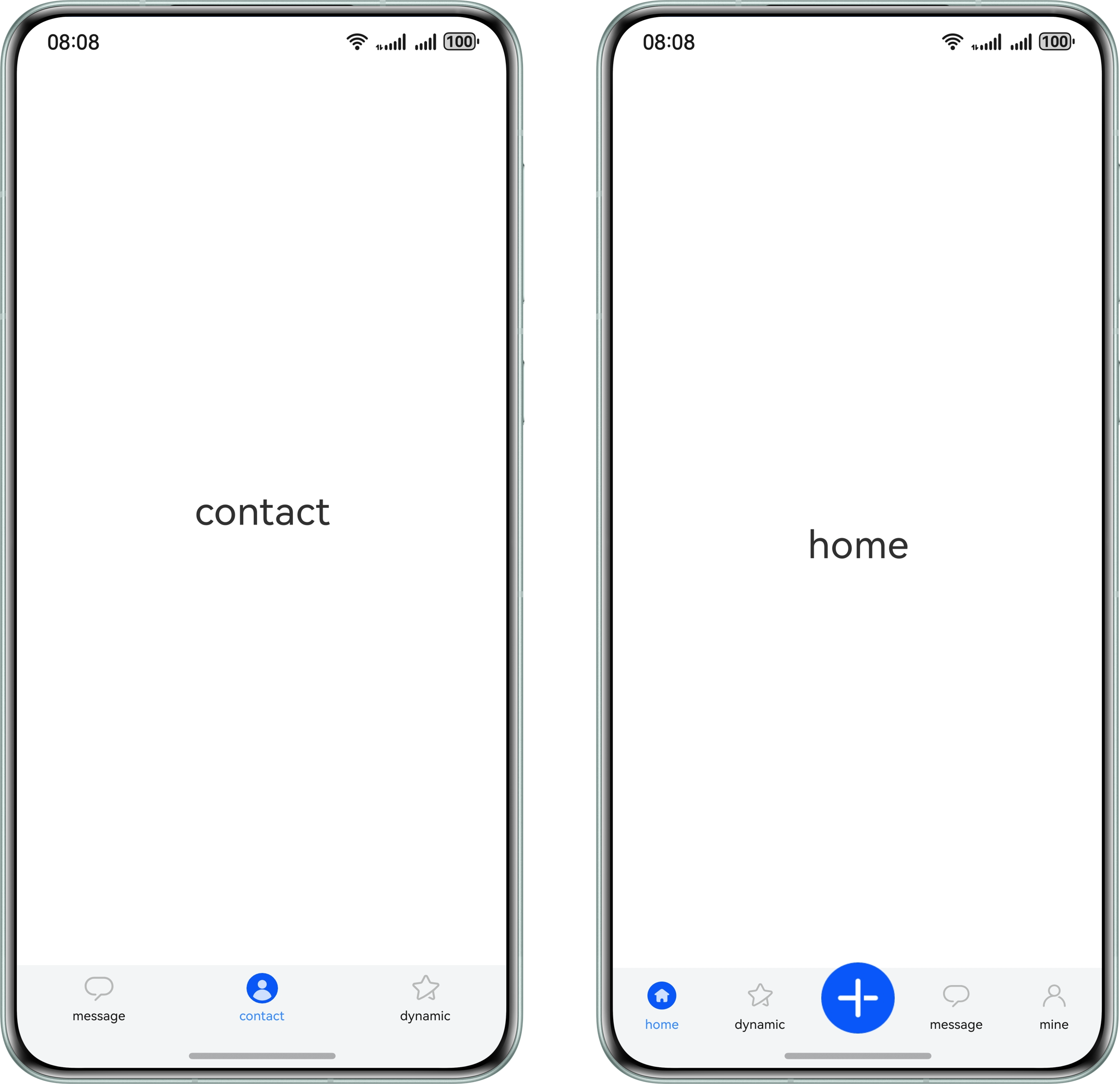
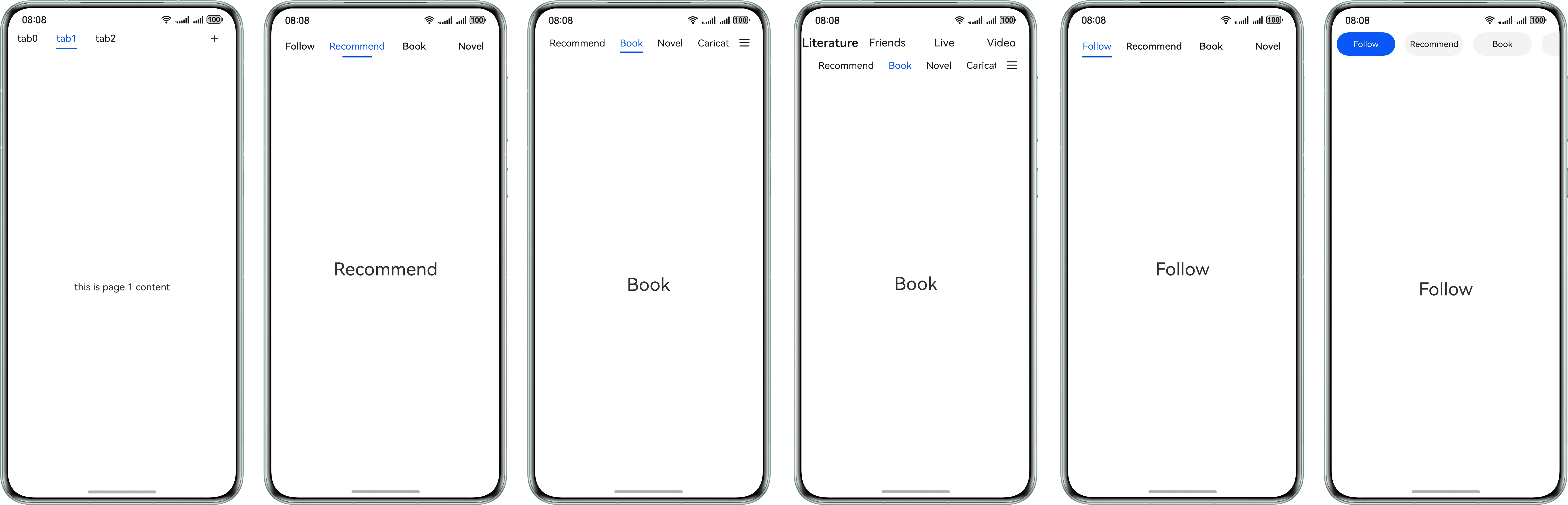
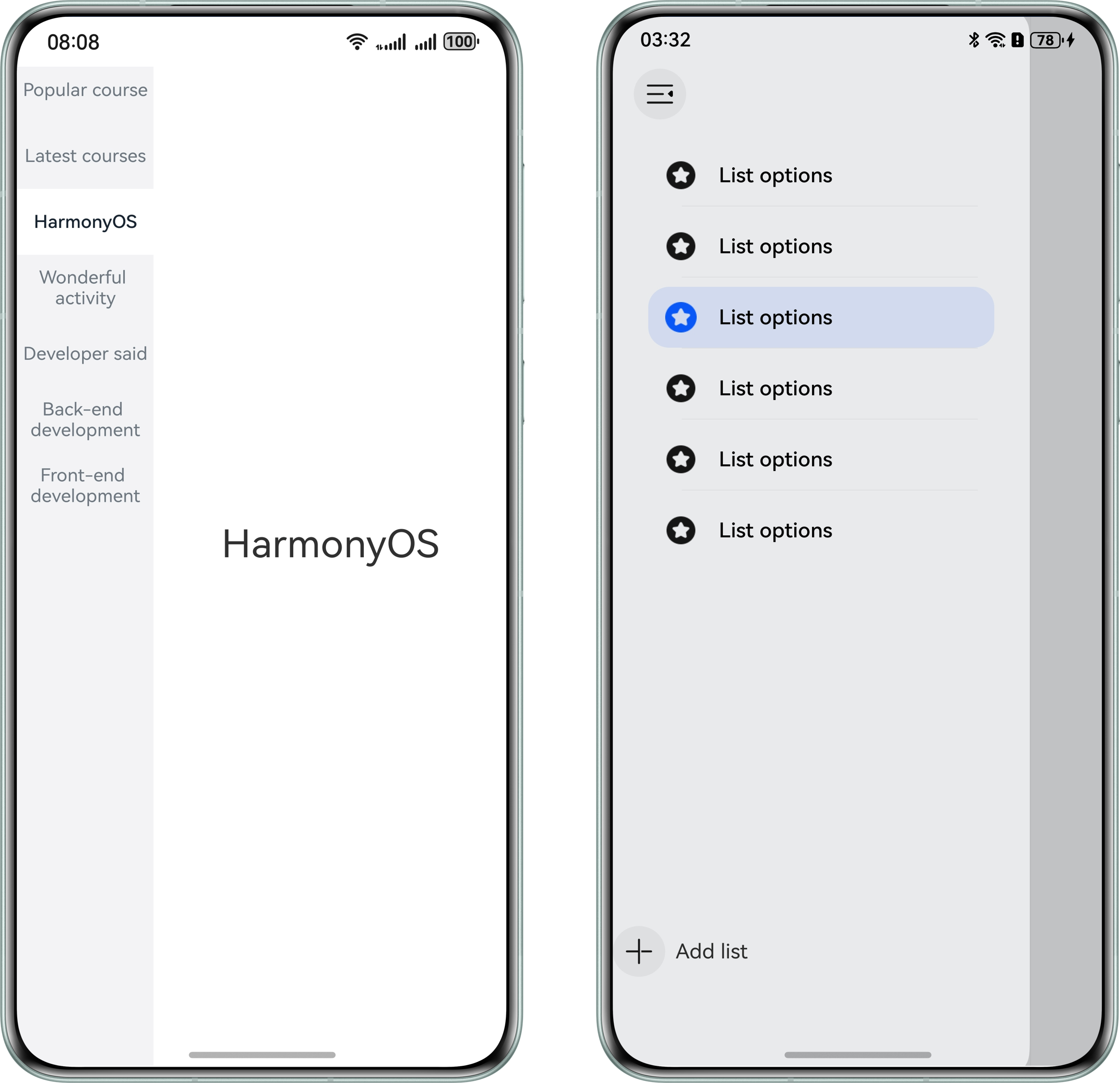
This following provides the implementation solution based on the tab navigation effects of common apps. The navigation effects of different tab pages are as follows.
[h2]Basic Bottom Navigation
The basic bottom navigation is a common navigation style. It is generally displayed in the form of icons and texts.
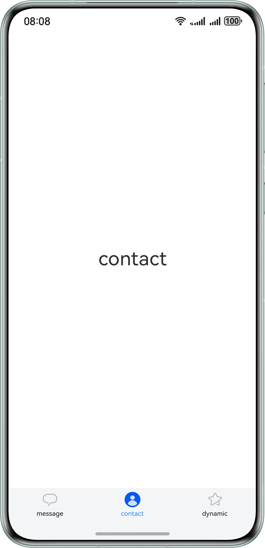
- Use the Tabs component and set barPosition to BarPosition.End to control the bottom display of the navigation bar. Nest the tabContentBuilder custom component in the Tabs component.
build() { Tabs({ barPosition: BarPosition.End, controller: this.tabsController }) { this.tabContentBuilder($r('app.string.message'), Constants.TAB_INDEX_ZERO, $r('app.media.activeMessage'), $r('app.media.message')) this.tabContentBuilder($r('app.string.people'), Constants.TAB_INDEX_ONE, $r('app.media.activePeople'), $r('app.media.people')) this.tabContentBuilder($r('app.string.activity'), Constants.TAB_INDEX_TWO, $r('app.media.activeStar'), $r('app.media.star')) } .width('100%') .backgroundColor('#F3F4F5') .barHeight(52) .barMode(BarMode.Fixed) .onAnimationStart((index: number, targetIndex: number) => { hilog.info(0x0000, 'index', index.toString()); this.currentIndex = targetIndex; }) } - Nest the TabContent component in the tabContentBuilder custom component to implement the content area, and set the tabBar attribute to implement the navigation bar.
@Builder tabContentBuilder(text: Resource, index: number, selectedImg: Resource, normalImg: Resource) { TabContent() { Row() { Text(text) .height(300) .fontSize(30) } .width('100%') .justifyContent(FlexAlign.Center) } .padding({ left: 12, right: 12 }) .backgroundColor(Color.White) .tabBar(this.tabBuilder(text, index, selectedImg, normalImg)) } - Write the navigation layout code:
@Builder
tabBuilder(title: Resource, index: number, selectedImg: Resource, normalImg: Resource) {
  Column() {
    if (index === 0) {
      Badge({
        count: this.msgNum,
        style: { badgeSize: 14 },
        maxCount: 999,
        position: BadgePosition.RightTop
      }) {
        Image(this.currentIndex === index ? selectedImg : normalImg)
          .width(24)
          .height(24)
          .objectFit(ImageFit.Contain)
      }
      .width(30)
    } else if (index === 1) {
      Image(this.currentIndex === index ? selectedImg : normalImg)
        .width(24)
        .height(24)
        .objectFit(ImageFit.Contain)
    } else {
      Badge({
        value: '',
        style: { badgeSize: 6 },
        position: BadgePosition.RightTop
      }) {
        Image(this.currentIndex === index ? selectedImg : normalImg)
          .width(24)
          .height(24)
          .objectFit(ImageFit.Contain)
      }
      .width(30)
    }

    Text(title)
      .margin({ top: 4 })
      .fontSize(10)
      .fontColor(this.currentIndex === index ? '#3388ff' : '#E6000000')
  }
  .justifyContent(FlexAlign.Center)
  .height(52)
  .width('100%')
  .onClick(() => {
    this.currentIndex = index;
    this.tabsController.changeIndex(this.currentIndex);
  })
}
[h2]Bottom Rudder Navigation
Rudder navigation is an extension of the basic bottom navigation. The center icon generally provides a core function and may exceed the height of the navigation bar, while common operation buttons are placed on the sides.

- Use the Tabs component and set barPosition to BarPosition.End to control the bottom display of the navigation bar. Nest the TabContent component in the Tabs component to implement the content area.
Tabs({ barPosition: BarPosition.End, controller: this.controller }) { ForEach(this.tabArray, (item: BottomTabModel, index: number) => { if (index === Constants.TAB_INDEX_TWO) { TabContent() .backgroundColor(Color.White) } else { TabContent() { Row() { Text(item.title) .fontSize(30) } .height(300) .width('100%') .justifyContent(FlexAlign.Center) } .backgroundColor(Color.White) } }, (item: BottomTabModel, index: number) => JSON.stringify(item) + index) } - Implement the navigation bar by using custom layout instead of setting the tabBar attribute.
Flex() { ForEach(this.tabArray, (item: BottomTabModel, index: number) => { this.Tab(item.selectImage, item.defaultImage, item.title, item.middleMode, index) }, (item: BottomTabModel, index: number) => JSON.stringify(item) + index) } - Implement the navigation bar by setting the offset to control the positions of the center icon and the side icons.
@Builder
Tab(selectImage: Resource, defaultImage: Resource, title: string | Resource, middleMode: boolean, index: number) {
  Column() {
    if (index === Constants.TAB_INDEX_TWO) {
      Image(defaultImage)
        .size({ width: 56, height: 56 })
        .offset({ y: -15 })
    } else {
      Image(this.currentIndex === index ? selectImage : defaultImage)
        .size({ width: 22, height: 22 })
        .offset({
          y: (this.currentIndex === index && this.currentIndex !== Constants.TAB_INDEX_TWO)
            ? this.iconOffset : this.initNumber
        })
        .objectFit(ImageFit.Contain)
        .animation({
          duration: Constants.ANIMATION_DURATION,
          curve: Curve.Ease,
          playMode: PlayMode.Normal
        })
    }

    if (!middleMode) {
      Text(title)
        .fontSize(10)
        .margin({ top: 6 })
        .fontColor(this.currentIndex === index ? '#3388ff' : '#E6000000')
    }
  }
  .padding({ top: 11 })
  .width('100%')
  .backgroundColor('#F3F4F5')
  .height(90)
  .translate({ y: 40 })
  .onClick(() => {
    if (index !== Constants.TAB_INDEX_TWO) {
      this.currentIndex = index;
      this.controller.changeIndex(index);
      this.iconOffset = Constants.ICON_Offset;
    }
  })
}
[h2]Left Alignment Style
The left-alignment navigation is a common navigation style. The Tabs component can only be displayed in the middle. Therefore, the navigation bar cannot be set through the tabBar attribute. To implement the left alignment style, you can use a custom layout instead of tabBar to control the button alignment direction.
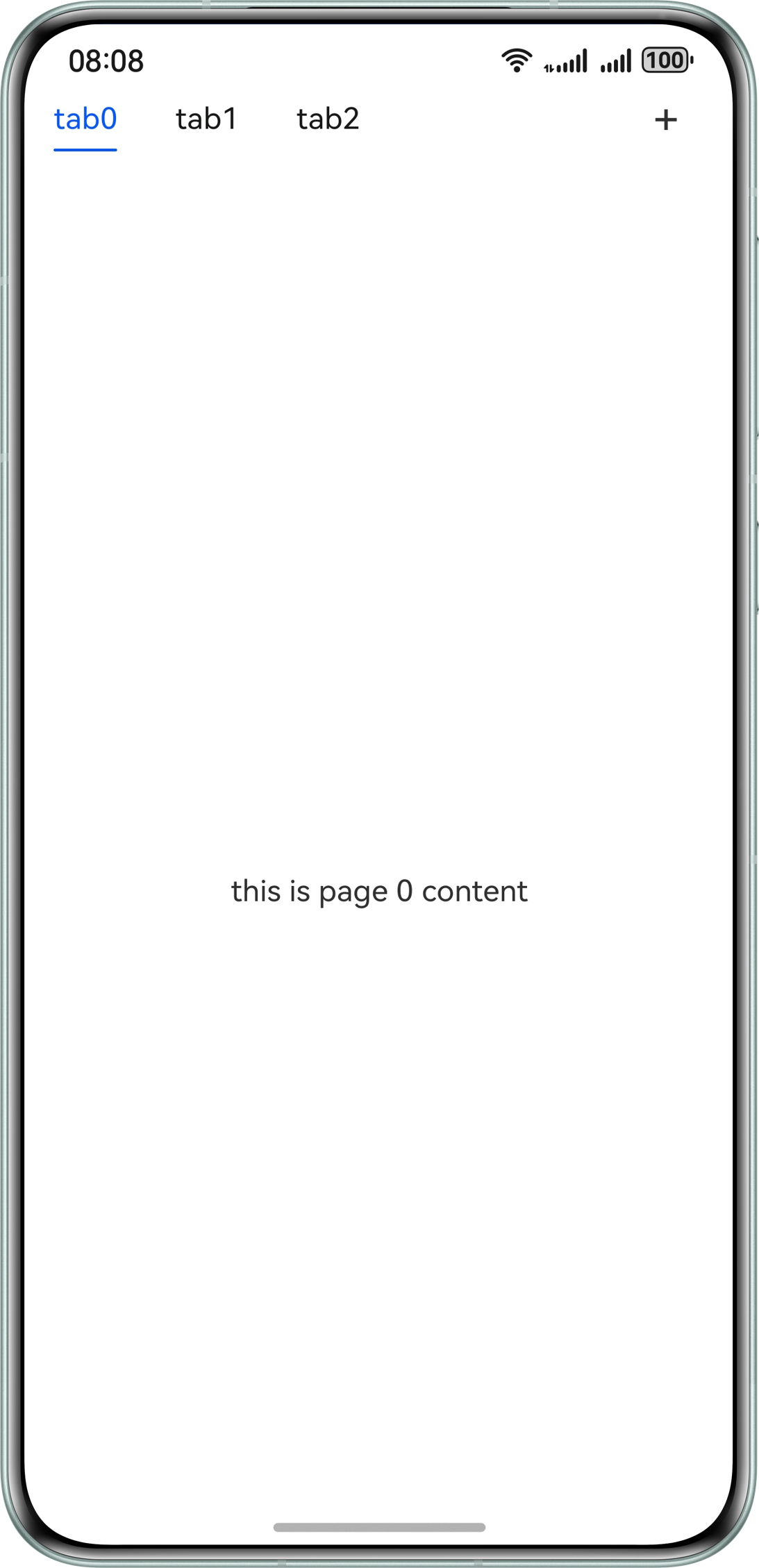
- Nest the Row and Column components in the Stack component to implement the text and underline parts of the navigation bar.
Stack({ alignContent: Alignment.TopStart }) { // The text of tab. Row() { ForEach(this.tabArray, (item: number, index: number) => { this.tab(this.tabStr + item, item, index); }, (item: number, _index: number) => item.toString()) Blank() Text('+') .width(24) .height(24) .fontSize(24) .textAlign(TextAlign.Center) .margin({ right: 24 }) } .justifyContent(FlexAlign.Start) .width('100%') // The underline of tab. Column() .width(this.indicatorWidth) .height(1.5) .backgroundColor('#0A59F7') .borderRadius(1) .margin({ left: this.indicatorLeftMargin, top: 35 }) } .height(56) .margin({ left: this.tabLeftOffset }) - In onAreaChange(), the system calculates the offset between the activated tab and the left side of the screen, and assigns the value to the indicatorLeftMargin variable to control the position of the underline.
@Builder tab(tabName: string, _tabItem: number, tabIndex: number) { Row() { Text(tabName) .fontSize(16) .lineHeight(22) .fontColor(tabIndex === this.currentIndex ? '#0A59F7' : '#E6000000') .id(tabIndex.toString()) .onAreaChange((_, newValue: Area) => { if (this.currentIndex === tabIndex && (this.indicatorLeftMargin === 0 || this.indicatorWidth === 0)) { let positionX: number; let width: number = Number.parseFloat(newValue.width.toString()); if (newValue.position.x !== undefined) { positionX = Number.parseFloat(newValue.position.x?.toString()) this.indicatorLeftMargin = Number.isNaN(positionX) ? 0 : positionX; } this.indicatorWidth = width; } }) } .justifyContent(FlexAlign.Center) .constraintSize({ minWidth: 35 }) .width(64) .height(35) .onClick(() => { this.controller.changeIndex(tabIndex); this.currentIndex = tabIndex; }) } - When a user clicks a tab, the system calculates the offset between the selected tab and the left side as well as the tab width in real time, and updates the position and width of the underline.
.onAnimationStart((_index: number, targetIndex: number, _event: TabsAnimationEvent) => { this.currentIndex = targetIndex; let targetIndexInfo = this.getTextInfo(targetIndex); this.startAnimateTo(this.animationDuration, targetIndexInfo.left, targetIndexInfo.width); }) private getTextInfo(index: number): Record<string, number> { let modePosition: componentUtils.ComponentInfo | null = null; try { modePosition = this.getUIContext().getComponentUtils().getRectangleById(index.toString()); } catch (error) { hilog.error(0x0000, 'testTag',`getRectangleById failed, Code:${error.code}, message:${error.message}`); } return { 'left': this.getUIContext().px2vp(modePosition?.windowOffset.x), 'width': this.getUIContext().px2vp(modePosition?.size.width) }; } private startAnimateTo(duration: number, leftMargin: number, width: number) { this.getUIContext().animateTo({ duration: duration, curve: Curve.Linear, iterations: 1, playMode: PlayMode.Normal, }, () => { this.indicatorLeftMargin = leftMargin; this.indicatorWidth = width; }) } - When a user swipes a page left or right, the system updates the position and width of the underline if the swiping distance exceeds half of the screen width.
    .onGestureSwipe((index: number, event: TabsAnimationEvent) => {
      let currentIndicator = this.getCurrentIndicatorInfo(index, event);
      this.currentIndex = currentIndicator.index;
      this.indicatorLeftMargin = currentIndicator.left;
      this.indicatorWidth = currentIndicator.width;
    })

private getCurrentIndicatorInfo(index: number, event: TabsAnimationEvent): Record<string, number> {
  let nextIndex = index;
  if (index > 0 && event.currentOffset > 0) {
    // swipe to left.
    nextIndex--;
  } else if (index < this.tabArray.length - 1 && event.currentOffset < 0) {
    // swipe to right.
    nextIndex++;
  } else {
    // error condition.
    hilog.info(0x0000, 'leftTab', 'the index is out of boundary: %{public}s', index);
  }
  let indexInfo = this.getTextInfo(index);
  let nextIndexInfo = this.getTextInfo(nextIndex);

  let swipeRatio = Math.abs(event.currentOffset / this.tabsWidth);
  let currentIndex = swipeRatio > 0.5 ? nextIndex : index;
  let currentIndicatorLeft: number = indexInfo.left + (nextIndexInfo.left - indexInfo.left) * swipeRatio;
  let currentIndicatorWidth: number = indexInfo.width + (nextIndexInfo.width - indexInfo.width) * swipeRatio;
  return { 'index': currentIndex, 'left': currentIndicatorLeft, 'width': currentIndicatorWidth };
}
[h2]Left Alignment Style with Swiping
The swiping function is added to the left-alignment navigation style, which is suitable for scenarios where there are many tabs.
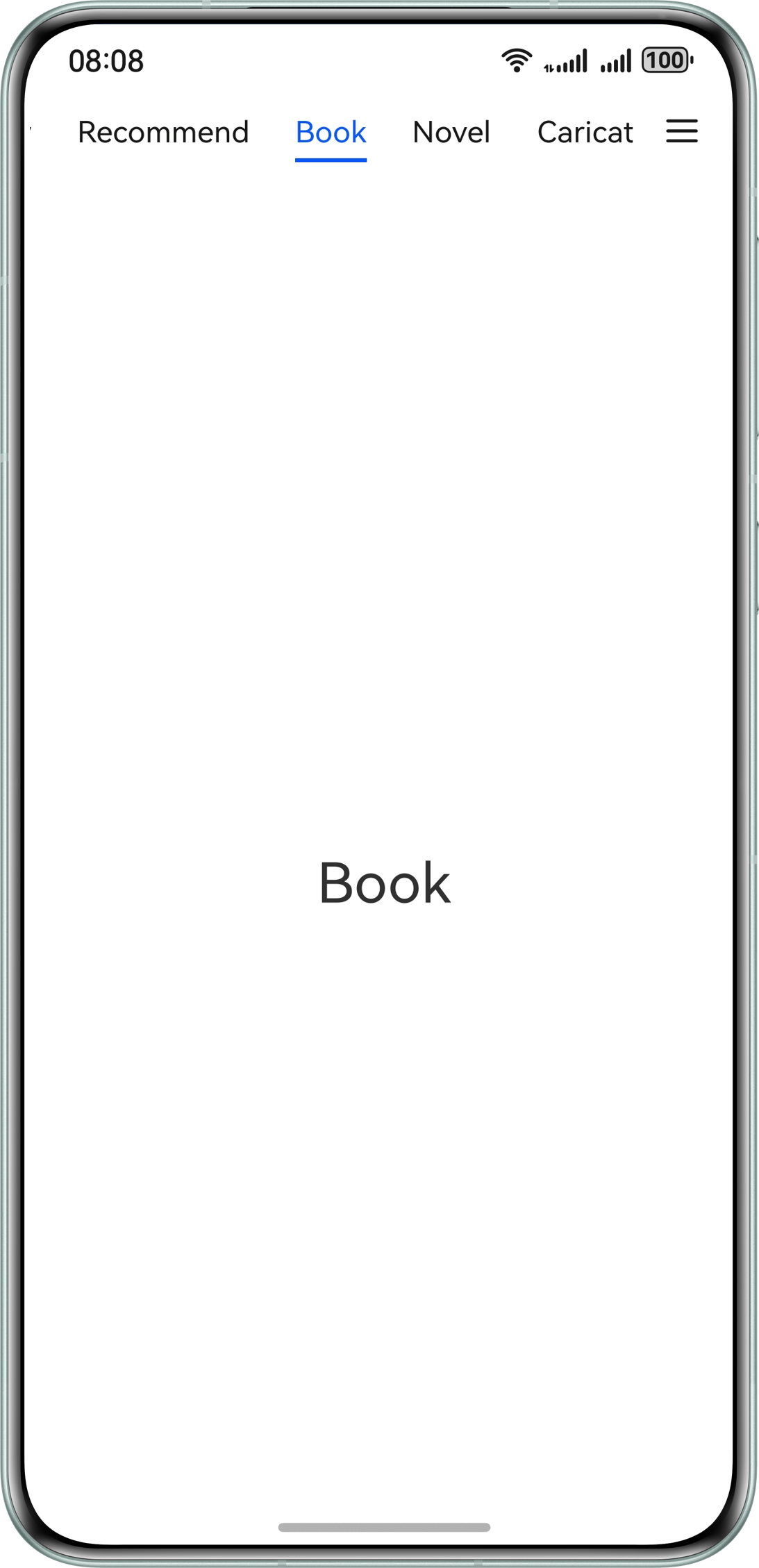
The implementation is the same as that of the left alignment style, except that the List component is nested in the navigation layout to implement the swiping effect.
Row() {
  List({ initialIndex: 0, scroller: this.listScroller }) {
    ForEach(this.tabArray, (item: TabItem, index: number) => {
      this.Tab(item.name, index)
    }, (item: TabItem, index: number) => JSON.stringify(item) + index)
  }
  .listDirection(Axis.Horizontal)
  .height(30)
  .scrollBar(BarState.Off)
  .width('85%')
  .friction(0.6)
  .onWillScroll((xOffset: number) => {
    this.indicatorLeftMargin -= xOffset;
  })

  Image($r('app.media.more'))
    .width(20)
    .height(15)
    .margin({ left: 16 })
}
.height(52)
.width('100%')
[h2]Underline Style
The underlined navigation style is a common navigation style. It is displayed in the form of texts and underlines.
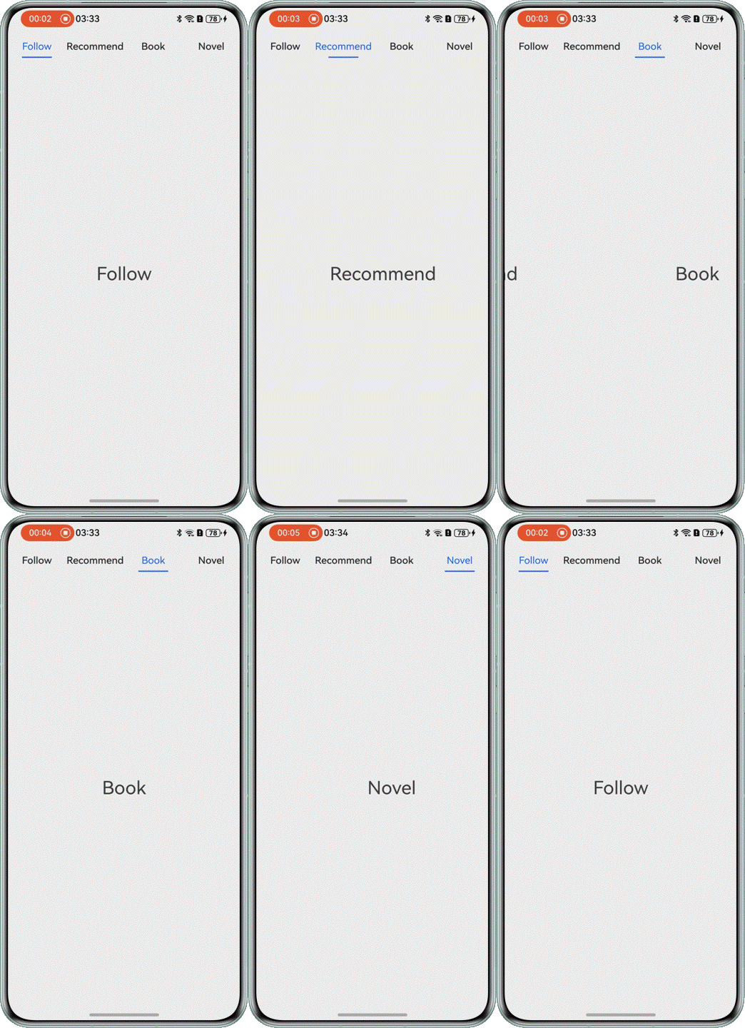
- Use the Tabs component and set barPosition to BarPosition.Start to control the top display of the navigation bar. Use the tabBar attribute and Builder decorator to implement navigation.
Tabs({ barPosition: BarPosition.Start }) { ForEach(this.tabArray.slice(0, 4), (item: TabItem) => { TabContent() { Row() { Text(item.name) .height(300) .fontSize(30) } .width('100%') .justifyContent(FlexAlign.Center) .height('100%') }.tabBar(this.tabBuilder(item.id, item.name)) }, (item: TabItem, index: number) => JSON.stringify(item) + index) } - Use the Divider component to implement the underline.
@Builder
tabBuilder(index: number, name: string | Resource) {
  Column() {
    Text(name)
      .fontColor(this.currentIndex === index ? '#0A59F7' : '#E6000000')
      .fontSize(16)
      .fontWeight(this.currentIndex === index ? FontWeight.Normal : FontWeight.Medium)
      .lineHeight(22)
      .margin({ top: 17, bottom: 7 })
    Divider()
      .width(48)
      .strokeWidth(Constants.STROKE_WIDTH)
      .color('#0A59F7')
      .opacity(this.currentIndex === index ? 1 : 0)
  }
}
[h2]Background Highlight
The background highlight navigation style is a common navigation style. The selected tab is highlighted by the background color.
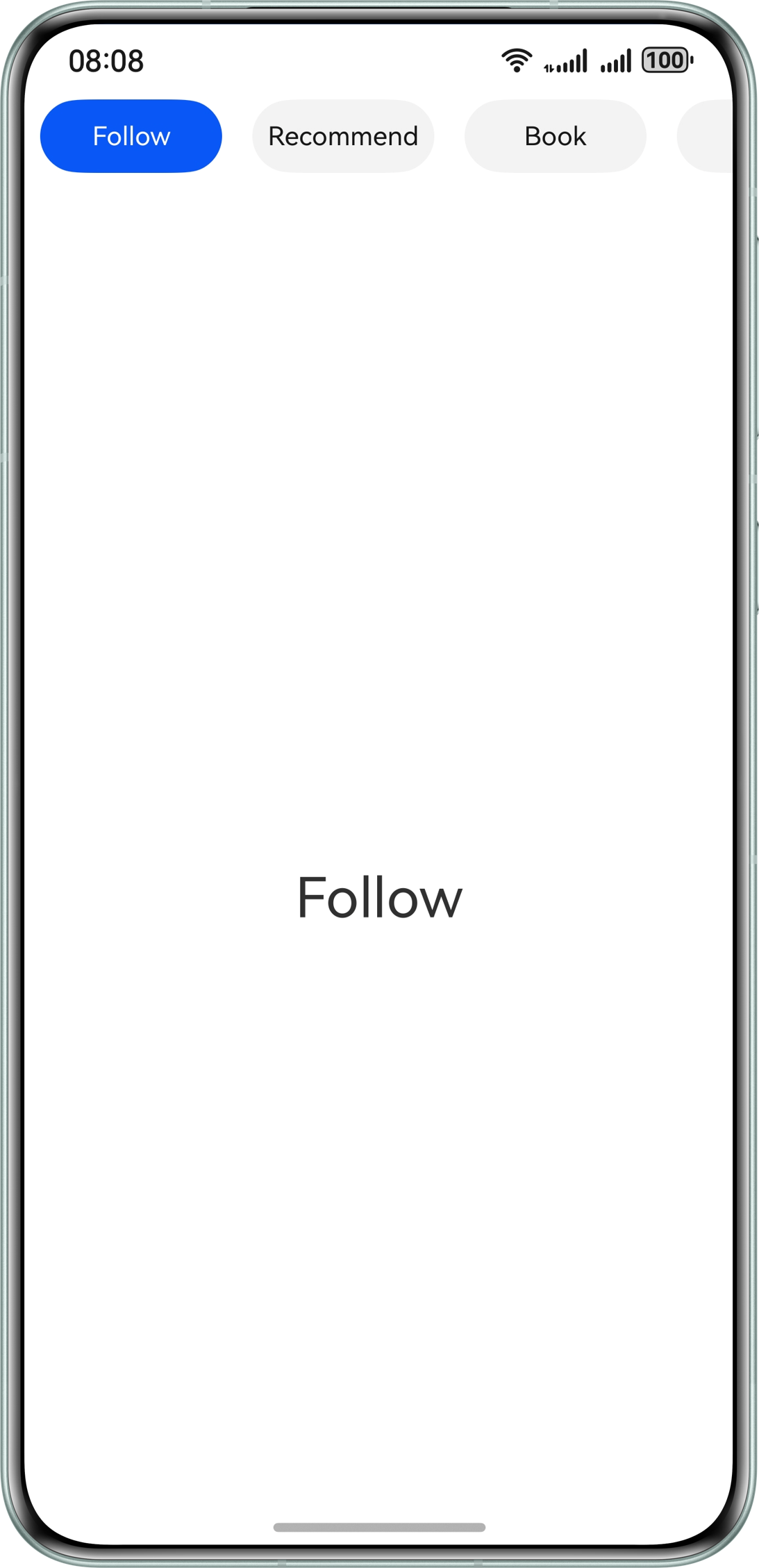
- Use the Tabs component and set barPosition to BarPosition.Start to control the top display of the navigation bar. Use custom layout to highlight the navigation background.
Tabs({ barPosition: BarPosition.Start, controller: this.controller }) { ForEach(this.tabArray.slice(0, 6), (item: TabItem) => { TabContent() { Row() { Text(item.name) .height(300) .fontSize(30) } .width('100%') .justifyContent(FlexAlign.Center) } .backgroundColor(Color.White) }, (item: TabItem, index: number) => JSON.stringify(item) + index) } .width('100%') - Use the List component to implement the swiping effect.
List({ scroller: this.listScroller }) { ForEach(this.tabArray.slice(0, 6), (item: TabItem, index: number) => { this.tabBuilder(item.name, index); }, (item: TabItem, index: number) => JSON.stringify(item) + index) } - In the tabBuilder component, check whether the tab index is the same as the activated tab index to control the change of the background color.
@Builder
tabBuilder(tabName: string | Resource, tabIndex: number) {
  Row() {
    Text(tabName)
      .fontSize(14)
      .fontColor(tabIndex === this.focusIndex ? Color.White : '#E6000000')
      .id(tabIndex.toString())
  }
  .justifyContent(FlexAlign.Center)
  .width(96)
  .backgroundColor(tabIndex === this.focusIndex ? '#0A59F7' : '#0D000000')
  .borderRadius(21)
  .height(40)
  .margin({ left: 8, right: 8 })
  .onClick(() => {
    this.controller.changeIndex(tabIndex);
    this.listScroller.scrollToIndex(tabIndex, true, ScrollAlign.CENTER);
  })
}
[h2]Text Zooming
The text zooming navigation style is a common navigation style. The selected tab is boldfaced and zoomed in.
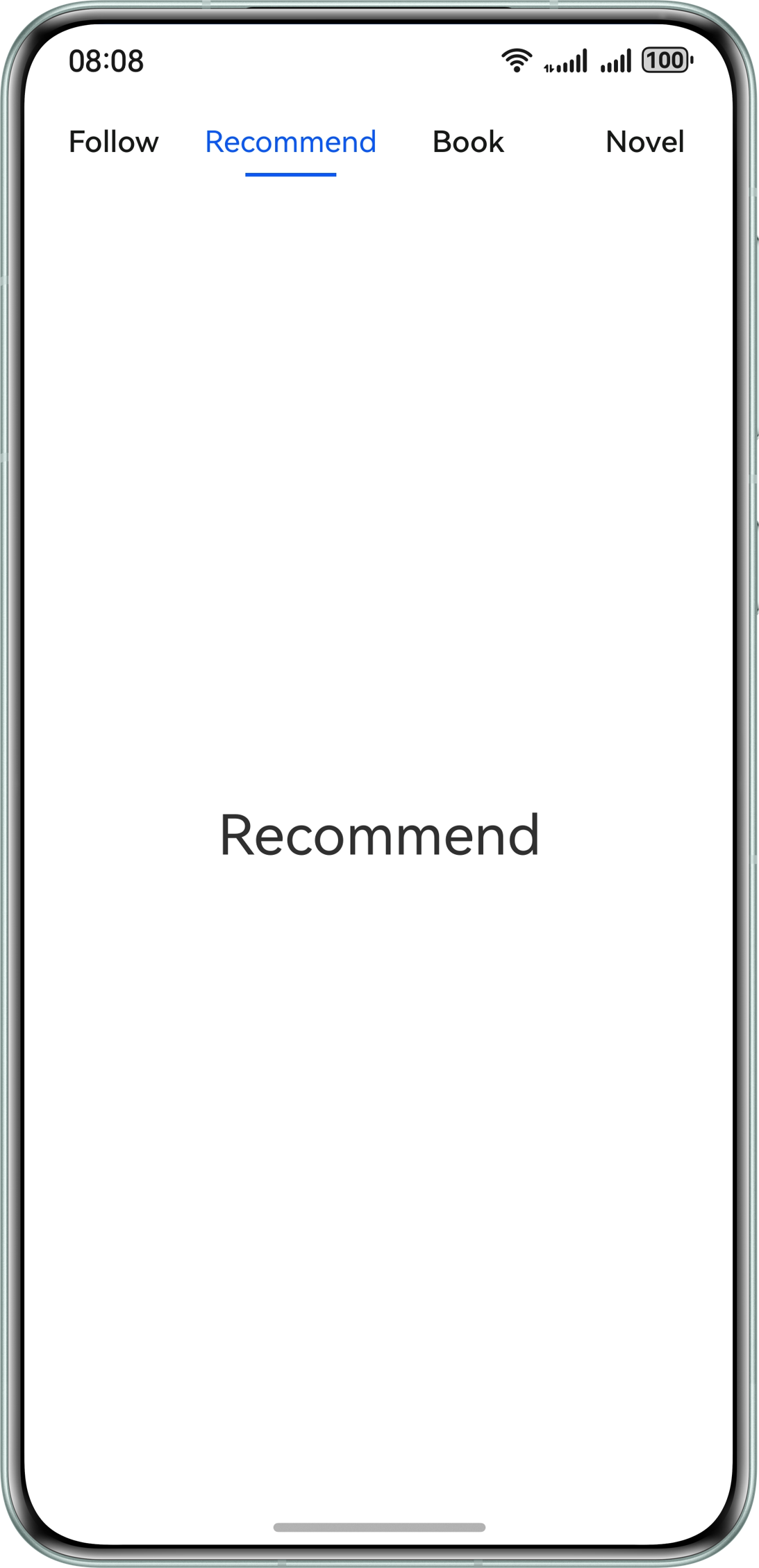
- Use the Tabs component and set barPosition to BarPosition.Start. Use the tabBar attribute and Builder decorator to implement navigation.
Tabs({ barPosition: BarPosition.Start }) { ForEach(this.tabArray.slice(0, 4), (item: TabItem) => { TabContent() { Row() { Text(item.name) .height(300) .fontSize(30) } .width('100%') .justifyContent(FlexAlign.Center) .height('100%') }.tabBar(this.tabBuilder(item.id, item.name)) }, (item: TabItem, index: number) => JSON.stringify(item) + index) } - In the tabBuilder component, check whether the tab index is the same as the selected tab index to control the font size change.
@Builder
tabBuilder(index: number, name: string | Resource) {
  Text(name)
    .fontColor(Color.Black)
    .fontSize(this.currentIndex === index ? 20 : 16)
    .fontWeight(this.currentIndex === index ? 600 : FontWeight.Normal)
    .lineHeight(22)
    .id(index.toString())
}
[h2]Double-Layer Nesting
The double-layer nesting style has two layers of navigation. The outer layer is nested with the inner layer. Compared with the single-layer navigation, this style can contain more tab pages.
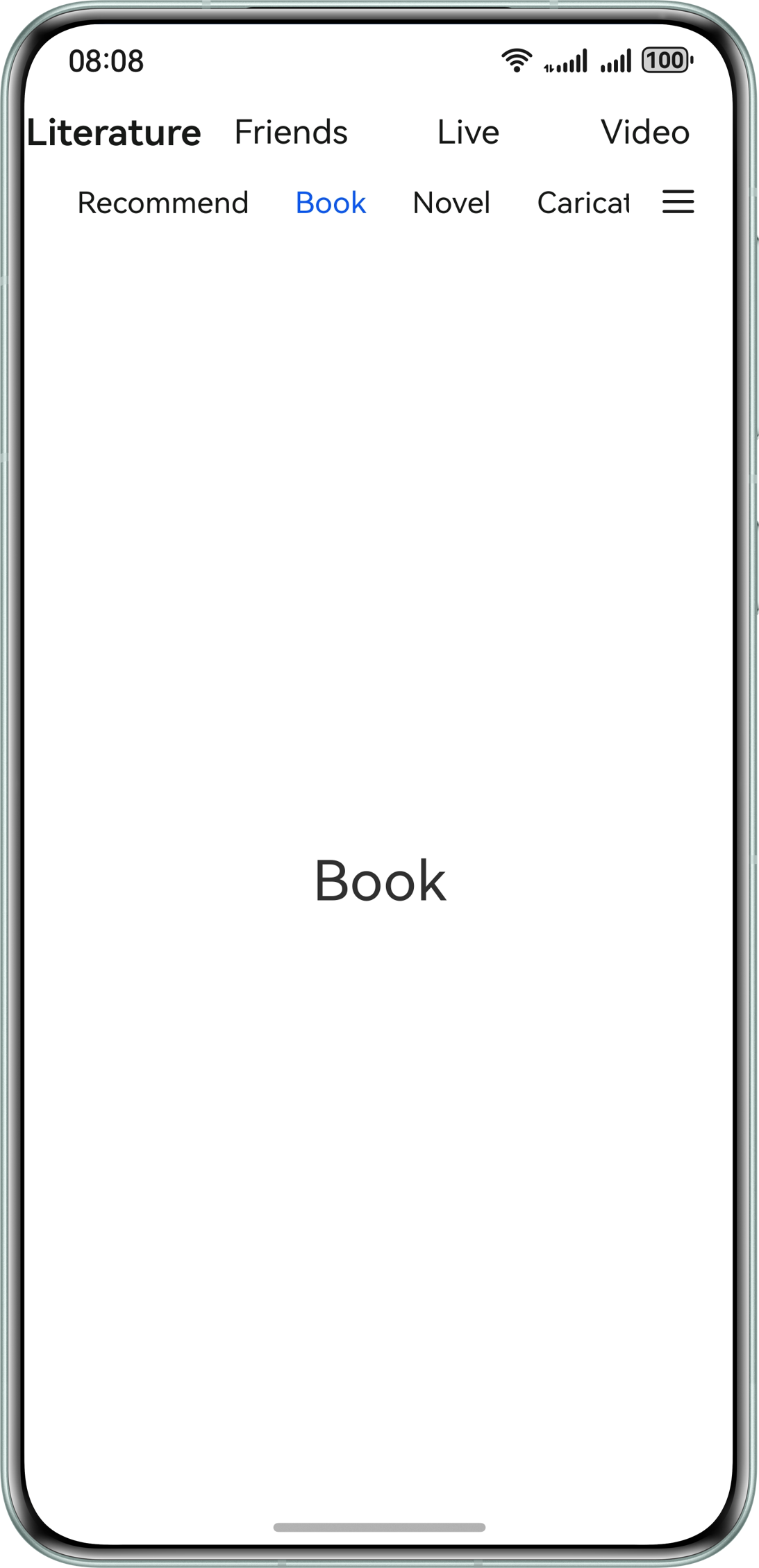
The outer navigation is implemented by setting the tabBar attribute in the TabContent component nested with List and child-level Tabs components. The inner navigation is implemented by nesting the subTabBuilder custom component in the List component. The content area is implemented by nesting the TabContent component in the child-level Tabs component.
@Builder
subTabBuilder(tabName: string | Resource, tabIndex: number) {
  Row() {
    Text(tabName)
      .fontSize(16)
      .fontColor(tabIndex === this.focusIndex ? '#0A59F7' : '#E6000000')
      .id(tabIndex.toString())
  }
  .justifyContent(FlexAlign.Center)
  .padding({ left: 12, right: 12 })
  .height(30)
  .onClick(() => {
    this.subController.changeIndex(tabIndex);
    this.focusIndex = tabIndex;
  })
}
      TabContent() {
        Column() {
          Column() {
            Row() {
              List({ initialIndex: Constants.TAB_INDEX_ZERO, scroller: this.listScroller }) {
                ForEach(this.tabArray, (item: TabItem, index: number) => {
                  this.subTabBuilder(item.name, index)
                }, (item: TabItem, index: number) => JSON.stringify(item) + index)
              }
              .listDirection(Axis.Horizontal)
              .height(30)
              .scrollBar(BarState.Off)
              .width('85%')
              .friction(0.6)

              Image($r('app.media.more'))
                .width(20)
                .height(15)
                .margin({ left: 16 })
            }
            .height(25)
            .width('100%')
          }
          .alignItems(HorizontalAlign.Center)
          .width('100%')
          .padding({ left: 4 })
          Tabs({ barPosition: BarPosition.Start, controller: this.subController }) {
            // ...
          }
          .barHeight(0)
          .animationDuration(Constants.ANIMATION_DURATION)
          .onAnimationStart((index: number, targetIndex: number) => {
            hilog.info(0x0000, 'index', index.toString());
            this.focusIndex = targetIndex;
            this.listScroller.scrollToIndex(targetIndex, true, ScrollAlign.CENTER);
          })
        }
      }
.tabBar(this.tabBuilder(Constants.TAB_INDEX_ZERO, this.topTabData[Constants.TAB_INDEX_ZERO])) [h2]Basic Side Navigation
It is a type of side navigation. The navigation bar area on the left is implemented using the List component.
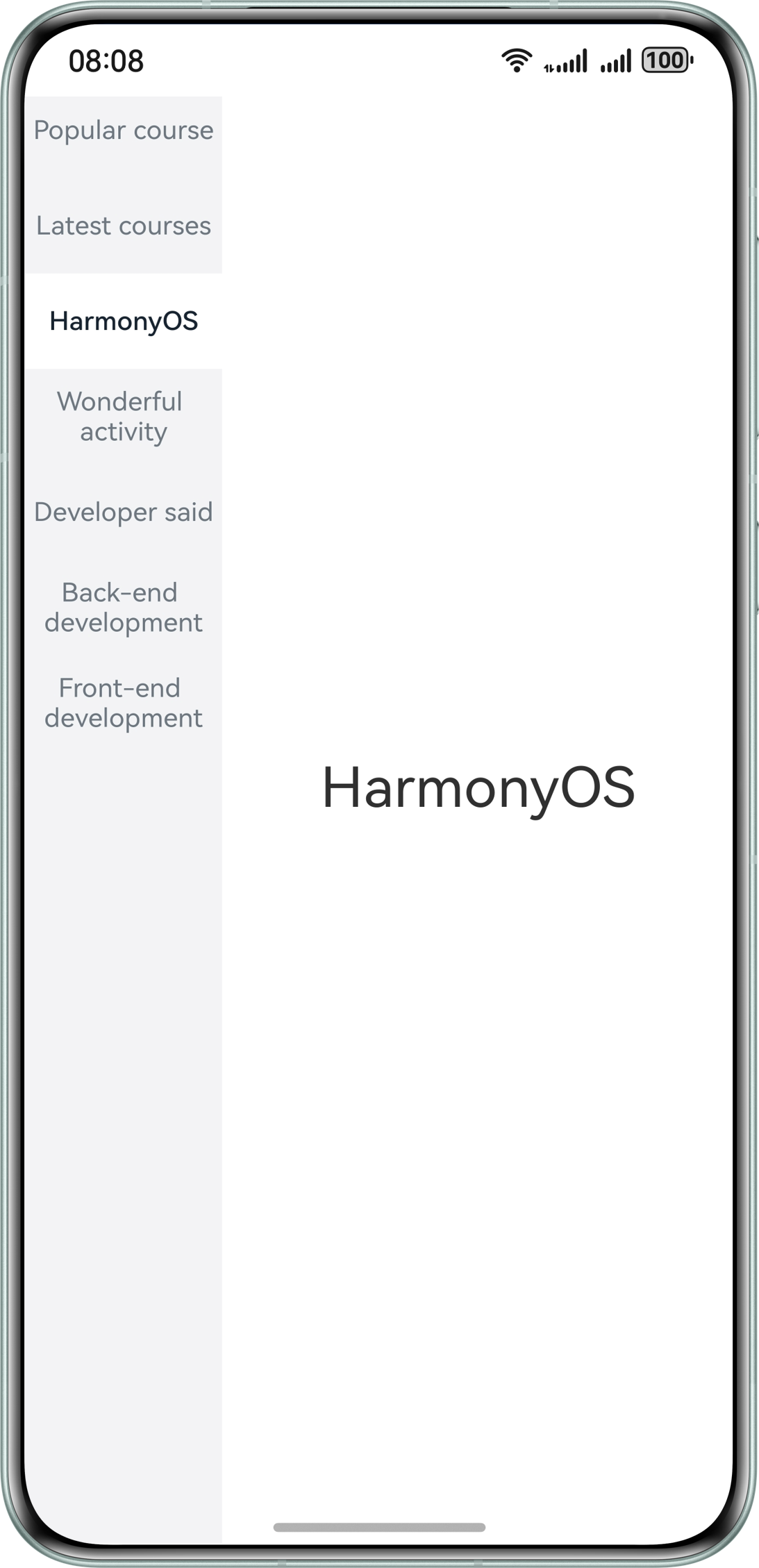
The basic side navigation uses the left-right layout, in which the left side is the navigation layout implemented by the List and ListItem components and the right side is the navigation content area.
List({ scroller: this.classifyScroller }) {
  ForEach(this.ClassifyArray, (item: ClassifyModel, index?: number) => {
    ListItem() {
      ClassifyItem({
        classifyName: item.classifyName,
        isSelected: this.currentClassify === index,
        onClickAction: () => {
          if (index !== undefined) {
            this.classifyChangeAction(index, true);
          }
        }
      })
    }
  }, (item: ClassifyModel, index: number) => JSON.stringify(item) + index)
}
.height('110%')
.width('27.8%')
.backgroundColor($r('app.color.side_background_color'))
.scrollBar(BarState.Off)
.margin({ top: 74 })

Column() {
  ForEach(this.ClassifyArray, (item: ClassifyModel, index: number) => {
    Text(this.currentClassify === index ? item.classifyName : '')
      .fontSize(30)
  },(item: ClassifyModel, index: number) => JSON.stringify(item) + index)
}
.width('72.2%')
[h2]Drawer Side Navigation
It is a type of side navigation, with the core idea of "hiding". You can tap the entry or swipe on the side to draw the menu out.
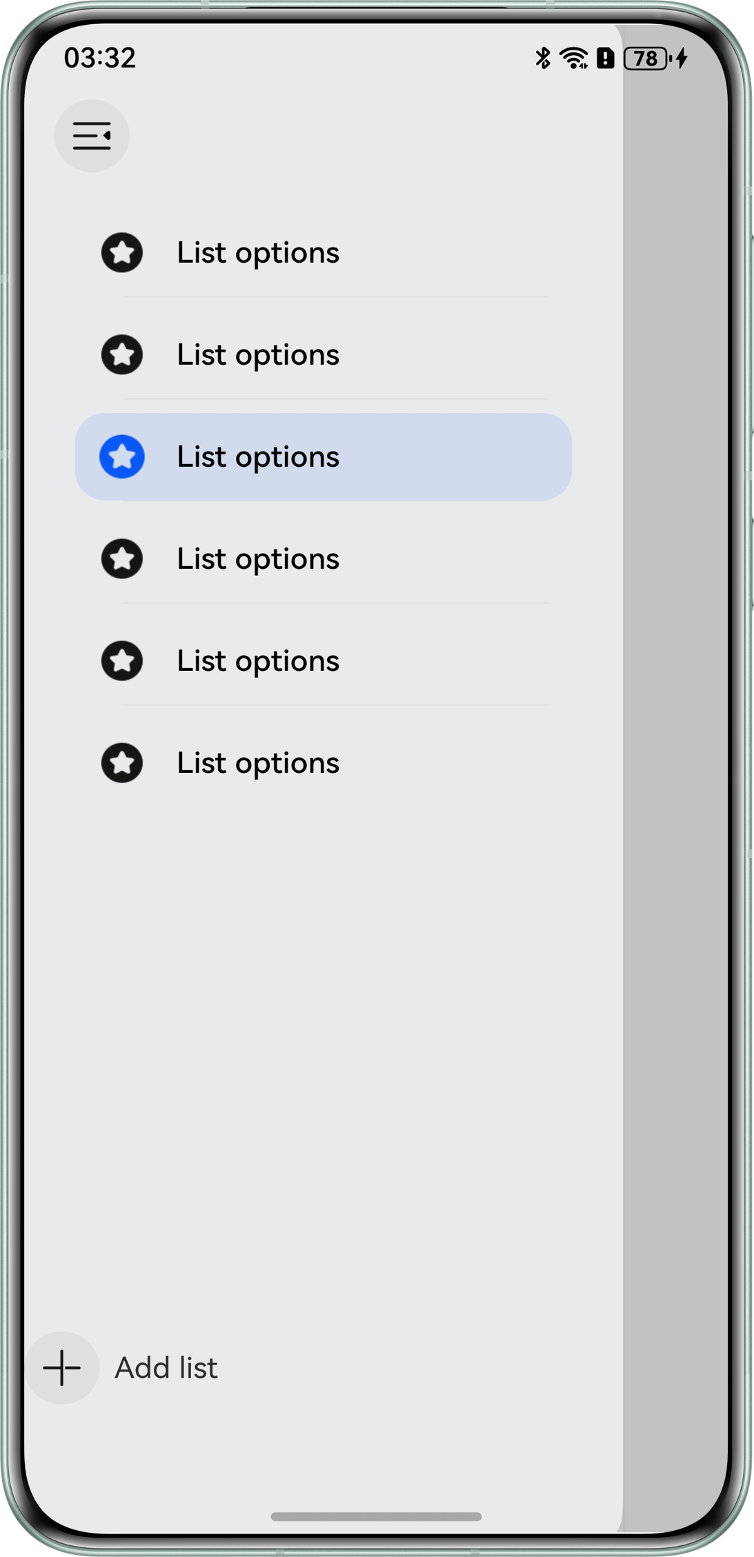
- Use the SideBarContainer component to implement side navigation, and set showSideBar of this component to show or hide the sidebar. Use SideBarContainer to implement the navigation style on the left and the content area on the right. Use the controlButton attribute to control the position of the side navigation button.
SideBarContainer(SideBarContainerType.Overlay) { Column() { // ... } .height('100%') .padding({ top: 104 }) .backgroundColor('#E9EAEC') .width(272) .height(344) .backgroundColor(Color.White) .borderRadius(20) Column() { // ... } .onClick(() => { this.getUIContext().animateTo({ duration: Constants.ANIMATION_DURATION, curve: Curve.EaseOut, playMode: PlayMode.Normal, }, () => { this.show = false; }) }) .width('100%') .height('110%') .backgroundColor(this.show ? '#c1c2c4' : '') } .showSideBar(this.show) .controlButton({ left: 16, top: 48, height: 40, width: 40, icons: { shown: $r('app.media.changeBack'), hidden: $r('app.media.change'), switching: $r('app.media.change') } }) .onChange((value: boolean) => { this.show = value; }) - Use the Image and Text components in the left navigation bar to display icons and texts.
Column() {
  ForEach(this.navList, (item: number, index: number) => {
    Column() {
      Row() {
        Image(this.active === item ? $r('app.media.activeList') : $r('app.media.list'))
          .width(24)
          .height(24)
        Text($r('app.string.list_name'))
          .fontSize(16)
          .fontColor(Color.Black)
          .fontWeight(FontWeight.Medium)
          .margin({ left: 17 })
      }
      .height(48)
      .width('100%')

      if (this.navList.length - 1 !== index) {
        Row()
          .height(0.5)
          .backgroundColor('#0D000000')
          .width('90%')
      }
    }
    .onClick(() => {
      this.active = item;
    })
    .margin({
      top: 4,
      left: 4,
      right: 4,
      bottom: 4
    })
    .justifyContent(FlexAlign.Center)
    .width(264)
    .height(48)
    .padding({ left: 13 })
    .borderRadius(16)
    .backgroundColor(this.active === item ? '#1A0A59F7' : '')
  }, (item: number, index: number) => JSON.stringify(item) + index)

  Row() {
    Image($r('app.media.add'))
      .width(40)
      .height(40)
    Text($r('app.string.add_list')).margin({ left: 8 })
  }
  .width('100%')
  .margin({ top: 284 })
}
.height('100%')
.padding({ top: 104 })
.backgroundColor('#E9EAEC')
.width(272)
.height(344)
.backgroundColor(Color.White)
.borderRadius(20)