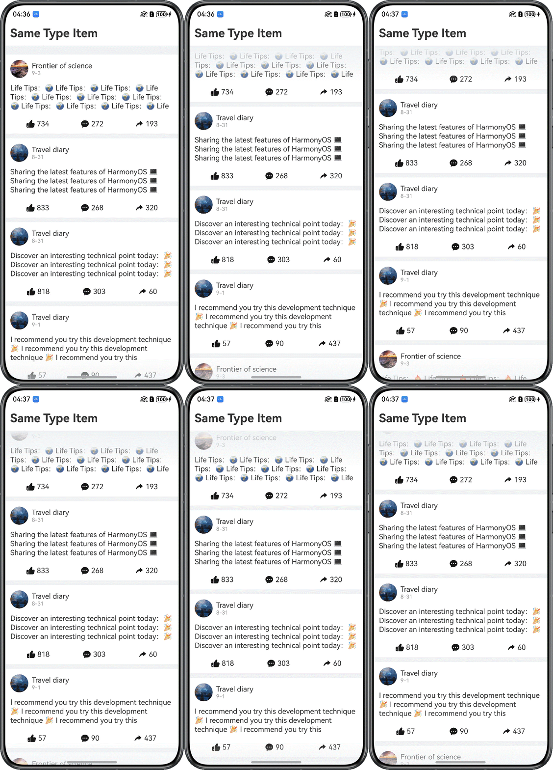
Overview
The List component is a container that contains a series of list items of the same width, suitable for sequential, multi-line display of the same type of data, for example, images or text. It supports dynamic data processing, enabling the iterative generation of list items to adapt to data changes. By adopting scroll loading (lazy loading), it renders only visible items during scrolling, significantly enhancing performance for long lists. Additionally, it allows customization of interaction logic and visual styles to meet diverse interaction requirements. Its use cases include: list-based information display (for example, news and product catalogs), navigation menu design (for example, bottom navigation and sidebars), and paginated long-content presentation (for example, social media feeds and comment sections). As a core component, it enables efficient data visualization and interaction.
However, frequent creation and measurement of child components during scrolling in long lists consume substantial computational resources, often resulting in stuttering. Concurrently, concentrated requests for resources (such as images) within a short timeframe may cause visible blank areas during scrolling, degrading user experience.
ScrollComponents is designed to address issues of component reuse and implements high-performance scrolling through minimal code. With this library, you do not need to focus on reuse pool management or interaction details of other performance optimization solutions. For details about how to install and use ScrollComponents, see the ScrollComponents usage guide. ScrollComponents provides the following features:
- Smooth scrolling on common complex pages in list, waterflow, or grid layout.
- Lazy loading.
- Component reuse, which prevents frame drops during scrolling and improves scrolling performance.
- Reuse pool sharing, which enables component reuse across pages and parent components.
- Pre-creation, which reduces initial frame drops upon cold startup and improves scrolling performance.
- Preloading, which loads data in advance during scrolling to improve browsing experience.
Based on system capabilities such as NodeAdapter, BuilderNode, FrameNode, Prefetcher, and FrameCallback, ScrollComponents implements high-performance scrolling through efficient component reuse, frame-by-frame component pre-creation, dynamic content pre-creation, and lazy loading. Additionally, it encapsulates system components such as List, WaterFlow, and Grid based on FrameNode, providing a series of view managers. This offers developers capabilities for various built-in scrolling components, such as list item styling setting, adjustment of header and footer offsets, scroll event listening, and edge fade effects. These features aim to streamline the development process while meeting common development requirements.
The following sections will detail how the ScrollComponents library implements key features for long-list components, including cross-page reuse, first-screen rendering acceleration, infinite scrolling, pull-to-refresh, and pull-up-to-load-more.
The ScrollComponents third-party library encapsulates NodeContainer and FrameNode at the underlying layer, combining NodeAdapter, BuildNode, and a custom reuse pool to implement features such as lazy loading, component reuse, and component pre-creation. Additionally, it provides view management components like WaterFlowManager, ListManager, and GridManager to support various capabilities of built-in scrolling components. By meeting standard development requirements while delivering high-performance scrolling, the library enables rapid implementation of lazy loading and component reuse simply by passing a data source and a view manager, allowing you to focus more on service logic.
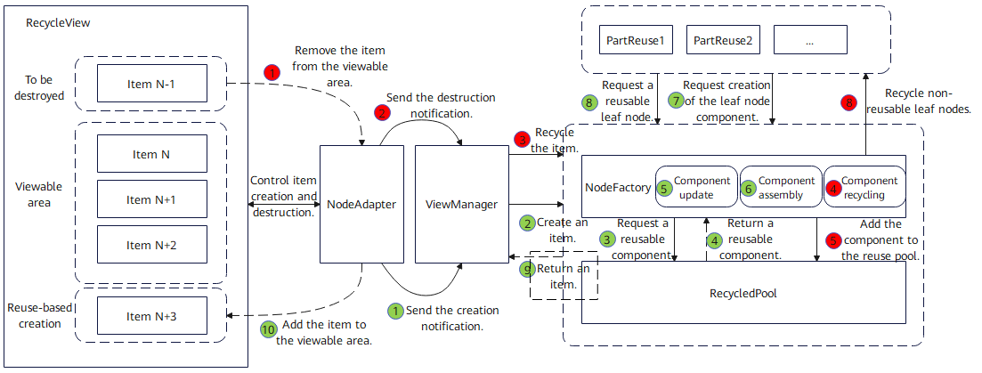
As shown in the diagram below, when a node is removed from the viewable area, NodeAdapter notifies the view manager to recycle the component, which is processed by NodeFactory and eventually stored in the component reuse pool. When NodeAdapter notifies the view manager that a new node is required, NodeFactory requests a node from the reuse pool, updates and assembles the components, and returns the node. Finally, NodeAdapter adds the returned node to the viewable area.
[h2]How to Develop
- Create a long-list view manager.
ListManager provides only basic view capabilities. To enable component reuse, you need to define a class that inherits from ListManager and implement the onWillCreateItem() method to retrieve components from the reuse pool. For specific implementation, see Reusing Child Node Templates.
When you create an instance object of the view manager, the defaultNodeItem property specifies the name of the default list item template. Typically, a unique identifier string is passed to this property for component reuse. The context property is used to obtain the UI context, and this.getUIContext() is usually passed to it.
import { ListManager, NodeItem, RecyclerView } from '@hadss/scroll_components';
@Component
struct SameItemListPage {
  myListManager: MyListManager = new MyListManager({
    defaultNodeItem: 'EasyBlogItemContainer',
    context: this.getUIContext()
  });
  // ...
}

class MyListManager extends ListManager {
  onWillCreateItem(_index: number, data: BlogData) {
    // ...
  }
}
To quickly create a long list with ScrollComponents and improve scrolling efficiency through lazy loading and pre-creation, without considering component reuse, use ListManager provided by ScrollComponents to create a long list view manager. For details about the usage and configuration options, see the quick start in the ScrollComponents usage guide.
- Initialize the ListManager.During page initialization, call the setViewStyle API of the view manager to set view properties, including the layout and constraints, the direction of the main axis and cross axis, custom list styles (such as content spacing, dividers, and scroll bars), and scroll listeners.
this.myListManager.setItemViewStyle((item, index, data: Params) => { item({ style: ListItemStyle.NONE }) .width('100%') .height('auto') .swipeAction({ // ... }) .onClick(() => Logger.info("index:" + index)) }) this.myListManager.setViewStyle({ space: 10, scroller: this.listScroller }) .cachedCount(2)// Set the number of preloaded ListItemListItemGroups in the list and whether to display the preloaded nodes .width('100%') .edgeEffect(EdgeEffect.Spring) .layoutWeight(1) .contentStartOffset(20)// Sets the offset at the start of the content area .contentEndOffset(20)// Sets the offset at the end of the content area .scrollBar(BarState.Off)// Set the scrollbar status // ... .alignListItem(ListItemAlign.Start)// Set the direction of the List cross axis .lanes(1)// Set the number of layout columns or rows in the List portlet .fadingEdge(true, { fadingEdgeLength: LengthMetrics.vp(80) }) // Nested scrolling: Set up a scrolling scheme .nestedScroll({ scrollForward: NestedScrollMode.PARENT_FIRST, // The parent component scrolls first, scrolls to the edge, and then scrolls itself scrollBackward: NestedScrollMode.SELF_FIRST // Itself rolls first, and then the parent component scrolls to the edge }) - Set the data source for component rendering.
- Call the setDataSource() method of the view manager to set the data source. ScrollComponents supports lazy loading by default and provides APIs for adding, deleting, modifying, and querying data. You do not need to manage LazyForEach constraints or define DataSource explicitly; just integrate and go. For details about the lazy loading APIs, see the description for providing the lazy loading capability for the view manager based on NodeAdapter.
- Call the registerNodeItem method of the view manager to register the child node template and pass in the template name and @Builder constructor.
- ScrollComponents provides the view placeholder component RecyclerView, which can render a long list after being bound to a view container instance.
import { ListManager, NodeItem, RecyclerView } from '@hadss/scroll_components';
@Component
struct SameItemListPage {
  myListManager: MyListManager = new MyListManager({
    defaultNodeItem: 'EasyBlogItemContainer',
    context: this.getUIContext()
  });
  @State myViewModel: SameItemViewModel = new SameItemViewModel(this.myListManager);
  // ...
  aboutToAppear(): void {
    // ...
    // Register a reuse template
    this.myListManager.registerNodeItem('EasyBlogItemContainer', wrapBuilder(EasyBlogItemContainer));
    // ...
    // Simulate request data
    this.myViewModel.loadData();
  }
  // ...
  build() {
    // ...
        Column() {
          RecyclerView({
            viewManager: this.myListManager
          })
        }
        // ...
  }
}

// Define an item template
@Builder
function EasyBlogItemContainer($$: Params) {
  EasyBlogItem({ blogData: $$.blogData })
}
@Observed export class SameItemViewModel { @Track dataArray: BlogData[] = []; myListManager: ListManager; // ... loadData() { generateRandomBlogData(300, false).then((dataArray: BlogData[]) => { this.dataArray = dataArray; this.myListManager.setDataSource(dataArray); }); } // ... }

1. In the registerNodeItem() method for registering child node templates, only global builder functions are currently supported.
2. If you use this.ListView.myListManager.preCreate() to implement pre-creation of components, this operation must be completed prior to node template registration.
- Reuse the child node template.After customizing the template, you must implement the onWillCreateItem() API when defining a long-list view manager. Within this API, a reusable node is obtained via dequeueReusableNodeByType() to enable component reuse. Additionally, data must be updated during the aboutToReuse lifecycle of the reused component.
- List items with the same structure
When reusable ListItem components and target list items (to be rendered) have the same structure but different data, register the node template directly.
@Component struct SameItemListPage { myListManager: MyListManager = new MyListManager({ defaultNodeItem: 'EasyBlogItemContainer', context: this.getUIContext() }); // ... aboutToAppear(): void { // ... // Register a reuse template this.myListManager.registerNodeItem('EasyBlogItemContainer', wrapBuilder(EasyBlogItemContainer)); // ... } // ... } class MyListManager extends ListManager { onWillCreateItem(_index: number, data: BlogData) { let node: NodeItem<Params> | null = this.dequeueReusableNodeByType('EasyBlogItemContainer'); node?.setData({ blogData: data }); return node; } } // Define an item template @Builder function EasyBlogItemContainer($$: Params) { EasyBlogItem({ blogData: $$.blogData }) } - List items with composable child components
When the reusable ListItem component largely matches the structure required by the target list item, but exhibits partial differences, for example, the header and footer components are identical, but the middle content area may render either a Text or an Image component, two different @Builder functions are usually required to implement reuse. However, ScrollComponents provides the PartReuse feature for this case. It enables component reuse with just a single @Builder function by reusing the common parts and only swapping the differing elements. For details, see the description about list items with composable child components for component reuse.
When a component is about to be destroyed, it is removed from the view container and enters the item reuse pool. When a component is about to be created, an item node is retrieved from the item reuse pool. If the reusable item node does not match the target node, the differing parts (that is, the components in PartReuse) are first recycled into the corresponding component reuse pool. The required components are then retrieved from the component reuse pool and assembled with the item node to form the target component, which is finally added to the view container.
Figure 2 Process of composable component reuse
import { ListManager, NodeItem, PartReuse, RecyclerView, } from '@hadss/scroll_components';
@Component
struct CombineItemListPage {
  myListManager: MyListManager = new MyListManager({
    defaultNodeItem: "BlogItemContainer",
    context: this.getUIContext()
  });
  // ...
  aboutToAppear(): void {
    // ...
    // Register a reuse template
    this.myListManager.registerNodeItem('BlogItemContainer', wrapBuilder(BlogItemContainer));
    this.myListManager.registerNodeItem('AdaptiveTextComponentContainer', wrapBuilder(AdaptiveTextComponentContainer));
    this.myListManager.registerNodeItem('GridImageViewContainer', wrapBuilder(GridImageViewContainer));
    // ...
  }
  // ...
}

class MyListManager extends ListManager {
  onWillCreateItem(_index: number, data: BlogData) {
    let node: NodeItem<Params> | null = this.dequeueReusableNodeByType('BlogItemContainer');
    node?.setData({ blogData: data });
    return node;
  }
}

@Builder
function BlogItemContainer($$: Params) {
  BlogItem({ blogData: $$.blogData })
}

@Component
struct BlogItem {
  @State blogData: BlogData = new BlogData();

  aboutToReuse(params: Record<string, ESObject>): void {
    this.blogData = params.blogData;
  }

  build() {
    Column({ space: 12 }) {
      BlogItemHeaderView({ blogData: this.blogData })
      if (this.blogData?.content.length > 0) {
        PartReuse({
          type: 'AdaptiveTextComponent',
          builder: wrapBuilder(AdaptiveTextComponentContainer),
          data: { blogData: this.blogData }
        })
      }
      // Display pictures
      if (this.blogData?.images && this.blogData.images.length > 0) {
        PartReuse({
          type: 'GridImageViewContainer',
          builder: wrapBuilder(GridImageViewContainer),
          data: { blogData: this.blogData }
        })
      }
      BottomActionView({ blogData: this.blogData })
    }
    // ...
  }
}

@Builder
function AdaptiveTextComponentContainer($$: Params) {
  AdaptiveTextComponent({ blogData: $$.blogData })
}

@Builder
function GridImageViewContainer($$: Params) {
  GridImageView({ blogData: $$.blogData })
}
Check whether the reuse is successful based on the log output, as shown in the following figure. generateItem reuse indicates successful reuse.
Figure 3 Logs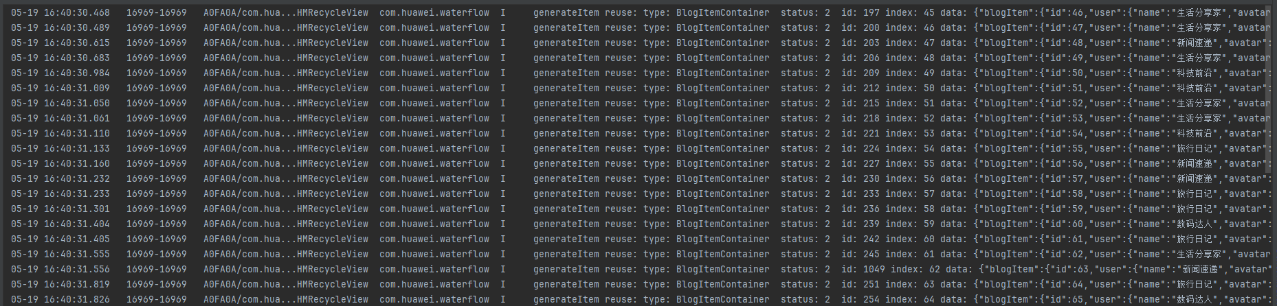

Logging is disabled by default. To enable it, set debug to true in the Config parameter in the initialization method of ListManager.
- List items with different structures
If the reusable ListItem and the target list item have significant structural differences, such as different layouts, a large discrepancy in the number of child components, or different component types, that make it difficult to reuse the same template, then multiple reuse templates can be defined.
@Component
struct DifferentItemListPage {
  myListManager: MyListManager = new MyListManager({
    defaultNodeItem: 'EasyBlogItemContainer',
    context: this.getUIContext()
  });
  @State dataArray: BlogData[] = [];
  @State myViewModel: DifferentItemViewModel = new DifferentItemViewModel(this.myListManager, this.dataArray);
  // ...
  aboutToAppear(): void {
    // ...
    this.myListManager.registerNodeItem('EasyBlogItemContainer', wrapBuilder(EasyBlogItemContainer));
    this.myListManager.registerNodeItem('HotVideoBlogItemContainer', wrapBuilder(HotVideoBlogItemContainer));
    this.myListManager.preCreate('HotVideoBlogItemContainer', 30);
    this.myListManager.preCreate('EasyBlogItemContainer', 30);
    this.myViewModel.loadData();
  }

  initView() {
    this.myListManager.setItemViewStyle((_item, _index, _data: ESObject) => {
    })
    this.myListManager.setViewStyle({ space: 10, scroller: this.scroller })
    // ...
  }

  @Builder
  buildListView() {
    RecyclerView({
      viewManager: this.myListManager
    })
  }

  build() {
    // ...
        PullToRefresh({
          // ...
          customList: () => {
            this.buildListView();
          },
          // ...
        })
        // ...
  }
}
class MyListManager extends ListManager {
  onWillCreateItem(index: number, data: BlogData) {
    if (index % 4 === 3) {
      let node: NodeItem<Params> | null = this.dequeueReusableNodeByType('HotVideoBlogItemContainer');
      node?.setData({ blogData: data });
      return node;
    }
    let node: NodeItem<Params> | null = this.dequeueReusableNodeByType('EasyBlogItemContainer');
    node?.setData({ blogData: data });
    return node;
  }
}

// Reusable EasyBlog Component Template
@Builder
function EasyBlogItemContainer($$: Params) {
  EasyBlogItem({ blogData: $$.blogData })
}

// Reusable HotVideoBlog Component Template
@Builder
function HotVideoBlogItemContainer($$: Params) {
  HotVideoBlogItem({ blogData: $$.blogData })
}
- List items with the same structure
Supporting grouped data display in long lists can make the structure clearer, facilitate browsing, and improve overall usability. Grouped lists are commonly used in practical apps, such as the contact list and product category list shown in the figure below.
In grouped layout scenarios, headers and footers are typically configured for each group to display unified introductory or summary information for the section.

- Define the reusable template for the items.
@Builder function GoodItemContainer($$: ParamsGoods) { GoodItem({ dataModel: $$.dataModel }) } @Component struct GoodItem { @Prop dataModel: GoodsDataModel = { titleId: 0, goodsId: 0, goodsName: '', imgUrl: $r('app.media.pic2'), price: 0 }; aboutToReuse(params: Record<string, ESObject>): void { this.dataModel = params.dataModel; } build() { Row() { Image(this.dataModel.imgUrl) .height('100%') .aspectRatio(1) .sourceSize({ width: 96, height: 96}) Column() { Text(this.dataModel.goodsName) .width('100%') .fontSize(14) .maxLines(2) .textOverflow({ overflow: TextOverflow.Clip }) .lineHeight(20) Text('$' + this.dataModel.price) .fontSize(18) .fontColor(Color.Red) } .height('100%') .padding(12) .layoutWeight(1) .alignItems(HorizontalAlign.Start) .justifyContent(FlexAlign.SpaceBetween) } .clip(true) .width('100%') .height(96) .backgroundColor(Color.White) .borderRadius(18) } } - Define the ListItemGroupManager class.
class MyListItemGroupManager extends ListItemGroupManager { onWillCreateItem(_index: number, data: GoodsDataModel): NodeItem | null { let node: NodeItem<ParamsGoods> | null = this.dequeueReusableNodeByType('GoodItemContainer'); node?.setData({ dataModel: data }); return node; } } - Define the ListManager class.
class MyListManager extends ListManager { context: UIContext; constructor(config: Config) { super(config); this.context = config.context; } onWillCreateItem(_index: number, data: CategoryModel): NodeItem { const groupManager = new MyListItemGroupManager({ defaultNodeItem: 'GoodItemContainer', context: this.context }); groupManager.registerNodeItem('GoodItemContainer', wrapBuilder(GoodItemContainer)); groupManager.setDataSource(data.goodsList); // The header and footer of the group groupManager.setViewStyle({ space: 12, // ... }) groupManager.setItemViewStyle((listItem, index, data: ParamsGoods) => { // Used to set the scratch component of ListItem. listItem().swipeAction({ // ... }) }) return groupManager.getNodeItem(this); } } - Set the group header and footer.
To set the header and footer for a group, use the headerComponent and footerComponent properties of ListItemGroupManager and implement their corresponding builder functions.
class MyListManager extends ListManager {
  // ...
  onWillCreateItem(_index: number, data: CategoryModel): NodeItem {
    const groupManager = new MyListItemGroupManager({ defaultNodeItem: 'GoodItemContainer', context: this.context });
    groupManager.registerNodeItem('GoodItemContainer', wrapBuilder(GoodItemContainer));
    groupManager.setDataSource(data.goodsList);
    // The header and footer of the group
    groupManager.setViewStyle({
      space: 12,
      headerComponent: new ComponentContent<Resource>(this.context,
        wrapBuilder<[Resource]>(goodsHeaderBuilderPublic),
        data.titleName),
      // onClick:(...)=>{} can be declared in the DataModel, and data.onClick is used when data is assigned
      // headerComponent: new ComponentContent<DataModel>(this.context,
      //   wrapBuilder<[DataModel]>(groupHeaderBuilderPublic),
      //   dataModel)
      footerComponent: new ComponentContent<[Resource, number]>(this.context,
        wrapBuilder<[[Resource, number]]>(goodsFooterBuilderPublic),
        [data.titleName, data.titleId]),
    })
    // ...
    return groupManager.getNodeItem(this);
  }
}
// The global Builder: passes multiple parameters
@Builder
function goodsHeaderBuilderPublic(headerName: Resource) {
  // ...
}

// The global Builder: passes multiple parameters
@Builder
function goodsFooterBuilderPublic(args: [Resource, number]) {
  // ...
}
Currently, the header must be set using the headerComponent property. The builder function for goodsHeaderBuilderPublic must be defined in the global scope and the same rule applies to goodsFooterBuilderPublic.
To handle interactions (such as a tap) from within the header/footer and notify the page, define a tap callback property in the data model class (DataModel). Assign a handler function to this property when passing the model data to the component.
Simultaneous configuration of both the header and footer is currently unsupported. This capability will be supported in a future version of the ScrollComponents library.
- Implement the page.
@Component
struct GroupLayoutListPage {
  // ...
  myListManager: MyListManager = new MyListManager({ defaultNodeItem: '', context: this.getUIContext() });
  private goodsListScroller: ListScroller = new ListScroller();
  @State myViewModel: GroupLayoutViewModel = new GroupLayoutViewModel(this.myListManager, this.goodsListScroller);

  aboutToAppear() {
    this.initView();
    this.myListManager.registerNodeItem('GoodItemContainer', wrapBuilder(GoodItemContainer));
    this.myListManager.preCreate('GoodItemContainer', 30);
    this.myViewModel.loadData();
  }

  // ...
  build() {
    // ...
            Column() { // 3.Nested Scrolling: Inner List
              RecyclerView({
                viewManager: this.myListManager
              })
            }
            .height('100%')
            // ...
  }
}

// ...
@Builder
function GoodItemContainer($$: ParamsGoods) {
  GoodItem({ dataModel: $$.dataModel })
}
[h2]When to Use
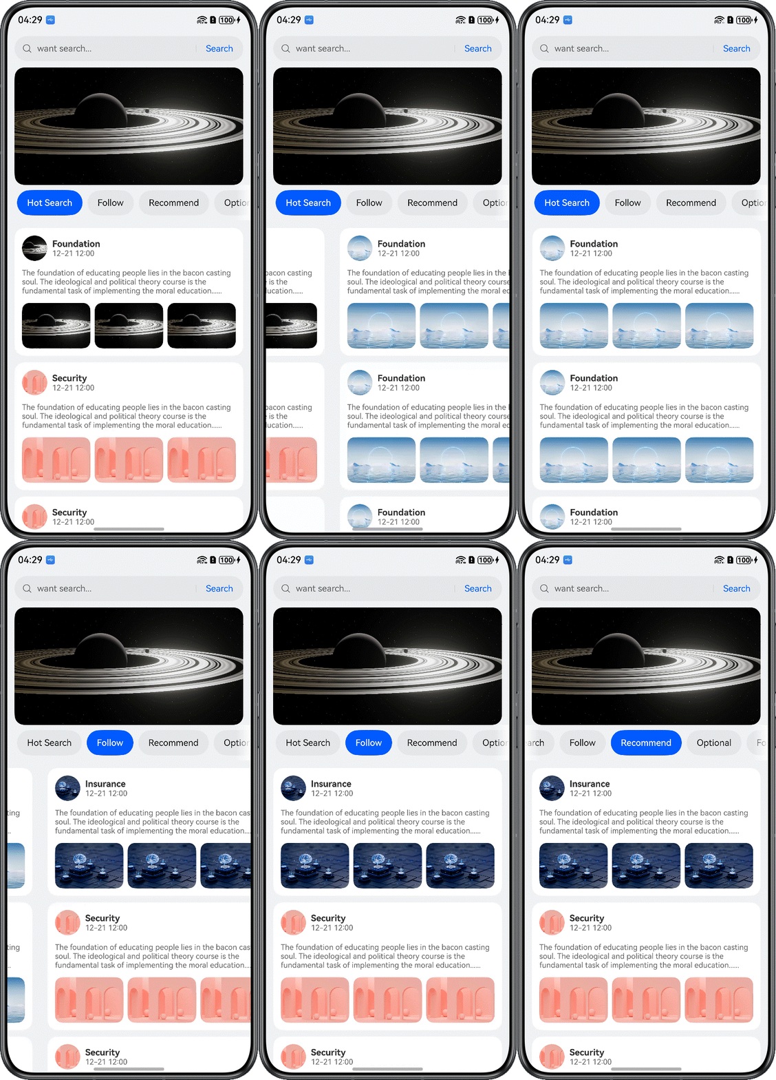
Lists may be reused across multiple pages, for example, during tab switching. ScrollComponents provides global reuse capabilities to support this requirement.
- Define a singleton reuse pool.
ScrollComponents generates a RecycledPool object by default. A singleton reuse pool can be defined to store this object, making it accessible across pages. The following singleton is for reference only. You can encapsulate it based on actual demands.
import { RecycledPool } from '@hadss/scroll_components'; export class Utils { // ... private static utils_: Utils; nodePool: RecycledPool | null = null; // ... } - Store the RecycledPool object in the singleton reuse pool.
HMListManager provides the getRecyclePool() method to obtain the RecyclePool object and store it in the global singleton.
if (Utils.getInstance().nodePool) { this.myListManager.registerRecyclePool(Utils.getInstance().nodePool!); } else { Utils.getInstance().nodePool = this.myListManager.getRecyclePool(); } - Share the RecyclePool object in the singleton across pages.
Use the registerRecyclePool() API to register the RecyclePool object in the global singleton with the list view class object defined for the page. This enables reuse pool sharing across HMRecyclerView components on different pages.
@Component
struct TabsCeilingListPage {
  private tabArray: Resource[] = [
  // ...
  ];
  // ...
  aboutToDisappear(): void {
    Utils.getInstance().nodePool?.clear()
  }

  // ...
  build() {
    // ...
              Tabs({ barPosition: BarPosition.Start, controller: this.contentTabController }) {
                ForEach(this.tabArray, (item: Resource, index: number) => {
                  TabContent() {
                    CustomListPage({ index: index })
                  }
                  .tabBar(this.tabBuilder(index, item))
                  .align(Alignment.Center)
                }, (item: string) => item)
              }
              // ...
  }
}

@Component
struct CustomListPage {
  index: number = 1;
  myListManager: MyListManager = new MyListManager({
    defaultNodeItem: 'CustomListItemContainer',
    context: this.getUIContext()
  });
  @State myViewModel: TabsCeilingViewModel = new TabsCeilingViewModel(this.myListManager);
  scroller: Scroller = new Scroller();

  aboutToAppear(): void {
    // ...
    // Shared multiplexing pools
    if (Utils.getInstance().nodePool) {
      this.myListManager.registerRecyclePool(Utils.getInstance().nodePool!);
    } else {
      Utils.getInstance().nodePool = this.myListManager.getRecyclePool();
    }
    // ...
    this.myListManager.registerNodeItem('CustomListItemContainer', wrapBuilder(CustomListItemContainer));
    this.myListManager.preCreate('CustomListItemContainer', 5);
    this.myViewModel.loadData();
  }

  build() {
    RecyclerView({
      viewManager: this.myListManager
    })
  }
}
[h2]When to Use
When users first open a long-list page after a cold start, a blank screen or white patches may appear due to numerous media resources such as images or videos contained in the page, which may take a few seconds to load, resulting in the content gradually appearing only after the wait. The ScrollComponents library supports component pre-creation. With this feature enabled, users can see the text and image skeletons immediately after the page opens, thereby reducing stuttering.
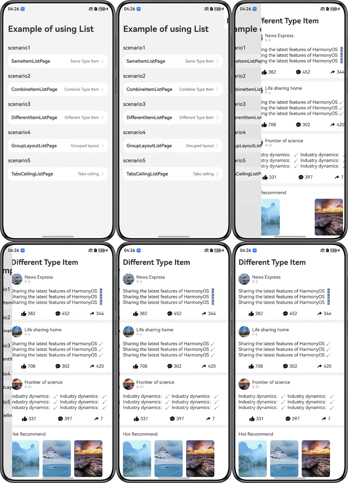
[h2]How to Develop
The process includes template registration and reusable template pre-creation. The preCreate() API must be called after the reusable template is registered.
aboutToAppear(): void {
  // ...
  // Register a reuse template
  this.myListManager.registerNodeItem('BlogItemContainer', wrapBuilder(BlogItemContainer));
  this.myListManager.registerNodeItem('AdaptiveTextComponentContainer', wrapBuilder(AdaptiveTextComponentContainer));
  this.myListManager.registerNodeItem('GridImageViewContainer', wrapBuilder(GridImageViewContainer));
  // Pre-creation Important: preCreate pre-creates a reusable template, which must be done after the reuse template is registered
  // Pre-create 30 list items to optimize the first-screen performance; the number can be adjusted according to actual needs.
  this.myListManager.preCreate('BlogItemContainer', 30);
  this.myListManager.preCreate('AdaptiveTextComponentContainer', 30);
  this.myListManager.preCreate('GridImageViewContainer', 30);
  // ...
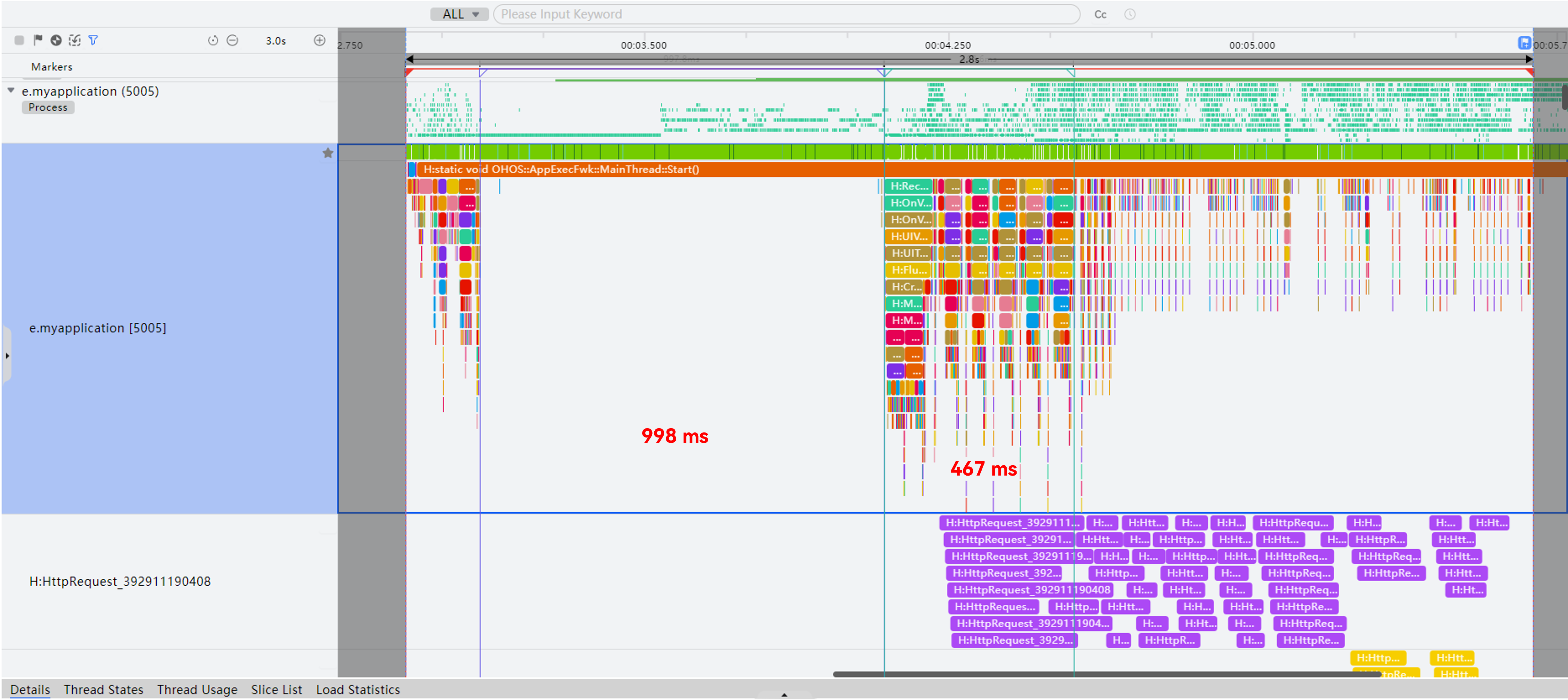
} To compare the completion latencies of loading identical data in the post-cold-start scenario, a 1-second delay is added to simulate the network request scenario that occurs after a cold start.
@Reusable: During the network request, the main thread exhibited long idle durations. After the request completed, the time taken to render the first-screen components was relatively long.
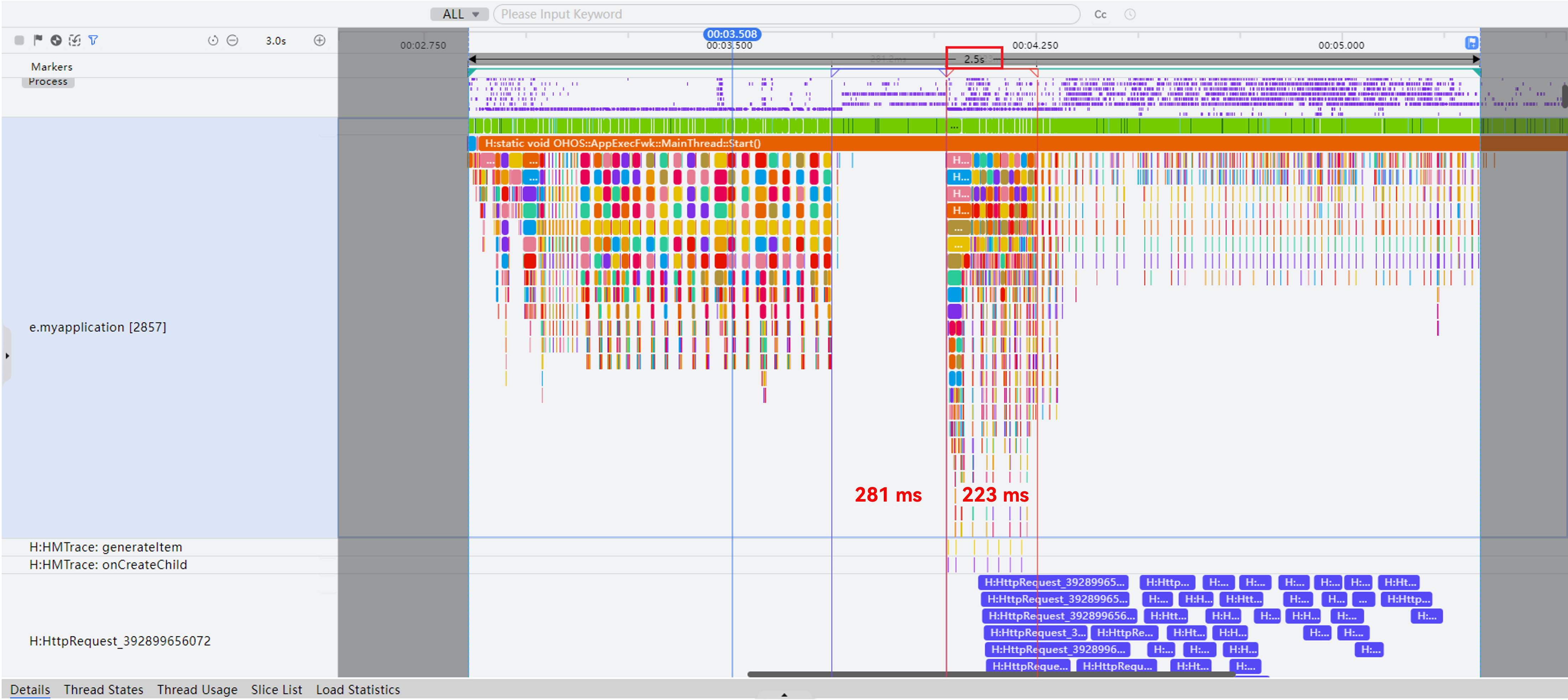
ScrollComponents: During the network request, the main thread exhibited minimal idle durations. After the request completed, the time taken to render the first-screen components was relatively short.
Cold Start Completion Latency | Main Thread Idle Duration | First-Screen Component Creation Duration | |
|---|---|---|---|
ScrollComponents | 2.5s | 281 ms | 223 ms |
@Reusable | 2.8s | 997 ms | 467 ms |
Conclusion: In cold start scenarios, ScrollComponents outperforms the built-in @Reusable implementation in completion latency, delivering an overall reduction in latency of 300 ms.
[h2]When to Use
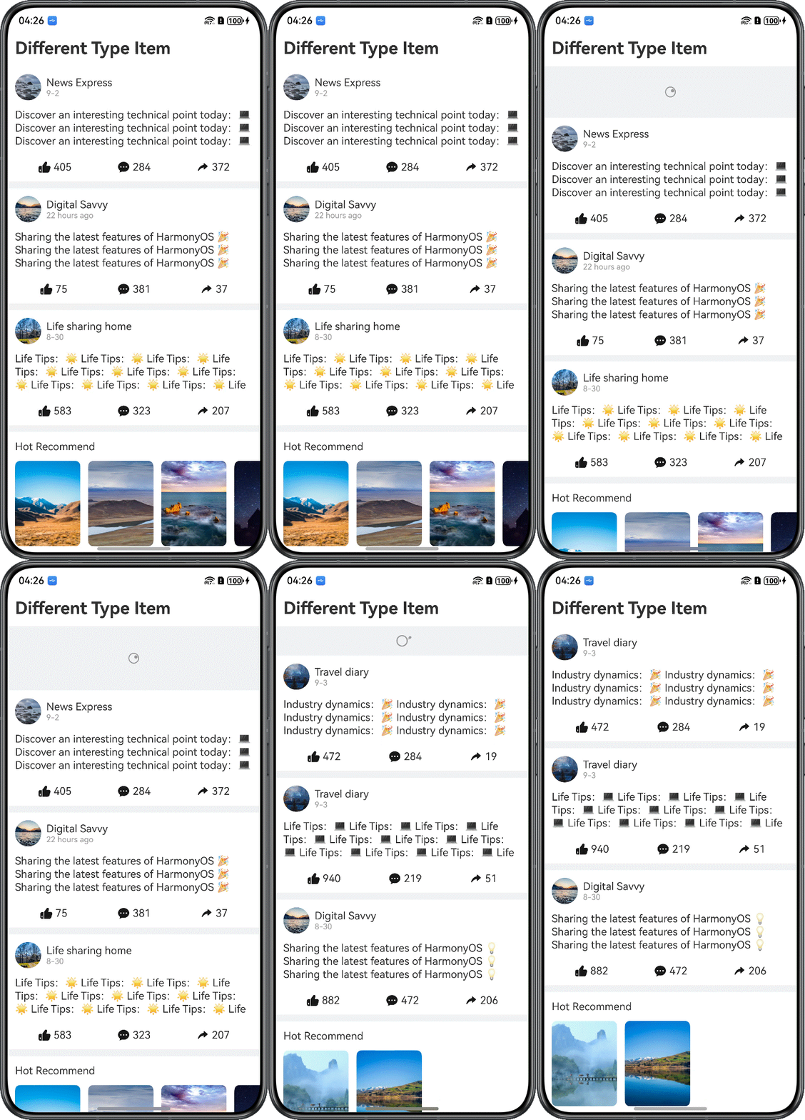
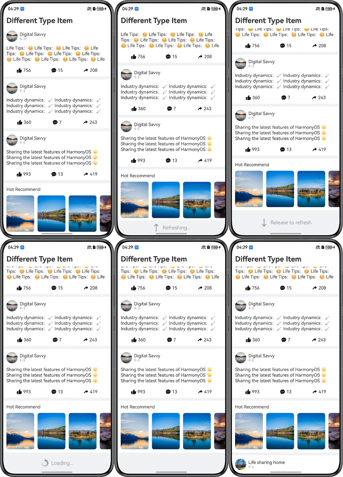
Pull-to-refresh is a critical feature for enhancing user experience, requiring both seamless data loading and maintaining smooth interaction effects. You are advised to use lazy loading for data updates to prevent UI rendering blocks caused by media resource loading. For details about the implementation logic, see Implementing Pull-Down-to-Refresh and Pull-Up-to-Load-More.
[h2]How to Develop
Use the Refresh component to implement pull-down operations on the page, and bind it to the container component that displays the loading animation. Then, use the onRefreshing callback to reset data, simulating data refresh.
@Component
struct DifferentItemListPage {
  myListManager: MyListManager = new MyListManager({
    defaultNodeItem: 'EasyBlogItemContainer',
    context: this.getUIContext()
  });
  @State dataArray: BlogData[] = [];
  @State myViewModel: DifferentItemViewModel = new DifferentItemViewModel(this.myListManager, this.dataArray);
  @State isRefreshing: boolean = false;
  @State isLoadMore: boolean = false;
  // ...
  @Builder
  buildListView() {
    RecyclerView({
      viewManager: this.myListManager
    })
  }

  build() {
    // ...
        Refresh({ refreshing: $$this.isRefreshing }) {
          Column() {
            this.buildListView();
            // ...
          }
        }
        .layoutWeight(1)
        .onRefreshing(() => {
          this.myViewModel.loadData((_isSuccess) => {
            this.isRefreshing = false;
          });
        })
        // ...
  }
}
@Observed
export class DifferentItemViewModel {
@Track dataArray: BlogData[] = [];
myListManager: ListManager;
// ...
loadData(callBack?: (isSuccess: boolean) => void): void {
generateRandomBlogData().then((data: BlogData[]) => {
this.dataArray = data;
this.myListManager.setDataSource(data);
if (callBack) {
callBack(true);
}
});
}
// ...
} When a long-list page involves large volumes of data and requires pagination or batched requests, a load-more effect can be implemented by leveraging the lazy loading capability provided by ScrollComponents.
[h2]How to Develop
Use the Refresh component to implement pull-up operations on the page, and bind it to the container component that displays the loading animation. Then, use the onReachEnd callback to add new data, simulating data loading.
@Component
struct DifferentItemListPage {
  myListManager: MyListManager = new MyListManager({
    defaultNodeItem: 'EasyBlogItemContainer',
    context: this.getUIContext()
  });
  @State dataArray: BlogData[] = [];
  @State myViewModel: DifferentItemViewModel = new DifferentItemViewModel(this.myListManager, this.dataArray);
  @State isRefreshing: boolean = false;
  @State isLoadMore: boolean = false;
  // ...
  initView() {
    this.myListManager.setItemViewStyle((_item, _index, _data: ESObject) => {
    })
    this.myListManager.setViewStyle({ space: 10, scroller: this.scroller })
    // ...
      .onReachEnd(() => {
        if (!this.isLoadMore) {
          this.isLoadMore = true;
          this.myViewModel.loadDataMore((_isSuccess) => {
            this.isLoadMore = false;
          });
        }
      })
  }

  @Builder
  buildListView() {
    RecyclerView({
      viewManager: this.myListManager
    })
  }

  build() {
    // ...
        Refresh({ refreshing: $$this.isRefreshing }) {
          Column() {
            this.buildListView();
            if (this.isLoadMore) {
              Row() {
                LoadingProgress()
                  .width(20)
                  .height(20)
                  .color('#999999')
                Text($r('app.string.loading_more'))
                  .fontSize(14)
                  .fontColor('#999999')
                  .margin({ left: 8 })
              }
              .width(CommonConstants.FULL_WIDTH)
              .height(50)
              .justifyContent(FlexAlign.Center)
            }
          }
        }
        // ...
  }
}
@Observed
export class DifferentItemViewModel {
// ...
private isLoadingMore: boolean = false;
// ...
loadDataMore(callBack?: (isSuccess: boolean) => void): void {
if (!this.isLoadingMore) {
this.isLoadingMore = true;
setTimeout(() => {
generateRandomBlogData().then((data: BlogData[]) => {
this.myListManager.nodeAdapter.pushData(data);
this.isLoadingMore = false;
if (callBack) {
callBack(true);
}
})
}, this.NetworkTime);
}
}
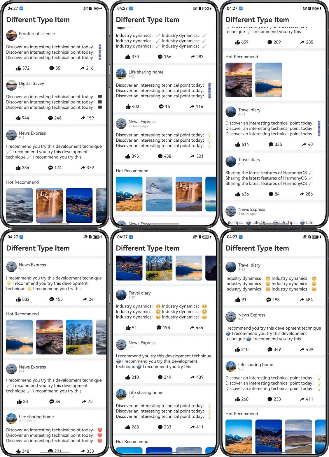
} To address the inconvenience of manual pull-up-to-load-more operations, new data loading is triggered in advance when the user is about to scroll to the bottom of the list. The newly loaded data is then displayed at the end of the long list, thereby achieving an infinite scrolling effect.
- Pain point: When a long list contains a large number of images or videos, rapidly scrolling past the list bottom may cause white patches. This issue becomes even more noticeable in weak network environments or when the user is accessing large volumes of online data.
- Solution: To reduce white patches during scrolling and minimize waiting time for data loading, ScrollComponents comes with a built-in content prefetching feature (Prefetcher). This feature dynamically adapts to network conditions and pre-downloads images or resources in advance to ensure they can be displayed immediately when needed, thus minimizing the occurrence of white patches.
- Applicable scenarios: Dynamic preloading is particularly suitable for scenarios involving time-consuming data requests, such as scrollable lists containing extensive image resources.
The following sections describe the specific usage.
- Modify the data model parameters to add a bitmap field.
@Observed class ObservedArray<T> extends Array<T> { } @Observed export class ImagePixelMap { imageUrl: string = ''; imagePixelMap: image.PixelMap | undefined = undefined; } @Observed export class BlogData { // ... // Multiple graphs define imagePixelMapArray, corresponding to images imagePixelMapArray: ObservedArray<ImagePixelMap> = []; // A single graph defines an imagePixelMap, which corresponds to an imageUrl // imageUrl: string = '' // imagePixelMap: image.PixelMap | undefined = undefined; callback: Function | undefined = undefined; fetchUrl: string | ImageContent = ImageContent.EMPTY; } - Implement the fetchCallback() and cancelCallback() methods.
fetchCallback: (item: ESObject, fetchId: number) => Promise<void> = (item: ESObject, fetchId: number) => { // Simulate a simple pre-loading scenario. This is where you can migrate the preloaded scenarios for your project. // 1. When the component is not displayed or created, obtain the image's PixelMap in advance. When the component is displayed, directly load and display this PixelMap, with no need to wait for network requests. // 2. If the image is to be displayed but its PixelMap has not been obtained, first bind the data to the Image component. Once the PixelMap is obtained, the image can be refreshed immediately. let data = item as BlogData; this.fetchesMore.set(fetchId, new Map()); return new Promise(resolve => { this.loadImagesInBatches(data.imagePixelMapArray, fetchId, 0, resolve); }) } private loadImagesInBatches(images: ImagePixelMap[], fetchId: number, startIndex: number, resolve: () => void): void { if (startIndex >= images.length) { const fetchMap = this.fetchesMore.get(fetchId); if (fetchMap && fetchMap.size === 0) { this.fetchesMore.delete(fetchId); } resolve(); return; } const batchSize = 1; const endIndex = Math.min(startIndex + batchSize, images.length); for (let i = startIndex; i < endIndex; i++) { const pixMap = images[i]; if (pixMap.imagePixelMap) { continue; } let httpRequest = HttpGet(pixMap.imageUrl, (error: number, pixelMap?: image.PixelMap) => { let fetchMap = this.fetchesMore.get(fetchId); if (fetchMap) { fetchMap.delete(i); if (fetchMap?.size === 0) { this.fetchesMore.delete(fetchId); } } if (error === -1) { return; } if (pixelMap) { // You need to create an array to store the pixelMap, because there is a change in the internal data of the array to make the component respond, which is more complicated, the developer can choose the preloading scheme by himself: // Define the ImagePixelMap class to store the pixelMap, encapsulate the Image component as an ObservedImage, add @ObjectLink imagePixelMap: ImagePixelMap property to bind the data object, // In the preloaded callback fetchCallback, after the image pixelMap is obtained, set ImagePixelMap.imagePixelMap, and the image can be refreshed by ObservedImage pixMap.imagePixelMap = pixelMap; } }); let fetchMap = this.fetchesMore.get(fetchId); if (fetchMap) { fetchMap.set(i, httpRequest); } } setTimeout(() => { this.loadImagesInBatches(images, fetchId, endIndex, resolve); }, 80); } cancelCallback: (fetchId: number) => void = (fetchId: number) => { const fetchMap = this.fetchesMore.get(fetchId); if (fetchMap) { Array.from(fetchMap.values()).forEach(element => { element.destroy(); }); fetchMap.clear(); } this.fetchesMore.delete(fetchId); } - When creating a component instance, register the fetch and cancel methods with the view manager.
aboutToAppear(): void {
  this.initView();
  // Register a preload function callback
  this.myViewModel.registerPrefetch();
  // ...
}
registerPrefetch() { this.myListManager?.registerFetchCallback(this.fetchCallback); this.myListManager?.registerCancelCallback(this.cancelCallback); } - Listen for changes to the child components of the scrollable component.
@Component struct CombineItemListPage { // ... initView() { this.myListManager.setViewStyle({ space: 10, scroller: this.scroller }) // ... .onScrollIndex((start: number, end: number) => { // Infinite swipe, when the 10th data is counted, new data is requested in advance if (end > this.myViewModel.dataArray.length - 10) { this.myViewModel.loadDataMore(); } // Trigger a preload callback, request an image in advance, and resolve the white block of the image if (end > 0) { this.myListManager.visibleAreaChanged(start, end); } }) } // ... } - Customize the Image component and set up two-way data binding.
@Component
struct GridImageView {
  @State blogData: BlogData = new BlogData();

  aboutToReuse(params: Record<string, ESObject>): void {
    this.blogData = params.blogData;
  }

  build() {
    Grid() {
      ForEach(this.blogData.imagePixelMapArray, (image: ImagePixelMap | undefined, _index: number) => {
        GridItem() {
          Stack() {
            ObservedImage({ imagePixelMap: image })
          }
        }
      })
    }
    .columnsTemplate("1fr 1fr 1fr")
    .rowsGap(5)
    .columnsGap(5)
  }
}

@Component
struct ObservedImage {
  @ObjectLink imagePixelMap: ImagePixelMap;

  build() {
    Image(this.imagePixelMap.imagePixelMap)
      .sourceSize({ width: 100, height: 100 })
      .width('100%')
      .aspectRatio(1)
      .objectFit(ImageFit.Cover)
      .borderRadius(8)
  }
}
[h2]When to Use
Swipe menus are commonly used in many apps. For example, a messaging app generally provides a swipe-to-delete feature for its message list. This feature allows users to delete a message by swiping left on it and tapping the delete button.

[h2]How to Develop
- Implement swipe-to-delete for a standard list.
@Component struct SameItemListPage { // ... initView() { this.myListManager.setItemViewStyle((item, index, data: Params) => { item({ style: ListItemStyle.NONE }) .width('100%') .height('auto') .swipeAction({ end: { builder: () => this.ItemActionEnd(data.blogData) }, start: { builder: () => this.ItemActionStart(data.blogData) }, onOffsetChange: (offset: number) => Logger.info("offset:" + offset) }) .onClick(() => Logger.info("index:" + index)) }) // ... } @Builder ItemActionStart(data: BlogData) { Row() { Text($r('app.string.collection')) // ... } // ... } @Builder ItemActionEnd(data: BlogData) { Row() { Text($r('app.string.delete')) // ... } // ... } build() { // ... Column() { RecyclerView({ viewManager: this.myListManager }) } // ... } } - Implement swipe-to-delete for a grouped list.
Currently, ListItemGroupManage is written inside ListManager, and groupManager.setItemViewStyle() of the swipe component needs to be set in ListManager.onWillCreateItem().
class MyListManager extends ListManager {
  // ...
  onWillCreateItem(_index: number, data: CategoryModel): NodeItem {
    const groupManager = new MyListItemGroupManager({ defaultNodeItem: 'GoodItemContainer', context: this.context });
    groupManager.registerNodeItem('GoodItemContainer', wrapBuilder(GoodItemContainer));
    // ...
    groupManager.setItemViewStyle((listItem, index, data: ParamsGoods) => {
      // Used to set the scratch component of ListItem.
      listItem().swipeAction({
        end: {
          builderComponent: new ComponentContent<[number, GoodsDataModel, ListItemGroupManager]>(this.context,
            wrapBuilder<[[number, GoodsDataModel, ListItemGroupManager]]>(GroupItemActionEnd),
            [index, data.dataModel, groupManager]),
          onEnterActionArea: () => Logger.info("onEnterActionArea"),
          onExitActionArea: () => Logger.info("onExitActionArea"),
          onStateChange: (state: SwipeActionState) => Logger.info("onStateChange" + state)
        },
        start: {
          builderComponent: new ComponentContent<[number, GoodsDataModel]>(this.context,
            wrapBuilder<[[number, GoodsDataModel]]>(GroupItemActionStart),
            [index, data.dataModel]),
        },
        onOffsetChange: (offset: number) => Logger.info("offset:" + offset),
        edgeEffect: SwipeEdgeEffect.Spring,
      })
    })
    return groupManager.getNodeItem(this);
  }
}
class MyListItemGroupManager extends ListItemGroupManager {
  // ...
}

@Builder
function GroupItemActionStart(args: [number, GoodsDataModel]) {
  // ...
}

@Builder
function GroupItemActionEnd(args: [number, GoodsDataModel, ListItemGroupManager]) {
  // ...
}
Currently, swipeAction must be set using the builderComponent property. The builder function for GroupItemActionEnd must be defined in the global scope and the same rule applies to GroupItemActionStart.
To handle interactions (such as a tap) and notify the page, define a tap callback property in the data model class (DataModel). Assign a handler function to this property when passing the model data to the component.
[h2]When to Use
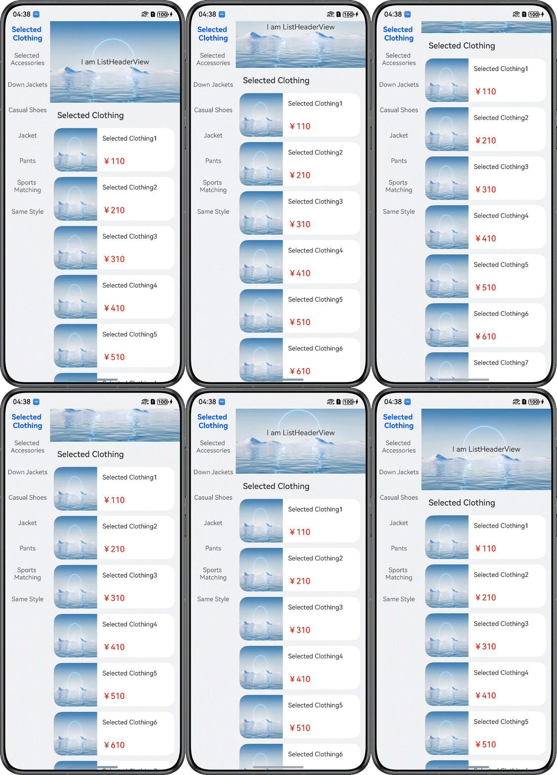
As the container of the long list on the home page, the List component customizes the view UIs of different modules via ListItem. It is usually used in the list information flow scenarios where multiple types of views are displayed, such as the portal home page and mall home page. For details about the multi-type list item scenario (List + ListHeaderView), see Multi-type List Item Scenario.
[h2]How to Develop
To achieve the effect shown in the figure above, place HeaderView and RecyclerView inside Scroll, and set the nested scrolling mode of RecyclerView via the nestedScroll() API.
@Component
struct GroupLayoutListPage {
  // ...
  initView() {
    // ...
    this.myListManager.setViewStyle({ space: 10, scroller: this.goodsListScroller })
      // ...
      .nestedScroll({
        // 1.Nested scrolling: Set up a scrolling scheme
        scrollForward: NestedScrollMode.PARENT_FIRST,
        scrollBackward: NestedScrollMode.SELF_FIRST
      })
  }

  // ...
  build() {
    // ...
        // Nested scrolling: Implement the ListHeader effect
        Scroll() { // 2.Nested Scroll: Outer Scroll
          Column() {
            ListHeaderView()
            Column() { // 3.Nested Scrolling: Inner List
              RecyclerView({
                viewManager: this.myListManager
              })
            }
            .height('100%')
          }
        }
        .layoutWeight(1)
        .scrollBar(BarState.Off)
        // ...
  }
}


@Component
export struct ListHeaderView {
  build() {
    Column() {
      // ListHeaderView: You can set up various types of subassemblies
      // Swiper(...){...}
      // Grid(...){...}
      // CustomComponent(...){...}
      Stack({ alignContent: Alignment.Center }) {
        Image($r('app.media.pic1'))
        Row() {
          Text($r('app.string.i_am'))
            .fontSize(16)
            .fontColor('#333')
          Text(' ListHeaderView')
            .fontSize(16)
            .fontColor('#333')
        }
      }
    }
    .alignItems(HorizontalAlign.Center)
  }
} 
In ArkUI, this can be implemented by nesting HeaderView and ForEach inside List. HeaderView supports adding multiple types of components to achieve the effect of synchronous scrolling with List, and ForEach is used to display specific items.
In ScrollComponents, this can be implemented by directly using ScrollComponents, which is built on FrameNode and automatically manages data sources, or by nesting HeaderView and RecyclerView inside the Scroll container.
[h2]When to Use
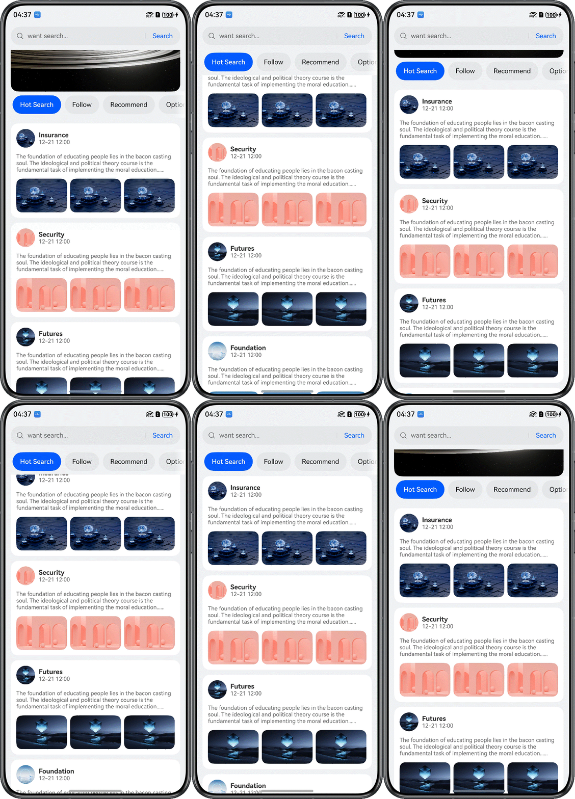
The sticky effect achieved by nesting Tabs with List is commonly used on the home pages of news and information apps. For details about the sticky Tabs in a long list, see Sticky Tabs Scenario.
[h2]How to Develop
- Implement the skeleton layout for TabContent within the Tabs component.
@Component struct TabsCeilingListPage { // ... build() { // ... Column() { Tabs({ barPosition: BarPosition.Start, controller: this.contentTabController }) { ForEach(this.tabArray, (item: Resource, index: number) => { TabContent() { CustomListPage({ index: index }) } .tabBar(this.tabBuilder(index, item)) .align(Alignment.Center) }, (item: string) => item) } // Set the height of the tab to 'calc(100% - 63vp)' to ensure that the Tabs component leaks out just when the nest slides .height('calc(100% - 58vp)') .barHeight(56) // ... .onChange((index: number) => this.currentTabIndex = index) } .backgroundColor($r('app.color.home_background_color')) // ... } } - Use RecyclerView to implement a List inside TabContent.
@Component struct CustomListPage { // ... aboutToAppear(): void { this.myListManager.setItemViewStyle((_item, _index, _data: ESObject) => { }) this.myListManager.setViewStyle({ space: 10, scroller: this.scroller, }) // ... } build() { RecyclerView({ viewManager: this.myListManager }) } } class MyListManager extends ListManager { // ... } @Builder function CustomListItemContainer($$: ParamsItemData) { CustomListItem({ itemData: $$.itemData }) } - Configure the nested scrolling mode.
@Component struct CustomListPage { // ... aboutToAppear(): void { // ... this.myListManager.setViewStyle({ space: 10, scroller: this.scroller, }) // ... .nestedScroll({ scrollForward: NestedScrollMode.PARENT_FIRST, // Set the effect of scrolling the component to the end: The parent component rolls first, and then rolls itself to the edge scrollBackward: NestedScrollMode.SELF_FIRST // Set the effect of rolling the component to the start end: Rolls itself first, and then the parent component scrolls to the edge }) // Shared multiplexing pools // ... } // ... } - Set the height of the List component to expose the Tabs component when scrolled to the top.
@Component
struct TabsCeilingListPage {
  // ...
  build() {
    // ...
            Column() {
              Tabs({ barPosition: BarPosition.Start, controller: this.contentTabController }) {
                // ...
              }
              // Set the height of the tab to 'calc(100% - 63vp)' to ensure that the Tabs component leaks out just when the nest slides
              .height('calc(100% - 58vp)')
              .barHeight(56)
              // ...
  }
}

Issue: When the Tabs component is set to be sticky, the nestedScroll property does not take effect.
Solution: By default, RecyclerView uses .layoutWeight(1) to automatically fill the height. To resolve this, add a layout component at the outermost layer and set its height to .height(calc(100% - 50vp)) to correctly define the height of the RecyclerView.
[h2]When to Use
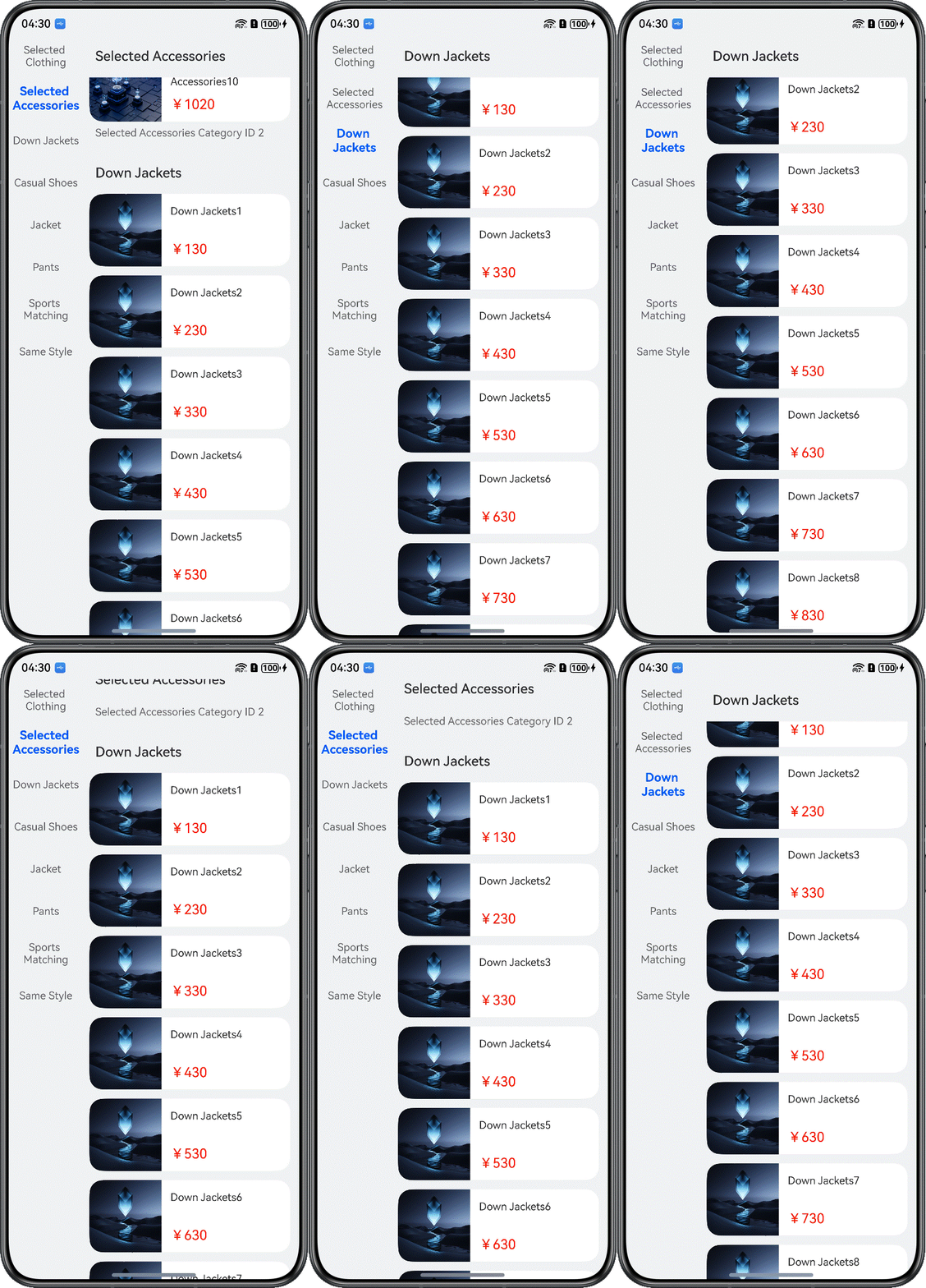
Sticky group headers are applicable to scenarios with two synchronously scrolling lists: a left category list for quick indexing and a content list grouped by categories. Typical use cases include product category selection, address books, city selection, and other grouped choice pages. For details about sticky group headers in a long list, see Grouped Pinning Scenario.
This case implements a sticky header effect for the product category list page, as shown in the figure below.
[h2]How to Develop
- Implement grouped display for the product category page.
class MyListManager extends ListManager { // ... } class MyListItemGroupManager extends ListItemGroupManager { // ... } @Component struct GroupLayoutListPage { // ... build() { NavDestination() { Row() { List({ scroller: this.categoryScroller }) { // ... } .width(100) .height('100%') .scrollBar(BarState.Off) // Nested scrolling: Implement the ListHeader effect Scroll() { // 2.Nested Scroll: Outer Scroll Column() { ListHeaderView() Column() { // 3.Nested Scrolling: Inner List RecyclerView({ viewManager: this.myListManager }) } .height('100%') } } .layoutWeight(1) .scrollBar(BarState.Off) } // ... } // ... } } @Builder function GoodItemContainer($$: ParamsGoods) { GoodItem({ dataModel: $$.dataModel }) } - Set the sticky property.
initView() {
  // ...
  this.myListManager.setViewStyle({ space: 10, scroller: this.goodsListScroller })
    // ...
    .sticky(StickyStyle.Header)// Set up grouped ceilings
    // ...
}
[h2]When to Use
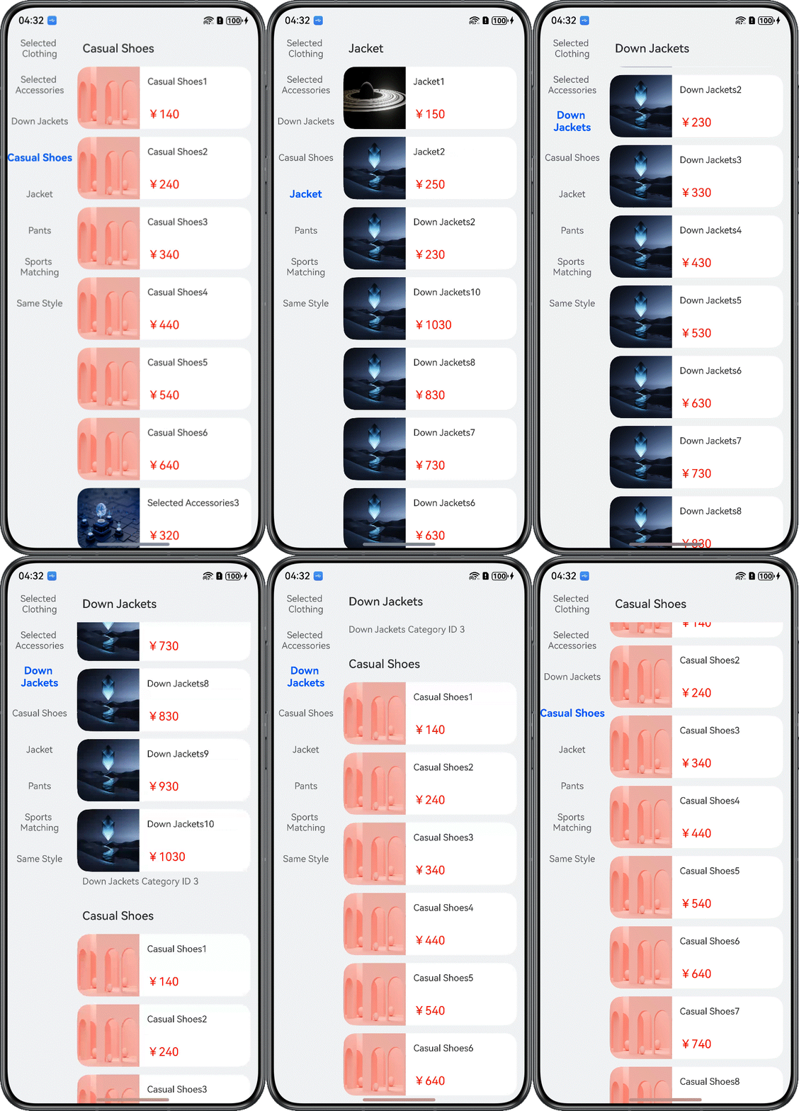
Selecting an item in the primary list on the left updates the data in the secondary list on the right. This pattern is commonly used for product category selection, editing style options, and other secondary category selection pages. For details about the level-2 linkage feature of a long list, see Level-2 Linkage Scenario.
Taking the product category list page as an example, two List components are used: one on the left to display the category navigation and one on the right to show the corresponding category details. When users enter the page and tap a category on the left navigation, the corresponding category details data is displayed in the right list. When users scroll the right list, the list title is pinned to the top, while the corresponding content on the left navigation is highlighted.
- Build left-side category navigation data using the List component.
List({ scroller: this.categoryScroller }) { ForEach(this.myViewModel.categoryList, (item: CategoryModel, index: number) => { ListItem() { Text(item.titleName) // ... } }, (item: CategoryModel) => JSON.stringify(item.titleName)) } - Build right-side category content data using the RecyclerView component, along with the item reuse-related code.
class MyListManager extends ListManager { // ... } class MyListItemGroupManager extends ListItemGroupManager { // ... } @Component struct GroupLayoutListPage { // ... aboutToAppear() { this.initView(); this.myListManager.registerNodeItem('GoodItemContainer', wrapBuilder(GoodItemContainer)); this.myListManager.preCreate('GoodItemContainer', 30); this.myViewModel.loadData(); } // ... build() { // ... Column() { // 3.Nested Scrolling: Inner List RecyclerView({ viewManager: this.myListManager }) } .height('100%') // ... } } - Add a tap event to the navigation list on the left, add the onScrollIndex() event to the category details list on the right, and call the custom listChange method. In listChange, call the scrollToIndex() method of the corresponding list controller based on the value of isGoods to achieve linkage between the navigation list and the category details data.
List({ scroller: this.categoryScroller }) {
  ForEach(this.myViewModel.categoryList, (item: CategoryModel, index: number) => {
    ListItem() {
      Text(item.titleName)
        // ...
        .onClick(() => this.listChange(index, true))
    }
  }, (item: CategoryModel) => JSON.stringify(item.titleName))
}
initView() { // ... this.myListManager.setViewStyle({ space: 10, scroller: this.goodsListScroller }) // ... .onScrollIndex((index: number) => { // Scrolling listeners this.listChange(index, false); }) // ... } listChange(index: number, isGoods: boolean) { if (this.currentTitleId !== index) { this.currentTitleId = index; if (isGoods) { this.goodsListScroller.scrollToIndex(index); } else { this.categoryScroller.scrollToIndex(index); } } }
[h2]When to Use
When a device switches between landscape and portrait modes, or when foldable smartphones transition between small-, medium-, and large-screen states, the number of columns in the long list adjusts based on the current screen width to display items at a more appropriate size.

[h2]How to Develop
Enable free screen rotation and listen for screen size changes. When the width is greater than the height, set the list to display 2 columns.
@Component
struct SameItemListPage {
  // ...
  private context = this.getUIContext().getHostContext() as common.UIAbilityContext;
  private windowClass = (this.context as common.UIAbilityContext).windowStage.getMainWindowSync();

  aboutToDisappear(): void {
    this.windowClass.off('windowSizeChange');
  }
  aboutToAppear(): void {
    // The settings page is free to rotate
    let orientation = window.Orientation.AUTO_ROTATION;
    this.windowClass.setPreferredOrientation(orientation, (err: BusinessError) => {
      const errCode: number = err.code;
      if (errCode) {
        Logger.error('Failed to set window orientation. Cause:' + JSON.stringify(err));
        return;
      }
      Logger.info('Succeed to setting window orientation');
    })
    // Listen for screen size changes
    this.windowClass.on('windowSizeChange', (size) => {
      let viewWidth = size.width;
      let viewHeight = size.height;
      if (viewWidth > viewHeight) { // Criteria are judged based on business settings
        this.myListManager.setViewStyle().lanes(2);
      } else {
        this.myListManager.setViewStyle().lanes(1);
      }
    })

    this.initView();
    // ...
  }
  initView() {
    // ...
    this.myListManager.setViewStyle({ space: 10, scroller: this.listScroller })
    // ...
      .alignListItem(ListItemAlign.Start)// Set the direction of the List cross axis
      .lanes(1)// Set the number of layout columns or rows in the List portlet
      // ...
  }
  // ...
} 
For scenarios where items have consistent height, dynamically adjusting the number of columns is recommended. If items vary in size, dynamically setting the column count may result in blank areas, as the height of each row is determined by the tallest item. In such cases, you must choose an appropriate layout strategy.
Two-way binding between a @State variable and a property of the List component is currently not supported. Instead, use the format this.myListManager.setViewStyle().xxxx to update the property manually.
[h2]When to Use
The edge fading effect is implemented by setting the fadingEdge property, as shown in the figure below.