Overview
Multi-Window is a multi-task processing solution that allows multiple app windows to run simultaneously on the same screen in floating window or split-screen mode. In Multi-Window mode, users can properly arrange the positions and sizes of the app windows as required. Currently, Multi-Window is implemented in floating window or split-screen mode.
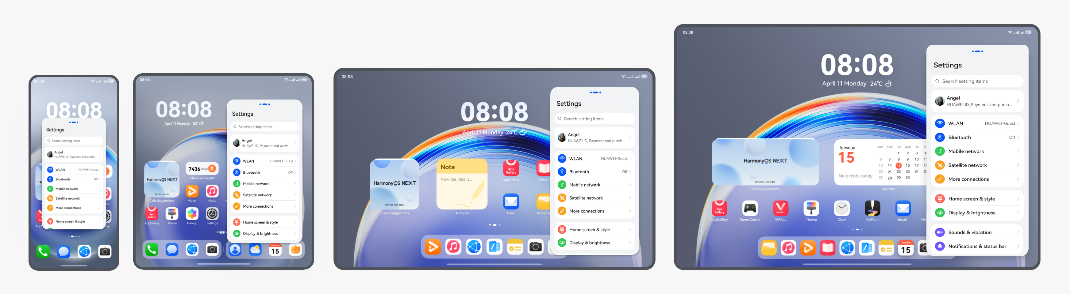
- Floating window: A non-full-screen app window that floats on the device screen. Generally, it is used to temporarily process another task on top of an ongoing full-screen task, or to concurrently run multiple tasks within a short period of time. For example, users can reply to a message while browsing a web page in this mode.
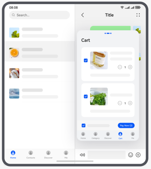
- Split screen: The split-screen mode applies to scenarios where two apps are concurrently running on the screen for a long time. For example, users can watch shopping guides while browsing through commodities, watch videos while playing games, or take notes while watching videos.
After an app enters the Multi-Window (floating window or split-screen) mode from the full screen, the window size and aspect ratio change, which may cause layout adaptation issues. For example, after the screen is split, the page content is not completely displayed and cannot be scrolled, the aspect ratio is incorrect due to video compression, and the overlapping area between the content and the status bar cannot respond to the user operation after the floating windows are opened.
This document describes the floating window and split-screen layout adaptation solutions, as well as some common problems and solutions during Multi-Window development, to help you quickly adapt to the Multi-Window layout and improve user experience.
Before reading this document, you can learn about the UX design specifications of Multi-Window. For details, see Multi-Window Interaction.
Multi-Window Adaptation Solutions
The floating window and split-screen functions are provided by the system and hence do not need to be developed separately. Therefore, you only need to consider the app UI adaptation after the floating window or split-screen function is enabled.
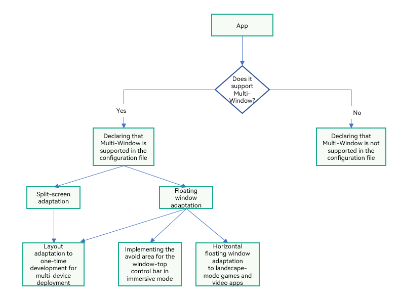
First, you need to consider whether your app needs to support the floating window or split-screen function. If yes, you need to consider layout adaptation and perform one-time development for multi-device deployment on layout adaptation. In some special scenarios, for example, in immersive mode, if the control bar of the top window blocks important information or an event needs to be responded in the overlapping area, the overlapping on the control bar needs to be avoided. For games and videos in landscape mode, the horizontal floating window needs to be adapted. You can refer to the following flowchart for Multi-Window adaptation.
[h2]Configuring Declaration for Multi-Window
You can add the supportWindowMode field to the abilities tag in the module.json5 file to specify whether an app supports the floating window or split-screen mode. The supportWindowMode attribute specifies the window modes supported by UIAbility. For details, see Declaring the Support for Multi-Window.
[h2]One-Time Development for Multi-Device Deployment on Layout Adaptation
When the Multi-Window function is used, the window size changes, which may affect the layout. The following is a detailed description of the two cases:
- Split-screen mode: When the phone enters split-screen mode, the window height is reduced to 1/2 or 1/3 of the original height, and the width remains unchanged. The content page size is not adjusted accordingly. As a result, the content in the vertical direction may be truncated, and the page cannot be scrolled to view the complete content.
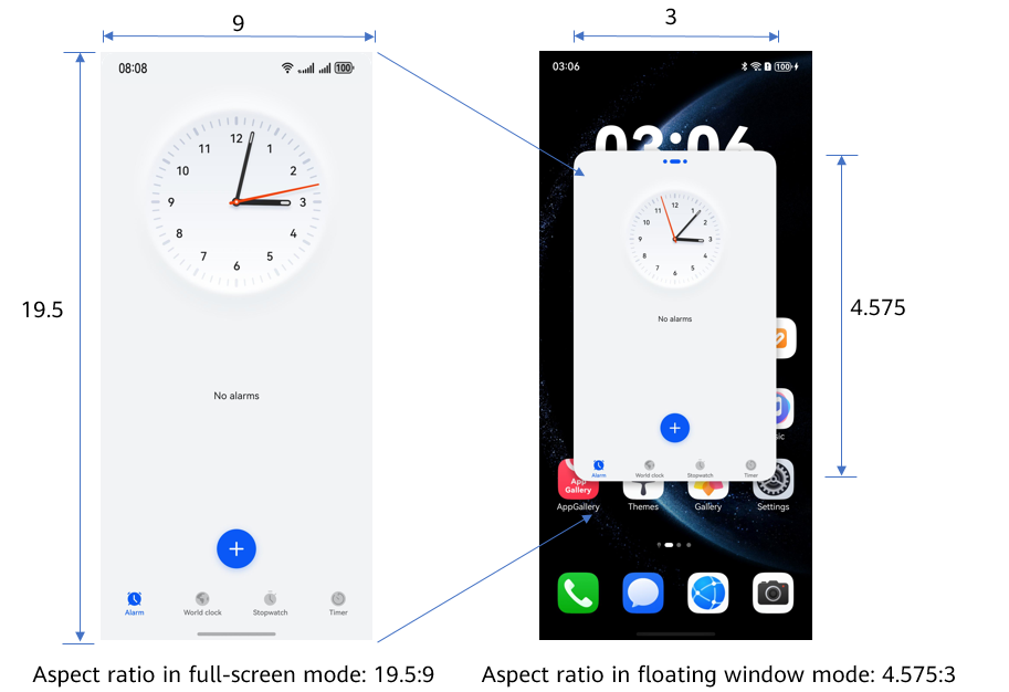
- Vertical floating window mode: In this mode, the content in the window is scaled proportionally based on the window size. However, the aspect ratio of the window changes to 3:4.575, which is different from the full-screen mode (usually 16:9 or 4:3). The vertical ratio is smaller than the horizontal ratio, which may also cause content truncation.
This comparison indicates that when Multiple-Window is used, special attention needs to be paid to layout visibility and content accessibility to ensure user experience.

For details about the aspect ratio of floating windows and the height ratio of split screens on different devices, see Adapting the Application Layout to Multi-Window.
To solve problems such as content truncation, deformation, and stacking when an app enters the floating window or split-screen mode, you can use the adaptive layout and responsive layout to enable the app to adapt to window size changes by referring to Cross-Device UI Development in One-Time Development for Multi-Device Deployment. For example, in Layout Adaptation, the screen is truncated and cannot be scrolled up or down, and the extension capability is used.
[h2]Implementing the Avoid Area for the Window-Top Control Bar in Immersive Mode
In an immersive layout, the app layout does not avoid the status bar, navigation bar, or window-top control bar. In this case, components may overlap with the window-top control bar, resulting in issues such as text blocking and touch event conflicts.
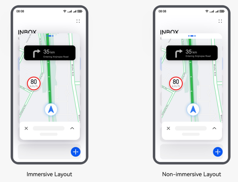
You can use either of the following methods to avoid the window-top control bar. For details, see Implementing the Avoid Area for the Window-top Control Bar.
- Use the window avoidance capability. Specifically, call setWindowLayoutFullScreen() to set whether to use an immersive window layout. In an immersive layout, the app layout does not avoid the status bar, navigation bar, or window-top control bar. In this case, components may overlap with the window-top control bar, resulting in issues such as text blocking and touch event conflicts. In a non-immersive layout, the layout avoids the status bar, navigation bar, and window-top control bar so that components do not overlap with these bars. Therefore, you can set the parameter of setWindowLayoutFullScreen() to false to set the window layout to non-immersive.
- Enable the app to perform active avoidance. When an immersive window layout is used, an app can perform layout avoidance through the getWindowAvoidArea() API. To be specific, the app can obtain the topRect value of the matrix area to be avoided on top of the screen through this API and perform layout avoidance accordingly. In addition, the app can use on('avoidAreaChange') to listen for avoidance area changes in the system for dynamic layout adjustment.
For details, see Implementing the Avoid Area for the Window-top Control Bar in Immersive Mode.
[h2]Horizontal Floating Window Adaptation for Games and Video Apps
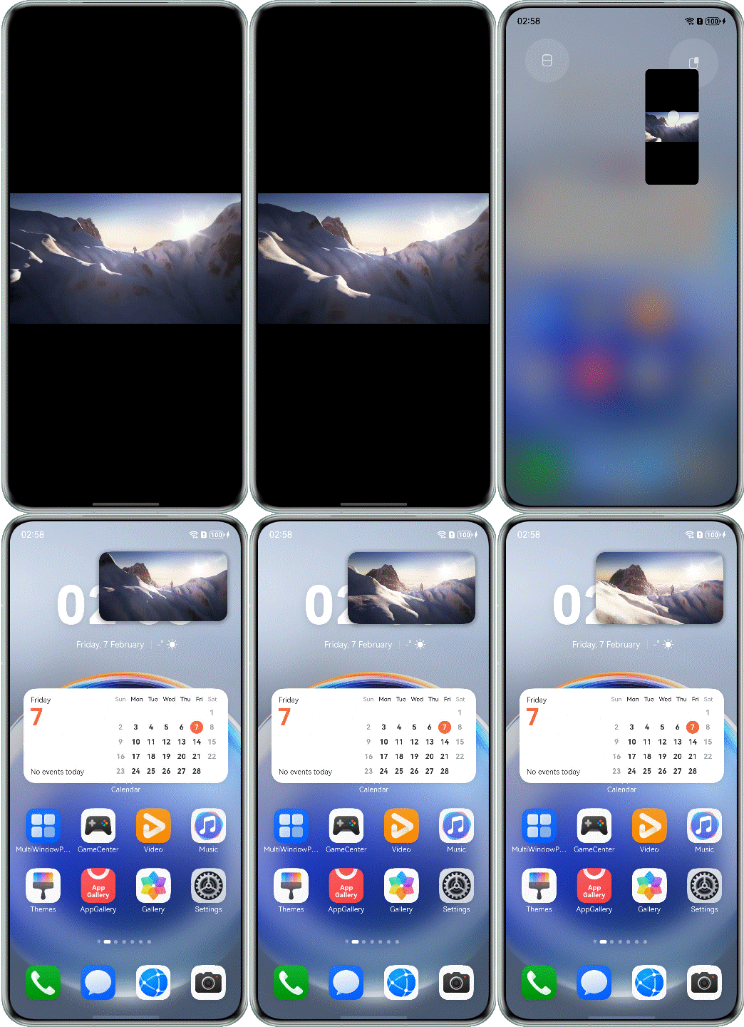
By default, the floating window is in portrait mode. However, for games and video apps run in landscape mode, the horizontal floating window provides better experience. You can add landscape or landscape_auto to the preferMultiWindowOrientation attribute under the abilities tag in the module.json5 configuration file to declare that your app supports the horizontal floating window or vertical split-screen mode.
{
  "module": {
    // ...
    "abilities": [
      {
        "name": "EntryAbility",
        // ...
        "preferMultiWindowOrientation": "landscape_auto"
      }
    ],
    // ...
  }
}
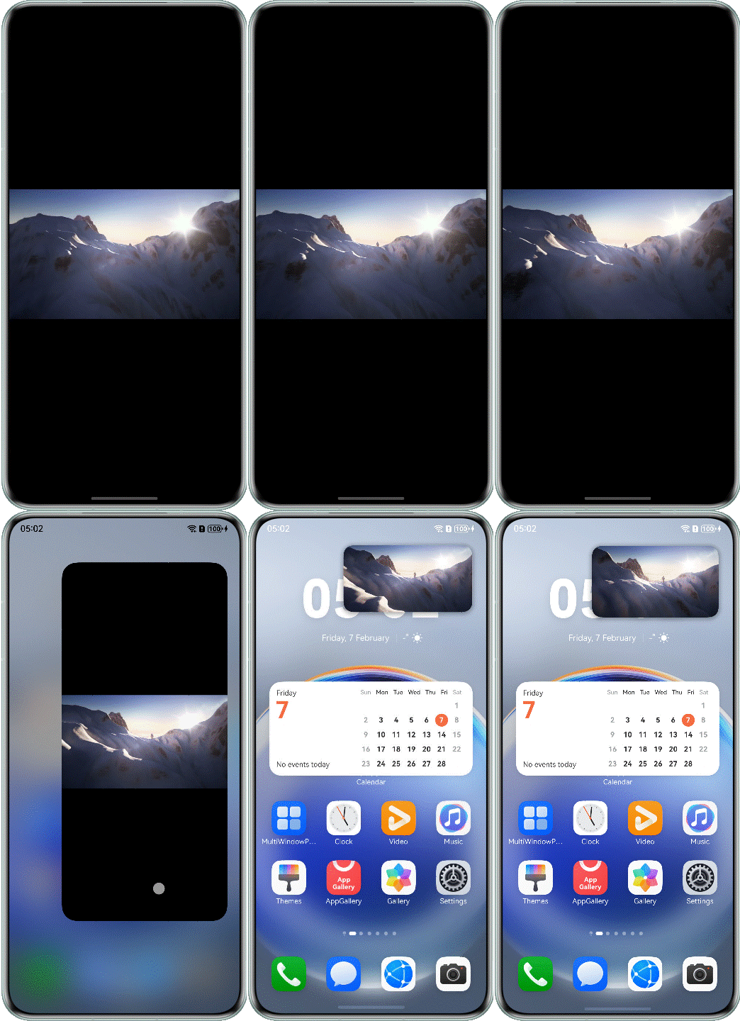
The preferMultiWindowOrientation attribute identifies the Multi-Window layout orientation of the current UIAbility. For details, see the description of preferMultiWindowOrientation in Declaring the Support for Multi-Window. When preferMultiWindowOrientation is set to landscape_auto, the multi-window layout can be dynamically changed to the landscape mode. This attribute needs to be used together with the enableLandscapeMultiWindow or disableLandscapeMultiWindow API. It is recommended that this attribute be configured for video apps. The following figure shows the effect of adapting the video playback page to the horizontal floating window. For details, see Horizontal Floating Window Adaptation.
FAQs
To help you quickly adapt the Multi-Window layout, the following lists some common Multi-Window layout adaptation problems and corresponding solutions.
Common problems are classified into the following three types. You can use the preceding adaptation solutions accordingly.
- Layout adaptation: layout disorder or page truncation due to the reduced window height when the page enters the split-screen or floating window mode.
- Implementing the avoid area for the window-top control bar in immersive mode: no response to operations in the app split-screen view and the overlapping area on top of the floating window.
- Horizontal floating window adaptation: horizontal floating window adaptation for games and video apps.
[h2]Layout Adaptation
- The page is truncated and cannot be scrolled up or down.
Symptom
After the screen is split into two parts, the app content is not completely displayed and cannot be scrolled up or down to view more.
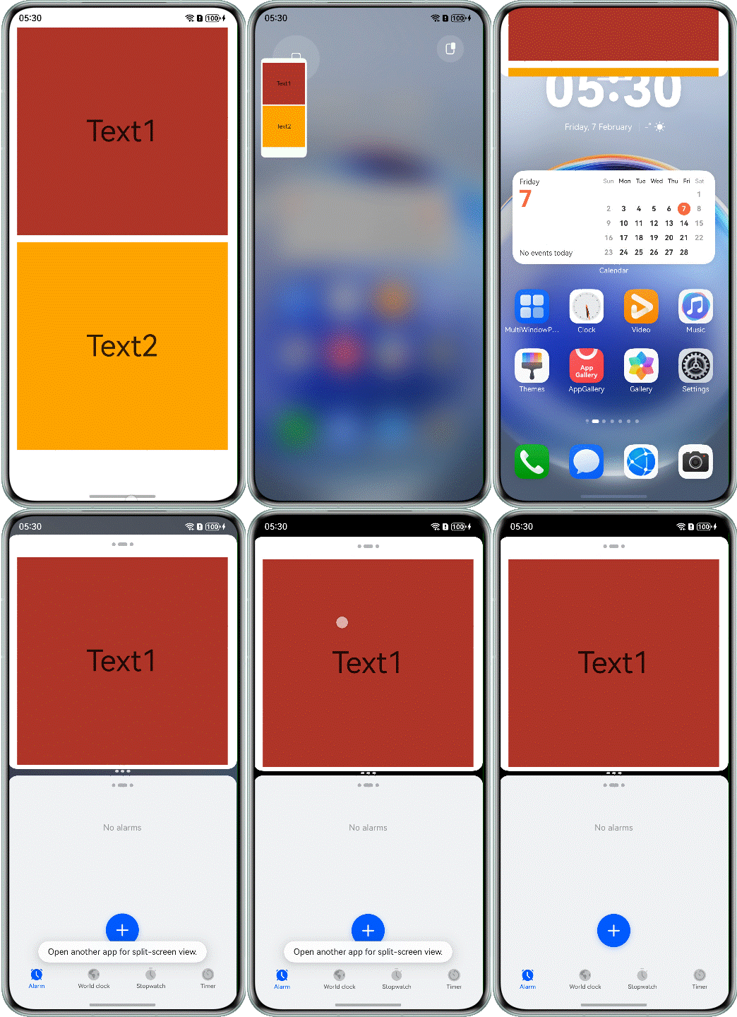
The sample code before optimization is as follows:
@Component
export struct Question1Incorrect {
  build() {
    NavDestination() {
      Column({ space: 12 }) {
        Text('Text1')
          .fontSize(50)
          .width('100%')
          .textAlign(TextAlign.Center)
          .height(350)
          .backgroundColor(Color.Brown)

        Text('Text2')
          .fontSize(50)
          .width('100%')
          .textAlign(TextAlign.Center)
          .height(350)
          .backgroundColor(Color.Orange)
      }
      // ...
    }
    // ...
  }
}
Possible Causes
The app is adapted only to the full-screen size. When the app enters the split-screen or floating window mode, the window becomes smaller. As a result, the page is not completely displayed, and the content in the area beyond the window cannot be displayed.
Solution
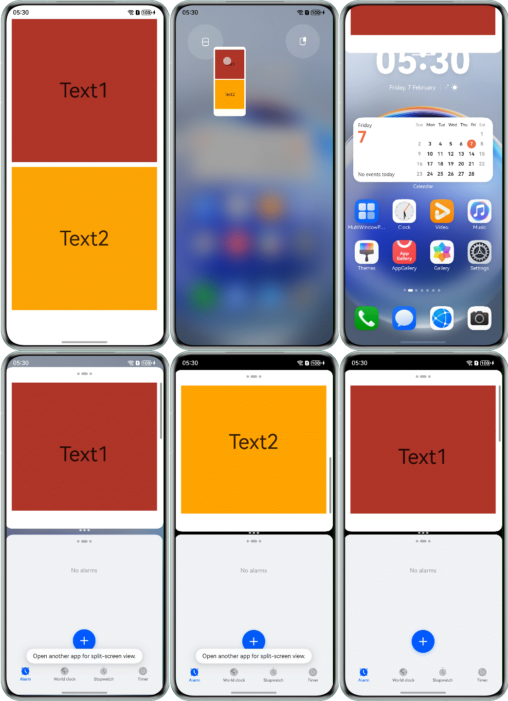
Use the extension capability to add the Scroll component for the list or text area for scrolling in a specified direction. The optimized sample code is as follows:
@Component
export struct Question1Correct {
  build() {
    NavDestination() {
      Scroll() {
        Column({ space: 12 }) {
          Text('Text1')
            .fontSize(50)
            .width('100%')
            .textAlign(TextAlign.Center)
            .height(350)
            .backgroundColor(Color.Brown)

          Text('Text2')
            .fontSize(50)
            .width('100%')
            .textAlign(TextAlign.Center)
            .height(350)
            .backgroundColor(Color.Orange)
        }
      }
      // ...
    }
    // ...
  }
}
The following figure shows the effect after optimization.
- The Xcomponent video page is not completely displayed on the split-screen page.
Symptom
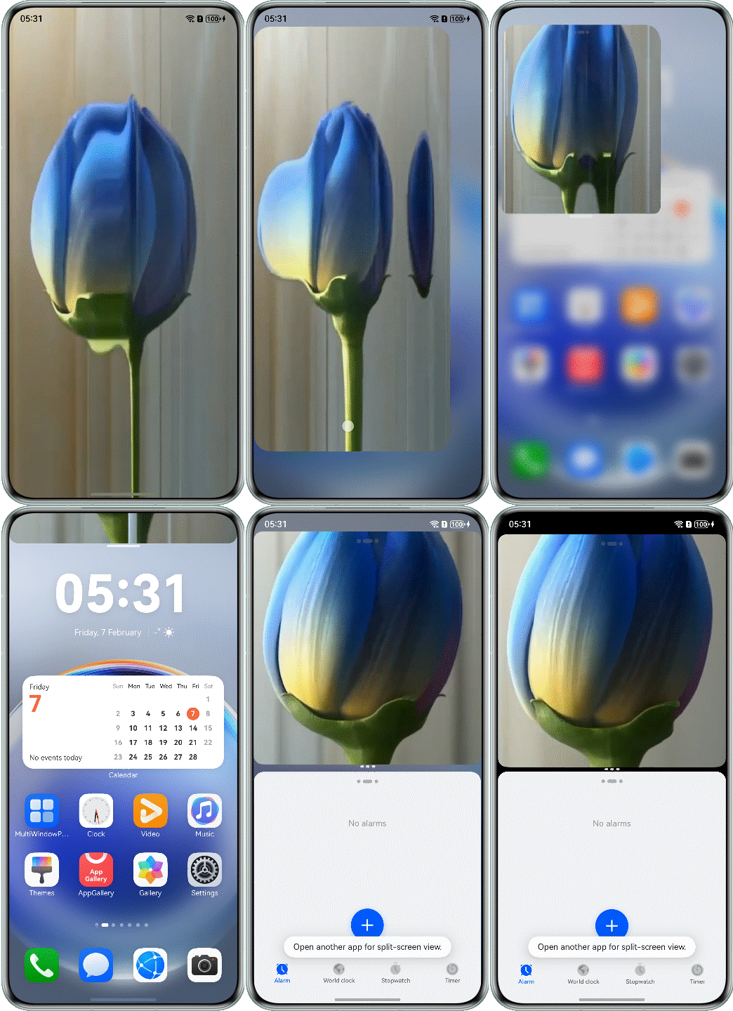
After the video playback screen is split, the video is truncated and not completely displayed.
Possible Causes
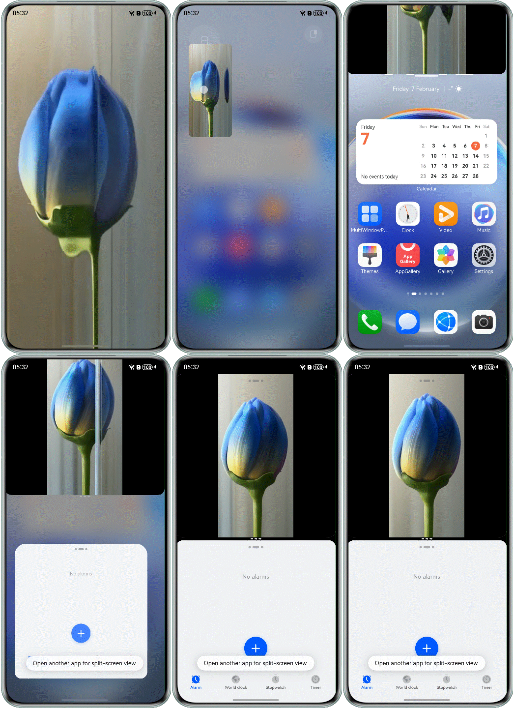
When the split-screen page is displayed, the height of the window changes to 1/2 of the screen. The app does not adapt to this situation. As a result, the width of Xcomponent does not change to 1/2 of the original width, causing the video page to be deformed. The sample code before optimization is as follows:
@Component
export struct Question2Incorrect {
  @State aspect: number = 9 / 16; // default video height/width ratio value
  @State xComponentWidth: number = this.getUIContext().px2vp(display.getDefaultDisplaySync().width);
  @State xComponentHeight: number = this.getUIContext().px2vp(display.getDefaultDisplaySync().width * this.aspect);
  // ...

  build() {
    NavDestination() {
      Stack() {
        XComponent({ id: 'video_player_id', type: XComponentType.SURFACE, controller: this.xComponentController })
          // ...
          .width(this.xComponentWidth)
          .height(this.xComponentHeight)
      }
      .width('100%')
      .height('100%')
      .backgroundColor(Color.Black)
    }
    .hideTitleBar(true)
  }
}
Solution
Use the aspectRatio attribute of layout constraints to specify the aspect ratio of the XComponent component. After the aspectRatio attribute is set, the width and height of the component are constrained by the size of the content area of the parent component.
@Component
export struct Question2Correct {
  @State aspect: number = 9 / 16; // default video width/height ratio value
  // ...

  build() {
    NavDestination() {
      Stack() {
        XComponent({ id: 'video_player_id', type: XComponentType.SURFACE, controller: this.xComponentController })
          // ...
          .aspectRatio(this.aspect)
      }
      .width('100%')
      .height('100%')
      .backgroundColor(Color.Black)
    }
    // ...
  }
}
The following figure shows the effect after optimization.
- The Video component is truncated in split-screen mode.
Symptom
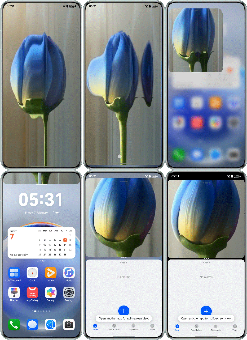
When the Video component is in split-screen mode, the video playback page is truncated and not completely displayed.
The sample code before optimization is as follows:
@Component
export struct Question3Incorrect {
  build() {
    NavDestination() {
      Column() {
        Video({ src: $rawfile('testVideo2.mp4') })
          .height('100%')
          .width('100%')
          .autoPlay(true)
          .controls(false)
      }
      .height('100%')
      .width('100%')
    }
    .hideTitleBar(true)
  }
}
Possible Causes
The width and height of the Video component are set to 100%. By default, the Video component is scaled up or down based on the aspect ratio so that the video can cover the entire screen. After screen splitting, the window width remains unchanged, but the height changes to half of the original height. The height of the Video component exceeds the window height. As a result, the video is not completely displayed.
Solution
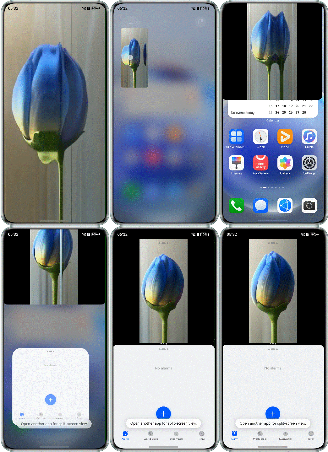
Set the .objectFit(ImageFit.Contain) attribute for the Video component to be scaled up or down with the fixed aspect ratio so that the video is completely displayed within the boundary of the Video component. The sample code after optimization is as follows:
@Component
export struct Question3Correct {
  build() {
    NavDestination() {
      Column() {
        Video({ src: $rawfile('testVideo2.mp4') })
          // ...
          .objectFit(ImageFit.Contain)
      }
      .height('100%')
      .width('100%')
    }
    .hideTitleBar(true)
  }
}
The following figure shows the effect after optimization.
- The child component is beyond the scope of the parent component.
Symptom
The display of the child component is beyond the scope of the parent component, and cannot be completely displayed by scrolling up or down.
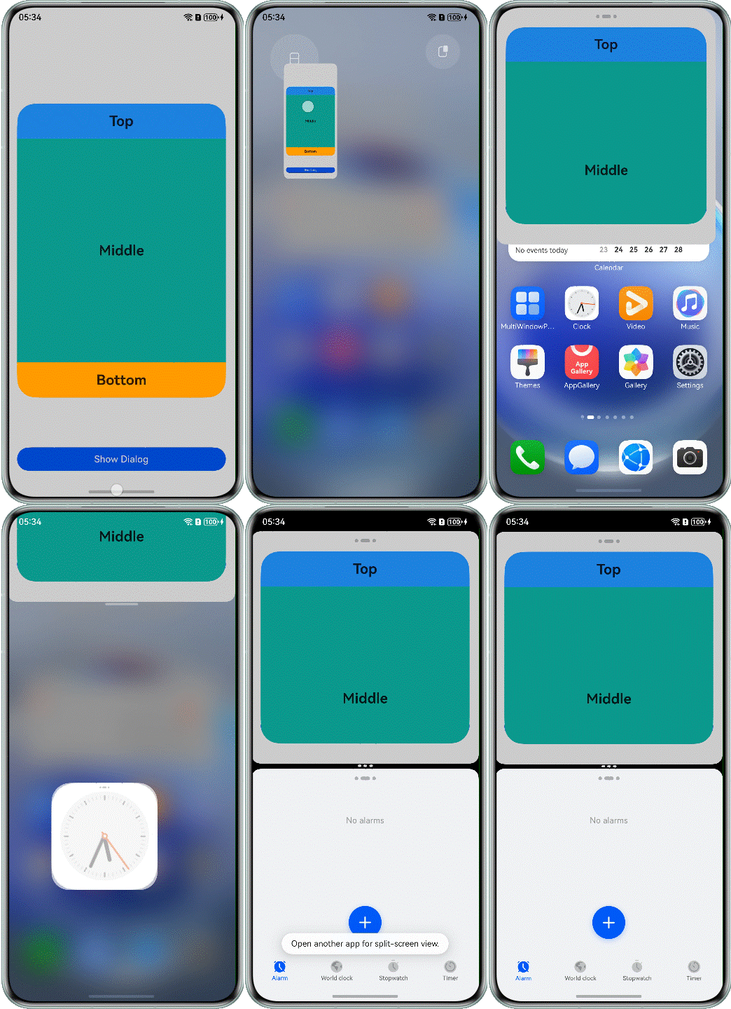
The sample code before optimization is as follows:
@Component
export struct Question4Incorrect {

  @Builder
  customDialogComp() {
    Column() {
      Text('Top')
        // ...

      Scroll() {
        Text('Middle')
          // ...
      }
      .layoutWeight(1)

      Text('Bottom')
        // ...
    }
    .height(500)
    .justifyContent(FlexAlign.SpaceBetween)
  }

  build() {
    // ...
  }
}
Possible Causes
The child component is set to a fixed value. When the app is displayed in split-screen mode, the screen height changes to 1/2 of the original height, and the height of the parent component decreases accordingly. If the height of the child component is greater than that of the parent component, the child component cannot be completely displayed.
Solution
Use constraintSize to change the size of the child component proportionally with that of the parent container. You are advised to use the percentage of the height of the child component to the height of the parent component, instead of the absolute value. The sample code after optimization is as follows:
@Builder
customDialogComp() {
  Column() {
    Text('Top')
      // ...

    Scroll() {
      Text('Middle')
        // ...
    }
    .layoutWeight(1)

    Text('Bottom')
      // ...
  }
  .height(500)
  .justifyContent(FlexAlign.SpaceBetween)
  .constraintSize({
    maxHeight: '90%'
  })
}
The following figure shows the effect after optimization.
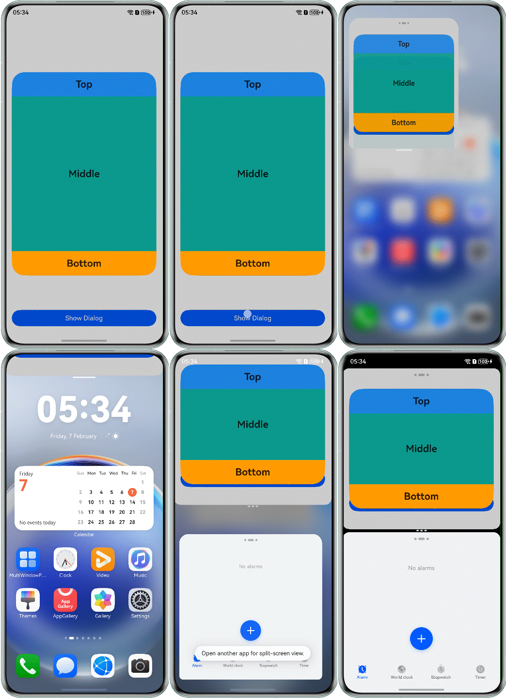
- The Image component is displayed abnormally in split-screen mode.
Symptom
After the app enters the split-screen mode, the Image component is not completely displayed as the window size decreases, and the page layout is abnormal.
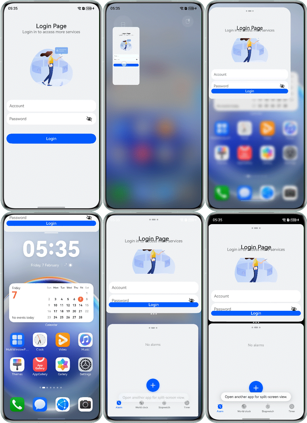
The sample code before optimization is as follows:
@Component
export struct Question5Incorrect {
  build() {
    NavDestination() {
      Flex({ direction: FlexDirection.Column, alignItems: ItemAlign.Center }) {
        Text("Login Page")
          // ...
        Text("Login in to access more services")
          // ...

        Image($r('app.media.login_pic'))
          // ...

        Column() {
          TextInput({ placeholder:  "Account" })
            // ...

          TextInput({ placeholder:"Password" })
            // ...
        }
        // ...

        Button($r('app.string.login'))
          // ...
      }
      // ...
    }
    // ...
  }
}
Possible Causes
On the split-screen page, the height of the window changes to half of the screen. As a result, the height of the Image component decreases and the image is deformed.
Solution
Use the hiding capability to display or hide the container component as its size changes based on the preset display priority. You can set the layout priority (through the displayPriority attribute) to control the visibility of container components. The sample code is as follows:
@Component
export struct Question5Correct {
  build() {
    NavDestination() {
      Flex({ direction: FlexDirection.Column, alignItems: ItemAlign.Center }) {
        Text("Login Page")
          // ...
          .displayPriority(4)

        Text("Login in to access more services")
          // ...
          .displayPriority(3)

        Image($r('app.media.login_pic'))
          // ...
          .displayPriority(2)

        Column() {
          TextInput({ placeholder: "Account" })
            // ...

          TextInput({ placeholder: "Password" })
            // ...
        }
        // ...
        .displayPriority(5)
        // ...
        Button($r('app.string.login'))
          // ...
          .displayPriority(5)
      }
      // ...
    }
    // ...
  }
}
The following figure shows the effect after optimization.
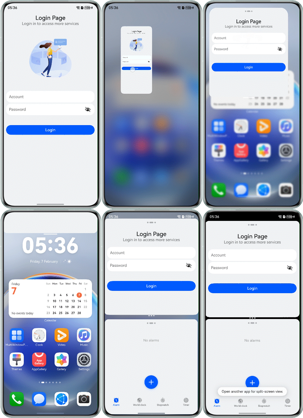
- The layout of the dialog box is in disorder.
Symptom
After the split-screen mode is enabled, the content in the dialog box is displayed in disorder, and the buttons at the bottom block the content in the dialog box.
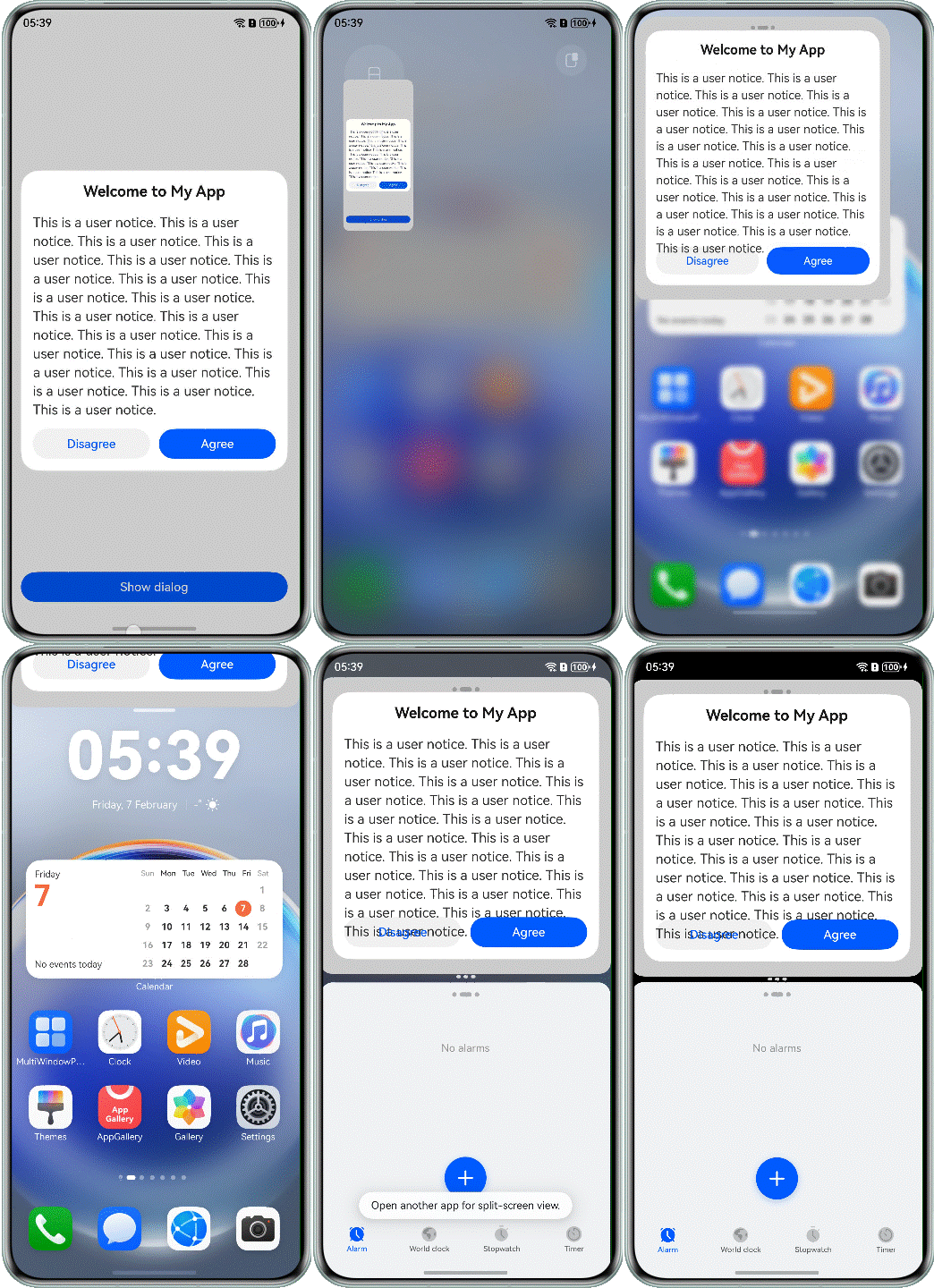
The sample code before optimization is as follows:
@CustomDialog
struct CustomDialogComp1 {
  controller: CustomDialogController = new CustomDialogController({ 'builder': '' });

  build() {
    Column() {
      Text($r('app.string.welcome'))
        // ...

      Column() {
        Scroll() {
          Text($r('app.string.dialog_content'))
            // ...
        }
      }

      Row({ space: 12 }) {
        Button($r('app.string.disagree'))
          // ...
        Button($r('app.string.agree'))
          // ...
      }
      .height(56)
      .alignItems(VerticalAlign.Top)
      .position({
        bottom: 0,
        left: 0
      })
    }
    .constraintSize({
      maxHeight: '80%'
    })
    // ...
  }
}
Possible Causes
The app does not consider the scenario where the split-screen window size becomes smaller. The height of the dialog box is set to a fixed value, and the position attribute is used to set the fixed position of the bottom button. As a result, the overall layout is disordered.
Solution
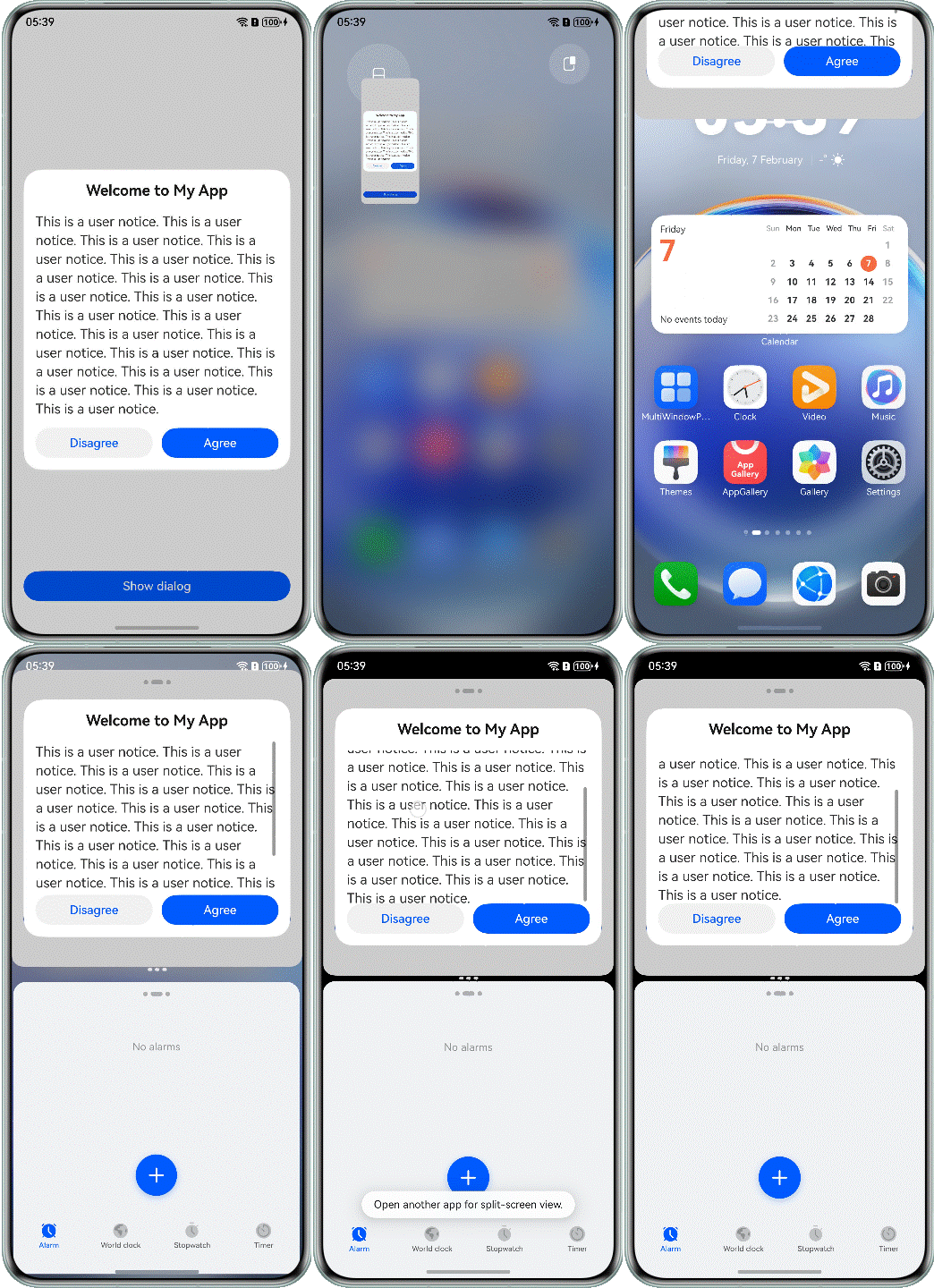
Use the constraintSize attribute to limit the maximum height of the dialog box, use the Scroll component to wrap the content area of the dialog box (through the extension capability), and set the layoutWeight attribute (through the proportion capability) for the Column component in the content area to occupy the remaining space so that the operation buttons are displayed at the bottom. When the content goes beyond the content area, you can scroll on the screen to view more content. The sample code after optimization is as follows:
@CustomDialog
struct CustomDialogComp {
  controller: CustomDialogController = new CustomDialogController({ 'builder': '' });

  build() {
    Column() {
      Text($r('app.string.welcome'))
        // ...

      Column() {
        Scroll() {
          Text($r('app.string.dialog_content'))
            // ...
        }
      }
      .layoutWeight(1)

      Row({ space: 12 }) {
        Button($r('app.string.disagree'))
          // ...
        Button($r('app.string.agree'))
          // ...
      }
      .height(56)
      .alignItems(VerticalAlign.Top)
    }
    .constraintSize({
      maxHeight: '80%'
    })
    .height(400)
    // ...
  }
}
The following figure shows the effect after optimization.
[h2]Implementing the Avoid Area for the Window-Top Control Bar in Immersive Mode
No response to operations on the control bar on top of the floating window of an immersive app
Symptom
There is no response to operations in the app split-screen view and the overlapping area on top of the floating window.
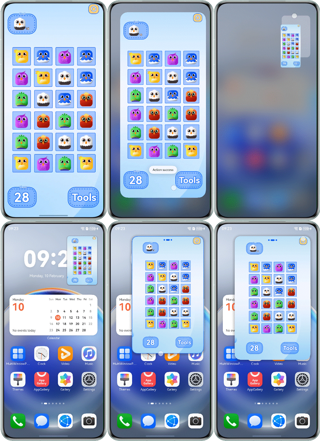
The sample code before optimization is as follows:
@Component
export struct Question7Incorrect {
  private windowClass: window.Window | undefined = undefined;

  aboutToAppear(): void {
    try {
      this.windowClass=(this.getUIContext().getHostContext() as common.UIAbilityContext).windowStage.getMainWindowSync();
      this.windowClass.setSpecificSystemBarEnabled('status', false).catch((error:BusinessError) => {
        Logger.error(TAG, `setSpecificSystemBarEnabled err, code: ${error.code}, message: ${error.message}`);
      });
    } catch (err) {
      let error = err as BusinessError;
      Logger.error(TAG, `aboutToAppear err, code: ${error.code}, message: ${error.message}`);
    }
  }

  aboutToDisappear(): void {
    this.windowClass?.setSpecificSystemBarEnabled('status', true).catch((error:BusinessError) => {
      Logger.error(TAG, `setSpecificSystemBarEnabled err, code: ${error.code}, message: ${error.message}`);
    });
  }

  build() {
    NavDestination() {
      Stack() {
        // ...

        Row() {
          Image($r('app.media.icon_pause'))
            // ...
            .onClick(() => {
              try {
                this.getUIContext().getPromptAction().showToast({
                  message: 'Action success'
                });
              } catch (err) {
                let error = err as BusinessError;
                Logger.error(TAG, `showToast err, code: ${error.code}, message: ${error.message}`);
              }
            })
        }
        .height('100%')
        .width('100%')
        .justifyContent(FlexAlign.End)
        .alignItems(VerticalAlign.Top)
      }
    }
    .hideTitleBar(true)
  }
}
Possible Causes
The bar on the top of the floating window overlaps with the top area of the immersive app, which, however, should be avoided. The buttons in the overlapping area cannot respond to the tap event.
Solution
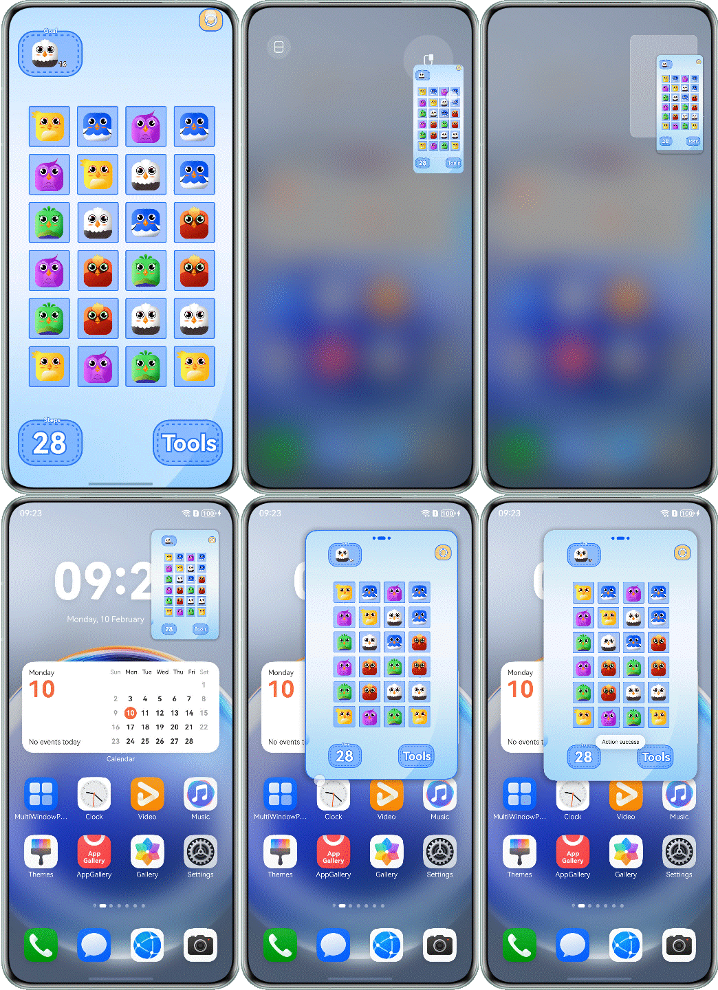
Use the getWindowAvoidArea API to obtain the topRect value of the matrix area to be avoided on the top of the screen. After the value is obtained, layout avoidance can be performed for the app. In addition, the app can use on('avoidAreaChange') to listen for avoidance area changes in the system for dynamic layout adjustment. For details, see Implementing the Avoid Area for the Window-top Control Bar. The optimized sample code is as follows:
@Component
export struct Question7Correct {
  private windowClass: window.Window | undefined = undefined;
  @State topSafeHeight: number = 0;
  @State windowStatus: WindowStatusType = window.WindowStatusType.FULL_SCREEN;

  aboutToAppear(): void {
    try {
      this.windowClass=(this.getUIContext().getHostContext() as common.UIAbilityContext).windowStage.getMainWindowSync();
      this.windowClass.setSpecificSystemBarEnabled('status', false).catch((error:BusinessError) => {
        Logger.error(TAG, `setSpecificSystemBarEnabled err, code: ${error.code}, message: ${error.message}`);
      });
      this.windowStatus = this.windowClass.getWindowStatus();

      if (this.windowStatus === window.WindowStatusType.FLOATING) {
        this.topSafeHeight = this.getUIContext()
          .px2vp(this.windowClass.getWindowAvoidArea(window.AvoidAreaType.TYPE_SYSTEM).topRect.height);
      }

      this.windowClass.on('windowStatusChange', data => {
        if (data === window.WindowStatusType.FLOATING) {
          this.topSafeHeight =
            this.getUIContext()
              .px2vp(this.windowClass?.getWindowAvoidArea(window.AvoidAreaType.TYPE_SYSTEM).topRect.height);
        } else {
          this.topSafeHeight = 0;
        }
      })
    } catch (err) {
      let error = err as BusinessError;
      Logger.error(TAG, `aboutToAppear err, code: ${error.code}, message: ${error.message}`);
    }
  }

  aboutToDisappear(): void {
    this.windowClass?.setSpecificSystemBarEnabled('status', true).catch((error:BusinessError) => {
      Logger.error(TAG, `setSpecificSystemBarEnabled err, code: ${error.code}, message: ${error.message}`);
    });
  }

  build() {
    // ...
  }
}
The following figure shows the effect after optimization.
[h2]Horizontal Floating Window Adaptation
Video playback not adapted to the horizontal floating window
Symptom
When a video or game app is in landscape mode and the floating window is enabled, the page does not adapt to the landscape mode. As a result, the content is not completely displayed or the viewing experience is poor.
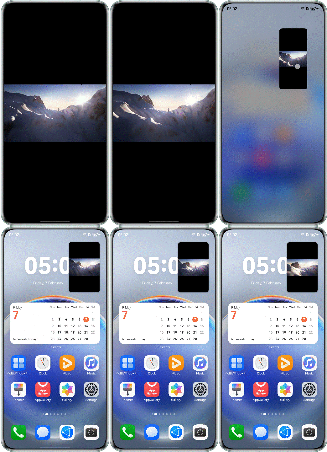
The sample code before optimization is as follows:
@Component
export struct Question8Incorrect {
  build() {
    NavDestination() {
      Column() {
        Video({ src: $rawfile('testVideo1.mp4') })
          .height('100%')
          .width('100%')
          .autoPlay(true)
          .objectFit(ImageFit.Contain)
          .controls(false)
      }
      .height('100%')
      .width('100%')
    }
    .hideTitleBar(true)
  }
}
Possible Causes
By default, the floating window is in portrait mode. The app needs to proactively adapt to the attribute value of the landscape mode.
Solution
Add landscape_auto to the preferMultiWindowOrientation attribute under the abilities tag in the module.json5 configuration file.
{
  "module": {
    // ...
    "abilities": [
      {
        "name": "EntryAbility",
        // ...
        "preferMultiWindowOrientation": "landscape_auto"
      }
    ],
    // ...
  }
}
In this scenario, the Multi-Window layout can be dynamically changed to the landscape mode, which needs to call the enableLandscapeMultiWindow/disableLandscapeMultiWindow API additionally.
@Component
export struct Question8Correct {
  private windowClass: window.Window | undefined = undefined;

  aboutToAppear(): void {
    try {
      this.windowClass=(this.getUIContext().getHostContext() as common.UIAbilityContext).windowStage.getMainWindowSync();
      this.windowClass.enableLandscapeMultiWindow().catch((error:BusinessError) => {
        Logger.error(TAG, `enableLandscapeMultiWindow err, code: ${error.code}, message: ${error.message}`);
      });
    } catch (err) {
      let error = err as BusinessError;
      Logger.error(TAG, `aboutToAppear err, code: ${error.code}, message: ${error.message}`);
    }


  }

  aboutToDisappear(): void {
    this.windowClass?.disableLandscapeMultiWindow().catch((error:BusinessError) => {
      Logger.error(TAG, `disableLandscapeMultiWindow err, code: ${error.code}, message: ${error.message}`);
    });
  }

  build() {
    // ...
  }
}
The following figure shows the effect after optimization.
Summary
The floating window and split-screen capabilities of Multi-Window are provided by the system. You do not need to develop these capabilities. However, you need to focus on the layout adaptation of apps in floating window or split-screen mode. The following describes some common layout adaptation experience:
- If the app does not need to use the floating window or split-screen capability, you are advised to set supportWindowMode to fullscreen.
- You can refer to One-Time Development for Multi-Device Deployment for Cross-Device UI Development to prevent content truncation, deformation, and stacking when your app uses floating windows or split screens.
- setWindowLayoutFullScreen() is used to dynamically set whether the app is in immersive mode to determine whether to avoid the status bar.
- In floating window mode, on('avoidAreaChange') is used to obtain the height of the status bar so that the app content area can avoid overlapping with the status bar.