


Intelligent Assistant
Chat with our virtual assistant to get answers promptly.
We use essential cookies for the website to function, as well as analytics cookies for analyzing and creating statistics of the website performance. To agree to the use of analytics cookies, click "Accept All". You can manage your preferences at any time by clicking "Cookie Settings" on the footer. More Information.
HarmonyOS
Unlike @Styles, which are used to reuse styles only on static pages, stateStyles enables you to set dynamic, state-specific styles. This topic explores the implementation of polymorphic styles through stateStyles.
Polymorphic styles support only universal attributes. If a polymorphic style does not take effect, the attribute may be a private, component-specific attribute, for example, fontColor or backgroundColor of the TextInput component. In this case, you can use attributeModifier to dynamically set component attributes to enable the polymorphic style.
stateStyles is an attribute method that sets the style based on the internal state of a component. It is similar to a CSS pseudo-class, with different syntax. ArkUI provides the following states:
focused
normal
pressed
disabled
clicked
selected10+
Currently, the focused state can be triggered only by pressing the Tab or arrow keys on an external keyboard. Triggering through key presses in nested scrollable components is not supported.
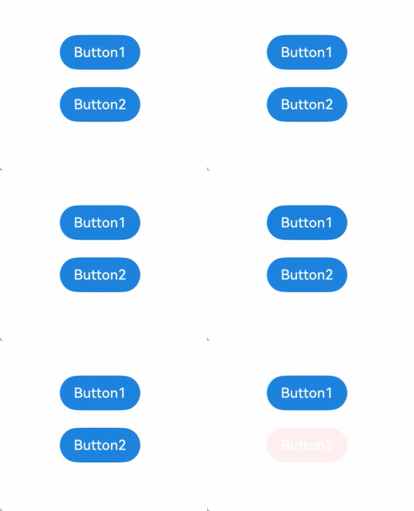
This example shows the most basic application scenario of stateStyles. Button1 is the first component and Button2 the second component. When either of these components is pressed, the black style specified for pressed takes effect. When the Tab key is pressed for sequential navigation, Button1 obtains focus and is displayed in the pink style specified for focused. When Button 2 is focused, it is displayed in the pink style specified for focused, and Button1 changes to the blue style specified for normal.
- @Entry
- @Component
- struct StateStylesSample {
- build() {
- Column() {
- Button('Button1')
- .stateStyles({
- focused: {
- .backgroundColor('#ffffeef0')
- },
- pressed: {
- .backgroundColor('#ff707070')
- },
- normal: {
- .backgroundColor('#ff2787d9')
- }
- })
- .margin(20)
- Button('Button2')
- .stateStyles({
- focused: {
- .backgroundColor('#ffffeef0')
- },
- pressed: {
- .backgroundColor('#ff707070')
- },
- normal: {
- .backgroundColor('#ff2787d9')
- }
- })
- }.margin('30%')
- }
- }
Figure 1 Focused and pressed states
The following example uses @Styles to specify different states of stateStyles.
- @Entry
- @Component
- struct MyComponent {
- @Styles normalStyle() {
- .backgroundColor(Color.Gray)
- }
-
- @Styles pressedStyle() {
- .backgroundColor(Color.Red)
- }
- build() {
- Column() {
- Text('Text1')
- .fontSize(50)
- .fontColor(Color.White)
- .stateStyles({
- normal: this.normalStyle,
- pressed: this.pressedStyle,
- })
- }
- }
- }
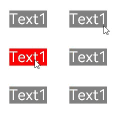
Figure 2 Normal and pressed states
stateStyles can use this to bind regular variables and state variables in a component.
- @Entry
- @Component
- struct CompWithInlineStateStyles {
- @State focusedColor: Color = 0xD5D5D5;
- normalColor: Color = 0x004AAF;
-
- build() {
- Column() {
- Button('clickMe')
- .height(100)
- .width(100)
- .stateStyles({
- normal: {
- .backgroundColor(this.normalColor)
- },
- focused: {
- .backgroundColor(this.focusedColor)
- }
- })
- .onClick(() => {
- this.focusedColor = 0x707070;
- })
- .margin('30%')
- }
- }
- }
By default, the button is displayed in blue in the normal state. When you press the Tab key for the first time, the button obtains focus and is displayed in the light gray style specified for focused. After a click event occurs and you press the Tab key again, the button obtains focus and changes to dark gray.
Figure 3 Change of the styles in focused state by a click

Intelligent Assistant
Chat with our virtual assistant to get answers promptly.
Quick start
Helps you find desired resources with ease.