问题现象
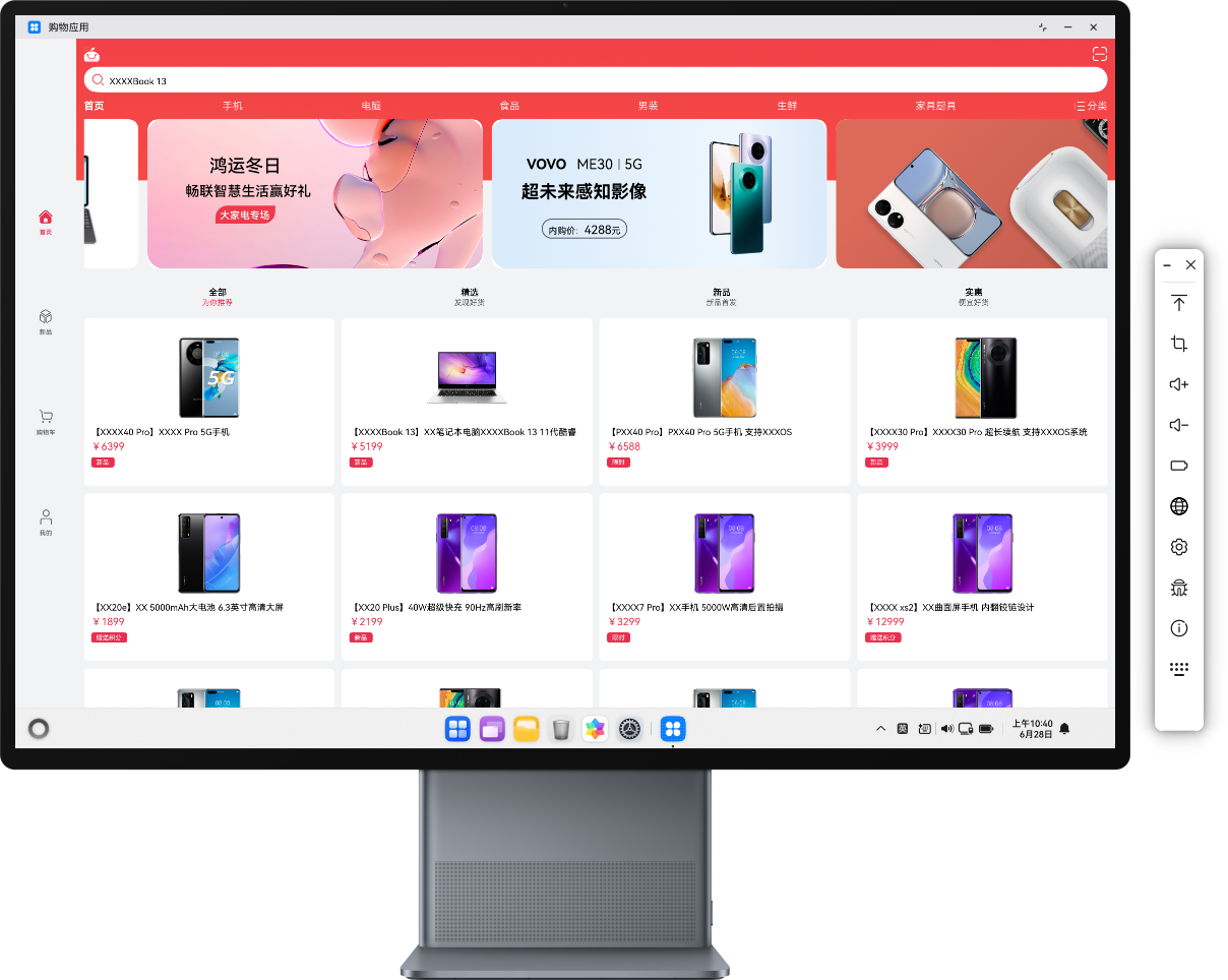
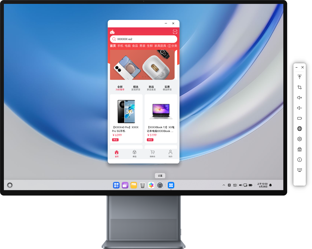
手机端应用在PC上仍显示为手机样式UI,无法打开全屏。
效果图如下:
背景知识
一多适配提供帮助开发者快速开发出适配多种类型设备的应用的能力。一多适配开发使用的布局能力包括以下两种方式:
- 自适应布局:开发框架提供了拉伸,均分,占比,缩放,延伸,隐藏,折行等七种自适应布局能力。这些布局能力可以独立使用,也可多种布局叠加使用。
- 响应式布局:基于响应式设计方法论进行布局的方法,核心思想是页面根据不同屏幕尺寸,进行不同的UI展示,以此自动调整布局。
问题定位
- 排查项目代码中所有module.json5配置文件中的deviceTypes配置项,是否包含了'2in1'选项。
- 排查项目代码中UI相关的代码,是否针对PC端使用自适应布局和响应式布局,做了一多适配的逻辑。
分析结论
- 项目代码中的module.json5配置文件中的deviceTypes配置项,未包含'2in1'。
- 项目代码中未使用响应式布局逻辑进行设备屏幕的尺寸的监听,导致页面UI在PC端展示变形。
修改建议
- 修改项目中的所有module.json5配置文件中的deviceTypes配置项,新增'2in1'项。如果项目中包含多个模块,每个模块的module.json5都需要修改deviceTypes配置。
- 监听屏幕尺寸,获取相应的断点进行保存。
smListener: mediaquery.MediaQueryListener =
  this.getUIContext().getMediaQuery().matchMediaSync('(orientation: landscape)');
mdListener: mediaquery.MediaQueryListener =
  this.getUIContext().getMediaQuery().matchMediaSync('(520vp<=width<840vp)');
lgListener: mediaquery.MediaQueryListener = this.getUIContext().getMediaQuery().matchMediaSync('(840vp<=width)');

// 注册媒体属性变更回调事件,监听屏幕尺寸在页面初始化的时候完成注册。
public register() {
  this.smListener = this.getUIContext().getMediaQuery().matchMediaSync('(320vp<=width<520vp)');
  this.smListener.on('change', this.isBreakpointSM);
  this.mdListener = this.getUIContext().getMediaQuery().matchMediaSync('(520vp<=width<840vp)');
  this.mdListener.on('change', this.isBreakpointMD);
  this.lgListener = this.getUIContext().getMediaQuery().matchMediaSync('(840vp<=width)');
  this.lgListener.on('change', this.isBreakpointLG);
}

// 保存屏幕尺寸的断点
private updateCurrentBreakpoint(breakpoint: string) {
  if (this.currentBreakpoint !== breakpoint) {
    this.currentBreakpoint = breakpoint;
    AppStorage.set<string>('currentBreakpoint', this.currentBreakpoint);
  }
}

private isBreakpointSM = (mediaQueryResult: mediaquery.MediaQueryResult) => {
  if (mediaQueryResult.matches) {
    this.updateCurrentBreakpoint('sm');
  }
};

private isBreakpointMD = (mediaQueryResult: mediaquery.MediaQueryResult) => {
  if (mediaQueryResult.matches) {
    this.updateCurrentBreakpoint('md');
  }
};

private isBreakpointLG = (mediaQueryResult: mediaquery.MediaQueryResult) => {
  if (mediaQueryResult.matches) {
    this.updateCurrentBreakpoint('lg');
  }
};
- 通过判断断点,刷新UI页面。以下代码片段以tab元素为例。
@StorageProp('currentBreakpoint') currentBreakpoint: string = 'sm'; // 初始化默认为手机

build() {
  Column() {
    Tabs({
      barPosition: this.currentBreakpoint === BreakpointConstants.BREAKPOINT_LG ? BarPosition.Start : BarPosition.End,
    }) {
      // tab内容

    }
    .barWidth(this.currentBreakpoint === 'lg' ?
      $r('app.float.barWidth') : StyleConstants.FULL_WIDTH)
    .barHeight(this.currentBreakpoint === 'lg' ?
      StyleConstants.SIXTY_HEIGHT : $r('app.float.back_width'))
    .vertical(this.currentBreakpoint === 'lg')
  }
}
- 对页面其他元素或组件,采用相应的自适应布局或响应式布局进行相应的改造。
效果如下:
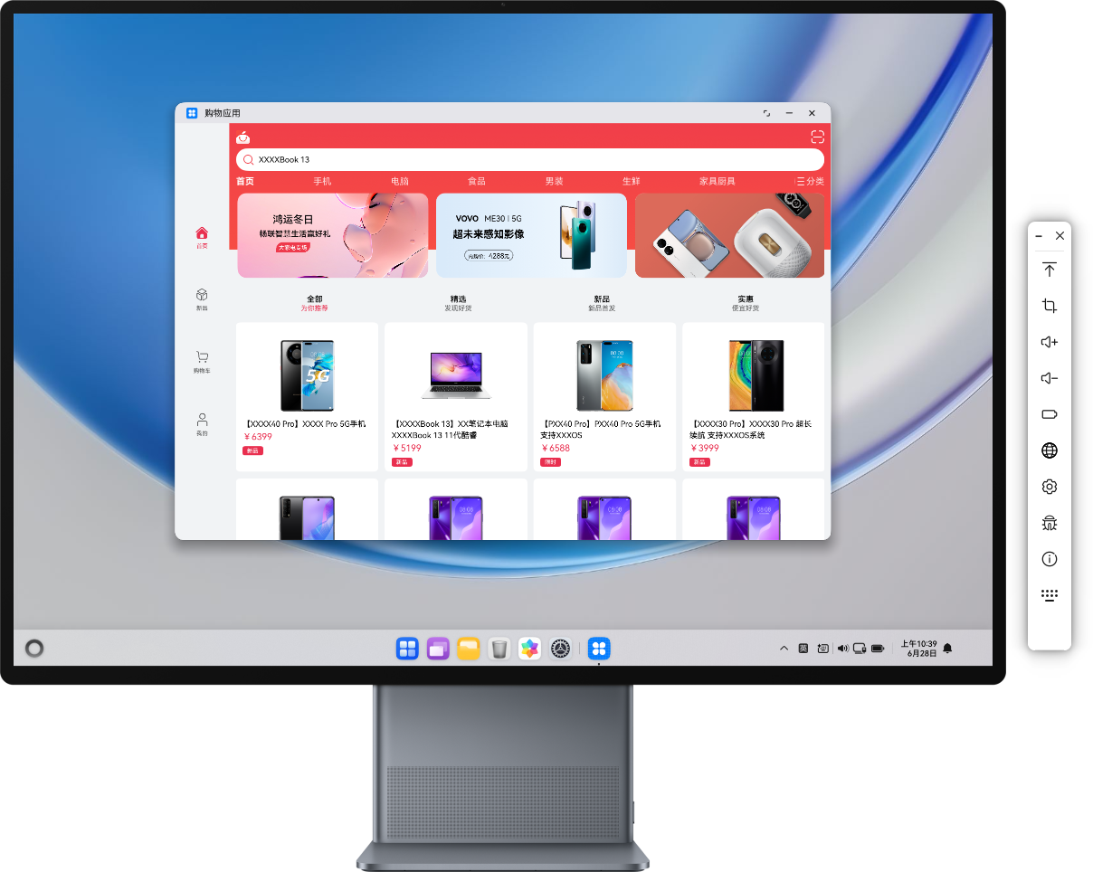
PC上进行全屏展示: