概述
自定义键盘是一种简易的键盘替代系统默认键盘,允许用户根据实际业务场景和习惯偏好,调整键盘的布局和位置、添加额外的功能键,使输入更加便捷和舒适,从而提升整体的用户体验。同时自定义键盘也可以增强用户输入的安全性,避免敏感信息被截取或者泄露。
本文将从以下几个方面介绍自定义键盘的实现和使用:
[h2]自定义键盘布局实现
自定义键盘的布局以自定义组件的方式呈现,根据具体业务场景由开发者实现。自定义键盘的高度通过自定义组件根节点的height属性设置,宽度不可设置,默认为屏幕宽度。
@Component
export struct CustomKeyboard {
  // ...
  build() {
    Column() {
      // ...
    }
    // ...
    .height(this.getKeyboardHeightVp())
    // ...
  }
}
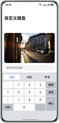
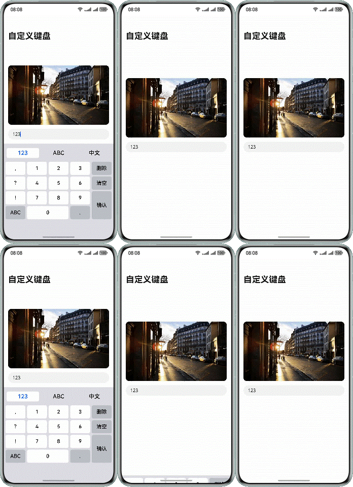
以Grid方式实现数字键盘布局示例:
图 1
@Component
export struct NumberKeyboard {
  @Consume inputText: string;
  @Consume keyboardController: KeyboardController;
  layoutOptions: GridLayoutOptions = {
    regularSize: [1, 1],
    irregularIndexes: [14, 16],
    onGetIrregularSizeByIndex: (index: number) => {
      if (index === 14) {
        return [2, 1];
      }
      return [1, 2];
    }
  };

  build() {
    Grid(undefined, this.layoutOptions) {
      ForEach(numberKeyboardData, (item: Menu) => {
        GridItem() {
          Button(item.text, { type: ButtonType.Normal })
            .fontColor(Color.Black)
            .backgroundColor(item.backgroundColor)
            .borderRadius(Constants.KEYBOARD_BUTTON_RADIUS)
            .fontSize(Constants.KEYBOARD_BUTTON_FONTSIZE_18)
            .padding(0)
            .width(item.width)
            .height(item.height)
            .onClick(() => {
              this.inputText = this.keyboardController.onInput(item.text);
            })
        }
      }, (item: Menu) => JSON.stringify(item))
    }
    .columnsTemplate('1fr 1fr 1fr 1fr 1fr')
    .rowsGap($r('app.float.number_keyboard_grid_gap'))
    .columnsGap($r('app.float.number_keyboard_grid_gap'))
  }
}
[h2]输入控件绑定自定义键盘布局
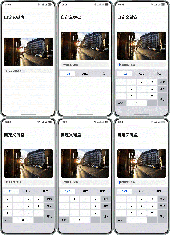
输入控件(TextArea、TextInput、RichEditor、Search)支持通过customKeyboard属性绑定自定义键盘布局。绑定自定义键盘后,输入控件获取焦点时,不会拉起系统键盘,而是加载指定的自定义键盘。本文后续以TextInput控件为例进行介绍。
图 2
代码示例如下:
  build() {
    Column() {
      TextInput({
        placeholder: 'Bind Custom Keyboard',
        text: this.inputText,
        controller: this.textInputController
      })
        // ...
        .customKeyboard(this.isCustomKeyboardAttach ? this.customKeyboard() : null)
          // ...
    }
  }
  @Builder
  customKeyboard() {
    CustomKeyboard()
  }
}
[h2]监听键盘弹出与收起
在输入组件内,使用@Link和@Watch('onChangeKeyboard')修饰isKeyboardShown;
当键盘状态变化后,会调用onChangeKeyboard,此时要收起键盘,则执行和键盘控制器绑定的文字输入控制器的stopEditing()方法。
@Component
export struct TextInputComponent {
  // ...
  @Link @Watch('onChangeKeyboard') isKeyboardShown: boolean;
  // ...
  onChangeKeyboard() {
    if (this.isKeyboardShown === false) {
      this.textInputController.stopEditing();
    }
  }

  // ...
}
输入组件内有两个事件:
onFocus()代表获得焦点,用户点击输入组件的时候,输入组件会获得焦点从而弹出键盘,此时设定isKeyboardShown为true,表示弹起;
onBlur()代表失去焦点,当输入组件失去焦点,会被调用, 此时设为isKeyboardShown为false,表示收起;
.onBlur(() => {
  this.isKeyboardShown = false;
  // ...
})
.onFocus(() => {
  this.isKeyboardShown = true;
  // ...
})
页面内的isKeyboardShown要和输入组件TextInputComponent建立双向绑定,用来监听isKeyboardShown变化,响应键盘的弹出与收起.
@Entry
@Component
struct MainPage {
  // ...
  @State isKeyboardShown: boolean = false;
  // ...
  build() {
    Navigation() {
      Column() {
        // ...
      }
      // ...
    }
    .onClick(() => {
      if (this.isKeyboardShown) {
        this.isKeyboardShown = false;
      }
    })
    .mode(NavigationMode.Stack)
    .titleMode(NavigationTitleMode.Full)
    .title($r('app.string.main_page_title'))
  }
}
在横竖屏切换时设置键盘高度
在键盘组件CustomKeyboard.ets引入方向检测与动态高度,在键盘组件内对应位置处理。
引入@ohos.display (屏幕属性),新增@State isLandscape保存当前方向。
在aboutToAppear注册监听器display.on('change') ,在aboutToDisappear注销监听器,方向变化时调用updateOrientation(), 通过 display.getDefaultDisplaySync()判断width > height判定横屏。
@Component
export struct CustomKeyboard {
  // ...

  aboutToAppear(): void {
    this.updateOrientation();
    try {
      display.on('change', this.onDisplayChange);
    } catch (e) {
    }
  }

  aboutToDisappear(): void {
    try {
      display.off('change', this.onDisplayChange);
    } catch (e) {
    }
  }

  private updateOrientation() {
    try {
      const d = display.getDefaultDisplaySync();
      this.isLandscape = d.width > d.height;
    } catch (e) {
      this.isLandscape = false;
    }
  }
  // ...
}
重写getKeyboardHeightVp(),判断设备为平板的时候,按照平板的比例给予横屏0.33、竖屏0.22的屏幕高度占比,手机的话固定为0.36的占比高度。
@Component
export struct CustomKeyboard {
  // ...

  private getKeyboardHeightVp(): number | Resource {
    try {
      const d = display.getDefaultDisplaySync();
      const ui = this.getUIContext();
      const screenHeightVp = ui.px2vp(d.height);
      const shortSideVp = ui.px2vp(Math.min(d.width, d.height));
      const isLargeScreen = shortSideVp >= 600;
      const ratio = isLargeScreen
          ? (this.isLandscape ? 0.33 : 0.22)
          :  0.36;

      return Math.floor(screenHeightVp * ratio);
    } catch (e) {
      return $r('app.float.keyboard_total_height');
    }
  }
  // ...
}
修改组件高度,将键盘组件的.height(...) 改为.height(this.getKeyboardHeightVp())以采用动态计算值。
@Component
export struct CustomKeyboard {
  // ...
  build() {
    // ...
    // ...
    .padding({ left: $r('app.float.keyboard_padding'), right: $r('app.float.keyboard_padding') })
    .height(this.getKeyboardHeightVp())
    .width('100%')
    .backgroundColor($r('app.color.keyboard_background_color'))
  }
}
[h2]自定义键盘输入控制
自定义键盘可以拦截手势事件,通过对状态变量的修改,实现文本的输入。
图 3
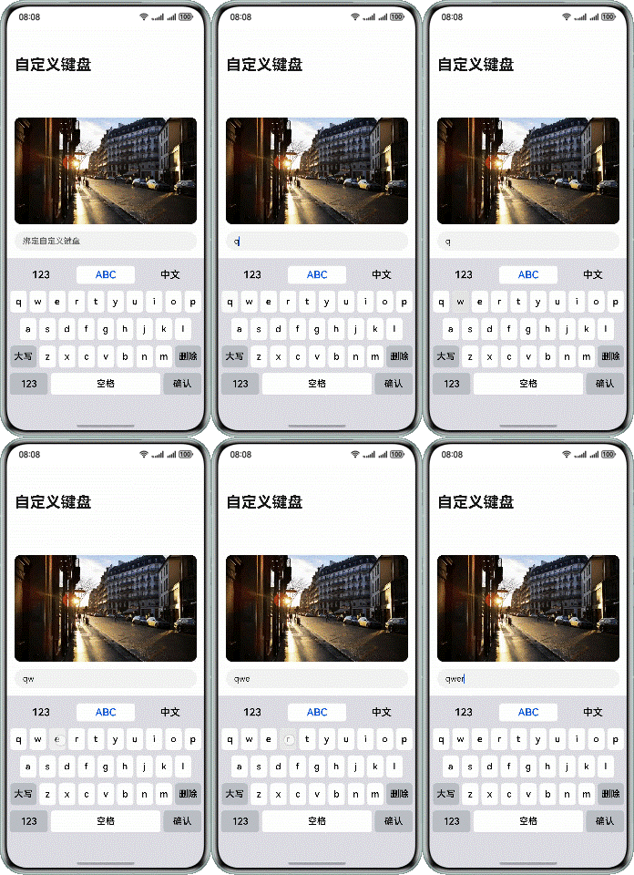
以英文键盘为例,监听EnglishButton的onClick事件,修改状态变量。
@Component
struct EnglishButton {
  @Consume inputText: string;
  // ...

  build() {
    Button({ type: ButtonType.Normal })
    // ...
    .onClick(() => {
      this.inputText = this.keyboardController.onInput(this.getEnglishText(this.item));
    })
  }
}
通过对状态变量inputText的修改,实现文本输入。
@Component
export struct TextInputComponent {
  @Provide inputText: string = '';
  // ...
  build() {
    Column() {
      TextInput({
        placeholder: 'Bind Custom Keyboard',
        text: this.inputText,
        controller: this.textInputController
      })
        // ...
    }
  }
  // ...
}
[h2]自定义键盘光标控制
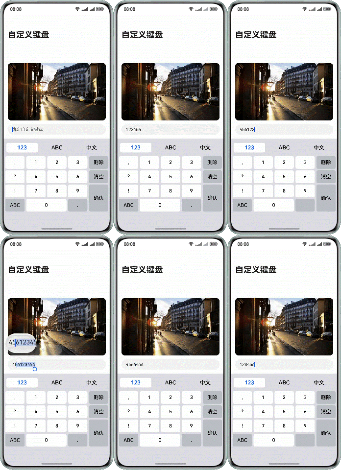
通过监听TextInput的onTextSelectionChange()生命周期,获取初始光标位置,文本输入后,调用TextInputController的caretPosition方法,设置最终光标位置。
图 4
获取光标位置:
TextInput({
  placeholder: 'Bind Custom Keyboard',
  text: this.inputText,
  controller: this.textInputController
})
  // ...
  .onTextSelectionChange((start: number, end: number) => {
    this.keyboardController.setCaretPosition(start, end);
  })
    // ...
设置光标位置:
onChange(value: string) {
  this.text = value;
  if (this.keyboardType !== 'System') {
    this.textInputController?.caretPosition(this.targetCaretPos);
  }
}
[h2]自定义键盘弹出与收起
通过对焦点进行控制,可以实现键盘的弹出和收起,参考软键盘的弹出收起和监听。
开发者也可以通过TextInputController的stopEditing()方法控制键盘关闭,下面的自定义键盘示例中,点击确认按键关闭自定义键盘。
图 5
onInput(value: string | Resource): string {
  // ...

  switch (value.id) {
    // ...
    case $r('app.string.keyboardButton_finish').id:
      this.textInputController?.stopEditing();
      break;
  // ...
  }
  return this.text;
}
自定义键盘和系统键盘的切换
当需要实现同一个输入框内可以切换自定义键盘和系统键盘时,可以通过如下方式实现:
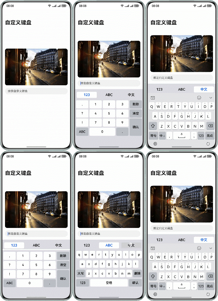
Tab栏点击“123”、“ABC”按钮,this.isCustomKeyboardAttach为true,TextInput绑定自定义键盘;点击“中文”按钮,this.isCustomKeyboardAttach为false,切换系统键盘。
图 6
TextInput({
  placeholder: 'Bind Custom Keyboard',
  text: this.inputText,
  controller: this.textInputController
})
  // ...
.customKeyboard(this.isCustomKeyboardAttach ? this.customKeyboard() : null) [h2]使用系统提供的自定义键盘避让功能
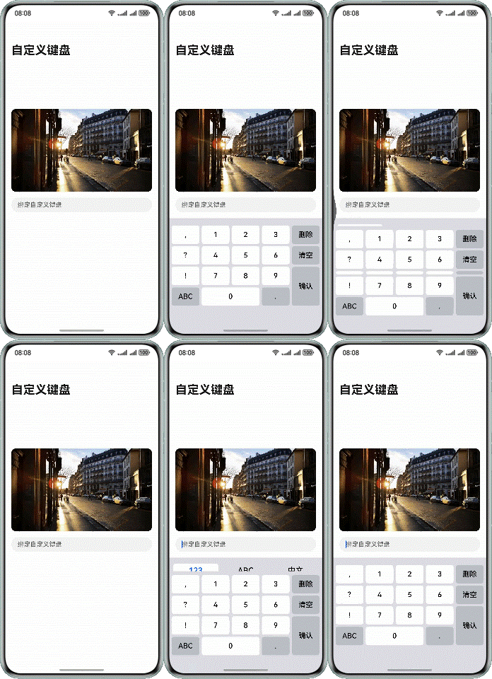
为了确保输入框不被自定义键盘挡住,系统默认提供了输入框避让自定义键盘的能力。在TextInput组件的customKeyboard属性设置supportAvoidance为true,开启系统提供的自定义键盘避让功能。键盘的避让机制和常见问题的解决方法,可以参考软键盘避让机制。
图 7
TextInput({
  placeholder: 'Bind Custom Keyboard',
  text: this.inputText,
  controller: this.textInputController
})
  .customKeyboard(this.customKeyboard(), { supportAvoidance: true })
    // ...
系统默认的自定义键盘避让功能只能保证输入框不被遮挡,输入框下方的组件可能会被自定义键盘挡住,如上图中所示,输入框下方的tab栏被自定义键盘挡住。为解决这一问题,需要开发者自己实现自定义键盘的避让功能。
[h2]开发者自己实现自定义键盘的避让功能
开发者需要监听自定义键盘根节点的onAreaChange()生命周期,获取自定义键盘的高度,根据实际场景设置布局的避让。
图 8
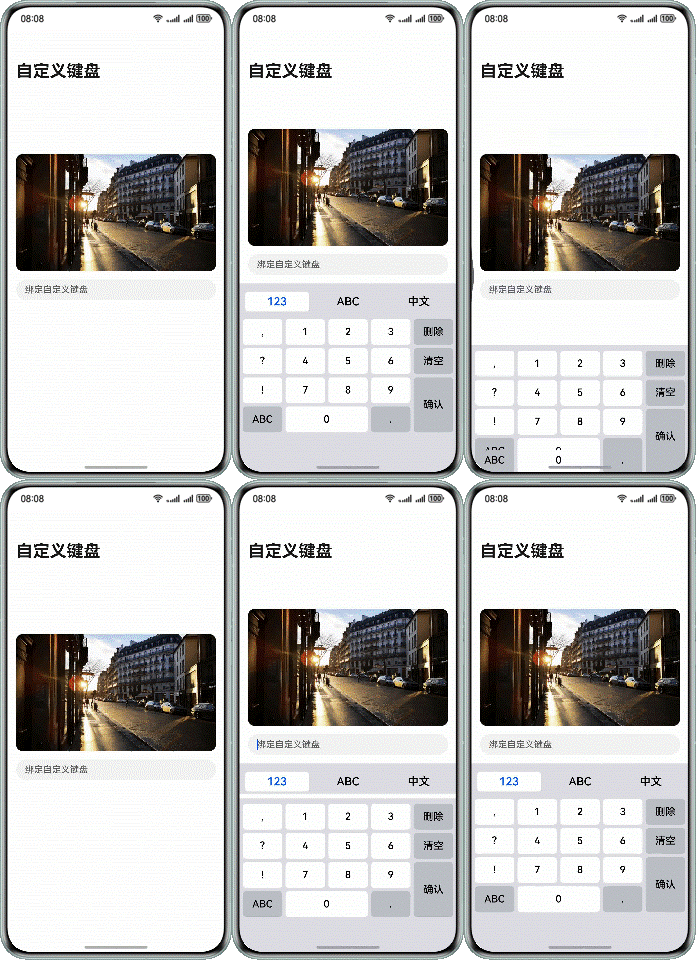
监听自定义键盘布局的onAreaChange()生命周期,通过newValue.height获取自定义键盘弹出时的高度,根据实际业务场景计算布局避让高度avoidHeight。
@Component
export struct CustomKeyboard {
  // ...
  build() {
    Column() {
      // ...
    }
    .onAreaChange((oldValue: Area, newValue: Area) => {
      this.customKeyboardHeight = Number(newValue.height);
      let avoidHeight: number = (this.isCustomKeyboardAttach ? this.customKeyboardHeight : this.systemKeyboardHeight)
        - this.bottomRectHeight;
      this.keyboardController.changeAvoidHeight(avoidHeight);
    })
    // ...
  }
} 通过emitter(详见@ohos.events.emitter (Emitter))的方式,发送自定义键盘高度变化的通知。
changeAvoidHeight(value: number) {
  let event: emitter.InnerEvent = {
    eventId: Constants.AVOID_EVENT_ID
  };
  let eventData: emitter.EventData = {
    data: {
      'avoidHeight': value
    }
  };
  emitter.emit(event, eventData);
}
接收到高度变化通知后,根据实际业务场景,设置页面的避让高度。
@Entry
@Component
struct MainPage {
  @State bottomPadding: number = 210;
  @State isKeyboardShown: boolean = false;
  aboutToAppear(): void {
    let event: emitter.InnerEvent = {
      eventId: 1
    }
    emitter.on(event, (eventData: emitter.EventData) => {
      if (eventData.data) {
        let avoidHeight: number = eventData.data['avoidHeight'];
        if (avoidHeight === 0) {
          this.bottomPadding = 210;
        } else {
          this.bottomPadding = avoidHeight;
        }
      }
    })
  }
  build() {
    Navigation() {
      Column() {
        // ...
      }
      .padding({ bottom: this.bottomPadding })
      // ...
    }
    .onClick(() => {
      if (this.isKeyboardShown) {
        this.isKeyboardShown = false;
      }
    })
    .mode(NavigationMode.Stack)
    .titleMode(NavigationTitleMode.Full)
    .title($r('app.string.main_page_title'))
  }
}