场景介绍
从6.0.0(20)版本开始,导航组件支持设置标题栏的stackBuilder和bottomBuilder,允许开发者自定义标题栏样式,以匹配应用的视觉风格。
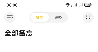
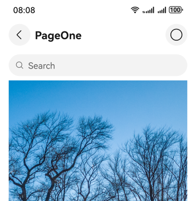
当应用开发者需要在标题栏区域增加自定义节点时,例如在标题栏上方区域增加分段按钮,标题下方区域增加搜索框、页签时,可以使用标题栏自定义区域设置能力。由于标题栏高度通常由系统或框架统一控制,开发者在添加自定义节点时需注意不要超出标题栏的可用空间,否则可能导致布局溢出或视觉混乱。自定义区域可能会覆盖或影响默认标题栏组件(如返回按钮、标题文字),需谨慎布局,避免交互冲突或遮挡关键元素。如果在标题栏中添加大量交互复杂、渲染频率高的组件,可能会对性能产生影响。
开发步骤
-
导入相关模块。
// 从6.0.2(22)版本开始,无需手动导入HdsNavigationAttribute。具体请参考HdsNavigation的导入模块说明。 import { HdsNavigation, HdsNavigationTitleMode, HdsNavigationAttribute } from '@kit.UIDesignKit'; import { ItemRestriction, SegmentButton, SegmentButtonOptions, SegmentButtonTextItem } from '@kit.ArkUI'; -
创建一级导航组件,通过配置titleBar中content属性的stackBuilder以及bottomBuilder属性,即可实现导航组件的自定义区域设置。
@Entry @Component struct Index { @Provide('pageInfos') pageInfos: NavPathStack = new NavPathStack(); scroller: Scroller = new Scroller(); @State tabOptions: SegmentButtonOptions = SegmentButtonOptions.tab({ buttons: [{ text: '备忘' }, { text: '待办' }] as ItemRestriction<SegmentButtonTextItem>, selectedFontColor: '#ffe6ba0b', selectedBackgroundColor: Color.White, textPadding: { top: 5, right: 5, bottom: 5, left: 5 } }); @State tabSelectedIndexes: number[] = [0]; @Builder stackBuilder() { Row() { Flex({ justifyContent: FlexAlign.SpaceBetween }) { Button() { SymbolGlyph($r('sys.symbol.open_sidebar')) .fontColor([$r('sys.color.icon_primary')]) .fontSize(24) .width(24) .height(24) } .width(40) .height(40) .backgroundColor($r('sys.color.ohos_id_color_button_normal')) SegmentButton({ options: this.tabOptions, selectedIndexes: $tabSelectedIndexes }) .width(150) Button() { SymbolGlyph($r('sys.symbol.dot_grid_2x2')) .fontColor([$r('sys.color.icon_primary')]) .fontSize(24) .width(24) .height(24) } .backgroundColor($r('sys.color.ohos_id_color_button_normal')) .width(40) .height(40) } .margin({ left: 16, right: 16 }) } .width('100%') } build() { HdsNavigation(this.pageInfos) { // 创建HdsNavigation组件 Row() { Text('全部备忘') .fontSize(26) .fontWeight(FontWeight.Bold) .layoutWeight(1) .onClick(() => { this.pageInfos.pushPath({ name: 'pageOne' }); }) } .margin({ left: 16, top: 16 }) .justifyContent(FlexAlign.Start) } .titleBar({ enableComponentSafeArea: true, // 将标题栏设置为组件级安全区,内容区可避让标题栏 content: { title: { mainTitle: '' }, // 设置HdsNavigation 自定义标题区 stackBuilder: (): void => this.stackBuilder(), } }) .hideBackButton(true) .bindToScrollable([this.scroller]) // 绑定导航组件和可滚动容器组件 .titleMode(HdsNavigationTitleMode.MINI) } } -
在PageOne页面创建二级导航组件。通过titleBar接口设置HdsNavDestination标题栏HarmonyOS风格化样式及内容设置。展示NavPathStack路由使用示例。
// PageOne.ets // 模块导入 // 从6.0.2(22)版本开始,无需手动导入HdsNavDestinationAttribute。具体请参考HdsNavDestination的导入模块说明。 import { BottomBuilderShowType, HdsNavDestination, HdsNavDestinationAttribute } from '@kit.UIDesignKit'; @Builder export function PageOneBuilder() { PageOne() } @Component export struct PageOne { @Consume('pageInfos') pageInfos: NavPathStack; scroller: Scroller = new Scroller(); @Builder bottomBuilder() { Column() { Search({ placeholder: 'Search' }) .height(40) .placeholderColor($r('sys.color.font_primary')) .margin({ left: 16, right: 16 }) } .width('100%') } build() { HdsNavDestination() { // 创建HdsNavDestination组件 Scroll(this.scroller) { // HdsNavDestination内容区设置可滚动容器组件,用于实现内容区滚动联动标题栏动态模糊样式 Image($r('app.media.scenery2')) // scenery2为自定义资源,开发者需替换本地资源 .height('100%') } .edgeEffect(EdgeEffect.Spring) .scrollBar(BarState.Off) .margin({ left: 16, right: 16 }) .clip(false) // 设置不对子组件超出当前组件范围外的区域进行裁剪,使内容区可以穿透到标题栏下方 } .titleBar({ enableComponentSafeArea: true, // 将标题栏设置为组件级安全区,内容区可避让标题栏 content: { // HdsNavigation标题栏内容区设置 title: { // HdsNavigation标题栏标题设置 mainTitle: 'PageOne', }, // HdsNavigation标题栏返回按钮设置 backIcon: { label: 'backIcon', // 无障碍播报内容 componentId: 'backIconId', // 返回按钮id }, // 设置标题栏下方自定义区域,包括设置高度,显示类型 bottomBuilder: { builder: (): void => this.bottomBuilder(), height: 56, showType: BottomBuilderShowType.DIRECTLY_SHOW }, menu: { // HdsNavigation标题栏菜单设置 value: [{ // 菜单项内容设置 content: { label: 'menu', icon: $r('sys.symbol.ohos_circle'), }, }] }, } }) .bindToScrollable([this.scroller]) // 绑定导航组件和可滚动容器组件 } } -
工程entry/src/main/module.json5文件中的“module”下新增如下配置,用于页面跳转。
"routerMap": "$profile:route_map"
-
工程entry/src/main/resources/base/profile目录下增加route_map.json文件。
{
  "routerMap": [
    {
      "name": "pageOne",
      "pageSourceFile": "src/main/ets/pages/PageOne.ets",
      "buildFunction": "PageOneBuilder",
      "data": {
        "description": "this is pageOne"
      }
    }
  ]
}