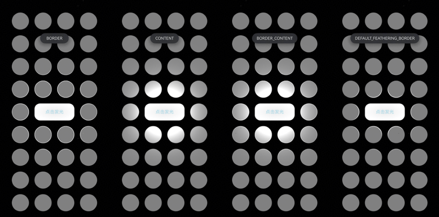
开发步骤
-
导入模块。
import { hdsEffect } from '@kit.UIDesignKit'; -
创建点光源发光效果。如果需要发光,配置sourceType属性;如果需要被照亮,配置illuminatedType属性。
以下代码表示:当中间的Button点击时,产生点光源效果,重复点击触发不同点光源效果。
@Entry
@Component
struct Index {
  @State bloomValue: number = 0;
  @State index: number = 0;
  @State illuminatedType: hdsEffect.PointLightIlluminatedType = hdsEffect.PointLightIlluminatedType.NONE;
  @State buttonGradientState: hdsEffect.PressShadowType = hdsEffect.PressShadowType.NONE;
  @State lightIntensity: number = 10;
  @State types: hdsEffect.PointLightIlluminatedType[] =
    [hdsEffect.PointLightIlluminatedType.NONE, hdsEffect.PointLightIlluminatedType.BORDER,
      hdsEffect.PointLightIlluminatedType.CONTENT, hdsEffect.PointLightIlluminatedType.BORDER_CONTENT,
      hdsEffect.PointLightIlluminatedType.DEFAULT_FEATHERING_BORDER];

  build() {
    Flex({
      direction: FlexDirection.Column,
      justifyContent: FlexAlign.Center,
      alignItems: ItemAlign.Center,
    }) {
      // 纵向循环
      ForEach(Array<number>(4).fill(0), (row: number) => {
        Flex({
          direction: FlexDirection.Row,
          justifyContent: FlexAlign.Center,
          alignItems: ItemAlign.Center,
        }) {
          // 横向循环
          ForEach(Array<number>(4).fill(0), (col: number) => {
            Flex()
              .visualEffect(new hdsEffect.HdsEffectBuilder().pointLight({
                illuminatedType: this.illuminatedType,
              }).buildEffect())
              .backgroundColor(0x808080)
              .size({ width: 60, height: 60 })
              .borderRadius(50)
              .margin({ top: 20, right: 10, left: 10 }) // 添加间距
          })
        }
        .width('100%') // 设置 Row 组件的宽度为 100%
      })

      Flex({
        direction: FlexDirection.Row,
        justifyContent: FlexAlign.Center,
        alignItems: ItemAlign.Center,
      }) {
        Flex()
          .visualEffect(new hdsEffect.HdsEffectBuilder().pointLight({
            illuminatedType: this.illuminatedType,
          }).buildEffect())
          .backgroundColor(0x808080)
          .size({ width: 60, height: 60 })
          .borderRadius(50)
          .margin({ top: 20, right: 10, left: 10 })

        Button('点击发光')
          .size({ width: 140, height: 60 })
          .backgroundColor(0x808080)
          .fontColor(0xADD8E6)
          .visualEffect(new hdsEffect.HdsEffectBuilder()
            .pressShadow(this.buttonGradientState)
            .pointLight({
              options: {
                color: Color.White,
                intensity: this.lightIntensity,
                height: 150
              }
            })
            .buildEffect())
          .onClick(() => {
            if (this.index <= 3) {
              this.index++;
              this.illuminatedType = this.types[this.index];
              this.buttonGradientState = hdsEffect.PressShadowType.BLEND_GRADIENT;
            }
            let message = 'NONE';
            if (this.illuminatedType == 1) {
              message = 'BORDER';
            } else if (this.illuminatedType == 2) {
              message = 'CONTENT';
            } else if (this.illuminatedType == 3) {
              message = 'BORDER_CONTENT';
            } else {
              message = 'DEFAULT_FEATHERING_BORDER';
            }
            this.getUIContext().getPromptAction().showToast({
              message: message,
              duration: 2000,
              bottom: '80%'
            });
          })
          .margin({ top: 20, right: 10, left: 10 })

        Flex()
          .visualEffect(new hdsEffect.HdsEffectBuilder().pointLight({
            illuminatedType: this.illuminatedType,
          }).buildEffect())
          .backgroundColor(0x808080)
          .size({ width: 60, height: 60 })
          .borderRadius(50)
          .margin({ top: 20, right: 10, left: 10 })
      }
      .width('100%') // 设置 Row 组件的宽度为 100%

      ForEach(Array<number>(4).fill(0), (row: number) => {
        Flex({
          direction: FlexDirection.Row,
          justifyContent: FlexAlign.Center,
          alignItems: ItemAlign.Center,
        }) {
          // 横向循环
          ForEach(Array<number>(4).fill(0), (col: number) => {
            Flex()
              .visualEffect(new hdsEffect.HdsEffectBuilder().pointLight({
                illuminatedType: this.illuminatedType,
              }).buildEffect())
              .backgroundColor(0x808080)
              .size({ width: 60, height: 60 })
              .borderRadius(50)
              .margin({ top: 20, right: 10, left: 10 })
          })
        }
        .width('100%') // 设置 Row 组件的宽度为 100%
      })
    }
    .backgroundColor(Color.Black)
  }
}