Q:在HarmonyOS中,如何使用不同的滚动与滑动组件,实现标题吸顶效果?
A:本文主要介绍实现普通吸顶效果、单标题滚动嵌套吸顶效果和多标题滚动嵌套吸顶效果的方案。
- 普通吸顶效果:
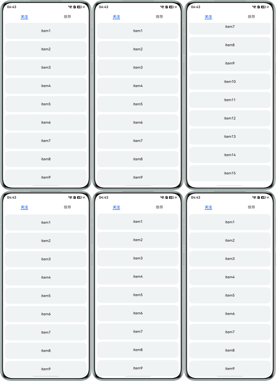
- 方案一:通过Tabs组件的tabBar属性实现吸顶效果。可以自定义实现Tabs效果。示例代码如下:
@Entry
@Component
export struct CommonSolutionOne {
  subsController: TabsController = new TabsController();
  @State arr: string[] = ['1', '2', '3', '4', '5', '6', '7', '8', '9', '10', '11', '12', '13', '14', '15'];

  build() {
    Tabs({ barPosition: BarPosition.Start, controller: this.subsController }) {
      TabContent() {
        List({ space: 10 }) {
          ForEach(this.arr, (item: number) => {
            ListItem() {
              Row() {
                Text('item' + item)
                  .fontSize(16)
                  .height(72)
                  .fontColor(Color.Black);
              }
              .width('100%')
              .height(72)
              .justifyContent(FlexAlign.Center);
            }
            .borderRadius(15)
            .backgroundColor('#F1F3F5');
          }, (item: string) => item);
        }
        .expandSafeArea([SafeAreaType.SYSTEM], [SafeAreaEdge.BOTTOM])
        .padding({ left: 10, right: 10 })
        .width('100%')
        .height('100%')
        .scrollBar(BarState.Off);
      }
      .expandSafeArea([SafeAreaType.SYSTEM], [SafeAreaEdge.BOTTOM])
      .tabBar('关注')
        .backgroundColor('#ffffff');

      TabContent() {
        Text('推荐');
      }
      .expandSafeArea([SafeAreaType.SYSTEM], [SafeAreaEdge.BOTTOM])
      .tabBar('推荐')
      .backgroundColor('#ffffff');
    }
    .expandSafeArea([SafeAreaType.SYSTEM], [SafeAreaEdge.BOTTOM])
    .backgroundColor('#ffffff');
  }
}
实现效果如下:
- 方案二:自定义标题的吸顶实现。若要实现Tabs页面切换效果,需要自定义页面切换逻辑。
@Entry
@Component
export struct CommonSolutionTwo {
  subsController: TabsController = new TabsController();
  @State arr: string[] = ['1', '2', '3', '4', '5', '6', '7', '8', '9', '10', '11', '12', '13', '14', '15'];

  build() {
    Column() {
      Row() {
        // 吸顶标题
        Text('自定义占位标题')
          .width('100%')
          .height(60)
          .textAlign(TextAlign.Center)
          .backgroundColor('#66666666');
      };

      List({ space: 10 }) {
        ForEach(this.arr, (item: number) => {
          ListItem() {
            Row() {
              Text('item' + item)
                .fontSize(16)
                .height(72)
                .fontColor(Color.Black);
            }
            .width('100%')
            .height(72)
            .justifyContent(FlexAlign.Center);
          }
          .borderRadius(15)
          .backgroundColor('#F1F3F5');
        }, (item: string) => item);
      }
      .expandSafeArea([SafeAreaType.SYSTEM], [SafeAreaEdge.BOTTOM])
      .padding({ left: 10, right: 10 })
      .width('100%')
      .scrollBar(BarState.Off)
      .layoutWeight(1); // 更换List组件height属性,高度限制以layoutWeight(1)的形式自动填充父组件高度
    }
    .expandSafeArea([SafeAreaType.SYSTEM], [SafeAreaEdge.BOTTOM])
    .width('100%')
    .height('100%') // 普通吸顶效果时,滚动组件的父组件可以不设置高度,但是滚动嵌套吸顶时一定要设置高度限制为100%
    .backgroundColor('#ffffff');
  }
}
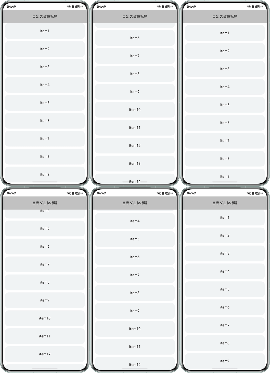
实现效果如下:
- 方案一:通过Tabs组件的tabBar属性实现吸顶效果。可以自定义实现Tabs效果。示例代码如下:
- 单标题滚动嵌套吸顶效果:
- 方案一: 通过nestedScroll属性,实现吸顶效果。由于nestedScroll属性是滚动与滑动组件的通用属性,理论上在滚动组件嵌套的过程中,支持该属性的滚动组件都可以实现吸顶效果。以Tabs组件为例,示例代码如下:
@Entry
@Component
struct SingleTitleSolutionOne {
  subsController: TabsController = new TabsController();
  @State arr: string[] = ['1', '2', '3', '4', '5', '6', '7', '8', '9', '10', '11', '12', '13', '14', '15'];

  build() {
    Scroll() {
      Column() {
        Column() {
          Text('自定义占位标题')
            .fontSize(30)
            .width('100%')
            .height(200)
            .backgroundColor('#66666666')
            .textAlign(TextAlign.Center);
        }
        .expandSafeArea([SafeAreaType.SYSTEM], [SafeAreaEdge.BOTTOM])

        Tabs({ barPosition: BarPosition.Start, controller: this.subsController }) {
          TabContent() {
            List({ space: 10 }) {
              ForEach(this.arr, (item: number) => {
                ListItem() {
                  Row() {
                    Text('item' + item)
                      .fontSize(16)
                      .height(72)
                      .fontColor(Color.Black);
                  }
                  .expandSafeArea([SafeAreaType.SYSTEM], [SafeAreaEdge.BOTTOM])
                  .width('100%')
                  .height(72)
                  .justifyContent(FlexAlign.Center);
                }
                .expandSafeArea([SafeAreaType.SYSTEM], [SafeAreaEdge.BOTTOM])
                .borderRadius(15)
                .backgroundColor('#F1F3F5');
              }, (item: string) => item);
            }
            .expandSafeArea([SafeAreaType.SYSTEM], [SafeAreaEdge.BOTTOM])
            .padding({ left: 10, right: 10 })
            .width('100%')
            .height('100%')
            .scrollBar(BarState.Off)
            .nestedScroll({
              scrollForward: NestedScrollMode.PARENT_FIRST, // 向上滚动PARENT_FIRST:父组件先滚动,父组件滚动到边缘以后自身滚动。
              scrollBackward: NestedScrollMode.SELF_FIRST // 向下滚动SELF_FIRST:自身先滚动,自身滚动到边缘以后父组件滚动。
            });
          }
          .clip(false)
          .expandSafeArea([SafeAreaType.SYSTEM], [SafeAreaEdge.BOTTOM])
          .tabBar('关注')
          .backgroundColor('#ffffff');

          TabContent() {
            Text('推荐');
          }
          .expandSafeArea([SafeAreaType.SYSTEM], [SafeAreaEdge.BOTTOM])
          .tabBar('推荐')
          .backgroundColor('#ffffff');
        }
        .clip(false)
        .expandSafeArea([SafeAreaType.SYSTEM], [SafeAreaEdge.BOTTOM])
        .backgroundColor('#ffffff');
      }
      .expandSafeArea([SafeAreaType.SYSTEM], [SafeAreaEdge.BOTTOM])
      .width('100%');
    }
    .clip(false)
    .expandSafeArea([SafeAreaType.SYSTEM], [SafeAreaEdge.BOTTOM])
    .edgeEffect(EdgeEffect.Spring)
    .friction(0.6)
    .backgroundColor('#ffffff')
    .scrollBar(BarState.Off)
    .width('100%')
    .height('100%');
  }
}
实现效果如下:
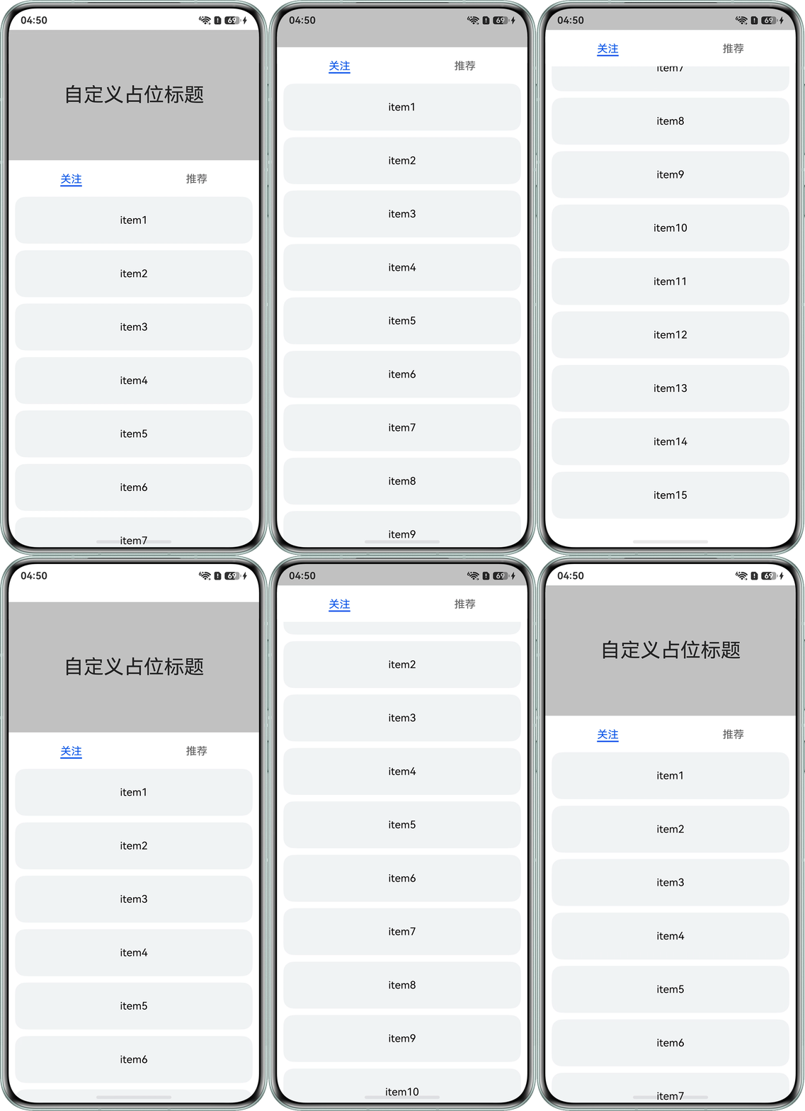

自定义标题的实现方式,此处主要讲解滚动组件嵌套实现方式。若是想要以自定义标题实现滚动嵌套吸顶效果,滚动组件的父组件一定要设置高度限制为100%,若不设置高度限制,父组件自适应高度会导致吸顶失效,可详见下文中"多标题滚动嵌套吸顶效果"的方案一,其内第一个标题为自定义标题,及其父组件高度注释。
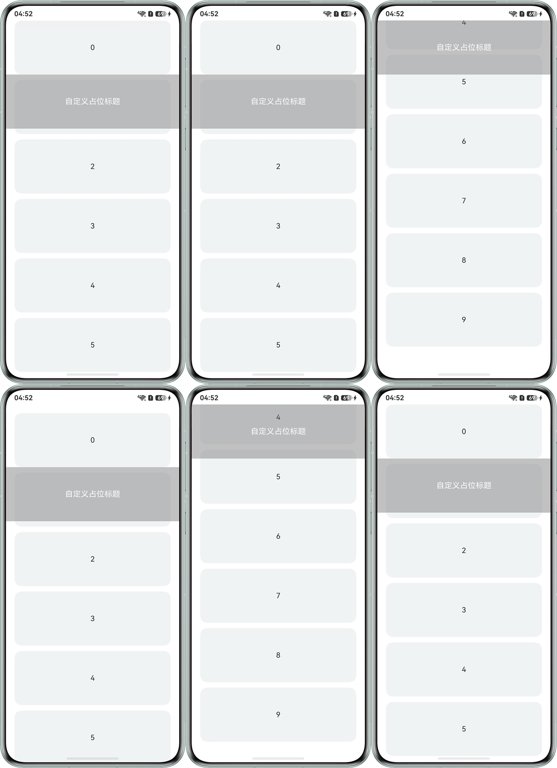
- 方案二: 由于Waterflow布局本身不支持吸顶,如需使用Waterflow布局实现吸顶效果,可以在滚动组件上通过Stack叠加一个组件实现,示例代码如下:
// 瀑布流布局项数据模型(用于描述每个子项的布局属性)
export class WaterFlowItemModel {
  fullWidth: boolean = false;
  stickyTop: number | undefined = undefined;
  height: number = 0;
  width: number = 0;
  bgColor: string = '#f0f0f0';
}

// 瀑布流数据源实现类
export class WaterFlowDataSource implements IDataSource {
  private dataArray: WaterFlowItemModel[] = [];
  private listeners: DataChangeListener[] = [];

  constructor() {
    this.dataArray = [];
    // 生成10个瀑布流测试数据项
    for (let i = 0; i < 10; i++) {
      const model = new WaterFlowItemModel();
      model.fullWidth = i % 5 === 4;
      model.height = 120;
      model.bgColor = '#f0f0f0';
      this.dataArray.push(model);
    }
  }

  // 获取数据总量
  totalCount(): number {
    return this.dataArray.length;
  }

  // 根据索引获取单个数据项
  getData(index: number) {
    return this.dataArray[index];
  }

  // 注册数据变更监听器
  registerDataChangeListener(listener: DataChangeListener) {
    if (this.listeners.indexOf(listener) < 0) {
      this.listeners.push(listener);
    }
  }

  // 移除已注册的数据变更监听器
  unregisterDataChangeListener(listener: DataChangeListener) {
    const pos = this.listeners.indexOf(listener);
    if (pos >= 0) {
      this.listeners.splice(pos, 1);
    }
  }
}

@Entry
@Component
struct SingleTitleSolutionTwo {
  scroller: Scroller = new Scroller();
  datasource: WaterFlowDataSource = new WaterFlowDataSource();
  @State scrollOffset: number = 0;

  build() {
    Stack({ alignContent: Alignment.TopStart }) {
      WaterFlow({ scroller: this.scroller }) {
        LazyForEach(this.datasource, (item: WaterFlowItemModel, index) => {
          FlowItem() {
            // 当索引不为1,展示当前索引值
            if (index !== 1) {
              Text(`${index}`);
            }
          }
          .expandSafeArea([SafeAreaType.SYSTEM], [SafeAreaEdge.BOTTOM])
          .margin({ right:20,bottom:12,left:19 })
          .borderRadius(15)
          .onClick(() => {
            console.info('onClick ---- ', index);
          })
          .width('90%')
          .height(item.height)
          // .backgroundColor(index === 1 ? '#00000000' : Color.White);
          .backgroundColor('#F1F3F5')
        }, (key: string) => key);
      }
      .expandSafeArea([SafeAreaType.SYSTEM], [SafeAreaEdge.BOTTOM])
      .edgeEffect(EdgeEffect.Spring)
      .onWillScroll((offset: number) => {
        this.scrollOffset = this.scroller.currentOffset().yOffset + offset;
      })
      .width('100%')
      .height('100%')
      .backgroundColor('#ffffff');

      // 在索引为1的WaterFlowItem上方叠加一个组件
      Stack() {
        Text('自定义占位标题')
          .width('100%')
          .height(this.datasource.getData(1).height)
          .fontColor(Color.White)
          .backgroundColor('#66666666')
          .fontSize(17)
          .textAlign(TextAlign.Center);
      }
      .expandSafeArea([SafeAreaType.SYSTEM], [SafeAreaEdge.BOTTOM])
      .hitTestBehavior(HitTestMode.Transparent)
      .position({ x: 0, y: this.scrollOffset >= 120 ? 0 : 120 - this.scrollOffset });

    }
    .expandSafeArea([SafeAreaType.SYSTEM], [SafeAreaEdge.BOTTOM])
    .width('100%')
    .height('100%')
    .clip(true);
  }
}
实现效果如下:
- 方案一: 通过nestedScroll属性,实现吸顶效果。由于nestedScroll属性是滚动与滑动组件的通用属性,理论上在滚动组件嵌套的过程中,支持该属性的滚动组件都可以实现吸顶效果。以Tabs组件为例,示例代码如下:
- 多标题滚动嵌套吸顶效果:
- 方案一:通过nestedScroll属性对滚动组件多次滚动嵌套,参考单标题滚动嵌套吸顶效果,示例代码如下:
@Entry
@Component
struct MultipleTitleSolutionOne {
  subsController: TabsController = new TabsController();
  @State arr: string[] = ['1', '2', '3'];
  @State arr1: string[] = ['1', '2', '3', '4', '5', '6', '7', '8', '9', '10', '11', '12', '13', '14', '15'];

  build() {
    Scroll() {
      Column() {
        Column() {
          Text('自定义占位标题')
            .fontSize(30)
            .width('100%')
            .height(200)
            .backgroundColor('#66666666')
            .textAlign(TextAlign.Center);
        };

        Column() {
          Row() {
            Text('自定义占位标题') // 自定义实现标题吸顶,依旧采用Tabs组件也适用
              .fontSize(16)
              .height(60)
              .width('100%')
              .textAlign(TextAlign.Center);
          }.backgroundColor('#6dbab8b8')

          Scroll() {
            Column() {
              ForEach(this.arr, (item: number) => {
                Row() {
                  Text('item' + item)
                    .fontSize(16)
                    .height(72)
                    .fontColor(Color.Black);
                }
                .width('100%')
                .height(72)
                .borderRadius(15)
                .margin({
                  bottom: 10
                })
                .justifyContent(FlexAlign.Center);
              }, (item: string) => item);

              Tabs({ barPosition: BarPosition.Start, controller: this.subsController }) {
                TabContent() {
                  List({ space: 10 }) {
                    ForEach(this.arr1, (item: number) => {
                      ListItem() {
                        Row() {
                          Text('item' + item)
                            .fontSize(16)
                            .height(72)
                            .fontColor(Color.Black);
                        }
                        .width('100%')
                        .height(72)
                        .justifyContent(FlexAlign.Center);
                      }
                      .expandSafeArea([SafeAreaType.SYSTEM], [SafeAreaEdge.BOTTOM])
                      .borderRadius(15)
                      .backgroundColor(Color.White);
                    }, (item: string) => item);
                  }
                  .expandSafeArea([SafeAreaType.SYSTEM], [SafeAreaEdge.BOTTOM])
                  .padding({ left: 10, right: 10 })
                  .width('100%')
                  .height('100%')
                  .scrollBar(BarState.Off)
                  .nestedScroll({
                    scrollForward: NestedScrollMode.PARENT_FIRST, // 向上滚动PARENT_FIRST:父组件先滚动,父组件滚动到边缘以后自身滚动。
                    scrollBackward: NestedScrollMode.SELF_FIRST // 向下滚动SELF_FIRST:自身先滚动,自身滚动到边缘以后父组件滚动。
                  });
                }
                .expandSafeArea([SafeAreaType.SYSTEM], [SafeAreaEdge.BOTTOM])
                .tabBar('关注')
                .backgroundColor('#F1F3F5');

                TabContent() {
                  Text('推荐');
                }
                .expandSafeArea([SafeAreaType.SYSTEM], [SafeAreaEdge.BOTTOM])
                .tabBar('推荐')
                .backgroundColor('#F1F3F5');
              }
              .expandSafeArea([SafeAreaType.SYSTEM], [SafeAreaEdge.BOTTOM])
              .backgroundColor('#6dbab8b8');
            }
            .expandSafeArea([SafeAreaType.SYSTEM], [SafeAreaEdge.BOTTOM])
            .backgroundColor(Color.White)
            .width('100%');
          }
          .expandSafeArea([SafeAreaType.SYSTEM], [SafeAreaEdge.BOTTOM])
          .width('100%')
          .layoutWeight(1)
          .scrollBar(BarState.Off)
          .nestedScroll({
            scrollForward: NestedScrollMode.PARENT_FIRST, // 向上滚动PARENT_FIRST:父组件先滚动,父组件滚动到边缘以后自身滚动。
            scrollBackward: NestedScrollMode.SELF_FIRST // 向下滚动SELF_FIRST:自身先滚动,自身滚动到边缘以后父组件滚动。
          });
        }
        .expandSafeArea([SafeAreaType.SYSTEM], [SafeAreaEdge.BOTTOM])
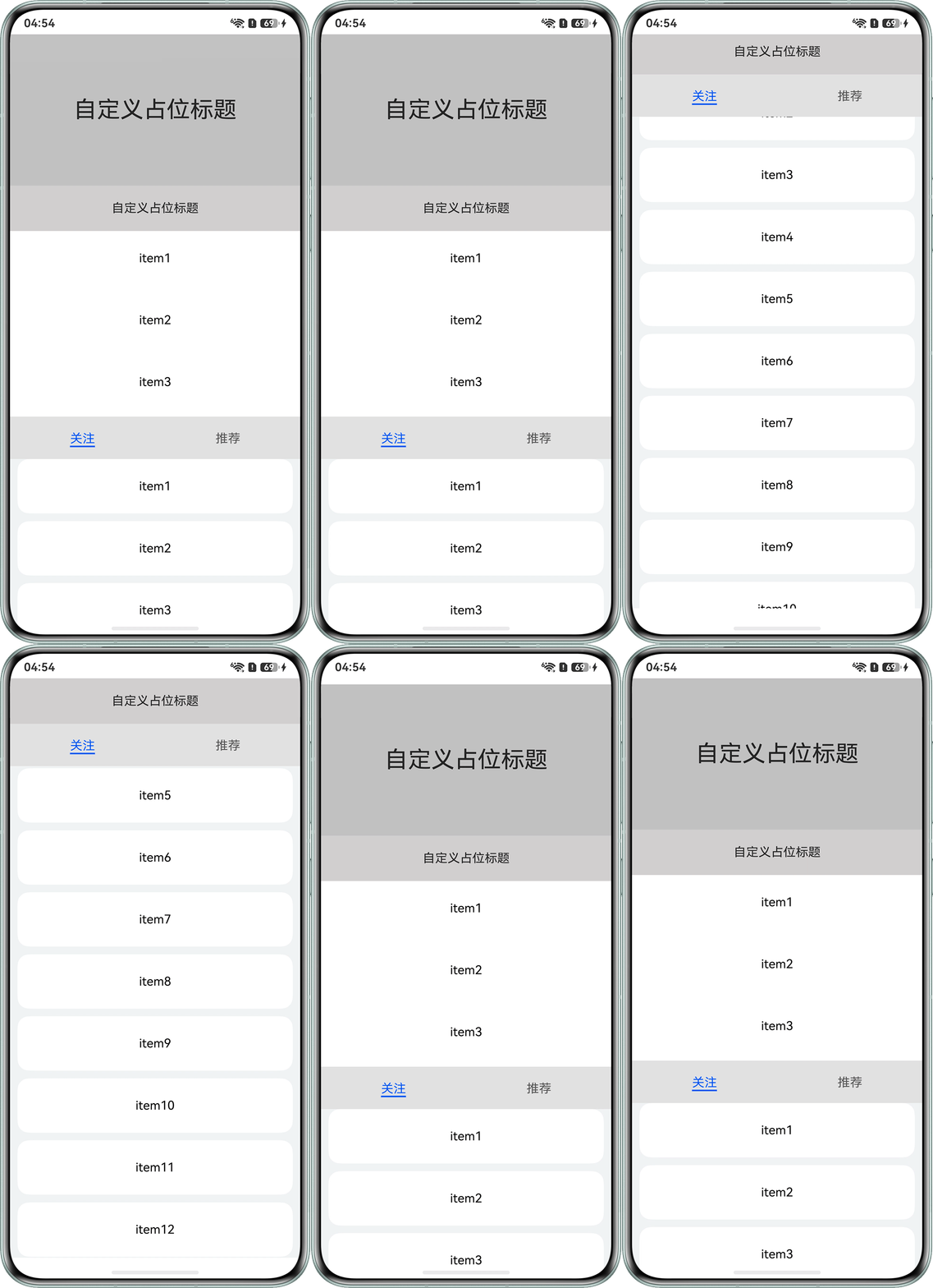
        .height('100%') // 由于是自定义的标题,所以容纳标题和列表的父组件一定要设置高度为100%
        .backgroundColor('#6dbab8b8');
      }
      .expandSafeArea([SafeAreaType.SYSTEM], [SafeAreaEdge.BOTTOM])
      .width('100%');
    }
    .expandSafeArea([SafeAreaType.SYSTEM], [SafeAreaEdge.BOTTOM])
    .edgeEffect(EdgeEffect.Spring)
    .friction(0.6)
    .backgroundColor(Color.White)
    .scrollBar(BarState.Off)
    .width('100%')
    .height('100%');
  }
}
实现效果如下:
- 方案二:通过List组件的sticky属性,实现吸顶效果。
常见场景一:header吸顶和footer吸底,该方案仅适用于List组件,具体实施方案参考官方示例:吸顶/吸底。
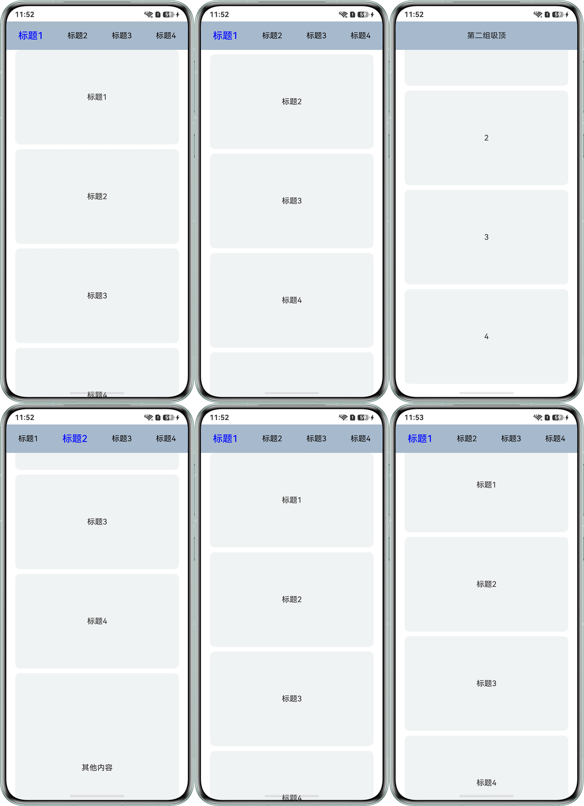
常见场景二:多标题多tab菜单吸顶时,实现滑动时自动切换tab栏。通过onDidScroll方法,监听滚动事件,根据滚动偏移量动态计算当前处于哪个区域,再根据当前区块切换标题内容。示例代码如下:
@Entry
@Component
struct MultipleTitleSolutionOnePlus {
  @State data1: string[] = ['标题1', '标题2', '标题3', '标题4'];
  @State data2: string[] = ['1', '2', '3', '4'];
  @State selectIndex1: number = 0;
  private listController: ListScroller = new ListScroller();

  @Builder
  topBuilder1() {
    Row() {
      ForEach(this.data1, (item: string, index: number) => {
        Text(item)
          .fontColor(index == this.selectIndex1 ? Color.Blue : '#000')
          .fontSize(index == this.selectIndex1 ? 20 : 16)
          .fontWeight(index == this.selectIndex1 ? 500 : 400)
          .onClick(() => {
            this.listController.scrollToItemInGroup(0, index, true);
          });
      });
    }
    .backgroundColor(0xAABBCC)
    .height(60)
    .width('100%')
    .justifyContent(FlexAlign.SpaceAround);
  }

  @Builder
  topBuilder2() {
    Row() {
      Text('第二组吸顶')
        .padding(5)
        .textAlign(TextAlign.Center);
    }
    .backgroundColor(0xAABBCC)
    .justifyContent(FlexAlign.SpaceAround)
    .height(60)
    .width('100%');
  }

  build() {
    Column() {
      List({ space: 10, scroller: this.listController }) {
        ListItemGroup({ header: this.topBuilder1, space: 10 }) {
          ForEach(this.data1, (item: string) => {
            ListItem() {
              Text(item)
                .width('90%')
                .height(200)
                .backgroundColor('#f1f3f5')
                .borderRadius(10)
                .textAlign(TextAlign.Center);
            };
          });
        };

        ListItemGroup() {
          ListItem() {
            Text('其他内容')
              .width('90%')
              .height(400)
              .backgroundColor('#f1f3f5')
              .borderRadius(10)
              .fontSize(16)
              .textAlign(TextAlign.Center);
          };
        };

        ListItemGroup({ header: this.topBuilder2, space: 10 }) {
          ForEach(this.data2, (item: string) => {
            ListItem() {
              Text(item)
                .width('90%')
                .height(200)
                .backgroundColor('#f1f3f5')
                .borderRadius(10)
                .textAlign(TextAlign.Center);
            };
          });
        };
      }
      .expandSafeArea([SafeAreaType.SYSTEM], [SafeAreaEdge.BOTTOM])
      .onDidScroll(() => {
        let currentOffset = this.listController.currentOffset().yOffset;
        this.selectIndex1 = Math.floor(currentOffset / 200);
      })
      .scrollBar(BarState.Off)
      .sticky(StickyStyle.Header)
      .alignListItem(ListItemAlign.Center);
    };
  }
}
实现效果如下:
- 方案一:通过nestedScroll属性对滚动组件多次滚动嵌套,参考单标题滚动嵌套吸顶效果,示例代码如下:
- 二级标题滚动嵌套吸顶效果:
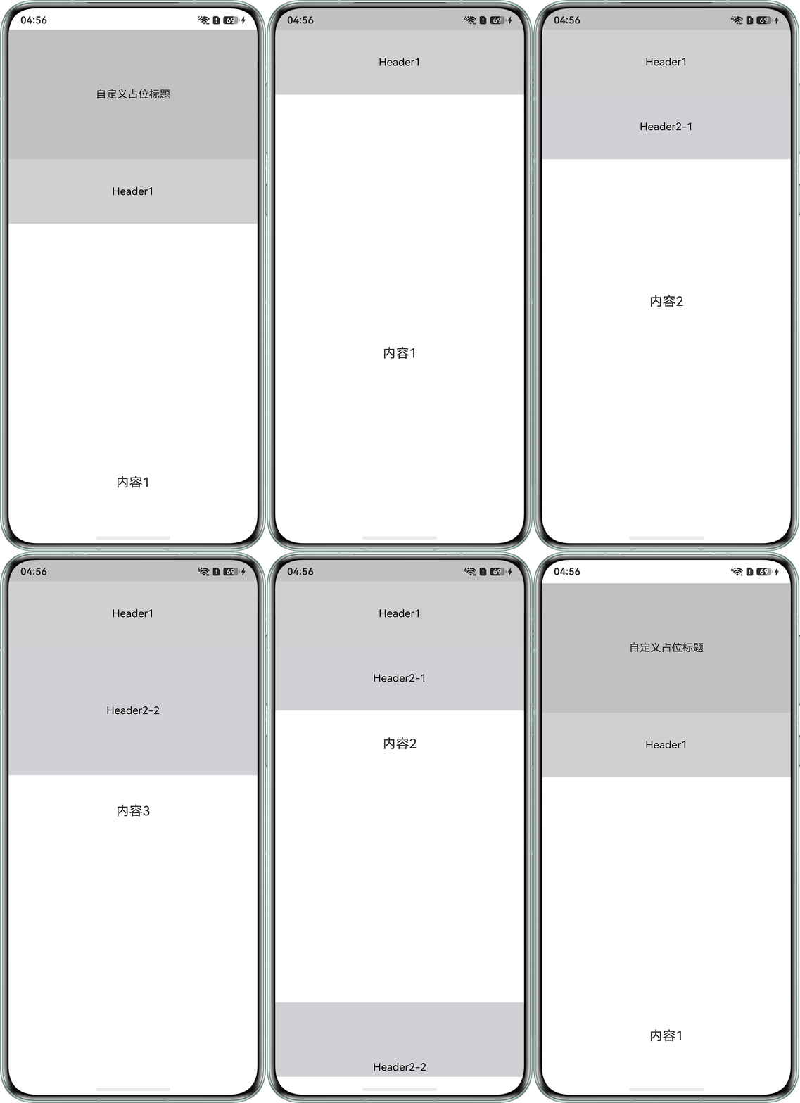
第一层吸顶用Scroll嵌套List实现,第二层是利用ListItemGroup的sticky属性实现,示例代码如下:
@Entry
@Component
struct MultipleTitleSolutionTwo {
  private timeTable: TimeTable[] = [
    {
      title: 'Header2-0',
      projects: ['内容1']
    },
    {
      title: 'Header2-1',
      projects: ['内容2']
    },
    {
      title: 'Header2-2',
      projects: ['内容3']
    }
  ];

  @Builder
  itemHead(text: string, index: number) {
    if (index === 0) {
      Text().height(0);
    } else {
      Text(text)
        .width('100%')
        .textAlign(TextAlign.Center)
        .fontColor(Color.Black)
        .height(index === 1 ? 100 : 200)
        .backgroundColor('#d1d1d6');
    }
  }

  build() {
    Scroll() {
      Column() {
        Text('自定义占位标题')
          .width('100%')
          .height(200)
          .backgroundColor('#66666666')
          .textAlign(TextAlign.Center);
        Column() {
          // 第一层吸顶效果主要是通过设置nestedScroll属性以及父组件设置高度100%实现
          Text('Header1')
            .width('100%')
            .height(100)
            .backgroundColor('#4d666666')
            .textAlign(TextAlign.Center)
            .fontColor(Color.Black);
          List() {
            ForEach(this.timeTable, (item: TimeTable, index) => {
              ListItemGroup({ header: this.itemHead(item.title, index) }) {
                ForEach(item.projects, (project: string) => {
                  ListItem() {
                    Text(project)
                      .width('100%')
                      .height(800)
                      .fontSize(20)
                      .textAlign(TextAlign.Center)
                      .backgroundColor('#FFFFFF');
                  }
                }, (item: string) => item);
              }.clip(false);
            });
          }
          .expandSafeArea([SafeAreaType.SYSTEM], [SafeAreaEdge.BOTTOM])
          .sticky(StickyStyle.Header)
          .scrollBar(BarState.Off)
          .width('100%')
          .height('calc(100% - 100vp)')
          .backgroundColor('#ffffff')
          .edgeEffect(EdgeEffect.Spring)
          .nestedScroll({
            scrollForward: NestedScrollMode.PARENT_FIRST,
            scrollBackward: NestedScrollMode.SELF_FIRST
          });
        }.clip(false).expandSafeArea([SafeAreaType.SYSTEM], [SafeAreaEdge.BOTTOM]).height('100%')
      }.expandSafeArea([SafeAreaType.SYSTEM], [SafeAreaEdge.BOTTOM])
    }
    .expandSafeArea([SafeAreaType.SYSTEM], [SafeAreaEdge.BOTTOM])
    .clip(false)
    .edgeEffect(EdgeEffect.Spring)
    .friction(0.6)
    .backgroundColor(Color.White)
    .scrollBar(BarState.Off)
    .width('100%')
    .height('100%');
  }
}

interface TimeTable {
  title: string;
  projects: string[];
}
实现效果如下:
- 动态控制二级标题滚动嵌套吸顶效果:
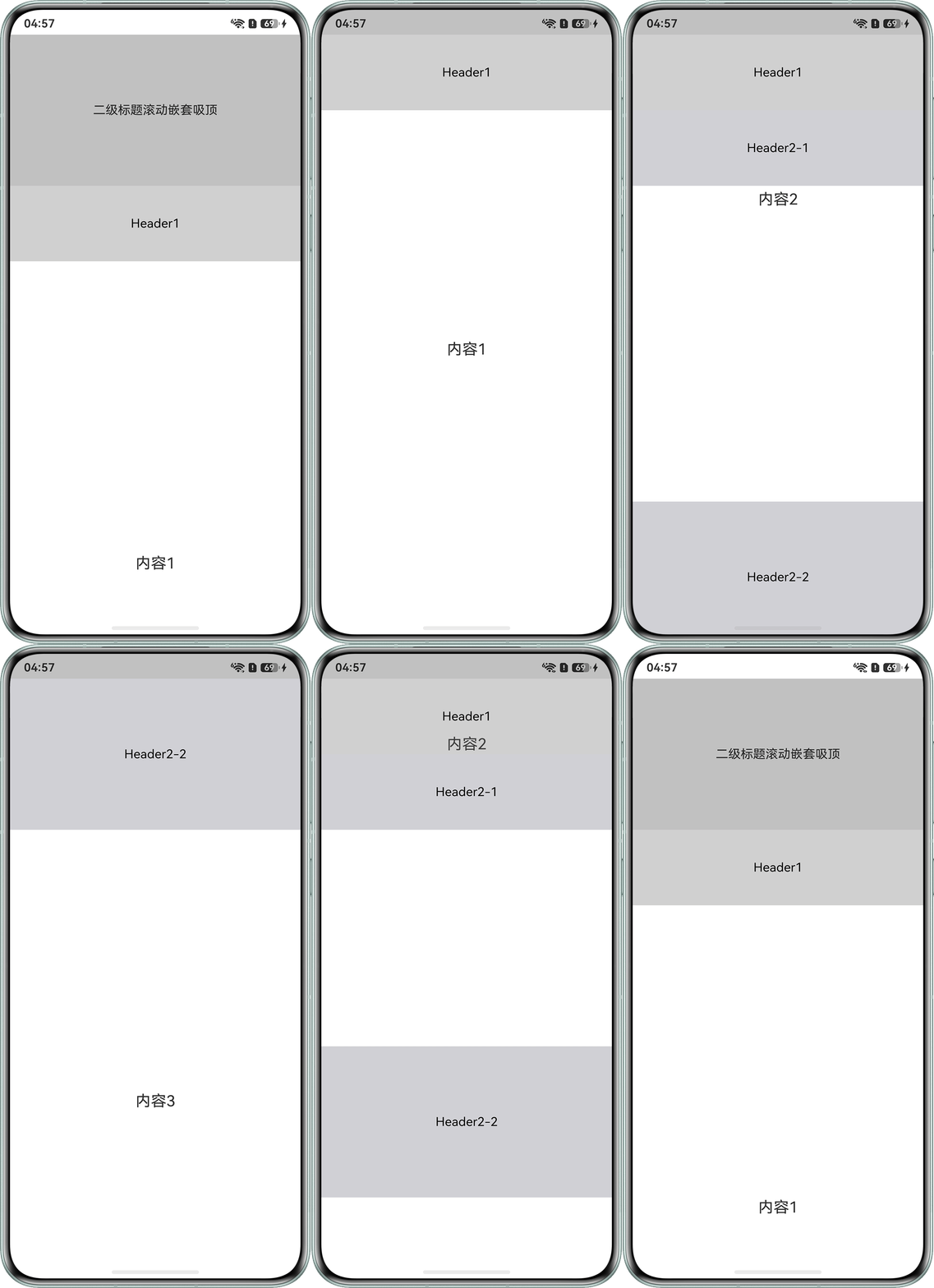
在List组件onDidScroll方法里判断索引为2的组件滚动偏移量,动态调整Header1的position属性和List组件的contentStartOffset属性,示例代码如下:
@Entry
@Component
struct MultipleTitleSolutionTwoDynamic {
  @State header1Position: number = 0;
  @State listStartOffset: number = 100;
  private scroller = new Scroller();
  private timeTable: TimeTableDynamic[] = [
    {
      title: 'Header2-0',
      projects: ['内容1']
    },
    {
      title: 'Header2-1',
      projects: ['内容2']
    },
    {
      title: 'Header2-2',
      projects: ['内容3']
    }
  ];

  @Builder
  itemHead(text: string, index: number) {
    if (index === 0) {
      Text().height(0);
    } else {
      Text(text)
        .width('100%')
        .textAlign(TextAlign.Center)
        .fontColor(Color.Black)
        .height(index === 1 ? 100 : 200)
        .backgroundColor('#d1d1d6');
    }
  }

  build() {
    Scroll() {
      Column() {
        Text('二级标题滚动嵌套吸顶')
          .width('100%')
          .height(200)
          .backgroundColor('#66666666')
          .textAlign(TextAlign.Center);
        Column() {
          // 第一层吸顶效果主要是通过设置nestedScroll属性以及父组件设置高度100%实现
          Text('Header1')
            .width('100%')
            .height(100)
            .backgroundColor('#4d666666')
            .textAlign(TextAlign.Center)
            .fontColor(Color.Black)
            .position({ y: this.header1Position })
            .zIndex(10);
          List({ scroller: this.scroller }) {
            ForEach(this.timeTable, (item: TimeTableDynamic, index) => {
              ListItemGroup({ header: this.itemHead(item.title, index) }) {
                ForEach(item.projects, (project: string) => {
                  ListItem() {
                    Text(project)
                      .width('100%')
                      .height(800)
                      .fontSize(20)
                      .textAlign(TextAlign.Center)
                      .backgroundColor('#ffffff');
                  }.expandSafeArea([SafeAreaType.SYSTEM], [SafeAreaEdge.BOTTOM]);
                }, (item: string) => item);
              };
            });
          }
          .expandSafeArea([SafeAreaType.SYSTEM], [SafeAreaEdge.BOTTOM])
          .sticky(StickyStyle.Header)
          .scrollBar(BarState.Off)
          .width('100%')
          .height('100%')
          .backgroundColor('#ffffff')
          .edgeEffect(EdgeEffect.Spring)
          .contentStartOffset(this.listStartOffset)
          .nestedScroll({
            scrollForward: NestedScrollMode.PARENT_FIRST,
            scrollBackward: NestedScrollMode.SELF_FIRST
          })
          .onDidScroll(() => {
            let secondRect = this.scroller.getItemRect(2);
            if (secondRect.x === 0 && secondRect.y === 0 && secondRect.width === 0 && secondRect.height === 0) {
              console.info(`索引为${2}的组件不在屏幕上`);
              return;
            }
            this.header1Position = Math.min(0, secondRect.y - 200);
            this.listStartOffset = Math.max(0, 100 + this.header1Position);
          });
        }.height('100%');
      };
    }.expandSafeArea([SafeAreaType.SYSTEM], [SafeAreaEdge.BOTTOM])
    .clip(false)
    .edgeEffect(EdgeEffect.Spring)
    .friction(0.6)
    .backgroundColor(Color.White)
    .scrollBar(BarState.Off)
    .width('100%')
    .height('100%');
  }
}

interface TimeTableDynamic {
  title: string;
  projects: string[];
}
实现效果如下:
Q:还有其他组件能实现吸顶效果吗?
A:可以通过Stack组件或者zIndex属性,这类层叠布局实现组件吸顶。但这类层叠方式,该场景下并不常见,该方式更多用于网页中的客服按钮/回到页面顶部等场景。
Q:如何实现滑动时吸顶标题组件颜色渐变的效果?
A:可以通过onDidScroll等监听滑动的事件,监听组件的偏移量,从而控制吸顶的标题组件改变透明度、背景颜色等状态。