问题现象
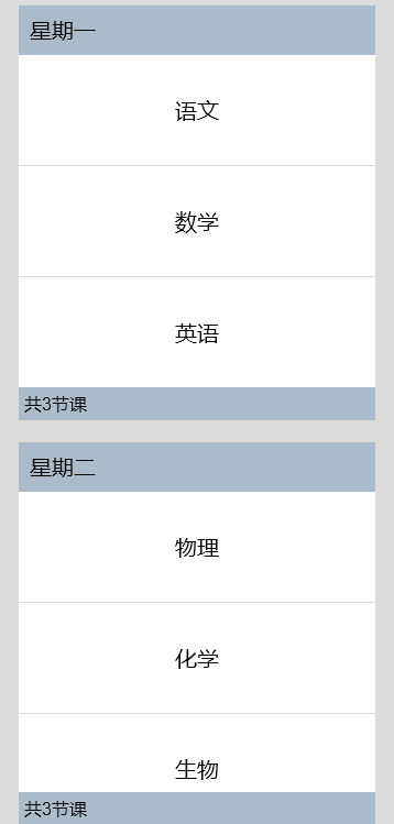
根据数据种类为ListItem设置不同样式。例如,标题和标题对应的子类等,应分别应用相应的样式。
解决措施
可以通过在List组件中使用ListItemGroup组件来展示ListItem分组,并单独设置ListItemGroup中的header参数以自定义每组的头部组件样式。参考代码如下:
// xxx.ets
@Entry
@Component
struct ListItemGroupExample {
  private timetable: TimeTable[] = [
    {
      title: 'Monday',
      projects: ['language', 'mathematics', 'English']
    },
    {
      title: 'Tuesday',
      projects: ['physics', 'chemistry', 'biology']
    },
    {
      title: 'Wednesday',
      projects: ['history', 'geography', 'politics']
    },
    {
      title: 'Thursday',
      projects: ['the fine arts', 'music', 'sport']
    }
  ]

  @Builder
  itemHead(text: string) {
    Text(text)
      .fontSize(20)
      .backgroundColor(0xAABBCC)
      .width('100%')
      .padding(10)
  }

  @Builder
  itemFoot(num: number) {
    Text('common' + num + 'period')
      .fontSize(16)
      .backgroundColor(0xAABBCC)
      .width('100%')
      .padding(5)
  }

  build() {
    Column() {
      List({ space: 20 }) {
        ForEach(this.timetable, (item: TimeTable) => {
          ListItemGroup({ header: this.itemHead(item.title), footer: this.itemFoot(item.projects.length) }) {
            ForEach(item.projects, (project: string) => {
              ListItem() {
                Text(project)
                  .width('100%')
                  .height(100)
                  .fontSize(20)
                  .textAlign(TextAlign.Center)
                  .backgroundColor(0xFFFFFF)
              }
            }, (item: string) => item)
          }
          .divider({ strokeWidth: 1, color: Color.Blue }) // The boundary line between each row
        })
      }
      .width('90%')
      .height('100%')
      .sticky(StickyStyle.Header | StickyStyle.Footer)
      .scrollBar(BarState.Off)
    }.width('100%').height('100%').backgroundColor(0xDCDCDC).padding({ top: 5 })
  }
}

interface TimeTable {
  title: string;
  projects: string[];
}
效果如图所示:
参考链接