背景知识
- RichEditor:支持图文混排和文本交互式编辑的组件。
- bindSheet:给组件绑定半模态页面,点击后显示模态页面。
- aboutToIMEInput:输入法输入内容前触发回调。
- overlay:在当前组件上,增加遮罩文本或者叠加自定义组件以及ComponentContent作为该组件的浮层。
- Text:显示一段文本的组件,可以包含Span、ImageSpan、SymbolSpan和ContainerSpan子组件。
- ContainerSpan:Text组件的子组件,用于统一管理多个Span、ImageSpan的背景色及圆角弧度。
- Span:作为Text、ContainerSpan组件的子组件,用于显示行内文本的组件。
解决方案
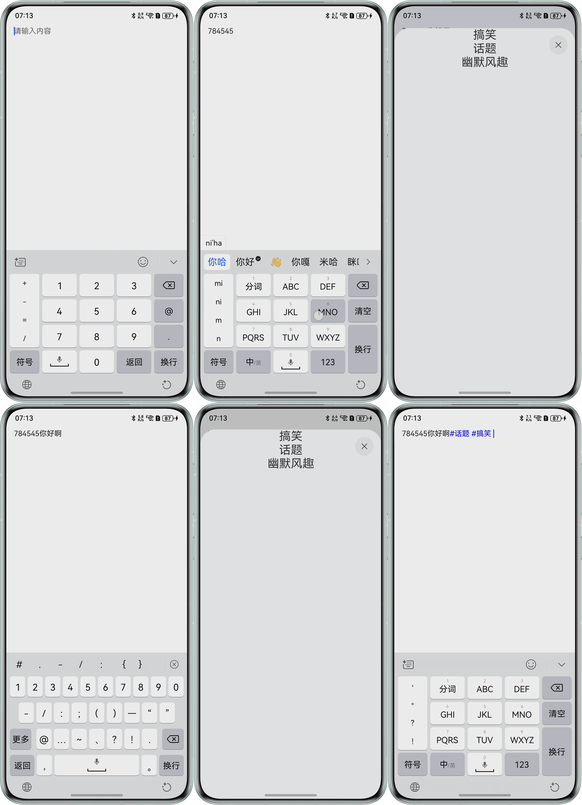
- 方案一:
- 使用@Builder创建一个自定义组件tagSheet,用于实现标签的展示。
- 创建一个标记showTagSheet,在aboutToIMEInput事件中检测'#'字符的输入,若检测到'#',showTagSheet则为true,否则为false。
- 使用bindSheet将自定义组件tagSheet绑定在RichEditor。showTagSheet为true时,弹出tagSheet模态框。
- 点击模态框标签后,通过addTextSpan插入标签和空格。
@Entry
@Component
struct RichEditorPage {
  controller: RichEditorController = new RichEditorController();
  options: RichEditorOptions = { controller: this.controller };
  private tagMap: string[] = ['搞笑', '话题', '幽默风趣'];
  @State showTagSheet: boolean = false;
  private readonly tagColor: string = '#FF0000FF';
  private readonly normalColor: string = '#FF000000';

  @Builder
  tagSheet() {
    Column() {
      ForEach(this.tagMap, (item: string) => {
        Text(item)
          .fontSize(25)
          .onClick(() => {
            this.showTagSheet = false;
            let curIndex = this.controller.getCaretOffset();
            this.controller.deleteSpans({ start: curIndex - 1, end: curIndex });
            this.controller.addTextSpan('#' + item, {
              offset: curIndex - 1,
              style: {
                fontColor: this.tagColor
              }
            });
            this.controller.addTextSpan(' ', {
              offset: curIndex + item.length,
              style: {
                fontColor: this.normalColor,
              }
            });
          });
      });
    }
    .width('100%')
    .height('100%');
  }

  build() {
    RelativeContainer() {
      RichEditor(this.options)
        .placeholder('请输入内容')
        .aboutToIMEInput((value: RichEditorInsertValue) => {
          if (value.insertValue === '#') {
            this.showTagSheet = true;
          }
          return true;
        })
        .width('100%')
        .height('100%')
        .backgroundColor(Color.White)
        .id('rich_editor');
    }
    .backgroundColor(Color.Gray)
    .bindSheet(this.showTagSheet, this.tagSheet(), {
      shouldDismiss: () => {
        this.showTagSheet = false;
      }
    })
    .height('100%')
    .width('100%');
  }
}
效果预览:
- 方案二:
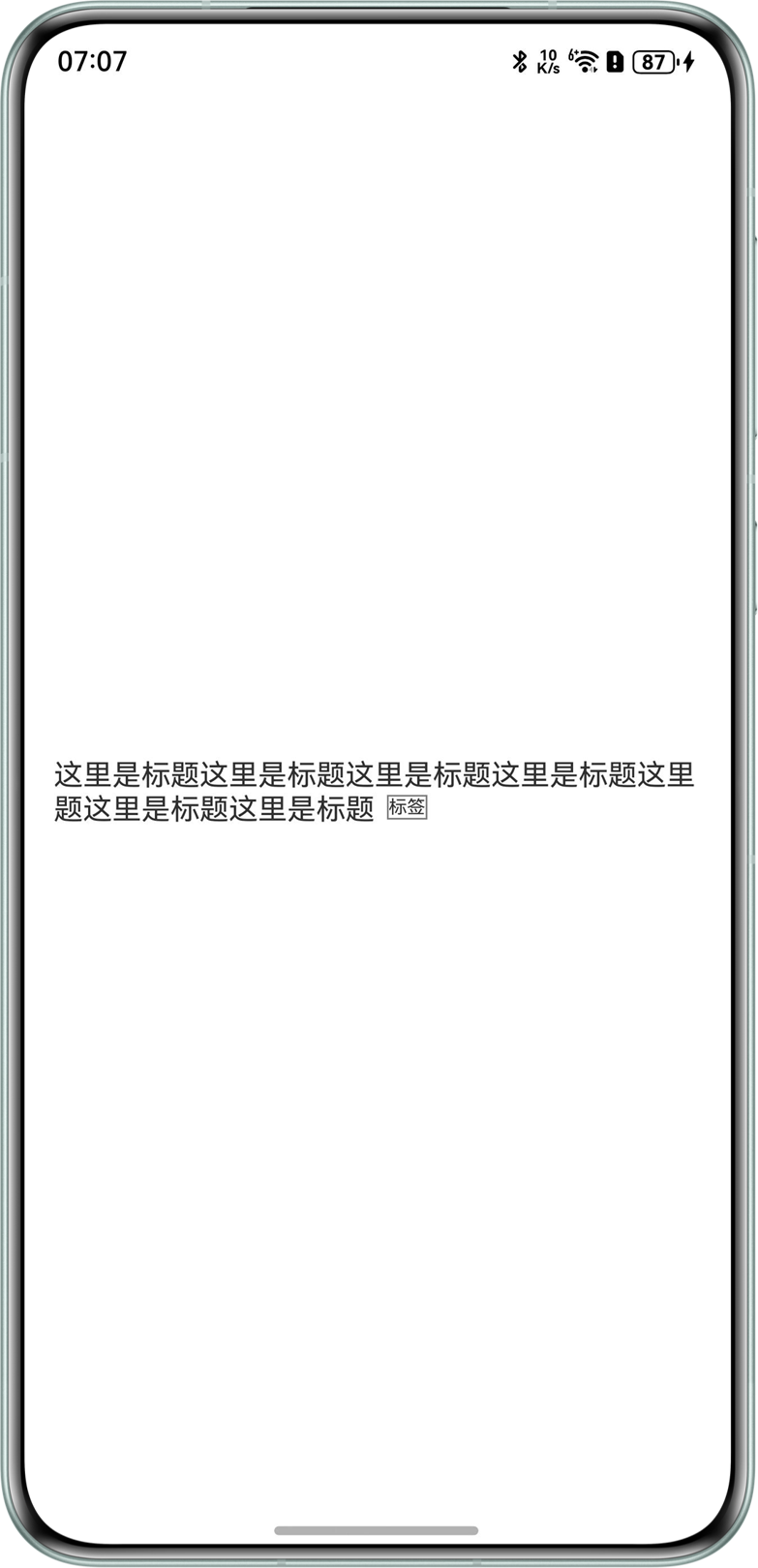
- 使用@Builder创建一个自定义的浮层组件OverlayNode。
- 使用overlay属性将浮层组件OverlayNode绑定到Text组件,并通过offset来控制浮层位置。
import { display, MeasureUtils } from '@kit.ArkUI';

@Entry
@Component
struct Index {
  @State offsetX: number = 0;
  @State offsetY: number = 0;
  @State textWidth: number = 0;
  @State compHeight: number = 0;
  @State compWidth: number = 0;
  @State screenWidth: number = 0;
  private text: string = "这里是标题这里是标题这里是标题这里这里是标题这里是标题这里是标题这里";
  private uiContextMeasure: MeasureUtils = this.getUIContext().getMeasureUtils();

  @Builder
  OverlayNode() {
    Column() {
      Text('标签')
        .border({ width: 1, color: Color.Gray })
        .fontSize(10);
    };
  }

  aboutToAppear(): void {
    // 获取文本宽度
    this.textWidth = this.getUIContext().px2vp(this.uiContextMeasure.measureText({
      textContent: this.text,
      fontSize: 15,
    }));
    this.screenWidth = this.getUIContext().px2vp(display.getDefaultDisplaySync().width); // 获取屏幕宽度
  }

  build() {
    Column() {
      Row() {
        Text(this.text)
          .fontSize(15)
          .margin(10)
          .onAreaChange((oldVal: Area, newVal: Area) => {
            this.compWidth = newVal.width as number;
            this.compHeight = newVal.height as number;
            console.info('ffff111=', this.textWidth, this.compWidth, this.screenWidth, oldVal.width);
            if (this.screenWidth - this.compWidth > 30) {
              this.offsetX = this.compWidth - this.screenWidth / 2 + 13;
              this.offsetY = 2;
            } else {
              if (this.textWidth - this.compWidth <= 0) {
                this.offsetX = 0;
                this.offsetY = 0;
              }
              if (this.textWidth - this.compWidth > 0) {
                let deta = this.textWidth - this.compWidth;
                this.offsetX = -(this.compWidth / 2 - deta) + 10;
                this.offsetY = this.compHeight / 2 + 2;
                console.info('ffff=', this.offsetX, deta);
              }
            }
          })
          .maxLines(2)
          .textOverflow({ overflow: TextOverflow.Ellipsis })
          .overlay(this.OverlayNode(), { align: Alignment.End, offset: { x: this.offsetX, y: this.offsetY } });
      }
      .height('100%')
      .width('100%');
    }
    .height('100%')
    .width('100%')
    .alignItems(HorizontalAlign.Start);
  }
}
效果如下:
- 方案三:
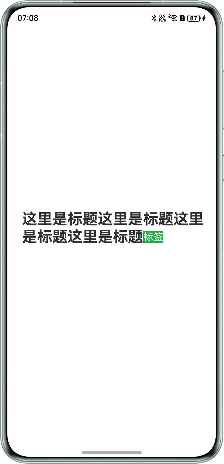
- 使用Text嵌套Span组件和ContainerSpan组件。
- 使用ContainerSpan组件嵌套Span组件,展示标签。
import { LengthUnit, LengthMetrics } from '@kit.ArkUI';

@Entry
@Component
struct Index {
  build() {
    Column() {
      Text() {
        Span('这里是标题这里是标题这里是标题这里是标题')
          .fontSize(28)
          .fontWeight(FontWeight.Bold);
        ContainerSpan() {
          Span('标签')
            .fontColor(Color.White)
            .fontSize(20)
            .borderRadius(8)
            .baselineOffset(new LengthMetrics(3, LengthUnit.VP))
            .border({ width: 2, color: Color.Red });
        }
        .textBackgroundStyle({ color: 0x20AD48 });
      };
    }
    .padding({ left: 16, right: 16 })
    .width('100%')
    .height('100%')
    .justifyContent(FlexAlign.Center);
  }
}
效果预览:
- 方案四:
使用Stack层叠布局,创建一个Text标签,通过rotate属性固定位置,实现自定义标签。
@Entry
@Component
struct Page2 {
  build() {
    Column() {
      Stack() {
        Column({ space: 0 }) {
          Text('免费')
            .fontSize(14)
            .fontColor('#ffffff')
            .textAlign(TextAlign.Center)
            .width('100%')
            .height('100%')
        }
        .width(200)
        .height(40)
        .backgroundColor('#28C76F')
        .rotate({
          z: 1,
          angle: 45,
          centerX: this.getUIContext().vp2px(70),
          centerY: this.getUIContext().vp2px(50)
        }) // 旋转 -45 度
      }
      .clip(true) // 裁剪区域
      .backgroundColor('#ffe3e3e3')
      .width('100%')
      .height(200)
    }
    .height('100%')
    .width('100%')
    .padding({ top: 60 })
  }
}
总结
方案 | 优缺点 | 拓展:带图片的标签 |
|---|---|---|
bindSheet | 可自定义标签样式,添加任意位置,比较灵活,适用于标签较多,位置不固定的场景。 | this.controller.addImageSpan($r('app.media.app_icon')) |
浮层overlay属性 | 标签位置是固定的,可自定义标签样式,适用于标签位置固定的场景。 | Image($r('app.media.app_icon')) |
Text嵌套Span | 使用简单,但Span组件无法设置边框,标签会换行,适用于对标签样式无要求的简单场景。 | ImageSpan($r('app.media.app_icon')) |
Stack层叠 | 简单,标签样式灵活,可实现斜标签。 | Image($r('app.media.app_icon'))、ImageSpan($r('app.media.app_icon')) |
CustomSpan | 标签内容可动态变化,但实现比较复杂。 | ImageAttachment |