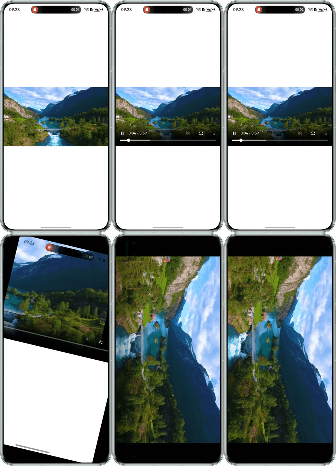
定位过程
- 通过DevEco Testing查看视频页面所在组件,该组件为Web组件。
- 全局搜索setPreferredOrientation方法,查看应用是否设置了横竖屏切换。
    import { webview } from '@kit.ArkWeb';
    import { window } from '@kit.ArkUI';
    import { common } from '@kit.AbilityKit';

    @Entry
    @Component
    struct Index {
      controller: webview.WebviewController = new webview.WebviewController();
      context: common.UIAbilityContext = this.getUIContext().getHostContext() as common.UIAbilityContext;

      aboutToAppear(): void {
        window.getLastWindow(this.context).then((lastWindow) => {
          lastWindow.setWindowLayoutFullScreen(true);
        });
      }

      build() {
        Column() {
          // $rawfile('index_cn.html')需要替换为开发者需要的网页资源文件
          Web({ src: $rawfile('index_cn.html'), controller: this.controller })
            .height('100%')
            .width('100%')
            .fileAccess(true)
            .geolocationAccess(false)
            .onFullScreenEnter(() => {
              // 未使用setPreferredOrientation设置旋转屏幕
            })
            .onFullScreenExit(() => {
              // 未使用setPreferredOrientation设置旋转屏幕
            });
        }
        .height('100%')
        .width('100%');
      }
    }

修改建议
使用setPreferredOrientation,在Web组件全屏时设置屏幕旋转功能。
import { webview } from '@kit.ArkWeb';
import { window } from '@kit.ArkUI';
import { common } from '@kit.AbilityKit';

@Entry
@Component
struct Index {
  controller: webview.WebviewController = new webview.WebviewController();
  context: common.UIAbilityContext = this.getUIContext().getHostContext() as common.UIAbilityContext;

  aboutToAppear(): void {
    window.getLastWindow(this.context).then((lastWindow) => {
      lastWindow.setWindowLayoutFullScreen(true);
    });
  }

  private changeOrientation(isLandscape: boolean) {
    window.getLastWindow(this.context).then((lastWindow) => {
      lastWindow.setPreferredOrientation(isLandscape ? window.Orientation.LANDSCAPE : window.Orientation.PORTRAIT); // 设置屏幕旋转
      lastWindow.setWindowSystemBarEnable(isLandscape ? [] : ['status', 'navigation']); // 设置沉浸式全屏
    });
  }

  build() {
    Column() {
      Web({ src: $rawfile('index_cn.html'), controller: this.controller })
        .height('100%')
        .width('100%')
        .fileAccess(true)
        .geolocationAccess(false)
        .onFullScreenEnter(() => {
          this.changeOrientation(true);
        })
        .onFullScreenExit(() => {
          this.changeOrientation(false);
        });
    }
    .height('100%')
    .width('100%');
  }
}
src/main/resources/rawfile:
<!DOCTYPE html>
<html lang="en">

<head>
    <meta charset="UTF-8">
    <meta name="viewport" content="width=device-width, initial-scale=1.0">
    <title>测试页面</title>
    <style>
        * {
            padding: 0;
            margin: 0;
        }

        body {
            width: 100vw;
            height: 100vh;
            box-sizing: border-box;
        }

        .page {
            display: flex;
            flex-direction: column;
            justify-content: flex-start;
            align-items: flex-start;
            width: 100%;
            height: 100%;
            box-sizing: border-box;
        }

        .descriptions {
            width: 100%;
            height: 78px;
            padding: 8px 0;
            display: flex;
            flex-direction: column;
            justify-content: space-between;
            margin-bottom: 12px;
            box-sizing: border-box;
            margin-top: 96px;
            padding-left: 16px;
        }

        .title {
            color: rgba(0, 0, 0, 0.9);
            font-size: 30px;
            font-weight: 700;
            line-height: 40px;
            height: 40px;
        }

        .sub-title {
            color: rgba(0, 0, 0, 0.6);
            font-size: 14px;
            font-weight: 400;
            line-height: 19px;
        }

        .video-box {
            width: 100%;
            display: flex;
            flex-direction: column;
            justify-content: start;
            align-items: center;
            box-sizing: border-box;
            margin-top: 200px;
        }

        .img-subtitle {
            color: black;
            font-size: 16px;
            font-weight: 400;
            line-height: 21px;
            margin-top: 8px;
        }

        .myVideo {
            width: 100%;
            height: calc(100vw * 9 / 16);
            object-fit: contain;
            background-color: black;
        }
    </style>
</head>

<body>
<div class="page">
    <div class="video-box">
        <video autoplay muted loop class="myVideo" controls>
            <!-- www.example.mp4需要替换为开发者需要的视频资源 -->
            <source src="www.example.mp4" type="video/mp4">
        </video>
    </div>
</div>

</body>

</html>
效果图如下: