问题现象
TabBar可以帮助用户快速切换核心功能页面,比如“首页、购物车、我的”这种高频跳转的场景,默认样式可能和整体设计风格不搭,而自定义背景色或图片能提升视觉统一性,增强图标或文字的视觉效果,让操作更直观。设置TabBar时可能会遇到如下问题:
- 场景一:如何给TabBar设置背景色?
- 场景二:如何给TabBar设置背景色透明样式?
- 场景三:如何给TabBar设置背景色渐变?
- 场景四:如何给TabBar设置背景图片?
- 场景五:如何给TabBar设置背景模糊效果?
解决方案
在不同场景下设置TabBar背景的实现方式及其适用场景内容如下:
实现场景 | 实现方式 | 适用场景 |
场景一:TabBar设置背景色。 | barBackgroundColor设置TabBar的背景色,如"#FFFFFF"。 | 需要单一背景色的Tabs页签样式。 |
场景二:TabBar设置背景色透明样式。 | 使用setTabBarOpacity设置TabBar的不透明度,包括背景、图标、文字。 | 在某些动态效果中,如滚动时逐渐改变TabBar的透明度,以实现平滑的过渡效果。 |
利用barBackgroundColor设置透明度,如"#55FFFFFF",并使用barOverlap设置TabBar背景变模糊并叠加在TabContent之上,展示出透明效果。 | 在某些设计中,希望TabBar与背景内容有一定的融合,但又需要TabBar上的文字及图标内容清晰可见,可使用该方案增强视觉层次感。 | |
场景三:TabBar设置背景色渐变。 | 利用Stack组件,在如Column等的其他组件上设置linearGradient方法实现Tabs组件整体的背景色渐变。 | 需要多种渐变背景色的Tabs页签样式。 |
场景四:TabBar设置背景图片。 | 利用Stack组件,设置Tabs组件叠加在Image组件上方。 | 需要完整图片的Tabs页签样式。 |
场景五:TabBar设置背景模糊效果。 | barBackgroundBlurStyle设置TabBar背景模糊效果。 | 专门用于设置模糊效果,使用简单,适用于需要简单模糊背景的场景。 |
barBackgroundEffect设置TabBar视觉效果,也可以达到模糊效果。 | 更通用,可以设置多种视觉效果,适用于需要复杂背景效果的场景。 |
- 场景一:TabBar设置背景色。
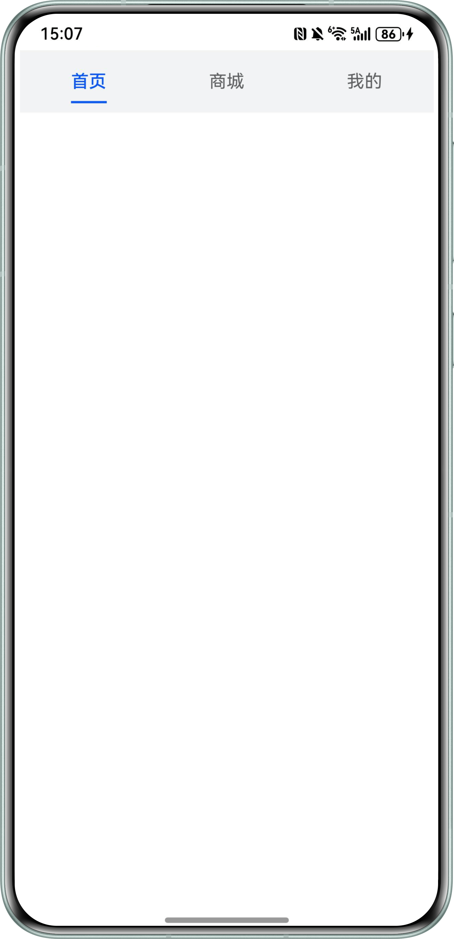
Tabs组件可以通过接口barBackgroundColor设置TabBar的背景色,其默认值为Color.Transparent。
使用代码如下:
@Entry
@Component
struct BackgroundColor {
  build() {
    Column() {
      Tabs() {
        TabContent() {
          Column()
            .width('100%')
            .height('100%')
            .backgroundColor('#FFF')
        }
        .tabBar(SubTabBarStyle.of('首页'))

        TabContent() {
          Column()
            .width('100%')
            .height('100%')
            .backgroundColor('#0A59F7')
        }
        .tabBar(SubTabBarStyle.of('商城'))

        TabContent() {
          Column()
            .width('100%')
            .height('100%')
            .backgroundColor('#FFF')
        }
        .tabBar(SubTabBarStyle.of('我的'))
      }
      .barBackgroundColor('#F1F3F5')
      .barOverlap(true)
    }
  }
}
设置效果如下:
- 场景二:TabBar设置背景色透明样式。
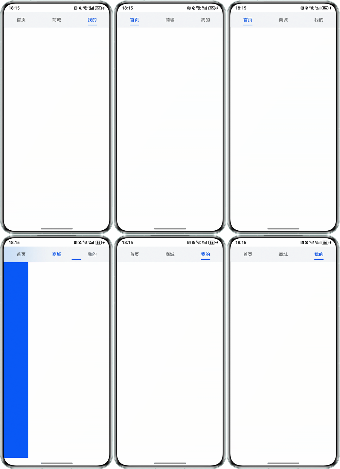
- TabBar透明背景:在上述代码的基础上,利用barBackgroundColor设置透明度,并使用barOverlap设置TabBar背景变模糊并叠加在TabContent之上,展示出透明效果。
使用代码如下:
@Entry
@Component
struct TransparentBackgroundColor1 {
  build() {
    Column() {
      Tabs() {
        TabContent() {
          Column()
            .width('100%')
            .height('100%')
            .backgroundColor('#FFF')
        }
        .tabBar(SubTabBarStyle.of('首页'))

        TabContent() {
          Column()
            .width('100%')
            .height('100%')
            .backgroundColor('#0A59F7')
        }
        .tabBar(SubTabBarStyle.of('商城'))

        TabContent() {
          Column()
            .width('100%')
            .height('100%')
            .backgroundColor('#FFF')
        }
        .tabBar(SubTabBarStyle.of('我的'))

      }
      .barBackgroundColor('#55F1F3F5')
      .barOverlap(true)
    }
  }
}
设置效果如下:
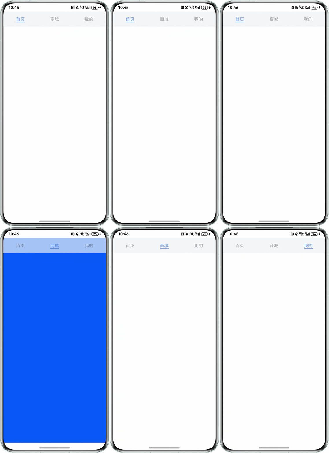
- TabBar所有内容全透明:可以使用setTabBarOpacity设置TabBar的不透明度,包括背景、图标、文字。为了使透明样式更明显,此处依旧使用barOverlap设置叠加效果。与方案一不同点在于该方式不仅修改了背景的透明度,还修改了TabBar的文字透明度。
使用代码如下:
@Entry
@Component
struct TransparentBackgroundColor2 {
  private controller: TabsController = new TabsController();

  onDidBuild(): void {
    // 设置TabBar透明
    this.controller.setTabBarOpacity(0.5);
  }

  build() {
    Column() {
      Tabs({ controller: this.controller }) {
        TabContent() {
          Column().width('100%').height('100%').backgroundColor('#FFF')
        }
        .tabBar('首页')

        TabContent() {
          Column().width('100%').height('100%').backgroundColor('#0A59F7')
        }
        .tabBar('商城')

        TabContent() {
          Column().width('100%').height('100%').backgroundColor('#FFF')
        }
        .tabBar('我的')
      }
      .width('100%')
      .height('100%')
      .margin({ top: 20 })
      .barOverlap(true)
      .barBackgroundColor('#F1F3F5')
    }
    .width('100%')
  }
}
设置效果如下:
- TabBar透明背景:在上述代码的基础上,利用barBackgroundColor设置透明度,并使用barOverlap设置TabBar背景变模糊并叠加在TabContent之上,展示出透明效果。
- 场景三:TabBar设置背景色渐变。
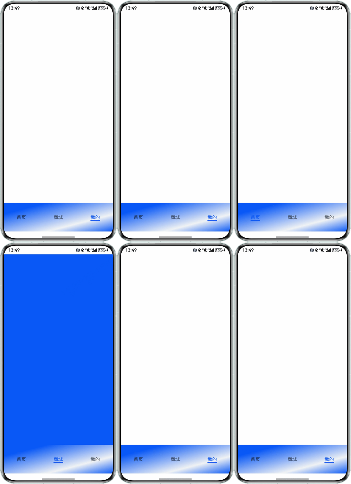
可以通过linearGradient方法实现Tabs组件整体的背景色渐变,当然,因为是对整个Tabs组件做了背景渐变色,导致该方式的弊端是只有在固定的角度才能呈现出渐变效果。所以推荐利用Stack堆叠容器,其子组件按照顺序依次入栈,后一个子组件覆盖前一个子组件的特性,叠加Column或其他容器组件于TabBar下方,对其他容器组件进行渐变背景色的设置。
使用代码如下:
@Entry
@Component
struct GradientBackgroundColor2 {
  barHeight: number = 100;

  build() {
    Stack({ alignContent: Alignment.Bottom }) {
      Column()
        .width('100%')
        .height(this.barHeight)
        .linearGradient({
          direction: GradientDirection.LeftTop, // 渐变方向
          repeating: false, // 渐变颜色是否重复
          colors: [[0x0A59F7, 0.0], [0xF1F3F5, 0.3], [0x0A59F7, 0.8]] // 数组末尾元素占比小于1时满足重复着色效果
        })
      Tabs({ barPosition: BarPosition.End }) {
        TabContent() {
          Column()
            .width('100%')
            .height('100%')
            .backgroundColor('#FFF')
        }
        .tabBar('首页')

        TabContent() {
          Column()
            .width('100%')
            .height('100%')
            .backgroundColor('#0A59F7')
        }
        .tabBar('商城')

        TabContent() {
          Column()
            .width('100%')
            .height('100%')
            .backgroundColor('#FFF')
        }
        .tabBar('我的')
      }
      .barHeight(this.barHeight)
    }
  }
}
设置效果如下:
- 场景四:TabBar设置背景图片。
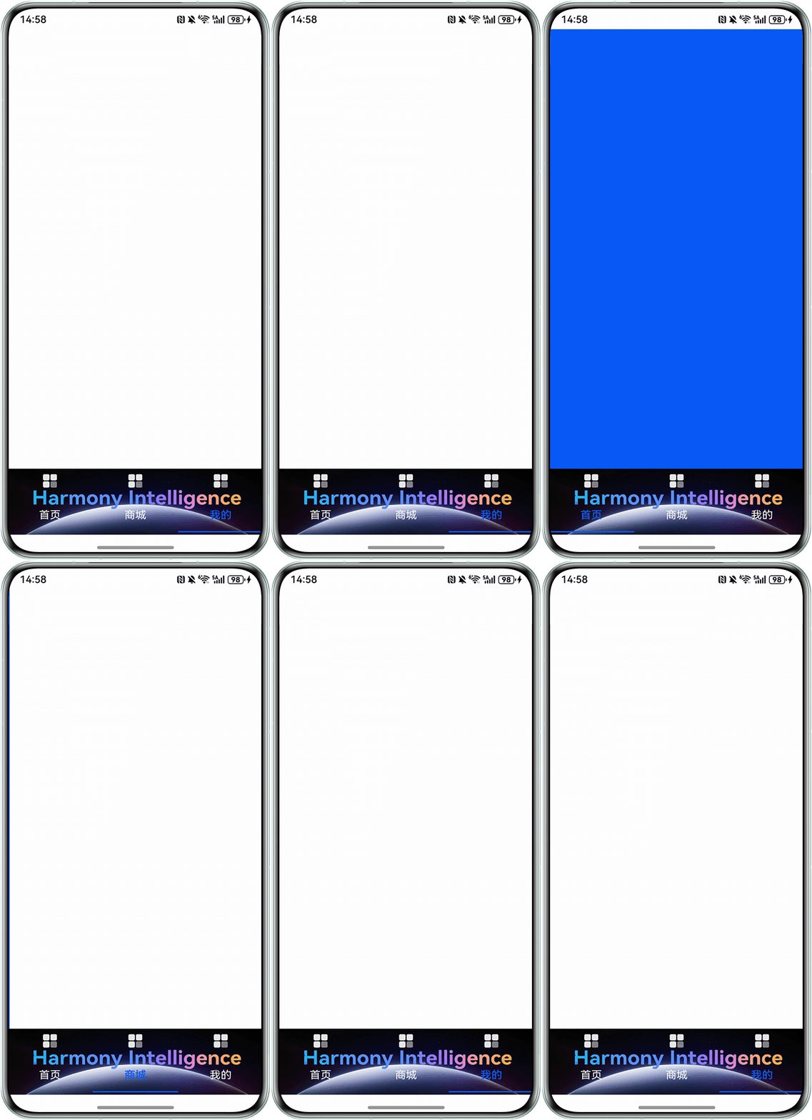
设置背景图效果与上文中提到的设置渐变背景色原理相同,需要利用Stack组件,在TabBar下方设置Image组件,达到设置背景图效果。
使用代码如下:
@Entry
@Component
struct BackgroundImage1 {
  currentFontColor: string = '#FFF';
  selectedFontColor: string = '#0A59F7';
  @State currentIndex: number = 0;
  @State selectedIndex: number = 0;
  barHeight: number = 100;

  @Builder
  tabBuilder(index: number, image: Resource, name: string) {
    Column() {
      Image(image)
        .width(30)
        .height(30)
      Text(name)
        .fontColor(this.selectedIndex === index ? this.selectedFontColor : this.currentFontColor)
        .fontSize(16)
        .fontWeight(this.selectedIndex === index ? 500 : 400)
        .lineHeight(22)
        .margin({ top: 17, bottom: 7 })
      Divider()
        .strokeWidth(2)
        .color('#0A59F7')
        .opacity(this.selectedIndex === index ? 1 : 0)
    }
    .width('100%')
    .height(this.barHeight)
    .justifyContent(FlexAlign.SpaceAround)
  }

  build() {
    Stack({ alignContent: Alignment.Bottom }) {
      Image($r('app.media.harmony_intelligence')) // 开发者需自行替换图片资源
        .width('100%')
        .height(this.barHeight)
        .objectFit(ImageFit.Fill)
      Tabs({ barPosition: BarPosition.End }) {
        TabContent() {
          Column()
            .width('100%')
            .height('100%')
            .backgroundColor('#FFF')
        }
        .tabBar(this.tabBuilder(0, $r('app.media.foreground'), '首页')) // 开发者需自行替换图片资源和文字内容

        TabContent() {
          Column()
            .width('100%')
            .height('100%')
            .backgroundColor('#0A59F7')
        }
        .tabBar(this.tabBuilder(1, $r('app.media.foreground'), '商城')) // 开发者需自行替换图片资源和文字内容

        TabContent() {
          Column()
            .width('100%')
            .height('100%')
            .backgroundColor('#FFF')
        }
        .tabBar(this.tabBuilder(2, $r('app.media.foreground'), '我的')) // 开发者需自行替换图片资源和文字内容
      }
      .onChange((index: number) => {
        // currentIndex控制TabContent显示页签
        this.currentIndex = index;
        this.selectedIndex = index;
      })
      .barHeight(this.barHeight)
    }
  }
}
设置效果如下:
- 场景五:TabBar设置背景模糊效果。
可以通过barBackgroundBlurStyle和barBackgroundEffect设置TabBar页签栏的背景模糊样式和效果。详情请参考:设置TabBar背景模糊效果。