问题现象
borderRadius属性可以为组件设置边框的圆角半径,但某些场景下直接设置borderRadius属性可能会导致圆角不生效或显示异常。如何根据不同问题场景正确设置圆角边框?
场景 | 场景说明 |
|---|---|
场景一:直接设置borderRadius属性圆角不生效 | 部分组件和自定义组件直接设置borderRadius无法成功设置圆角 |
场景二:同时设置border属性和borderRadius属性圆角不生效 | 先设置borderRadius后设置border时无法成功设置圆角 |
场景三:不同背景色重叠导致圆角出现黑边 | 父子组件或存在重叠的兄弟组件如果背景色不同,圆角处会出现黑边。 |
解决方案
- 场景一:直接设置borderRadius属性圆角不生效。
示例一:地图组件MapComponent直接设置borderRadius属性圆角不生效。
示例二:@Component自定义组件直接设置borderRadius属性圆角不生效。
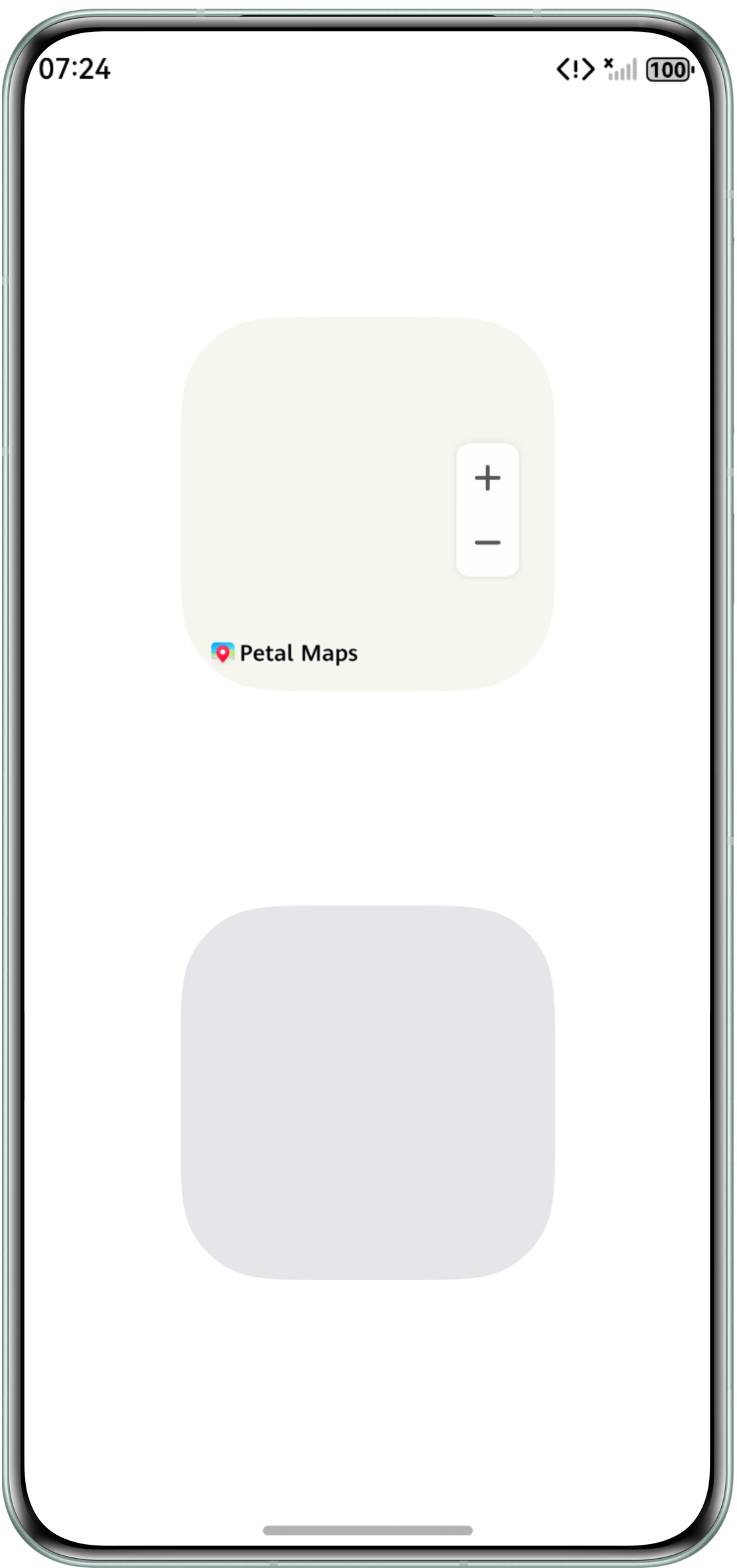
大多数情况下,直接给组件设置borderRadius即可实现圆角边框,但部分类似于地图组件这样渲染较为复杂的组件和所有的自定义组件,需要在设置borderRadius的同时添加clip属性才能实现圆角边框,示例代码如下:
import { MapComponent, mapCommon, map } from '@kit.MapKit';
import { AsyncCallback } from '@kit.BasicServicesKit';


@Entry
@Component
struct Index {
  private TAG = 'MapDemo';
  private mapOptions?: mapCommon.MapOptions;
  private callback?: AsyncCallback<map.MapComponentController>;
  private mapController?: map.MapComponentController;
  private mapEventManager?: map.MapEventManager;


  aboutToAppear(): void {
    // 地图初始化参数,设置地图中心点坐标及层级
    this.mapOptions = {
      position: {
        target: {
          latitude: 39.9,
          longitude: 116.4
        },
        zoom: 10
      }
    };


    // 地图初始化的回调
    this.callback = async (err, mapController) => {
      if (!err) {
        // 获取地图的控制器类,用来操作地图
        this.mapController = mapController;
        this.mapEventManager = this.mapController.getEventManager();
        let callback = () => {
          console.info(this.TAG, `on-mapLoad`);
        };
        this.mapEventManager.on('mapLoad', callback);
      }
    };
  }


  build() {
    Column() {
      // 调用MapComponent组件初始化地图
      MapComponent({ mapOptions: this.mapOptions, mapCallback: this.callback })
        .width(200)
        .height(200)
        .borderRadius(50)
        .clip(true);
      TestColumn()
        .width(200)
        .height(200)
        .borderRadius(50)
        .clip(true);
    }
    .justifyContent(FlexAlign.SpaceEvenly)
    .width('100%')
    .height('100%');
  }
}


@Component
struct TestColumn {
  build() {
    Column()
      .width('100%')
      .height('100%')
      .backgroundColor('#E5E5EA');
  }
}
效果图如下:
- 场景二:同时设置border属性和borderRadius属性圆角不生效。
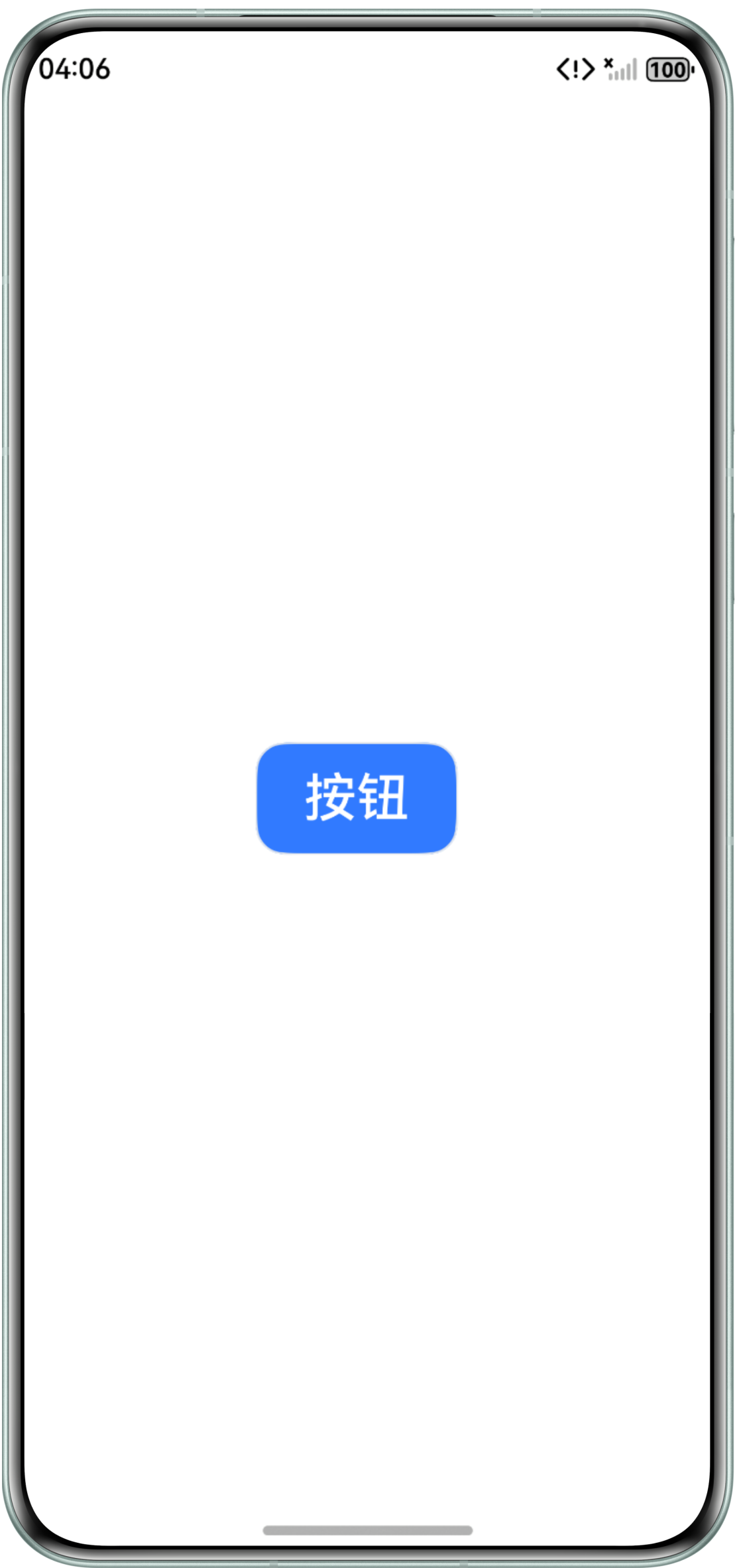
border设置在borderRadius之后会导致border覆盖borderRadius,并且,border已经存在参数radius用于控制圆角。如果border属性的radius参数缺省,需要borderRadius设置在border后。
示例代码如下:
@Entry
@Component
struct Index3 {
  build() {
    Column() {
      Button('按钮')
        .type(ButtonType.Normal)
        .border({ color: '#E5E7EB', width: 1 }) // 调整该属性配置顺序在borderRadius前
        .borderRadius(16) // 设置borderRadius生效
        .backgroundColor(0x317aff)
        .fontColor('white')
        .width(108)
        .height(60)
        .fontSize(28)
        .margin({ right: 12 })
        .padding(0);
    }
    .justifyContent(FlexAlign.Center)
    .alignItems(HorizontalAlign.Center)
    .height('100%')
    .width('100%');
  }
}
效果图如下:
- 场景三:不同背景色重叠导致圆角出现黑边。
示例一:Video组件与父容器Column背景色不同时,四角出现黑边。
问题现象图如下:
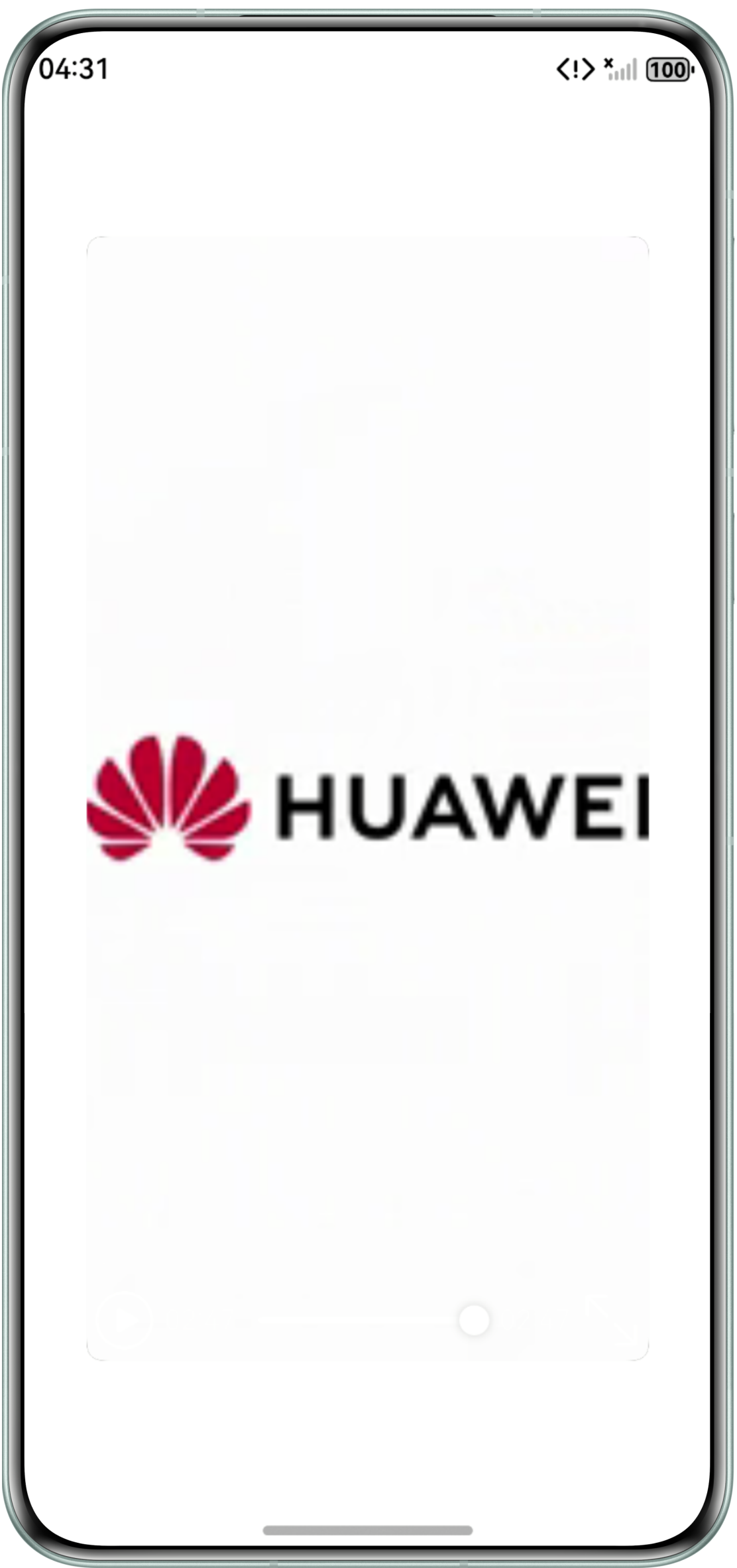
由于抗锯齿是半透明像素(GPU绘制正常原理),导致无法完全遮挡下方内容。需要将两者背景色统一或者将Video组件的背景色设为透明。
示例代码如下:
@Entry
@Component
struct Index2 {
  @State videoSrc: ResourceStr = $r('app.media.input');
  @State curRate: PlaybackSpeed = PlaybackSpeed.Speed_Forward_1_00_X;
  isAutoPlay: boolean = true;
  showControls: boolean = true;
  controller: VideoController = new VideoController();


  build() {
    Column() {
      Video({
        src: this.videoSrc,
        currentProgressRate: this.curRate,
        controller: this.controller
      })
        .width(300)
        .height(600)
        .borderRadius(8)
        .backgroundColor(Color.Transparent) // 设置背景色为透明(或与父组件背景一直),防止圆角边框出现
        .autoPlay(this.isAutoPlay)
        .controls(this.showControls);
    }
    .width('100%')
    .height('100%')
    .justifyContent(FlexAlign.Center)
    // 或者添加父组件背景,要求与video组件背景一致,防止圆角边框出现
    .backgroundColor('#fff');
  }
}
效果图如下:
示例二:存在重叠关系的兄弟组件背景色不同时,四角出现黑边。
问题代码如下:
@Entry
@Component
struct Index4 {
  build() {
    Stack({ alignContent: Alignment.TopStart }) {
      Column() {
      }
      .backgroundColor(Color.Black)
      .width('100%')
      .height('100%');


      Column() {
      }
      .backgroundColor('#ffe5e3e3')
      .backgroundColor(Color.White)
      .width('100%')
      .height('100%');
    }
    .margin({ left: 50, top: 50 })
    .width(300)
    .height(300)
    .clip(true)
    .borderRadius(30);
  }
}
方法一:同示例一解决方法,需要将两者背景色统一。
方法二:令上层组件的圆角半径小于下层组件的圆角半径以覆盖原本重叠的边缘区域。
示例代码如下:
@Entry
@Component
struct Index5 {
  build() {
    Stack({ alignContent: Alignment.TopStart }) {
      Column() {
      }
      .borderRadius(30)
      .backgroundColor(Color.Black)
      .width('100%')
      .height('100%');


      Column() {
      }
      .borderRadius(25)
      .backgroundColor(Color.White)
      .width('100%')
      .height('100%');
    }
    .margin({ left: 50, top: 50 })
    .width(300)
    .height(300);
  }
}
方法三:缩小被遮盖的下层组件尺寸,防止边缘区域重合。
示例代码如下:
@Entry
@Component
struct Index6 {
  build() {
    Stack({ alignContent: Alignment.Center }) {
      Column() {
      }
      .borderRadius(30)
      .backgroundColor(Color.Black)
      .width('298px')
      .height('298px');


      Column() {
      }
      .borderRadius(30)
      .backgroundColor(Color.White)
      .width('300px')
      .height('300px');
    }
    .width(300)
    .height(300);
  }
}
效果图如下: