效果预览
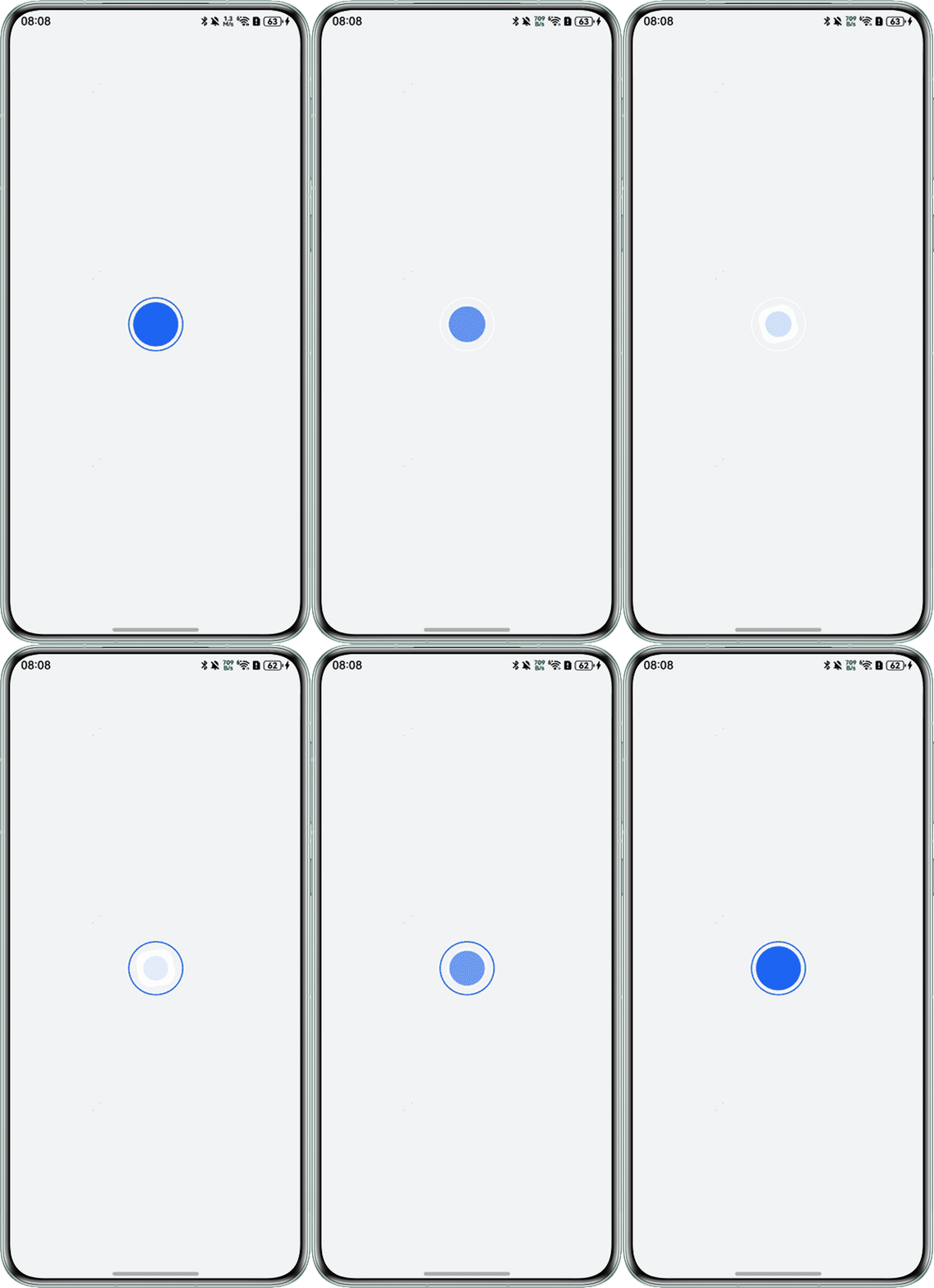
解决方案
- 在Stack中定义Circle组件,它的stroke属性的值用boolean类型的recording变量来控制,recording的值为true时,将边框设置为白色,为false时设置为宇宙蓝。
- 在Stack中继续创建两个矩形组件,分别设置不同的填充颜色及宽高,其中一个矩形的opacity值设置为opacityValue,另一个值设为1-opacityValue。
- 为组件创建onClick方法,在点击后对recording进行取反,在animateTo方法中将动画曲线设置为curve,并根据recording值的真假对角度、透明度、缩放比例进行修改,以实现两种矩形组件的过渡效果。
@Entry
@Component
struct Riders {
  @State recording: boolean = false;
  @State angleSize: number = 0;
  @State opacityValue: number = 1;
  @State scaleSize: number = 1;

  build() {
    Column() {
      Button() {
        Stack({ alignContent: Alignment.Center }) {
          // 外环(动态颜色)
          Circle()
            .width(70)
            .height(70)
            .stroke(this.recording ? '#fff' : '#0A59F7')
            .strokeWidth(1.5)
            .fill(Color.Transparent);

          // 内矩形(动态切换)
          Rect()
            .width(48)
            .height(48)
            .radius(16)
            .fill('#fff')
            .rotate({ z: 1, angle: this.angleSize })
            .opacity(1 - this.opacityValue);

          Rect()
            .width(58)
            .height(58)
            .radius(29)
            .fill('#0A59F7')
            .rotate({ z: 1, angle: this.angleSize })
            .scale({ x: this.scaleSize, y: this.scaleSize })
            .opacity(this.opacityValue);
        }
        .width('100%')
        .height('100%');
      }
      .width(50)
      .height(50)
      .backgroundColor(Color.Transparent)
      .onClick(() => {
        this.recording = !this.recording;
        this.getUIContext().animateTo({
          duration: 1000,
          curve: Curve.Linear
        }, () => {
          if (this.recording) {
            this.opacityValue = 0;
            this.angleSize = 90;
            this.scaleSize = 0.5;
          } else {
            this.opacityValue = 1;
            this.angleSize = 0;
            this.scaleSize = 1;
          }
        });
      });
    }
    .expandSafeArea([SafeAreaType.SYSTEM], [SafeAreaEdge.TOP, SafeAreaEdge.BOTTOM])
    .width('100%')
    .height('100%')
    .backgroundColor('#f1f3f5')
    .justifyContent(FlexAlign.Center)
    .alignItems(HorizontalAlign.Center);
  }
}
总结
该解决方案的核心在于两个Rect组件opacity属性的值共享同一个opacityValue变量,一个值设置为opacityValue,另一个设置为1-opacityValue,以实现平滑的组件动态旋转过程。