
背景知识
- 通过UIContext.getPromptAction().openCustomDialog()接口弹出的弹窗内容样式完全按照dialogContent中设置的样式显示。
- 通过bindSheet属性为组件绑定半模态页面,在组件插入时可通过设置自定义或默认的内置高度确定半模态大小。使用CustomBuilder配合Column和Row容器自定义显示区域,为了展现页面内组件堆叠顺序,可通过zIndex属性设置。
- Stack堆叠容器,子组件按照顺序依次入栈,后一个子组件覆盖前一个子组件。
解决方案
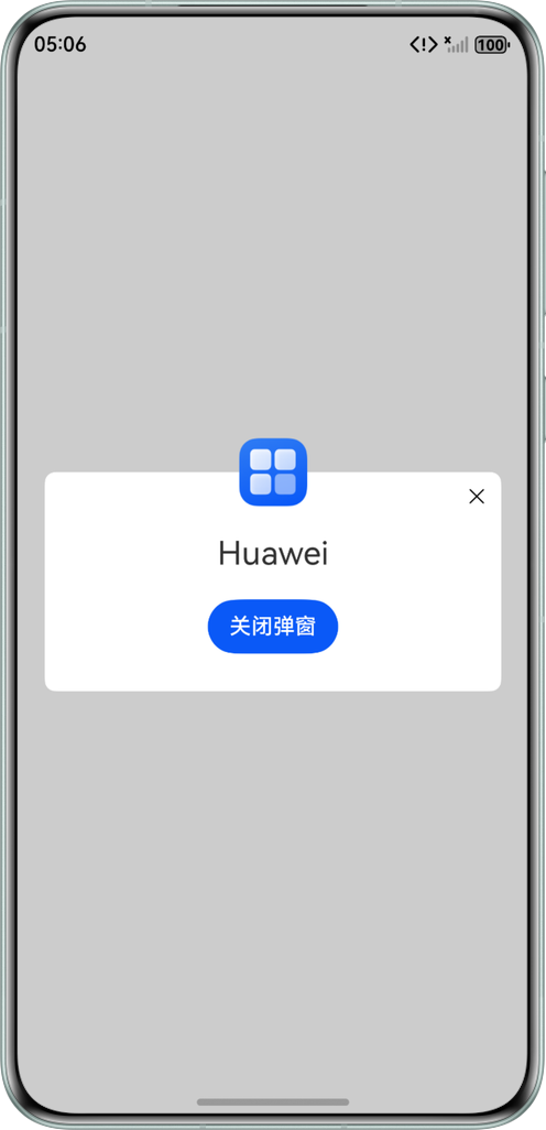
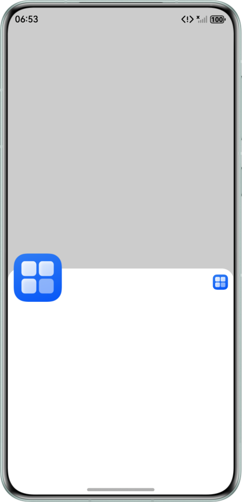
对于使用@Builder自定义构建函数作为UI内容的弹窗来说,都有一种通用的方法设置上述效果。基本思路是:将整个弹窗UI内容的根容器组件设为透明背景,实际显示可见UI内容的容器作为子组件放置这个透明背景的父容器中,与图像堆叠而成。图像的一部分显示在有可见UI内容的容器上,一部分显示在透明背景上。
这种堆叠布局可以采用Stack堆叠布局实现,也可以使用zIndex设置显示层级,同时margin控制布局上移的方式实现。以下分别以openCustomDialog全局自定义弹窗和bindSheet半模态弹窗两种弹窗为例,分别展示两种方法的具体实现。
- 场景一:openCustomDialog全局自定义弹窗使用Stack布局实现图片超出弹窗边框效果。弹窗的核心实现代码如下:
@Builder
function customDialogBuilder(close: () => void) {
  Stack() {
    Column() {
      Row() {
        SymbolGlyph($r('sys.symbol.xmark'))
          .onClick(() => {
            close();
          })
      }
      .width('100%')
      .height(20)
      .justifyContent(FlexAlign.End)

      Text('Test').fontSize(24).margin({ top: 30, bottom: 10 })

      Button('关闭弹窗').onClick(() => {
        close();
      })
    }
    .borderRadius(8)
    .padding(10)
    .margin({ top: 40 })  // 留出图片占位
    .backgroundColor(Color.White)
    .width('100%')
    .height('auto')

    Image($r('app.media.startIcon'))
      .width(80)
  }
  .alignContent(Alignment.Top)
  .margin({ right: 20, left: 20 })
  .backgroundColor(Color.Transparent)
}
使用UIContext.getPromptAction().openCustomDialog()调用弹窗的示例如下:
@Builder
function customDialogBuilder(close: () => void) {
  Stack() {
    Column() {
      Row() {
        SymbolGlyph($r('sys.symbol.xmark'))
          .onClick(() => {
            close();
          })
      }
      .width('100%')
      .height(20)
      .justifyContent(FlexAlign.End)

      Text('Test').fontSize(24).margin({ top: 30, bottom: 10 })

      Button('关闭弹窗').onClick(() => {
        close();
      })
    }
    .borderRadius(8)
    .padding(10)
    .margin({ top: 40 })  // 留出图片占位
    .backgroundColor(Color.White)
    .width('100%')
    .height('auto')

    Image($r('app.media.startIcon'))
      .width(80)
  }
  .alignContent(Alignment.Top)
  .margin({ right: 20, left: 20 })
  .backgroundColor(Color.Transparent)
}

@Component
struct Scene1 {
  build() {
    Button("场景一")
      .onClick(() => {
        let uiContext = this.getUIContext();
        let contentNode = new ComponentContent(uiContext, wrapBuilder(customDialogBuilder), () => {
          uiContext.getPromptAction().closeCustomDialog(contentNode);
        });
        uiContext.getPromptAction().openCustomDialog(contentNode);
      })
  }
}
效果预览:
- 场景二:bindSheet半模态弹窗使用zIndex+margin实现图片超出弹窗边框效果。
- 设置bindSheet背景色为透明,隐藏bindSheet自带的关闭按钮。
.bindSheet($$this.isShow, customBindSheet(), {
  height: this.sheetHeight,
  // 设置bindSheet的背景色为透明色
  backgroundColor: '#00000000',
  // 隐藏bindSheet自带的关闭按钮
  showClose: false,
  radius: LengthMetrics.vp(0),
})
- 通过.zIndex(999)设置Image组件的显示层级为最高。
Image($r('app.media.startIcon'))
  .width(80)
  .clip(false)
  .margin({ left: 10 })
    // 设置图片的层级为最高,显示在最上层
  .zIndex(999)
- 通过.zIndex(1)设置容器Row的显示层级最低,并使用.margin({ top: -40 })设置Row向上偏移。
Row() {
  Blank()
  Image($r('app.media.startIcon'))
    .height(25)
    .width(25)
    .margin({ top: 10, right: 10 })
}
// 设置图片的层级为最低,显示在图片下层
.zIndex(1)
// 设置容器向上偏移
.margin({ top: -40 })
通过bindSheet绑定弹窗的示例如下:
@Builder
export function customBindSheet() {
  Column() {
    Image($r('app.media.startIcon'))
      .width(80)
      .clip(false)
      .margin({ left: 10 })
        // 设置图片的层级为最高,显示在最上层
      .zIndex(999)
    Row() {
      Blank()
      Image($r('app.media.startIcon'))
        .height(25)
        .width(25)
        .margin({ top: 10, right: 10 })
    }
    // 设置图片的层级为最低,显示在图片下层
    .zIndex(1)
    // 设置容器向上偏移
    .margin({ top: -40 })
    .borderRadius({ topLeft: 20, topRight: 20 })
    .width('100%')
    .height(380)
    .backgroundColor(Color.White)
    .alignItems(VerticalAlign.Top)
    .justifyContent(FlexAlign.SpaceBetween)
  }
  .width('100%')
  .height('100%')
  // 设置column的背景色为透明色
  .backgroundColor(Color.Transparent)
  .justifyContent(FlexAlign.Start)
  .alignItems(HorizontalAlign.Start)
}

@Component
struct Scene2 {
  @State isShow: boolean = false;
  sheetHeight: number = 400;

  build() {
    Button("场景二")
      .onClick(() => {
        this.isShow = true;
      })
      .bindSheet($$this.isShow, customBindSheet(), {
        height: this.sheetHeight,
        // 设置bindSheet的背景色为透明色
        backgroundColor: '#00000000',
        // 隐藏bindSheet自带的关闭按钮
        showClose: false,
        radius: LengthMetrics.vp(0),
      })
  }
}
效果预览:
- 设置bindSheet背景色为透明,隐藏bindSheet自带的关闭按钮。
两种场景的完整示例代码如下:
import { ComponentContent, LengthMetrics } from '@kit.ArkUI';

@Entry
@Component
struct DialogOverflow {
  build() {
    Column({ space: 20 }) {
      Scene1()
      Scene2()
    }
    .width('100%')
    .height('100%')
    .alignItems(HorizontalAlign.Center)
    .justifyContent(FlexAlign.Center)
  }
}

@Builder
function customDialogBuilder(close: () => void) {
  Stack() {
    Column() {
      Row() {
        SymbolGlyph($r('sys.symbol.xmark'))
          .onClick(() => {
            close();
          })
      }
      .width('100%')
      .height(20)
      .justifyContent(FlexAlign.End)

      Text('Test').fontSize(24).margin({ top: 30, bottom: 10 })

      Button('关闭弹窗').onClick(() => {
        close();
      })
    }
    .borderRadius(8)
    .padding(10)
    .margin({ top: 40 })  // 留出图片占位
    .backgroundColor(Color.White)
    .width('100%')
    .height('auto')

    Image($r('app.media.startIcon'))
      .width(80)
  }
  .alignContent(Alignment.Top)
  .margin({ right: 20, left: 20 })
  .backgroundColor(Color.Transparent)
}

@Component
struct Scene1 {
  build() {
    Button("场景一")
      .onClick(() => {
        let uiContext = this.getUIContext();
        let contentNode = new ComponentContent(uiContext, wrapBuilder(customDialogBuilder), () => {
          uiContext.getPromptAction().closeCustomDialog(contentNode);
        });
        uiContext.getPromptAction().openCustomDialog(contentNode);
      })
  }
}

@Builder
export function customBindSheet() {
  Column() {
    Image($r('app.media.startIcon'))
      .width(80)
      .clip(false)
      .margin({ left: 10 })
        // 设置图片的层级为最高,显示在最上层
      .zIndex(999)
    Row() {
      Blank()
      Image($r('app.media.startIcon'))
        .height(25)
        .width(25)
        .margin({ top: 10, right: 10 })
    }
    // 设置图片的层级为最低,显示在图片下层
    .zIndex(1)
    // 设置容器向上偏移
    .margin({ top: -40 })
    .borderRadius({ topLeft: 20, topRight: 20 })
    .width('100%')
    .height(380)
    .backgroundColor(Color.White)
    .alignItems(VerticalAlign.Top)
    .justifyContent(FlexAlign.SpaceBetween)
  }
  .width('100%')
  .height('100%')
  // 设置column的背景色为透明色
  .backgroundColor(Color.Transparent)
  .justifyContent(FlexAlign.Start)
  .alignItems(HorizontalAlign.Start)
}

@Component
struct Scene2 {
  @State isShow: boolean = false;
  sheetHeight: number = 400;

  build() {
    Button("场景二")
      .onClick(() => {
        this.isShow = true;
      })
      .bindSheet($$this.isShow, customBindSheet(), {
        height: this.sheetHeight,
        // 设置bindSheet的背景色为透明色
        backgroundColor: '#00000000',
        // 隐藏bindSheet自带的关闭按钮
        showClose: false,
        radius: LengthMetrics.vp(0),
      })
  }
}