问题现象
开发者在使用Button组件时,对组件的背景色设置有以下几个经典问题:
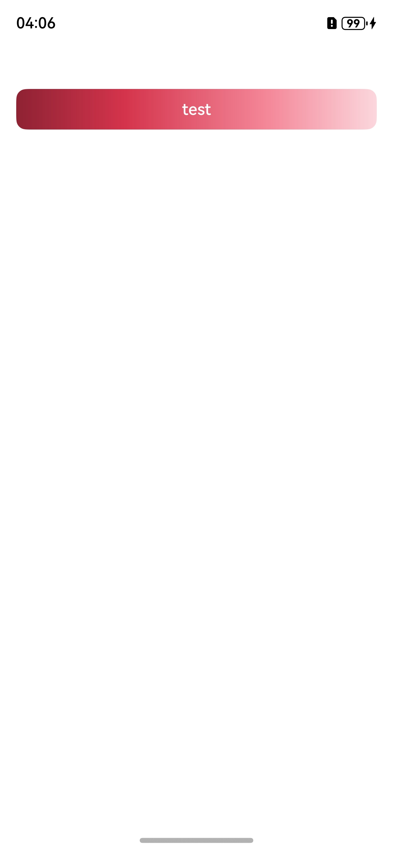
- 场景一:如何设置渐变背景色?
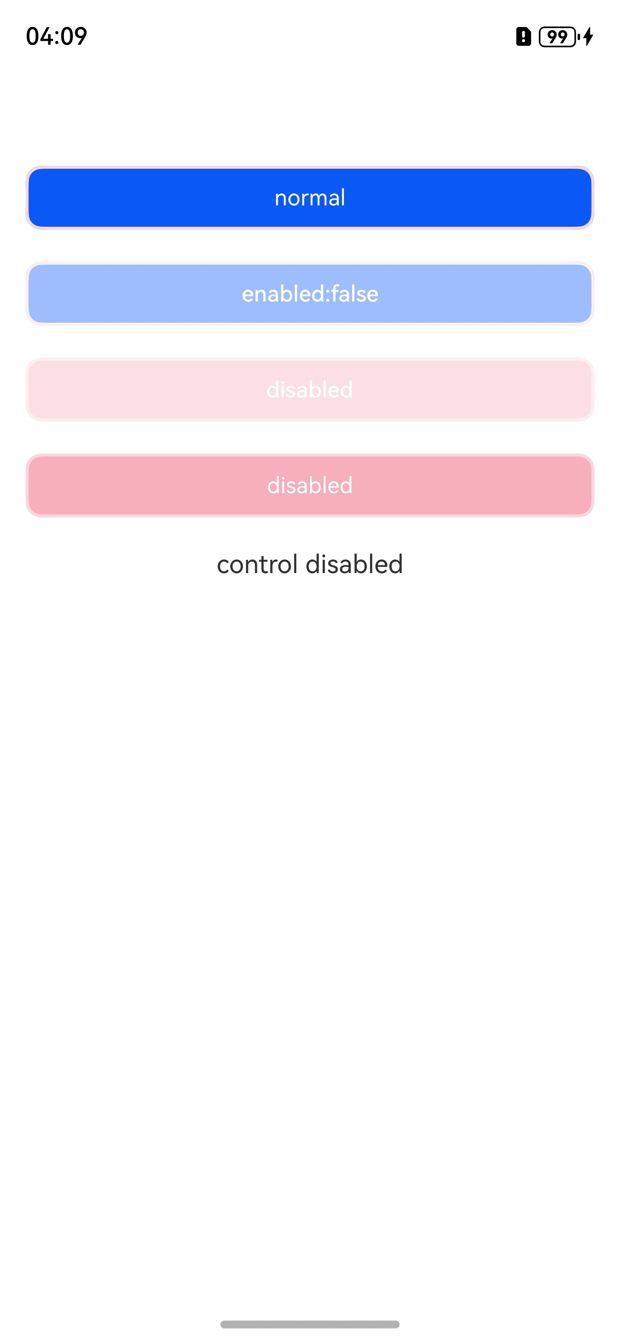
- 场景二:Button设置disable的多态样式,显示效果会比目标效果的颜色淡,如何实现准确的效果?
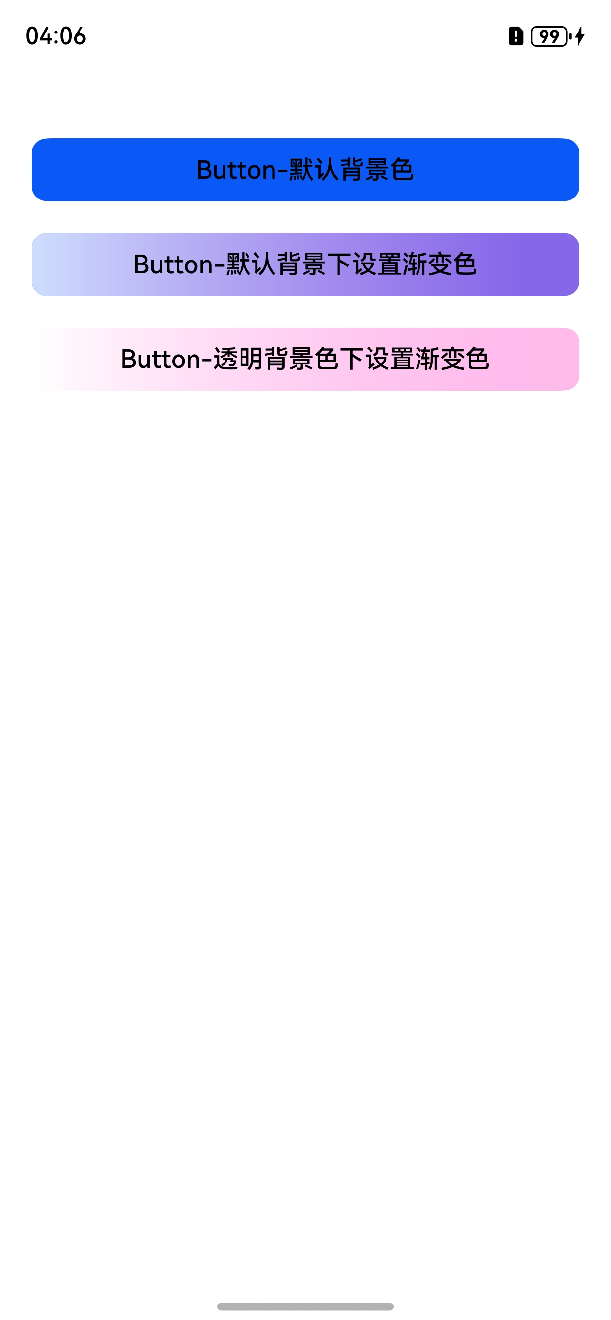
- 场景三:Button设置相同颜色值的背景色和渐变色,为什么效果不一致?
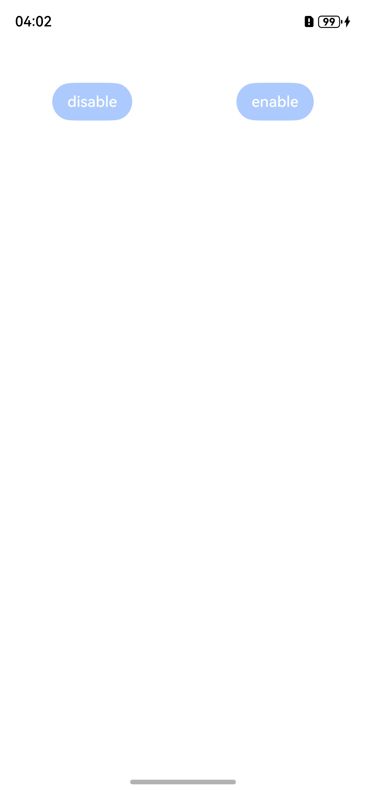
- 场景四:Button想要设置成置灰的样式,但是不知道置灰时的颜色值的情况下,该如何处理?
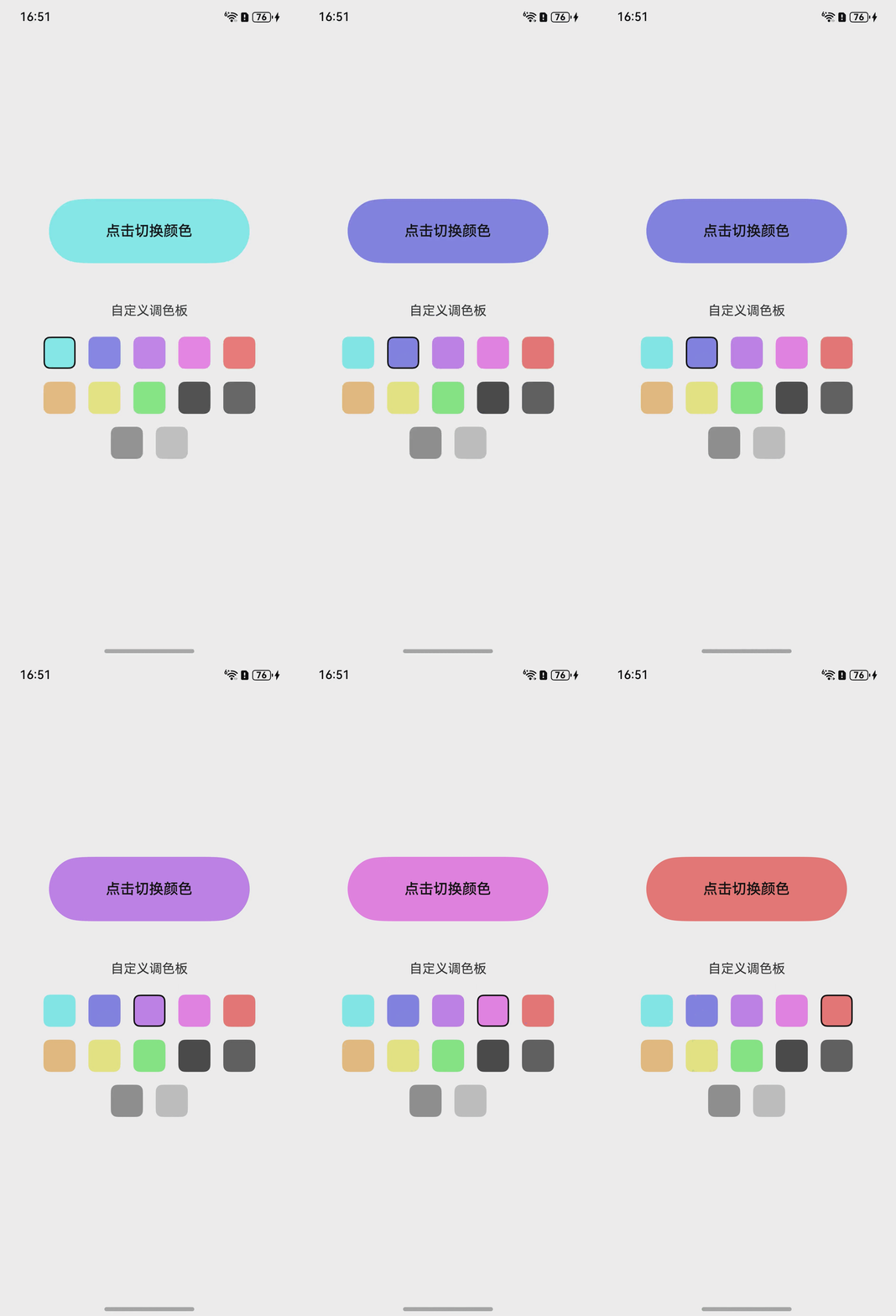
- 场景五:如何自定义一个调色板,实现点击色块改变按钮背景颜色,并且点击按钮也可根据色块改变背景颜色的功能?
- 场景六:按钮如何设置在任何状态下都不要背景色?
背景知识
- Button按钮组件,可快速创建不同样式的按钮,可采用backgroundColor属性来更改组件的背景色,如需设置颜色渐变,需先设置backgroundColor为透明色才能生效。
- stateStyles(多态样式)可以依据组件的内部状态的不同,快速设置不同样式。
- 禁用控制设置组件是否可交互。当未设置enabled时,组件默认可交互。
- ImageSpan:Text、ContainerSpan组件的子组件,用于显示行内图片。
- clip:是否对子组件超出当前组件范围外的区域进行裁剪。不设置该接口时,默认不对子组件超出当前组件范围外的区域进行裁剪。
- stateEffect:设置是否开启按压态显示效果。
解决方案
- 场景一:使用linearGradient属性自定义颜色实现渐变背景色。
@Entry
@Component
struct ButtonSolution1 {
  build() {
    Column() {
      Button('test')
        .width('100%')
        .height(40)
        .margin({ top: 50 })
        .borderRadius(10)
        .backgroundColor('#00000000')
        // 设置渐变色
        .linearGradient({
          angle: 90,
          colors: [['#8E2233', 0.0], ['#D4344C', 0.3], ['#F48899', 0.7], ['#FBD7DD', 1]]
        });
    }
    .height('100%')
    .width('100%')
    .padding({ left: 16, right: 16 })
    .alignItems(HorizontalAlign.Center);
  }
}
效果预览:
- 场景二:Button设置disabled多态样式会受到Button组件禁用控制属性样式影响导致显示颜色偏淡,建议用Text组件多态样式代替Button组件实现想要的效果。
@Entry
@Component
struct ButtonSolution2 {
  @State isEnable: boolean = true;

  @Styles
  disabledStyles(): void {
    .backgroundColor('#F7B0BB')
    .borderRadius(10)
    .borderStyle(BorderStyle.Solid)
    .borderWidth(2)
    .borderColor('#FBD7DD')
    .width('100%')
    .height(40)
    .opacity(1);
  }

  @Styles
  normalStyles(): void {
    .backgroundColor('#0A59F7')
    .borderRadius(10)
    .borderStyle(BorderStyle.Solid)
    .borderWidth(2)
    .borderColor('#FBD7DD')
    .width('100%')
    .height(40)
    .opacity(1);
  }

  build() {
    Flex({ direction: FlexDirection.Column, alignItems: ItemAlign.Center }) {
      Text('normal')
        .fontSize(14)
        .fontColor(Color.White)
        .opacity(0.5)
        .stateStyles({
          normal: this.normalStyles,
        })
        .margin({ bottom: 20, top: 50 })
        .textAlign(TextAlign.Center);

      Button(this.isEnable === true ? 'enabled:true' : 'enabled:false')
        .enabled(this.isEnable)
        .borderRadius(10)
        .borderStyle(BorderStyle.Solid)
        .borderWidth(2)
        .borderColor('#FBD7DD')
        .width('100%')
        .height(40)
        .opacity(1)
        .fontSize(14)
        .fontColor(Color.White)
        .margin({ bottom: 20 });

      Button(this.isEnable === true ? 'effective' : 'disabled')
        .backgroundColor('#0A59F7')
        .borderRadius(10)
        .borderStyle(BorderStyle.Solid)
        .borderWidth(2)
        .borderColor('#FBD7DD')
        .width('100%')
        .height(40)
        .opacity(1)
        .fontSize(14)
        .fontColor(Color.White)
        .enabled(this.isEnable)
        .stateStyles({
          disabled: this.disabledStyles,
        })
        .margin({ bottom: 20 });

      Text(this.isEnable === true ? 'effective' : 'disabled')
        .backgroundColor('#0A59F7')
        .borderRadius(10)
        .borderStyle(BorderStyle.Solid)
        .borderWidth(2)
        .borderColor(Color.Gray)
        .width('100%')
        .height(40)
        .opacity(1)
        .fontSize(14)
        .fontColor(Color.White)
        .enabled(this.isEnable)
        .stateStyles({
          disabled: this.disabledStyles,
        })
        .margin({ bottom: 20 })
        .textAlign(TextAlign.Center);

      Text('control disabled')
        .margin({ bottom: 20 })
        .onClick(() => {
          this.isEnable = !this.isEnable;
          console.info(`${this.isEnable}`);
        });

    }
    .height('100%')
    .padding(16);
  }
}
效果预览:
- 场景三:Button默认有背景色,直接设置渐变色会影响渐变效果,解决方案是设置渐变色的同时设置Button组件背景色为透明。
@Entry
@Component
struct ButtonSolution3 {
  build() {
    Column() {
      Button('Button-默认背景色', { type: ButtonType.Normal })
        .width('100%')
        .height(40)
        .fontSize(16)
        .fontColor(Color.Black)
        .borderRadius(10)
        .fontWeight(500)
        .margin({ top: 50 });

      Button('Button-默认背景下设置渐变色', { type: ButtonType.Normal })
        .width('100%')
        .height(40)
        .fontSize(16)
        .fontColor(Color.Black)
        .borderRadius(10)
        .fontWeight(500)
        .linearGradient({
          direction: GradientDirection.Left,
          colors: [['rgba(255, 117, 218, 0.5)', 0.1],
            ['rgba(255, 255, 255, 0.8)', 1.0]]
        })
        .margin({ top: 20 });

      Button('Button-透明背景色下设置渐变色', { type: ButtonType.Normal })
        .width('100%')
        .height(40)
        .fontSize(16)
        .fontColor(Color.Black)
        .borderRadius(10)
        .fontWeight(500)
        .backgroundColor('#00000000')
        .linearGradient({
          direction: GradientDirection.Left,
          colors: [['rgba(255, 117, 218, 0.5)', 0.1],
            ['rgba(255, 255, 255, 0.8)', 1.0]]
        })
        .margin({ top: 20 });

    }
    .width('100%')
    .height('100%')
    .padding({ left: 20, right: 20 });
  }
}
效果预览:
- 场景四:Button组件可以设置不透明度属性达到置灰效果,如设置不透明度属性opacity(0.4)实现与禁用控制属性enabled(false)时的相同样式效果。
@Entry
@Component
struct ButtonSolution4 {
  build() {
    Flex({ justifyContent: FlexAlign.SpaceAround }) {
      // 点击时无响应
      Button('disable')
        .enabled(false)
        .backgroundColor(0x317aff);
      // 相同样式效果
      Button('enable')
        .backgroundColor(0x317aff)
        .opacity(0.4);
    }
    .width('100%')
    .margin({ top: 50 });
  }
}
效果预览:
- 场景五:定义调色板数据源,用数组存储自定义颜色,通过@State响应式状态管理维护当前选中颜色的索引,实现状态与视图的双向联动。用Flex和ForEach组件完成调色板布局。给按钮和调色板都绑定点击事件,点击按钮时索引递增,超出数组长度自动重置,循环遍历调色板;点击调色板色块通过当前索引值,切换到对应颜色。
@Entry
@Component
struct BgColorSwitchPage {
  // 自定义调色板颜色
  private bgColorList: string[] = [
    '#ff89fafa', '#ff8a8af6', '#ffcd89fa', '#fff689f6',
    '#fffa7d7d', '#fff5c885', '#fff6f688', '#ff8bf88b',
    '#ff4e4d4d', '#666666', '#999999', '#CCCCCC'
  ];
  // 当前选中的颜色索引(响应式状态)
  @State currentColorIndex: number = 0;

  build() {
    Column() {
      Button('点击切换颜色')
        .width(250)
        .height(80)
        .fontSize(18)
        .fontWeight(FontWeight.Medium)
        .fontColor('#FFFFFF')
        .fontColor('#ff050505')
        .backgroundColor(this.bgColorList[this.currentColorIndex]) // 设置按钮背景颜色
        .borderRadius(16)
        // 点击按钮组件切换颜色
        .onClick(() => {
          // 循环切换颜色索引
          this.currentColorIndex = (this.currentColorIndex + 1) % this.bgColorList.length;
        });

      // 调色板标题
      Text('自定义调色板')
        .fontSize(16)
        .margin({ top: 50, bottom: 15 });

      // 调色板布局:Flex自动换行
      Flex({ wrap: FlexWrap.Wrap, justifyContent: FlexAlign.Center }) {

        ForEach(
          this.bgColorList,
          (color: string, index: number) => {
            Column()
              .width(40)
              .height(40)
              .backgroundColor(color)
              .borderRadius(8)
              .margin(8)
              // 点击色块切换到对应颜色
              .onClick(() => {
                this.currentColorIndex = index;
              })
              // 当前选中的色块添加黑色边框高亮
              .border({
                width: this.currentColorIndex === index ? 2 : 0,
                color: '#000000',
                style: BorderStyle.Solid
              });
          },
          (index: number) => index.toString()
        );
      }
      .width('100%');
    }
    .width('100%')
    .height('100%')
    .justifyContent(FlexAlign.Center)
    .padding(20);
  }
}
效果预览:
- 场景六:使用stateStyles属性方法可以依据组件的内部状态的不同,快速设置不同样式,使用此方法将各个状态下的背景设为透明,此外通过stateEffect属性设置组件是否开启按压态显示效果。stateEffect默认值为true,将其设置为false即可关闭按压效果。
@Entry
@Component
struct BgStyles {
  @State message: string = '文本内容';
  @State index: number = 0;

  aboutToAppear(): void {
    this.message = '文本内容' + this.index;
  }

  build() {
    Column() {
      Button() {
        Text(this.message).fontSize(40);
      }
      .customStateStyle() // 调用自定义样式扩展
      .onClick(() => {
        this.index++;
        if (this.index >= 10) {
          this.index = 0;
        }
        this.message = '文本内容' + this.index;
      });
    }
    .justifyContent(FlexAlign.Center)
    .height('100%')
    .width('100%');
  }
}

// 自定义方法
@Extend(Button)
function customStateStyle() {
  // 设置组件不同状态下的样式
  .stateStyles({
    clicked: {
      .backgroundColor(Color.Transparent);
    },
    focused: {
      .backgroundColor(Color.Transparent);
    },
    normal: {
      .backgroundColor(Color.Transparent);
    },
    pressed: {
      .backgroundColor(Color.Transparent);
    },
    selected: {
      .backgroundColor(Color.Transparent);
    },
    disabled: {
      .backgroundColor(Color.Transparent);
    },
  })
  // 用于控制是否开启状态动效
  .stateEffect(false);
}
效果预览:

常见FAQ
Q:Button设置渐变背景色为什么未生效?
A:设置颜色渐变需先设置backgroundColor为透明色,详见ButtonType枚举说明。
Q:Button组件的默认背景色是什么?
A:Button组件的默认背景色为“#0A59F7”。