TextInput and TextArea are input box components used to respond to user input, such as input in comment sections, chat boxes, and forms. They can also be combined with other components to build functional pages, for example, login and registration pages. For details, see the API documentation for TextInput and TextArea. Search is a special input box component called a search box, which includes a search icon in its default style. For details, see the API documentation for Search.

Creating an Input Box
TextInput is a single-line input box, TextArea is a multiline input box, and Search is a search box. You can create these components using the following APIs.
TextInput(value?:{placeholder?: ResourceStr, text?: ResourceStr, controller?: TextInputController}) TextArea(value?:{placeholder?: ResourceStr, text?: ResourceStr, controller?: TextAreaController}) Search(options?:{placeholder?: ResourceStr, value?: ResourceStr, controller?: SearchController, icon?: string}) -
A single-line input box.
TextInput()

-
A multiline input box.
TextArea()

-
A multiline input box. Text automatically wraps when it exceeds one line.
/*Replace $r('app.string.CreatTextInput_textContent') with the actual resource file. In this example, the value of the resource file is
 * "I am TextArea I am TextArea I am TextArea I am TextArea"
 */
TextArea({ text: $r('app.string.CreatTextInput_textContent') })
  .width(300)
-
Search box.
Search()
  // Replace $r('app.string.Creat_TextInput_Content') with the actual resource file. In this example, the value of the resource file is "Search".
  .searchButton($r('app.string.Creat_TextInput_Content'))
Setting the Input Box Type
TextInput, TextArea, and Search all support setting the input box type through the type attribute, but the enum values vary slightly across components. The following uses the single-line input box as an example.
TextInput supports the following types: Normal (basic input mode), Password (password input mode), Email (email address input mode), Number (pure number input mode), PhoneNumber (phone number input mode), USER_NAME (username input mode), NEW_PASSWORD (new password input mode), NUMBER_PASSWORD (pure number password input mode), NUMBER_DECIMAL (decimal number input mode), and URL (URL input mode). Set the type through the type attribute:

[h2]Password Mode
This includes the Password password input mode, NUMBER_PASSWORD numeric password mode, and NEW_PASSWORD new password input mode.
The following example shows an input box in Password password input mode.
TextInput()
  .type(InputType.Password)

[h2]Email Address Input Mode
In email address input mode, the input box can contain only one @ symbol.
TextInput()
  .type(InputType.Email)

[h2]Pure Number Input Mode
In the Pure Number Input Mode, the input box accepts only digits [0-9].
TextInput()
  .type(InputType.Number)

[h2]Phone Number Input Mode
In Phone Number Input Mode, the input box supports digits, spaces, +, -, *, #, (, and ), with no length limit.
TextInput()
  .type(InputType.PhoneNumber)

[h2]Decimal Number Input Mode
An input box in decimal number input mode accepts only digits [0-9] and a decimal point, and only one decimal point is allowed.
TextInput()
  .type(InputType.NUMBER_DECIMAL)

[h2]Input Mode with URL
The input mode with URL has no special restrictions.
TextInput()
  .type(InputType.URL)

Setting Multi-State Styles for Input Boxes
TextInput and TextArea support multi-state styles for input boxes, which can be configured through the style attribute. The following uses the multiline input box TextArea as an example.
TextArea offers the following two types: the default style, with the parameter value TextContentStyle.DEFAULT; and inline mode, also known as inline input style, with the parameter value TextContentStyle.INLINE.
[h2]Default Style
For an input box with the default style, there is no visual difference between the editing state and the non-editing state.
TextArea()
  .style(TextContentStyle.DEFAULT)

[h2]Inline Mode
Inline mode, also known as inline input style. In inline mode, the input box has clearly distinct styles between the editing state and the non-editing state.
TextArea()
  .style(TextContentStyle.INLINE)

Setting Styles
-
Set the placeholder text.
// Replace $r('app.string.i_am_placeholder') with the actual resource file. In this example, the value of the resource file is 'I am placeholder text'.
TextInput({ placeholder: $r('app.string.i_am_placeholder') })
-
Set the current text content of the input box.
TextInput({
  // Replace $r('app.string.i_am_placeholder') with the actual resource file. In this example, the value of this resource file is "I am placeholder text".
  placeholder: $r('app.string.i_am_placeholder'),
  // Replace $r('app.string.i_am_current_text_content') with the actual resource file. In this example, the value of this resource file is "I am the current text content".
  text: $r('app.string.i_am_current_text_content')
})
-
Add backgroundColor to change the background color of the input box.
TextInput({
  // Replace $r('app.string.i_am_placeholder') with the actual resource file. In this example, the value of the resource file is "I am placeholder text."
  placeholder: $r('app.string.i_am_placeholder'),
  // Replace $r('app.string.i_am_current_text_content') with the actual resource file. In this example, the value of the resource file is "I am current text content."
  text: $r('app.string.i_am_current_text_content')
})
  .backgroundColor(Color.Pink)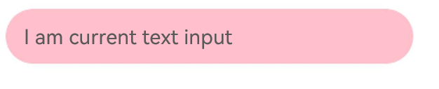
Richer styles can be implemented in combination with general attributes.
Adding Events
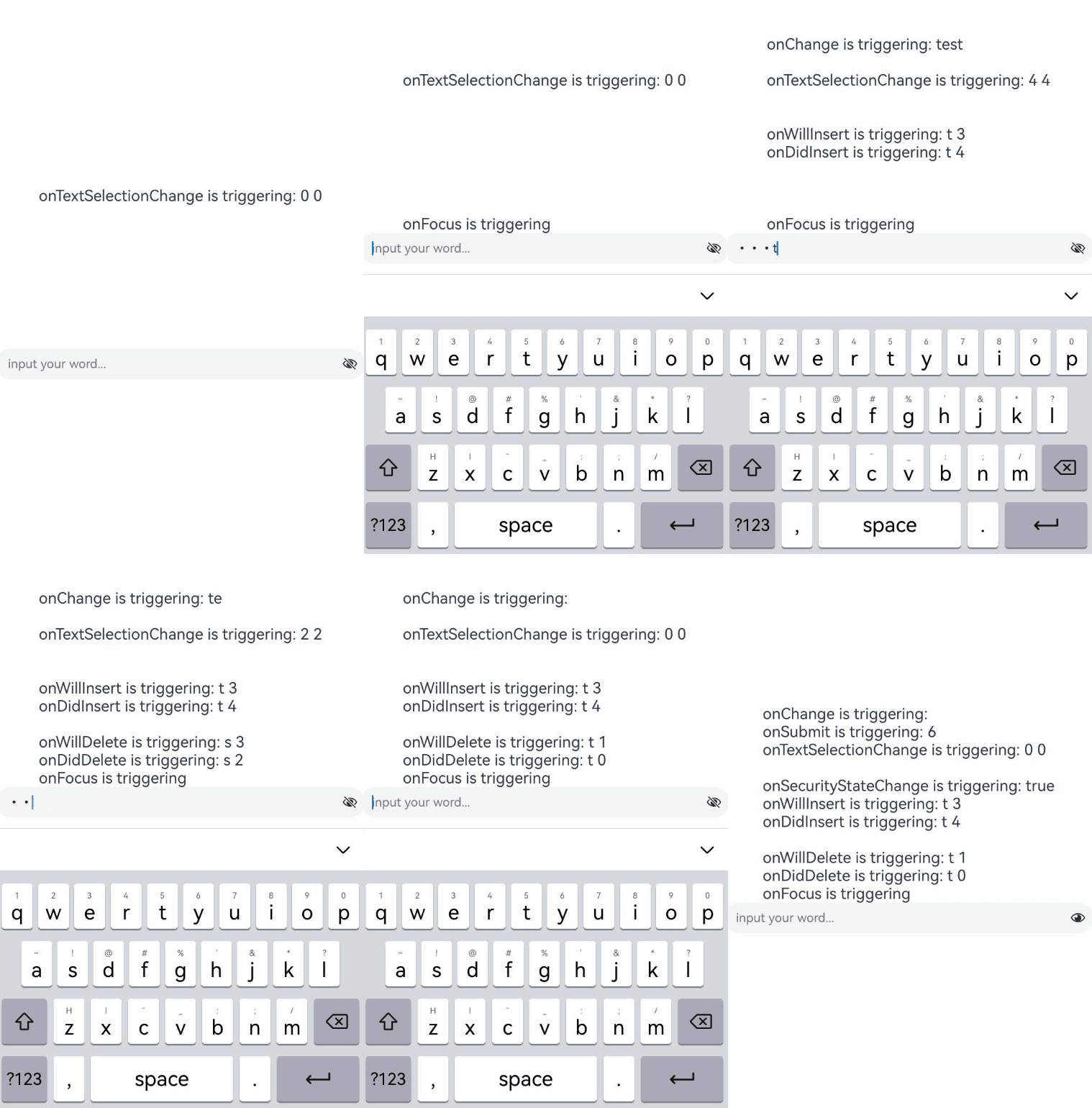
Text boxes are primarily used to obtain user input and process the information into data for uploading. Binding the onChange event allows you to obtain the changed text content in the input box. Binding the onSubmit event allows you to obtain the text submitted via the Enter key. Binding the onTextSelectionChange event allows you to obtain the position of the selection handles or the cursor position during editing. You can also use general events for corresponding interactive operations.

In password mode, when setting the showPassword attribute, you are advised to add state synchronization in the onSecurityStateChange callback. For details, see the following example.
The onWillInsert, onDidInsert, onWillDelete, and onDidDelete callbacks are supported only in system input method scenarios.
The callback timing of onWillChange is later than onWillInsert and onWillDelete, and earlier than onDidInsert and onDidDelete.
import { hilog } from '@kit.PerformanceAnalysisKit';

const TAG = '[Sample_Textcomponent]';
const DOMAIN = 0xF811;
const BUNDLE = 'Textcomponent_';

@Entry
@Component
struct TextInputEventAdd {
  @State text: string = '';
  @State textStr1: string = '';
  @State textStr2: string = '';
  @State textStr3: string = '';
  @State textStr4: string = '';
  @State textStr5: string = '';
  @State textStr6: string = '';
  @State textStr7: string = '';
  @State textStr8: string = '';
  @State textStr9: string = '';
  @State passwordState: boolean = false;
  controller: TextInputController = new TextInputController();

  build() {
    Row() {
      Column() {
        Text(`${this.textStr1}\n${this.textStr2}\n${this.textStr3}
          \n${this.textStr4}\n${this.textStr5}\n${this.textStr6}
          \n${this.textStr7}\n${this.textStr8}\n${this.textStr9}`)
          .fontSize(20)
        TextInput({ text: this.text, placeholder: 'input your word...', controller: this.controller })
          .type(InputType.Password)
          .showPassword(this.passwordState)
          .onChange((value: string) => {
            // Triggered when the text content changes.
            hilog.info(DOMAIN, TAG, BUNDLE + 'onChange is triggering: ' + value);
            this.textStr1 = `onChange is triggering: ${value}`;
          })
          .onSubmit((enterKey: EnterKeyType, event: SubmitEvent) => {
            // Triggered when the Enter key on the input method is pressed.
            hilog.info(DOMAIN, TAG, BUNDLE + 'onSubmit is triggering: ' + enterKey + event.text);
            this.textStr2 = `onSubmit is triggering: ${enterKey} ${event.text}`;
          })
          .onTextSelectionChange((selectionStart: number, selectionEnd: number) => {
            // Triggered when the text selection position changes or the cursor position changes in editing state.
            hilog.info(DOMAIN, TAG, BUNDLE + 'onTextSelectionChange is triggering: ' + selectionStart + selectionEnd);
            this.textStr3 = `onTextSelectionChange is triggering: ${selectionStart} ${selectionEnd}`;
          })
          .onSecurityStateChange((isShowPassword: boolean) => {
            // Triggered when the password visibility state toggles.
            hilog.info(DOMAIN, TAG, BUNDLE + 'onSecurityStateChange is triggering: ' + isShowPassword);
            this.passwordState = isShowPassword;
            this.textStr4 = `onSecurityStateChange is triggering: ${isShowPassword}`;
          })
          .onWillInsert((info: InsertValue) => {
            // Triggered before text is about to be inserted.
            hilog.info(DOMAIN, TAG, BUNDLE + 'onWillInsert is triggering: ' + info.insertValue + info.insertOffset);
            this.textStr5 = `onWillInsert is triggering: ${info.insertValue} ${info.insertOffset}`;
            return true;
          })
          .onDidInsert((info: InsertValue) => {
            // Triggered when input is completed.
            hilog.info(DOMAIN, TAG, BUNDLE + 'onDidInsert is triggering: ' + info.insertValue + info.insertOffset);
            this.textStr6 = `onDidInsert is triggering: ${info.insertValue} ${info.insertOffset}`;
          })
          .onWillDelete((info: DeleteValue) => {
            // Triggered when deletion is about to occur.
            hilog.info(DOMAIN, TAG, BUNDLE + 'onWillDelete is triggering: ' + info.deleteValue + info.deleteOffset);
            this.textStr7 = `onWillDelete is triggering: ${info.deleteValue} ${info.deleteOffset}`;
            return true;
          })
          .onDidDelete((info: DeleteValue) => {
            // Triggered when deletion is completed.
            hilog.info(DOMAIN, TAG, BUNDLE + 'onDidDelete is triggering: ' + info.deleteValue + info.deleteOffset);
            this.textStr8 = `onDidDelete is triggering: ${info.deleteValue} ${info.deleteOffset}`;
          })
          .onFocus(() => {
            // Binds a universal event. Triggered when the input box gains focus.
            hilog.info(DOMAIN, TAG, BUNDLE + 'onFocus is triggering');
            this.textStr9 = `onFocus is triggering`;
          })
      }.width('100%')
    }
    .height('100%')
  }
} 
Selection Menu
When text in the input box is selected, a menu containing cut, copy, translate, and share options appears.
TextInput:
// Replace $r('app.string.show_selected_menu') with an actual resource file. In this example, the value of the resource file is "This is a piece of text used to demonstrate the selection menu."
TextInput({ text: $r('app.string.show_selected_menu') }) 
TextArea:
// Replace $r('app.string.show_selected_menu') with the actual resource file. In this example, the resource file value is "This is a piece of text used to demonstrate the selection menu".
TextArea({ text: $r('app.string.show_selected_menu') }) 
Disabling System Service Menu Items
Starting from API version 20, you can use the disableSystemServiceMenuItems method to hide all system service menu items in the text selection menu. For details, see the API reference for disableSystemServiceMenuItems. The following example is only one part of a complete sample project. To avoid affecting other page examples in the project, system service menus are disabled and restored only in the page's aboutToAppear and aboutToDisappear lifecycle callbacks. In actual scenarios, you can choose other timing, such as onCreate and onDestroy of UIAbility.
import { TextMenuController } from '@kit.ArkUI';

@Entry
@Component
struct DisableSystemServiceMenuItem {
  aboutToAppear(): void {
    // Disable all system service menu items.
    TextMenuController.disableSystemServiceMenuItems(true)
  }

  aboutToDisappear(): void {
    // Restore system service menu items when the page disappears.
    TextMenuController.disableSystemServiceMenuItems(false)
  }

  build() {
    Row() {
      Column() {
        // Replace $r('app.string.ProhibitSelectMenu_content') with the actual resource file. In this example, the value of the resource file is "This is a TextInput. Long press to show the text selection menu."
        TextInput({ text: $r('app.string.ProhibitSelectMenu_content') })
          .height(60)
          .fontStyle(FontStyle.Italic)
          .fontWeight(FontWeight.Bold)
          .textAlign(TextAlign.Center)
          .caretStyle({ width: '4vp' })
          .editMenuOptions({
            onCreateMenu: (menuItems: Array<TextMenuItem>) => {
              // menuItems does not include blocked system menu items.
              return menuItems
            },
            onMenuItemClick: (menuItem: TextMenuItem, textRange: TextRange) => {
              return false
            }
          })
      }.width('100%')
    }
    .height('100%')
  }
} 
Since API version 20, you can use the disableMenuItems method to disable specified system service menu items in the text selection menu. For details, see the API description of disableMenuItems. The following example is only one part of a complete sample project. To avoid affecting other page samples in the project, system service menu items are disabled and restored only in the page's aboutToAppear and aboutToDisappear lifecycle callbacks. In actual scenarios, you can choose other timing, such as onCreate and onDestroy of UIAbility.
import { TextMenuController } from '@kit.ArkUI';

@Entry
@Component
struct DisableMenuItem {
  aboutToAppear(): void {
    // Disable Search, Translate, and AI Writer.
    TextMenuController.disableMenuItems([TextMenuItemId.SEARCH, TextMenuItemId.TRANSLATE, TextMenuItemId.AI_WRITER])
  }

  aboutToDisappear(): void {
    // Restore the system service menu items when the page disappears.
    TextMenuController.disableMenuItems([])
  }

  build() {
    Row() {
      Column() {
        // Replace $r('app.string.ProhibitSelectMenu_content') with the actual resource file. In this example, the value of the resource file is "This is a TextInput. Long press to show the text selection menu."
        TextInput({ text: $r('app.string.ProhibitSelectMenu_content') })
          .height(60)
          .fontStyle(FontStyle.Italic)
          .fontWeight(FontWeight.Bold)
          .textAlign(TextAlign.Center)
          .caretStyle({ width: '4vp' })
          .editMenuOptions({
            onCreateMenu: (menuItems: Array<TextMenuItem>) => {
              // menuItems does not include Search, Translate, and AI Writer.
              return menuItems;
            },
            onMenuItemClick: (menuItem: TextMenuItem, textRange: TextRange) => {
              return false
            }
          })
      }.width('100%')
    }
    .height('100%')
  }
} 
Auto-Fill
The input box can set the auto-fill type through the contentType attribute.
For supported types, see ContentType.
// Replace `$r('app.string.Auto_Fill_PlaceHolder')` with the actual resource file. In this example, the value of the resource file is "Enter your email...".
TextInput({ placeholder: $r('app.string.Auto_Fill_PlaceHolder') })
  .width('95%')
  .height(40)
  .margin(20)
  .contentType(ContentType.EMAIL_ADDRESS)
Setting Attributes
-
Set the ellipsis attribute.
The input box can set the ellipsis position through the ellipsisMode attribute.
The ellipsisMode attribute must be used together with the textOverflow attribute set to TextOverflow.Ellipsis. Setting ellipsisMode alone does not take effect.
// Replace $r('app.string.Set_Omission_Property_textContent') with the actual resource file. In this example, the value of the resource file is "This is a piece of text used to demonstrate the ellipsis mode".
TextInput({ text: $r('app.string.Set_Omission_Property_textContent') })
  .textOverflow(TextOverflow.Ellipsis)
  .ellipsisMode(EllipsisMode.END)
  .style(TextInputStyle.Inline)
  .fontSize(30)
  .margin(30)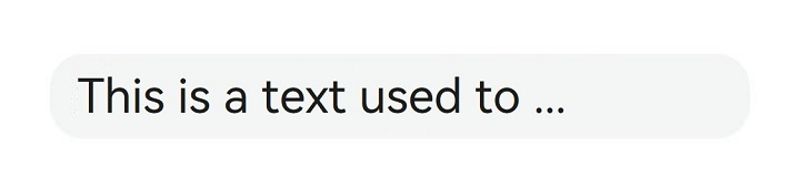
-
Set text stroke attributes.
Starting from API version 20, the input box supports setting the text stroke width and color through the strokeWidth and strokeColor attributes.
TextInput({ text: 'Text with stroke' })
  .width('100%')
  .height(60)
  .borderWidth(1)
  .fontSize(40)
  .strokeWidth(LengthMetrics.px(3.0))
  .strokeColor(Color.Red)
Setting Text Line Spacing
Starting from API version 20, you can set the text line spacing via lineSpacing. When LineSpacingOptions is not configured, line spacing is applied by default above the first line and below the last line. When onlyBetweenLines is set to true, line spacing applies only between lines, with no extra spacing above the first line.
TextArea({
  text: 'The line spacing of this TextArea is set to 20_px, and the spacing is effective only between the lines.'
})
  .fontSize(22)
.lineSpacing(LengthMetrics.px(20), { onlyBetweenLines: true }) 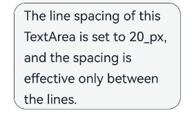
Keyboard Avoidance
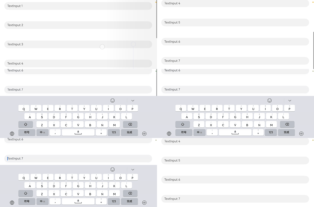
After the keyboard is raised, keyboard avoidance takes effect for scrollable container components only when switching between landscape and portrait modes. If you want keyboard avoidance to also take effect for non-scrollable container components, nest them inside a scrollable container component, such as Scroll, List, or Grid.
@Entry
@Component
struct KeyboardAvoid {
  placeHolderArr: string[] = ['1', '2', '3', '4', '5', '6', '7'];

  build() {
    Scroll() {
      Column() {
        ForEach(this.placeHolderArr, (placeholder: string) => {
          TextInput({ placeholder: 'TextInput ' + placeholder })
            .margin(30)
            // ···
        })
      }
    }
    .height('100%')
    .width('100%')
  }
} 
Cursor Avoidance
The OFFSET and RESIZE modes in the keyBoardAvoidMode enumeration do not support secondary avoidance after the keyboard is raised. If you want the cursor position to trigger secondary avoidance after being changed by a tap or through an API, consider using OFFSET_WITH_CARET and RESIZE_CARET to replace the original OFFSET and RESIZE modes.
For scrollable containers, RESIZE_WITH_CARET is recommended; for non-scrollable containers, OFFSET_WITH_CARET should be used.
import { hilog } from '@kit.PerformanceAnalysisKit';
import { window } from '@kit.ArkUI';
import { KeyboardAvoidMode } from '@kit.ArkUI';
// Used in UIAbility
onWindowStageCreate(windowStage: window.WindowStage): void {
// Main window is created, set main page for this ability
hilog.info(0x0000, 'testTag', '%{public}s', 'Ability onWindowStageCreate');
windowStage.loadContent('pages/Index', (err, data) => {
windowStage.getMainWindowSync().getUIContext().getKeyboardAvoidMode();
windowStage.getMainWindowSync().getUIContext().setKeyboardAvoidMode(KeyboardAvoidMode.OFFSET_WITH_CARET);
if (err.code) {
hilog.error(0x0000, 'testTag', 'Failed to load the content. Cause: %{public}s', JSON.stringify(err) ?? '');
return;
}
hilog.info(0x0000, 'testTag', 'Succeeded in loading the content. Data: %{public}s', JSON.stringify(data) ?? '');
});
} @Entry
@Component
struct CursorAvoid {
@State caretPosition: number = 600;
areaController: TextAreaController = new TextAreaController();
text = 'Most of us compare ourselves with anyone we think is happier — a relative, someone we know a lot,' +
' or someone we hardly know. As a result, what we do remember is anything that makes others happy, ' +
'anything that makes ourselves unhappy,' +
' totally forgetting that there is something happy in our own life.\
So the best way to destroy happiness is to look at something and focus on even the smallest flaw. ' +
'It is the smallest flaw that would make us complain. And it is the complaint that leads to us becoming unhappy.\
If one chooses to be happy, he will be blessed; if he chooses to be unhappy, he will be cursed. ' +
'Happiness is just what you think will make you happy.' +
'Most of us compare ourselves with anyone we think is happier — a relative, someone we know a lot, ' +
'or someone we hardly know. As a result, what we do remember is anything that makes others happy, ' +
'anything that makes ourselves unhappy, totally forgetting that there is something happy in our own life.\
';
build() {
Scroll() {
Column() {
Row() {
Button('CaretPosition++: ' + this.caretPosition).onClick(() => {
this.caretPosition += 1;
}).fontSize(10)
Button('CaretPosition--: ' + this.caretPosition).onClick(() => {
this.caretPosition -= 1;
}).fontSize(10)
Button('SetCaretPosition: ').onClick(() => {
this.areaController.caretPosition(this.caretPosition);
}).fontSize(10)
}
TextArea({ text: this.text, controller: this.areaController })
.width('100%')
.fontSize('20fp')
}
}.width('100%').height('100%')
}
} 
[h2]How to Set the Minimum Number of Displayed Lines for TextArea and Auto-Adjust Height
Problem
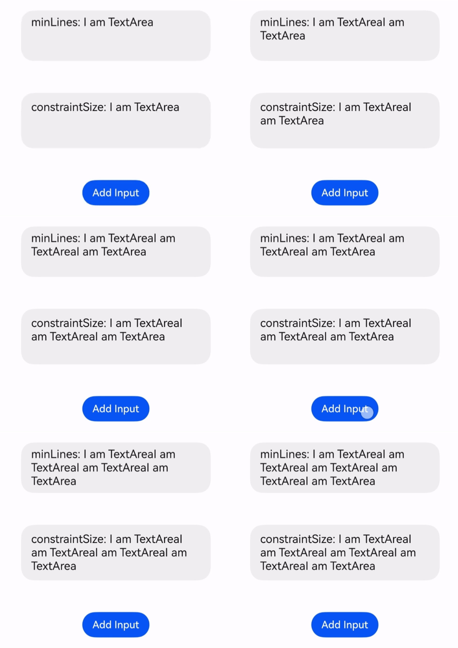
Set the initial height of TextArea to control the minimum number of displayed text lines. When the input text exceeds the initial height, the height of TextArea adjusts automatically.
Solution
Set minLines (starting from API version 20), or set height to "auto" and use constraintSize to calculate the height manually.
import { MeasureUtils } from '@kit.ArkUI';

@Entry
@Component
struct TextExample {
  private textAreaPadding = 12;
  private setMaxLines = 3;
  private resourceManager = this.getUIContext().getHostContext()?.resourceManager;
  // Configure a resource with the name 'NormalQuestion_change' and a non-empty string value in the resources\base\element\string.json file.
  private changeText = this.resourceManager?.getStringByNameSync('NormalQuestion_change') as string;
  @State fullText: string = this.changeText;
  @State originText: string = this.changeText;
  @State uiContext: UIContext = this.getUIContext();
  @State uiContextMeasure: MeasureUtils = this.uiContext.getMeasureUtils();
  textSize: SizeOptions = this.uiContextMeasure.measureTextSize({
    textContent: this.originText,
    fontSize: 18
  });

  build() {
    Column() {
      TextArea({ text: 'minLines: ' + this.fullText })
        .fontSize(18)
        .width(300)
        .minLines(3)

      Blank(50)

      TextArea({ text: 'constraintSize: ' + this.fullText })
        .fontSize(18)
        .padding({ top: this.textAreaPadding, bottom: this.textAreaPadding })
        .width(300)
        .height('auto')
        .constraintSize({
          // Calculate the height in combination with padding, and set it to display at least this.setMaxLines lines of text.
          // If accessibility font scaling is involved, monitor and adjust the height.
          minHeight: this.textAreaPadding * 2 +
            this.setMaxLines * this.getUIContext().px2vp(Number(this.textSize.height))
        })

      Blank(50)
      // Replace $r('app.string.NormalQuestion_AddInput') with the actual resource file. In this example, the value of the resource file is "Add Input".
      Button($r('app.string.NormalQuestion_AddInput'))
        .onClick(() => {
          this.fullText += this.changeText;
        })
    }
    .justifyContent(FlexAlign.Center)
    .width('100%')
    .padding({ top: 30 })
  }
}