The ListItem component displays specific items in the list. It must be used together with List.

- This component is supported since API version 7. Updates will be marked with a superscript to indicate their earliest API version.
- The parent of this component can only be List or ListItemGroup.
- When this component is used with LazyForEach, its child components are created when it is created. When this component is used with if/else or ForEach, or when the parent component is List or ListItemGroup, its child components are created when it is laid out.
[h2]ListItem10+
ListItem(value?: ListItemOptions)
Creates a ListItem component.
Widget capability: This API can be used in ArkTS widgets since API version 10.
Atomic service API: This API can be used in atomic services since API version 11.
System capability: SystemCapability.ArkUI.ArkUI.Full
Parameters
| Name | Type | Mandatory | Description |
|---|---|---|---|
| value | ListItemOptions | No | Parameters of the list item, containing the style parameter of ListItemStyle. Default value: { style: ListItemStyle.NONE } |
[h2]ListItem(deprecated)
ListItem(value?: string)
Creates a ListItem component.

This API is supported since API version 7 and deprecated since API version 10. You are advised to use ListItem10+ instead.
Widget capability: This API can be used in ArkTS widgets since API version 9.
System capability: SystemCapability.ArkUI.ArkUI.Full
Parameters
| Name | Type | Mandatory | Description |
|---|---|---|---|
| value | string | No | N/A |
[h2]sticky(deprecated)
sticky(value: Sticky)
Sets the sticky effect of the list item.

This API is supported since API version 7 and deprecated since API version 9. You are advised to use sticky instead.
System capability: SystemCapability.ArkUI.ArkUI.Full
Parameters
| Name | Type | Mandatory | Description |
|---|---|---|---|
| value | Sticky | Yes | Sticky effect of the list item. Default value: Sticky.None |
[h2]editable(deprecated)
editable(value: boolean | EditMode)
Sets whether to enable edit mode, where the list item can be deleted or moved.

This API is supported since API version 7 and deprecated since API version 9. No substitute is provided.
System capability: SystemCapability.ArkUI.ArkUI.Full
Parameters
| Name | Type | Mandatory | Description |
|---|---|---|---|
| value | boolean | EditMode | Yes | Whether to enable edit mode. Default value: false |
[h2]selectable8+
selectable(value: boolean)
Sets whether the list item is selectable for multiselect. This attribute takes effect only when mouse frame selection is enabled for the parent List container.
Widget capability: This API can be used in ArkTS widgets since API version 9.
Atomic service API: This API can be used in atomic services since API version 11.
System capability: SystemCapability.ArkUI.ArkUI.Full
Parameters
| Name | Type | Mandatory | Description |
|---|---|---|---|
| value | boolean | Yes | Whether the list item is selectable for multiselect. The value means that the grid item is selectable in the mouse selection box area, and false means the opposite. Default value: true |
[h2]selected10+
selected(value: boolean)
Sets whether the list item is selected. This attribute supports two-way binding through $$. This attribute must be used before the polymorphic style is set. Otherwise, the style settings will not take effect.
Widget capability: This API can be used in ArkTS widgets since API version 10.
Atomic service API: This API can be used in atomic services since API version 11.
System capability: SystemCapability.ArkUI.ArkUI.Full
Parameters
| Name | Type | Mandatory | Description |
|---|---|---|---|
| value | boolean | Yes | Whether the list item is selected. The value means that the grid item is selected, and false means that the grid item is in the default state. Default value: false |
[h2]swipeAction9+
swipeAction(value: SwipeActionOptions)
Sets the swipe action item displayed when the list item is swiped out from the screen edge.
Atomic service API: This API can be used in atomic services since API version 11.
System capability: SystemCapability.ArkUI.ArkUI.Full
Parameters
| Name | Type | Mandatory | Description |
|---|---|---|---|
| value | SwipeActionOptions | Yes | Swipe action item displayed when the list item is swiped out from the screen edge. |
Sticky(deprecated)
Enumerates the sticky effects for list items.

This API is supported since API version 7 and deprecated since API version 9. You are advised to use StickyStyle of the List component instead.
System capability: SystemCapability.ArkUI.ArkUI.Full
| Name | Value | Description |
|---|---|---|
| None | - | The list item is not sticky. |
| Normal | - | The list item is sticky with no special effects. |
| Opacity | - | The list item is sticky with opacity changes. |
EditMode(deprecated)
Enumerates the edit modes of list items.

This API is supported since API version 7 and deprecated since API version 9. No substitute is provided.
System capability: SystemCapability.ArkUI.ArkUI.Full
| Name | Value | Description |
|---|---|---|
| None | - | The editing operation is not restricted. |
| Deletable | - | The list item can be deleted. |
| Movable | - | The list item can be moved. |
SwipeEdgeEffect9+
Enumerates the edge effects.
Atomic service API: This API can be used in atomic services since API version 11.
System capability: SystemCapability.ArkUI.ArkUI.Full
| Name | Value | Description |
|---|---|---|
| Spring | - | When the list item scrolls to the edge of the list, it can continue to scroll for a distance. If the delete area is set, the list item can continue to scroll after the scroll distance exceeds the delete threshold and, after being released, rebound following the spring curve. |
| None | - | The list item cannot scroll beyond the edge of the list. If the delete area is set, the list item cannot continue to scroll after the scroll distance exceeds the delete threshold. If the delete callback is set, it is triggered when the delete threshold is reached and the list item is released. |
SwipeActionOptions9+
The top layer of the @builder function corresponding to start and end must be a single component. Otherwise, undefined behavior occurs. If the top layer of the @builder function is a statement such as if/else or ForEach, ensure that these statements can generate a single component.
The swipe gesture works only in the list item area. If a swipe causes a child component to extend beyond the list item area, the portion outside the area does not respond to the swipe. In light of this, avoid setting swipeAction to a component too wide in a multi-column list.
System capability: SystemCapability.ArkUI.ArkUI.Full
| Name | Type | Read-Only | Optional | Description |
|---|---|---|---|---|
| start | CustomBuilder | SwipeActionItem | No | Yes | Swipe action item displayed on the left of the list item when the item is swiped right (in vertical list layout) or above the list item when the item is swiped down (in horizontal list layout). Atomic service API: This API can be used in atomic services since API version 11. |
| end | CustomBuilder | SwipeActionItem | No | Yes | Swipe action item displayed on the right of the list item when the item is swiped left (in vertical list layout) or below the list item when the item is swiped up (in horizontal list layout). Atomic service API: This API can be used in atomic services since API version 11. |
| edgeEffect | SwipeEdgeEffect | No | Yes | Scroll effect. Atomic service API: This API can be used in atomic services since API version 11. |
| onOffsetChange11+ | (offset: number) => void | No | Yes | Specifically, this callback is invoked when the location of the list item changes, in vp, when it is swiped left or right (in vertical list layout) or up or down (in horizontal list layout). Atomic service API: This API can be used in atomic services since API version 12. |
SwipeActionItem10+
Describes the swipe action item.
For a list in vertical layout, it refers to the delete option displayed on the left (or right) of the list item when the list item is swiped right (or left).
For a list in horizontal layout, it refers to the delete option displayed below (or above) the list item when the list item is swiped up (or down).
System capability: SystemCapability.ArkUI.ArkUI.Full
| Name | Type | Read-Only | Optional | Description |
|---|---|---|---|---|
| actionAreaDistance | Length | No | Yes | Swipe distance threshold for deleting the list item. This threshold applies after the swipe action component is fully swiped into view and triggers the deletion action. Default value: 56vp NOTE This parameter cannot be set in percentage. If the value is greater than the list item width minus the width of swipeAction, or is less than or equal to 0, the delete area will not be set. Atomic service API: This API can be used in atomic services since API version 11. |
| onAction | () => void | No | Yes | Callback invoked when the list item is released while in the delete area. NOTE This callback is invoked only when the list item is released in a position that meets or goes beyond the specified swipe distance threshold (which must be valid) for deleting the list item. Atomic service API: This API can be used in atomic services since API version 11. |
| onEnterActionArea | () => void | No | Yes | Callback invoked each time the list item enters the delete area. Atomic service API: This API can be used in atomic services since API version 11. |
| onExitActionArea | () => void | No | Yes | Callback invoked each time the list item exits the delete area. Atomic service API: This API can be used in atomic services since API version 11. |
| builder | CustomBuilder | No | Yes | Swipe action item displayed when the list item is swiped left or right (in vertical list layout) or up or down (in horizontal list layout). Atomic service API: This API can be used in atomic services since API version 11. |
| builderComponent18+ | ComponentContent | No | Yes | Swipe action item displayed when the list item is swiped left or right (in vertical list layout) or up or down (in horizontal list layout). NOTE This parameter takes precedence over the builder parameter. This means that, if both builder and builderComponent are set, the value of builderComponent is used. To avoid display issues, do not assign the same builderComponent to different swipe action items specified by start and end. Atomic service API: This API can be used in atomic services since API version 18. |
| onStateChange11+ | (state:SwipeActionState) => void | No | Yes | Callback invoked when the swipe state of the list item changes. Atomic service API: This API can be used in atomic services since API version 12. |
ListItemOptions10+
Defines ListItem component configuration options.
Atomic service API: This API can be used in atomic services since API version 11.
System capability: SystemCapability.ArkUI.ArkUI.Full
| Name | Type | Read-Only | Optional | Description |
|---|---|---|---|---|
| style | ListItemStyle | No | Yes | Style of the list item. Default value: ListItemStyle.NONE If this parameter is set to ListItemStyle.NONE, no style is applied. When ListItemStyle.CARD is used, you are advised to pair it with ListItemGroupStyle.CARD from ListItemGroup to apply the default card style. In the card style, the default specifications for a list item are as follows: a height of 48 vp, a width of 100%, and horizontal padding of 8 vp on both the left and right sides. If you want to implement an adaptive height for the list item, you can set the height attribute to undefined. The card style provides default focus, hover, press, selected, and disabled states for list items. NOTE When ListItemStyle.CARD is set, the listDirection attribute of List must be Axis.Vertical. If listDirection is set to Axis.Horizontal, the display will be disordered. The default value of alignListItem is ListItemAlign.Center, which centers the items vertically. |
ListItemStyle10+
Enumerates the card styles of the List component.
Atomic service API: This API can be used in atomic services since API version 11.
System capability: SystemCapability.ArkUI.ArkUI.Full
| Name | Value | Description |
|---|---|---|
| NONE | 0 | No style. |
| CARD | 1 | Default card style. |
SwipeActionState11+
Enumerates swipe states of list items.
Atomic service API: This API can be used in atomic services since API version 12.
System capability: SystemCapability.ArkUI.ArkUI.Full
| Name | Value | Description |
|---|---|---|
| COLLAPSED | 0 | Collapsed state. When the list item is swiped left or right (in vertical list layout) or up or down (in horizontal list layout), the swipe action item is hidden. |
| EXPANDED | 1 | Expanded state. When the list item is swiped left or right (in vertical list layout) or up or down (in horizontal list layout), the swipe action item is shown. NOTE When the list item is swiped left or right (in vertical list layout) or up or down (in horizontal list layout), the swipe action item is shown. |
| ACTIONING | 2 | In-action state. The list item is in this state when it enters the delete area. NOTE A list item can enter this state only when it is released in a position that meets or goes beyond the specified swipe distance threshold (which must be valid) for deleting the list item. |
[h2]onSelect8+
onSelect(event: (isSelected: boolean) => void)
Triggered when the selected state of the list item for multiselect changes.
Widget capability: This API can be used in ArkTS widgets since API version 9.
Atomic service API: This API can be used in atomic services since API version 11.
System capability: SystemCapability.ArkUI.ArkUI.Full
Parameters
| Name | Type | Mandatory | Description |
|---|---|---|---|
| isSelected | boolean | Yes | Whether the list item is selected for multi-select. Returns true if the list item is selected for multi-select; returns false otherwise. |
[h2]expand21+
expand(node: FrameNode, direction: ListItemSwipeActionDirection): void
Expands the swipe action menu for the specified list item.
Atomic service API: This API can be used in atomic services since API version 21.
System capability: SystemCapability.ArkUI.ArkUI.Full
Parameters
| Name | Type | Mandatory | Description |
|---|---|---|---|
| node | FrameNode | Yes | ListItem node object. |
| direction | ListItemSwipeActionDirection | Yes | Swipe action menu display direction for the ListItem component. |
Error codes
For details about the error codes, see Custom Node Error Codes.
| ID | Error Message |
|---|---|
| 100023 | The component type of the node is incorrect. |
| 106203 | The node not mounted to component tree. |

- If the List component's cachedCount attribute is configured to preload ListItem child components, swipe action menus can be expanded for preloaded ListItem child components outside the visible area. Otherwise, child components outside the visible area cannot be expanded.
[h2]collapse21+
collapse(node: FrameNode): void
Collapses the swipe action menu for the specified list item.
Atomic service API: This API can be used in atomic services since API version 21.
System capability: SystemCapability.ArkUI.ArkUI.Full
Parameters
| Name | Type | Mandatory | Description |
|---|---|---|---|
| node | FrameNode | Yes | ListItem node object. |
Error codes
For details about the error codes, see Custom Node Error Codes.
| ID | Error Message |
|---|---|
| 100023 | The component type of the node is incorrect. |
| 106203 | The node not mounted to component tree. |
ListItemSwipeActionDirection21+
Enumerates the swipe action menu display directions for ListItem components.
Atomic service API: This API can be used in atomic services since API version 21.
System capability: SystemCapability.ArkUI.ArkUI.Full
| Name | Value | Description |
|---|---|---|
| START | 0 | For vertical lists: left side in LTR mode, right side in RTL mode. For horizontal lists: top side. |
| END | 1 | For vertical lists: right side in LTR mode, left side in RTL mode. For horizontal lists: bottom side. |
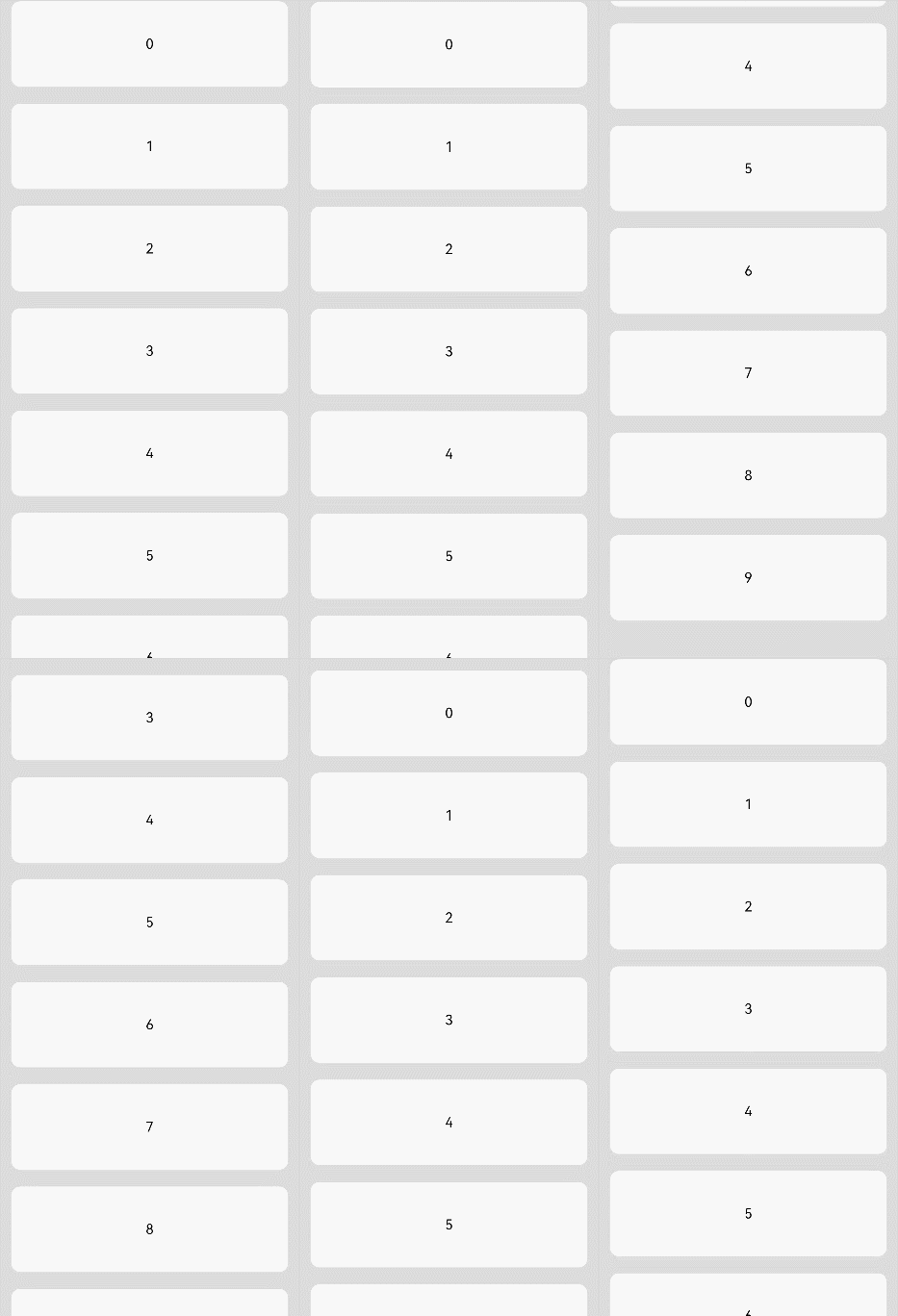
[h2]Example 1: Creating a List Item
This example demonstrates the basic usage of creating a list item.
// xxx.ets
export class ListDataSource implements IDataSource {
  private list: number[] = [];

  constructor(list: number[]) {
    this.list = list;
  }

  totalCount(): number {
    return this.list.length;
  }

  getData(index: number): number {
    return this.list[index];
  }

  registerDataChangeListener(listener: DataChangeListener): void {
  }

  unregisterDataChangeListener(listener: DataChangeListener): void {
  }
}

@Entry
@Component
struct ListItemExample {
  private arr: ListDataSource = new ListDataSource([0, 1, 2, 3, 4, 5, 6, 7, 8, 9]);

  build() {
    Column() {
      List({ space: 20, initialIndex: 0 }) {
        LazyForEach(this.arr, (item: number) => {
          ListItem() {
            Text('' + item)
              .width('100%')
              .height(100)
              .fontSize(16)
              .textAlign(TextAlign.Center)
              .borderRadius(10)
              .backgroundColor(0xFFFFFF)
          }
        }, (item: string) => item)
      }.width('90%')
      .scrollBar(BarState.Off)
    }.width('100%').height('100%').backgroundColor(0xDCDCDC).padding({ top: 5 })
  }
} 
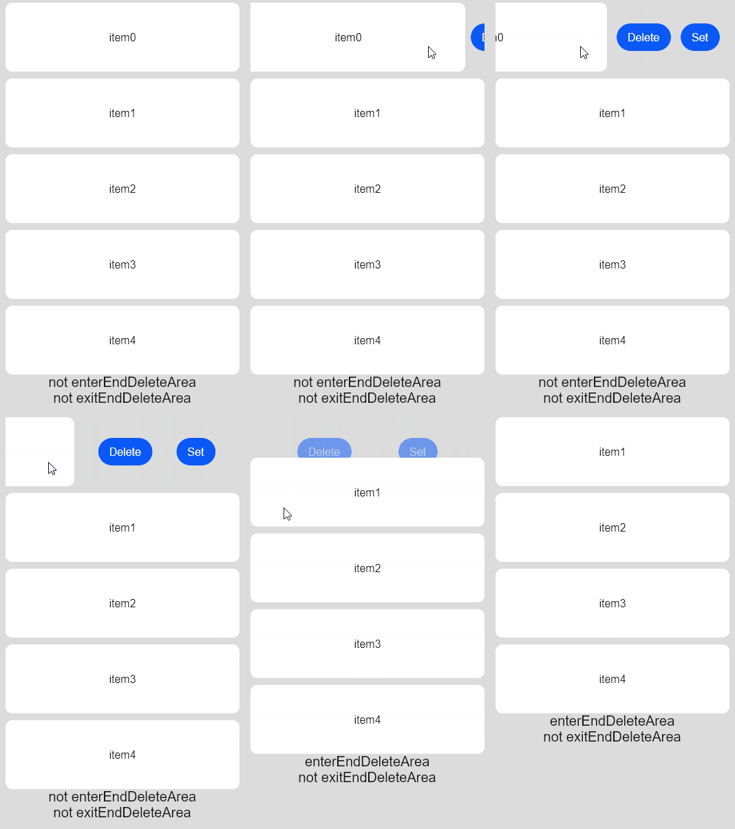
[h2]Example 2: Setting the Swipe Action Item
This example shows how to set the swipe action item for a list item using swipeAction.
// xxx.ets
@Entry
@Component
struct ListItemExample2 {
  @State arr: number[] = [0, 1, 2, 3, 4];
  @State enterEndDeleteAreaString: string = 'not enterEndDeleteArea';
  @State exitEndDeleteAreaString: string = 'not exitEndDeleteArea';
  private scroller: ListScroller = new ListScroller();

  @Builder
  itemEnd() {
    Row() {
      Button('Delete').margin('4vp')
      Button('Set').margin('4vp').onClick(() => {
        try {
          this.scroller.closeAllSwipeActions();
        } catch (error) {
          console.info('Failed to close all swipe actions:', error);
        }
      })
    }.padding('4vp').justifyContent(FlexAlign.SpaceEvenly)
  }

  build() {
    Column() {
      List({ space: 10, scroller: this.scroller }) {
        ForEach(this.arr, (item: number) => {
          ListItem() {
            Text('item' + item)
              .width('100%')
              .height(100)
              .fontSize(16)
              .textAlign(TextAlign.Center)
              .borderRadius(10)
              .backgroundColor(0xFFFFFF)
          }
          .transition(TransitionEffect.OPACITY)
          .swipeAction({
            end: {
              builder: () => {
                this.itemEnd()
              },
              onAction: () => {
                this.getUIContext()?.animateTo({ duration: 1000 }, () => {
                  let index = this.arr.indexOf(item);
                  this.arr.splice(index, 1);
                });
              },
              actionAreaDistance: 56,
              onEnterActionArea: () => {
                this.enterEndDeleteAreaString = 'enterEndDeleteArea';
                this.exitEndDeleteAreaString = 'not exitEndDeleteArea';
              },
              onExitActionArea: () => {
                this.enterEndDeleteAreaString = 'not enterEndDeleteArea';
                this.exitEndDeleteAreaString = 'exitEndDeleteArea';
              }
            }
          })
        }, (item: number) => item.toString())
      }

      Text(this.enterEndDeleteAreaString).fontSize(20)
      Text(this.exitEndDeleteAreaString).fontSize(20)
    }
    .padding(10)
    .backgroundColor(0xDCDCDC)
    .width('100%')
    .height('100%')
  }
} 
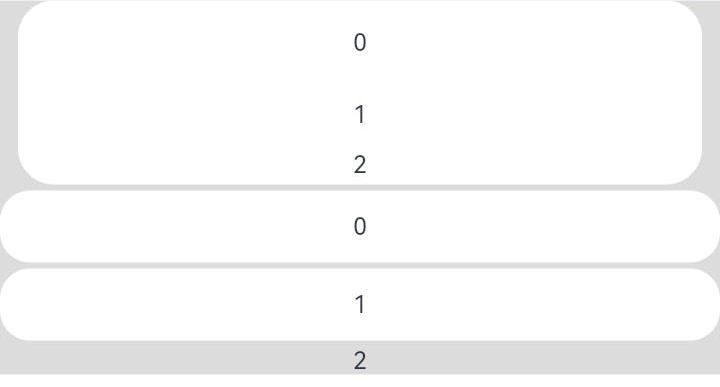
[h2]Example 3: Applying a Card-style Effect
This example illustrates the card-style effect of the ListItem component.
// xxx.ets
@Entry
@Component
struct ListItemExample3 {
  build() {
    Column() {
      List({ space: '4vp', initialIndex: 0 }) {
        ListItemGroup({ style: ListItemGroupStyle.CARD }) {
          ForEach([ListItemStyle.CARD, ListItemStyle.CARD, ListItemStyle.NONE], (itemStyle: number, index?: number) => {
            ListItem({ style: itemStyle }) {
              Text('' + index)
                .width('100%')
                .textAlign(TextAlign.Center)
            }
          })
        }

        ForEach([ListItemStyle.CARD, ListItemStyle.CARD, ListItemStyle.NONE], (itemStyle: number, index?: number) => {
          ListItem({ style: itemStyle }) {
            Text('' + index)
              .width('100%')
              .textAlign(TextAlign.Center)
          }
        })
      }
      .width('100%')
      .multiSelectable(true)
      .backgroundColor(0xDCDCDC)
    }
    .width('100%')
    .padding({ top: 5 })
  }
} 
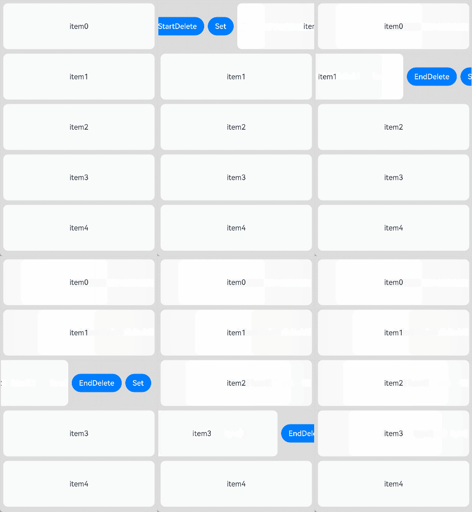
[h2]Example 4: Setting the Swipe Action Item Using ComponentContent
This example demonstrates how to set the action items displayed during swipe operations in ListItem using ComponentContent.
// xxx.ets
import { ComponentContent } from '@kit.ArkUI';

class BuilderParams {
  text: string | Resource;
  scroller: ListScroller;

  constructor(text: string | Resource, scroller: ListScroller) {
    this.text = text;
    this.scroller = scroller;
  }
}

@Builder
function itemBuilder(params: BuilderParams) {
  Row() {
    Button(params.text).margin('4vp')
    Button('Set').margin('4vp').onClick(() => {
      params.scroller.closeAllSwipeActions()
    })
  }.padding('4vp').justifyContent(FlexAlign.SpaceEvenly)
}

@Component
struct MyListItem {
  scroller: ListScroller = new ListScroller();
  @State arr: number[] = [0, 1, 2, 3, 4];
  @State project ?: number = 0;
  startBuilder ?: ComponentContent<BuilderParams> = undefined;
  endBuilder ?: ComponentContent<BuilderParams> = undefined;
  builderParam = new BuilderParams('delete', this.scroller);

  aboutToAppear(): void {
    this.startBuilder = new ComponentContent(this.getUIContext(), wrapBuilder(itemBuilder), this.builderParam);
    this.endBuilder = new ComponentContent(this.getUIContext(), wrapBuilder(itemBuilder), this.builderParam);
  }

  GetStartBuilder() {
    this.startBuilder?.update(new BuilderParams('StartDelete', this.scroller));
    return this.startBuilder;
  }

  GetEndBuilder() {
    this.endBuilder?.update(new BuilderParams('EndDelete', this.scroller));
    return this.endBuilder;
  }

  build() {
    ListItem() {
      Text('item' + this.project)
        .width('100%')
        .height(100)
        .fontSize(16)
        .textAlign(TextAlign.Center)
        .borderRadius(10)
        .backgroundColor(0xFFFFFF)
    }
    .transition(TransitionEffect.OPACITY)
    .swipeAction({
      end: {
        builderComponent: this.GetEndBuilder(),
        onAction: () => {
          this.getUIContext()?.animateTo({ duration: 1000 }, () => {
            let index = this.arr.indexOf(this.project);
            this.arr.splice(index, 1);
          });
        },
        actionAreaDistance: 56
      },
      start: {
        builderComponent: this.GetStartBuilder(),
        onAction: () => {
          this.getUIContext()?.animateTo({ duration: 1000 }, () => {
            let index = this.arr.indexOf(this.project);
            this.arr.splice(index, 1);
          });
        },
        actionAreaDistance: 56
      }
    })
    .padding(5)
  }
}

@Entry
@Component
struct ListItemExample {
  @State arr: number[] = [0, 1, 2, 3, 4];
  private scroller: ListScroller = new ListScroller();

  build() {
    Column() {
      List({ space: 10, scroller: this.scroller }) {
        ListItemGroup() {
          ForEach(this.arr, (project: number) => {
            MyListItem({ scroller: this.scroller, project: project, arr: this.arr })
          }, (item: string) => item)
        }
      }
    }
    .padding(10)
    .backgroundColor(0xDCDCDC)
    .width('100%')
    .height('100%')
  }
} 
[h2]Example 5: Managing the Swipe Action Menu Through ListItemSwipeActionManager
This example demonstrates how to manage the swipe action menu of a list item using ListItemSwipeActionManager, available since API version 21.
// xxx.ets
import { BusinessError } from '@kit.BasicServicesKit';

@Entry
@Component
struct ListItemExample5 {
  @Builder
  itemAction(str: string) {
    Row() {
      Button(str).margin('4vp')
    }.padding('4vp').justifyContent(FlexAlign.SpaceEvenly)
  }

  build() {
    Flex({ wrap: FlexWrap.Wrap }) {
      Flex({ wrap: FlexWrap.Wrap, justifyContent: FlexAlign.SpaceBetween }) {
        Button('expand start')
          .onClick(() => {
            try {
              let node: FrameNode | null = this.getUIContext().getAttachedFrameNodeById('listItem');
              ListItemSwipeActionManager.expand(node, ListItemSwipeActionDirection.START)
            } catch (error) {
              console.error('Error expand item:', (error as BusinessError).code, (error as BusinessError).message);
            }
          })
        Button('expand end')
          .onClick(() => {
            try {
              let node: FrameNode | null = this.getUIContext().getAttachedFrameNodeById('listItem');
              ListItemSwipeActionManager.expand(node, ListItemSwipeActionDirection.END)
            } catch (error) {
              console.error('Error expand item:', (error as BusinessError).code, (error as BusinessError).message);
            }
          })
        Button('collapse')
          .onClick(() => {
            try {
              let node: FrameNode | null = this.getUIContext().getAttachedFrameNodeById('listItem');
              ListItemSwipeActionManager.collapse(node)
            } catch (error) {
              console.error('Error collapse item:', (error as BusinessError).code, (error as BusinessError).message);
            }
          })
      }
      .margin({ bottom: 10 })

      List({ space: 10 }) {
        ListItem() {
          Text('item')
            .width('100%')
            .height(100)
            .fontSize(16)
            .textAlign(TextAlign.Center)
            .borderRadius(10)
            .backgroundColor(0xFFFFFF)
        }
        .id('listItem')
        .transition(TransitionEffect.OPACITY)
        .swipeAction({
          start: {
            builder: () => {
              this.itemAction('start')
            },
          },
          end: {
            builder: () => {
              this.itemAction('end')
            },
          }
        })
      }
      .height('80%')

    }
    .padding(10)
    .backgroundColor(0xDCDCDC)
    .width('100%')
    .height('100%')
  }
} 