The UIPickerComponent container is a component used to implement user selection operations. It allows users to make a single selection from a limited set of options, and uses a 3D wheel style to provide intuitive visual feedback and a smooth scrolling experience. This component supports on-demand customization of options, including text type, image type, and image-text combination type, which can provide richer information display based on service requirements. It can be widely used in various scenarios such as time selection, date selection, region selection, and status selection.

-
The initial APIs of this module are supported since API version 22. Newly added APIs will be marked with a superscript to indicate their earliest API version.
-
The UIPickerComponent container has a default option row height of 40 vp and displays 7 options by default. You can configure them through the itemHeight and displayedItemCount attributes. Because the display effect is a 3D wheel style, options other than the selected one are rotated at different angles, so the actual visible height is smaller than the option row height.
-
It is recommended that the height of the UIPickerComponent container be set to 200 vp. When the set height is greater than or equal to this recommended value, the default 7 options can be fully displayed. If more visible items or a larger option height are configured through displayedItemCount or itemHeight, it is recommended to increase the component height accordingly. When the set height is smaller than the recommended value, the display range is cropped from the top and bottom edges toward the center, and the number of options that can be displayed is reduced accordingly, with the selected item always kept vertically centered.
-
When the width of the UIPickerComponent container is not set, the maximum width of the visible child components in the current view is used as the container width. It is recommended to set a width for the UIPickerComponent container, or set the same width for each child component, to avoid dynamic changes in the container width during scrolling, which may affect the display effect.
-
The alignment of child components in the UIPickerComponent container is fixed to center alignment. Changing the alignment of child components through the align attribute is not supported.
-
The UIPickerComponent container currently does not support smartwatch devices. You can obtain the device type through deviceInfo.deviceType to determine whether the device is a smartwatch.
-
This component supports WithTheme since API version 26.0.0.
Child Components
-
Supports multiple child components.
-
Supported child component types: Text, Image, Row, and SymbolGlyph.

-
When a Row container is used as a child component, the Row container can contain only the basic components Text, Image, and SymbolGlyph. Including other container components may affect the display effect or cause abnormal scrolling.
-
When counting child components, the child components inside a Row container are not counted. A Row container and its child components are counted as one child component.
-
When the child component is Text, Image, or SymbolGlyph, the height attribute does not take effect. The actual height is determined by the itemHeight attribute (40 vp by default). The child component content is displayed within the option area.
-
When the child component is a Row container, the height attribute of the Row container does not take effect. The actual height is determined by the itemHeight attribute (40 vp by default). The height attribute of the child components inside the Row container takes effect normally, and the final display effect is determined by the Row container.
-
An option that combines an image and text requires a Row container to contain the image and text components. When using an option that combines an image and text, you are advised to set the height of the image to 40 vp or less to prevent the image from being cropped when it is large.
-
The fontSize attribute of all text components in the UIPickerComponent container (including the text components inside a Row container) is 20 fp by default. A user setting overrides the default value. If an invalid value is set, the result processed by the text component fontSize prevails. You are advised to set fontSize uniformly or not set it to ensure a good display effect.
APIs
UIPickerComponent(options?: UIPickerComponentOptions)
Creates a UIPickerComponent container. The selected item is determined by the selectedIndex attribute value in the options parameter.
Model restriction: This API can be used only in the stage model.
Atomic service API: This API can be used in atomic services since API version 22.
System capability: SystemCapability.ArkUI.ArkUI.Full
Parameters
| Name | Type | Mandatory | Description |
|---|---|---|---|
| options | UIPickerComponentOptions | No | Parameters of the UIPickerComponent container, which are used to customize the initial selected item and other settings. When this parameter is omitted, the component occupies space but displays empty content. Pass this parameter when you need to set the initial selected item. |
UIPickerComponentOptions Object Description
Describes the parameters of the UIPickerComponent container.
Model restriction: This API can be used only in the stage model.
Atomic service API: This API can be used in atomic services since API version 22.
System capability: SystemCapability.ArkUI.ArkUI.Full
| Name | Type | Read-Only | Optional | Description |
|---|---|---|---|---|
| selectedIndex | number | No | Yes | Index of the selected item, used to specify the initially selected option. Value range: an integer in [0, number of child components - 1]. If the value is out of the range, the default value is used. If a decimal is set, the integer obtained by rounding down is used. Default value: 0. Pass this parameter when the component needs to initially display a specific option. Note: When counting the number of child components, child components inside a Row container are not counted. A Row container and its child components are counted as one child component. |
[h2]canLoop
canLoop(isLoop: Optional<boolean>)
Sets whether the option list can loop scrolling. When there are many options and infinite scrolling is required, enable the loop; when there are few options or the selection range needs to be limited, disable the loop.
Model restriction: This API can be used only in the stage model.
Atomic service API: This API can be used in atomic services since API version 22.
System capability: SystemCapability.ArkUI.ArkUI.Full
Parameters
| Name | Type | Mandatory | Description |
|---|---|---|---|
| isLoop | Optional<boolean> | Yes | Whether loop scrolling is enabled. - true: Loop scrolling is enabled. - false: Loop scrolling is disabled. Default value: true When the value of isLoop is undefined, the default value is used. When the number of child components is less than or equal to the number of visible options (set by displayedItemCount, which defaults to 7), loop scrolling will not occur regardless of whether isLoop is set to true or false. |
[h2]enableHapticFeedback
enableHapticFeedback(enable: Optional<boolean>)
Sets whether to enable haptic feedback. Haptic feedback can be enabled in scenarios where the user interaction experience needs to be enhanced.
To enable haptic feedback, configure the requestPermissions field in the "module" section of the src/main/module.json5 file of the project to request the vibration permission, as follows:
"requestPermissions": [
   {
      "name": "ohos.permission.VIBRATE"
   }
]
Model restriction: This API can be used only in the stage model.
Atomic service API: This API can be used in atomic services since API version 22.
System capability: SystemCapability.ArkUI.ArkUI.Full
Parameters
| Name | Type | Mandatory | Description |
|---|---|---|---|
| enable | Optional<boolean> | Yes | Whether to enable haptic feedback. - true: enables haptic feedback. - false: disables haptic feedback. Default value: true When the value of enable is undefined, the default value is used. After it is enabled, whether haptic feedback is available depends on the hardware support of the system. |
[h2]selectionIndicator
selectionIndicator(style: Optional<PickerIndicatorStyle>)
Sets the style of the selected item indicator. Use a background indicator when the selected area needs to be highlighted, and use a divider indicator when a simple and lightweight marker is required.
Model restriction: This API can be used only in the stage model.
Atomic service API: This API can be used in atomic services since API version 22.
System capability: SystemCapability.ArkUI.ArkUI.Full
Parameters
| Name | Type | Mandatory | Description |
|---|---|---|---|
| style | Optional<PickerIndicatorStyle> | Yes | Style of the selected item indicator. Default value: { type: PickerIndicatorType.BACKGROUND, borderRadius: { value:12, unit:LengthUnit.vp }, backgroundColor: 'sys.color.comp_background_tertiary' } When the value of style is undefined, the default value is used. |
[h2]itemHeight
itemHeight(height: Optional<LengthMetrics>)
Sets the height of each option in the UIPickerComponent container. If this API is not called, the height of each option is 40 vp. When the option content is large or a larger font is required, you can increase the height to avoid content clipping. When the option content is concise or a compact display is required, you can decrease the height. This attribute, together with displayedItemCount, affects the display effect of the component. You are advised to adjust it in combination with the component height attribute to ensure complete display.
Since: 26.0.0
Model restriction: This API can be used only in the stage model.
Atomic service API: This API can be used in atomic services since API version 26.0.0.
System capability: SystemCapability.ArkUI.ArkUI.Full
Parameters
| Name | Type | Mandatory | Description |
|---|---|---|---|
| height | Optional<LengthMetrics> | Yes | Height of the option. Unit: same as that of LengthMetrics. Value range: [40 vp, 64 vp] If the value is less than 40 vp or greater than 64 vp, the default value 40 vp is used. If the value of height is undefined, the default value 40 vp is used. The "Percentage" type is not supported. |
[h2]displayedItemCount
displayedItemCount(count: Optional<number>)
Sets the number of visible options in the UIPickerComponent container. If this API is not called, the number of visible options is 7 rows. Reduce the number of visible options when space needs to be saved, and increase it when more preview information needs to be provided. This attribute, together with itemHeight, affects the display effect of the component. It is recommended to adjust it in combination with the component height attribute to ensure complete display.
Since: 26.0.0
Model restriction: This API can be used only in the stage model.
Atomic service API: This API can be used in atomic services since API version 26.0.0.
System capability: SystemCapability.ArkUI.ArkUI.Full
Parameters
| Name | Type | Mandatory | Description |
|---|---|---|---|
| count | Optional<number> | Yes | Number of visible options. Value range: an integer in [2, 9]. If a decimal is set, the value is rounded down to an integer. If an even number is set, it is automatically converted to an odd number greater than the value (for example, 2 becomes 3 and 8 becomes 9). If the value is outside the value range, the default value of 7 rows is used. If the value of count is undefined, the default value of 7 rows is used. |
[h2]onChange
onChange(callback: Optional<OnUIPickerComponentCallback>)
Triggered when the selected item changes while the picker options are being scrolled. It applies to scenarios where the UI needs to be updated in real time, corresponding data needs to be loaded, or related logic needs to be executed when the selected item changes.

If more than half of an option enters the selected item area, the option becomes the selected item.
The selected item area can be identified by setting selectionIndicator. If the selected item indicator is set to the background, the background area is the selected item area. If the selected item indicator is set to a divider line, the area between the center lines of the upper and lower divider lines is the selected item area.
Model restriction: This API can be used only in the stage model.
Atomic service API: This API can be used in atomic services since API version 22.
System capability: SystemCapability.ArkUI.ArkUI.Full
Parameters
| Name | Type | Mandatory | Description |
|---|---|---|---|
| callback | Optional<OnUIPickerComponentCallback> | Yes | Callback invoked when the selected item changes. When the value of callback is undefined, the callback is not used. |
[h2]onScrollStop
onScrollStop(callback: Optional<OnUIPickerComponentCallback>)
Triggered when the picker stops scrolling. The picker stops scrolling when the scrolling animation triggered by a certain action is completely finished. If a new scrolling animation is triggered before the current scrolling animation finishes, it is not considered as scrolling stop. This event is suitable for scenarios where the final selection result needs to be submitted, the loading animation needs to be stopped, or a one-time callback needs to be executed after scrolling ends.

Differences between onChange and onScrollStop:
- Trigger timing: onChange is triggered immediately when the selected item changes; onScrollStop is triggered after the scrolling animation completely stops.
- Trigger frequency: During continuous scrolling, onChange may be triggered multiple times (each time the selected item changes); onScrollStop is triggered only once when scrolling stops.
- Use scenarios: onChange is suitable for scenarios that require real-time response (such as displaying the selected content in real time and updating other components in linkage); onScrollStop is suitable for scenarios that require final confirmation (such as submitting the final selection result and saving data).
- Relationship between the two: A complete scrolling operation may trigger these two events in sequence. They can be used simultaneously or selectively based on actual requirements.
Model restriction: This API can be used only in the stage model.
Atomic service API: This API can be used in atomic services since API version 22.
System capability: SystemCapability.ArkUI.ArkUI.Full
Parameters
| Name | Type | Mandatory | Description |
|---|---|---|---|
| callback | Optional<OnUIPickerComponentCallback> | Yes | Callback invoked when the picker stops scrolling. When the value of callback is undefined, the callback is not used. |
PickerIndicatorStyle
Describes the parameters of the selected item indicator style.
Model restriction: This API can be used only in the stage model.
Atomic service API: This API can be used in atomic services since API version 22.
System capability: SystemCapability.ArkUI.ArkUI.Full
| Name | Type | Read-Only | Optional | Description |
|---|---|---|---|---|
| type | PickerIndicatorType | No | No | Type of the selected item indicator. Default value: PickerIndicatorType.BACKGROUND If the value of type is a decimal, the integer obtained by rounding down is used. If the value of type is outside the range of the PickerIndicatorType enum, the default value is used. |
| strokeWidth | LengthMetrics | No | Yes | Width of the divider line. Default value: { value: 2.0, unit: LengthUnit.px } Unit: same as LengthMetrics. Value range: [0, half of the selected item height]. If strokeWidth is less than 0 or greater than half of the selected item height, the default value is used. Note: The selected item height can be set through the itemHeight attribute. The default value is 40 vp, in which case the upper limit of the value range is 20 vp. When itemHeight is set to another value, the upper limit changes accordingly. The "Percentage" type is not supported. NOTE 1. Takes effect when type is PickerIndicatorType.DIVIDER. 2. When the value is set through LengthMetrics.resource, a value of a non-length attribute is processed as 0 vp. |
| dividerColor | ResourceColor | No | Yes | Color of the divider line. Default value: 'sys.color.comp_divider' NOTE Takes effect when type is PickerIndicatorType.DIVIDER. |
| startMargin | LengthMetrics | No | Yes | Distance between the divider line and the start edge of the UIPickerComponent container. Default value: 0 Unit: same as LengthMetrics. Value range: the sum of startMargin and endMargin must not exceed the width of the UIPickerComponent container. If the value is less than 0 or the sum of startMargin and endMargin exceeds the width of the UIPickerComponent container, the default value is used. The percentage type is not supported. NOTE Takes effect when type is PickerIndicatorType.DIVIDER. |
| endMargin | LengthMetrics | No | Yes | Distance between the divider line and the end edge of the UIPickerComponent container. Default value: 0 Unit: same as LengthMetrics. Value range: the sum of startMargin and endMargin must not exceed the width of the UIPickerComponent container. If the value is less than 0 or the sum of startMargin and endMargin exceeds the width of the UIPickerComponent container, the default value is used. The percentage type is not supported. NOTE Takes effect when type is PickerIndicatorType.DIVIDER. |
| backgroundColor | ResourceColor | No | Yes | Color of the selected item background. Default value: 'sys.color.comp_background_tertiary' NOTE Takes effect when type is PickerIndicatorType.BACKGROUND. |
| borderRadius | LengthMetrics | BorderRadiuses | LocalizedBorderRadiuses | No | Yes | Corner radius of the selected item background border. Default value: { value:12, unit:LengthUnit.vp }, which means the four corner radii are all 12 vp. Value range: let x be the smaller of the width and height of the selected item; the maximum value does not exceed half of x. If the value is less than 0, the default value is used. If the value is greater than the maximum value, the maximum value is used. NOTE 1. Takes effect when type is PickerIndicatorType.BACKGROUND. 2. LengthMetrics: sets the size and unit of the four corner radii uniformly. 3. BorderRadiuses: sets the size of the four corner radii separately (in vp). 4. LocalizedBorderRadiuses: sets the size and unit of the four corner radii separately. |
PickerIndicatorType
Enumerates the types of the selected item indicator.
Model restriction: This API can be used only in the stage model.
Atomic service API: This type can be used in atomic services since API version 22.
System capability: SystemCapability.ArkUI.ArkUI.Full
| Name | Value | Description |
|---|---|---|
| BACKGROUND | 0 | Identifies the selected item by adding a background to it. |
| DIVIDER | 1 | Identifies the selected item by adding divider lines to the upper and lower edges of it. |
OnUIPickerComponentCallback
type OnUIPickerComponentCallback = (selectedIndex: number) => void
Defines the callback type for the onChange and onScrollStop events.
Model restriction: This API can be used only in the stage model.
Atomic service API: This API can be used in atomic services since API version 22.
System capability: SystemCapability.ArkUI.ArkUI.Full
Parameters
| Name | Type | Mandatory | Description |
|---|---|---|---|
| selectedIndex | number | Yes | Index of the currently selected item. Value range: an integer in [0, number of child components - 1]. |
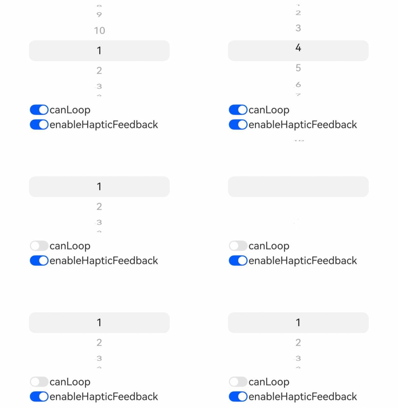
[h2]Example 1: Switching Loop Scrolling and Enabling/Disabling Haptic Feedback
Since API version 22, this example demonstrates how to switch the loop scrolling of the UIPickerComponent container and how to enable or disable haptic feedback via button clicks.
// xxx.ets
@Entry
@Component
struct UIPickerComponentAttrsExample {
  private dataArray: string[] = [];
  @State loop: boolean = true;
  @State hapticFeedback: boolean = true;

  aboutToAppear(): void {
    // Construct the option data.
    for (let i = 1; i <= 10; i++) {
      this.dataArray.push(i.toString())
    }
  }

  build() {
    Column() {
      Row() {
        UIPickerComponent() {
          ForEach(this.dataArray, (item: string) => {
            Text(item)
          })
        }
        // Configure the loop scrolling of the option list.
        .canLoop(this.loop)
        // Configure the haptic feedback.
        .enableHapticFeedback(this.hapticFeedback)
        .width('70%')
      }

      Column() {
        Row() {
          Toggle({ type: ToggleType.Switch, isOn: true })
            .onChange((isOn: boolean) => {
              this.loop = isOn;
            })
          Text('canLoop').fontSize(20)
        }
        .width('70%')

        Row() {
          Toggle({ type: ToggleType.Switch, isOn: true })
            .onChange((isOn: boolean) => {
              this.hapticFeedback = isOn;
            })
          Text('enableHapticFeedback').fontSize(20)
        }
        .width('70%')
      }

    }
    .width('100%')
  }
} 
[h2]Example 2: Setting Event Callbacks
Since API version 22, this example implements the onChange and onScrollStop event callbacks of the UIPickerComponent container based on status selection.
// xxx.ets
@Entry
@Component
struct UIPickerComponentEventsExample {
  // Construct the status option data.
  private dataArray: string[] = ['To do', 'In progress', 'Completed'];
  @State onChangeDesc: string = '';
  @State onScrollStopDesc: string = '';
  @State index: number = 0;

  build() {
    Column() {
      Row() {
        UIPickerComponent({
          selectedIndex: this.index
        }) {
          ForEach(this.dataArray, (item: string) => {
            Text(item)
          })
        }
        // Configure the onChange event callback.
        .onChange((selectedIndex: number) => {
          this.index = selectedIndex;
          this.onChangeDesc = 'on change: ' + selectedIndex;
        })
        // Configure the onScrollStop event callback.
        .onScrollStop((selectedIndex: number) => {
          this.onScrollStopDesc = 'on scroll stop: ' + selectedIndex;
        })
        .width('70%')
      }

      Column() {
        Text(this.onChangeDesc)
        Text(this.onScrollStopDesc)
      }

    }
    .width('100%')
  }
}
[h2]Example 3: Setting the Selected Item Index
Since API version 22, this example implements setting the selected item index of the UIPickerComponent container.
// xxx.ets
@Entry
@Component
struct UIPickerComponentSelectedIndexExample {
  private dataArray: string[] = [];
  @State selectedIndex: number = 0;

  aboutToAppear(): void {
    // Construct the option data.
    for (let i = 1; i <= 10; i++) {
      this.dataArray.push(i.toString())
    }
  }

  build() {
    Column() {
      Row() {
        UIPickerComponent({
          // Configure the selected item index.
          selectedIndex: this.selectedIndex
        }) {
          ForEach(this.dataArray, (item: string) => {
            Text(item)
          })
        }
        .onChange((selectedIndex: number) => {
          this.selectedIndex = selectedIndex;
        })
        .onScrollStop((selectedIndex: number) => {
          this.selectedIndex = selectedIndex;
        })
        .width('70%')
      }

      Column() {
        Text('selectedIndex: ' + this.selectedIndex)
      }

    }
    .width('100%')
  }
} 
[h2]Example 4: Setting the Selected Item Indicator
Since API version 22, this example implements setting the selected item indicator of the UIPickerComponent container. Specifically, when a background indicator is used, set backgroundColor and borderRadius of PickerIndicatorStyle; when a divider indicator is used, set strokeWidth, dividerColor, startMargin, and endMargin of PickerIndicatorStyle.
// xxx.ets
import { LengthMetrics } from '@kit.ArkUI';

@Entry
@Component
struct UIPickerComponentIndicatorExample {
  private dataArray: string[] = [];
  @State indicatorType: Optional<PickerIndicatorType> = undefined;
  @State bgColor: Color | undefined = undefined;
  @State dividerColor: Color | undefined = undefined;
  @State strokeWidth: LengthMetrics = LengthMetrics.px(2);
  @State startMargin: LengthMetrics = LengthMetrics.px(2);
  @State endMargin: LengthMetrics = LengthMetrics.px(2);
  @State selectIndicator: PickerIndicatorStyle | undefined = undefined;
  @State bgBorderRadius: LengthMetrics | BorderRadiuses | LocalizedBorderRadiuses | undefined = undefined
  bgBorderRadiuses1: LengthMetrics = LengthMetrics.vp(10)
  bgBorderRadiuses2: BorderRadiuses = {
    topLeft: 10,
    bottomLeft: 0,
    topRight: 10,
    bottomRight: 0,
  }
  bgBorderRadiuses3: LocalizedBorderRadiuses = {
    topStart: LengthMetrics.vp(0),
    bottomStart: LengthMetrics.vp(10),
    topEnd: LengthMetrics.vp(0),
    bottomEnd: LengthMetrics.vp(10)
  }
  private controller: TabsController = new TabsController();
  @State curTabIndex: number = 0;

  @Builder
  dividerBuilder() {
    Column() {
      Row() {
        Text('Divider Stroke Width')
      }.margin(2)

      Row() {
        Button('0')
          .onClick(() => {
            this.strokeWidth = LengthMetrics.px(0)
          })
          .fontSize(12)
          .height(30)
          .width(100)
          .margin(2)
        Button('10px')
          .onClick(() => {
            this.strokeWidth = LengthMetrics.px(10)
          })
          .fontSize(12)
          .height(30)
          .width(100)
          .margin(2)
        Button('10vp')
          .onClick(() => {
            this.strokeWidth = LengthMetrics.vp(10)
          })
          .fontSize(12)
          .height(30)
          .width(100)
          .margin(2)
      }

      Row() {
        Text('Start Margin')
      }.margin(2)

      Row() {
        Button('0')
          .onClick(() => {
            this.startMargin = LengthMetrics.px(0)
          })
          .fontSize(12)
          .height(30)
          .width(100)
          .margin(2)
        Button('10px')
          .onClick(() => {
            this.startMargin = LengthMetrics.px(10)
          })
          .fontSize(12)
          .height(30)
          .width(100)
          .margin(2)
        Button('10vp')
          .onClick(() => {
            this.startMargin = LengthMetrics.vp(10)
          })
          .fontSize(12)
          .height(30)
          .width(100)
          .margin(2)
      }

      Row() {
        Text('End Margin')
      }.margin(2)

      Row() {
        Button('0')
          .onClick(() => {
            this.endMargin = LengthMetrics.px(0)
          })
          .fontSize(12)
          .height(30)
          .width(100)
          .margin(2)
        Button('10px')
          .onClick(() => {
            this.endMargin = LengthMetrics.px(10)
          })
          .fontSize(12)
          .height(30)
          .width(100)
          .margin(2)
        Button('10vp')
          .onClick(() => {
            this.endMargin = LengthMetrics.vp(10)
          })
          .fontSize(12)
          .height(30)
          .width(100)
          .margin(2)
      }

      Row() {
        Text('Divider Color')
      }

      Row() {
        Button('Blue')
          .onClick(() => {
            this.dividerColor = Color.Blue
          })
          .fontSize(12)
          .height(30)
          .width(73)
          .margin(2)
        Button('Black')
          .onClick(() => {
            this.dividerColor = Color.Black
          })
          .fontSize(12)
          .height(30)
          .width(73)
          .margin(2)
      }

      Row() {
        Button('Ignore Custom Settings')
          .onClick(() => {
            this.dividerColor = undefined
          })
          .fontSize(12)
          .height(30)
          .width(150)
          .margin(2)
      }
    }
  }

  @Builder
  backgroundBuilder() {
    Column() {
      Row() {
        Text('Corner Radius Settings')
      }.margin(2)

      Column() {
        Button('Use LengthMetrics to Implement Unified Corner Radius')
          .onClick(() => {
            this.bgBorderRadius = this.bgBorderRadiuses1
          })
          .fontSize(12)
          .height(30)
          .width(300)
          .margin(2)
        Button('Use BorderRadiuses to Achieve Top Rounded, Bottom Square')
          .onClick(() => {
            this.bgBorderRadius = this.bgBorderRadiuses2
          })
          .fontSize(12)
          .height(30)
          .width(300)
          .margin(2)
        Button('Use LocalizedBorderRadiuses to Achieve Top Square, Bottom Rounded')
          .onClick(() => {
            this.bgBorderRadius = this.bgBorderRadiuses3
          })
          .fontSize(12)
          .height(30)
          .width(300)
          .margin(2)
      }.margin(2)

      Row() {
        Text('Background Color Settings')
      }.margin(2)

      Row() {
        Button('Blue')
          .onClick(() => {
            this.bgColor = Color.Blue
          })
          .fontSize(12)
          .height(30)
          .width(73)
          .margin(2)
        Button('Green')
          .onClick(() => {
            this.bgColor = Color.Green
          })
          .fontSize(12)
          .height(30)
          .width(73)
          .margin(2)
      }

      Row() {
        Button('Ignore Custom Settings')
          .onClick(() => {
            this.bgColor = undefined
          })
          .fontSize(12)
          .height(30)
          .width(150)
          .margin(2)
      }
    }
  }

  aboutToAppear(): void {
    // Construct the option data.
    for (let i = 1; i <= 10; i++) {
      this.dataArray.push(i.toString())
    }
  }

  build() {
    Column() {
      Row() {
        UIPickerComponent() {
          ForEach(this.dataArray, (item: string) => {
            Text(item)
          })
        }
        // Configure the selected item indicator.
        .selectionIndicator({
          type: this.indicatorType,
          strokeWidth: this.strokeWidth,
          dividerColor: this.dividerColor,
          startMargin: this.startMargin,
          endMargin: this.endMargin,
          backgroundColor: this.bgColor,
          borderRadius: this.bgBorderRadius
        })
        .width('70%')
      }
      Tabs({ barPosition: BarPosition.Start, index: this.curTabIndex, controller: this.controller }) {
        TabContent() {
          this.backgroundBuilder()
        }.tabBar('Background Indicator')

        TabContent() {
          this.dividerBuilder()
        }.tabBar('Divider Indicator')
      }
      .vertical(false)
      .barMode(BarMode.Fixed)
      .barWidth(360)
      .barHeight(56)
      .animationDuration(400)
      .onChange((index: number) => {
        this.curTabIndex = index
        if (this.curTabIndex == 1) {
          this.indicatorType = PickerIndicatorType.DIVIDER
        } else {
          this.indicatorType = PickerIndicatorType.BACKGROUND
        }
      })
      .height(LayoutPolicy.wrapContent)
      .divider({ strokeWidth: 2 })
      .margin({ top: 20 })
      .backgroundColor('#F1F3F5')
    }
    .width('100%')
  }
} 
[h2]Example 5: Customizing the Month Picker
Since API version 22, this example uses the UIPickerComponent container with nested text child components to implement a month picker.
// xxx.ets
@Entry
@Component
struct MonthUIPickerComponentExample {
  private fontSize: number | string | Resource = '20vp';
  private monthArray: string[] = [];

  aboutToAppear(): void {
    // Construct the option data.
    for (let i = 1; i <= 12; i++) {
      this.monthArray.push(i + 'month')
    }
  }

  build() {
    Column() {
      UIPickerComponent() {
        ForEach(this.monthArray, (item: string) => {
          Text(item)
            .fontSize(this.fontSize)
            .textAlign(TextAlign.Center)
            .fontColor(Color.Black)
        })
      }
      .width('70%')
      // Configure the option list looping.
      .canLoop(true)
      // Disable haptic feedback.
      .enableHapticFeedback(false)
      // Configure the selected item indicator as a divider.
      .selectionIndicator({ type: PickerIndicatorType.DIVIDER })
      // Subscribe to the selected item change event.
      .onChange((idx: number) => {
        console.info('UIPickerComponent item changed: ' + this.monthArray[idx]);
      })
      // Subscribe to the scroll stop event.
      .onScrollStop((idx: number) => {
        console.info('UIPickerComponent scroll stopped: ' + this.monthArray[idx]);
      })
    }
    .width('100%')
  }
} 
[h2]Example 6: Customizing the Area Picker
Since API version 22, this example uses a multi-column UIPickerComponent container combination to implement an area selector.
// xxx.ets

type RegionDict = Record<string, Record<string, Array<string>>>;
// Define the region dictionary.
let regionData: RegionDict = {
  'Liaoning': {
    'Shenyang': ['Shenhe District', 'Heping District', 'Hunnan District'],
    'Dalian': ['Zhongshan District', 'Jinzhou District', 'Changhai County']
  },
  'Jilin': {
    'Changchun': ['Nanguan District', 'Kuancheng District', 'Chaoyang District'],
    'Siping': ['Tiexi District', 'Tiedong District', 'Lishu County']
  },
  'Heilongjiang': {
    'Harbin': ['Daoli District', 'Daowai District', 'Nangang District'],
    'Daqing': ['Honggang District', Longfeng District', Datong District']
  },
};

@Entry
@Component
struct RegionUIPickerComponentExample {
  @State provinceIndex: number = 0;
  @State cityIndex: number = 0;
  @State countyIndex: number = 0;
  @State provinces: Array<string> = [];
  @State cities: Array<string> = [];
  @State counties: Array<string> = [];

  aboutToAppear(): void {
    this.provinces = Object.keys(regionData);
    this.flushCityColumn()
  }

  flushCityColumn() {
    let currentProvince = this.provinces[this.provinceIndex]
    this.cities = Object.keys(regionData[currentProvince]);
    this.cityIndex = 0;
    this.flushCountyColumn()
  }

  flushCountyColumn() {
    let currentProvince = this.provinces[this.provinceIndex]
    let currentCity = this.cities[this.cityIndex]
    this.counties = regionData[currentProvince][currentCity];
    this.countyIndex = 0;
  }

  build() {
    Column() {
      Row() {
        // Province
        UIPickerComponent({
          selectedIndex: this.provinceIndex
        }) {
          ForEach(this.provinces, (province: string) => {
            Text(province)
          })
        }
        .onChange((selectedIndex: number) => {
          this.provinceIndex = selectedIndex;
          this.flushCityColumn()

        })
        .onScrollStop((selectedIndex: number) => {
          this.provinceIndex = selectedIndex;
        })
        .selectionIndicator({ type: PickerIndicatorType.DIVIDER })
        .width('25%')

        // City
        UIPickerComponent({
          selectedIndex: this.cityIndex
        }) {
          ForEach(this.cities, (city: string) => {
            Text(city)
          })
        }
        .onChange((selectedIndex: number) => {
          this.cityIndex = selectedIndex;
          this.flushCountyColumn()
        })
        .onScrollStop((selectedIndex: number) => {
          this.cityIndex = selectedIndex;
        })
        .selectionIndicator({ type: PickerIndicatorType.DIVIDER })
        .width('25%')

        // County
        UIPickerComponent({
          selectedIndex: this.countyIndex
        }) {
          ForEach(this.counties, (county: string) => {
            Text(county)
          })
        }
        .onChange((selectedIndex: number) => {
          this.countyIndex = selectedIndex;
        })
        .onScrollStop((selectedIndex: number) => {
          this.countyIndex = selectedIndex;
        })
        .selectionIndicator({ type: PickerIndicatorType.DIVIDER })
        .width('25%')
      }
    }
    .width('100%')
  }
} 
[h2]Example 7: Customizing Option Types
Since API version 22, this example uses the UIPickerComponent container to implement pickers with different option types, including a text picker, an image picker, and a combined image-text picker.
// xxx.ets
@Entry
@Component
struct UIPickerComponentExample {
  @State textList: string[] =
    ['text1', 'text2', 'text3', 'text4', 'text5', 'text6', 'text7', 'text8'];
  // Replace the following $r('sys.media.*') resource files with the image resource files you use.
  @State imageList: Resource[] =
    [$r('sys.media.ohos_ic_normal_white_grid_audio'), $r('sys.media.ohos_ic_normal_white_grid_calendar'),
      $r('sys.media.ohos_ic_normal_white_grid_compress'), $r('sys.media.ohos_ic_normal_white_grid_doc'),
      $r('sys.media.ohos_ic_normal_white_grid_flac'), $r('sys.media.ohos_ic_normal_white_grid_folder'),
      $r('sys.media.ohos_ic_normal_white_grid_html'), $r('sys.media.ohos_ic_normal_white_grid_image')];
  // Replace the following $r('sys.symbol.*') resource files with the image resource files you use.
  @State symbolList: Resource[] =
    [$r('sys.symbol.calendar_01'), $r('sys.symbol.calendar_02'), $r('sys.symbol.calendar_03'),
      $r('sys.symbol.calendar_04'), $r('sys.symbol.calendar_05'), $r('sys.symbol.calendar_06'),
      $r('sys.symbol.calendar_07'), $r('sys.symbol.calendar_08')];
  private controller: TabsController = new TabsController();
  @State curTabIndex: number = 0;

  @Builder
  ImagePicker() {
    Column() {
      UIPickerComponent() {
        ForEach(this.imageList, (item: Resource) => {
          Image(item)
        })
      }
      .margin(20)
      .width(200)
    }
  }

  @Builder
  TextPicker() {
    Column() {
      UIPickerComponent() {
        ForEach(this.textList, (item: string) => {
          Text(item)
        })
      }
      .margin(20)
      .width(200)
    }
  }

  @Builder
  HybridPicker() {
    Column() {
      UIPickerComponent() {
        ForEach(this.symbolList, (item: Resource, index: number) => {
          Row() {
            SymbolGlyph(item)
              .height('20vp')
            Text(this.textList[index])
          }
        })
      }
      .margin(20)
      .width(200)
    }
  }

  build() {
    Column() {
      Tabs({ barPosition: BarPosition.Start, index: this.curTabIndex, controller: this.controller }) {
        TabContent() {
          this.TextPicker()
        }.tabBar('Text Picker')

        TabContent() {
          this.ImagePicker()
        }.tabBar('Image Picker')

        TabContent() {
          this.HybridPicker()
        }.tabBar('Text-Image Picker')
      }
      .vertical(true)
      .divider({ strokeWidth: 1 })
      .barMode(BarMode.Fixed)
      .barWidth(140)
      .barHeight(230)
      .height(230)
      .animationDuration(400)
    }
  }
} 
[h2]Example 8: Customizing the Time Picker
Since API version 22, this example implements a time picker with the following features: setting whether to loop scrolling, whether to display seconds, whether to use the 24-hour format, and whether to display leading zeros. It can also display content in the language corresponding to the current system language and adjust the display order of each column based on language habits.

- In this example, the content of each column of the time picker is displayed in the language corresponding to the system language. For example, an English system displays AM/PM, while a Chinese system displays morning/afternoon.
- In this example, the display order of each column of the time picker is adjusted according to the system language. For example, an English system displays hour/minute/second/AMPM, while a Chinese system displays morning/afternoon/hour/minute/second.
To make "morning/afternoon" switch with the system language, you need to add the corresponding language translations in the resource directory of the project. For example:
-
Chinese (default): Create a base directory under the resource directory, create an element directory under the base directory, and add a string.json file under the element directory (if the file already exists, append the following "name"-"value" key-value pairs to the file instead of overwriting the original file). The file content is as follows:
{ "string": [ { "name": "app_name", "value": "timePicker" }, { "name": "am", "value": "AM" }, { "name": "pm", "value": "PM" } ] } -
English: Create the en directory under the resource directory, create the element directory under the en directory, and add the string.json file under the element directory (if the file already exists, append the following "name"-"value" key-value pairs to the file instead of overwriting the original file). The file content is as follows:
{ "string": [ { "name": "app_name", "value": "timePicker" }, { "name": "am", "value": "AM" }, { "name": "pm", "value": "PM" } ] } -
Arabic: Create the ar directory under the resource directory, create the element directory under the ar directory, and add the string.json file under the element directory (if the file already exists, append the following "name"-"value" key-value pairs to the file instead of overwriting the original file). The file content is as follows:
{ "string": [ { "name": "app_name", "value": "timePicker" }, { "name": "am", "value": "ص" }, { "name": "pm", "value": "م" } ] } -
The same applies to other languages.
The sample code is as follows:
// xxx.ets
import { LengthMetrics } from '@kit.ArkUI';
import { i18n, intl } from '@kit.LocalizationKit';
import { commonEventManager } from '@kit.BasicServicesKit';

@Entry
@Component
struct TimeUIPickerComponentExample {
  @State showSecond: boolean = false;
  @State useMilitary: boolean = false;
  @State zeroPrefix: boolean = true;
  @State loop: boolean = true;
  @State amPmAtLast: boolean = false
  @State isRtl: boolean = false;

  startBorderStyle: LocalizedBorderRadiuses = {
    topStart: LengthMetrics.px(40),
    bottomStart: LengthMetrics.px(40),
    topEnd: LengthMetrics.px(0),
    bottomEnd: LengthMetrics.px(0)
  }
  centerBorderStyle: LengthMetrics = LengthMetrics.px(0)
  endBorderStyle: LocalizedBorderRadiuses = {
    topStart: LengthMetrics.px(0),
    bottomStart: LengthMetrics.px(0),
    topEnd: LengthMetrics.px(40),
    bottomEnd: LengthMetrics.px(40)
  }
  @State amPmBorder: LengthMetrics | LocalizedBorderRadiuses = this.startBorderStyle;
  @State hourBorder: LengthMetrics | LocalizedBorderRadiuses = this.startBorderStyle;
  @State minBorder: LengthMetrics | LocalizedBorderRadiuses = this.endBorderStyle;
  @State secBorder: LengthMetrics | LocalizedBorderRadiuses = this.endBorderStyle;

  @State amPmIndex: number = 0;
  @State hourIndex: number = 0;
  @State minIndex: number = 0;
  @State secIndex: number = 0;

  @State amPmArr: Array<string| undefined> = []
  @State hourArr: Array<string> = []
  @State minSecArr: Array<string> = []

  @State currentTime: string = '';

  sysLanguageChanged: boolean = false
  zero: string = '0'
  systemLanguage: string = i18n.System.getSystemLanguage();
  // Create a NumberFormat object using the current locale ID of the system.
  formatter: intl.NumberFormat = new intl.NumberFormat();
  private subscriber: commonEventManager.CommonEventSubscriber | undefined = undefined;

  aboutToAppear(): void {
    this.zero = this.formatter.format(0)
    this.flushAmPmColumn()
    this.flushHourColumn()
    this.flushMinSecColumn()
    this.flushCurrentTime()
    this.flushBorderStyle()
    let subscribeInfo: commonEventManager.CommonEventSubscribeInfo = {
      events: [commonEventManager.Support.COMMON_EVENT_LOCALE_CHANGED]
    };
    // Create a subscriber to listen for system language changes.
    commonEventManager.createSubscriber(subscribeInfo)
      .then((commonEventSubscriber: commonEventManager.CommonEventSubscriber) => {
        console.info("CreateSubscriber");
        this.subscriber = commonEventSubscriber;
        commonEventManager.subscribe(this.subscriber, (err, data) => {
          if (err) {
            console.error(`Failed to subscribe common event. error code: ${err.code}, message: ${err.message}.`);
            return;
          }
          this.formatter = new intl.NumberFormat();
          this.zero = this.formatter.format(0);
          this.sysLanguageChanged = true;
          this.systemLanguage = i18n.System.getSystemLanguage();
          this.flushAmPmColumn()
          this.flushHourColumn()
          this.flushMinSecColumn()
          this.flushCurrentTime()
          this.flushBorderStyle()
        })
      })
      .catch((err: BusinessError) => {
        console.error(`CreateSubscriber failed, code is ${err.code}, message is ${err.message}`);
      });
  }

  // Refresh the UI state after the system language changes.
  aboutToDisappear(): void {
    if (this.subscriber) {
      commonEventManager.unsubscribe(this.subscriber, (err) => {
        if (err) {
          console.error(`Failed to unsubscribe common event. error code: ${err.code}, message: ${err.message}.`);
        }
      });
    }
  }

  onPageShow(): void {
    if (this.sysLanguageChanged) {
      this.flushAmPmColumn()
      this.flushCurrentTime()
      this.flushBorderStyle()
      this.sysLanguageChanged = false
    }
  }

  buildColumnOptions(start: number, end: number, isHour: boolean = false) : string[] {
    let newOptions: string[] = []
    for (let i = start; i <= end; i++) {
      if (isHour && i == 0 && !this.useMilitary) {
        newOptions.push(this.formatter.format(12))
        continue
      }
      if (this.zeroPrefix) {
        newOptions.push(this.formatTime(i))
      } else {
        newOptions.push(this.formatter.format(i))
      }
    }
    return newOptions
  }

  flushAmPmColumn() {
    // Set whether the amPm column is placed last based on language habits.
    if (this.systemLanguage.startsWith('en') || this.systemLanguage == 'ug') {
      this.amPmAtLast = true
    } else {
      this.amPmAtLast = false
    }
    this.amPmArr = [];
    this.amPmArr[0] = this.getUIContext().getHostContext()?.resourceManager.getStringSync($r('app.string.am').id)
    this.amPmArr[1] = this.getUIContext().getHostContext()?.resourceManager.getStringSync($r('app.string.pm').id)
  }

  flushHourColumn() {
    if (this.useMilitary) {
      this.hourArr = this.buildColumnOptions(0, 23)
    } else {
      this.hourArr = this.buildColumnOptions(0, 11, true)
    }
  }

  flushMinSecColumn() {
    this.minSecArr = this.buildColumnOptions(0, 59)
  }

  flushBorderStyle() {
    let realStartBorder = this.startBorderStyle
    let realEndBorder = this.endBorderStyle
    // Set the time order of the RTL language based on language habits.
    if (this.systemLanguage == 'ar' || this.systemLanguage == 'ug') {
      this.isRtl = true
      realStartBorder = this.endBorderStyle
      realEndBorder = this.startBorderStyle
    } else {
      this.isRtl = false
    }
    if (!this.useMilitary) {
      if (this.amPmAtLast) {
        this.amPmBorder = realEndBorder
        this.hourBorder = realStartBorder
        this.minBorder = this.centerBorderStyle
        this.secBorder = this.centerBorderStyle
      } else {
        this.amPmBorder = realStartBorder
        this.hourBorder = this.centerBorderStyle
        if (this.showSecond) {
          this.minBorder = this.centerBorderStyle
        } else {
          this.minBorder = realEndBorder
        }
        this.secBorder = realEndBorder
      }
    } else {
      this.hourBorder = realStartBorder
      if (this.showSecond) {
        this.minBorder = this.centerBorderStyle
      } else {
        this.minBorder = realEndBorder
      }
      this.secBorder = realEndBorder
    }
  }

  formatTime(time: number): string {
    if (time < 10) {
      return this.zero + this.formatter.format(time)
    }
    return this.formatter.format(time)
  }

  @Builder
  buildAmPmColumn() {
    UIPickerComponent({ selectedIndex: this.amPmIndex }) {
      ForEach(this.amPmArr, (amPm: string | undefined) => {
        Text(amPm ?? '')
      })
    }
    .width('200px')
    .canLoop(this.loop)
    .selectionIndicator({
      type: PickerIndicatorType.BACKGROUND,
      borderRadius: this.amPmBorder
    })
    .onChange((selectedIndex: number) => {
      this.amPmIndex = selectedIndex
      this.flushCurrentTime()
    })
    .onScrollStop((selectedIndex: number) => {
      this.amPmIndex = selectedIndex
      this.flushCurrentTime()
    })
  }

  @Builder
  buildHourColumn() {
    UIPickerComponent({ selectedIndex: this.hourIndex }) {
      ForEach(this.hourArr, (hour: string) => {
        Text(hour)
      })
    }
    .width('200px')
    .canLoop(this.loop)
    .selectionIndicator({
      type: PickerIndicatorType.BACKGROUND,
      borderRadius: this.hourBorder
    })
    .onChange((selectedIndex: number) => {
      this.hourIndex = selectedIndex
      this.flushCurrentTime()
    })
    .onScrollStop((selectedIndex: number) => {
      this.hourIndex = selectedIndex
      this.flushCurrentTime()
    })
  }

  @Builder
  buildMinColumn() {
    UIPickerComponent({ selectedIndex: this.minIndex }) {
      ForEach(this.minSecArr, (min: string) => {
        Text(min)
      })
    }
    .width('200px')
    .canLoop(this.loop)
    .selectionIndicator({
      type: PickerIndicatorType.BACKGROUND,
      borderRadius: this.minBorder
    })
    .onChange((selectedIndex: number) => {
      this.minIndex = selectedIndex
      this.flushCurrentTime()
    })
    .onScrollStop((selectedIndex: number) => {
      this.minIndex = selectedIndex
      this.flushCurrentTime()
    })
  }

  @Builder
  buildSecColumn() {
    UIPickerComponent({ selectedIndex: this.secIndex }) {
      ForEach(this.minSecArr, (sec: string) => {
        Text(sec)
      })
    }
    .width('200px')
    .canLoop(this.loop)
    .selectionIndicator({
      type: PickerIndicatorType.BACKGROUND,
      borderRadius: this.secBorder
    })
    .onChange((selectedIndex: number) => {
      this.secIndex = selectedIndex
      this.flushCurrentTime()
    })
    .onScrollStop((selectedIndex: number) => {
      this.secIndex = selectedIndex
      this.flushCurrentTime()
    })
  }

  flushCurrentTime() {
    this.currentTime = ''
    if (!this.useMilitary) {
      this.currentTime += this.amPmArr[this.amPmIndex] + ' ';
    }
    this.currentTime += this.hourArr[this.hourIndex] + ':' + this.minSecArr[this.minIndex];
    if (this.showSecond) {
      this.currentTime += ':' + this.minSecArr[this.secIndex];
    }
  }

  build() {
    Column() {
      Row() {
        // Create columns based on the display order of the RTL language.
        if (!this.isRtl) {
          if (!this.useMilitary && !this.amPmAtLast) {
            this.buildAmPmColumn()
            this.buildHourColumn()
          } else {
            this.buildHourColumn()
          }
          this.buildMinColumn()
          if (this.showSecond) {
            this.buildSecColumn()
          }
          if (!this.useMilitary && this.amPmAtLast) {
            this.buildAmPmColumn()
          }
        } else {
          if (!this.useMilitary && this.amPmAtLast) {
            this.buildAmPmColumn()
          }
          if (this.showSecond) {
            this.buildSecColumn()
          }
          this.buildMinColumn()
          if (!this.useMilitary && !this.amPmAtLast) {
            this.buildHourColumn()
            this.buildAmPmColumn()
          } else {
            this.buildHourColumn()
          }
        }
      }

      Row() {
        Text('selected time: ' + this.currentTime)
          .margin(5)
          .width("80%")
          .textAlign(TextAlign.Center)
      }
      .border({ width: 1 })
      .margin(5)

      Column() {
        Row() {
          Toggle({ type: ToggleType.Switch, isOn: true })
            .onChange((isOn: boolean) => {
              this.loop = isOn;
            })
          Text('loop').fontSize(20)
        }.width(200).margin(5)
        Row() {
          Toggle({ type: ToggleType.Switch, isOn: false })
            .onChange((isOn: boolean) => {
              this.showSecond = isOn
              this.flushCurrentTime()
              this.flushBorderStyle()
            })
          Text('show second').fontSize(20)
        }.width(200).margin(5)
        Row() {
          Toggle({ type: ToggleType.Switch, isOn: false })
            .onChange((isOn: boolean) => {
              this.useMilitary = isOn
              if (this.useMilitary) {
                if (this.amPmIndex) {
                  this.hourIndex += 12;
                }
              } else {
                if (this.hourIndex >= 12) {
                  this.amPmIndex = 1;
                  this.hourIndex -= 12;
                } else {
                  this.amPmIndex = 0;
                }
              }
              this.flushBorderStyle()
              this.flushHourColumn()
              this.flushCurrentTime()
            })
          Text('use military').fontSize(20)
        }.width(200).margin(5)
        Row() {
          Toggle({ type: ToggleType.Switch, isOn: true })
            .onChange((isOn: boolean) => {
              this.zeroPrefix = isOn
              this.flushHourColumn()
              this.flushMinSecColumn()
              this.flushCurrentTime()
            })
          Text('2-digits').fontSize(20)
        }.width(200).margin(5)
      }
    }
    .width('100%')
  }
} 
[h2]Example 9: Setting the Item Height
This example uses itemHeight to set the item height of the UIPickerComponent container.
Since API version 26.0.0, the itemHeight attribute is added.
// xxx.ets
import { LengthMetrics } from '@kit.ArkUI';

@Entry
@Component
struct UIPickerComponentItemHeightExample {
  private dataArray: string[] = [];
  @State pickerItemHeight: LengthMetrics | undefined = undefined;
  @State selectedIndex: number = 0;

  aboutToAppear(): void {
    for (let i = 1; i <= 10; i++) {
      this.dataArray.push('Item' + i)
    }
  }

  build() {
    Column({ space: 12 }) {
      Text('Current itemHeight:' + (this.pickerItemHeight ? this.pickerItemHeight.value + 'vp' : 'Default value (40vp)'))
        .fontSize(16)

      UIPickerComponent({
        selectedIndex: this.selectedIndex
      }) {
        ForEach(this.dataArray, (item: string) => {
          Text(item)
        })
      }
      .width('70%')
      .itemHeight(this.pickerItemHeight)
      .onChange((selectedIndex: number) => {
        this.selectedIndex = selectedIndex
      })

      Row({ space: 12 }) {
        Button('40vp')
          .onClick(() => {
            this.pickerItemHeight = LengthMetrics.vp(40)
          })
        Button('50vp')
          .onClick(() => {
            this.pickerItemHeight = LengthMetrics.vp(50)
          })
        Button('64vp')
          .onClick(() => {
            this.pickerItemHeight = LengthMetrics.vp(64)
          })
      }
    }
    .width('100%')
    .padding(16)
  }
}
[h2]Example 10: Setting the Number of Visible Items
This example uses displayedItemCount to set the number of visible items in the UIPickerComponent container.
Since API version 26.0.0, the displayedItemCount attribute is added.
// xxx.ets
@Entry
@Component
struct UIPickerComponentDisplayedCountExample {
  private dataArray: string[] = [];
  @State visibleCount: number = 7;
  @State selectedIndex: number = 0;

  aboutToAppear(): void {
    for (let i = 1; i <= 12; i++) {
      this.dataArray.push('Item' + i)
    }
  }

  build() {
    Column({ space: 12 }) {
      Text('displayedItemCount: ' + this.visibleCount)
        .fontSize(16)

      UIPickerComponent({
        selectedIndex: this.selectedIndex
      }) {
        ForEach(this.dataArray, (item: string) => {
          Text(item)
        })
      }
      .onChange((selectedIndex: number) => {
        this.selectedIndex = selectedIndex
      })
      .width('70%')
      .displayedItemCount(this.visibleCount)

      Row({ space: 12 }) {
        Button('Item 3')
          .width(120)
          .height(40)
          .onClick(() => {
            this.visibleCount = 3
          })
        Button('Item 5')
          .width(120)
          .height(40)
          .onClick(() => {
            this.visibleCount = 5
          })
        Button('Item 8 (auto changes to 9)')
          .width(120)
          .height(40)
          .onClick(() => {
            this.visibleCount = 8
          })
      }
    }
    .width('100%')
    .padding(16)
  }
}