Overview
As common mobile devices, tablets play an important role in daily life and are also indispensable to the all-scenario experience of HarmonyOS 1+8 devices.
Compared with a bar-type phone, a tablet has the following features:
- Tablets feature high-resolution large screens that can display more content, enhancing learning, entertainment, and work experiences.
- Tablets can be held in either portrait or landscape mode.
- Tablets support full-screen, split-screen, freeform window, and floating window modes.
- Tablets can connect to keyboard and mouse via wireless methods (such as Bluetooth).
Currently, the tablet products mainly include the MatePad Edge series, MatePad Pro series, MatePad Mini series, MatePad Air series, MatePad series, and MatePad SE series.


This document provides the development guidelines for improving user experience of tablet apps. For general guidance on the fundamental capabilities for developing apps across multiple device types, see One-Time Development for Multi-Device Deployment.
Product Hardware Description
This section describes the screen orientation, screen size, and camera hardware parameters of tablets.
[h2]Screen Specification Information
The following uses MatePad Pro 13.2-inch as an example to describe the effect, resolution, and horizontal and vertical breakpoints. For details, see the following table.
Screen Rotation Angle | 0 (0°) | 1 (90°) | 2 (180°) | 3 (270°) |
|---|---|---|---|---|
Final effect |
|
|
|
|
Landscape (LANDSCAPE) | Portrait (PORTRAIT) | Inverted landscape (LANDSCAPE_INVERTED) | Inverted portrait (PORTRAIT_INVERTED) | |
Display ID | 0 | 0 | 0 | 0 |


MatePad Pro 13.2-inch 2025, MatePad Pro 12.2-inch 2025, MatePad Air 12-inch 2025, and MatePad 11.5 S 2025 comply with the screen rotation angle and screen orientation in the preceding table. MatePad Mini is different from the four tablets. For details, see the following table.
The following uses MatePad Mini as an example to describe the effect, resolution, and horizontal and vertical breakpoints. For details, see the following table.
Screen Rotation Angle | 0 (0°) | 1 (90°) | 2 (180°) | 3 (270°) |
|---|---|---|---|---|
Final effect |
|
|
|
|
Portrait (PORTRAIT) | Inverted landscape (LANDSCAPE_INVERTED) | Inverted portrait (PORTRAIT_INVERTED) | Landscape (LANDSCAPE) | |
Display ID | 0 | 0 | 0 | 0 |


The following table lists the common resolutions (px), resolutions (vp), and breakpoints of tablets.
Tablet Model | Resolution (px) | Resolution (vp, Rounded Down) | Horizontal Breakpoints + Vertical Breakpoints |
|---|---|---|---|
MatePad Pro 13.2-inch 2025 | 2880*1920 | 1440*960 | Landscape/inverted landscape: xl/sm; portrait/inverted portrait: lg/lg. |
MatePad Pro 12.2-inch 2025 | 2800*1840 | 1317*865 | Landscape/inverted landscape: lg/sm; portrait/inverted portrait: lg/lg. |
MatePad Air 12-inch 2025 | 2800*1840 | 1244*817 | Landscape/inverted landscape: lg/sm; portrait/inverted portrait: md/lg. |
MatePad 11.5 S 2025 | 2800*1840 | 1120*736 | Landscape/inverted landscape: lg/sm; portrait/inverted portrait: md/lg. |
MatePad Mini | 2560 *1600 | 1077*673 | Landscape/inverted landscape: lg/sm; portrait/inverted portrait: md/lg. |
[h2]Camera Hardware Information
The tablet camera has a default camera lens installation angle. When using the camera, you need to consider the lens angle and device rotation angle. For details, see Preview Rotation Angle. The following table lists the angles of the front and rear tablet cameras and the rotation angles of the preview stream to be set.
Screen Rotation Angle | 0 (0°) | 1 (90°) | 2 (180°) | 3 (270°) |
|---|---|---|---|---|
Diagram |
|
|
|
|
Rear Camera Lens Angle | 90° | 90° | 90° | 90° |
Rotation Angle of the Preview Stream of the Rear Camera | 90° | 180° | 270° | 0° |
Front Camera Lens Angle | 270° | 270° | 270° | 270° |
Rotation Angle of the Preview Stream of the Front Camera | 270° | 0° | 90° | 180° |


[h2]Finger-Following Interaction
Compared with a bar-type phone, a tablet has a wider display view, carries more information, and provide a wider operation range. To further improve user experience of the tablet large screen, it is recommended that the system adapt to the new interaction capabilities. By integrating new features such as smart reachability, popup sheet, and follow-up sheet, users can perform operations more quickly and efficiently.
- Popup sheet: To minimize lengthy user operation paths, position a follow-up pop-up box closer to the hand for quicker user interaction on tablets.
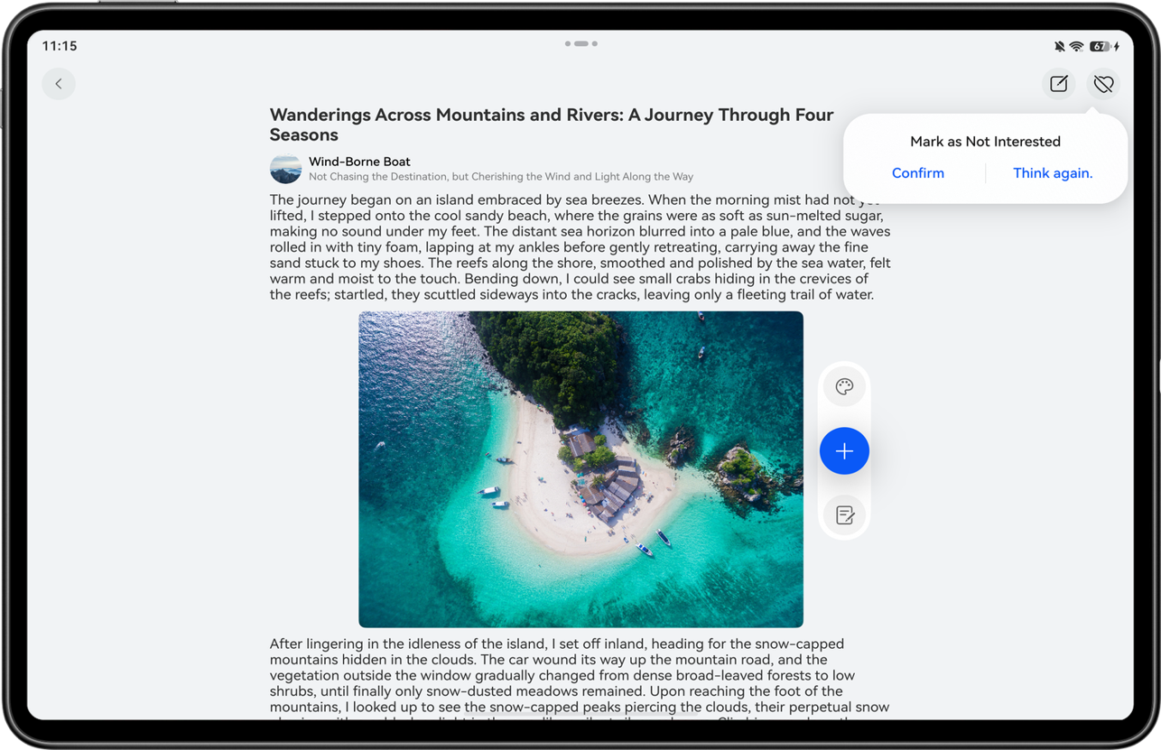
Subscribe to the motion.on('holdingHandChanged') event to obtain the hand holding information and change the display position of the component.
- Follow-up sheet: On a tablet, you can choose display in a follow-up sheet window or a central sheet window, and select a specific display mode based on service requirements.
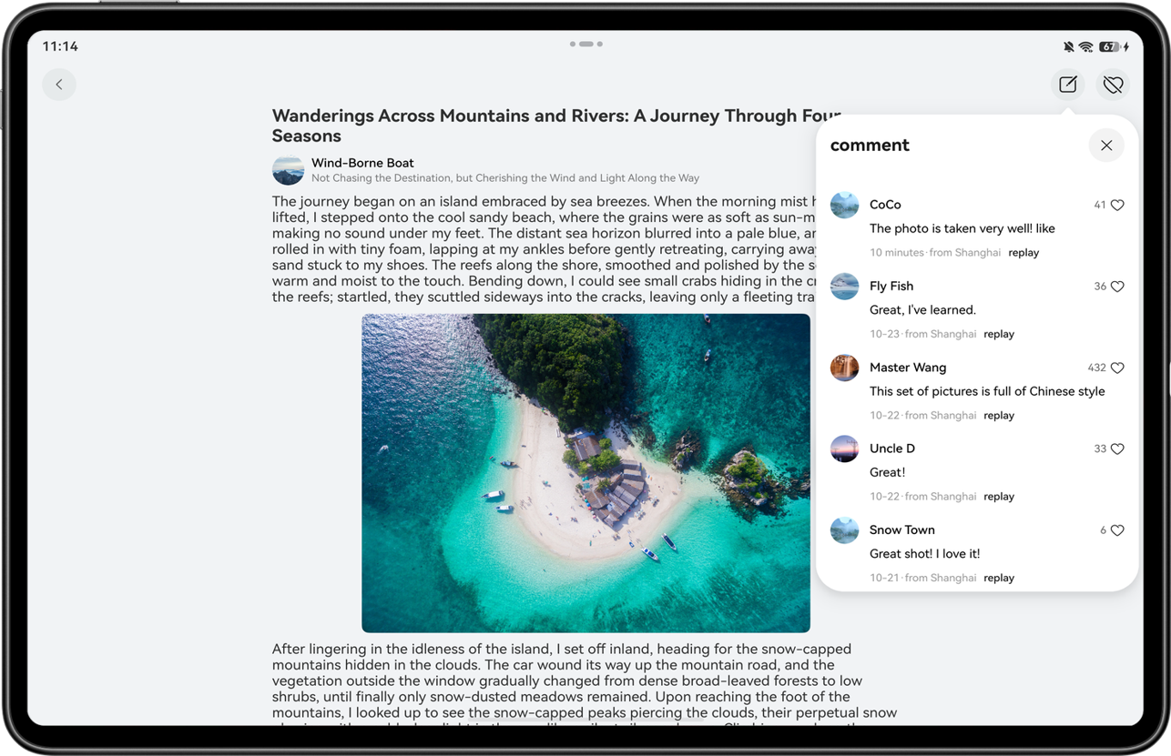
When using bindSheet to bind the sheet transition, set the sheet attribute preferType to SheetType.POPUP. After this attribute is set, the bottom pop-up window is displayed by default for devices whose window width is less than 600 vp, and the popup sheet is automatically displayed for other devices.
[h2]Floating Components
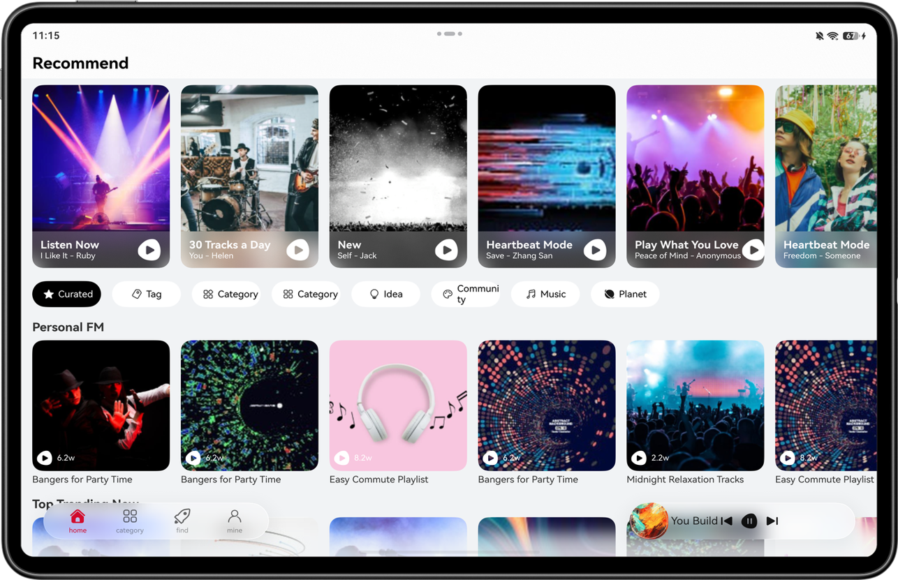
On a tablet, the barFloatingStyle attribute of the HdsTab component can be used to implement the floating navigation bar, further expanding the visible area of the screen. The SystemMaterialParams parameter can be used to set the effect of transparent matte texture, improving the UI transparency and adapting to immersive browsing experience. The HdsTabsMiniBar component can be used to extend the mini tab bar, providing multi-dimensional quick entries and adapting to partition operations on large screens. This can effectively improve operation efficiency and user experience.
[h2]Adaptive Immersion
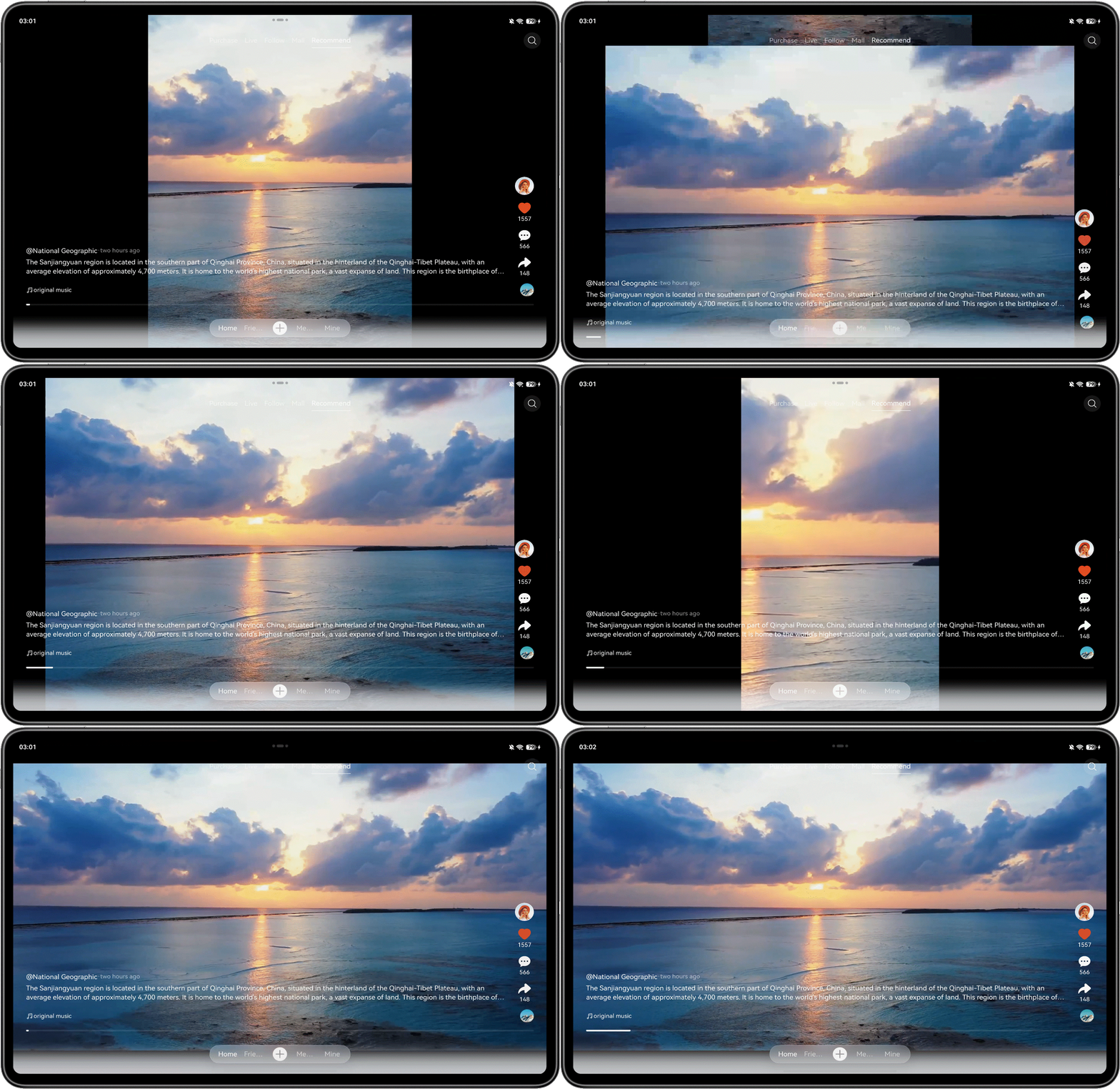
The expansive view of large screens can be used to enahnce the video viewing experience on tablets. To avoid issues such as image stretching, cropping, and abnormal aspect ratio, you are advised to use an adaptive immersive full-screen playback solution. This approach simplifies UI elements, reduces visual distractions, and guides users to focus on the video content, improving the overall viewing experience. For details about the implementation, see Adapting Videos to Different Screen Sizes.
[h2]Stylus Adaptation
Tablets mainly use a touchscreen for interactions. Common operations include tap, double-tap, long press, and drag. You can perform functionality adaptation based on these operations. For details, see Interaction Event.
As a perfect companion to tablets, styluses support seamless connection and low-latency transmission. The styluses are ready to use upon opening the box and can be used for global annotation, quick note-taking, and remote control, providing a smooth and natural writing and interaction experience. The Pen Kit capability provided by the system can help developers flexibly integrate APIs such as handwriting suite, Color picker, and Instant Shape, improving the extensibility and creation efficiency of writing interaction.
[h2]Keyboard and Mouse Adaptation
In addition to touchscreen interactions, tablets also support interactions by connecting a keyboard or a mouse. The adaptation of keyboard and mouse interactions include:
- Mouse hover effect: It is recommended that UI components that support interaction within apps on tablets be adapted to support the mouse hover effect. For details about the development solution, see adaptation of unified interaction events.
- Keyboard shortcuts: Apps must support common shortcuts to improve user operation efficiency. For details about the development solution, see adaptation of unified interaction events.

When an external keyboard is connected to the tablet, the system provides the ESC key event by default. If the app does not listen for the ESC key event, the previous page is displayed. onKeyEvent bubbles up by default. In the callback of onKeyEvent, return true if this event has been processed. This action stops the event from continuing to bubble up and avoids repeated responses from upper layers, thereby preventing the key event from being triggered multiple times.
[h2]Focus Navigation
When users interact with an app indirectly using keyboards connected to tablets, you are advised to set interactive elements to a focusable state and configure visual effects for focus states to clearly indicate the current focus position and enhance interaction experience. For details about the development solution, see Focus Event.

Generally, tablets mainly rely on touchscreens for interaction and can be adapted through unified interactions. When external keyboards and mouse devices are connected, the mouse floating effect, keyboard shortcuts, and focus navigation can be adapted to improve the operation experience of multiple input modes.
[h2]Multitask Views
The multitask views feature is designed to help users efficiently handle multiple tasks. With this feature, users can run multiple apps on the same screen concurrently and quickly switch between them, breaking through the physical limitations of the screen and improving operation efficiency. Compared with a bar-type phone, a tablet has a wider display view and has stronger information display and content bearing capabilities. In landscape mode, the multitask views capability can be used to fully carry out the space advantages of the large screen. A maximum of three windows can run concurrently on the same screen, enabling users to browse information, edit content, and communicate for work at the same time. Multiple tasks can be processed synchronously without conflicting with each other, implementing one-stop collaboration of office, entertainment, and daily operations.
Compatibility Mode
This section describes the running rules, adaptation key points, and configuration and optimization methods for split-view display of tablets in compatibility mode.
[h2]Compatible Running
Compatibility running allows developers to port mobile apps for tablet deployment.
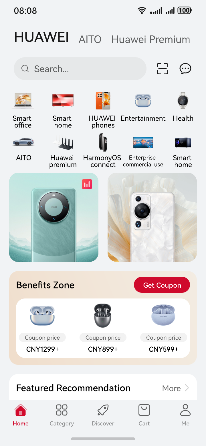
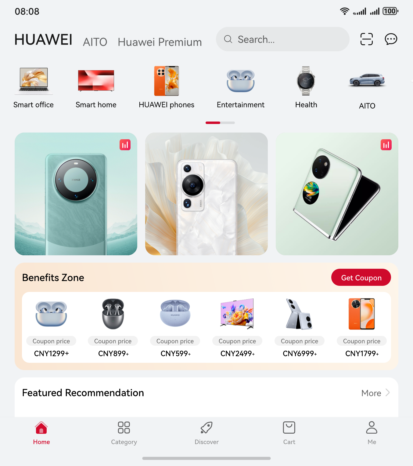
When an app is running in landscape mode, it automatically enters the compatibility running mode. This mode can be triggered by rotating the device from portrait to landscape orientation or by cold-starting the app in landscape orientation. The window height can be set in either of the following ways:
- Set the window's width-to-height ratio to 9:18.
- Set the window's width-to-height ratio to 1:1.
[h2]Project Configuration for Compatibility Running
Project configuration
To ensure that a phone-adapted app (non-game app) runs properly on a tablet, remove tablet from module.json5 of the entry module.
"deviceTypes": [
  "phone",
  "tablet" // Remove tablet from module.json5 of the entry module.
]
Window Display Logic in Compatibility Mode
On a tablet, an app must meet either of the following orientation policies to enter the small window:
- In module.json5, set orientation of the ability to one of the following options: {"portrait", "portrait_inverted", "auto_rotation_portrait", "auto_rotation_portrait_restricted"}. This setting is allowed only in portrait mode.
- In module.json5, set orientation of the ability to either unspecified or locked. deviceTypes can only be set to phone. This setting is allowed only in portrait mode.
[h2]App Compatibility Test
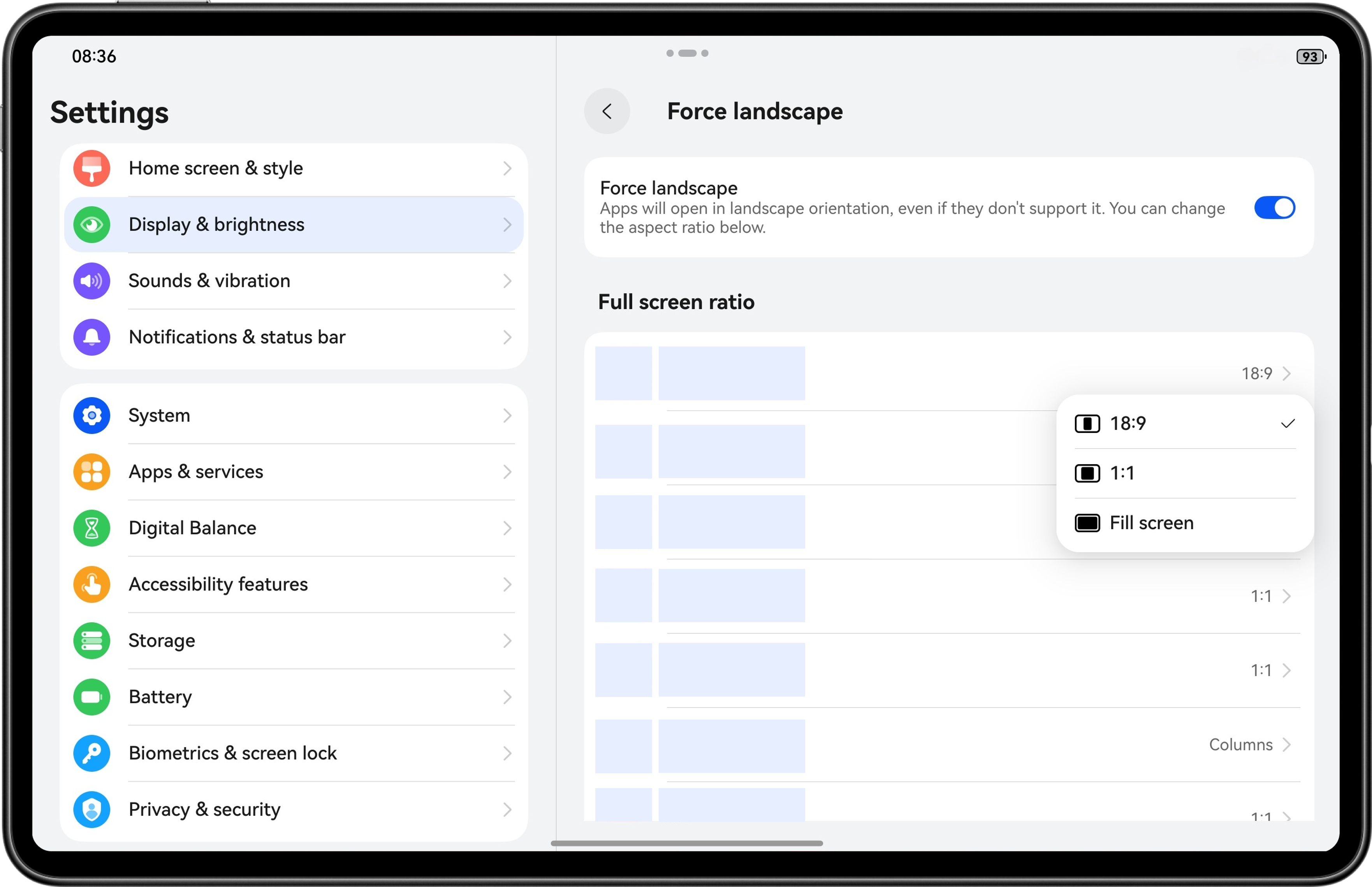
To facilitate developers' adaptation to landscape mode on tablets, the system provides a setting option to clear the system compatibility policy.
After an app is installed, choose Settings > Display and brightness > Force landscape and adjust the ratio to the original to exit the compatibility mode for debugging.
[h2]Check or Adaptation Items
In principle, apps capable of compatibility running only require small adaption on some differences. For details about the adaptation requirements, see the following description.
- Camera display differences
It is recommended to strictly follow the specifications to complete camera adaptation and ensure the image orientation and angle are normal, preventing image distortion. For details, see Camera Kit.
- API behavior differences: The APIs related to the display size and screen orientation have different behaviors, as shown in the following table.
Difference
Impact
Related Scenarios
Display size
In compatibility mode, the Display.width, Display.height, and DPI obtained using display.getAllDisplays(), display.getDisplayByIdSync(), and display.getDefaultDisplaySync() are not the actual resolution and DPI of the device:
Tablets in landscape mode with portrait display; tablets in free-from multi-window mode: free-form window and window maximization
Orientation request
In compatibility mode, when an app uses window.setPreferredOrientation() to request landscape/portrait mode switching, the window switches between landscape full-screen and portrait center modes. However, the actual screen orientation remains unchanged.
Tablets in landscape mode with portrait display; tablets in free-from multi-window mode: free-form window and window maximization
- PhotoPicker experience differences: Tablets allow the use of the PhotoPicker component to access images and videos. The following table lists the access scope of different Picker components.
Picker
Accessible Range
PhotoPicker(PhotoViewPicker)
Allows users to access images and videos in the media library and store images and videos to the media library.
FilePicker(DocumentViewPicker)
Allows users to access files in the public directory and save images, videos, and files to the public directory.
To adapt to the experience differences of PhotoPicker, you are advised to use the following solutions.
When an app needs to access in the media library or save files to the media library, it can continue to use PhotoPicker. If the app needs to access or save files outside the media library, it is recommended that FilePicker be used.- Viewing files: FilePicker can access files in the public directory and images and videos in the media library (gallery).
- Saving files: If an app saves files using the save mode of FilePicker, files are saved to the user-specified public directory.
Scenario
Recommended Method
Implementation Mechanism
The user taps the save button or option when creating a text or document within an app
Use FilePicker as well as user-specified save path and file name.
Create a DocumentViewPicker instance and call save() to start the FilePicker to save the file. If the app needs to access the file later, call the file persistence API to persist the authorized file.
The user taps the open file button within the app to view or edit the file.
Use FilePicker to select a file to open.
Create a DocumentViewPicker instance and call select() to open the FilePicker for the user to select files. After the user selects a file, the system grants the read and write permissions on the file to the app.
Open a file in the preset 3D directories within an app (only for tablets and PCs).
Use pre-authorization of the 3D directories, after the user consents, the app can access files in the corresponding folder.
Call the corresponding system APIs. The ohos.permission.READ_WRITE_DOWNLOAD_DIRECTORY permission is required for the download directory and the ohos.permission.READ_WRITE_DOCUMENTS_DIRECTORY permission is required for the document directory.
Request the authorization of a single file or folder (only for tablets and PCs) when the app obtains a file or folder URI but lacks the access permission.
Use FilePicker to select an authorization mode and pass the URI.
Create a DocumentViewPicker instance, call select(), and pass the authMode and defaultFilePathUri parameters to start the FilePicker for file selection. This authorization is temporary, and the app needs to additionally request the permission to persist files or folders.
Save a file to a specified directory.
Use FilePicker to select a file to open.
Create a DocumentViewPicker instance, call select(), set DocumentSelectMode to FOLDER, and start the FilePicker to select a folder. This authorization is temporary. The app needs to proactively request the permission to persist folders.
[h2]Split-View Display in Compatibility Mode
- Entering the split-view display mode
Choose Settings > Display and brightness > Force landscape, and the split-view option will be available for apps that support the split-view display. If this option is selected, the app will be displayed in split-view in landscape full-screen mode.
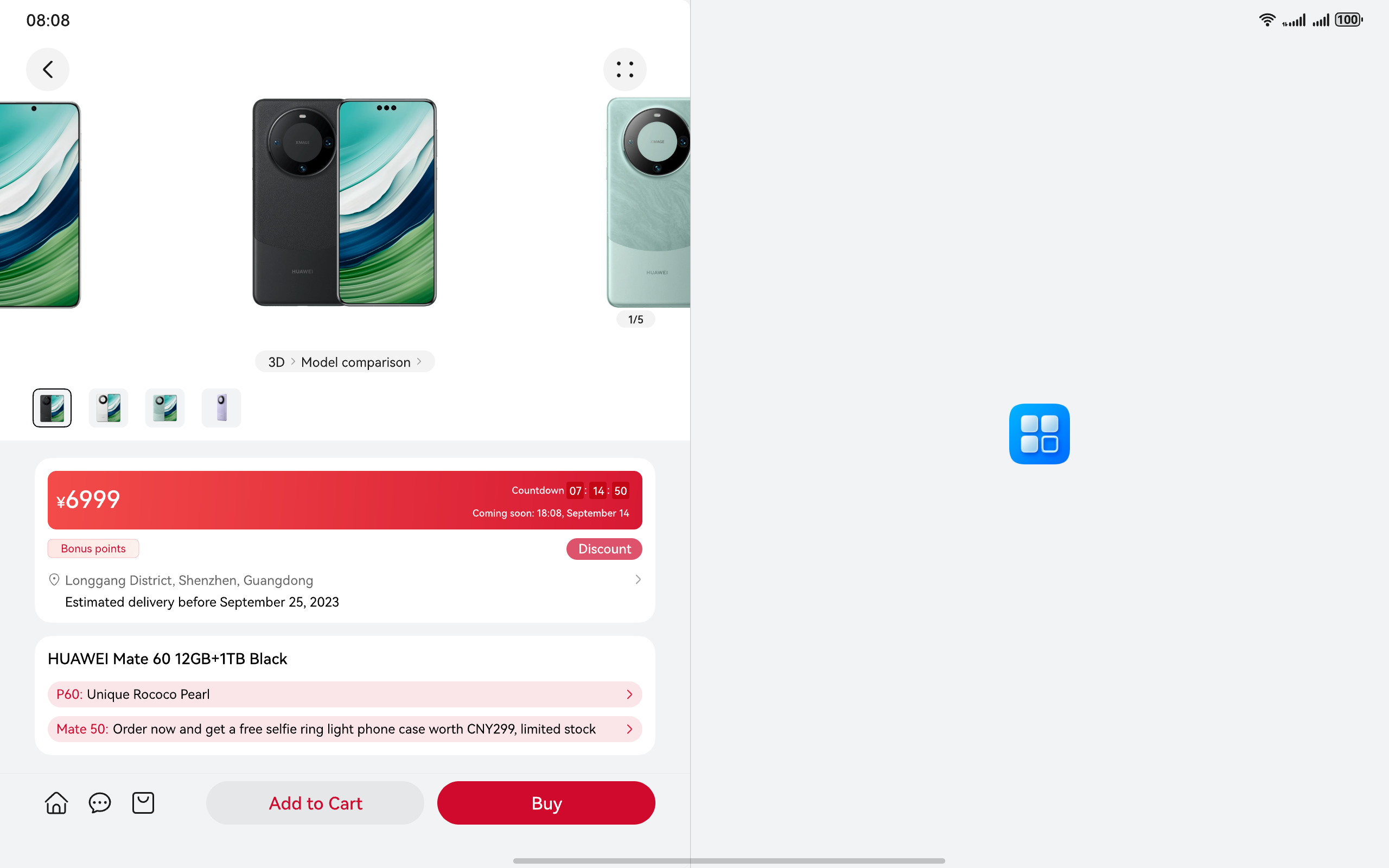
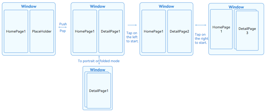
For apps with split-view enabled, content will be displayed in a left-right split layout by page unit when the device is in landscape mode. When only the home page (the first page) exists in the page stack, the system will automatically add a placeholder page on the right side.
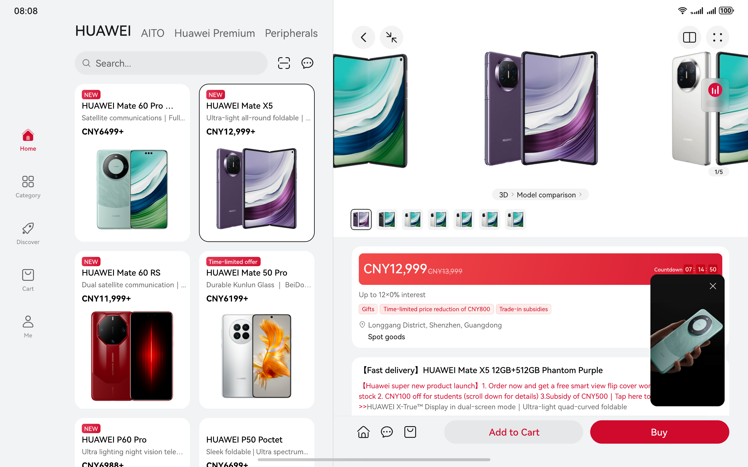
The following figure shows the display effect of the placeholder.
The following figure shows the split-view display effect of the page.
- Page redirection rules in forced split-view mode
- Optimization suggestions for apps in split-view mode
- Apps are recommended to adapt to the parent container size of the page. Avoid fixing the window or screen dimensions.
- Clarify the transfer logic between split views and distinguish the hierarchical or parallel relationship between the main view and split views.
- When the Navigation component is used, the scenario where multiple pages coexist needs to be adapted, the corresponding lifecycle processing needs to be optimized, and the service logic needs to adapt to the non-single page display mode.
[h2]Feature Differences
During tablet app development, adaptation issues may occur due to function differences between tablets. The following table lists the function differences between common tablets.
Feature/Tablet Model | MatePad Pro 13.2-inch 2025 | MatePad Pro 12.2-inch 2025 | MatePad Air 12-inch 2025 | MatePad 11.5 S 2025 | MatePad Mini |
|---|---|---|---|---|---|
Network positioning | ✓ | ✓ | ✓ | ✓ | ✓ |
GPS | ✓ | ✓ | / | / | ✓ |
Hall effect sensor | ✓ | ✓ | ✓ | ✓ | ✓ |
Gyroscope | ✓ | ✓ | ✓ | ✓ | ✓ |
Barometer | / | / | / | / | / |
NFC | / | / | / | / | / |
Compass | ✓ | ✓ | / | / | ✓ |
Status indicator | / | / | / | / | / |
Ambient light sensor | ✓ | ✓ | ✓ | ✓ | ✓ |
Proximity sensor | / | / | / | / | ✓ |
Gravity sensor | ✓ | ✓ | ✓ | ✓ | ✓ |
Infrared sensor | / | / | / | / | / |
Temperature sensor | / | / | / | / | / |
Distance sensor | / | / | / | / | / |
Fingerprint sensor | ✓ | ✓ | / | / | ✓ |