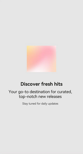
SplitLayout is a component that enables you to divide the available space vertically into separate sections, each of which can contain solely text or a combination of text and images.

This component is supported since API version 10. Updates will be marked with a superscript to indicate their earliest API version.
If the SplitLayout component has universal attributes and universal events configured, the compiler toolchain automatically generates an additional __Common__ node and mounts the universal attributes and universal events on this node rather than the SplitLayout component itself. As a result, the configured universal attributes and universal events may fail to take effect or behave as intended. For this reason, avoid using universal attributes and events with the SplitLayout component.
SplitLayout
SplitLayout({mainImage: Resource, primaryText: string, secondaryText?: string, tertiaryText?: string, container: () => void })
Decorator: @Component
Atomic service API: This API can be used in atomic services since API version 11.
System capability: SystemCapability.ArkUI.ArkUI.Full
Device behavior differences: On wearables, calling this API results in a runtime exception indicating that the API is undefined. On other devices, the API works correctly.
| Name | Type | Mandatory | Decorator | Description |
|---|---|---|---|---|
| mainImage | ResourceStr | Yes | @State | Image. |
| primaryText | ResourceStr | Yes | @Prop | Title. |
| secondaryText | ResourceStr | No | @Prop | Subtitle. |
| tertiaryText | ResourceStr | No | @Prop | Auxiliary text. |
| container | () => void | Yes | @BuilderParam | Container in the component. |
Example
This example demonstrates how to use SplitLayout to achieve a page layout that is both adaptable and responsive.
import { SplitLayout } from '@kit.ArkUI';

@Entry
@Component
struct Index {
  @State demoImage: Resource = $r("app.media.background");

  build() {
    Column() {
      SplitLayout({
        mainImage: this.demoImage,
        primaryText:'New music recommendation',
        secondaryText: 'Get a playlist tailored to your taste;',
        tertiaryText: 'Updated every day',
      }) {
        Text('Example: Components can be added to a blank area container.')
          .margin({ top: 36 })
      }
    }
    .justifyContent(FlexAlign.SpaceBetween)
    .height('100%')
    .width('100%')
  }
}
Layout less than or equal to 600 vp

Layout greater than 600 vp and less than or equal to 840 vp

Layout greater than 840 vp