This module extends visual effects for components, encompassing point-light effects, press illumination effects, and animation control.
Since: 6.0.0(20)
HdsEffectBuilder
Adds the visual effect parameters to the VisualEffect object and constructs the object.
Model restriction: This API can be used only in the stage model.
System capability: SystemCapability.UIDesign.HDSComponent.Core
Since: 6.0.0(20)
[h2]constructor
constructor()
Constructor for HdsEffectBuilder.
Model restriction: This API can be used only in the stage model.
System capability: SystemCapability.UIDesign.HDSComponent.Core
Since: 6.0.0(20)
[h2]pointLight
pointLight(value: PointLightEffect): HdsEffectBuilder
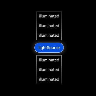
Creates a point-light effect for a component. A component can be illuminated by a maximum of 12 light sources at the same time. The following components support the point-light effect: Button, Toggle, Row, Column, Image, Flex, Stack, Select, Menu, and MenuItem.
Model restriction: This API can be used only in the stage model.
System capability: SystemCapability.UIDesign.HDSComponent.Core
Since: 6.0.0(20)
Parameters
| Parameter | Type | Mandatory | Description |
|---|---|---|---|
| value | PointLightEffect | Yes | Point-light effect parameters. You can apply a point-light effect by setting the point light emission and illuminated types to achieve a UI effect where a point-light source illuminates surrounding components. Note: The light source position is initially at the center of the component but does not move with the component. Therefore, you are not advised to use this effect for scrollable components. |
Return value
| Type | Description |
|---|---|
| HdsEffectBuilder | HdsEffectBuilder object. |
Example
import { hdsEffect } from '@kit.UIDesignKit';

@Entry
@Component
struct Index {
  @State lightSourceType: hdsEffect.PointLightSourceType = hdsEffect.PointLightSourceType.NONE;

  build() {
    Column({ space: 10 }) {
      Row({ space: 10 }) {
        Column() {
          Text('illuminated').padding(10).fontColor(Color.White)
          Text('illuminated').padding(10).fontColor(Color.White)
          Text('illuminated').padding(10).fontColor(Color.White)
        }
        .visualEffect(new hdsEffect.HdsEffectBuilder()
          .pointLight({
            illuminatedType: hdsEffect.PointLightIlluminatedType.BORDER
          })
          .buildEffect())
      }

      Row({ space: 10 }) {
        Button('lightSource')
          .visualEffect(new hdsEffect.HdsEffectBuilder()
            .pointLight({
              sourceType: this.lightSourceType,
              illuminatedType: hdsEffect.PointLightIlluminatedType.BORDER
            })
            .buildEffect())
          .onTouch((event: TouchEvent) => {
            if (event.type === TouchType.Down) {
              this.lightSourceType = hdsEffect.PointLightSourceType.BRIGHT;
            } else if (event.type === TouchType.Up || event.type === TouchType.Cancel) {
              this.lightSourceType = hdsEffect.PointLightSourceType.NONE;
            }
          })
      }

      Row({ space: 10 }) {
        Column() {
          Text('illuminated').padding(10).fontColor(Color.White)
          Text('illuminated').padding(10).fontColor(Color.White)
          Text('illuminated').padding(10).fontColor(Color.White)
        }
        .visualEffect(new hdsEffect.HdsEffectBuilder()
          .pointLight({
            illuminatedType: hdsEffect.PointLightIlluminatedType.BORDER
          })
          .buildEffect())
      }
    }
    .backgroundColor(Color.Black)
    .width('100%')
    .height('100%')
    .justifyContent(FlexAlign.Center)
  }
} 
[h2]pressShadow
pressShadow(type: PressShadowType): HdsEffectBuilder
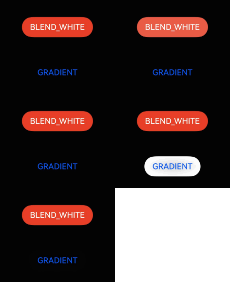
Sets the shadow effect upon a press for the current component, which usually applies to background color changes after the component is pressed. This API is available only for button components.
Model restriction: This API can be used only in the stage model.
System capability: SystemCapability.UIDesign.HDSComponent.Core
Since: 6.0.0(20)
Parameters
| Parameter | Type | Mandatory | Description |
|---|---|---|---|
| type | PressShadowType | Yes | Shadow effect after a component is pressed. |
Return value
| Type | Description |
|---|---|
| HdsEffectBuilder | HdsEffectBuilder object. |
Example
import { hdsEffect } from '@kit.UIDesignKit';

@Entry
@Component
struct PressShadowExample {
  @State button_blend_state: hdsEffect.PressShadowType = hdsEffect.PressShadowType.NONE;
  @State button_gradient_state: hdsEffect.PressShadowType = hdsEffect.PressShadowType.NONE;

  build() {
    NavDestination() {
      Column({ space: 50 }) {
        Button("BLEND_WHITE", { buttonStyle: ButtonStyleMode.EMPHASIZED, role: ButtonRole.ERROR, stateEffect: false })
          .visualEffect(new hdsEffect.HdsEffectBuilder()
            .pressShadow(this.button_blend_state)
            .buildEffect())
          .onTouch((event: TouchEvent) => {
            if (event.type === TouchType.Down) {
              this.button_blend_state = hdsEffect.PressShadowType.BLEND_WHITE;
            } else if (event.type === TouchType.Up || event.type === TouchType.Cancel) {
              this.button_blend_state = hdsEffect.PressShadowType.NONE;
            }
          })

        Button("GRADIENT", { buttonStyle: ButtonStyleMode.NORMAL, stateEffect: false })
          .visualEffect(new hdsEffect.HdsEffectBuilder()
            .pressShadow(this.button_gradient_state)
            .buildEffect())
          .onTouch((event: TouchEvent) => {
            if (event.type === TouchType.Down) {
              this.button_gradient_state = hdsEffect.PressShadowType.BLEND_GRADIENT;
            } else if (event.type === TouchType.Up || event.type === TouchType.Cancel) {
              this.button_gradient_state = hdsEffect.PressShadowType.NONE;
            }
          })
      }
      .height('70%')
      .justifyContent(FlexAlign.Center)
    }
    .width('100%')
    .height('100%')
    .title('Button example')
    .backgroundColor('#040404')
  }
} 
[h2]shaderEffect
shaderEffect(params: ShaderEffectParams): HdsEffectBuilder
Creates a shader visual effect.
Model restriction: This API can be used only in the stage model.
System capability: SystemCapability.UIDesign.HDSComponent.Core
Since: 6.0.0(20)
Parameters
| Parameter | Type | Mandatory | Description |
|---|---|---|---|
| params | ShaderEffectParams | Yes | Shader visual effect parameters. |
Return value
| Type | Description |
|---|---|
| HdsEffectBuilder | HdsEffectBuilder object. |
Example
import { hdsEffect } from '@kit.UIDesignKit';

@Entry
@Component
struct Index {
  @State controller: hdsEffect.ShaderEffectController = new hdsEffect.ShaderEffectController();

  build() {
    Column() {
      Stack() {
      }
      .visualEffect(new hdsEffect.HdsEffectBuilder()
        .shaderEffect({
          effectType: hdsEffect.EffectType.DUAL_EDGE_FLOW_LIGHT,
          animation: {
            duration: 4000,
            iterations: -1,
            autoPlay: true,
            onFinish: () => {
              console.info('Succeeded in finishing');
            }
          },
          controller: this.controller,
          params: {
            firstEdgeFlowLight: {
              startPos: 0,
              endPos: 1.0,
              color: '#1AD0F1',
            },
            secondEdgeFlowLight: {
              startPos: 0.5,
              endPos: 1.5,
              color: '#FFA4E5',
            }
          }
        })
        .buildEffect())
      .width(200)
      .borderRadius('50%')
      .clip(true)
      .height(200)
      .backgroundColor('#383838')
    }
    .justifyContent(FlexAlign.Center)
    .backgroundColor(Color.Black)
    .width('100%')
    .height('100%')
  }
} 
[h2]buildEffect
buildEffect(): VisualEffect
Adds all visual effects configured above to the VisualEffect object.
Model restriction: This API can be used only in the stage model.
System capability: SystemCapability.UIDesign.HDSComponent.Core
Since: 6.0.0(20)
Return value
| Type | Description |
|---|---|
| VisualEffect | VisualEffect object that contains various visual effects. |
ShaderEffectParams
Defines visual effect settings for shaderEffect.
Model restriction: This API can be used only in the stage model.
System capability: SystemCapability.UIDesign.HDSComponent.Core
Since: 6.0.0(20)
| Name | Type | Read-Only | Optional | Description |
|---|---|---|---|---|
| effectType | EffectType | No | No | Visual effect type. |
| animation | AnimationParams | No | Yes | Visual effect animation parameters. |
| params | EffectParams | No | Yes | Shader parameters. |
| controller | ShaderEffectController | No | Yes | Visual effect controller. |
EffectType
Visual effect type.
Device behavior difference: This visual effect is not supported on TVs, but can be displayed on other device types.
Model restriction: This API can be used only in the stage model.
System capability: SystemCapability.UIDesign.HDSComponent.Core
Since: 6.0.0(20)
| Name | Value | Description |
|---|---|---|
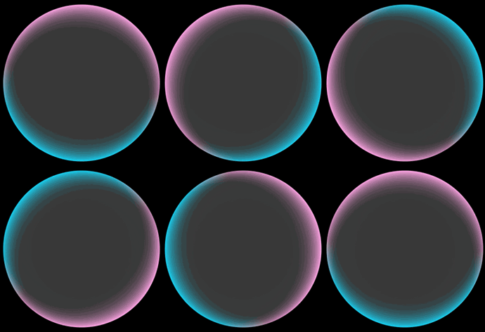
| DUAL_EDGE_FLOW_LIGHT | 0 | Dual-edge flowing light effect. |
| UV_BACKGROUND_FLOW_LIGHT | 1 | UV background flowing light effect. |
AnimationParams
Defines visual effect animation parameters.
Model restriction: This API can be used only in the stage model.
System capability: SystemCapability.UIDesign.HDSComponent.Core
Since: 6.0.0(20)
| Name | Type | Read-Only | Optional | Description |
|---|---|---|---|---|
| duration | number | No | Yes | Time for playing the visual effect animation once, in milliseconds. The default value is 1000. NOTE - A value less than 0 evaluates to the value 0. - Floating-point values will be rounded down to integers. For example, if the value set is 1.2, 1 will be used. |
| iterations | number | No | Yes | Number of playbacks. The value -1 indicates continuous looping. Value range: [-1,+∞) The default value is 1, NOTE - If the value is out of the range, the default value is used. - Floating-point values will be rounded down to integers. For example, if the value set is 1.2, 1 will be used. |
| curve | Curve | No | Yes | Animation curve. |
| delay | number | No | Yes | Delay for playing the visual effect animation, in milliseconds. Default value: 0 The value range is (-∞, +∞). NOTE - A value greater than or equal to 0 means to start the animation after the specified amount of time has elapsed, and a value less than 0 means to start the animation in advance. When the value is less than 0: If the absolute value of delay is less than the actual animation duration, the animation starts its first frame from the progress state at the absolute value; if the absolute value of delay is greater than or equal to the actual animation duration, the animation directly ends. The actual animation duration is equal to the duration of a single animation multiplied by the number of animation playback times. - Floating-point values will be rounded down to integers. For example, if the value set is 1.2, 1 will be used. |
| autoPlay | boolean | No | Yes | Indicates whether the animation starts automatically. The options are true (yes) and false (no). The default value is true. |
| onFinish | OnFinishCallback | No | Yes | Callback function triggered when animation playback ends. |
| expectedFrameRateRange | ExpectedFrameRateRange | No | Yes | Expected frame rate range. |
OnFinishCallback
type OnFinishCallback = () => void
Defines the callback triggered upon animation ending.
Model restriction: This API can be used only in the stage model.
System capability: SystemCapability.UIDesign.HDSComponent.Core
Since: 6.0.0(20)
ExpectedFrameRateRange
Defines the visual effect frame rate range settings.
Model restriction: This API can be used only in the stage model.
System capability: SystemCapability.UIDesign.HDSComponent.Core
Since: 6.0.0(20)
| Name | Type | Read-Only | Optional | Description |
|---|---|---|---|---|
| expected | FrameRateType | No | No | Expected frame rate. |
| min | FrameRateType | No | No | Minimum frame rate. |
| max | FrameRateType | No | No | Maximum frame rate. |
FrameRateType
Defines the visual effect frame rate options.
Model restriction: This API can be used only in the stage model.
System capability: SystemCapability.UIDesign.HDSComponent.Core
Since: 6.0.0(20)
| Name | Value | Description |
|---|---|---|
| FRAME_RATE_15 | 15 | 15 fps frame rate. |
| FRAME_RATE_30 | 30 | 30 fps frame rate. |
| FRAME_RATE_60 | 60 | 60 fps frame rate. |
EffectParams
type EffectParams = DualEdgeFlowLightParam | UVFlowLightColorParam
Defines visual effect parameters.
Model restriction: This API can be used only in the stage model.
System capability: SystemCapability.UIDesign.HDSComponent.Core
Since: 6.0.0(20)
| Type | Description |
|---|---|
| DualEdgeFlowLightParam | Dual-edge flowing light effect parameters. |
| UVFlowLightColorParam | UV flowing light effect parameters. |
DualEdgeFlowLightParam
Dual-edge flowing light effect parameters.
Model restriction: This API can be used only in the stage model.
System capability: SystemCapability.UIDesign.HDSComponent.Core
Since: 6.0.0(20)
| Name | Type | Read-Only | Optional | Description |
|---|---|---|---|---|
| firstEdgeFlowLight | EdgeFlowLightParam | No | No | Parameters of the first flowing light edge. |
| secondEdgeFlowLight | EdgeFlowLightParam | No | No | Parameters of the second flowing light edge. |
UVFlowLightColorParam
UV flowing light effect parameters.
Model restriction: This API can be used only in the stage model.
System capability: SystemCapability.UIDesign.HDSComponent.Core
Since: 6.0.0(20)
| Name | Type | Read-Only | Optional | Description |
|---|---|---|---|---|
| colorSource | Array<ResourceColor> | No | No | Array of background colors before the gradient color change. |
| colorTarget | Array<ResourceColor> | No | Yes | Array of background colors after the gradient color change. The color of the flowing light does not change by default. |
EdgeFlowLightParam
Defines edge flowing light effect parameters.
Model restriction: This API can be used only in the stage model.
System capability: SystemCapability.UIDesign.HDSComponent.Core
Since: 6.0.0(20)
| Name | Type | Read-Only | Optional | Description |
|---|---|---|---|---|
| startPos | number | No | No | Flowing light starting point. The starting point is represented by the ratio of the distance between the midpoint of the visual effect container's top edge and the starting point along the container's edge in a specified direction, relative to the container's total perimeter. Moving counter-clockwise along the container's edge is the positive direction and is represented using a positive value of this parameter; while moving clockwise is the negative direction and is represented using a negative value of this parameter. |
| endPos | number | No | No | Flowing light ending point. The starting point is represented by the ratio of the distance between the midpoint of the visual effect container's top edge and the starting point along the container's edge in a specified direction, relative to the container's total perimeter. Moving counter-clockwise along the container's edge is the positive direction and is represented using a positive value of this parameter; while moving clockwise is the negative direction and is represented using a negative value of this parameter. |
| color | ResourceColor | No | No | Color of the flowing light on the current edge. |
ShaderEffectController
Visual effect controller.
Model restriction: This API can be used only in the stage model.
System capability: SystemCapability.UIDesign.HDSComponent.Core
Since: 6.0.0(20)
[h2]constructor
constructor()
Constructor for ShaderEffectController.
Model restriction: This API can be used only in the stage model.
System capability: SystemCapability.UIDesign.HDSComponent.Core
Since: 6.0.0(20)
[h2]play
play(): void
Starts playing a visual effect animation.
Model restriction: This API can be used only in the stage model.
System capability: SystemCapability.UIDesign.HDSComponent.Core
Since: 6.0.0(20)
[h2]pause
pause(): void
Pauses a visual effect animation.
Model restriction: This API can be used only in the stage model.
System capability: SystemCapability.UIDesign.HDSComponent.Core
Since: 6.0.0(20)
[h2]resume
resume(): void
Resumes a visual effect animation.
Model restriction: This API can be used only in the stage model.
System capability: SystemCapability.UIDesign.HDSComponent.Core
Since: 6.0.0(20)
[h2]reverse
reverse(): void
Reverses a visual effect animation.
Model restriction: This API can be used only in the stage model.
System capability: SystemCapability.UIDesign.HDSComponent.Core
Since: 6.0.0(20)
[h2]stop
stop(): void
Stops playing a visual effect animation.
Model restriction: This API can be used only in the stage model.
System capability: SystemCapability.UIDesign.HDSComponent.Core
Since: 6.0.0(20)
[h2]setEffectParams
setEffectParams(params: EffectParams): void
Sets visual effect shader parameters.
Model restriction: This API can be used only in the stage model.
System capability: SystemCapability.UIDesign.HDSComponent.Core
Since: 6.0.0(20)
| Parameter | Type | Mandatory | Description |
|---|---|---|---|
| params | EffectParams | Yes | Shader visual effect parameters. |
PointLightEffect
Defines point-light effect parameters.
Model restriction: This API can be used only in the stage model.
System capability: SystemCapability.UIDesign.HDSComponent.Core
Since: 6.0.0(20)
| Name | Type | Read-Only | Optional | Description |
|---|---|---|---|---|
| sourceType | PointLightSourceType | No | Yes | Light emission type of a component. The light emission affects the surrounding components that are marked as illuminable and creates light effects on those components. The default value is NONE, indicating that the component does not emit light. |
| illuminatedType | PointLightIlluminatedType | No | Yes | Illumination type of a component, which defines whether this component can be illuminated by a light source and the illuminated type. The default value is NONE, indicating that the component will not be illuminated. Note: If the border color and width are set for the illuminated component, the point light effect will be overwritten. |
| options | PointLightOptions | No | Yes | Custom point-light effect options of a component. |

sourceType takes precedence over options. That is, if both sourceType and options are set, the setting of options does not take effect.
PointLightSourceType
Defines light emission types of a component.
Model restriction: This API can be used only in the stage model.
System capability: SystemCapability.UIDesign.HDSComponent.Core
Since: 6.0.0(20)
| Name | Value | Description |
|---|---|---|
| NONE | 0 | The point-light effect does not take effect and the component does not emit light. |
| SOFT | 1 | A soft point-light effect is applied, with weak light intensity and a smaller surrounding illumination range. |
| BRIGHT | 2 | A bright point-light effect is applied, with strong light intensity and a larger surrounding illumination range. |
PointLightIlluminatedType
Defines illuminated types of a component.
Model restriction: This API can be used only in the stage model.
System capability: SystemCapability.UIDesign.HDSComponent.Core
Since: 6.0.0(20)
| Name | Value | Description |
|---|---|---|
| NONE | 0 | The component is not illuminated. |
| BORDER | 1 | Only the edges of the component are illuminated. |
| CONTENT | 2 | Only the content of the component is illuminated. |
| BORDER_CONTENT | 3 | Both the edges and content of the component are illuminated. |
| DEFAULT_FEATHERING_BORDER | 20 | Only the edges of the component are illuminated, with a feathered effect. |
PointLightOptions
Custom point-light effect options of a component.
Model restriction: This API can be used only in the stage model.
System capability: SystemCapability.UIDesign.HDSComponent.Core
Since: 6.0.0(20)
| Name | Type | Read-Only | Optional | Description |
|---|---|---|---|---|
| color | ResourceColor | No | Yes | Light source color. Default value: Color.White |
| intensity | number | No | Yes | Intensity of the light source. The recommended value range is 0–1. A larger numeric value indicates stronger light intensity. When the light source intensity is 0, the light source does not emit light. The default value is 0. |
| height | Dimension | No | Yes | Height of the light source. The higher the light source, the broader the light illumination. The default value is 0. |
| bloom | number | No | Yes | Bloom effect intensity of the component. The recommended value range is 0–1. A larger numeric value indicates a larger bloom range. The default value is 0. |
PressShadowType
Defines the shadow effect types after a component is pressed.
Model restriction: This API can be used only in the stage model.
System capability: SystemCapability.UIDesign.HDSComponent.Core
Since: 6.0.0(20)
| Name | Value | Description |
|---|---|---|
| NONE | 0 | No shadow effect is applied upon a press. |
| BLEND_GRADIENT | 1 | The shadow is an elliptical radial gradient of white, with the center being 85% transparent white and the edges being opaque white. It is overlaid on the background color of the component. |
| BLEND_WHITE | 2 | The shadow is 15% transparent white, It is overlaid on the background color of the component. |