The flex layout enables flexible arrangement, alignment, and space distribution among child components within a container. It allows elements to dynamically expand or shrink based on available space, meeting responsive layout requirements across different screen sizes.

flexBasis
flexBasis(value: number | string): T
Sets the base size of the component.
Widget capability: This API can be used in ArkTS widgets since API version 9.
Atomic service API: This API can be used in atomic services since API version 11.
System capability: SystemCapability.ArkUI.ArkUI.Full
Parameters
| Name | Type | Mandatory | Description |
|---|---|---|---|
| value | number | string | Yes | Base size of the component in the main axis of the parent container. Default value: 'auto' (indicating that the base size of the component in the main axis is the original size of the component) For the string type, the value must be a string that can be converted into a number (for example, '10'), a string that includes a length unit (for example, '10px'), or the literal string 'auto'; percentage-based strings are not supported. For the number type, the value range is (0, +∞), and the unit is vp. Invalid values are treated as the default value 'auto'. |
Return value
| Type | Description |
|---|---|
| T | Current component. |
flexGrow
flexGrow(value: number): T
Sets the percentage of the parent container's remaining space that is allocated to the component.
Widget capability: This API can be used in ArkTS widgets since API version 9.
Atomic service API: This API can be used in atomic services since API version 11.
System capability: SystemCapability.ArkUI.ArkUI.Full
Parameters
| Name | Type | Mandatory | Description |
|---|---|---|---|
| value | number | Yes | Percentage of the parent container's remaining space that is allocated to the component. Value range: [0, +∞). Default value: 0 If this parameter is set to an invalid value, the default value will be used. |
Return value
| Type | Description |
|---|---|
| T | Current component. |
flexShrink
flexShrink(value: number): T
Sets the percentage of the parent container's shrink size that is allocated to the component. When the parent container is Column or Row, you must set the size along the main axis.

When getInspectorByKey is used to obtain the flexShrink attribute, if the node does not have flexShrink set, the default value of 1 is returned by default.
Widget capability: This API can be used in ArkTS widgets since API version 9.
Atomic service API: This API can be used in atomic services since API version 11.
System capability: SystemCapability.ArkUI.ArkUI.Full
Parameters
| Name | Type | Mandatory | Description |
|---|---|---|---|
| value | number | Yes | Percentage of the parent container's shrink size that is allocated to the component. If the parent container is Column or Row, the default value is 0, and the value range is (0, +∞). If the parent container is Flex, the default value is 1. constraintSize limits the component's size range. For Column and Row components without explicit main axis size specified (through width, height, or size), the default layout behavior (adapt-to-fit child components) applies, even when constraintSize is configured. In this case, flexShrink has no effect. If this parameter is set to an invalid value, the default value will be used. |
Return value
| Type | Description |
|---|---|
| T | Current component. |
alignSelf
alignSelf(value: ItemAlign): T
Sets the alignment mode of the child components along the cross axis of the parent container.
Widget capability: This API can be used in ArkTS widgets since API version 9.
Atomic service API: This API can be used in atomic services since API version 11.
System capability: SystemCapability.ArkUI.ArkUI.Full
Parameters
| Name | Type | Mandatory | Description |
|---|---|---|---|
| value | ItemAlign | Yes | Alignment mode of the child components along the cross axis of the parent container. The setting overwrites the alignItems setting of the parent container (Flex, Column, Row, or GridRow). GridCol can have the alignSelf attribute bound to change its own layout along the cross axis. Default value: ItemAlign.Auto |
Return value
| Type | Description |
|---|---|
| T | Current component. |
Example
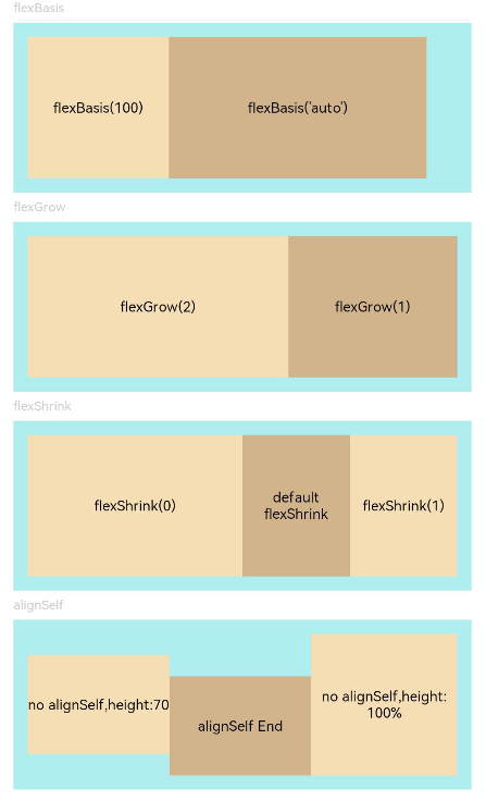
This example shows how to set up a flex layout through the flexBasis, flexGrow, flexShrink, and alignSelf attributes.
// xxx.ets
@Entry
@Component
struct FlexExample {
  build() {
    Column({ space: 5 }) {
      Text('flexBasis').fontSize(9).fontColor(0xCCCCCC).width('90%')
      // Base size in the main axis
      // The value of flexBasis() can be 'auto' or a number, which is equivalent to .width()/.height().
      Flex() {
        Text('flexBasis(100)')
          .flexBasis(100) // The width is 100 vp.
          .height(100)
          .backgroundColor(0xF5DEB3)
          .textAlign(TextAlign.Center)
        Text(`flexBasis('auto')`)
          .flexBasis('auto') // The width is 60% of the original width.
          .width('60%')
          .height(100)
          .backgroundColor(0xD2B48C)
          .textAlign(TextAlign.Center)
      }.width('90%').height(120).padding(10).backgroundColor(0xAFEEEE)

      Text('flexGrow').fontSize(9).fontColor(0xCCCCCC).width('90%')
      // flexGrow() indicates the percentage of the remaining space allocated to the component.
      Flex() {
        Text('flexGrow(2)')
          .flexGrow(2) // The width allocated to the Text component is 2/3 of the remaining width of the parent container.
          .height(100)
          .backgroundColor(0xF5DEB3)
          .textAlign(TextAlign.Center)
        Text('flexGrow(1)')
          .flexGrow(1) // The width allocated to the Text component is 1/3 of the remaining width of the parent container.
          .height(100)
          .backgroundColor(0xD2B48C)
          .textAlign(TextAlign.Center)
      }.width('90%').height(120).padding(10).backgroundColor(0xAFEEEE)

      Text('flexShrink').fontSize(9).fontColor(0xCCCCCC).width('90%')
      // flexShrink() indicates the percentage of the shrink size allocated to the component.
      // The value is 0 for the first Text component and 1 for the other two Text components. This means that, if the components cannot be completely displayed in the parent container, the latter two are shrunk proportionally, while the former is not shrunk.
      Flex({ direction: FlexDirection.Row }) {
        Text('flexShrink(0)')
          .flexShrink(0)
          .width('50%')
          .height(100)
          .backgroundColor(0xF5DEB3)
          .textAlign(TextAlign.Center)
        Text('default flexShrink') // The default value is 1.
          .width('40%')
          .height(100)
          .backgroundColor(0xD2B48C)
          .textAlign(TextAlign.Center)
        Text('flexShrink(1)')
          .flexShrink(1)
          .width('40%')
          .height(100)
          .backgroundColor(0xF5DEB3)
          .textAlign(TextAlign.Center)
      }.width('90%').height(120).padding(10).backgroundColor(0xAFEEEE)

      Text('alignSelf').fontSize(9).fontColor(0xCCCCCC).width('90%')
      // The alignSelf setting overrides the alignItems setting of the parent container.
      Flex({ direction: FlexDirection.Row, alignItems: ItemAlign.Center }) {
        Text('no alignSelf,height:70')
          .width('33%')
          .height(70)
          .backgroundColor(0xF5DEB3)
          .textAlign(TextAlign.Center)
        Text('alignSelf End')
          .alignSelf(ItemAlign.End)
          .width('33%')
          .height(70)
          .backgroundColor(0xD2B48C)
          .textAlign(TextAlign.Center)
        Text('no alignSelf,height:100%')
          .width('34%')
          .height('100%')
          .backgroundColor(0xF5DEB3)
          .textAlign(TextAlign.Center)
      }.width('90%').height(120).padding(10).backgroundColor(0xAFEEEE)
    }.width('100%').margin({ top: 5 })
  }
}