Supported since API version 4. Updates will be marked with a superscript to indicate their earliest API version.
Common Attributes
Common attributes are used to set component identities and appearance.
| Name | Type | Default Value | Mandatory | Description |
|---|---|---|---|---|
| id | string | - | No | Unique ID of the component. |
| style | string | - | No | Style declaration of the component. |
| class | string | - | No | Style class of the component, which is used to refer to a style table. |
| ref | string | - | No | Reference information of child elements or child components, which is registered with the parent component on $refs. |
| disabled | boolean | false | No | Whether the component is disabled. If it is disabled, it cannot respond to user interaction. The value true indicates the component does not respond to interaction events, and false indicates the opposite. |
| data | string | - | No | Attribute set for the component to facilitate data storage and reading. In the JS file: - Use e.target.attr.data to read data in the event callback, where e is the input parameter. - Use $element or $refs to obtain a DOM element, which can then be accessed through attr.data. You are advised to use data-* instead since API version 6. |
| data-*6+ | string | - | No | Attribute set for the component to facilitate data storage and reading. The value is case insensitive. For example, data-A and data-a are the same by default. In the JS file: - Use e.target.dataSet.a to read data in the event callback, where e is the input parameter. - After a DOM element is obtained by using $element or $refs, it can be accessed through dataSet.a. |
| click-effect5+ | string | - | No | Click effect complying with spring physics. Available values are as follows: - spring-small: The component scales down to 90% of its size when it is selected. This is appropriate for small components. - spring-medium: The component scales down to 95% of its size when it is selected. This is appropriate for medium-sized components. - spring-large: The component scales down to 95% of its size when it is selected. This is appropriate for large components. |
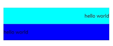
| dir6+ | string | auto | No | Element layout mode. Available values are as follows: - rtl: right-to-left layout. - ltr: left-to-right layout. - auto: follows the system language environment. |
Rendering Attributes
Rendering attributes are used to set whether a component is rendered.
| Name | Type | Default Value | Description |
|---|---|---|---|
| for | Array | - | Expands the current element based on the configured data list. |
| if | boolean | - | Whether the element is added or removed. The value true indicates that the element is added, and false indicates that the element is removed. |
| show | boolean | - | Whether the element is displayed or hidden. The value true indicates that the element is displayed, and false indicates that the element is hidden. |

Do not set styles in attribute fields.
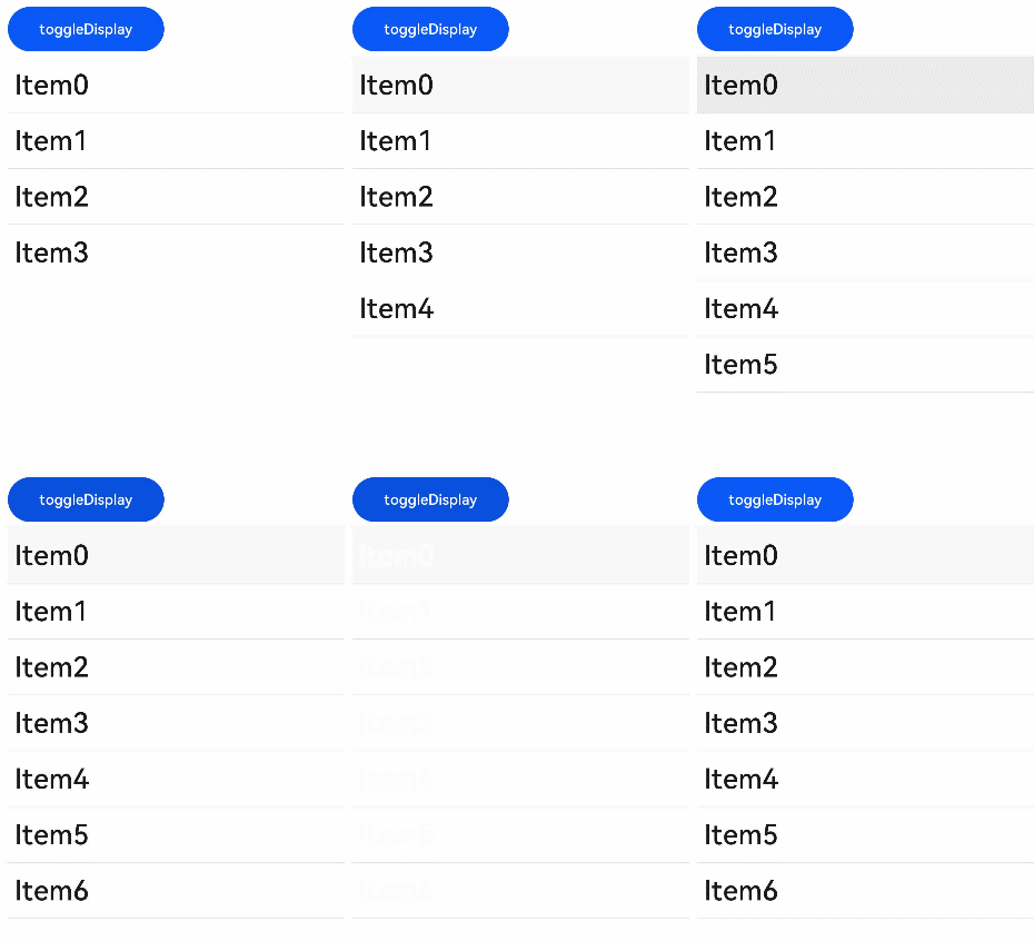
[h2]Example 1
<!-- xxx.hml -->
<div id="container">
    <button class="btn" type="capsule" value="toggleDisplay" onclick="toggleDisplay"></button>
    <list class="list">
        <list-item for="{{ array }}" class="listItem">
            <text class="text" onclick="toggleShow" show="{{ visible }}"
                  if="{{ display }}">{{ $item.value }}</text>
        </list-item>
    </list>
</div>
/* xxx.css */
#container {
flex-direction: column;
width: 100%;
margin-top: 10px;
}
.text {
font-size: 50px;
font-weight: 500;
margin-left: 12px;
}
.listItem {
width: 100%;
height: 100px;
line-height: 60px;
border-bottom: 1px solid #DEDEDE;
font-size: 20px;
}
.btn{
width: 280px;
font-size: 26px;
margin: 10px 0;
} // xxx.js
export default {
data: {
visible: true,
display: true,
title: "",
i: 4,
array: [
{"value": "List text 0"},
{"value": "List text 1"},
{"value": "List text 2"},
{"value": "List text 3"},
],
},
toggleShow: function() {
this.array.push({"value": "List text " + this.i })
this.i++
},
toggleDisplay: function() {
this.display = !this.display
},
} 
[h2]Example 2
<!-- xxx.hml -->
<div class="container">
    <div>
        <text class="text1" dir='rtl' >hello world</text>
    </div>
    <div>
        <text class="text2" dir='ltr' >hello world</text>
    </div>
</div>
/* xxx.css */
.container {
display: flex;
flex-direction: column;
justify-content: center;
align-items: center;
width: 100%;
height: 100%;
}
.text1{
width: 90%;
height: 100px;
background-color: aqua;
}
.text2{
width: 90%;
height: 100px;
background-color: blue;
}