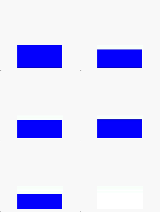
With animateTo, you can build explicit animations for state changes caused by closure code. Similar to property animations, animations with layout properties (such as width and height) changed typically cause content (such as text or content in Canvas) to jump directly to the final state. To enable the content to change with the width and height during the animation process, you can use the renderFit attribute.

The initial APIs of this module are supported since API version 7. Updates will be marked with a superscript to indicate their earliest API version.
The functionality of this module depends on UI context. This means that the APIs of this module cannot be used where the UI context is ambiguous. For details, see UIContext.
AnimateParam
Defines parameters related to animation effects.
System capability: SystemCapability.ArkUI.ArkUI.Full
| Name | Type | Read-Only | Optional | Description |
|---|---|---|---|---|
| duration | number | No | Yes | Animation duration, in ms. Default value: 1000 Note: 1. Before API 26.0.0, the maximum animation duration for an ArkTS widget is 1,000 ms; values exceeding this limit are clamped to 1,000 ms. Starting from API version 26.0.0, the maximum animation duration for an ArkTS widget is adjusted to 2,000 ms. 2. To stop the animation of a property, change the property value in an animation closure with a duration of 0. 3. Values less than 0 are clamped to 0. 4. Floating-point values are floored to integers. For example, if the value set is 1.2, 1 will be used. 5. The duration parameter does not take effect when springMotion, responsiveSpringMotion, and interpolatingSpring are configured for curve. Widget capability: This API can be used in ArkTS widgets since API version 9. Atomic service API: This API can be used in atomic services since API version 11. |
| tempo | number | No | Yes | Animation playback speed. A larger value indicates faster animation playback, and a smaller value indicates slower animation playback. The value 0 means that there is no animation. When the value is set to +∞, the animation completes in the current frame, and the animation end callback is executed immediately. Default value: 1.0 Value range: [0, +∞) Note: Values less than 0 are clamped to 1. Atomic service API: This API can be used in atomic services since API version 11. |
| curve | Curve | string | ICurve9+ | No | Yes | Animation curve. You are advised to specify the curve using the Curve or ICurve type. When the type is string, it represents an animation interpolation curve, supporting only the following options: "linear": Changes linearly. "ease": Slow at both the start and end of an animation; equivalent to cubic-bezier(0.25, 0.1, 0.25, 1.0). "ease-in": Starts slowly and then accelerates; equivalent to cubic-bezier(0.42, 0.0, 1.0, 1.0). "ease-out": Starts quickly and then decelerates; equivalent to cubic-bezier(0.0, 0.0, 0.58, 1.0). "ease-in-out": Accelerates and then decelerates; equivalent to cubic-bezier(0.42, 0.0, 0.58, 1.0). "fast-out-slow-in": Standard curve, cubic-bezier(0.4, 0.0, 0.2, 1.0) "linear-out-slow-in": Deceleration curve, cubic-bezier(0.0, 0.0, 0.2, 1.0) "fast-out-linear-in": Acceleration curve, cubic-bezier(0.4, 0.0, 1.0, 1.0) "friction": Damping curve, cubic-bezier(0.2, 0.0, 0.2, 1.0) "extreme-deceleration": Extreme deceleration curve, cubic-bezier(0.0, 0.0, 0.0, 1.0) curve "rhythm": Rhythm curve, cubic-bezier(0.7, 0.0, 0.2, 1.0) "sharp": Sharp curve, cubic-bezier(0.33, 0.0, 0.67, 1.0) "smooth": Smooth curve, cubic-bezier(0.4, 0.0, 0.4, 1.0) "cubic-bezier(x1, y1, x2, y2)": Cubic Bezier curve. The values of x1 and x2 must be within the range of [0, 1], as in "cubic-bezier(0.42, 0.0, 0.58, 1.0)". "steps(number, step-position)": Step curve. number is required and must be a positive integer. step-position is optional and the values start and end are supported; defaults to end, as in "steps(3, start)". "interpolating-spring(velocity,mass,stiffness,damping)": For details about the parameters, see curves.interpolatingSpring. "responsive-spring-motion(response,dampingFraction,overlapDuration)": For details about the parameters, see curves.responsiveSpringMotion. "spring(velocity,mass,stiffness,damping)": For details about the parameters, see curves.springCurve. "spring-motion(response,dampingFraction,overlapDuration)": For details about the parameters, see curves.springMotion. Default value: Curve.EaseInOut Widget capability: This API can be used in ArkTS widgets since API version 9. Atomic service API: This API can be used in atomic services since API version 11. |
| delay | number | No | Yes | Delay of animation playback, in ms. By default, the playback is not delayed. Default value: 0 Value range: (-∞, +∞) Note: 1. A non-negative delay defers the start of the animation. A negative delay plays the animation ahead of schedule. If the absolute value of delay is less than the actual animation duration, the animation starts its first frame from the state at the absolute value. If the absolute value of delay is greater than or equal to the actual animation duration, the animation starts its first frame from the end state. The actual animation duration is equal to the duration of a single animation multiplied by the number of animation playback times. 2. Floating-point values are floored to integers. For example, if the value set is 1.2, 1 will be used. Atomic service API: This API can be used in atomic services since API version 11. |
| iterations | number | No | Yes | Number of times that the animation is played. By default, the animation is played once. The value -1 indicates that the animation is played for an unlimited number of times. The value 0 indicates that there is no animation. Default value: 1 Value range: [-1, +∞) Note: Floating-point values are floored to integers. For example, if the value set is 1.2, 1 will be used. Atomic service API: This API can be used in atomic services since API version 11. |
| playMode | PlayMode | No | Yes | Animation playback mode. By default, the animation is played from the beginning after the playback is complete. Default value: PlayMode.Normal Widget capability: This API can be used in ArkTS widgets since API version 9. For details about the restrictions, see Notes about PlayMode. Atomic service API: This API can be used in atomic services since API version 11. |
| onFinish | () => void | No | Yes | Callback invoked when the animation playback is complete. If the UIAbility moves from the foreground to the background, any finite loop animation that is still in progress will be immediately terminated, triggering the completion callback. If the transition animation is disabled in the developer options and tempo is set to +∞, the callback is executed immediately when the animation playback is complete. Widget capability: This API can be used in ArkTS widgets since API version 9. Atomic service API: This API can be used in atomic services since API version 11. |
| finishCallbackType11+ | FinishCallbackType | No | Yes | Type of the onFinish callback. Default value: FinishCallbackType.REMOVED Widget capability: This API can be used in ArkTS widgets since API version 11. Atomic service API: This API can be used in atomic services since API version 12. Model restriction: This API can be used only in the stage model. |
| expectedFrameRateRange11+ | ExpectedFrameRateRange | No | Yes | Expected frame rate range of the animation. Atomic service API: This API can be used in atomic services since API version 12. Model restriction: This API can be used only in the stage model. |
Notes about PlayMode:
- PlayMode.Normal and PlayMode.Alternate are recommended. Under these settings, the first round of the animation is played forwards. If PlayMode.Reverse or PlayMode.AlternateReverse is used, the first round of the animation is played backwards. In this case, the animation jumps to the end state and then starts from there.
- When PlayMode.Alternate or PlayMode.AlternateReverse is used, make sure the final state of the animation is the same as the value of the state variable. In other words, make sure the last round of the animation is played forwards. When PlayMode.Alternate is used, iterations must be set to an odd number. When PlayMode.AlternateReverse is used, iterations must be set to an even number.
- PlayMode.Reverse is not recommended. Under this setting, the animation jumps to the end state at the beginning, and its final state will be different from the value of the state variable.
[h2]interpolate9+
interpolate(fraction: number): number
Calculates the interpolated value along the curve at the specified normalized time point.
Atomic service API: This API can be used in atomic services since API version 11.
System capability: SystemCapability.ArkUI.ArkUI.Full
Widget capability: This API can be used in ArkTS widgets since API version 9.
Parameters
| Name | Type | Mandatory | Description |
|---|---|---|---|
| fraction | number | Yes | Current normalized time. Value range: [0, 1]. NOTE A value less than 0 is treated as 0. A value greater than 1 is treated as 1. |
Return value
| Type | Description |
|---|---|
| number | Curve interpolation corresponding to the normalized time point. |
FinishCallbackType11+
Defines the type of the onFinish callback.
Widget capability: This API can be used in ArkTS widgets since API version 11.
Atomic service API: This API can be used in atomic services since API version 12.
Model restriction: This API can be used only in the stage model.
System capability: SystemCapability.ArkUI.ArkUI.Full
| Name | Value | Description |
|---|---|---|
| REMOVED | 0 | The callback is invoked when the entire animation is removed once it has finished. |
| LOGICALLY | 1 | The callback is invoked when the animation logically enters the falling state, though it may still be in its long tail state. |
ExpectedFrameRateRange11+
Sets the expected frame rate range for an animation.
Atomic service API: This API can be used in atomic services since API version 12.
Model restriction: This API can be used only in the stage model.
System capability: SystemCapability.ArkUI.ArkUI.Full
| Name | Type | Read-Only | Optional | Description |
|---|---|---|---|---|
| min | number | No | No | Expected minimum frame rate, in fps. The value range is [0, Maximum frame rate of the device]. |
| max | number | No | No | Expected maximum frame rate, in fps. The value range is [min, Maximum frame rate of the device]. |
| expected | number | No | No | Expected optimal frame rate, in fps. The value range is [min, max]. When this parameter is set to 0, the frame rate of the app is used. |
animateTo(deprecated)
animateTo(value: AnimateParam, event: () => void): void
Defines an explicit animation. When an animation is required, call this API explicitly to modify state and produce an animation effect.

- This API is supported since API version 7 and deprecated since API version 18. You are advised to use animateTo instead.
- Since API version 10, you can use animateTo in UIContext to specify the UI execution context.
- Avoid using animateTo in aboutToAppear or aboutToDisappear.
- When animateTo is called in aboutToAppear, the component's build method is not executed yet, and internal components are not created. This means the animation has no initial values to work with and will not function as expected.
- During aboutToDisappear, the component is being destroyed, so animations should not be used.
- When a component appears or disappears, you can add animation effects through the transition attribute.
- For attributes not supported by component transitions, see Example 2 and use animateTo to implement the component disappearance effect after animation completion.
- In certain scenarios, using animateTo with state management V2 may produce unexpected results. For details, see Using animateTo Failed in State Management V2.
Widget capability: This API can be used in ArkTS widgets since API version 9.
Atomic service API: This API can be used in atomic services since API version 11.
System capability: SystemCapability.ArkUI.ArkUI.Full
Parameters
| Name | Type | Mandatory | Description |
|---|---|---|---|
| value | AnimateParam | Yes | Animation settings. |
| event | () => void | Yes | Closure function for the animation. The system automatically inserts the transition animation if the state changes in the closure function. |
[h2]Example 1: Creating an Appearance Animation for a Component

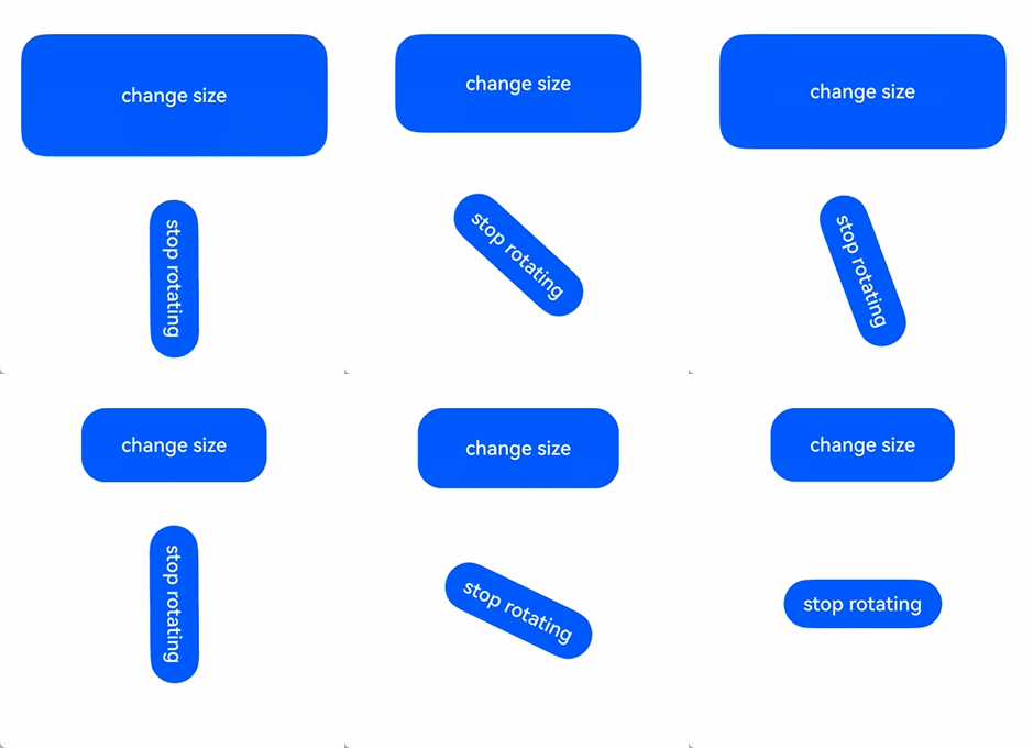
Directly using animateTo can lead to the issue of ambiguous UI context. To avoid this, obtain the UIContext object using the getUIContext() API and then call animateTo bound to the instance using the animateTo API.
This example demonstrates how to create an appearance animation for a component using the onAppear method.
// xxx.ets
@Entry
@Component
struct AnimateToExample {
  @State widthSize: number = 250;
  @State heightSize: number = 100;
  @State rotateAngle: number = 0;
  private flag: boolean = true;

  build() {
    Column() {
      Button('change size')
        .width(this.widthSize)
        .height(this.heightSize)
        .margin(30)
        .onClick(() => {
          if (this.flag) {
            // You are advised to use this.getUIContext()?.animateTo().
            animateTo({
              duration: 2000,
              curve: Curve.EaseOut,
              iterations: 3,
              playMode: PlayMode.Normal,
              onFinish: () => {
                console.info('play end');
              }
            }, () => {
              this.widthSize = 150;
              this.heightSize = 60;
            })
          } else {
            // You are advised to use this.getUIContext()?.animateTo().
            animateTo({}, () => {
              this.widthSize = 250;
              this.heightSize = 100;
            })
          }
          this.flag = !this.flag;
        })
      Button('stop rotating')
        .margin(50)
        .rotate({ x: 0, y: 0, z: 1, angle: this.rotateAngle })
        .onAppear(() => {
          // Start the animation when the component appears.
          // You are advised to use this.getUIContext()?.animateTo().
          animateTo({
            duration: 1200,
            curve: Curve.Friction,
            delay: 500,
            iterations: -1, // The value -1 indicates that the animation is played for an unlimited number of times.
            playMode: PlayMode.Alternate,
            expectedFrameRateRange: {
              min: 10,
              max: 120,
              expected: 60,
            }
          }, () => {
            this.rotateAngle = 90;
          })
        })
        .onClick(() => {
          // You are advised to use this.getUIContext()?.animateTo().
          animateTo({ duration: 0 }, () => {
            // Modify the property in the animation closure where duration is set to 0. This stops the previous animation and applies the new value.
            this.rotateAngle = 0;
          })
        })
    }.width('100%').margin({ top: 5 })
  }
} 
[h2]Example 2: Enabling Component Disappearance After Animation Completion
This example demonstrates how to make a component disappear after the animation ends.
// xxx.ets
@Entry
@Component
struct AttrAnimationExample {
  @State heightSize: number = 100;
  @State isShow: boolean= true;
  @State count: number= 0;
  private isToBottom: boolean = true; // Direction: moving downward.

  build() {
    Column() {
      if (this.isShow) {
        Column()
          .width(200)
          .height(this.heightSize)
          .backgroundColor('blue')
          .onClick(() => {
            // You are advised to use this.getUIContext()?.animateTo().
            animateTo({
              duration: 2000,
              curve: Curve.EaseOut,
              iterations: 1,
              playMode: PlayMode.Normal,
              onFinish: () => {
                this.count--;
                if (this.count == 0 &&!this.isToBottom) { // The component disappears only after completing the downward animation.
                  this.isShow = false;
                }
              }
            }, () => {
              this.count++;
              if (this.isToBottom) {
                this.heightSize = 60;
              } else {
                this.heightSize = 100;
              }
              this.isToBottom = !this.isToBottom;
            })
          })
      }
    }.width('100%').height('100%').margin({ top: 5 })
    .justifyContent(FlexAlign.End)
  }
}