The segment button component includes tab-style segment buttons and capsule-style segment buttons. Tab-style segment buttons are suitable for switching between pages or content areas. Capsule-style segment buttons are suitable for single-select or multi-select scenarios, including capsule-style single-select segment buttons and capsule-style multi-select segment buttons. This component supports custom appearance attributes such as text color, font size, font weight, background color, image size, padding, and background blur material. It supports three button styles: text-only, icon-only, and icon + text. It also provides capabilities such as accessibility reading, layout direction mirroring, custom rounded corners, and property animation, making it suitable for scenarios where you need to quickly build a segmented selection interface that complies with design specifications.

-
This component is supported since API version 11. Updates will be marked with a superscript to indicate their earliest API version.
-
The APIs of this module can be used only in the stage model.
Modules to Import
import { SegmentButton, SegmentButtonOptions, SegmentButtonItemOptionsArray } from '@kit.ArkUI'; SegmentButton
SegmentButton({ options: SegmentButtonOptions, selectedIndexes: number[], onItemClicked?: Callback<number>, maxFontScale: number | Resource, enableStateAnimation: boolean })
Decorator: @Component
System capability: SystemCapability.ArkUI.ArkUI.Full
Device behavior differences: On wearables, calling this API results in a runtime exception indicating that the API is undefined. On other devices, the API works correctly.

-
The segment button does not support universal attributes. The segment button uses the maximum available width in the current area as the component width, and evenly distributes the width among the buttons based on the number of buttons. The segment button height automatically adapts to the button content (text and images), with a minimum height of 28 vp.
-
Attributes decorated by @Prop are optional parameters. They must be passed during construction only when used together with the @Require decorator.
| Name | Type | Mandatory | Decorator | Description |
|---|---|---|---|---|
| options | SegmentButtonOptions | Yes | @ObjectLink | Configuration options of the segment button, used to set the button type (tab type or capsule type), appearance style (color, font, size, etc.), button content, selected state, and other attributes. Atomic service API: This API can be used in atomic services since API version 12. |
| selectedIndexes | number[] | Yes | @Link | Index of the selected item in the segment button. The index of the first item is 0, and subsequent items are numbered sequentially. NOTE selectedIndexes uses the @Link decorator: two-way synchronization between parent and child. Only valid button indexes are supported (the first button index is 0, and subsequent indexes increase sequentially, with the maximum index being the number of buttons minus 1). If an invalid index is passed in, it does not take effect. If no item is selected, an empty array [] can be passed in. Atomic service API: This API can be used in atomic services since API version 12. |
| onItemClicked13+ | Callback<number> | No | - | Callback invoked when a segment button option is clicked. It receives the index of the clicked option as a parameter. If this parameter is not passed in, no callback is triggered when clicked. Atomic service API: This API can be used in atomic services since API version 13. |
| maxFontScale14+ | number | Resource | No | @Prop | Maximum font scale factor of the segment button option text, used to limit the upper bound of font scaling. Pass in this parameter when you need to control the font scale factor to adapt to a specific UI layout or avoid oversized text. Value range: [1, 2] When the set value is less than 1, it is processed as 1; when the set value is greater than 2, it is processed as 2. Default value: 1 Atomic service API: This API can be used in atomic services since API version 14. |
| enableStateAnimation24+ | boolean | No | @Prop | Whether to enable the attribute animation of the segment button when the selectedIndexes value is modified through a variable. true indicates that the attribute animation of the segment button is enabled; false indicates that the attribute animation of the segment button is not enabled. Default value: false Atomic service API: This API can be used in atomic services since API version 24. Model constraint: This API can be used only in the stage model. |
SegmentButtonOptions

The component does not support custom font type settings.
Provides initial data and custom properties for the SegmentButton component.
Decorator Type: @Observed
[h2]Properties
System capability: SystemCapability.ArkUI.ArkUI.Full
Device behavior differences: On wearables, calling this API results in a runtime exception indicating that the API is undefined. On other devices, the API works correctly.
| Name | Type | Read-Only | Optional | Description |
|---|---|---|---|---|
| type | "tab" | "capsule" | No | No | Type of the segment button component. Note: "tab": tab-type segment button, suitable for switching between pages or content areas. "capsule": capsule-type segment button, suitable for single-select or multi-select scenarios. Atomic service API: This API can be used in atomic services since API version 12. |
| multiply | boolean | No | No | Whether the segment button component supports multi-select. true: multi-select is supported; false: multi-select is not supported. For tab-type segment buttons (type is "tab"), multiply is forcibly set to false, and setting it to true does not take effect. Default value: false When the value is undefined, the default value is used. Atomic service API: This API can be used in atomic services since API version 12. |
| buttons | SegmentButtonItemOptionsArray | No | No | Button information of the segment button component, including icon and text information. Atomic service API: This API can be used in atomic services since API version 12. |
| fontColor | ResourceColor | No | No | Text color of the segment button component in the unselected state. When the value is undefined, the color is $r('sys.color.ohos_id_color_text_secondary'). Atomic service API: This API can be used in atomic services since API version 12. |
| selectedFontColor | ResourceColor | No | No | Text color of the segment button component in the selected state. When the value is undefined and type is "tab", the color is $r('sys.color.ohos_id_color_text_primary'). When type is "capsule", the color is $r('sys.color.ohos_id_color_foreground_contrary'). Atomic service API: This API can be used in atomic services since API version 12. |
| fontSize | DimensionNoPercentage | No | No | Font size of the segment button component in the unselected state. Percentage setting is not supported. Unit: fp When the value is undefined, the font size is $r('sys.float.ohos_id_text_size_body2'). Atomic service API: This API can be used in atomic services since API version 12. |
| selectedFontSize | DimensionNoPercentage | No | No | Font size of the segment button component in the selected state. Percentage setting is not supported. Unit: fp When the value is undefined, the font size is $r('sys.float.ohos_id_text_size_body2'). Atomic service API: This API can be used in atomic services since API version 12. |
| fontWeight | FontWeight | No | No | Font weight of the segment button component in the unselected state. When the value is undefined, the font weight is FontWeight.Regular. Atomic service API: This API can be used in atomic services since API version 12. |
| selectedFontWeight | FontWeight | No | No | Font weight of the segment button component in the selected state. When the value is undefined, the font weight is FontWeight.Medium. Atomic service API: This API can be used in atomic services since API version 12. |
| backgroundColor | ResourceColor | No | No | Background color of the segment button component. When the value is undefined, the background color is $r('sys.color.ohos_id_color_button_normal'). Atomic service API: This API can be used in atomic services since API version 12. |
| selectedBackgroundColor | ResourceColor | No | No | Background color of the segment button component in the selected state. When the value is undefined and type is "tab", the background color is $r('sys.color.segment_button_checked_foreground_color'). When type is "capsule", the background color is $r('sys.color.ohos_id_color_emphasize'). Atomic service API: This API can be used in atomic services since API version 12. |
| imageSize | SizeOptions | No | No | Image size of the segment button component. When the value is undefined, the image size is { width: 24, height: 24 }. Unit: vp Note: The imageSize attribute takes effect only on icon-only buttons and icon + text buttons, and has no effect on text-only buttons. Atomic service API: This API can be used in atomic services since API version 12. |
| buttonPadding | Padding | Dimension | No | No | Button padding of the segment button component. When the value is undefined, the padding of icon-only buttons and text-only buttons is { top: 4, right: 8, bottom: 4, left: 8 }. The padding of icon + text buttons is { top: 6, right: 8, bottom: 6, left: 8 }. Unit: vp Atomic service API: This API can be used in atomic services since API version 12. |
| textPadding | Padding | Dimension | No | No | Text padding of the segment button component. When the value is undefined, the text padding is 0. Unit: vp Atomic service API: This API can be used in atomic services since API version 12. |
| localizedButtonPadding12+ | LocalizedPadding | No | Yes | Button padding of the segment button component, which supports adaptive adjustment based on the layout direction (LTR/RTL). Default value: For icon-only buttons and text-only buttons: { top: LengthMetrics.vp(4), end: LengthMetrics.vp(8), bottom: LengthMetrics.vp(4), start: LengthMetrics.vp(8) } For icon + text buttons: { top: LengthMetrics.vp(6), end: LengthMetrics.vp(8), bottom: LengthMetrics.vp(6), start: LengthMetrics.vp(8) } When the value is undefined, the default value is used. Atomic service API: This API can be used in atomic services since API version 12. |
| localizedTextPadding12+ | LocalizedPadding | No | Yes | Text padding, which supports adaptive adjustment based on the layout direction (LTR/RTL). Default value: 0 Unit: vp When the value is undefined, the default value is used. Atomic service API: This API can be used in atomic services since API version 12. |
| direction12+ | Direction | No | Yes | Layout direction of the segment button component. Default value: Direction.Auto When the value is undefined, the default value is used. Atomic service API: This API can be used in atomic services since API version 12. |
| backgroundBlurStyle | BlurStyle | No | No | Background blur material of the segment button component. Default value: BlurStyle.NONE When the value is undefined, the default value is used. Atomic service API: This API can be used in atomic services since API version 12. |
| borderRadiusMode20+ | BorderRadiusMode | No | Yes | Border radius mode, which controls how the radius is calculated. Default value: BorderRadiusMode.DEFAULT When the value is undefined, the default value is used. Atomic service API: This API can be used in atomic services since API version 20. |
| backgroundBorderRadius20+ | LengthMetrics | No | Yes | Border radius of the overall container of the segment button component. Note: This attribute takes effect only when borderRadiusMode is BorderRadiusMode.CUSTOM. For capsule-type multi-select segment buttons (type is "capsule" and multiply is true), this attribute does not take effect. Use itemBorderRadius to configure the radius instead. The radius is limited by the component size. The maximum value is half of the component width or height. Percentage setting is not supported. When the value exceeds the maximum, it is automatically corrected to the maximum. When a percentage is used, the default value is used. Default value: $r('sys.float.segmentbutton_container_shape') When the value is undefined, the default value is used. Atomic service API: This API can be used in atomic services since API version 20. |
| itemBorderRadius20+ | LengthMetrics | No | Yes | Border radius of the button items in the segment button component. Note: This attribute takes effect only when borderRadiusMode is BorderRadiusMode.CUSTOM. For capsule-type multi-select segment buttons (type is "capsule" and multiply is true), only the radius of the options at both ends can be controlled. The radius is limited by the component size. The maximum value is half of the component width or height. Percentage setting is not supported. When the value exceeds the maximum, it is automatically corrected to the maximum. When a percentage is used, the default value is used. Default value: $r('sys.float.segmentbutton_selected_background_shape') When the value is undefined, the default value is used. Atomic service API: This API can be used in atomic services since API version 20. |
| backgroundSystemMaterial | uiMaterial.Material | No | Yes | System material of the background of the segment button component. Different system materials have different properties and produce different effects. After a material is passed in, the animation effect of SegmentButton changes. For capsule-type multi-select segment buttons (type is "capsule" and multiply is true), this attribute does not take effect. Default value: no material effect. Since: 26.0.0 Atomic service API: This API can be used in atomic services since API version 26.0.0. Model constraint: This API can be used only in the stage model. |

Starting from API version 26.0.0, except for capsule-style multi-select buttons (where type is "capsule" and multiply is true), when backgroundSystemMaterial is set to a system material with automatic color inversion, fontColor and selectedFontColor use special system resources that support color inversion, and the colors automatically adapt to the inverted material background color.
[h2]constructor
constructor(options: TabSegmentButtonOptions | CapsuleSegmentButtonOptions)
Constructor.
Atomic service API: This API can be used in atomic services since API version 12.
System capability: SystemCapability.ArkUI.ArkUI.Full
Device behavior differences: On wearables, calling this API results in a runtime exception indicating that the API is undefined. On other devices, the API works correctly.
Parameters
| Name | Type | Mandatory | Description |
|---|---|---|---|
| options | TabSegmentButtonOptions | CapsuleSegmentButtonOptions | Yes | Configuration options for tab-style or capsule-style segment buttons. |
[h2]tab
static tab(options: TabSegmentButtonConstructionOptions): SegmentButtonOptions
Creates a SegmentButtonOptions class to define tabs.
Atomic service API: This API can be used in atomic services since API version 12.
System capability: SystemCapability.ArkUI.ArkUI.Full
Device behavior differences: On wearables, calling this API results in a runtime exception indicating that the API is undefined. On other devices, the API works correctly.
Parameters
| Name | Type | Mandatory | Description |
|---|---|---|---|
| options | TabSegmentButtonConstructionOptions | Yes | Configuration options for tab-style segment buttons. |
Return value
| Type | Description |
|---|---|
| SegmentButtonOptions | Segment button options, used to define a tab type segment button. |
[h2]capsule
static capsule(options: CapsuleSegmentButtonConstructionOptions): SegmentButtonOptions
Creates a capsule-style SegmentButtonOptions instance, which is used to define capsule-style segment buttons.
Atomic service API: This API can be used in atomic services since API version 12.
System capability: SystemCapability.ArkUI.ArkUI.Full
Device behavior differences: On wearables, calling this API results in a runtime exception indicating that the API is undefined. On other devices, the API works correctly.
Parameters
| Name | Type | Mandatory | Description |
|---|---|---|---|
| options | CapsuleSegmentButtonConstructionOptions | Yes | Configuration options for capsule-style segment buttons. |
Return value
| Type | Description |
|---|---|
| SegmentButtonOptions | Segment button options, used to define a capsule type segment button. |
DimensionNoPercentage
type DimensionNoPercentage = PX | VP | FP | LPX | Resource
The percentage length union type is not supported.
Atomic service API: This API can be used in atomic services since API version 12.
System capability: SystemCapability.ArkUI.ArkUI.Full
Device behavior differences: On wearables, calling this API results in a runtime exception indicating that the API is undefined. On other devices, the API works correctly.
CommonSegmentButtonOptions
Defines the customizable attributes of a segment button component.
System capability: SystemCapability.ArkUI.ArkUI.Full
Device behavior differences: On wearables, calling this API results in a runtime exception indicating that the API is undefined. On other devices, the API works correctly.
| Name | Type | Read-Only | Optional | Description |
|---|---|---|---|---|
| fontColor | ResourceColor | No | Yes | Text color of the button in the unselected state. Default value: $r('sys.color.ohos_id_color_text_secondary') If the value is undefined, the default value is used. Atomic service API: This API can be used in atomic services since API version 12. |
| selectedFontColor | ResourceColor | No | Yes | Text color of the button in the selected state. Default value: When type is "tab", the default value is $r('sys.color.ohos_id_color_text_primary'). When type is "capsule", the default value is $r('sys.color.ohos_id_color_foreground_contrary'). If the value is undefined, the default value is used. Atomic service API: This API can be used in atomic services since API version 12. |
| fontSize | DimensionNoPercentage | No | Yes | Font size of the button in the unselected state (percentage setting is not supported). Default value: $r('sys.float.ohos_id_text_size_body2') Unit: fp If the value is undefined, the default value is used. Atomic service API: This API can be used in atomic services since API version 12. |
| selectedFontSize | DimensionNoPercentage | No | Yes | Font size of the button in the selected state (percentage setting is not supported). Default value: $r('sys.float.ohos_id_text_size_body2') Unit: fp If the value is undefined, the default value is used. Atomic service API: This API can be used in atomic services since API version 12. |
| fontWeight | FontWeight | No | Yes | Font weight of the button in the unselected state. Default value: FontWeight.Regular If the value is undefined, the default value is used. Atomic service API: This API can be used in atomic services since API version 12. |
| selectedFontWeight | FontWeight | No | Yes | Font weight of the button in the selected state. Default value: FontWeight.Medium If the value is undefined, the default value is used. Atomic service API: This API can be used in atomic services since API version 12. |
| backgroundColor | ResourceColor | No | Yes | Background color. Default value: $r('sys.color.ohos_id_color_button_normal') If the value is undefined, the default value is used. Atomic service API: This API can be used in atomic services since API version 12. |
| selectedBackgroundColor | ResourceColor | No | Yes | Background color of the button in the selected state. Default value: When type is "tab", the default value is $r('sys.color.segment_button_checked_foreground_color'). When type is "capsule", the default value is $r('sys.color.ohos_id_color_emphasize'). If the value is undefined, the default value is used. Atomic service API: This API can be used in atomic services since API version 12. |
| imageSize | SizeOptions | No | Yes | Image size. Default value: { width: 24, height: 24 } Unit: vp If the value is undefined, the default value is used. Note: The imageSize attribute takes effect only on icon buttons and icon + text buttons, and has no effect on text-only buttons. Atomic service API: This API can be used in atomic services since API version 12. |
| buttonPadding | Padding | Dimension | No | Yes | Button padding. Default value: For icon-only buttons and text-only buttons: { top: 4, right: 8, bottom: 4, left: 8 } For icon + text buttons: { top: 6, right: 8, bottom: 6, left: 8 } Unit: vp If the value is undefined, the default value is used. Atomic service API: This API can be used in atomic services since API version 12. |
| textPadding | Padding | Dimension | No | Yes | Text padding. Default value: 0 Unit: vp If the value is undefined, the default value is used. Atomic service API: This API can be used in atomic services since API version 12. |
| localizedButtonPadding12+ | LocalizedPadding | No | Yes | Button padding, which supports adaptive adjustment based on the layout direction (LTR/RTL). Default value: For icon-only buttons and text-only buttons: { top: LengthMetrics.vp(4), end: LengthMetrics.vp(8), bottom: LengthMetrics.vp(4), start: LengthMetrics.vp(8) } For icon + text buttons: { top: LengthMetrics.vp(6), end: LengthMetrics.vp(8), bottom: LengthMetrics.vp(6), start: LengthMetrics.vp(8) } If the value is undefined, the default value is used. Atomic service API: This API can be used in atomic services since API version 12. |
| localizedTextPadding12+ | LocalizedPadding | No | Yes | Text padding, which supports adaptive adjustment based on the layout direction (LTR/RTL). Default value: 0 Unit: vp If the value is undefined, the default value is used. Atomic service API: This API can be used in atomic services since API version 12. |
| direction12+ | Direction | No | Yes | Layout direction. Default value: Direction.Auto If the value is undefined, the default value is used. Atomic service API: This API can be used in atomic services since API version 12. |
| backgroundBlurStyle | BlurStyle | No | Yes | Background blur material. Default value: BlurStyle.NONE If the value is undefined, the default value is used. Atomic service API: This API can be used in atomic services since API version 12. |
| borderRadiusMode20+ | BorderRadiusMode | No | Yes | Border radius mode, which is used to control the radius calculation method. Default value: BorderRadiusMode.DEFAULT If the value is undefined, the default value is used. Atomic service API: This API can be used in atomic services since API version 20. |
| backgroundBorderRadius20+ | LengthMetrics | No | Yes | Border radius of the overall container of the segment button. Note: This attribute takes effect only when borderRadiusMode is BorderRadiusMode.CUSTOM. For capsule-type multi-select segment buttons (type is "capsule" and multiply is true), this attribute does not take effect, and itemBorderRadius must be used to configure the radius. The radius is limited by the component size. The maximum value is half of the component width or height, and percentage setting is not supported. If the value exceeds the maximum, it is automatically corrected to the maximum. If a percentage is used, the default value is used. Default value: $r('sys.float.segmentbutton_container_shape') If the value is undefined, the default value is used. Atomic service API: This API can be used in atomic services since API version 20. |
| itemBorderRadius20+ | LengthMetrics | No | Yes | Border radius of the button items in the segment button. Note: This attribute takes effect only when borderRadiusMode is BorderRadiusMode.CUSTOM. For capsule-type multi-select segment buttons (type is "capsule" and multiply is true), only the radius of the options at both ends can be controlled. The radius is limited by the component size. The maximum value is half of the component width or height, and percentage setting is not supported. If the value exceeds the maximum, it is automatically corrected to the maximum. If a percentage is used, the default value is used. Default value: $r('sys.float.segmentbutton_selected_background_shape') If the value is undefined, the default value is used. Atomic service API: This API can be used in atomic services since API version 20. |
| backgroundSystemMaterial | uiMaterial.Material | No | Yes | System material of the background of the segment button component. Different system materials have different properties and produce different effects. After a material is passed in, the animation effects of the SegmentButton change. For capsule-type multi-select segment buttons (type is "capsule" and multiply is true), this attribute does not take effect. Default value: no material effect. Since API version 26.0.0, except for capsule-type multi-select segment buttons (type is "capsule" and multiply is true), when backgroundSystemMaterial is set to a system material with automatic inverted color, fontColor and selectedFontColor use special system resources that support inverted color, and the colors automatically adapt to the inverted color of the material background color. Since: 26.0.0 Atomic service API: This API can be used in atomic services since API version 26.0.0. Model restriction: This API can be used only in the stage model. |
BorderRadiusMode20+
Enumerates the border radius modes for the SegmentButton component, which are used to control the border radius calculation method.
Atomic service API: This API can be used in atomic services since API version 20.
System capability: SystemCapability.ArkUI.ArkUI.Full
Device behavior differences: On wearables, calling this API results in a runtime exception indicating that the API is undefined. On other devices, the API works correctly.
| Name | Value | Description |
|---|---|---|
| DEFAULT | 0 | Default mode, where the framework automatically calculates the border radius. |
| CUSTOM | 1 | Custom mode, where the border radius is set by the developer. |
TabSegmentButtonConstructionOptions
Creates a SegmentButtonOptions object of the tab type.
Inherits from CommonSegmentButtonOptions.
Atomic service API: This API can be used in atomic services since API version 12.
System capability: SystemCapability.ArkUI.ArkUI.Full
Device behavior differences: On wearables, calling this API results in a runtime exception indicating that the API is undefined. On other devices, the API works correctly.
| Name | Type | Read-Only | Optional | Description |
|---|---|---|---|---|
| buttons | ItemRestriction<SegmentButtonTextItem> | No | No | Button information. |
CapsuleSegmentButtonConstructionOptions
Represents configuration options for creating a SegmentButton component consisting of capsule-style segment buttons.
Inherits from CommonSegmentButtonOptions.
Atomic service API: This API can be used in atomic services since API version 12.
System capability: SystemCapability.ArkUI.ArkUI.Full
Device behavior differences: On wearables, calling this API results in a runtime exception indicating that the API is undefined. On other devices, the API works correctly.
| Name | Type | Read-Only | Optional | Description |
|---|---|---|---|---|
| buttons | SegmentButtonItemTuple | No | No | Button information. |
| multiply | boolean | No | Yes | Whether multiple items can be selected. Default value: false. If the value is undefined, the default value is used. true: multi-select is allowed. false: multi-select is not allowed. |
ItemRestriction
type ItemRestriction<T> = [T, T, T?, T?, T?]
Tuple type that stores button information.
Atomic service API: This API can be used in atomic services since API version 12.
System capability: SystemCapability.ArkUI.ArkUI.Full
Device behavior differences: On wearables, calling this API results in a runtime exception indicating that the API is undefined. On other devices, the API works correctly.
| Type | Description |
|---|---|
| [T, T, T?, T?, T?] | A tuple that contains two to five elements of the same type. |

A SegmentButton component supports two to five buttons.
SegmentButtonItemTuple
type SegmentButtonItemTuple = ItemRestriction<SegmentButtonTextItem> | ItemRestriction<SegmentButtonIconItem> | ItemRestriction<SegmentButtonIconTextItem>
Represents the tuple union type used to store button information.
Atomic service API: This API can be used in atomic services since API version 12.
System capability: SystemCapability.ArkUI.ArkUI.Full
Device behavior differences: On wearables, calling this API results in a runtime exception indicating that the API is undefined. On other devices, the API works correctly.
| Type | Description |
|---|---|
| ItemRestriction<SegmentButtonTextItem> | A tuple of text-only button information. |
| ItemRestriction<SegmentButtonIconItem> | A tuple of icon-only button information. |
| ItemRestriction<SegmentButtonIconTextItem> | A tuple of icon and text button information. |
SegmentButtonItemArray
type SegmentButtonItemArray = Array<SegmentButtonTextItem> | Array<SegmentButtonIconItem> | Array<SegmentButtonIconTextItem>
Represents the array union type used to store button information.
Atomic service API: This API can be used in atomic services since API version 12.
System capability: SystemCapability.ArkUI.ArkUI.Full
Device behavior differences: On wearables, calling this API results in a runtime exception indicating that the API is undefined. On other devices, the API works correctly.
| Type | Description |
|---|---|
| Array<SegmentButtonTextItem> | An array of text-only button information. |
| Array<SegmentButtonIconItem> | An array of icon-only button information. |
| Array<SegmentButtonIconTextItem> | An array of icon and text button information. |
SegmentButtonItemOptionsArray
Represents an array for storing button information.
Decorator Type: @Observed

The SegmentButtonItemOptionsArray can save only two to five button information elements.
[h2]constructor
constructor(elements: SegmentButtonItemTuple)
Constructor.
Atomic service API: This API can be used in atomic services since API version 12.
System capability: SystemCapability.ArkUI.ArkUI.Full
Device behavior differences: On wearables, calling this API results in a runtime exception indicating that the API is undefined. On other devices, the API works correctly.
Parameters
| Name | Type | Mandatory | Description |
|---|---|---|---|
| elements | SegmentButtonItemTuple | Yes | Button information tuple used to initialize the array, containing 2 to 5 button option elements, each defining the icon, text, and other attributes of a button. |

The SegmentButtonItemOptionsArray can save only two to five button information elements.
[h2]push
push(...items: SegmentButtonItemArray): number
Adds the specified elements to the end of this array and returns the new length of the array.
Atomic service API: This API can be used in atomic services since API version 12.
System capability: SystemCapability.ArkUI.ArkUI.Full
Device behavior differences: On wearables, calling this API results in a runtime exception indicating that the API is undefined. On other devices, the API works correctly.
Parameters
| Name | Type | Mandatory | Description |
|---|---|---|---|
| items | SegmentButtonItemArray | No | Array of added button information. Default value: no button information element is passed in. |
Return value
| Type | Description |
|---|---|
| number | Length of the array after the elements are added. |

The segment button component array supports storing only 2 to 5 button information elements. When the number of elements to be added causes the array to exceed 5, the operation is not performed and the current array length is returned.
[h2]pop
pop(): SegmentButtonItemOptions | undefined
Removes the last element from this array and returns that element.
Atomic service API: This API can be used in atomic services since API version 12.
System capability: SystemCapability.ArkUI.ArkUI.Full
Device behavior differences: On wearables, calling this API results in a runtime exception indicating that the API is undefined. On other devices, the API works correctly.
Return value
| Type | Description |
|---|---|
| SegmentButtonItemOptions | undefined | Element removed from the array. |

The segment button component array supports storing only 2 to 5 button information elements. If the number of buttons after removal is fewer than 2, the operation is not performed, undefined is returned, and the array remains unchanged.
[h2]shift
shift(): SegmentButtonItemOptions | undefined
Removes the first element from this array and returns that element.
Atomic service API: This API can be used in atomic services since API version 12.
System capability: SystemCapability.ArkUI.ArkUI.Full
Device behavior differences: On wearables, calling this API results in a runtime exception indicating that the API is undefined. On other devices, the API works correctly.
Return value
| Type | Description |
|---|---|
| SegmentButtonItemOptions | undefined | Element removed from the array. |

The segment button component array supports storing only 2 to 5 button information elements. If the number of buttons after removal is fewer than 2, the operation is not performed, undefined is returned, and the array remains unchanged.
[h2]unshift
unshift(...items: SegmentButtonItemArray): number
Adds new elements to the beginning of the array and returns the length of the array after the addition.
Atomic service API: This API can be used in atomic services since API version 12.
System capability: SystemCapability.ArkUI.ArkUI.Full
Device behavior differences: On wearables, calling this API results in a runtime exception indicating that the API is undefined. On other devices, the API works correctly.
Parameters
| Name | Type | Mandatory | Description |
|---|---|---|---|
| items | SegmentButtonItemArray | No | Array of button information to add. Default value: no button information element is passed in. |
Return value
| Type | Description |
|---|---|
| number | Length of the array after the elements are added. |

The segment button component array supports storing only 2 to 5 button information elements. When the number of elements to be added causes the array to exceed 5, the operation is not performed and the current array length is returned.
[h2]splice
splice(start: number, deleteCount: number, ...items: SegmentButtonItemOptions[]): SegmentButtonItemOptions[]
Changes the contents of this array by removing the specified number of elements from the specified position and adding new elements in place. This API returns an array containing the removed elements.
Atomic service API: This API can be used in atomic services since API version 12.
System capability: SystemCapability.ArkUI.ArkUI.Full
Device behavior differences: On wearables, calling this API results in a runtime exception indicating that the API is undefined. On other devices, the API works correctly.
Parameters
| Name | Type | Mandatory | Description |
|---|---|---|---|
| start | number | Yes | Start position of the elements to remove, counted from 0. |
| deleteCount | number | Yes | Number of elements to remove. The value must be greater than or equal to 0. If deleteCount exceeds the remaining length of the array, all remaining elements from the start position are removed. |
| items | SegmentButtonItemOptions[] | No | Element to be added to the array from start. Default value: If no element is specified, the element is deleted from the array. |
Return value
| Type | Description |
|---|---|
| SegmentButtonItemOptions[] | An array containing the removed elements. |

The segment button component array stores only 2 to 5 button information elements. If the operation result would cause the number of buttons to be fewer than 2 or more than 5, the operation is not performed and an empty array is returned. If a deletion operation causes the number to be fewer than 2, or an addition operation causes the number to exceed 5, the entire splice operation does not take effect and the array remains in its original state.
[h2]create
static create(elements: SegmentButtonItemTuple): SegmentButtonItemOptionsArray
Creates a SegmentButtonItemOptionsArray object. It accepts the same parameters as the constructor and has the same functionality. You can choose either as required.
Atomic service API: This API can be used in atomic services since API version 12.
System capability: SystemCapability.ArkUI.ArkUI.Full
Device behavior differences: On wearables, calling this API results in a runtime exception indicating that the API is undefined. On other devices, the API works correctly.
Parameters
| Name | Type | Mandatory | Description |
|---|---|---|---|
| elements | SegmentButtonItemTuple | Yes | Button information tuple used to initialize the array, containing 2 to 5 button option elements, each of which defines the icon, text, and other attributes of a button. |
Return value
| Type | Description |
|---|---|
| SegmentButtonItemOptionsArray | Returns the created SegmentButtonItemOptionsArray object, which is an array used to store button information. |

The SegmentButtonItemOptionsArray can save only two to five button information elements.
TabSegmentButtonOptions
Provides configuration options for tab-style segment buttons. Inherits from TabSegmentButtonConstructionOptions.
Atomic service API: This API can be used in atomic services since API version 12.
System capability: SystemCapability.ArkUI.ArkUI.Full
Device behavior differences: On wearables, calling this API results in a runtime exception indicating that the API is undefined. On other devices, the API works correctly.
| Name | Type | Read-Only | Optional | Description |
|---|---|---|---|---|
| type | "tab" | No | No | Type of the segment buttons, which is "tab" in this case. |
CapsuleSegmentButtonOptions
Provides configuration options for capsule-style segment buttons. Inherits from CapsuleSegmentButtonConstructionOptions.
Atomic service API: This API can be used in atomic services since API version 12.
System capability: SystemCapability.ArkUI.ArkUI.Full
Device behavior differences: On wearables, calling this API results in a runtime exception indicating that the API is undefined. On other devices, the API works correctly.
| Name | Type | Read-Only | Optional | Description |
|---|---|---|---|---|
| type | "capsule" | No | No | Type of the segment buttons, which is "capsule" in this case. |
SegmentButtonTextItem
Text button information.
System capability: SystemCapability.ArkUI.ArkUI.Full
Device behavior differences: On wearables, calling this API results in a runtime exception indicating that the API is undefined. On other devices, the API works correctly.
| Name | Type | Read-Only | Optional | Description |
|---|---|---|---|---|
| text | ResourceStr | No | No | Button text. Atomic service API: This API can be used in atomic services since API version 12. |
| accessibilityLevel13+ | string | No | Yes | Accessibility level, which controls whether the current component can be recognized by accessibility services. Supported values: "auto": The current component can be recognized by accessibility services. "yes": The current component can be recognized by accessibility services. "no": The current component cannot be recognized by accessibility services. "no-hide-descendants": The current component and all its child components cannot be recognized by accessibility services. Default value: "auto" If the value is undefined, the default value is used. Atomic service API: This API can be used in atomic services since API version 13. |
| accessibilityDescription13+ | ResourceStr | No | Yes | Accessibility description, which provides further explanation of the current component for users. Developers can set a relatively detailed explanatory text for this attribute of the component to help users understand the operation to be performed, for example, the possible consequences of the operation, especially when these consequences cannot be learned from the component's own attributes and accessibility text. If a component has both a text attribute and an accessibility description attribute, when the component is selected, the text attribute is announced first, followed by the content of the accessibility description attribute. Default value: empty string. If the value is undefined, the default value is used. Atomic service API: This API can be used in atomic services since API version 13. |
SegmentButtonIconItem
Icon button information.
System capability: SystemCapability.ArkUI.ArkUI.Full
Device behavior differences: On wearables, calling this API results in a runtime exception indicating that the API is undefined. On other devices, the API works correctly.
| Name | Type | Read-Only | Optional | Description |
|---|---|---|---|---|
| icon | ResourceStr | No | No | Icon of the button in the unselected state. If the value is undefined, the icon is not displayed. Note: icon and selectedIcon must be set together; setting either one alone does not take effect. Atomic service API: This API can be used in atomic services since API version 12. |
| iconAccessibilityText13+ | ResourceStr | No | Yes | Accessibility text of the button icon in the unselected state. Default value: empty string. If the value is undefined, the default value is used. Atomic service API: This API can be used in atomic services since API version 13. |
| selectedIcon | ResourceStr | No | No | Icon of the button in the selected state. If the value is undefined, the icon is not displayed. Note: icon and selectedIcon must be set together; setting either one alone does not take effect. Atomic service API: This API can be used in atomic services since API version 12. |
| selectedIconAccessibilityText13+ | ResourceStr | No | Yes | Accessibility text of the button icon in the selected state. Default value: empty string. If the value is undefined, the default value is used. Atomic service API: This API can be used in atomic services since API version 13. |
| accessibilityLevel13+ | string | No | Yes | Accessibility level, which controls whether the current component can be recognized by accessibility services. Supported values: "auto": The current component can be recognized by accessibility services. "yes": The current component can be recognized by accessibility services. "no": The current component cannot be recognized by accessibility services. "no-hide-descendants": The current component and all its child components cannot be recognized by accessibility services. Default value: "auto" If the value is undefined, the default value is used. Atomic service API: This API can be used in atomic services since API version 13. |
| accessibilityDescription13+ | ResourceStr | No | Yes | Accessibility description, which provides further explanation of the current component for users. Developers can set a relatively detailed explanatory text for this attribute to help users understand the operation to be performed, for example, the possible consequences of the operation, especially when these consequences cannot be learned from the component's own attributes and accessibility text. If a component has both a text attribute and an accessibility description attribute, when the component is selected, the text attribute is announced first, followed by the content of the accessibility description attribute. Default value: empty string. If the value is undefined, the default value is used. Atomic service API: This API can be used in atomic services since API version 13. |

Both the icon and selectedIcon attributes must be set. Setting only one of them is invalid.
SegmentButtonIconTextItem
Icon and text button information.
System capability: SystemCapability.ArkUI.ArkUI.Full
Device behavior differences: On wearables, calling this API results in a runtime exception indicating that the API is undefined. On other devices, the API works correctly.
| Name | Type | Read-Only | Optional | Description |
|---|---|---|---|---|
| icon | ResourceStr | No | No | Icon of the button in the unselected state. If the value is undefined, the icon is not displayed. Note: icon and selectedIcon must be set together; setting either one alone does not take effect. Atomic service API: This API can be used in atomic services since API version 12. |
| iconAccessibilityText13+ | ResourceStr | No | Yes | Accessibility text of the button icon in the unselected state. Default value: empty string. If the value is undefined, the default value is used. Atomic service API: This API can be used in atomic services since API version 13. |
| selectedIcon | ResourceStr | No | No | Icon of the button in the selected state. If the value is undefined, the icon is not displayed. Note: icon and selectedIcon must be set together; setting either one alone does not take effect. Atomic service API: This API can be used in atomic services since API version 12. |
| selectedIconAccessibilityText13+ | ResourceStr | No | Yes | Accessibility text of the button icon in the selected state. Default value: empty string. If the value is undefined, the default value is used. Atomic service API: This API can be used in atomic services since API version 13. |
| text | ResourceStr | No | No | Button text. If the value is undefined, the text is not displayed. Atomic service API: This API can be used in atomic services since API version 12. |
| accessibilityLevel13+ | string | No | Yes | Accessibility level, which controls whether the current component can be recognized by accessibility services. Supported values: "auto": The current component can be recognized by accessibility services. "yes": The current component can be recognized by accessibility services. "no": The current component cannot be recognized by accessibility services. "no-hide-descendants": The current component and all its child components cannot be recognized by accessibility services. Default value: "auto" If the value is undefined, the default value is used. Atomic service API: This API can be used in atomic services since API version 13. |
| accessibilityDescription13+ | ResourceStr | No | Yes | Accessibility description, which provides further explanation of the current component for users. Developers can set a relatively detailed explanatory text for this attribute to help users understand the operation to be performed, for example, the possible consequences of the operation, especially when these consequences cannot be learned from the component's own attributes and accessibility text. If a component has both a text attribute and an accessibility description attribute, when the component is selected, the text attribute is announced first, followed by the accessibility description. Default value: empty string. If the value is undefined, the default value is used. Atomic service API: This API can be used in atomic services since API version 13. |

Both the icon and selectedIcon attributes must be set. Setting only one of them is invalid.
[h2]Properties
System capability: SystemCapability.ArkUI.ArkUI.Full
Device behavior differences: On wearables, calling this API results in a runtime exception indicating that the API is undefined. On other devices, the API works correctly.
| Name | Type | Read-Only | Optional | Description |
|---|---|---|---|---|
| icon | ResourceStr | No | Yes | Icon of the button in the unselected state. Default value: the icon of the button in the unselected state is not displayed. If the value is undefined, the default value is used. Note: icon and selectedIcon must be set together; setting either alone does not take effect. Atomic service API: This API can be used in atomic services since API version 12. |
| iconAccessibilityText13+ | ResourceStr | No | Yes | Accessibility text of the button icon in the unselected state. Default value: empty string. If the value is undefined, the default value is used. Atomic service API: This API can be used in atomic services since API version 13. |
| selectedIcon | ResourceStr | No | Yes | Icon of the button in the selected state. Default value: the icon of the button in the selected state is not displayed. If the value is undefined, the default value is used. Note: icon and selectedIcon must be set together; setting either alone does not take effect. Atomic service API: This API can be used in atomic services since API version 12. |
| selectedIconAccessibilityText13+ | ResourceStr | No | Yes | Accessibility text of the button icon in the selected state. Default value: empty string. If the value is undefined, the default value is used. Atomic service API: This API can be used in atomic services since API version 13. |
| text | ResourceStr | No | Yes | Button text. Default value: empty string. If the value is undefined, the default value is used. Atomic service API: This API can be used in atomic services since API version 12. |
| accessibilityLevel13+ | string | No | Yes | Accessibility level, which controls whether the current component can be recognized by accessibility services. Supported values: "auto": The current component can be recognized by accessibility services. "yes": The current component can be recognized by accessibility services. "no": The current component cannot be recognized by accessibility services. "no-hide-descendants": The current component and all its child components cannot be recognized by accessibility services. Default value: "auto" If the value is undefined, the default value is used. Atomic service API: This API can be used in atomic services since API version 13. |
| accessibilityDescription13+ | ResourceStr | No | Yes | Accessibility description, which provides further explanation of the current component for users. Developers can set a relatively detailed explanatory text for this attribute of the component to help users understand the operation to be performed, for example, the possible consequences of the operation, especially when these consequences cannot be learned from the component's own attributes and accessibility text. If a component has both a text attribute and an accessibility description attribute, when the component is selected, the text attribute is announced first, followed by the content of the accessibility description attribute. Default value: empty string. If the value is undefined, the default value is used. Atomic service API: This API can be used in atomic services since API version 13. |

Both the icon and selectedIcon attributes must be set. Setting only one of them is invalid.
[h2]constructor
constructor(options: SegmentButtonItemOptionsConstructorOptions)
Constructor.
Atomic service API: This API can be used in atomic services since API version 12.
System capability: SystemCapability.ArkUI.ArkUI.Full
Device behavior differences: On wearables, calling this API results in a runtime exception indicating that the API is undefined. On other devices, the API works correctly.
Parameters
| Name | Type | Mandatory | Description |
|---|---|---|---|
| options | SegmentButtonItemOptionsConstructorOptions | Yes | Configuration options for a single segment button, including the icon, text, and accessibility attributes. |
SegmentButtonItemOptionsConstructorOptions
Construct parameters for SegmentButtonItemOptions.
System capability: SystemCapability.ArkUI.ArkUI.Full
Device behavior differences: On wearables, calling this API results in a runtime exception indicating that the API is undefined. On other devices, the API works correctly.
| Name | Type | Read-Only | Optional | Description |
|---|---|---|---|---|
| icon | ResourceStr | No | Yes | Icon of the button in the unselected state. Default value: the icon of the button in the unselected state is not displayed. If the value is undefined, the default value is used. Note: icon and selectedIcon must be set together. Setting either of them alone does not take effect. Atomic service API: This API can be used in atomic services since API version 12. |
| iconAccessibilityText13+ | ResourceStr | No | Yes | Accessibility text of the button icon in the unselected state. Default value: empty string. If the value is undefined, the default value is used. Atomic service API: This API can be used in atomic services since API version 13. |
| selectedIcon | ResourceStr | No | Yes | Icon of the button in the selected state. Default value: the icon of the button in the selected state is not displayed. If the value is undefined, the default value is used. Note: icon and selectedIcon must be set together. Setting either of them alone does not take effect. Atomic service API: This API can be used in atomic services since API version 12. |
| selectedIconAccessibilityText13+ | ResourceStr | No | Yes | Accessibility text of the button icon in the selected state. Default value: empty string. If the value is undefined, the default value is used. Atomic service API: This API can be used in atomic services since API version 13. |
| text | ResourceStr | No | Yes | Button text. Default value: empty string. If the value is undefined, the default value is used. Atomic service API: This API can be used in atomic services since API version 12. |
| accessibilityLevel13+ | string | No | Yes | Accessibility level, which controls whether the current component can be recognized by accessibility services. Supported values: "auto": The current component can be recognized by accessibility services. "yes": The current component can be recognized by accessibility services. "no": The current component cannot be recognized by accessibility services. "no-hide-descendants": The current component and all its child components cannot be recognized by accessibility services. Default value: "auto" If the value is undefined, the default value is used. Atomic service API: This API can be used in atomic services since API version 13. |
| accessibilityDescription13+ | ResourceStr | No | Yes | Accessibility description, which provides additional explanation about the current component for users. Developers can set a relatively detailed explanatory text for this attribute to help users understand the operation to be performed, for example, the possible consequences of the operation, especially when these consequences cannot be learned from the component's own attributes and accessibility text. If a component has both a text attribute and an accessibility description attribute, when the component is selected, the text attribute is announced first, followed by the content of the accessibility description attribute. Default value: empty string. If the value is undefined, the default value is used. Atomic service API: This API can be used in atomic services since API version 13. |

Both the icon and selectedIcon attributes must be set. Setting only one of them is invalid.
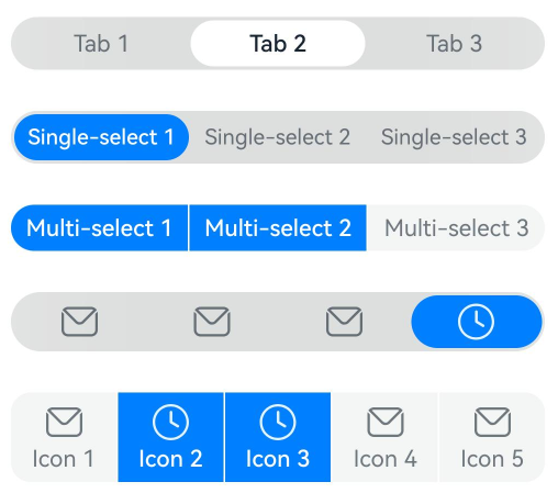
[h2]Example 1: Setting the Type of the SegmentButton component
This example demonstrates how to create two different types of SegmentButton components by configuring SegmentButtonOptions with tab and capsule types.
import {
  ItemRestriction,
  SegmentButton,
  SegmentButtonItemTuple,
  SegmentButtonOptions,
  SegmentButtonTextItem
} from '@kit.ArkUI';

@Entry
@Component
struct Index {
  // Array of tab type SegmentButton components.
  @State tabOptions: SegmentButtonOptions = SegmentButtonOptions.tab({
    buttons: [{ text: 'Tab 1' }, { text: 'Tab 2' }, {
      text: 'Tab 3'
    }] as ItemRestriction<SegmentButtonTextItem>,
    // Configure CommonSegmentButtonOptions to implement the background blur style.
    backgroundBlurStyle: BlurStyle.BACKGROUND_THICK
  });
  // Array of capsule type SegmentButton components.
  @State singleSelectCapsuleOptions: SegmentButtonOptions = SegmentButtonOptions.capsule({
    buttons: [{ text: 'Single-select 1' }, { text: 'Single-select 2' }, { text: 'Single-select 3' }] as SegmentButtonItemTuple,
    multiply: false,
    // Configure CommonSegmentButtonOptions to implement the background blur style.
    backgroundBlurStyle: BlurStyle.BACKGROUND_THICK
  });
  // Array of multi-select capsule type SegmentButton components.
  @State multiplySelectCapsuleOptions: SegmentButtonOptions = SegmentButtonOptions.capsule({
    buttons: [{ text: 'Multi-select 1' }, { text: 'Multi-select 2' }, { text: 'Multi-select 3' }] as SegmentButtonItemTuple,
    multiply: true
  });
  // Array of capsule type SegmentButton components with selected and unselected icons.
  @State iconCapsuleOptions: SegmentButtonOptions = SegmentButtonOptions.capsule({
    buttons: [
      { icon: $r('sys.media.ohos_ic_public_email'), selectedIcon: $r('sys.media.ohos_ic_public_clock') },
      { icon: $r('sys.media.ohos_ic_public_email'), selectedIcon: $r('sys.media.ohos_ic_public_clock') },
      { icon: $r('sys.media.ohos_ic_public_email'), selectedIcon: $r('sys.media.ohos_ic_public_clock') },
      { icon: $r('sys.media.ohos_ic_public_email'), selectedIcon: $r('sys.media.ohos_ic_public_clock') }
    ] as SegmentButtonItemTuple,
    multiply: false,
    // Configure CommonSegmentButtonOptions to implement the background blur style.
    backgroundBlurStyle: BlurStyle.BACKGROUND_THICK
  });
  // Array of multi-select capsule type SegmentButton components with selected and unselected icons.
  @State iconTextCapsuleOptions: SegmentButtonOptions = SegmentButtonOptions.capsule({
    buttons: [
      { text: 'Icon 1', icon: $r('sys.media.ohos_ic_public_email'), selectedIcon: $r('sys.media.ohos_ic_public_clock') },
      { text: 'Icon 2', icon: $r('sys.media.ohos_ic_public_email'), selectedIcon: $r('sys.media.ohos_ic_public_clock') },
      { text: 'Icon 3', icon: $r('sys.media.ohos_ic_public_email'), selectedIcon: $r('sys.media.ohos_ic_public_clock') },
      { text: 'Icon 4', icon: $r('sys.media.ohos_ic_public_email'), selectedIcon: $r('sys.media.ohos_ic_public_clock') },
      { text: 'Icon 5', icon: $r('sys.media.ohos_ic_public_email'), selectedIcon: $r('sys.media.ohos_ic_public_clock') }
    ] as SegmentButtonItemTuple,
    multiply: true
  });
  @State tabSelectedIndexes: number[] = [1];
  @State singleSelectCapsuleSelectedIndexes: number[] = [0];
  @State multiplySelectCapsuleSelectedIndexes: number[] = [0, 1];
  @State singleSelectIconCapsuleSelectedIndexes: number[] = [3];
  @State multiplySelectIconTextCapsuleSelectedIndexes: number[] = [1, 2];

  build() {
    Row() {
      Column() {
        Column({ space: 25 }) {
          SegmentButton({
            options: this.tabOptions,
            selectedIndexes: $tabSelectedIndexes
          })
          SegmentButton({
            options: this.singleSelectCapsuleOptions,
            selectedIndexes: $singleSelectCapsuleSelectedIndexes
          })
          SegmentButton({
            options: this.multiplySelectCapsuleOptions,
            selectedIndexes: $multiplySelectCapsuleSelectedIndexes
          })
          SegmentButton({
            options: this.iconCapsuleOptions,
            selectedIndexes: $singleSelectIconCapsuleSelectedIndexes
          })
          SegmentButton({
            options: this.iconTextCapsuleOptions,
            selectedIndexes: $multiplySelectIconTextCapsuleSelectedIndexes
          })
        }.width('90%')
      }.width('100%')
    }.height('100%')
  }
} 
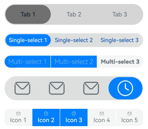
[h2]Example 2: Setting the Style of the SegmentButton component
Customize the text and background style of the segment button by configuring CommonSegmentButtonOptions.
import {
  ItemRestriction,
  SegmentButton,
  SegmentButtonItemTuple,
  SegmentButtonOptions,
  SegmentButtonTextItem
} from '@kit.ArkUI';

@Entry
@Component
struct Index {
  @State tabOptions: SegmentButtonOptions = SegmentButtonOptions.tab({
    buttons: [{ text: 'Tab 1' }, { text: 'Tab 2' }, {
      text: 'Tab 3'
    }] as ItemRestriction<SegmentButtonTextItem>,
    backgroundColor: 'rgb(213,213,213)',
    selectedBackgroundColor: 'rgb(112,112,112)', // Configure CommonSegmentButtonOptions to implement the selected background color.
    textPadding: {
      top: 10,
      right: 10,
      bottom: 10,
      left: 10
    }, // Configure CommonSegmentButtonOptions to implement the text padding.
  });
  @State singleSelectCapsuleOptions: SegmentButtonOptions = SegmentButtonOptions.capsule({
    buttons: [{ text: 'Single-select 1' }, { text: 'Single-select 2' }, { text: 'Single-select 3' }] as SegmentButtonItemTuple,
    multiply: false,
    fontColor: 'rgb(0,74,175)', // Configure CommonSegmentButtonOptions to implement the text color.
    selectedFontColor: 'rgb(247,247,247)', // Configure CommonSegmentButtonOptions to implement the selected text color.
    backgroundBlurStyle: BlurStyle.BACKGROUND_THICK // Configure CommonSegmentButtonOptions to implement the background blur style.
  });
  @State multiplySelectCapsuleOptions: SegmentButtonOptions = SegmentButtonOptions.capsule({
    buttons: [{ text: 'Multi-select 1' }, { text: 'Multi-select 2' }, { text: 'Multi-select 3' }] as SegmentButtonItemTuple,
    multiply: true,
    fontSize: 18,
    selectedFontSize: 18,
    fontWeight: FontWeight.Bolder, // Configure CommonSegmentButtonOptions to implement the text weight.
    selectedFontWeight: FontWeight.Lighter, // Configure CommonSegmentButtonOptions to implement the weight of the selected text.
  });
  @State iconCapsuleOptions: SegmentButtonOptions = SegmentButtonOptions.capsule({
    buttons: [
      { icon: $r('sys.media.ohos_ic_public_email'), selectedIcon: $r('sys.media.ohos_ic_public_clock') },
      { icon: $r('sys.media.ohos_ic_public_email'), selectedIcon: $r('sys.media.ohos_ic_public_clock') },
      { icon: $r('sys.media.ohos_ic_public_email'), selectedIcon: $r('sys.media.ohos_ic_public_clock') },
      { icon: $r('sys.media.ohos_ic_public_email'), selectedIcon: $r('sys.media.ohos_ic_public_clock') }
    ] as SegmentButtonItemTuple,
    multiply: false,
    imageSize: { width: 40, height: 40 },
    buttonPadding: {
      top: 6,
      right: 10,
      bottom: 6,
      left: 10
    },
    backgroundBlurStyle: BlurStyle.BACKGROUND_THICK
  });
  @State iconTextCapsuleOptions: SegmentButtonOptions = SegmentButtonOptions.capsule({
    buttons: [
      { text: 'Icon 1', icon: $r('sys.media.ohos_ic_public_email'), selectedIcon: $r('sys.media.ohos_ic_public_clock') },
      { text: 'Icon 2', icon: $r('sys.media.ohos_ic_public_email'), selectedIcon: $r('sys.media.ohos_ic_public_clock') },
      { text: 'Icon 3', icon: $r('sys.media.ohos_ic_public_email'), selectedIcon: $r('sys.media.ohos_ic_public_clock') },
      { text: 'Icon 4', icon: $r('sys.media.ohos_ic_public_email'), selectedIcon: $r('sys.media.ohos_ic_public_clock') },
      { text: 'Icon 5', icon: $r('sys.media.ohos_ic_public_email'), selectedIcon: $r('sys.media.ohos_ic_public_clock') }
    ] as SegmentButtonItemTuple,
    multiply: true,
    imageSize: { width: 10, height: 10 },
  });
  @State tabSelectedIndexes: number[] = [0];
  @State singleSelectCapsuleSelectedIndexes: number[] = [0];
  @State multiplySelectCapsuleSelectedIndexes: number[] = [0, 1];
  @State singleSelectIconCapsuleSelectedIndexes: number[] = [3];
  @State multiplySelectIconTextCapsuleSelectedIndexes: number[] = [1, 2];

  build() {
    Row() {
      Column() {
        Column({ space: 20 }) {
          SegmentButton({ options: this.tabOptions, selectedIndexes: $tabSelectedIndexes })
          SegmentButton({
            options: this.singleSelectCapsuleOptions,
            selectedIndexes: $singleSelectCapsuleSelectedIndexes
          })
          SegmentButton({
            options: this.multiplySelectCapsuleOptions,
            selectedIndexes: $multiplySelectCapsuleSelectedIndexes
          })
          SegmentButton({
            options: this.iconCapsuleOptions,
            selectedIndexes: $singleSelectIconCapsuleSelectedIndexes
          })
          SegmentButton({
            options: this.iconTextCapsuleOptions,
            selectedIndexes: $multiplySelectIconTextCapsuleSelectedIndexes
          })
        }.width('90%')
      }.width('100%')
    }.height('100%')
  }
} 
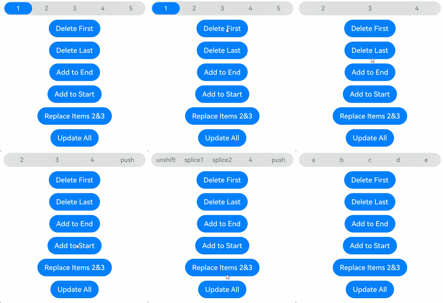
[h2]Example 3: Performing Array Operations on the SegmentButton Component
This example shows how to perform operations such as adding and removing segment buttons using array functions like pop, shift, and unshift.
import {
  SegmentButton,
  SegmentButtonOptions,
  SegmentButtonItemOptionsArray,
  SegmentButtonItemTuple,
  SegmentButtonItemOptions
} from '@kit.ArkUI';

@Entry
@Component
struct Index {
  // Array of capsule type SegmentButton.
  @State singleSelectCapsuleOptions: SegmentButtonOptions = SegmentButtonOptions.capsule({
    buttons: [{ text: '1' }, { text: '2' }, { text: '3' },
      { text: '4' }, { text: '5' }] as SegmentButtonItemTuple,
    multiply: false,
    // Configure CommonSegmentButtonOptions to implement the background blur style.
    backgroundBlurStyle: BlurStyle.BACKGROUND_THICK
  });
  @State capsuleSelectedIndexes: number[] = [0];

  build() {
    Row() {
      Column() {
        Column({ space: 10 }) {
          SegmentButton({
            options: this.singleSelectCapsuleOptions,
            selectedIndexes: $capsuleSelectedIndexes
          })
          // Click "Delete First" to delete the first button.
          Button('Delete First')
            .onClick(() => {
              this.singleSelectCapsuleOptions.buttons.shift()
            })
          // Click "Delete Last" to delete the last button.
          Button('Delete Last')
            .onClick(() => {
              this.singleSelectCapsuleOptions.buttons.pop()
            })
          // Click "Add to End" to add a button at the end.
          Button('Add to End')
            .onClick(() => {
              this.singleSelectCapsuleOptions.buttons.push({ text: 'push' })
            })
          // Click "Add to Start" to add a button at the beginning.
          Button('Add to Start')
            .onClick(() => {
              this.singleSelectCapsuleOptions.buttons.unshift(({ text: 'unshift' }))
            })
          // Click "Replace Items 2&3" to replace buttons 2 and 3 with splice1 and splice2.
          Button('Replace Items 2&3')
            .onClick(() => {
              this.singleSelectCapsuleOptions.buttons.splice(1, 2, new SegmentButtonItemOptions({
                text: 'splice1'
              }), new SegmentButtonItemOptions({ text: 'splice2' }))
            })
          // Click "Update All" to replace 1, 2, 3, 4, and 5 with a, b, c, d, and e.
          Button('Update All')
            .onClick(() => {
              this.singleSelectCapsuleOptions.buttons =
                SegmentButtonItemOptionsArray.create([{ text: 'a' }, { text: 'b' },
                  { text: 'c' }, { text: 'd' }, { text: 'e' }])
            })
        }.width('90%')
      }.width('100%')
    }.height('100%')
  }
} 
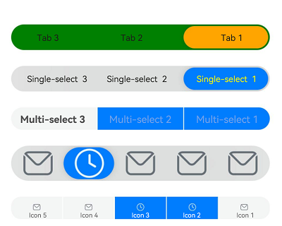
[h2]Example 4: Implementing a Mirrored Layout
This example shows how to implement a mirrored layout for a SegmentButton component by configuring direction.
import { LengthMetrics, SegmentButton, SegmentButtonOptions } from '@kit.ArkUI';

@Entry
@Component
struct Index {
  // Tab type SegmentButton array.
  @State tabOptions: SegmentButtonOptions = SegmentButtonOptions.tab({
    buttons: [{ text: 'Tab 1' }, { text: 'Tab 2' }, {
      text: 'Tab 3'
    }],
    direction: Direction.Rtl, // Set the layout direction of the SegmentButton.
    backgroundColor: Color.Green, // Set the background color of the SegmentButton.
    selectedBackgroundColor: Color.Orange, // Set the background color of the SegmentButton component in the selected state.
    // Set the text padding.
    localizedTextPadding: {
      end: LengthMetrics.vp(10),
      start: LengthMetrics.vp(10)
    },
  });
  // Capsule type SegmentButton array.
  @State singleSelectCapsuleOptions: SegmentButtonOptions = SegmentButtonOptions.capsule({
    buttons: [{ text: 'Single-select 1' }, { text: 'Single-select 2' }, { text: 'Single-select 3' }],
    multiply: false, // Set whether the SegmentButton component supports multiple selection.
    direction: Direction.Rtl, // Set the layout direction of the SegmentButton.
    fontColor: Color.Black, // Set the text color of the SegmentButton component in the unselected state.
    selectedFontColor: Color.Yellow, // Set the text color of the SegmentButton component in the selected state.
    backgroundBlurStyle: BlurStyle.BACKGROUND_THICK // Set the background blur material of the SegmentButton component.
  });
  // Capsule type SegmentButton array.
  @State multiplySelectCapsuleOptions: SegmentButtonOptions = SegmentButtonOptions.capsule({
    buttons: [{ text: 'Multi-select 1' }, { text: 'Multi-select 2' }, { text: 'Multi-select 3' }],
    multiply: true, // Set whether the SegmentButton component supports multiple selection.
    direction: Direction.Rtl, // Set the layout direction of the SegmentButton.
    fontSize: 18, // Set the font size of the SegmentButton component in the unselected state.
    selectedFontSize: 18, // Set the font size of the SegmentButton component in the selected state.
    fontWeight: FontWeight.Bolder, // Set the font weight of the SegmentButton component in the unselected state.
    selectedFontWeight: FontWeight.Lighter, // Set the font weight of the SegmentButton component in the selected state.
  });
  // Capsule type SegmentButton array.
  @State iconCapsuleOptions: SegmentButtonOptions = SegmentButtonOptions.capsule({
    buttons: [
      { icon: $r('sys.media.ohos_ic_public_email'), selectedIcon: $r('sys.media.ohos_ic_public_clock') },
      { icon: $r('sys.media.ohos_ic_public_email'), selectedIcon: $r('sys.media.ohos_ic_public_clock') },
      { icon: $r('sys.media.ohos_ic_public_email'), selectedIcon: $r('sys.media.ohos_ic_public_clock') },
      { icon: $r('sys.media.ohos_ic_public_email'), selectedIcon: $r('sys.media.ohos_ic_public_clock') },
      { icon: $r('sys.media.ohos_ic_public_email'), selectedIcon: $r('sys.media.ohos_ic_public_clock') }
    ],
    multiply: false, // Set whether the SegmentButton component supports multiple selection.
    direction: Direction.Rtl, // Set the layout direction of the SegmentButton.
    imageSize: { width: 40, height: 40 }, // Set the image size of the SegmentButton component.
    // Set the button padding of the SegmentButton component, which supports layout adaptation based on the layout direction (LTR/RTL).
    localizedButtonPadding: {
      end: LengthMetrics.vp(10),
      start: LengthMetrics.vp(10)
    },
    backgroundBlurStyle: BlurStyle.BACKGROUND_THICK // Set the background blur material of the SegmentButton component.
  });
  @State iconTextCapsuleOptions: SegmentButtonOptions = SegmentButtonOptions.capsule({
    buttons: [
      { text: 'Icon 1', icon: $r('sys.media.ohos_ic_public_email'), selectedIcon: $r('sys.media.ohos_ic_public_clock') },
      { text: 'Icon 2', icon: $r('sys.media.ohos_ic_public_email'), selectedIcon: $r('sys.media.ohos_ic_public_clock') },
      { text: 'Icon 3', icon: $r('sys.media.ohos_ic_public_email'), selectedIcon: $r('sys.media.ohos_ic_public_clock') },
      { text: 'Icon 4', icon: $r('sys.media.ohos_ic_public_email'), selectedIcon: $r('sys.media.ohos_ic_public_clock') },
      { text: 'Icon 5', icon: $r('sys.media.ohos_ic_public_email'), selectedIcon: $r('sys.media.ohos_ic_public_clock') }
    ],
    multiply: true, // Set whether the SegmentButton component supports multiple selection.
    direction: Direction.Rtl, // Set the layout direction of the SegmentButton.
    imageSize: { width: 10, height: 10 }, // Set the image size of the SegmentButton component.
  });
  @State tabSelectedIndexes: number[] = [0];
  @State singleSelectCapsuleSelectedIndexes: number[] = [0];
  @State multiplySelectCapsuleSelectedIndexes: number[] = [0, 1];
  @State singleSelectIconCapsuleSelectedIndexes: number[] = [3];
  @State multiplySelectIconTextCapsuleSelectedIndexes: number[] = [1, 2];

  build() {
    Row() {
      Column() {
        Column({ space: 20 }) {
          SegmentButton({ options: this.tabOptions, selectedIndexes: $tabSelectedIndexes })
          SegmentButton({
            options: this.singleSelectCapsuleOptions,
            selectedIndexes: $singleSelectCapsuleSelectedIndexes
          })
          SegmentButton({
            options: this.multiplySelectCapsuleOptions,
            selectedIndexes: $multiplySelectCapsuleSelectedIndexes
          })
          SegmentButton({
            options: this.iconCapsuleOptions,
            selectedIndexes: $singleSelectIconCapsuleSelectedIndexes
          })
          SegmentButton({
            options: this.iconTextCapsuleOptions,
            selectedIndexes: $multiplySelectIconTextCapsuleSelectedIndexes
          })
        }.width('90%')
      }.width('100%')
    }.height('100%')
  }
} 
[h2]Example 5: Setting Accessibility
This example showcases how to implement accessibility features for the SegmentButton component by configuring attributes such as accessibilityLevel and selectedIconAccessibilityText.
import {
  ItemRestriction,
  SegmentButton,
  SegmentButtonItemTuple,
  SegmentButtonOptions,
  SegmentButtonTextItem,
  SegmentButtonItemOptions
} from '@kit.ArkUI';

@Entry
@Component
struct Index {
  @State tabOptions: SegmentButtonOptions = SegmentButtonOptions.tab({
    buttons: [{ text: 'Tab 1', accessibilityLevel: 'yes', accessibilityDescription: 'Tab 1 usage hints' },
      { text: 'Tab 2', accessibilityLevel: 'yes', accessibilityDescription: 'Tab 2 usage hints' },
      {
        text: 'Tab 3 ', accessibilityLevel: 'yes', accessibilityDescription: 'Tab 3 usage hints'
      }] as ItemRestriction<SegmentButtonTextItem>,
    backgroundBlurStyle: BlurStyle.BACKGROUND_THICK
  });
  @State iconCapsuleOptions: SegmentButtonOptions = SegmentButtonOptions.capsule({
    buttons: [
      {
        icon: $r('sys.media.ohos_ic_public_email'),
        iconAccessibilityText: 'Accessibility text for the unselected icon', // Accessibility text for the icon of the button in the unselected state.
        selectedIcon: $r('sys.media.ohos_ic_public_clock'),
        selectedIconAccessibilityText: 'Accessibility text for the selected icon', // Accessibility text for the icon of the button in the selected state.
        accessibilityLevel: 'yes', // Accessibility importance, which controls whether the current component can be recognized by accessibility services.
        accessibilityDescription: 'SegmentButtonIconItem new user reminder' // Accessibility description.
      },
      {
        icon: $r('sys.media.ohos_ic_public_email'),
        iconAccessibilityText: 'Accessibility text for the unselected icon', // Accessibility text for the icon of the button in the unselected state.
        selectedIcon: $r('sys.media.ohos_ic_public_clock'),
        selectedIconAccessibilityText: 'Accessibility text for the selected icon', // Accessibility text for the icon of the button in the selected state.
        accessibilityLevel: 'yes', // Accessibility importance, which controls whether the current component can be recognized by accessibility services.
        accessibilityDescription: 'SegmentButtonIconItem new user reminder' // Accessibility description.
      },
      {
        icon: $r('sys.media.ohos_ic_public_email'),
        iconAccessibilityText: 'Accessibility text for the unselected icon', // Accessibility text for the icon of the button in the unselected state.
        selectedIcon: $r('sys.media.ohos_ic_public_clock'),
        selectedIconAccessibilityText: 'Accessibility text for the selected icon', // Accessibility text for the icon of the button in the selected state.
        accessibilityLevel: 'yes', // Accessibility importance, which controls whether the current component can be recognized by accessibility services.
        accessibilityDescription: 'SegmentButtonIconItem new user reminder' // Accessibility description.
      },
      {
        icon: $r('sys.media.ohos_ic_public_email'),
        iconAccessibilityText: 'Accessibility text for the unselected icon', // Accessibility text for the icon of the button in the unselected state.
        selectedIcon: $r('sys.media.ohos_ic_public_clock'),
        selectedIconAccessibilityText: 'Accessibility text for the selected icon', // Accessibility text for the icon of the button in the selected state.
        accessibilityLevel: 'yes', // Accessibility importance, which controls whether the current component can be recognized by accessibility services.
        accessibilityDescription: 'SegmentButtonIconItem new user reminder' // Accessibility description.
      }
    ] as SegmentButtonItemTuple,
    multiply: false,
    backgroundBlurStyle: BlurStyle.BACKGROUND_THICK
  });
  @State iconTextCapsuleOptions: SegmentButtonOptions = SegmentButtonOptions.capsule({
    buttons: [
      {
        text: 'Icon 1',
        icon: $r('sys.media.ohos_ic_public_email'),
        iconAccessibilityText: 'Accessibility text for the unselected icon', // Accessibility text for the icon of the button in the unselected state.
        selectedIcon: $r('sys.media.ohos_ic_public_clock'),
        selectedIconAccessibilityText: 'Accessibility text for the selected icon', // Accessibility text for the icon of the button in the selected state.
        accessibilityLevel: 'yes', // Accessibility importance, which controls whether the current component can be recognized by accessibility services.
        accessibilityDescription: 'SegmentButtonIconTextItem new user reminder' // Accessibility description.
      },
      {
        text: 'Icon 2',
        icon: $r('sys.media.ohos_ic_public_email'),
        iconAccessibilityText: 'Accessibility text for the unselected icon', // Accessibility text for the icon of the button in the unselected state.
        selectedIcon: $r('sys.media.ohos_ic_public_clock'),
        selectedIconAccessibilityText: 'Accessibility text for the selected icon', // Accessibility text for the icon of the button in the selected state.
        accessibilityLevel: 'yes', // Accessibility importance, which controls whether the current component can be recognized by accessibility services.
        accessibilityDescription: 'SegmentButtonIconTextItem new user reminder' // Accessibility description.
      },
      {
        text: 'Icon 3',
        icon: $r('sys.media.ohos_ic_public_email'),
        iconAccessibilityText: 'Accessibility text for the unselected icon', // Accessibility text for the icon of the button in the unselected state.
        selectedIcon: $r('sys.media.ohos_ic_public_clock'),
        selectedIconAccessibilityText: 'Accessibility text for the selected icon', // Accessibility text for the icon of the button in the selected state.
        accessibilityLevel: 'yes', // Accessibility importance, which controls whether the current component can be recognized by accessibility services.
        accessibilityDescription: 'SegmentButtonIconTextItem new user reminder' // Accessibility description.
      },
      {
        text: 'Icon 4',
        icon: $r('sys.media.ohos_ic_public_email'),
        iconAccessibilityText: 'Accessibility text for the unselected icon', // Accessibility text for the icon of the button in the unselected state.
        selectedIcon: $r('sys.media.ohos_ic_public_clock'),
        selectedIconAccessibilityText: 'Accessibility text for the selected icon', // Accessibility text for the icon of the button in the selected state.
        accessibilityLevel: 'yes', // Accessibility importance, which controls whether the current component can be recognized by accessibility services.
        accessibilityDescription: 'SegmentButtonIconTextItem new user reminder' // Accessibility description.
      }
    ] as SegmentButtonItemTuple,
    multiply: true
  });
  @State tabSelectedIndexes: number[] = [1];
  @State singleSelectIconCapsuleSelectedIndexes: number[] = [3];
  @State multiplySelectIconTextCapsuleSelectedIndexes: number[] = [1, 2];

  build() {
    Row() {
      Column() {
        Column({ space: 25 }) {
          SegmentButton({
            options: this.tabOptions,
            selectedIndexes: $tabSelectedIndexes
          })
          SegmentButton({
            options: this.iconCapsuleOptions,
            selectedIndexes: $singleSelectIconCapsuleSelectedIndexes
          })
          SegmentButton({
            options: this.iconTextCapsuleOptions,
            selectedIndexes: $multiplySelectIconTextCapsuleSelectedIndexes
          })
          Button('Replace Items 2 and 3 with splice1 and splice2')
            .onClick(() => {
              this.iconTextCapsuleOptions.buttons.splice(1, 2, new SegmentButtonItemOptions({
                text: 'splice1', accessibilityLevel: 'yes', accessibilityDescription: 'SegmentButtonItemOptions usage hints'
              }), new SegmentButtonItemOptions({
                text: 'splice2',
                icon: $r('sys.media.ohos_ic_public_email'),
                iconAccessibilityText: 'Accessibility text for the unselected icon', // Accessibility text for the icon of the button in the unselected state.
                selectedIcon: $r('sys.media.ohos_ic_public_clock'),
                selectedIconAccessibilityText: 'Accessibility text for the selected icon', // Accessibility text for the icon of the button in the selected state.
                accessibilityLevel: 'yes', // Accessibility importance, which controls whether the current component can be recognized by accessibility services.
                accessibilityDescription: 'SegmentButtonIconTextItem new user reminder' // Accessibility description.
              }))
            })
        }.width('90%')
      }.width('100%')
    }.height('100%')
  }
}
[h2]Example 6: Setting Custom Border Radius
This example demonstrates how to set a custom border radius for the SegmentButton component.
import {
  BorderRadiusMode,
  ItemRestriction,
  LengthMetrics,
  SegmentButton,
  SegmentButtonOptions,
  SegmentButtonTextItem
} from '@kit.ArkUI';

@Entry
@Component
struct Index {
  @State tabOptions: SegmentButtonOptions = SegmentButtonOptions.tab({
    buttons: [{ text: 'Tab 1' }, { text: 'Tab 2' }, {
      text: 'Tab 3'
    }] as ItemRestriction<SegmentButtonTextItem>,
    backgroundBlurStyle: BlurStyle.BACKGROUND_THICK,
    borderRadiusMode: BorderRadiusMode.CUSTOM, // Customize the corner radius of the border.
    backgroundBorderRadius: LengthMetrics.vp(8),
    itemBorderRadius: LengthMetrics.vp(6)
  });
  @State tabSelectedIndexes: number[] = [1];

  build() {
    Row() {
      Column() {
        Column({ space: 25 }) {
          SegmentButton({
            options: this.tabOptions,
            selectedIndexes: $tabSelectedIndexes,
          })
        }.width('90%')
      }.width('100%')
    }.height('100%')
  }
} 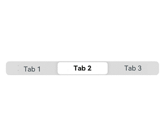
[h2]Example 7: Enabling Property Animation for SegmentButton
This example demonstrates how to enable property animation for SegmentButton. That is, after enableStateAnimation is set to true, modifying the selectedIndexes value triggers a button switching animation. In addition, two SegmentButton components with the same selectedIndexes value present different switching animations depending on whether property animation is enabled.
Since API version 24, SegmentButton has added the enableStateAnimation attribute.
import { SegmentButton, SegmentButtonItemTuple, SegmentButtonOptions } from '@kit.ArkUI';

@Entry
@Component
struct Index {
  @State singleSelectTextCapsuleOptions: SegmentButtonOptions = SegmentButtonOptions.capsule({
    buttons: [
      { text: 'Single-select 1' }, { text: 'Single-select 2' }, { text: 'Single-select 3' }
    ] as SegmentButtonItemTuple,
    multiply: false
  });

  @State textCapsuleSingleSelected: number[] = [0]; // Selected index of the Single-select button. The first one is selected by default.

  enableStateAnimation: boolean[] = [false, true];
  @State enableStateAnimationIndex: number = 0;
  @State currentSelectedIndex: number = 0; // Index counter for switching the selected item.

  build() {
    Row() {
      Column() {
        Column({ space: 25 }) {
          // The animation takes effect only when the selected item is switched by a manual tap. Modifying the selected item through non-tap operations does not trigger any animation.
          SegmentButton({
            options: this.singleSelectTextCapsuleOptions,
            selectedIndexes: this.textCapsuleSingleSelected // Property animation is not enabled.
          })

          Text('enableStateAnimation: ' + this.enableStateAnimation[this.enableStateAnimationIndex])
            .fontSize(18)
            .fontWeight(FontWeight.Bold)

          Row({ space: 10 }) {
            Button('false')
              .onClick(() => {
                this.enableStateAnimationIndex = 0;
              })

            Button('true')
              .onClick(() => {
                this.enableStateAnimationIndex = 1;
              })
          }
          .width('100%')
          .justifyContent(FlexAlign.Center)
          .margin({ bottom: 10 })

          // When enableStateAnimation is true, switching the selected item triggers the button switching animation. When enableStateAnimation is false, the animation takes effect only when the selected item is switched by a manual tap. Modifying the selected item through non-tap operations does not trigger any animation.
          SegmentButton({
            options: this.singleSelectTextCapsuleOptions,
            selectedIndexes: this.textCapsuleSingleSelected,
            enableStateAnimation: this.enableStateAnimation[this.enableStateAnimationIndex] // Enable property animation.
          })

          Button('change selectedIndexes')
            .onClick(() => {
              // Increment the index of the selected item. If it exceeds the maximum index, reset it to 0.
              this.currentSelectedIndex = this.currentSelectedIndex < 2 ? this.currentSelectedIndex + 1 : 0;
              this.textCapsuleSingleSelected = [this.currentSelectedIndex];
            })
        }.width('90%')
      }.width('100%')
    }.height('100%')
  }
} 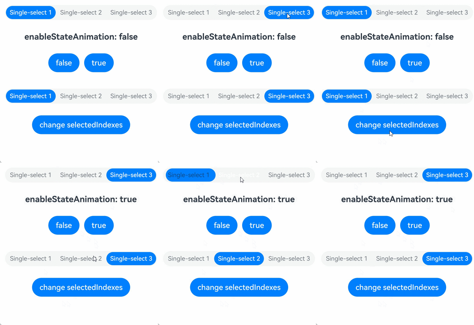
[h2]Example 8: Setting the Background Material
The following example uses the backgroundSystemMaterial attribute to set a transparent background material for the segment button, enable automatic color inversion and interactive deformation effects, and customize the color of the feedback light effect.
Starting from API version 26.0.0, the backgroundSystemMaterial attribute has been added to SegmentButtonOptions and CommonSegmentButtonOptions.
import {
  ItemRestriction,
  SegmentButton,
  SegmentButtonOptions,
  SegmentButtonTextItem,
  uiMaterial
} from '@kit.ArkUI';


@Entry
@Component
struct Index {
  @State tabOptions: SegmentButtonOptions = SegmentButtonOptions.tab({
    buttons: [{ text: 'Tab button 1' }, { text: 'Tab button 2' }, {
      text: 'Tab button 3'
    }] as ItemRestriction<SegmentButtonTextItem>,
    backgroundColor: Color.Transparent,
    // Set fontColor to a special system resource value to enable the automatic color inversion capability.
    fontColor: $r('sys.color.font_primary'),
    // Set the system material style to ULTRA_THIN, and enable automatic color inversion, interactive deformation effects, and a custom feedback light color.
    backgroundSystemMaterial: new uiMaterial.ImmersiveMaterial({
      style: uiMaterial.ImmersiveStyle.ULTRA_THIN,
      colorInvert: true,
      interactive: true,
      lightEffect: { color: undefined }
    })
  });
  @State tabSelectedIndexes: number[] = [0];

  build() {
    Column({ space: 20 }) {
      SegmentButton({
        options: this.tabOptions,
        selectedIndexes: $tabSelectedIndexes
      })
    }
    .width('100%')
    .height('20%')
    .padding(20)
    .linearGradient({
      angle: 90, // Gradient angle. 90 degrees means from left to right.
      colors: [
        ['#FF9A9E', 0.0], // Start color and position (0.0 indicates the start point).
        ['#FECFEF', 0.1], // Intermediate color and position.
        ['#3B324C', 1.0] // End color and position (1.0 indicates the end point).
      ]
    })
  }
}
[h2]Example 9: Listening for Changes to Properties in SegmentButtonOptions
SegmentButtonOptions uses the @Observed decorator, and the SegmentButton component receives this object through @ObjectLink. For first-level basic type properties of SegmentButtonOptions (such as fontColor and backgroundColor), the linkage mechanism of @Observed and @ObjectLink can already observe property changes and trigger UI refresh without additional processing. However, for internal properties of object-type properties in SegmentButtonOptions (such as width and height of imageSize, or properties of buttonPadding), which are deeper nested properties, @State can only observe first-level assignment changes and cannot detect modifications to such deep properties. As a result, the UI does not automatically refresh when internal properties of object-type properties are modified. Using the makeObserved API to wrap object-type properties (such as imageSize) can add deep observation capability to the internal properties of the object, so that when internal properties (such as width and height) are modified, the framework can detect the changes and trigger UI refresh. For details about the makeObserved API, see makeObserved API: Changing Unobservable Data to Observable Data.
The following example compares two scenarios: tapping the "Change fontColor" button changes the fontColor property of iconTextCapsuleOptions (a first-level basic type property, already supported for observation through @Observed and @ObjectLink), and the UI automatically refreshes. Tapping the "Change icon size" button changes the width and height properties of iconTextCapsuleOptions.imageSize (internal properties of the imageSize object, which require UIUtils.makeObserved to wrap imageSize for observation), and the UI also automatically refreshes.
import {
  SegmentButton,
  SegmentButtonOptions,
  SegmentButtonItemTuple,
  UIUtils
} from '@kit.ArkUI';

@Entry
@Component
struct Index {
  @State iconTextCapsuleOptions: SegmentButtonOptions = SegmentButtonOptions.capsule({
    buttons: [
      { text: 'Icon 1', icon: $r('sys.media.ohos_ic_public_email'), selectedIcon: $r('sys.media.ohos_ic_public_clock') },
      { text: 'Icon 2', icon: $r('sys.media.ohos_ic_public_email'), selectedIcon: $r('sys.media.ohos_ic_public_clock') },
      { text: 'Icon 3', icon: $r('sys.media.ohos_ic_public_email'), selectedIcon: $r('sys.media.ohos_ic_public_clock') },
      { text: 'Icon 4', icon: $r('sys.media.ohos_ic_public_email'), selectedIcon: $r('sys.media.ohos_ic_public_clock') },
      { text: 'Icon 5', icon: $r('sys.media.ohos_ic_public_email'), selectedIcon: $r('sys.media.ohos_ic_public_clock') }
    ] as SegmentButtonItemTuple,
    multiply: false,
    // Wrap imageSize with UIUtils.makeObserved so that its internal width and height properties can be observed.
    imageSize: UIUtils.makeObserved({ width: 30, height: 30 })
  });
  @State selectedIndexes: number[] = [0];
  @State currentFontColor: ResourceColor = Color.Blue;

  build() {
    Column({ space: 20 }) {
      SegmentButton({
        options: this.iconTextCapsuleOptions,
        selectedIndexes: $selectedIndexes
      })
      // First-level basic type properties. Observation of this.iconTextCapsuleOptions.fontColor is already supported through @Observed and @ObjectLink, so the UI refreshes automatically.
      Button('Modify fontColor')
        .onClick(() => {
          if (this.currentFontColor === Color.Blue) {
            this.currentFontColor = Color.Red;
          } else {
            this.currentFontColor = Color.Blue;
          }
          this.iconTextCapsuleOptions.fontColor = this.currentFontColor;
        })
      // Modify the internal properties of imageSize. Because it is wrapped by makeObserved, the UI refreshes automatically.
      Button('Change icon size')
        .onClick(() => {
          this.iconTextCapsuleOptions.imageSize.width = 10;
          this.iconTextCapsuleOptions.imageSize.height = 10;
        })
    }
    .width('100%')
    .height('50%')
    .padding({ top: 20 })
  }
}