In the preceding example, @Styles can be used to reuse styles. Building on @Styles, we provide @Extend for extending component styles.

The APIs of this module are supported since API version 9.
This decorator can be used in ArkTS widgets since API version 9.
This decorator can be used in atomic services since API version 11.
[h2]Usage Rules
-
Unlike @Styles, @Extend can encapsulate private attributes, private events, and globally defined methods of specific components.
// @Extend(Text) supports the private attribute fontColor of the Text component. @Extend(Text) function fancy() { .fontColor(Color.Red) } // superFancyText can call the predefined method fancy. @Extend(Text) function superFancyText(size: number) { .fontSize(size) .fancy() } -
When @Extend is used to encapsulate the private attributes, private events, and globally defined methods of a specified component, @Extend and @Styles cannot be used together.
@Styles function fancy() { .backgroundColor(Color.Red) } // superFancyText cannot call the predefined method fancy. @Extend(Text) function superFancyText(size: number) { .fontSize(size) .fancy() } -
Different from @Styles decorated methods, the @Extend decorated methods support passing parameters. The calling complies with the TS method calling convention.
// xxx.ets @Extend(Text) function fancy(fontSize: number) { .fontColor(Color.Red) .fontSize(fontSize) } @Entry @Component struct FancyUse { build() { Row({ space: 10 }) { Text('Fancy') .fancy(16) Text('Fancy') .fancy(24) } } } -
Parameters passed into @Extend decorated methods can be functions serving as event handlers.
// Methods decorated with @Extend support function parameters. @Extend(Text) function makeMeClick(onClick: () => void) { .backgroundColor(Color.Blue) .onClick(onClick) } @Entry @Component struct FancyUse { @State label: string = 'Hello World'; onClickHandler() { this.label = 'Hello ArkUI'; } build() { Row({ space: 10 }) { Text(`${this.label}`) .makeMeClick(() => { this.onClickHandler(); }) } } } -
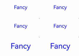
Parameters passed into @Extend decorated methods can also be state variables. Changes to these state variables cause the UI to re-render.
// Use a state variable as the @Extend parameter so that state changes drive the Text style refresh.
@Extend(Text)
function fancy(fontSize: number) {
  .fontColor(Color.Blue)
  .fontSize(fontSize)
}

@Entry
@Component
struct FancyUse {
  @State fontSizeValue: number = 20;

  build() {
    Column({ space: 10 }) {
      Text('Fancy')
        .fancy(this.fontSizeValue)
        .onClick(() => {
          this.fontSizeValue = 30;
        })
    }
    .width('100%')
  }
}
Constraints
- Unlike @Styles, @Extend must be defined globally, outside of any component declaration.

@Extend can be used only in the current file and cannot be exported.
To implement the export feature, you are advised to use AttributeModifier.
Incorrect Usage
@Entry
@Component
struct FancyUse {
  // Incorrect usage. @Extend supports only global definition, not definition inside a component.
  @Extend(Text) function fancy (fontSize: number) {
    .fontSize(fontSize)
  }

  build() {
    Row({ space: 10 }) {
      Text('Fancy')
        .fancy(16)
    }
  }
}
Correct Usage
// Correct approach
@Extend(Text)
function fancy(fontSize: number) {
  .fontSize(fontSize)
}

@Entry
@Component
struct FancyUse {
  build() {
    Row({ space: 10 }) {
      Text('Fancy')
        .fancy(16)
    }
  }
} - Functions decorated with @Extend can be used only in the current file and cannot be exported or called in other files.
Incorrect Usage
  // Incorrect usage: Do not use an @Extend function defined in another file (for example, pageOne) in pageTwo.
  // pageOne.ets
  @Extend(Button)
  function ButtonUse() {
    .width(100)
    .buttonStyle(ButtonStyleMode.NORMAL)
  }

  @Entry
  @Component
  struct extendUseOne {
    build() {
      Row() {
        Button()
          .ButtonUse()
          .height(200)
      }
    }
  }

  // pageTwo.ets
  @Entry
  @Component
  struct TextUse {
    build() {
      Row() {
        Text('this is TextUse')

        Button()
          .ButtonUse()  // A compilation warning is reported: Property 'ButtonUse' does not exist on type 'ButtonAttribute'.
          .height(50)
      }
    }
  }
Correct Usage
  // Correct approach: In the pageTwo file, you can define an @Extend function with a different name from the @Extend function in the pageOne file.
  // pageOne.ets
  @Extend(Button)
  function ButtonUse() {
    .width(100)
    .buttonStyle(ButtonStyleMode.NORMAL)
  }

  @Entry
  @Component
  struct extendUseOne {
    build() {
      Row() {
        Button()
          .ButtonUse()
          .height(200)
      }
    }
  }

  // pageTwo.ets
  @Extend(Button)
  function ButtonUse2() {
    .width(200)
    .buttonStyle(ButtonStyleMode.EMPHASIZED)
  }

  @Entry
  @Component
  struct TextUse {
    build() {
      Row() {
        Text('this is TextUse')

        Button()
          .ButtonUse2()
          .height(50)
      }
    }
  }
When to Use
The following example declares three Text components, each configured with fontStyle, fontWeight, and backgroundColor styles.
@Entry
@Component
struct FancyUse {
  @State label: string = 'Hello World';

  build() {
    Row({ space: 10 }) {
      // Repeatedly set styles for the Text component.
      Text(`${this.label}`)
        .fontStyle(FontStyle.Italic)
        .fontWeight(500)
        .backgroundColor(Color.Yellow)
      Text(`${this.label}`)
        .fontStyle(FontStyle.Italic)
        .fontWeight(600)
        .backgroundColor(Color.Pink)
      Text(`${this.label}`)
        .fontStyle(FontStyle.Italic)
        .fontWeight(700)
        .backgroundColor(Color.Orange)
    }.margin('20%')
  }
} 
Using @Extend for style composition and reuse:
// Use @Extend to encapsulate Text style combinations for easy reuse.
@Extend(Text)
function fancyText(weightValue: number, color: Color) {
  .fontStyle(FontStyle.Italic)
  .fontWeight(weightValue)
  .backgroundColor(color)
}
Simplified code with the use of @Extend:
@Entry
@Component
struct FancyUse {
  @State label: string = 'Hello World';

  build() {
    Row({ space: 10 }) {
      // Call the fancyText reusable style encapsulated by @Extend.
      Text(`${this.label}`)
        .fancyText(100, Color.Blue)
      Text(`${this.label}`)
        .fancyText(200, Color.Pink)
      Text(`${this.label}`)
        .fancyText(300, Color.Orange)
    }.margin('20%')
  }
}