AlbumPickerComponent is a UI component that allows an application to access the albums in the user directory without the required permissions.
This component must be used with PhotoPickerComponent. When a user selects an album via AlbumPickerComponent, PhotoPickerComponent is instructed to update the images/videos in the album.
The following figure shows the UI effect.
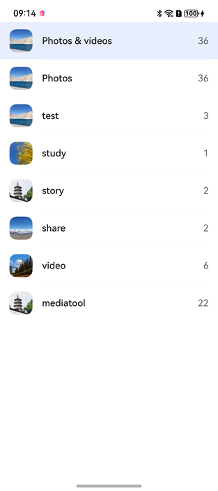
How to Develop
Import modules.
import {
  AlbumPickerComponent,
  AlbumPickerOptions,
  AlbumInfo,
  PickerColorMode,
  PickerController,
  DataType
} from '@kit.MediaLibraryKit';
Create an AlbumPickerOptions instance.
You can use AlbumPickerOptions to set the theme color of the album page. For details, see AlbumPickerOptions.
// Set parameters for initializing AlbumPickerComponent.
albumOptions: AlbumPickerOptions = new AlbumPickerOptions();
pickerController: PickerController = new PickerController();
Initialize the AlbumPickerOptions instance.
/**
 * Set the color mode of the album page. The default value is AUTO.
 * LIGHT indicates the light mode; DARK indicates the dark mode; AUTO means to follow the system color mode.
 */
this.albumOptions.themeColorMode = PickerColorMode.AUTO;
Create an AlbumPickerComponent.
AlbumPickerComponent({
  // Set the AlbumPickerOptions instance.
  albumPickerOptions: this.albumOptions,

  /**
   * Callback to be invoked to return the album information when an album is selected.
   * AlbumInfo (uri)
   */
  onAlbumClick: (albumInfo: AlbumInfo): boolean => this.onAlbumClick(albumInfo),
})
Define the callback to be invoked when the album is selected. When the user selects the album, AlbumPickerComponent and PhotoPickerComponent work together to return the album URI to the application and update the grid page content of PhotoPickerComponent based on the album URI.
private onAlbumClick(albumInfo: AlbumInfo): boolean {
    if (albumInfo?.uri) {
        // Update the grid page content based on the album URL.
        this.pickerController.setData(DataType.SET_ALBUM_URI, albumInfo.uri);
    }
    return true;
}
Sample Code
import {
  PhotoPickerComponent,
  AlbumPickerComponent,
  AlbumPickerOptions,
  AlbumInfo,
  PickerColorMode,
  PickerController,
  DataType
} from '@kit.MediaLibraryKit';

@Entry
@Component
struct AlbumPage {
  @State pickerController: PickerController = new PickerController();
  @State Width: string = '100%';
  @State Height: string = '100%';
  @State isShowAlbum: boolean = false;
  @State fontColor: string = '#182431222'
  @State selectedFontColor: string = '#007DFF'
  @State currentIndex: number = 0
  private controller: TabsController = new TabsController();
  albumOptions = new AlbumPickerOptions();
  albumOptions1 = new AlbumPickerOptions();
  albumOptions2 = new AlbumPickerOptions();

  /**
   * Callback to be invoked to return the album information when an album is selected.
   * AlbumInfo (uri)
   */
  private onAlbumClick(albumInfo: AlbumInfo): boolean {
    this.isShowAlbum = false;
    if (albumInfo?.uri) {
      // Update the grid page content based on the album URL.
      this.pickerController.setData(DataType.SET_ALBUM_URI, albumInfo.uri);
    }
    return true;
  }

  aboutToAppear() {
    /**
     * Set the color mode of the album page. The default value is AUTO.
     * AUTO means to follow the system color mode. LIGHT indicates the light mode. DARK indicates the dark mode.
     */
    this.albumOptions.themeColorMode = PickerColorMode.AUTO;
    this.albumOptions1.themeColorMode = PickerColorMode.LIGHT;
    this.albumOptions2.themeColorMode = PickerColorMode.DARK;
  }

  // Set the style of the navigation bar.
  @Builder
  tabBuilder(index: number, name: string) {
    Column() {
      Text(name)
        .fontColor(this.currentIndex === index ? this.selectedFontColor : this.fontColor)
        .fontSize(16)
        .fontWeight(this.currentIndex === index ? 500 : 400)
        .lineHeight(22)
        .margin({ top: 17, bottom: 7 })
      Divider()
        .strokeWidth(2)
        .color('#007DFF')
        .opacity(this.currentIndex === index ? 1 : 0)
    }.width('100%')
  }

  build() {
    Stack() {
      Column() {
        Row() {
          Button("All Albums").width('95%').height('5%').onClick(() => {
            this.isShowAlbum = true;
          })
        }.margin({ top: 40 })
        Column() {
          PhotoPickerComponent({
            pickerController: this.pickerController,
          }).height(this.Height).width(this.Width)
        }.width('100%').height('100%').alignItems(HorizontalAlign.Center)
      }

      if (this.isShowAlbum) {
        Row() {
          Column() {
            // Use three components to better display different effects.
            Tabs({ barPosition: BarPosition.Start, index: this.currentIndex, controller: this.controller }) {
              TabContent() {
                AlbumPickerComponent({
                  albumPickerOptions: this.albumOptions,
                  onAlbumClick: (albumInfo: AlbumInfo): boolean => this.onAlbumClick(albumInfo),
                }).height('100%').width('100%')
              }.tabBar(this.tabBuilder(0, 'System'))
              TabContent() {
                AlbumPickerComponent({
                  albumPickerOptions: this.albumOptions1,
                  onAlbumClick: (albumInfo: AlbumInfo): boolean => this.onAlbumClick(albumInfo),
                }).height('100%').width('100%')
              }.tabBar(this.tabBuilder(1, 'Light'))

              TabContent() {
                AlbumPickerComponent({
                  albumPickerOptions: this.albumOptions2,
                  onAlbumClick: (albumInfo: AlbumInfo): boolean => this.onAlbumClick(albumInfo),
                }).height('100%').width('100%')
              }.tabBar(this.tabBuilder(2, 'Dark'))
            }
            .vertical(false)
            .barMode(BarMode.Fixed)
            .barWidth('100%')
            .barHeight(56)
            .animationDuration(100)
            .onChange((index: number) => {
              this.currentIndex = index;
            })
            .width('100%')
            .height('100%')
            .backgroundColor('#F1F3F5')
          }.width('100%').height('100%').justifyContent(FlexAlign.Center).alignItems(HorizontalAlign.Center)
        }
        .margin({ top: 40 })
      }
    }
  }
}