This module sets accessibility attributes and events for components to fully leverage accessibility features. It supports setting accessibility grouping, accessibility text, accessibility description, accessibility importance, accessibility virtual child nodes, accessibility component type, screen reader focus control, state announcement, and custom accessibility actions, applicable to scenarios where screen reader assistance is needed for visually impaired users and application accessibility reachability needs to be improved.

The initial APIs of this module are supported since API version 10. Updates will be marked with a superscript to indicate their earliest API version.
The APIs of this module can be used only in the stage model.
accessibilityGroup
accessibilityGroup(value: boolean): T
Sets whether to enable accessibility grouping. When accessibility grouping is enabled, the component and all its children are treated as a single selectable unit, and the accessibility service will no longer focus on the child component content.
If accessibility grouping is enabled for a component that does not contain a universal text attribute or an accessibility text attribute, the system will concatenate the universal text attributes of its child components to generate merged text for the component. Child components without universal text attributes will be ignored during concatenation, and their accessibility text (if any) won't be used in the merged text.
When a child component's accessibilityLevel is set to "yes", it becomes focusable by screen readers when other accessibility criteria are met, bypassing accessibilityGroup constraints.

Widget capability: This API can be used in ArkTS widgets since API version 12.
Atomic service API: This API can be used in atomic services since API version 11.
System capability: SystemCapability.ArkUI.ArkUI.Full
Parameters
| Name | Type | Mandatory | Description |
|---|---|---|---|
| value | boolean | Yes | Whether to enable accessibility grouping. The value true means to enable accessibility grouping, and false means the opposite. When accessibility grouping is enabled, the component and all its children are treated as a single selectable unit, and the accessibility service will no longer focus on the individual child components. Text and accessibility information from child components are merged and sent to the accessibility service as a whole. Default value: false |
Return value
| Type | Description |
|---|---|
| T | Current object. |
accessibilityGroup14+
accessibilityGroup(isGroup: boolean, accessibilityOptions: AccessibilityOptions): T
Sets whether to enable accessibility grouping. When accessibility grouping is enabled, the component and all its children are treated as a single selectable unit, and the accessibility service will no longer focus on the child component content.
If accessibility grouping is enabled for a component that does not contain a universal text attribute or an accessibility text attribute, the system will concatenate the universal text attributes of its child components as the merged text of the component. If a child component does not have a universal text attribute, then ignore that child component and do not concatenate it, in which case the merged text does not use the child component's accessibility text.
When a child component's accessibilityLevel is set to "yes", it becomes focusable by screen readers when other accessibility criteria are met, bypassing accessibilityGroup constraints.
When accessibilityPreferred is set to true, the system prioritizes concatenating the accessibility text attributes of the child components to generate merged text for the component. If a child component has no accessibility text set, its universal text attribute will be used instead. Components without either attribute will be excluded from concatenation.
Since API version 23, through the related configuration items in accessibilityOptions (stateControllerRoleType or stateControllerId, actionControllerRoleType or actionControllerId), a specific child component can be specified, and the state information and click events of that child component take over the accessibility capabilities of the current aggregation component.

Widget capability: This API can be used in ArkTS widgets since API version 14.
Atomic service API: This API can be used in atomic services since API version 14.
System capability: SystemCapability.ArkUI.ArkUI.Full
Parameters
| Name | Type | Mandatory | Description |
|---|---|---|---|
| isGroup | boolean | Yes | Whether to enable accessibility grouping. The value true means to enable accessibility grouping, and false means the opposite. When accessibility grouping is enabled, the component and all its children are treated as a single selectable unit, and the accessibility service will no longer focus on the individual child components. Text and accessibility information from child components are merged and sent to the accessibility service as a whole. Default value: false |
| accessibilityOptions | AccessibilityOptions | Yes | Configuration options object for accessibility classification, which contains the following attributes: - accessibilityPreferred: When set to true, the application concatenates accessibility text first for reading; when set to false, the application does not prioritize accessibility text during screen reader reading. - stateControllerRoleType or stateControllerId: Supported since API version 23. Specifies a specific child component, and uses the state information of this child component as the accessibility state of the current aggregated component. - actionControllerRoleType or actionControllerId: Supported since API version 23. Specifies a specific child component, and uses the click event of this child component as the accessibility action of the current aggregated component. |
Return value
| Type | Description |
|---|---|
| T | Current object. |
accessibilityText
accessibilityText(value: string): T
Sets the accessibility text. If a component lacks text content, you can set the accessibility text attribute to enable text-to-speech playback for accessibility purposes. If a component already contains text content, the accessibility text takes precedence during screen reading scenarios.

Widget capability: This API can be used in ArkTS widgets since API version 12.
Atomic service API: This API can be used in atomic services since API version 11.
System capability: SystemCapability.ArkUI.ArkUI.Full
Parameters
| Name | Type | Mandatory | Description |
|---|---|---|---|
| value | string | Yes | Accessibility text. If a component does not contain text content, it will not be announced by the screen reader when selected. In this case, the screen reader user cannot know which component is selected. To solve this problem, you can set accessibility text for such components. When such a component is selected, the screen reader announces the specified accessibility text, informing the user which component is selected. Default value: "" NOTE If a component has both text content and accessibility text, only the accessibility text is announced. If a component is grouped for accessibility purposes but lacks both text content and accessibility text, the screen reader will concatenate text from its child components (depth-first traversal). To prioritize accessibility text concatenation, set accessibilityPreferred in accessibilityGroup. |
Return value
| Type | Description |
|---|---|
| T | Current object. |
accessibilityText12+
accessibilityText(text: Resource): T
Sets the accessibility text, with support for resource references using Resource. If a component lacks text content, you can set the accessibility text attribute to enable text-to-speech playback for accessibility purposes. If a component already contains text content, the accessibility text takes precedence during screen reading scenarios.

Widget capability: This API can be used in ArkTS widgets since API version 12.
Atomic service API: This API can be used in atomic services since API version 12.
System capability: SystemCapability.ArkUI.ArkUI.Full
Parameters
| Name | Type | Mandatory | Description |
|---|---|---|---|
| text | Resource | Yes | Accessibility text reference resource. When the component does not contain a text attribute, the screen reader does not announce it when this component is selected, and users cannot clearly know which component is currently selected. To address this scenario, developers can set accessibility text for components that do not contain text information. When the screen reader selects this component, it announces the content of the accessibility text, helping screen reader users clearly know which component they have selected. Note: If a component has both a text attribute and an accessibility text attribute, only the accessibility text content is announced when the component is selected. If a component has the accessibility group attribute set to true but has neither an accessibility text attribute nor a text attribute, the text of its child node components is concatenated (depth-first). The accessibility text attribute is not concatenated. If accessibility text needs to be concatenated first, set accessibilityPreferred of accessibilityGroup. |
Return value
| Type | Description |
|---|---|
| T | Current object. |
accessibilityDescription
accessibilityDescription(value: string): T
Sets the accessibility description. This attribute provides additional context and explanation for the component, helping users understand its functionality and purpose.

Widget capability: This API can be used in ArkTS widgets since API version 12.
Atomic service API: This API can be used in atomic services since API version 11.
System capability: SystemCapability.ArkUI.ArkUI.Full
Parameters
| Name | Type | Mandatory | Description |
|---|---|---|---|
| value | string | Yes | Accessibility description. You can specify further explanation of the current component, such as potential operation consequences that cannot be inferred from component attributes or accessibility text. If a component contains both text content and the accessibility description, the screen reader announces the text first, followed by the accessibility description, when the component is selected. Default value: "" |
Return value
| Type | Description |
|---|---|
| T | Current object. |
accessibilityDescription12+
accessibilityDescription(description: Resource): T
Sets the accessibility description, with support for resource references using Resource. This attribute provides additional context and explanation for the component, helping users understand its functionality and purpose.

Widget capability: This API can be used in ArkTS widgets since API version 12.
Atomic service API: This API can be used in atomic services since API version 12.
System capability: SystemCapability.ArkUI.ArkUI.Full
Parameters
| Name | Type | Mandatory | Description |
|---|---|---|---|
| description | Resource | Yes | Accessibility description resource reference. You can specify further explanation of the current component, such as potential operation consequences that cannot be inferred from component attributes or accessibility text. If a component contains both text content and the accessibility description, the screen reader announces the text first, followed by the accessibility description, when the component is selected. |
Return value
| Type | Description |
|---|---|
| T | Current object. |
accessibilityLevel
accessibilityLevel(value: string): T
Sets the accessibility level. It determines whether the component can be recognized by accessibility services.
Widget capability: This API can be used in ArkTS widgets since API version 12.
Atomic service API: This API can be used in atomic services since API version 11.
System capability: SystemCapability.ArkUI.ArkUI.Full
Parameters
| Name | Type | Mandatory | Description |
|---|---|---|---|
| value | string | Yes | Accessibility importance, which controls whether a component can be recognized by the accessibility service. Supported values: "auto": The accessibility service and ArkUI comprehensively determine whether the current component can be recognized by the accessibility service. "yes": The current component can be recognized by the accessibility service. When the parent component enables accessibility classification, a child component set to "yes" is not subject to the grouping constraint and can still be focused under other screen reader rules. "no": The current component cannot be recognized by the accessibility service. "no-hide-descendants": The current component and all its child components cannot be recognized by the accessibility service. Default value: "auto" Note: When accessibilityLevel is set to "auto", whether the component can be recognized by the accessibility service depends on the following factors: 1. Whether the component can be recognized is determined internally by the accessibility service, which makes its own choice. 2. If the isGroup attribute of the parent component's accessibilityGroup is set to true, the accessibility service will no longer focus on the content of its child components, and the component cannot be recognized by the accessibility service. 3. If the parent component's accessibilityLevel attribute is set to "no-hide-descendants", the component cannot be recognized by the accessibility service. |
Return value
| Type | Description |
|---|---|
| T | Current object. |
accessibilityVirtualNode11+
accessibilityVirtualNode(builder: CustomBuilder): T
Sets the accessibility virtual child node. It passes a CustomBuilder to a self-drawn component. The components in the CustomBuilder are only laid out on the backend and are not displayed. When an assistive application obtains accessibility node information, the node information in the CustomBuilder is returned. For example, when using the canvas component Canvas, you can set placeholder components with matching positions and sizes through virtual nodes, so that the accessibility service can identify the self-drawn information of the corresponding area.

Widget capability: This API can be used in ArkTS widgets since API version 12.
Atomic service API: This API can be used in atomic services since API version 11.
System capability: SystemCapability.ArkUI.ArkUI.Full
Parameters
| Name | Type | Mandatory | Description |
|---|---|---|---|
| builder | CustomBuilder | Yes | Accessibility virtual child node, which allows developers to pass a CustomBuilder to a self-drawn component. The components in the CustomBuilder only perform layout without display on the backend. When an assistive application obtains accessibility node information, the node information in the CustomBuilder is returned. |
Return value
| Type | Description |
|---|---|
| T | Current object. |
accessibilityChecked13+
accessibilityChecked(isCheck: boolean): T
Maintains the selected state of the accessibility node to support multiple selection, indicating whether the component is selected. This API only affects the component state announcement information in the screen reader scenario.

Widget capability: This API can be used in ArkTS widgets since API version 13.
Atomic service API: This API can be used in atomic services since API version 13.
System capability: SystemCapability.ArkUI.ArkUI.Full
Parameters
| Name | Type | Mandatory | Description |
|---|---|---|---|
| isCheck | boolean | Yes | Whether the component is selected. Supported values: true: The current component is selected. false: The current component is not selected. undefined: The component determines the selected state by itself. Default value: undefined Note: 1. After this API is used to set true or false, the checkable attribute of the component is set to true by default. 2. The accessibilityChecked attribute indicates that the component is in multi-select mode, while the accessibilitySelected attribute indicates that the component is in single-select mode. A component cannot have both selection modes at the same time, which causes an accessibility state conflict and prevents accessibility assistance applications such as the screen reader from correctly identifying the selected state. If this API is used to set the component to multi-select mode (set to true or false), ensure that the accessibilitySelected function has not been used to set the attribute to true or false. If it has been set, use the accessibilitySelected function to set the accessibilitySelected attribute to undefined mode. |
Return value
| Type | Description |
|---|---|
| T | Current object. |
accessibilitySelected13+
accessibilitySelected(isSelect: boolean): T
Maintains the selected state of an accessibility node to support single selection, indicating whether the component is selected. This API affects only the component state announcement information in screen reader scenarios.

Widget capability: This API can be used in ArkTS widgets since API version 13.
Atomic service API: This API can be used in atomic services since API version 13.
System capability: SystemCapability.ArkUI.ArkUI.Full
Parameters
| Name | Type | Mandatory | Description |
|---|---|---|---|
| isSelect | boolean | Yes | Used to indicate whether the component is selected. Supported values: true: The current component is selected. false: The current component is not selected. undefined: The component determines the selected state by itself. Default value: undefined Note: 1. The accessibilityChecked attribute indicates that the component is in multi-select mode, while the accessibilitySelected attribute indicates that the component is in single-select mode. A component cannot be in both selection modes at the same time, which would cause an accessibility state conflict and prevent accessibility assistive applications such as screen readers from correctly identifying the selected state. If this API is used to set the component to single-select mode (true or false), ensure that the accessibilityChecked function has not been used to set the attribute to true or false. If it has been set, use the accessibilityChecked function to set the accessibilityChecked attribute to undefined. |
Return value
| Type | Description |
|---|---|
| T | Current object. |
accessibilityRole18+
accessibilityRole(role: AccessibilityRoleType): T
Sets the accessibility component type. Different component types have corresponding reading methods. You can modify the component type based on application requirements to control the reading method and reading content of the component in accessibility mode.
Widget capability: This API can be used in ArkTS widgets since API version 18.
Atomic service API: This API can be used in atomic services since API version 18.
System capability: SystemCapability.ArkUI.ArkUI.Full
Parameters
| Name | Type | Mandatory | Description |
|---|---|---|---|
| role | AccessibilityRoleType | Yes | Component type announced by the screen reader, such as button or chart. The specific type can be selected by the developer as needed. |
Return value
| Type | Description |
|---|---|
| T | Current object. |
AccessibilityRoleType18+
Enumerates the component role types used by screen readers.
Widget capability: This API can be used in ArkTS widgets since API version 18.
Atomic service API: This API can be used in atomic services since API version 18.
System capability: SystemCapability.ArkUI.ArkUI.Full
| Name | Value | Description |
|---|---|---|
| ACTION_SHEET | 0 | Action sheet. |
| ALERT_DIALOG | 1 | Alert dialog box. |
| INDEXER_COMPONENT | 2 | Indexer component. |
| BADGE_COMPONENT | 3 | Badge component. |
| BLANK | 4 | Blank placeholder component. |
| BUTTON | 5 | Button. |
| BACK_BUTTON | 6 | Back button on a large image page. |
| SHEET_DRAG_BAR | 7 | Drag bar of a dialog box. |
| CALENDAR_PICKER | 8 | Calendar picker. |
| CALENDAR | 9 | Calendar. |
| CANVAS | 10 | Canvas component. |
| CANVAS_GRADIENT | 11 | Gradient object. |
| CANVAS_PATTERN | 12 | Pattern for image filling based on a specified source image and repetition mode. |
| CHECKBOX | 13 | Check box component. |
| CHECKBOX_GROUP | 14 | Check box group. |
| CIRCLE | 15 | Component for drawing circles. |
| COLUMN_SPLIT | 16 | Vertical layout of child components with horizontal dividers. |
| COLUMN | 17 | Container that lays out child components vertically. |
| CANVAS_RENDERING_CONTEXT_2D | 18 | 2D drawing object, which can be used to draw rectangles, images, and texts on a canvas component. |
| CHART | 19 | Chart component. |
| COUNTER | 20 | Counter component. |
| CONTAINER_MODAL | 21 | Modal container. |
| DATA_PANEL | 22 | Data panel component. |
| DATE_PICKER | 23 | Date picker. |
| DIALOG | 24 | Dialog box. |
| DIVIDER | 25 | Divider component. |
| DRAG_BAR | 26 | Drag bar. |
| EFFECT_COMPONENT | 27 | Container component for special effects. |
| ELLIPSE | 28 | Ellipse drawing component. |
| FLEX | 29 | Container that allows for flexible layout of child components. |
| FLOW_ITEM | 30 | Child component of a waterfall layout container. |
| FORM_COMPONENT | 31 | Widget component. |
| FORM_LINK | 32 | Static widget interaction component. |
| GAUGE | 33 | Gauge component. |
| GRID | 34 | Grid container. |
| GRID_COL | 35 | Grid column component. |
| GRID_CONTAINER | 36 | Grid container that lays out child components vertically. |
| GRID_ITEM | 37 | Single-item container within a grid container. |
| GRID_ROW | 38 | Grid row component. |
| HYPERLINK | 39 | Hyperlink component. |
| IMAGE | 40 | Image component |
| IMAGE_ANIMATOR | 41 | Frame animation component. |
| IMAGE_BITMAP | 42 | Bitmap image object that can be drawn on a canvas. |
| IMAGE_DATA | 43 | Pixel data stored in a canvas area. |
| IMAGE_SPAN | 44 | Component used to display inline images. |
| LABEL | 45 | Label. |
| LINE | 46 | Line. |
| LIST | 47 | List. |
| LIST_ITEM | 48 | Specific item in a list. |
| LIST_ITEM_GROUP | 49 | List item group. |
| LOADING_PROGRESS | 50 | Component for display loading animations. |
| MARQUEE | 51 | Marquee component. |
| MATRIX2D | 52 | 2D matrix object. |
| MENU | 53 | Menu. |
| MENU_ITEM | 54 | Menu item. |
| MENU_ITEM_GROUP | 55 | Menu item group. |
| NAV_DESTINATION | 56 | Content area of the Navigation component. |
| NAV_ROUTER | 57 | Navigation component. |
| NAVIGATION | 58 | Root view container for navigation routing. |
| NAVIGATION_BAR | 59 | Navigation bar. |
| NAVIGATION_MENU | 60 | Navigation menu. |
| NAVIGATOR | 61 | Navigation container component. |
| OFFSCREEN_CANVAS | 62 | Canvas for custom drawing of graphics. |
| OFFSCREEN_CANVAS_RENDERING_CONTEXT2D | 63 | 2D drawing object, which can be used to draw rectangles, images, and texts on a canvas component. |
| OPTION | 64 | Specific item. |
| PANEL | 65 | Slidable panel. |
| PAPER_PAGE | 66 | Page. |
| PATH | 67 | Path drawing component. |
| PATH2D | 68 | Path object. |
| PATTERN_LOCK | 69 | Pattern lock component. |
| PICKER | 70 | Picker. |
| PICKER_VIEW | 71 | Picker view. |
| PLUGIN_COMPONENT | 72 | Plugin component. |
| POLYGON | 73 | Component used to draw a polygon. |
| POLYLINE | 74 | Component used to draw a polyline. |
| POPUP | 75 | Popup with a specific style. |
| PROGRESS | 76 | Progress bar component. |
| QRCODE | 77 | QR code. |
| RADIO | 78 | Radio button. |
| RATING | 79 | Component for selecting a rating within a given range. |
| RECT | 80 | Component used to draw a rectangle. |
| REFRESH | 81 | Pull-to-refresh container component. |
| RELATIVE_CONTAINER | 82 | Relative layout component. |
| REMOTE_WINDOW | 83 | Remote control window component. |
| RICH_EDITOR | 84 | Component that supports rich text editing and interactive text editing. |
| RICH_TEXT | 85 | Rich text component. |
| ROLE_PAGER | 86 | Pagination component. |
| ROW | 87 | Container that lays out child components horizontally. |
| ROW_SPLIT | 88 | Horizontal layout of child components with vertical dividers. |
| SCROLL | 89 | Scrollable container component. |
| SCROLL_BAR | 90 | Scrollbar. |
| SEARCH | 91 | Search box component. |
| SEARCH_FIELD | 92 | Search box. |
| SELECT | 93 | Drop-down list component. |
| SHAPE | 94 | Parent component of the drawing components. |
| SIDEBAR_CONTAINER | 95 | Sidebar container that can show and hide the sidebar. |
| SLIDER | 96 | Slider component. |
| SPAN | 97 | Component used to display inline text. |
| STACK | 98 | Stack container. |
| STEPPER | 99 | Stepper component. |
| STEPPER_ITEM | 100 | Page child component of the stepper component. |
| SWIPER | 101 | Swiper view container. |
| SWIPER_INDICATOR | 102 | Navigation indicator for the Swiper component. |
| SWITCH | 103 | Switch. |
| SYMBOL_GLYPH | 104 | Component for displaying a symbol glyph. |
| TAB_CONTENT | 105 | Content view for a tab in the Tabs component. |
| TAB_BAR | 106 | Tab bar. |
| TABS | 107 | Container that allows users to switch between content views through tabs. |
| TEXT | 108 | Text. |
| TEXT_CLOCK | 109 | Text clock component. |
| TEXT_ENTRY | 110 | Text input. |
| TEXT_INPUT | 111 | Text box component. |
| TEXT_PICKER | 112 | Text picker. |
| TEXT_TIMER | 113 | Component that displays timing information and is controlled in text format. |
| TEXT_AREA | 114 | Text area component. |
| TEXT_FIELD | 115 | Text box. |
| TIME_PICKER | 116 | Time picker. |
| TITLE_BAR | 117 | Title bar. |
| TOGGLER | 118 | State component. |
| UI_EXTENSION_COMPONENT | 119 | UI extension component. |
| VIDEO | 120 | Component for playing video files and controlling playback. |
| WATER_FLOW | 121 | Waterfall layout container. |
| WEB | 122 | Component for loading web pages. |
| XCOMPONENT | 123 | Custom rendering component. |
| ROLE_NONE | 124 | Does not set a specific accessibility component type. The component is announced by the screen reader based on its default type. |
accessibilityNextFocusId18+
accessibilityNextFocusId(nextId: string): T
Sets the next component to receive focus during screen reader navigation.
Widget capability: This API can be used in ArkTS widgets since API version 18.
Atomic service API: This API can be used in atomic services since API version 18.
System capability: SystemCapability.ArkUI.ArkUI.Full
Parameters
| Name | Type | Mandatory | Description |
|---|---|---|---|
| nextId | string | Yes | Unique ID of the next component to receive focus. If the ID does not correspond to any component, the setting is ignored. |
Return value
| Type | Description |
|---|---|
| T | Current object. |
accessibilityNextFocusId
accessibilityNextFocusId(nextId: string, nextFocusParams: AccessibilityNextFocusParams | undefined): T
Specifies the next focus of the component during screen reader swipe focus traversal, and supports configuring detailed parameters.
Through the AccessibilityNextFocusParams parameter, you can configure whether to search for the focus in descendant nodes during the accessibility next focus processing.
Since: 26.0.0
Widget capability: This API can be used in ArkTS widgets since API version 26.0.0.
Atomic service API: This API can be used in atomic services since API version 26.0.0.
System capability: SystemCapability.ArkUI.ArkUI.Full
Parameters
| Name | Type | Mandatory | Description |
|---|---|---|---|
| nextId | string | Yes | Unique ID of the next component to be focused. If the unique ID has no corresponding component, the set accessibilityNextFocusId does not exist and the setting is invalid. |
| nextFocusParams | AccessibilityNextFocusParams | undefined | Yes | Detailed parameters for accessibility next focus processing, used to configure whether to search for focusable nodes in descendant nodes. When the value is undefined, the detailed parameters for next focus processing are not configured, and the focus is not searched for in descendant nodes. |
Returns
| Type | Description |
|---|---|
| T | Current object. |
accessibilityDefaultFocus18+
accessibilityDefaultFocus(focus: boolean): T
Sets the initial focus for the screen reader on a page. When the screen reader enters the current page for the first time, it locates the focus on the component set to true, helping developers guide users to prioritize the core content of the page.
Widget capability: This API can be used in ArkTS widgets since API version 18.
Atomic service API: This API can be used in atomic services since API version 18.
System capability: SystemCapability.ArkUI.ArkUI.Full
Parameters
| Name | Type | Mandatory | Description |
|---|---|---|---|
| focus | boolean | Yes | Sets the initial screen reader focus for the page. The value true indicates that the component is the default first focus of the current page, and the value false indicates that the component is not set as the default first focus. |
Return value
| Type | Description |
|---|---|
| T | Current object. |
accessibilityUseSamePage18+
accessibilityUseSamePage(pageMode: AccessibilitySamePageMode): T
Sets the same-page mode for the current component and its host application.
Solves focus jumping issues in sub-tree scenarios for cross-process embedded components, such as EmbeddedComponent. When components are embedded across processes, timing inconsistencies between page change events in the embedded component and the host application can cause focus to shift unexpectedly from the current component to another component.
Widget capability: This API can be used in ArkTS widgets since API version 18.
Atomic service API: This API can be used in atomic services since API version 18.
System capability: SystemCapability.ArkUI.ArkUI.Full
Parameters
| Name | Type | Mandatory | Description |
|---|---|---|---|
| pageMode | AccessibilitySamePageMode | Yes | Same-page mode for the cross-process embedded component and the host application. |
Return value
| Type | Description |
|---|---|
| T | Current object. |
AccessibilitySamePageMode18+
Enumerates the same-page modes for cross-process embedded components and their host applications.
Widget capability: This API can be used in ArkTS widgets since API version 18.
Atomic service API: This API can be used in atomic services since API version 18.
System capability: SystemCapability.ArkUI.ArkUI.Full
| Name | Value | Description |
|---|---|---|
| SEMI_SILENT | 0 | In the process started by a component for cross-process embedded display, the page event sent when the page is loaded for the first time, and the page event sent by the root node of the page, will be ignored. |
| FULL_SILENT | 1 | Ignores all page events from the cross-process embedded component. |
accessibilityScrollTriggerable18+
accessibilityScrollTriggerable(isTriggerable: boolean): T
Sets whether the accessibility node triggers automatic screen scrolling. When no focusable components are visible on the current page within a container, this setting determines whether automatic scrolling is initiated.
Widget capability: This API can be used in ArkTS widgets since API version 18.
Atomic service API: This API can be used in atomic services since API version 18.
System capability: SystemCapability.ArkUI.ArkUI.Full
Parameters
| Name | Type | Mandatory | Description |
|---|---|---|---|
| isTriggerable | boolean | Yes | Whether the component supports this capability. Supported values: true: When the screen reader focus switches and there is no focusable component on the current page in the container, an automatic scroll operation is required. false: When the screen reader focus switches and there is no focusable component on the current page in the container, no automatic scroll operation is required. undefined: Restores the default value. Default value: true. Note: 1. This attribute does not affect the scrollable attribute in the original accessibility node attribute ElementAttributeValues. 2. The scrolling logic of the component under the screen reader is determined by the screen reader based on this attribute and whether the component supports scroll. 3. This is a universal attribute and can be configured for all basic components. It is recommended to configure scrollable component types such as List, Grid, Scroll, and WaterFlow. |
Return value
| Type | Description |
|---|---|
| T | Current object. |
accessibilityTextHint12+
accessibilityTextHint(value: string): T
Sets the component text hint information, which is listened to and responded to by the in-vehicle accessibility service only in in-vehicle interaction scenarios.

Since API version 20, this API can be called in attributeModifier. This API is used to set the common attributes of a component. The text content configured through this attribute API is listened to and responded to only by the in-vehicle accessibility service. Therefore, this API takes effect only in in-vehicle interaction scenarios.
Widget capability: This API can be used in ArkTS widgets since API version 12.
Atomic service API: This API can be used in atomic services since API version 12.
System capability: SystemCapability.ArkUI.ArkUI.Full
Parameters
| Name | Type | Mandatory | Description |
|---|---|---|---|
| value | string | Yes | Text prompt of the component, which is listened to and responded to by the in-vehicle accessibility service only in the in-vehicle interaction scenario. |
Return value
| Type | Description |
|---|---|
| T | Current object. |
accessibilityFocusDrawLevel19+
accessibilityFocusDrawLevel(drawLevel: FocusDrawLevel): T
Sets the drawing level of the accessibility focus green frame.

The focused accessibility green frame is drawn at the focused node level, which is used by default. Due to the drawing order of components and graphics, the drawn green frame may be occluded and clipped by the parent component or a sibling component with a higher z-order.
When the green frame is drawn at the top level of the z-order, it can prevent the accessibility green frame from failing to display normally due to component occlusion overlay or clipping clip. However, because of its higher drawing level, this configuration is not suitable if the currently focused component needs to be occluded during interaction and the accessibility green frame should not be displayed.
Widget capability: This API can be used in ArkTS widgets since API version 19.
Atomic service API: This API can be used in atomic services since API version 19.
System capability: SystemCapability.ArkUI.ArkUI.Full
Parameters
| Name | Type | Mandatory | Description |
|---|---|---|---|
| drawLevel | FocusDrawLevel | Yes | Drawing level of the accessibility focus green box, used to control the drawing position of the green box. By default, it is drawn at the focused node level (that is, the focused node itself is drawn). For the optional values and their meanings, see the FocusDrawLevel enum, which includes two modes: drawing at the focused node level and drawing at the top level controlled by the Z-order. |
Return value
| Type | Description |
|---|---|
| T | Current object. |
accessibilityStateDescription23+
accessibilityStateDescription(description: string | Resource | undefined): T
Sets the state description of a component for broadcasting, which clearly describes the real-time state of the component in screen reading scenarios. Screen reader will broadcast the state description first.
Widget capability: This API can be used in ArkTS widgets since API version 23.
Atomic service API: This API can be used in atomic services since API version 23.
System capability: SystemCapability.ArkUI.ArkUI.Full
Parameters
| Name | Type | Mandatory | Description |
|---|---|---|---|
| description | string | Resource | undefined | Yes | Text to be broadcasted for the current state of the component. If the text contains more than 1000 characters, the first 1000 characters will be broadcasted. undefined: The text is empty by default. |
Return value
| Type | Description |
|---|---|
| T | Current object. |
accessibilityActionOptions23+
accessibilityActionOptions(option: AccessibilityActionOptions | undefined): T
Set component optional parameters for accessibility operations, which are used to restrict or modify the operations initiated by accessibility applications such as the screen reader.
Widget capability: This API can be used in ArkTS widgets since API version 23.
Atomic service API: This API can be used in atomic services since API version 23.
System capability: SystemCapability.ArkUI.ArkUI.Full
Parameters
| Name | Type | Mandatory | Description |
|---|---|---|---|
| option | AccessibilityActionOptions| undefined | Yes | Parameter of the accessibility operation, which is used to restrict or modify the sliding behavior in the accessibility operation. The scrollStep parameter in AccessibilityActionOptions is used to set the number of sliding steps in the accessibility operation. When the value is undefined, scrollStep is processed as 1. |
Returns
| Type | Description |
|---|---|
| T | Current object. |
accessibilityCustomActions
accessibilityCustomActions(actions: Array<AccessibilityCustomAction> | undefined): T
Sets the custom accessibility actions of a component. Developers can set an array of custom actions to bind callbacks to the component by action name for custom operations.
Since: 26.0.0
Widget capability: This API can be used in ArkTS widgets since API version 26.0.0.
Atomic service API: This API can be used in atomic services since API version 26.0.0.
System capability: SystemCapability.ArkUI.ArkUI.Full
Model restriction: This API can be used only in the stage model.
Parameters
| Name | Type | Mandatory | Description |
|---|---|---|---|
| actions | Array<AccessibilityCustomAction> | undefined | Yes | Array of custom accessibility actions. Each action contains an action name and a callback, used to bind callbacks to the component by action name for custom operations. Note: The array supports a maximum of 16 actions. Actions beyond this limit do not take effect. If the value is undefined, no custom actions are set. |
Return value
| Type | Description |
|---|---|
| T | Current object. |
[h2]Example 1: Setting Accessibility Text and Description
This example demonstrates how to use accessibilityText and accessibilityDescription to customize the content announced by screen readers.
// xxx.ets
@Entry
@Component
struct Index {
  @Builder
  customAccessibilityNode() {
    Column() {
      Text(`virtual node`)
    }
    .width(10)
    .height(10)
  }

  build() {
    Row() {
      Column() {
        Text('Text 1')
          .fontSize(50)
          .fontWeight(FontWeight.Bold)
        Text("Text 2")
          .fontSize(50)
          .fontWeight(FontWeight.Bold)
      }
      .width('100%')
      .accessibilityGroup(true)
      .accessibilityLevel("yes")
      .accessibilityText("Group") // If a component has both text content and accessibility text, only the accessibility text is announced.
      .accessibilityDescription("The Column component can be selected, and the announced content is 'Group'")
      .accessibilityVirtualNode(this.customAccessibilityNode)
      .accessibilityChecked(true)
      .accessibilitySelected(undefined)
    }
    .height('100%')
  }
}
[h2]Example 2: Setting the Accessibility Group
This example shows how to prioritize reading the accessibility text of child components.
// xxx.ets
@Entry
@Component
struct Index {
  build() {
    Column({ space: 10 }) {
      Text('123456')
        .focusable(true)
        .borderRadius(5)
        .accessibilityText("Accessibility text is announced if both accessibility text and text content are present")
        .accessibilityLevel("yes")
      Button().accessibilityLevel("yes").accessibilityText("Accessibility text is announced if no text is present")
      Button("Text content is announced if no accessibility text is present").accessibilityLevel("yes")
      Button()
      Button('btn123').accessibilityText('Button with both accessibility and text btn123').accessibilityLevel('yes')
      Button('btn123').accessibilityLevel("yes")
    }
    .accessibilityGroup(true, { accessibilityPreferred: true })
    .borderWidth(5)
    .width('100%')
    .height('100%')
  }
}
[h2]Example 3: Setting the Initial Focus and the Next Focus of a Component
This example demonstrates the use of accessibilityDefaultFocus to set the default initial focus for the screen reader on the current page and accessibilityNextFocusId to set the next focus for components during focus traversal.
// xxx.ets
@Entry
@Component
struct Index {
  build() {
    Column({ space: 20 }) {
      Text('Text Demo 1')
        .fontSize(50)
        .accessibilityLevel('yes')
        .accessibilityNextFocusId('text3')
      Text('Text Demo 2')
        .id('text2')
        .fontSize(50)
        .accessibilityLevel('yes')
        .accessibilityDefaultFocus(true)  // Set the component as initial focus for the screen reader.
        .accessibilityNextFocusId('text4')
      Text('Text Demo 3')
        .id('text3')
        .fontSize(50)
        .accessibilityLevel('yes')
        .accessibilityNextFocusId('text2')
      Text('Text Demo 4')
        .id('text4')
        .fontSize(50)
        .accessibilityLevel('yes')
    }
    .height('100%')
    .width('100%')
  }
}
[h2]Example 4: Setting the Accessibility Component Type and Text Hint
This example demonstrates the use of accessibilityRole to set the accessibility component type and accessibilityTextHint to provide text hints for components that can be queried by assistive technologies.
// xxx.ets
@Entry
@Component
struct Index {
  @State isDownloading: boolean = false;
  @State hintStr: string = 'Click to start download';

  build() {
    Column({ space: 20 }) {
      Button(this.isDownloading ? 'Downloading' : 'Click to download')
        .accessibilityLevel('yes')
        .accessibilityTextHint(this.hintStr)
        .onClick(() => {
          this.isDownloading = !this.isDownloading;
          this.hintStr = this.isDownloading ? 'State changed to downloading' : 'State changed to paused';
        })
      TextInput({ placeholder: 'Enter phone number' })
        .accessibilityLevel('yes')
        .accessibilityTextHint('Enter an 11-digit phone number')
        .width('80%')
      Text('Announced as button type')
        .accessibilityLevel('yes')
        .accessibilityRole(AccessibilityRoleType.BUTTON)
        .accessibilityTextHint('The screen reader will announce this component as a button')
        .fontSize(30)
    }
    .height('100%')
    .width('100%')
  }
}
[h2]Example 5: Configuring Screen Reader Scrolling, Focus Highlight Frame, and Cross-Process Focus
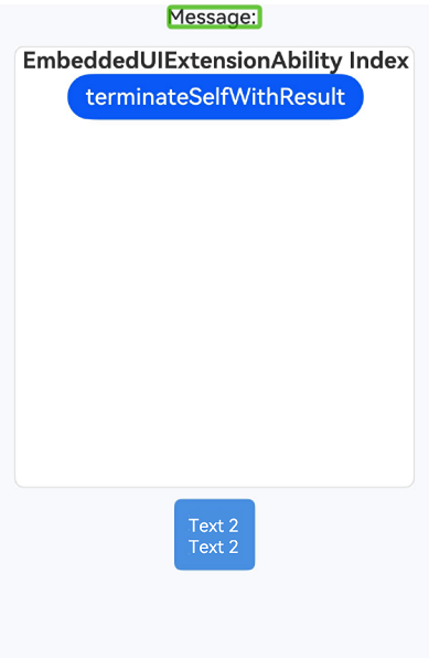
This example mainly demonstrates how accessibilityScrollTriggerable sets whether an accessibility node supports screen reader scrolling, how accessibilityFocusDrawLevel sets the drawing level of the accessibility focus green frame, and how accessibilityUseSamePage sets the same page mode for cross-process embedded components (such as EmbeddedComponent).
// xxx.ets
import { Want } from '@kit.AbilityKit';

@Entry
@Component
struct Index {
  @State message: string = 'Message: ';
  private want: Want = {
    // bundleName of the EmbeddedComponent provider. Configure it based on the actual situation.
    bundleName: 'com.example.embeddeddemo',
    // Ability name of the EmbeddedComponent provider. Configure it as required.
    abilityName: 'ExampleEmbeddedAbility',
  }

  build() {
    Row() {
      List() {
        ListItem() {
          Column() {
            Text(this.message)
              .fontSize(18)
              .fontColor('#2D2D2D')
              .fontWeight(FontWeight.Medium)
            Column() {
              EmbeddedComponent(this.want, EmbeddedType.EMBEDDED_UI_EXTENSION)
                .onTerminated((info) => {
                  this.message = 'Termination: code = ' + info.code + ', want = ' + JSON.stringify(info.want);
                })
                .onError((error) => {
                  this.message = 'Error: code = ' + error.code;
                })
                .accessibilityUseSamePage(AccessibilitySamePageMode.FULL_SILENT)
                .width('90%')
                .height('50%')
                .backgroundColor('#F0F0F0')
                .borderRadius(8)
                .borderWidth(1)
                .borderColor('#D9D9D9')

              Stack() {
                Column() {
                  Text('Text 1')
                    .fontSize(18)
                    .fontColor('#2D2D2D')
                    .fontWeight(FontWeight.Medium)
                  Text('Text 1')
                    .fontSize(18)
                    .fontColor('#2D2D2D')
                    .fontWeight(FontWeight.Medium)
                    .accessibilityFocusDrawLevel(FocusDrawLevel.TOP)
                }
                .padding({ top: 8, bottom: 8 })

                Column() {
                  Text('Text 2')
                    .fontSize(18)
                    .fontColor('#FFFFFF')
                    .fontWeight(FontWeight.Medium)
                  Text('Text 2')
                    .fontSize(18)
                    .fontColor('#FFFFFF')
                    .fontWeight(FontWeight.Medium)
                }
                .backgroundColor('#4A90E2')
                .padding({
                  left: 12,
                  right: 12,
                  top: 10,
                  bottom: 10
                })
                .borderRadius(6)
              }
              .width('100%')
              .margin({ top: 10, bottom: 10 })
            }
            .width('100%')
            .height('100%')
            .margin({ top: 15 })
            .accessibilityText($r('app.string.app_name'))
            .accessibilityDescription($r('app.string.module_desc'))

            Column() {
              Text('Text 4')
                .fontSize(18)
                .fontWeight(FontWeight.Medium)
            }
            .margin({ top: 15 })
          }
          .width('100%')
        }
      }
      .accessibilityScrollTriggerable(false)
      .width('100%')
    }
    .height('100%')
    .backgroundColor('#F7F9FC')
  }
} 
[h2]Example 6: Configuring Child Component State and Action Handlers in Accessibility Aggregation Mode
This example demonstrates how to use the optional parameters stateControllerRoleType or stateControllerId in accessibilityGroup to delegate accessibility state information to specific child components, and actionControllerRoleType or actionControllerId to delegate accessibility control operations to specific child components.
// xxx.ets
@Entry
@Component
struct Index {

  build() {
    Column({ space: 20 }) {
      Flex({ justifyContent: FlexAlign.SpaceEvenly, alignItems: ItemAlign.Center }) {
        Text('Enable Feature')
        Toggle({ type: ToggleType.Switch, isOn: false })
          .selectedColor('#007DFF')
          .switchPointColor('#FFFFFF')
          .onChange((isOn: boolean) => {
            console.info('Component status:' + isOn);
          })
      }
      .accessibilityGroup(true, {
        stateControllerRoleType: AccessibilityRoleType.TOGGLER,
        actionControllerRoleType: AccessibilityRoleType.TOGGLER
      })
      .width('80%')
      .border({ color: Color.Black, width: 2 })

      Flex({ justifyContent: FlexAlign.SpaceEvenly, alignItems: ItemAlign.Center }) {
        Text("Enable Feature")
        Toggle({ type: ToggleType.Switch, isOn: false })
          .selectedColor('#007DFF')
          .switchPointColor('#FFFFFF')
          .onChange((isOn: boolean) => {
            console.info('Component status:' + isOn);
          })
          .id("TestToggle")
      }
      .accessibilityGroup(true, {
        stateControllerId: "TestToggle",
        actionControllerId: "TestToggle"
      })
      .width('80%')
      .border({ color: Color.Black, width: 2 })

    }
    .height('100%')
    .width('100%')
  }
}
[h2]Example 7: Setting the State Announcement for the Accessibility Component
This example mainly uses the accessibilityStateDescription API to modify the state announcement of a component. After accessibility is enabled, when the component is focused or tapped, the screen reader announces the state information of the component.
The accessibilityStateDescription API is available since API version 23.
// xxx.ets
@Entry
@Component
struct Index {
  @State isSelected: boolean = false;

  build() {
    Column({ space: 20 }) {
      Button(this.isSelected ? 'Like' : 'Unlike')
        .accessibilityLevel('yes')
        .onClick(() => {
          this.isSelected = !this.isSelected;
        })
        .accessibilityStateDescription(this.isSelected ? 'Like' : 'Unlike')
    }
    .height('100%')
    .width('100%')
  }
}
[h2]Example 8: Setting the Accessibility Action Options to Modify the Component Scrolling Step
This example demonstrates how to customize the scrolling step of a component by using the scrollStep parameter in accessibilityActionOptions. The following uses a sliding distance change of the Slider component in screen reading scenarios.
AccessibilityActionOptions is available since API version 23.
// xxx.ets
@Entry
@Component
struct Index {
  build() {
    Column({ space: 20 }) {
      Row() {
        Slider({
          min: 0,
          max: 100,
          style: SliderStyle.OutSet
        })
        // Adjust the step size of the slider under screen reader gestures.
          .accessibilityActionOptions({ scrollStep: 10 })
      }
      .width('80%')
    }
    .height('100%')
    .width('100%')
  }
}
[h2]Example 9 (Setting Custom Accessibility Actions)
This example demonstrates how to use accessibilityCustomActions to set custom accessibility actions for a component. Developers can bind callbacks for custom actions by action name.
Since API version 26.0.0, accessibilityCustomActions is added.
// xxx.ets
@Entry
@Component
struct Index {
  @State listData: Array<string> = ['List item 1', 'List item 2', 'List item 3', 'List item 4'];

  build() {
    Column() {
      List({ space: 10 }) {
        ForEach(this.listData, (item: string, index: number) => {
          ListItem() {
            Row() {
              Text(item)
                .fontSize(16)
              Blank()
              Text('Delete')
                .fontSize(14)
                .fontColor(Color.Red)
            }
            .width('100%')
            .padding(10)
            .onClick(() => {
              console.info('[TestTag] click success!')
            })
            .accessibilityLevel('yes')
            .accessibilityCustomActions([
              {
                name: 'deleteItem',
                onAction: () => {
                  this.listData.splice(index, 1);
                }
              }
            ])
          }
        }, (item: string) => item)
      }
      .width('100%')
      .height('100%')
    }
  }
}