A variable decorated with a state decorator is called a state variable, enabling regular variables to possess state attributes. When a state variable changes, the UI components bound to it re-render and update accordingly.
Among the state variable decorators, @State is the most basic decorator and the data source for most state variables.
Before reading this topic, you are advised to read State Management Overview to have a basic understanding of the state management framework. For best practices, see State Management. For FAQs, see State Management Development.

This decorator can be used in ArkTS widgets since API version 9.
This decorator can be used in atomic services since API version 11.
Overview
An @State decorated variable is private and accessible only within its component. The variable type must be explicitly specified and locally initialized during declaration. For initialization from parent components, use the named parameter mechanism to assign values.
@State decorated variables have the following features:
- The lifecycle of the @State decorated variable is the same as that of its owning custom component.
Usage Rules
| @State Decorator | Description |
|---|---|
| Parameters | None |
| Synchronization type | Does not synchronize with any type of variable in the parent component. |
| Allowed variable types | object, class, string, number, Boolean, enum, and array of these types. API version 10 and later: Date type. API version 11 and later: Map, Set, undefined, null, union types defined by the ArkUI framework, for example, Length, ResourceStr, and ResourceColor. For details, see Using Union Types. For details about the supported types, see Observing Changes. |
| Disallowed variable types | Function. |
| Initial value for the decorated variable | Required. |
Variable Transfer/Access Rules
| Transfer/Access | Description |
|---|---|
| Initialization from the parent component | Supports initialization from the parent component or locally. If the parent component passes a non-undefined value, the local initial value is overridden. Otherwise, the local initial value of @State is used. Accepts regular variables and decorated state variables from the parent component: @State, @Link, @Prop, @Provide, @Consume, @ObjectLink, @StorageLink, @StorageProp, @LocalStorageLink, @LocalStorageProp. Note: External variables from the parent component are used only as initial values; subsequent changes are not synchronized to @State. |
| Child component initialization | Supported. An @State decorated variable can be used to initialize a regular variable or @State, @Link, @Prop, or @Provide decorated variable in the child component. |
| Access from outside the component | Private, accessible only within the component. |
Figure 1 Initialization rule

Observing Changes and Behavior
Not all changes to state variables cause UI updates. Only changes that can be observed by the framework do. This section describes what changes can be observed and how the framework triggers UI re-renders after the changes are observed, that is, how the framework behaves.
[h2]Observing Changes
-
When the decorated variable is of the Boolean, string, or number type, its value change can be observed.
// Primitive type
@State count: number = 0;
// The value change can be observed.
this.count = 1;
-
When the decorated variable is of the class or Object type, changes in its own assignment and property assignments are observable. Properties here refer to all properties returned by Object.keys(observedObject). Example:
Declare the Person and Model classes.
// Declare the Person class.
class Person {
  public value: string;

  constructor(value: string) {
    this.value = value;
  }
}

// Declare the Model class.
class Model {
  public value: string;
  public name: Person;

  constructor(value: string, person: Person) {
    this.value = value;
    this.name = person;
  }
}
The type decorated by @State is Model.
// Class type
@State title: Model = new Model('Hello', new Person('World'));
Assign a value to the @State decorated variable.
// Assign a value to the class object.
this.title = new Model('Hi', new Person('ArkUI'));
Assign a value to a property of the @State decorated variable.
// Assign a value to a property of the class object.
this.title.value = 'Hi';
The value assignment of a property of the nested object cannot be observed. Therefore, the UI is not refreshed.
// The value assignment of the nested property cannot be observed.
this.title.name.value = 'ArkUI';
-
When the decorated object is of the Array type, the overall assignment of the Array and the assignment of array elements can be observed. Additionally, the data in the Array can be updated by calling Array APIs such as push, pop, shift, unshift, splice, copyWithin, fill, reverse, and sort. The value assignment of the nested attribute in the array item cannot be observed. For details, see Decorating Variables of the Array Type.
-
When the decorated object is of the Date type, the following changes can be observed: (1) complete Date object reassignment; (2) property changes caused by calling Date APIs setFullYear, setMonth, setDate, setHours, setMinutes, setSeconds, setMilliseconds, setTime, setUTCFullYear, setUTCMonth, setUTCDate, setUTCHours, setUTCMinutes, setUTCSeconds, or setUTCMilliseconds.
-
When the decorated object is of the Map type, the following changes can be observed: (1) complete Map object reassignment; (2) changes caused by calling set, clear, or delete. For details, see Decorating Variables of the Map Type.
-
When the decorated object is of the Set type, the following changes can be observed: (1) complete Set object reassignment; (2) changes caused by calling add, clear, or delete. For details, see Decorating Variables of the Set Type.
[h2]Framework Behavior
-
When a state variable changes, the framework identifies all components that depend on this state variable.
-
The framework executes update methods for dependent components, enabling component updates and re-rendering.
Constraints
-
Variables decorated by @State must be initialized. Otherwise, an error is reported during compilation.
// Incorrect usage. An error is reported during compilation.
@State count: number;

// Correct usage.
@State count: number = 10;
-
@State does not support variables of type Function. In versions earlier than API version 23, the application would encounter a runtime error.
Starting from API version 23, relevant compile-time validation has been added. Decorating a Function type variable with @State will result in an ERROR message. You should remove the @State decorator from variables of the Function type in your code.
-
If the parent component passes undefined, the variable decorated by @State is still initialized using the local default value.
@Entry
@Component
struct Parent {
  @State count: number | undefined = undefined;

  build() {
    Column() {
      Text(`Parent count value: ${this.count}`)
        .fontSize(20)
        .margin(10)
      Child({ count: this.count })
    }
  }
}

@Component
struct Child {
  // The default value of the child component count is 0. If the parent component passes undefined, the framework retains the default value.
  @State count: number | undefined = 0;

  build() {
    Column() {
      Text(`Child count value: ${this.count}`)
        .fontSize(20)
        .margin(10)
    }
  }
}
[h2]Decorating Variables of Simple Types
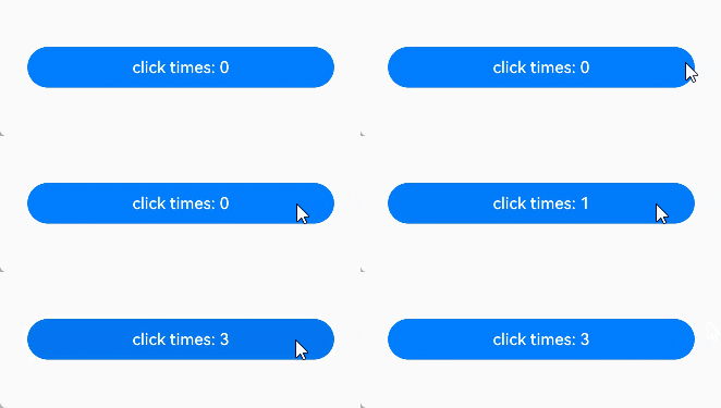
The following example shows a simple type decorated by @State. count is decorated by @State to become a state variable, and changes to count trigger the refresh of the Button component:
-
When the state variable count changes, only the Button component is identified as dependent.
-
The framework executes the update method of the Button component to implement on-demand updates.
@Entry
@Component
struct MyComponent {
  @State count: number = 0; // @State decorated simple variables.

  build() {
    Row() {
      Column() {
        Button(`click times: ${this.count}`)
          .onClick(() => {
            this.count += 1;
          })
          .width(300)
      }
      .width('100%')
    }
    .height('100%')
  }
}
[h2]Decorating Variables of the Class Object Type
-
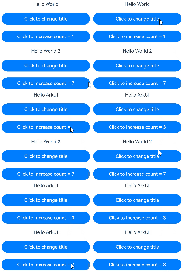
In this example, @State is used to decorate the variables count and title in the custom component MyComponent. The type of title is Model, a custom class. If the value of count or title changes, the framework searches for all MyComponent instances that depend on these variables and triggers re-rendering of them.
-
The EntryComponent has multiple MyComponent instances. The internal state change of the first MyComponent instance does not affect the second MyComponent instance.
class Model {
  public value: string;

  constructor(value: string) {
    this.value = value;
  }
}

@Entry
@Component
struct EntryComponent {
  build() {
    Column() {
      // count and increaseBy are initialized with the passed values 1 and 2; title is not passed and is initialized with the local default value new Model('Hello World').
      MyComponent({ count: 1, increaseBy: 2 })
        .width(300)
      // title and count are initialized with the passed values new Model('Hello World 2') and 7; increaseBy is not passed and is initialized with the local default value 1.
      MyComponent({ title: new Model('Hello World 2'), count: 7 })
    }
  }
}

@Component
struct MyComponent {
  @State title: Model = new Model('Hello World');
  @State count: number = 0;
  increaseBy: number = 1;

  build() {
    Column() {
      Text(`${this.title.value}`)
        .margin(10)
      Button(`Click to change title`)
        .onClick(() => {
          // The update of the @State decorated variable triggers the update of the <Text> component.
          this.title.value = this.title.value === 'Hello ArkUI' ? 'Hello World' : 'Hello ArkUI';
        })
        .width(300)
        .margin(10)

      Button(`Click to increase count = ${this.count}`)
        .onClick(() => {
          // The update of the @State decorated variable triggers the update of the <Button> component.
          this.count += this.increaseBy;
        })
        .width(300)
        .margin(10)
    }
  }
}
[h2]Decorating Variables of the Array Type
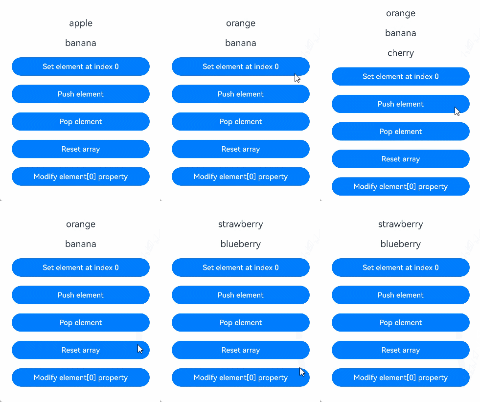
In this example, the fruits variable decorated with @State is of the Array<Fruit> type. After the button is clicked, the value of fruits changes, and the UI is re-rendered.
class Fruit {
  public name: string;

  constructor(name: string) {
    this.name = name;
  }
}

@Entry
@Component
struct ArraySample {
  @State fruits: Fruit[] = [new Fruit('apple'), new Fruit('banana')]; // @State decorated variables of the Array type.

  build() {
    Row() {
      Column() {
        ForEach(this.fruits, (item: Fruit) => {
          Text(`${item.name}`)
            .fontSize(20)
            .margin(10)
        })
        // Reassign an array element, triggering UI update.
        Button('Set element at index 0')
          .onClick(() => {
            this.fruits[0] = new Fruit('orange');
          })
          .width(300)
          .margin(10)
        // Add an array element, triggering UI update.
        Button('Push element')
          .onClick(() => {
            this.fruits.push(new Fruit('cherry'));
          })
          .width(300)
          .margin(10)
        // Delete an array element, triggering UI update.
        Button('Pop element')
          .onClick(() => {
            this.fruits.pop();
          })
          .width(300)
          .margin(10)
        // Reassign an array, triggering UI update.
        Button('Reset array')
          .onClick(() => {
            this.fruits = [new Fruit('strawberry'), new Fruit('blueberry')];
          })
          .width(300)
          .margin(10)
        // Modify the nested property, which cannot trigger UI update.
        Button('Modify element[0] property')
          .onClick(() => {
            this.fruits[0].name = 'pineapple';
          })
          .width(300)
          .margin(10)
      }
      .width('100%')
    }
    .height('100%')
  }
} 
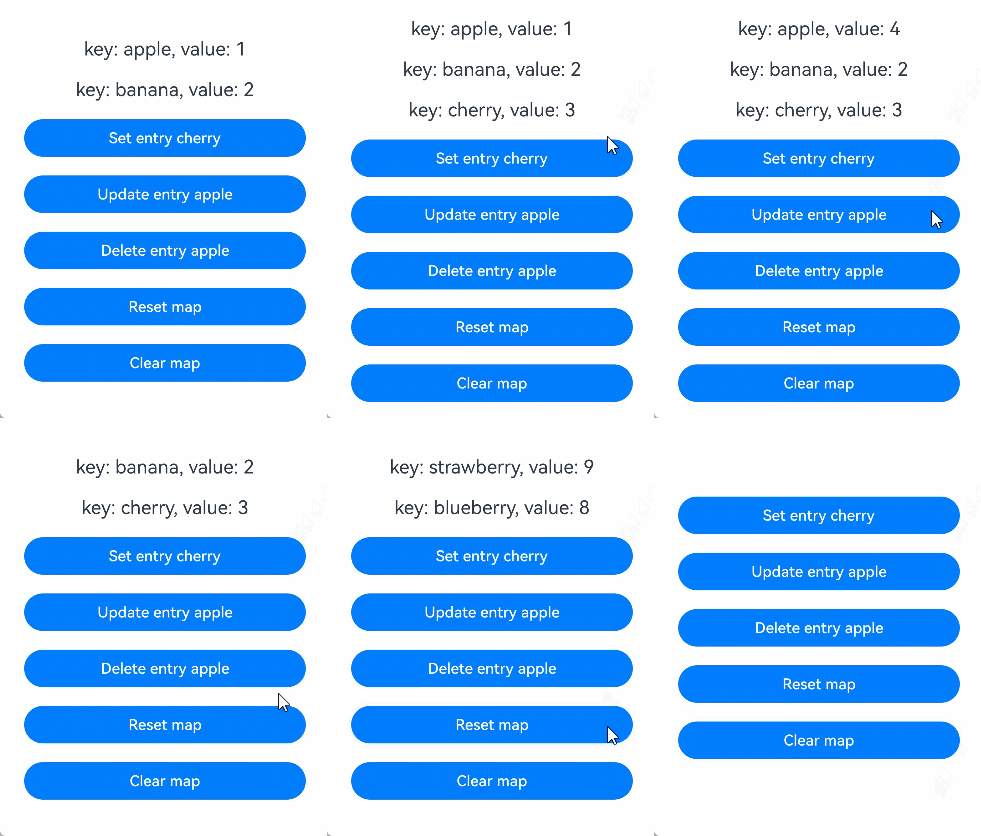
[h2]Decorating Variables of the Map Type

Since API version 11, @State supports the Map type.
In this example, the fruits variable decorated with @State is of the Map<string, number> type. After the button is clicked, the value of fruits changes, and the UI is re-rendered.
@Entry
@Component
struct MapSample {
  @State fruits: Map<string, number> = new Map([['apple', 1], ['banana', 2]]); // @State decorated variables of the Map type.

  build() {
    Row() {
      Column() {
        ForEach(Array.from(this.fruits.entries()), (item: [string, number]) => {
          Text(`key: ${item[0]}, value: ${item[1]}`)
            .fontSize(20)
            .margin(10)
        })
        // Add a key-value pair, triggering UI update.
        Button('Set entry cherry')
          .onClick(() => {
            this.fruits.set('cherry', 3);
          })
          .width(300)
          .margin(10)
        // Update a key-value pair, triggering UI update.
        Button('Update entry apple')
          .onClick(() => {
            this.fruits.set('apple', 4);
          })
          .width(300)
          .margin(10)
        // Delete a key-value pair, triggering UI update.
        Button('Delete entry apple')
          .onClick(() => {
            this.fruits.delete('apple');
          })
          .width(300)
          .margin(10)
        // Reassign values to the entire Map, triggering UI update.
        Button('Reset map')
          .onClick(() => {
            this.fruits = new Map([['strawberry', 9], ['blueberry', 8]]);
          })
          .width(300)
          .margin(10)
        // Clear the values of the entire Map, triggering UI update.
        Button('Clear map')
          .onClick(() => {
            this.fruits.clear();
          })
          .width(300)
          .margin(10)
      }
      .width('100%')
    }
    .height('100%')
  }
} 
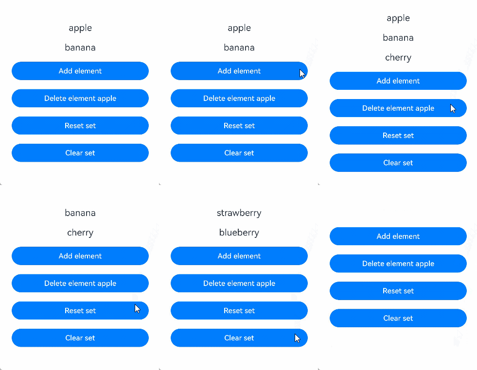
[h2]Decorating Variables of the Set Type

Since API version 11, @State supports the Set type.
In this example, the fruits variable decorated with @State is of the Set<string> type. After the button is clicked, the value of fruits changes, and the UI is re-rendered.
@Entry
@Component
struct SetSample {
  @State fruits: Set<string> = new Set(['apple', 'banana']); // @State decorated variables of the Set type.

  build() {
    Row() {
      Column() {
        ForEach(Array.from(this.fruits.entries()), (item: [string, string]) => {
          Text(`${item[0]}`)
            .fontSize(20)
            .margin(10)
        })
        // Add an element, triggering UI update.
        Button('Add element')
          .onClick(() => {
            this.fruits.add('cherry');
          })
          .width(300)
          .margin(10)
        // Delete an element, triggering UI update.
        Button('Delete element apple')
          .onClick(() => {
            this.fruits.delete('apple');
          })
          .width(300)
          .margin(10)
        // Reassign values to the entire Set, triggering UI update.
        Button('Reset set')
          .onClick(() => {
            this.fruits = new Set(['strawberry', 'blueberry']);
          })
          .width(300)
          .margin(10)
        // Clear the values of the entire Set, triggering UI update.
        Button('Clear set')
          .onClick(() => {
            this.fruits.clear();
          })
          .width(300)
          .margin(10)
      }
      .width('100%')
    }
    .height('100%')
  }
} 
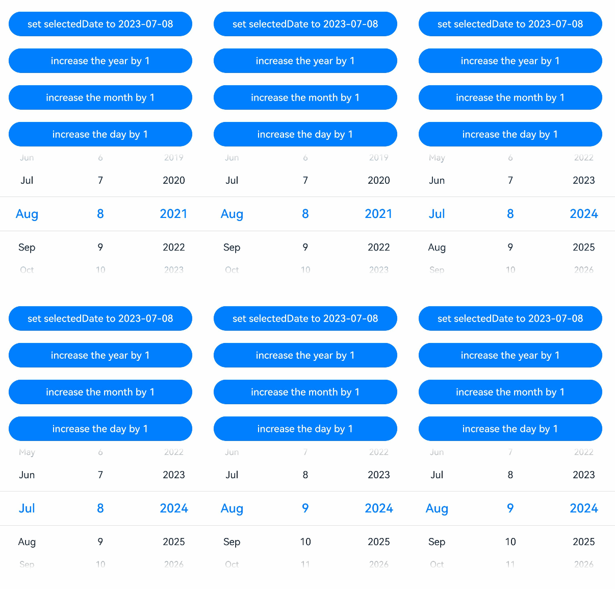
[h2]Decorating Variables of the Date Type
In this example, the selectedDate variable decorated by @State is of the Date type. After the button is clicked, the value of selectedDate changes, and the UI is re-rendered.
@Entry
@Component
struct DatePickerExample {
  @State selectedDate: Date = new Date('2021-08-08'); // @State decorated variables of the Date type.

  build() {
    Row() {
      Column() {
        // Reassign a new Date instance to selectedDate, triggering UI update.
        Button('set selectedDate to 2023-07-08')
          .onClick(() => {
            this.selectedDate = new Date('2023-07-08');
          })
          .margin(10)
          .width(300)
        // Call the setFullYear API of Date to change the year, triggering UI update.
        Button('increase the year by 1')
          .onClick(() => {
            this.selectedDate.setFullYear(this.selectedDate.getFullYear() + 1);
          })
          .margin(10)
          .width(300)
        // Call the setMonth API of Date to change the month, triggering UI update.
        Button('increase the month by 1')
          .onClick(() => {
            this.selectedDate.setMonth(this.selectedDate.getMonth() + 1);
          })
          .margin(10)
          .width(300)
        // Call the setDate API of Date to change the date, triggering UI update.
        Button('increase the day by 1')
          .onClick(() => {
            this.selectedDate.setDate(this.selectedDate.getDate() + 1);
          })
          .margin(10)
          .width(300)
        DatePicker({
          start: new Date('1970-1-1'),
          end: new Date('2100-1-1'),
          selected: this.selectedDate
        }).margin(20)
      }
      .width('100%')
    }
    .height('100%')
  }
} 
[h2]Union Type Instances Supported by @State
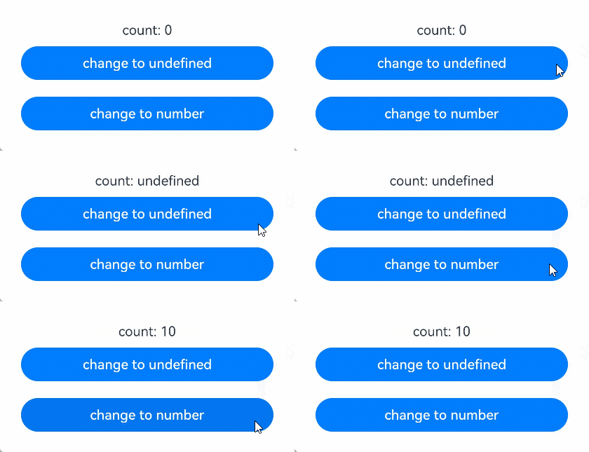
@State supports undefined, null, and union types. In the following example, the type of count is number | undefined. If the value of count is changed when the button is clicked, the view will be updated accordingly.
@Entry
@Component
struct UnionTypeSample {
  @State count: number | undefined = 0; // @State decorated variables of the union type.

  build() {
    Row() {
      Column() {
        Text(`count: ${this.count}`)
        // Change the union variable from number to undefined, triggering the UI update.
        Button('change to undefined')
          .onClick(() => {
            this.count = undefined;
          })
          .width(300)
          .margin(10)
        // Change the union variable from undefined to number, triggering the UI update.
        Button('change to number')
          .onClick(() => {
            this.count = 10;
          })
          .width(300)
          .margin(10)
      }
      .width('100%')
    }
    .height('100%')
  }
}