Overview
This topic uses image beautification apps as a typical example to detail how the feature of one-time development for multi-device deployment is applied in actual development.
The core feature of an image beautification app is user interaction. The main function modules include chatting, contact management, and social networking. You may face challenges in adapting to different screen sizes and formats when developing apps. This topic provides recommended solutions to common multi-device adaptation issues of image beautification apps.
Currently, this app is compatible with the following devices: bar-type phones, bi-fold devices (Mate X series), tri-fold devices, widescreen foldable devices, tablets, and PCs.

Before reading this topic, you are advised to learn the ArkUI framework and the capabilities of one-time development for multi-device deployment.
The following practices will focus on these product forms and provide examples from the perspectives of UX design, project management, and page development, helping you develop image beautification apps in multi-device development.
- UX Design: describes the interaction logic and design points of image beautification apps. You can refer to similar design points in other projects.
- Project Management: uses a layered architecture for projects with one-time development for multi-device deployment, clearly defining the logic of each layer. In addition, this section describes the three-layer architecture configuration applicable to image beautification apps.
- Mobile Pages and PC Pages: describe the design principles and implementation methods of window adaptation and page development by following the actual app development process, with pages as the basic unit.
UX Design
For details about the UX design of image beautification apps, see the photo and video section in the multi-device responsive design guide for social communication apps. See the following figure for reference.

Project Management
To ensure the reusability and maintainability of the project to implement one-time development for multi-device deployment, it is recommended that developers use a layered architecture to organize code projects. The architecture consists of three layers: products (product customization layer), features (basic feature layer), and common (common capability layer). Each layer has clear responsibilities and independent functions, providing developers with a clear, efficient, and scalable design architecture. For details about the layered architecture design, see Layered Architecture Design.
[h2]Project Creation
You are advised to create a template project after learning how to create and configure a layered architecture project by referring to Cross-Device Project Deployment and Release. Then, modify the template project based on the development requirements of the image beautification app to ensure that the project architecture meets the actual service requirements.
[h2]Project Structure
The image beautification app uses the recommended layered architecture, organizing the code project into three layers: products, features, and common. The design of each layer is as follows:
- products layer: The image beautification app needs to be compatible with the following devices: bar-type phones, bi-fold devices (Mate X series), tri-fold devices, widescreen foldable devices, tablets, and PCs. The UI layout of PCs differs greatly from that of other devices. Therefore, a hap package named pc needs to be created separately at the products layer as the app entry for PCs. The UI layouts of bar-type phones, bi-fold devices (Mate X series), tri-fold devices, widescreen foldable devices, and tablets are similar. Some differences can be adapted through the adaptive layout and responsive layout of one-time development for multi-device deployment. Therefore, a hap package named default is created at the products layer as the app entry for these devices.
- features layer: The photo beautification app consists of two core service modules: photo browsing (multipicturebrowsing) and photo editing (multipictureediting). A HAR package is created at the features layer for the two service modules, which can be referenced by the products layer as required. These two service modules are independent of each other, facilitating subsequent maintenance and iteration.
- common layer: stores basic capabilities such as common constants, route redirection utilities, and window management utilities in a centralized manner to implement code reuse and reduce redundancy. These capabilities can be shared and uniformly called by other modules.
The project structure is as follows:
├──features
│  ├──multipicturebrowsing                    // Photo browsing module
│  │  └──src/main
│  │     ├──ets
│  │     │  ├──constants                      // Photo browsing constants
│  │     │  ├──datasource                     // Photo data source
│  │     │  ├──model                          // Data model of the photo browsing module
│  │     │  ├──view                           // View of the photo browsing module
│  │     │  └──viewmodel                      // View model of the photo browsing module
│  │     └──resources                         // Photo browsing module resources
│  └──multipictureediting                     // Photo editing module
│     └──src/main
│        ├──ets
│        │  ├──constants                      // Photo editing constants
│        │  ├──model                          // Data model of the photo editing module
│        │  ├──view                           // View of the photo editing module
│        │  └──viewmodel                      // View model of the photo editing module
│        └──resources                         // Photo editing module resources
├──multipicturecommon
│  └──src/main
│     ├──ets
│     │  ├──constants                         // Common constants
│     │  └──utils                             // Utilities.
│     └──resources                            // Public resources
└──products
  ├──multipicturedefaultsample                // Mobile phone/Tablet
  │  └──src/main
  │     ├──ets
  │     │  ├──constants                       // Constants
  │     │  ├──defaultability                  // Entry ability
  │     │  ├──defaultbackupability            // Custom extension ability for application data backup and restoration
  │     │  ├──model                           // Data model
  │     │  ├──pages                           // Entry page
  │     │  ├──view                            // View
  │     │  └──viewmodel                       // View model
  │     └──resources                          // Resource file
  └──multipicturepcsample                     // PC
    └──src/main
       ├──ets
       │  ├──constants                        // Constants
       │  ├──model                            // Data model.
       │  ├──pages                            // Entry page
       │  ├──pcability                        // Entry ability
       │  └──pcbackupability                  // Custom extension ability for app data backup and restoration
       │  ├──view                             // View
       │  └──viewmodel                        // View model
       └──resources                           // Resource file
Mobile Pages
This section describes how to use layout capabilities to adapt a set of pages in the image beautification app across different devices, such as bar-type phones, bi-fold devices (Mate X series), tri-fold devices, widescreen foldable devices, and tablets. It also describes the window adaptation solutions for these devices.
[h2]Window Adaptation
- Window mode
Adapted devices support full-screen, split-screen, floating window, and freeform window modes. For details, see Window Mode. The split-screen and floating window modes can be easily accessed through the system. By monitoring window size changes, the app refreshes the UI based on the breakpoints to automatically apply layouts suitable for distinct window modes.
- Window Orientation
On bar-type phones, only the portrait mode is recommended. On large screens, such as bi-fold (unfolded), tri-fold (G state), and tablets, rotation in four orientations controlled by the rotation switch in Control Panel is recommended. For image beautification apps, you are advised to set orientation to FOLLOW_DESKTOP in the module.json5 file. For details, see Window Orientation.
- Immersive Window
You can implement the immersive windows in different modes (full-screen, split-screen, floating window, and freeform window modes) based on the UX design. For details, see Immersive Window. You are advised to use the component-level immersive solution (component-based page immersion) to implement the immersive effect and dynamically avoid the safe area to ensure the immersive display effect. In freeform window mode, call window.setWindowDecorVisible() to hide the title bar and display only the three buttons in the upper-right corner. In this case, the app page is extended to the title bar area, implementing the immersive display effect.
[h2]Photo Browsing Page
The photo browsing page of the photo beautification app displays photos and provides category navigation, meeting users' requirements for viewing photos in different albums. Based on the function design, the photo browsing page is divided into four areas, as shown in the following figure.
Horizontal Breakpoint | sm/md (Horizontal and Vertical Breakpoints) | sm | md | lg, xl |
|---|---|---|---|---|
Effect |
|
|
|
|


UI Development
The following table describes the details and implementation scheme.
No. | Description | How to Implement |
|---|---|---|
1 | Side navigation bar | Use the HdsNavigation component to implement this feature. Monitor the window change based on the window's width-to-height ratio. Switch between single-column and dual-column display by setting mode. |
2 | Title bar on the top | Use the HdsNavDestination component to set the titleBar attribute to implement this feature. The component automatically adapts to the screen on devices with different widths. |
3 | Bottom navigation bar | Use the HdsTabs component to implement this feature. Set the floating style of the tab bar using the barFloatingStyle attribute. |
4 | Image area | Use the Grid component to implement this feature. Modify columnsTemplate at different breakpoints using the @Env environment variable to display different numbers of columns, and set the aspectioRatio attribute of the image to a fixed aspect ratio. |
[h2]Photo Editing Page
The photo editing page of the photo beautification app is mainly used to apply preset filters with one tap, meeting users' personalized requirements. Based on the function design, the photo editing page is divided into four areas, as shown in the following figure.
Horizontal Breakpoint | sm/md (Horizontal and Vertical Breakpoints) | sm | md | lg |
|---|---|---|---|---|
Message page |
|
|
|
|


UI Development
The following table describes the details and implementation scheme.
No. | Description | How to Implement |
|---|---|---|
1 | Title bar on the top | Use the Row component to customize TitleView to implement this feature. The component automatically adapts to the screen on devices with different widths. |
2 | Bottom/Side toolbar | Use the Flex component to implement this feature. Monitor the window change based on the window's width-to-height ratio. Set the child component layout direction to Row or Column. |
3 | Image area | Use the Stack component to nest the Image component. Set the aspectioRatio attribute of the image to a fixed aspect ratio. Dynamically adjust the margins on both sides by monitoring breakpoint changes. |
4 | Alert Dialog Box | Use the Alert Dialog Box (AlertDialog) component to implement this feature. It is displayed only on small screens such as the PuraX cover screen. |
[h2]Interactive Development
On the photo browsing page, users can use two fingers to zoom in or out to dynamically adjust the display size of the image grid layout. Spread with two fingers to zoom in grids, and the number of images in each row decreases. Pinch with two fingers to zoom out grids, and the number of images in each row increases. The display effect is as follows.
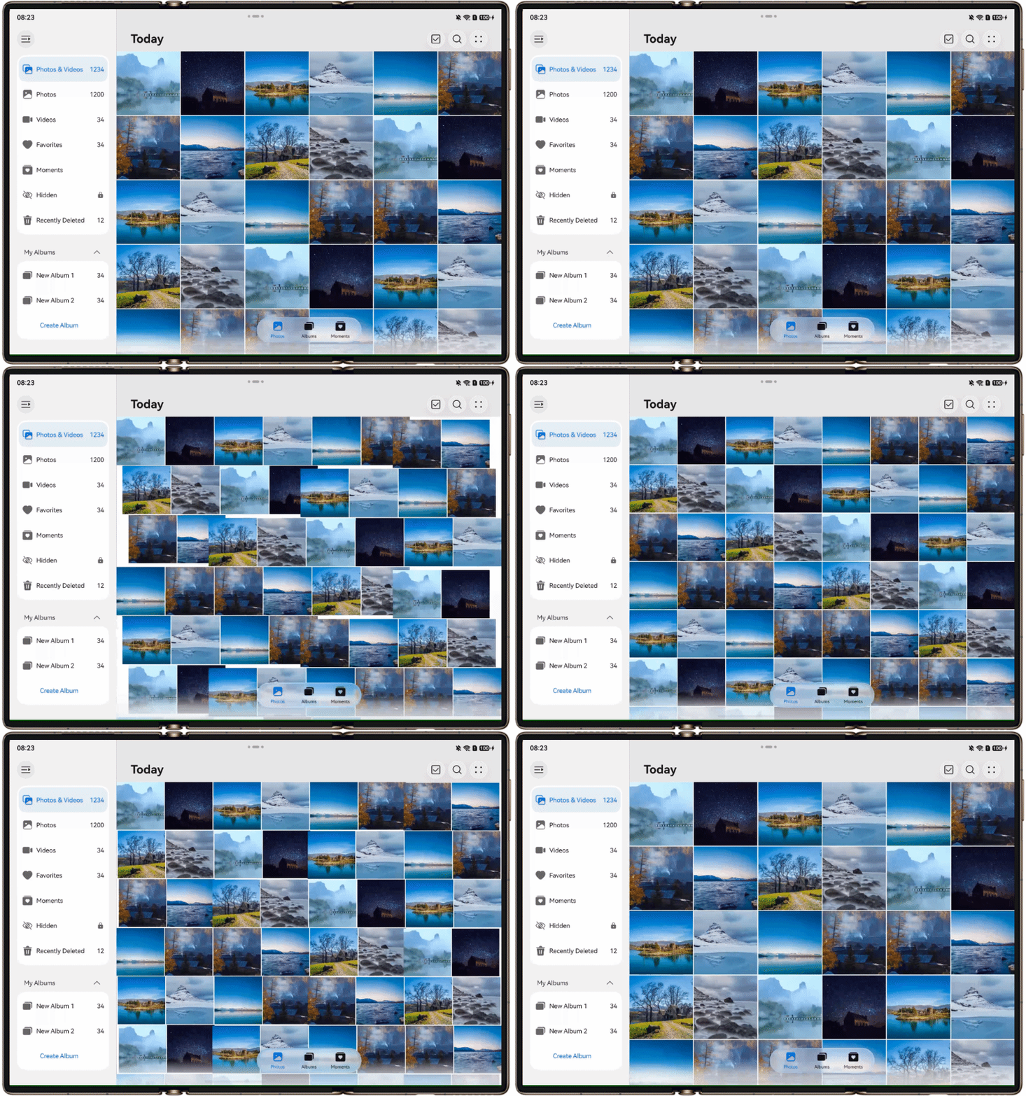
Use the PinchGesture component to dynamically change the number of columns displayed in the Grid component when the two-finger pinch gesture is triggered. For details, see Interactions Across Devices or Sample Code.
PC Pages
This section describes how to reuse the layout based on the existing mobile UI development solution to efficiently develop photo beautification apps for PCs. It also introduces the window adaptation solution for PCs.
[h2]Window Adaptation
- Window Mode
Adapted devices support the full-screen and freeform window modes. For details, see Window Mode. By monitoring window size changes, the app refreshes the UI based on the breakpoints to automatically apply layouts suitable for distinct window modes.
- Window Orientation
The window orientation of an app on a PC follows the screen orientation and cannot be customized by developers. For details, see Window Orientation.
- Immersive Window
According to the UX design requirements, the immersive effect needs to be implemented in freeform window mode. You are advised to use window.setWindowDecorVisible(false) to hide the title bar and display only the three buttons in the upper-right corner. You can also set the size and position of the three buttons. In this case, the app page is extended to the title bar area, implementing the immersive display effect. For details, see Immersive Window.
[h2]Photo Browsing Page
The photo browsing page of the photo beautification app displays photos and category navigation, meeting users' requirements for viewing photos in different albums. Based on the function design, the photo browsing page is divided into three areas, as shown in the following figure.
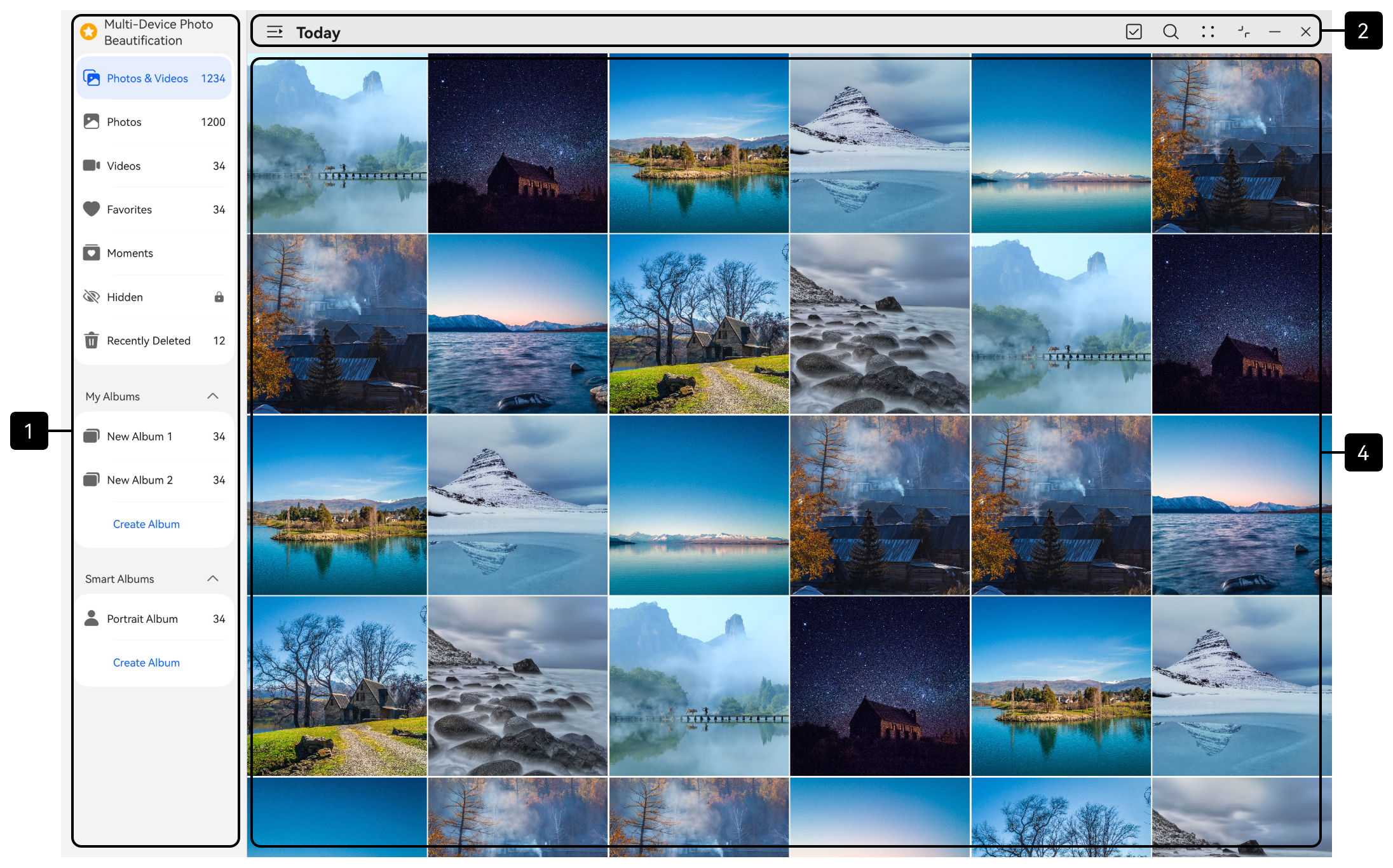
UI Development
The following table describes the details and implementation scheme.
No. | Description | How to Implement |
|---|---|---|
1 | Side navigation bar | The implementation solution is the same as that for implementing the layout of the corresponding area on the mobile photo browsing page. |
2 | Title bar on the top | |
3 | Image area |
[h2]Photo Editing Page
The photo editing page of the photo beautification app is mainly used to apply preset filters with one tap, meeting users' personalized requirements. Based on the function design, the photo editing page is divided into three areas, as shown in the following figure.
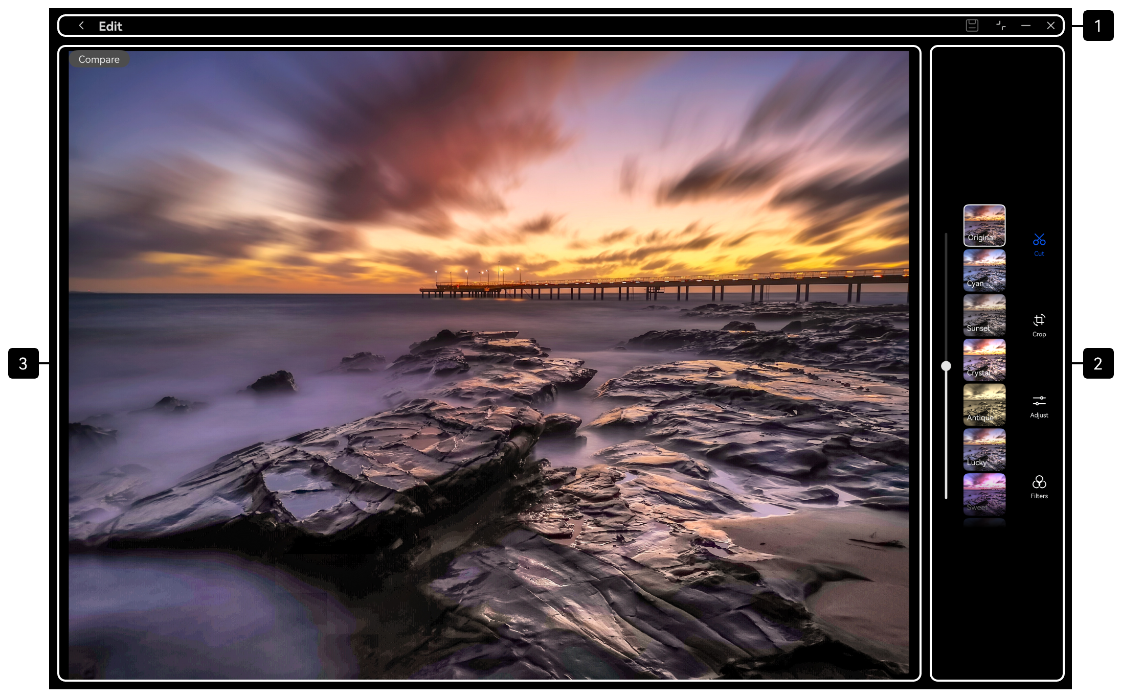
UI Development
The following table describes the details and implementation scheme.
No. | Description | How to Implement |
|---|---|---|
1 | Title bar on the top | The implementation solution is the same as that for implementing the layout of the corresponding area on the mobile photo editing page. |
2 | Bottom/Side toolbar | |
3 | Image area |
[h2]Interactive Development
On the PC photo browsing page, users can use two fingers to dynamically zoom in or out image grids on the touchscreen or touchpad. Both interaction events can be implemented using PinchGesture. For details, please refer to the interactive development for mobile devices.