Question
When a List component contains different types of data, how can different styles be assigned to the list items based on their types, for example, titles and their corresponding subcategories?
Answer
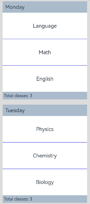
You can use the ListItemGroup component in the List component to display the list items by group and customize the header for each group. The code snippet is as follows:
// xxx.ets
@Entry
@Component
struct ListItemGroupExample {
  private timetable: TimeTable[] = [
    {
      title: 'Monday',
      projects: ['language', 'mathematics', 'English']
    },
    {
      title: 'Tuesday',
      projects: ['physics', 'chemistry', 'biology']
    },
    {
      title: 'Wednesday',
      projects: ['history', 'geography', 'politics']
    },
    {
      title: 'Thursday',
      projects: ['the fine arts', 'music', 'sport']
    }
  ]

  @Builder
  itemHead(text: string) {
    Text(text)
      .fontSize(20)
      .backgroundColor(0xAABBCC)
      .width('100%')
      .padding(10)
  }

  @Builder
  itemFoot(num: number) {
    Text('common' + num + 'period')
      .fontSize(16)
      .backgroundColor(0xAABBCC)
      .width('100%')
      .padding(5)
  }

  build() {
    Column() {
      List({ space: 20 }) {
        ForEach(this.timetable, (item: TimeTable) => {
          ListItemGroup({ header: this.itemHead(item.title), footer: this.itemFoot(item.projects.length) }) {
            ForEach(item.projects, (project: string) => {
              ListItem() {
                Text(project)
                  .width('100%')
                  .height(100)
                  .fontSize(20)
                  .textAlign(TextAlign.Center)
                  .backgroundColor(0xFFFFFF)
              }
            }, (item: string) => item)
          }
          .divider({ strokeWidth: 1, color: Color.Blue }) // The boundary line between each row
        })
      }
      .width('90%')
      .height('100%')
      .sticky(StickyStyle.Header | StickyStyle.Footer)
      .scrollBar(BarState.Off)
    }.width('100%').height('100%').backgroundColor(0xDCDCDC).padding({ top: 5 })
  }
}

interface TimeTable {
  title: string;
  projects: string[];
}
The figure below shows the preview.
Reference